|
| Group |
Round |
C/R |
Comment |
Date |
Image |
| 51 |
Aug 22 |
Reply |
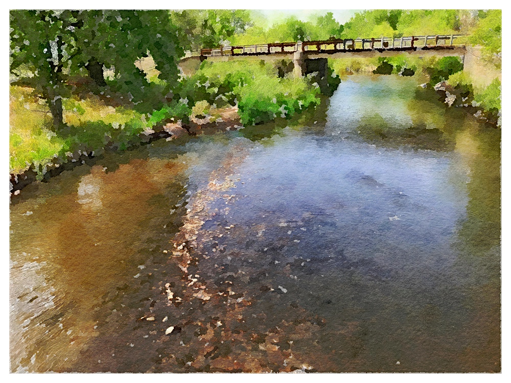
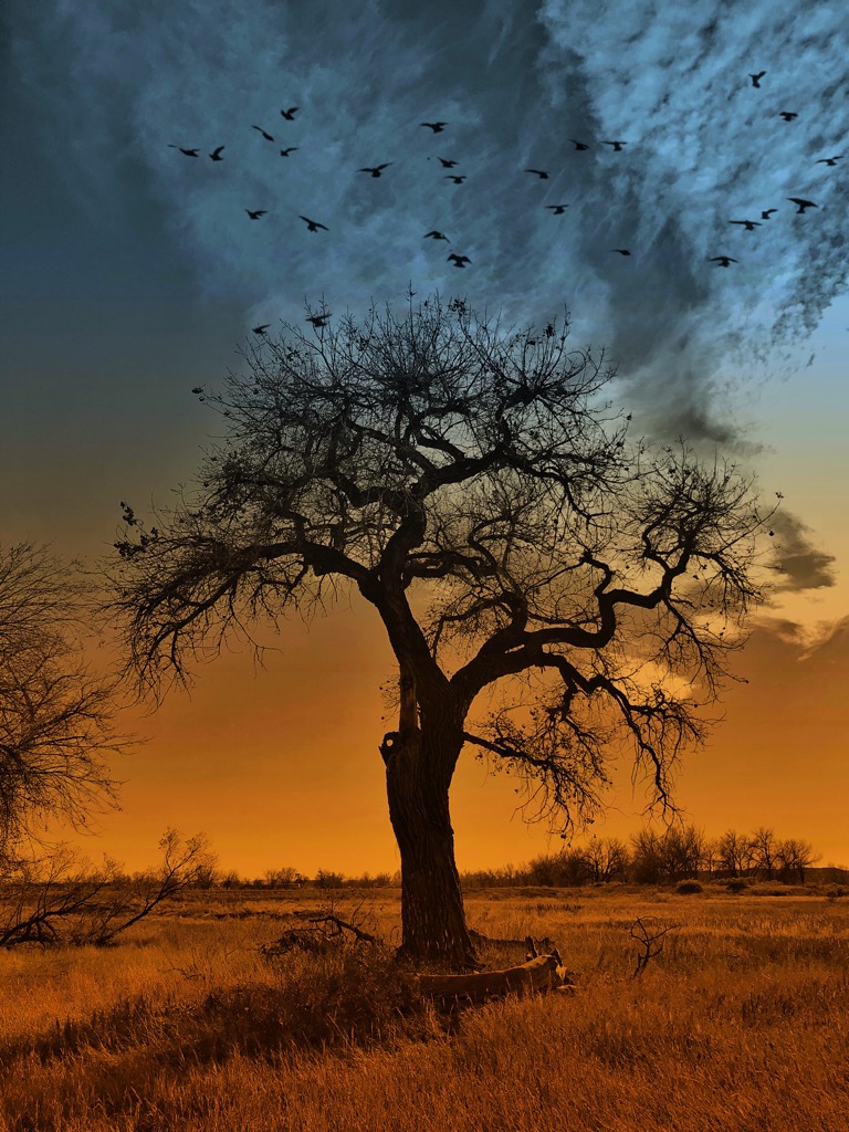
Thank you, Lynne, for your kind comments. It was the first time I tried something intentional with the Apple pencil.
|
Aug 11th |
| 51 |
Aug 22 |
Reply |
Thank you for your comments. I agree that there is so much that can be done these days. I've seen images from other people where I can't begin to understand how it was done. It reminds me that my skills and knowledge are limited, but it can still be fun to fiddle around a bit.
|
Aug 6th |
| 51 |
Aug 22 |
Reply |
Thanks, Dave. It was an interesting exercise. As I mentioned to Sol, I don't know if I will use the technique again, but it was worth trying.
|
Aug 6th |
| 51 |
Aug 22 |
Reply |
Thank you for your comments. I do agree that this editing technique has limited use, but it was just an exercise in seeing what could be done. I could have added a light leak simulation, too....
|
Aug 5th |
| 51 |
Aug 22 |
Comment |
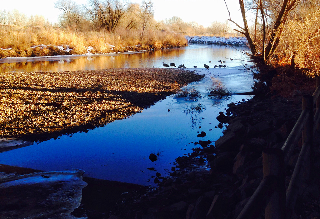
Those folks really put in a lot of time and money to make this amazing place. I'm sure it wasn't done in just a year or two, either. The Koi are a great addition. So much to see and enjoy in this pano. The colors are good, but imho, the HDR effect may have opened the shadows and brightened the scene too much, giving it an artificial appearance.
|
Aug 4th |
| 51 |
Aug 22 |
Reply |
Thank you for your comments. It was a fun exercise. I'm not too proficient with the Apple pencil yet, but practice should help with that. At the moment, it's just a small, rather expensive, toy.
|
Aug 4th |
| 51 |
Aug 22 |
Reply |
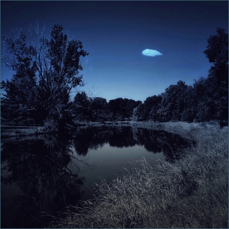
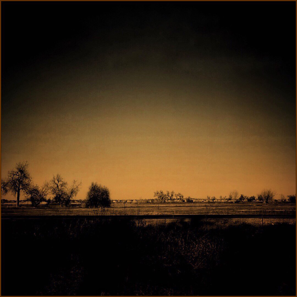
Thank you for your comments. I enjoyed reading about your initial reaction. It made me smile. The edits were just a bit of trickery, really, doing the opposite of what we normally might do. Digital imaging can go many directions!
|
Aug 4th |
| 51 |
Aug 22 |
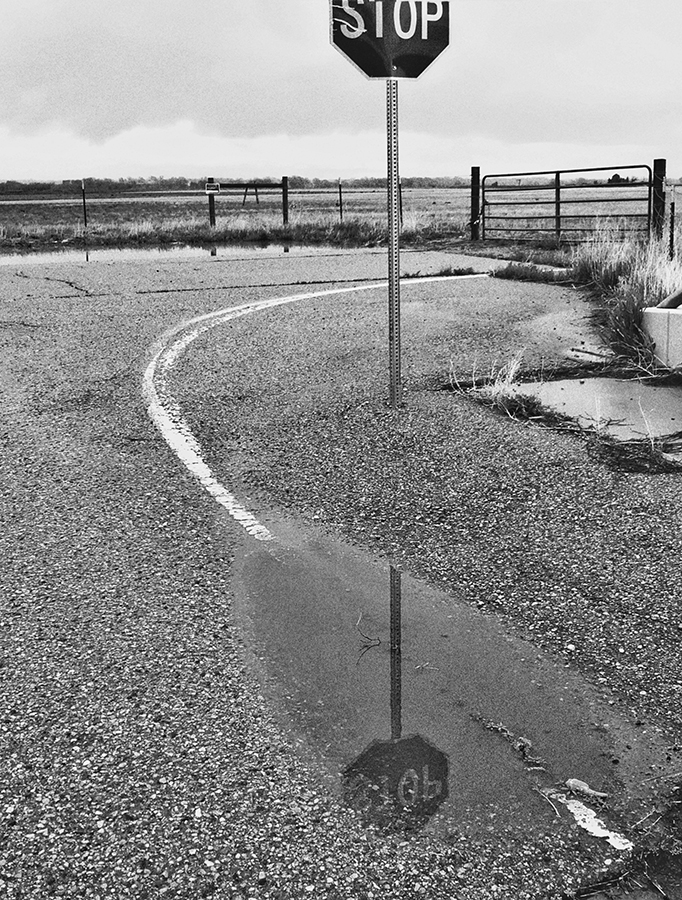
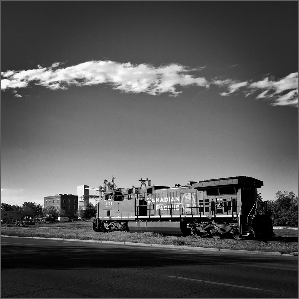
Comment |
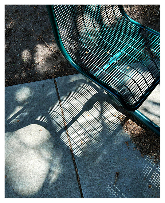
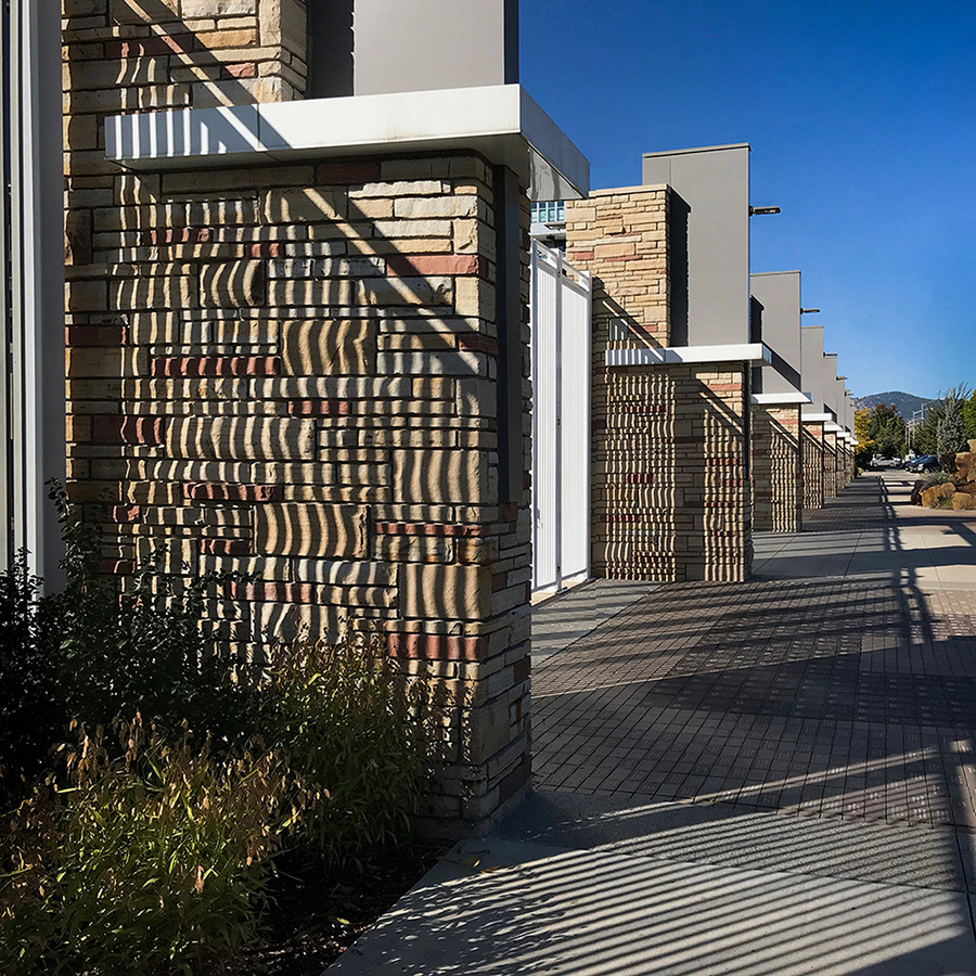
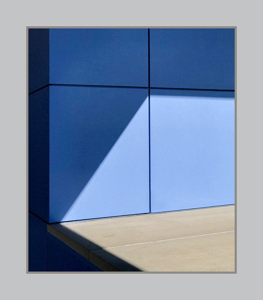
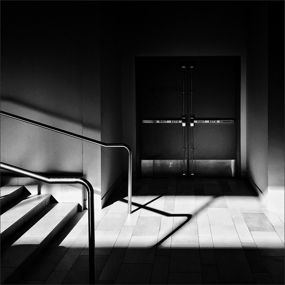
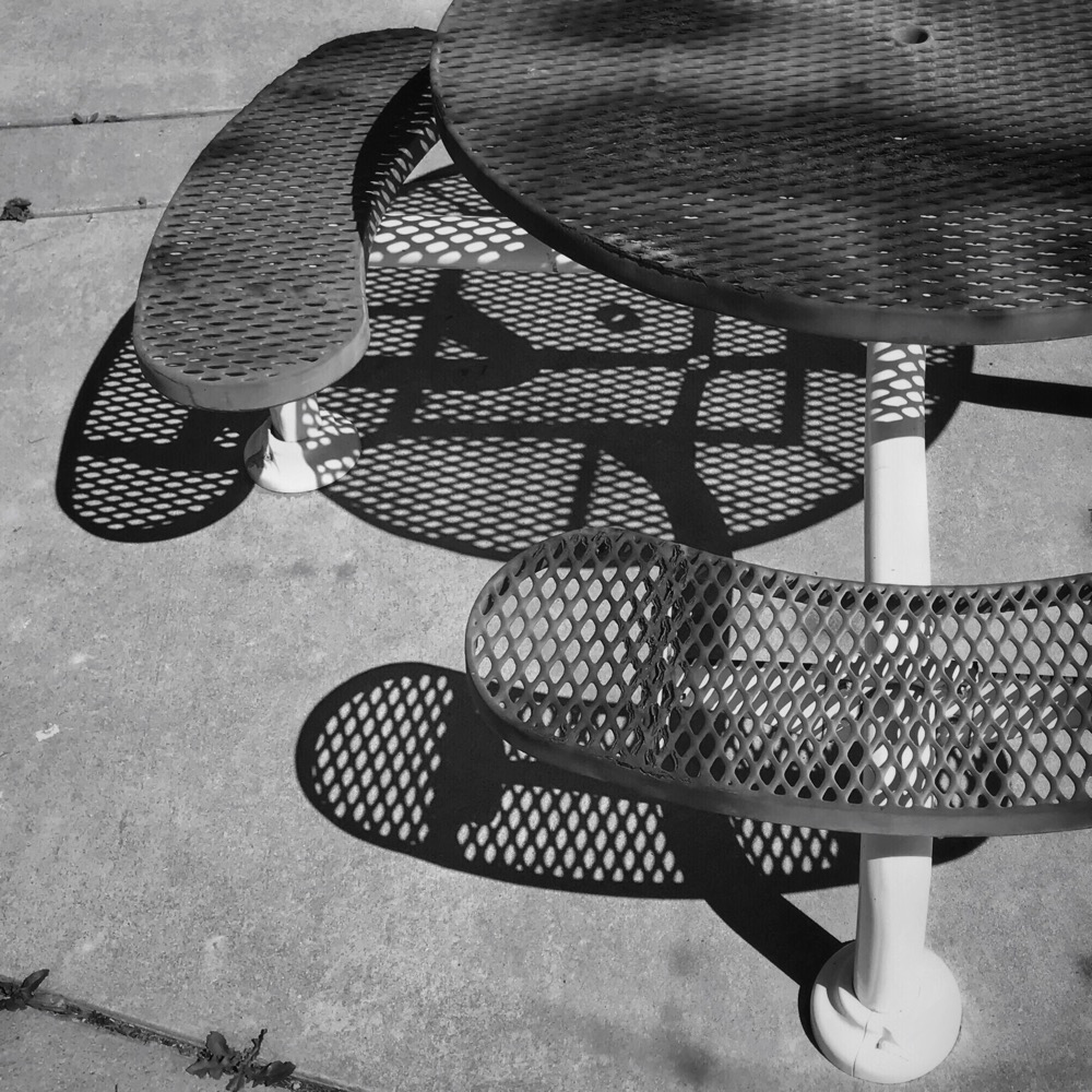
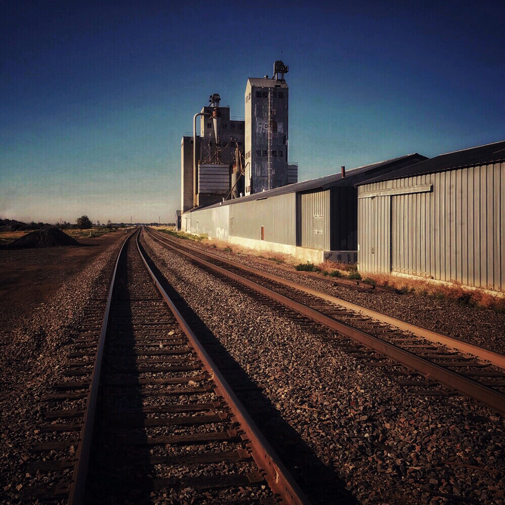
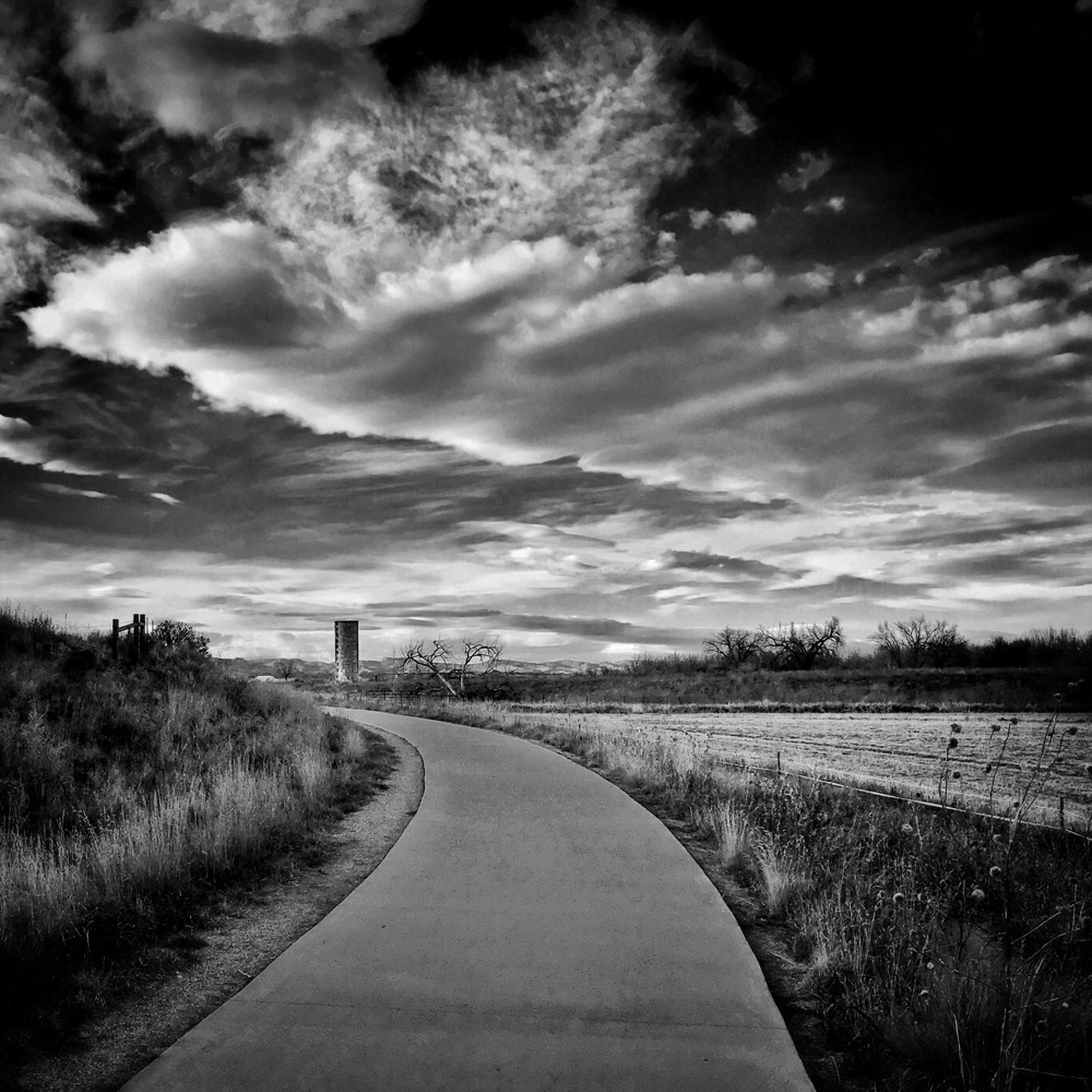
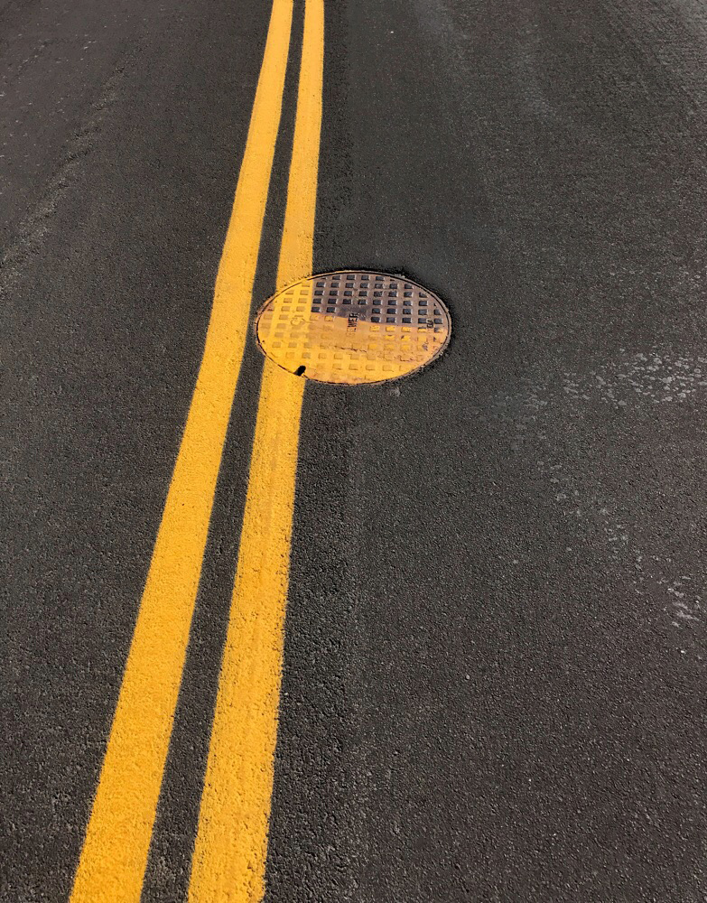
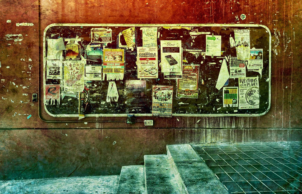
Another fun experiment! The white lines lead the viewer through the image, and the diagonals move the eye upward left to right. Good composition; the crop removed distractions nicely. The black snake-like lines push us up the white stripes. Good work.
|
Aug 4th |
| 51 |
Aug 22 |
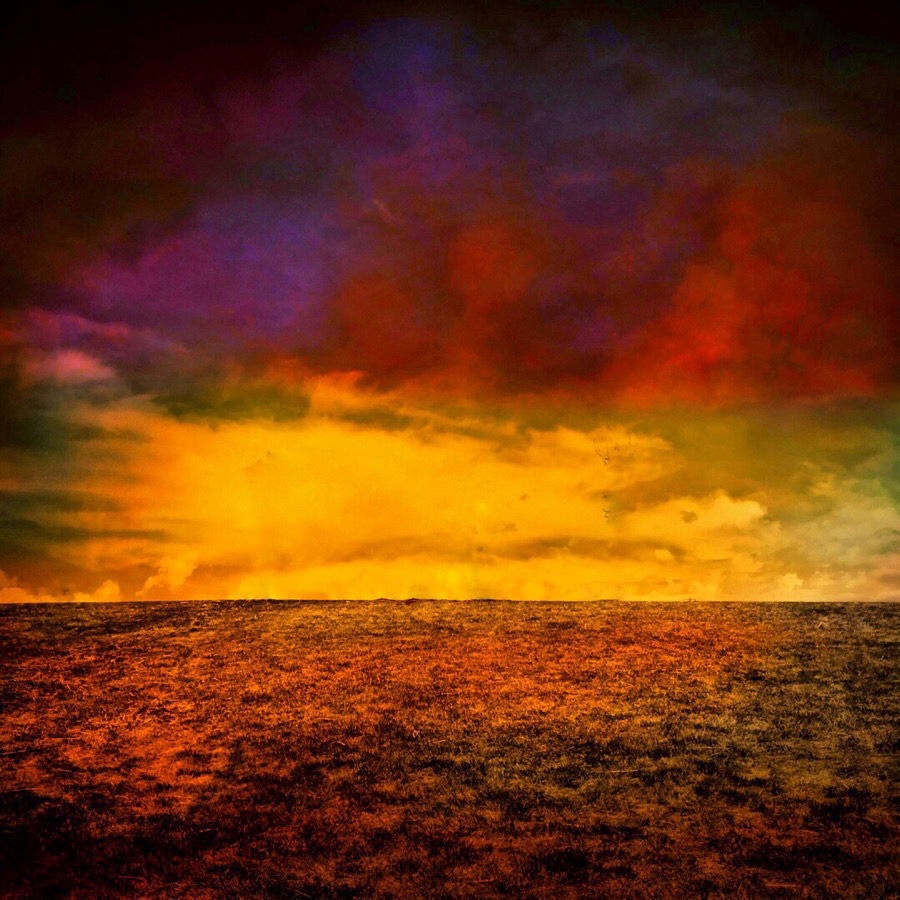
Comment |
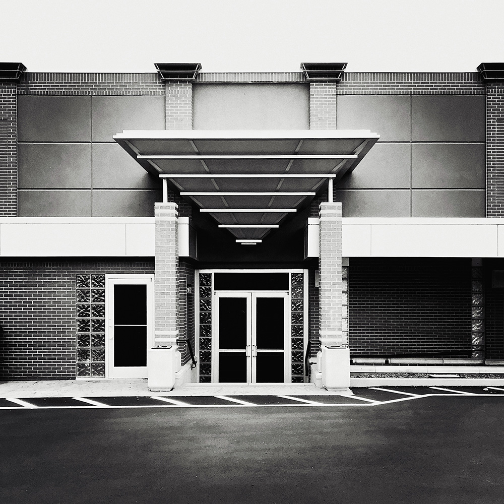
It's like an image from an advertising brochure. The warm, welcoming lighting against the evening sky makes a pleasant scene. Your images are always high-quality. You have a good understanding of composition and color. Nice shot.
|
Aug 4th |
| 51 |
Aug 22 |
Comment |
Lynn, this is really nice. One gets the feeling of being at the location. The bright reflection of the lighthouse explains more about the place. The blues and the greens are well-saturated, and the focus is spot-on. The "no trespassing" sign is small enough to not be a distraction. It was worth the fiddling to get the shot through the fence.
|
Aug 4th |
| 51 |
Aug 22 |
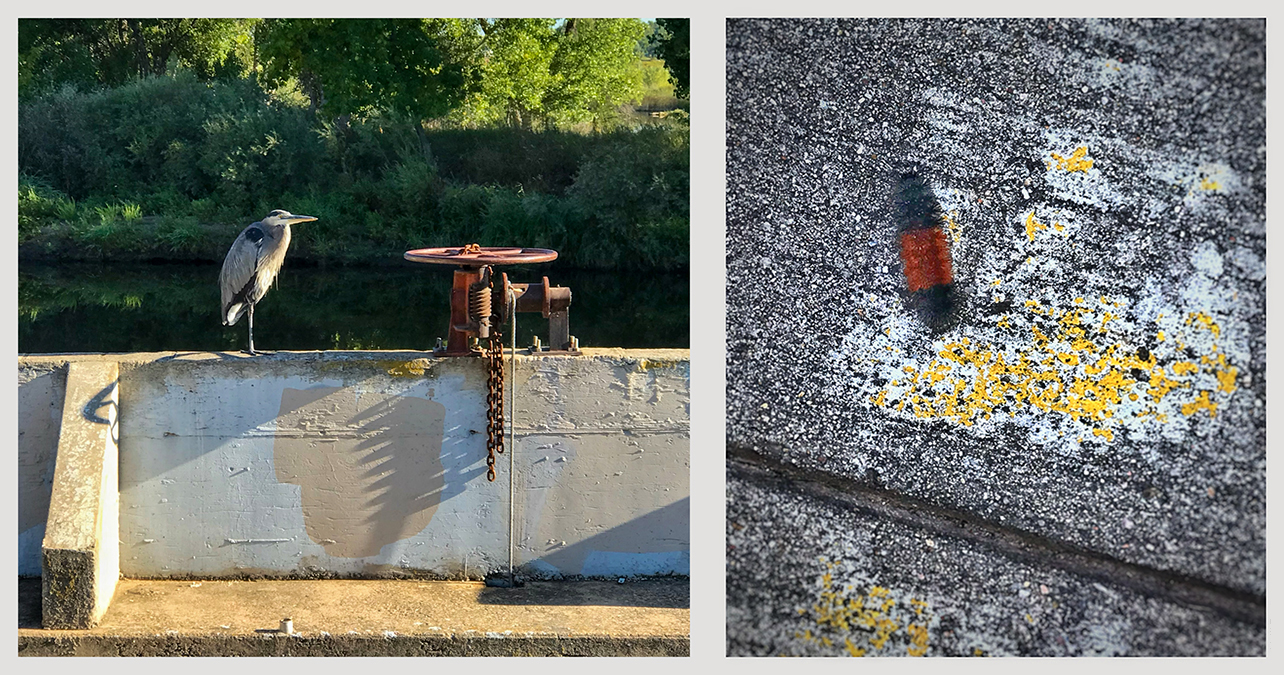
Comment |
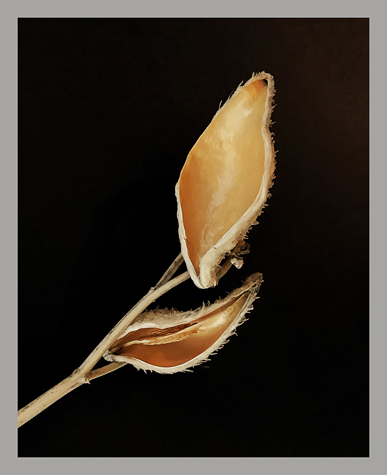
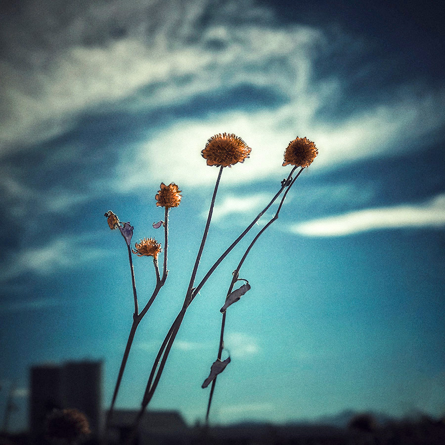
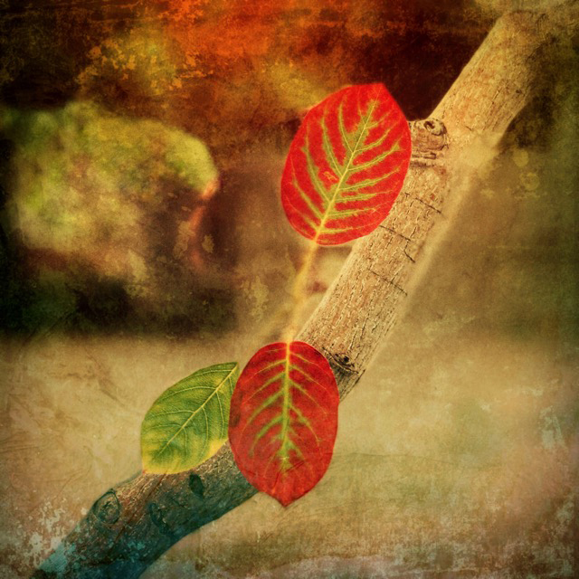
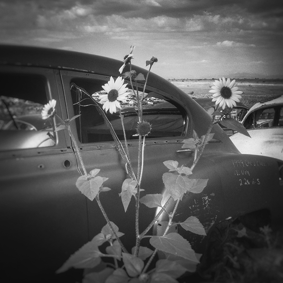
"If it's red, shoot it." That's an old saying that usually proves correct. The bright red against a darker background is sure to get noticed. The across-the-color-wheel contrast with the green and blue work very well, too. I might have flipped the image horizontally to let the green stem lead the viewer's eyes into the frame, but with that bright red, it probably isn't important! It may be cropped a little too much on the right edge, though, since the green tip is cut off. Nice capture.
|
Aug 4th |
| 51 |
Aug 22 |
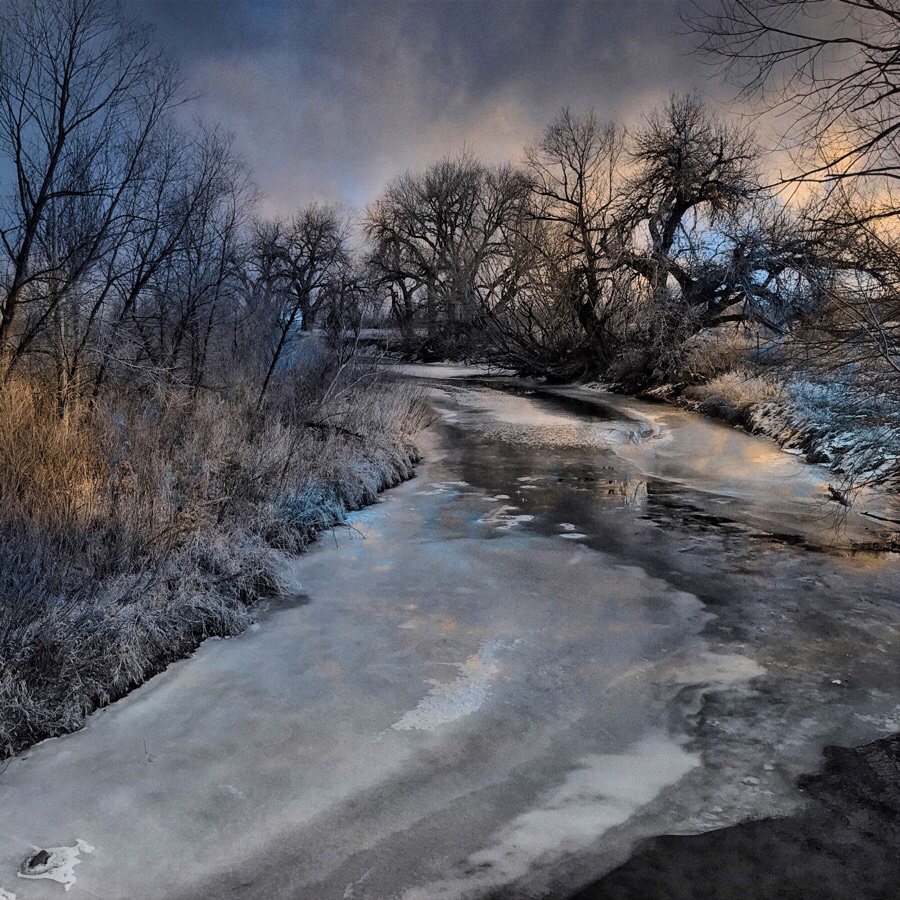
Comment |
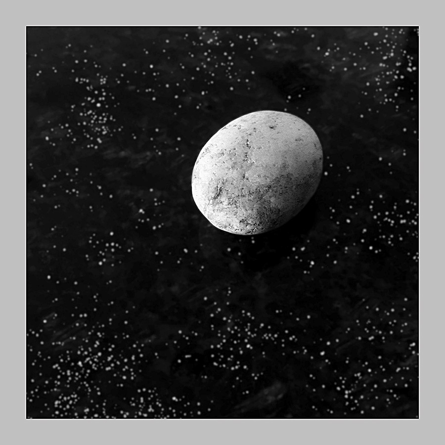
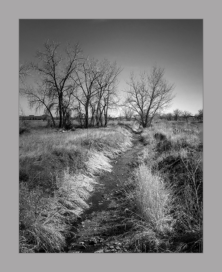
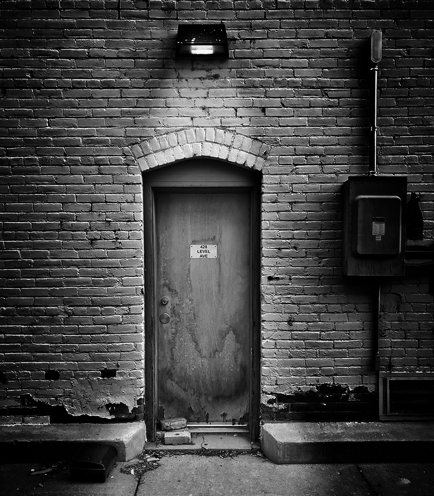
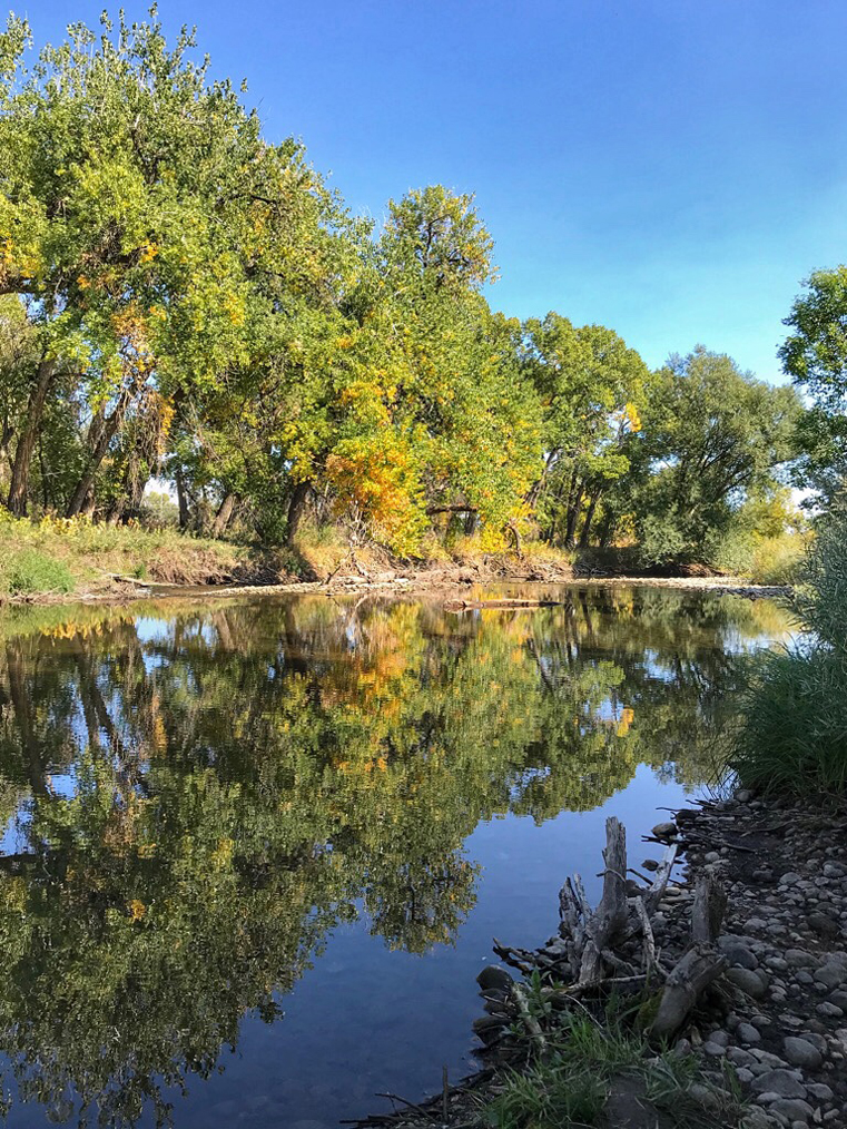
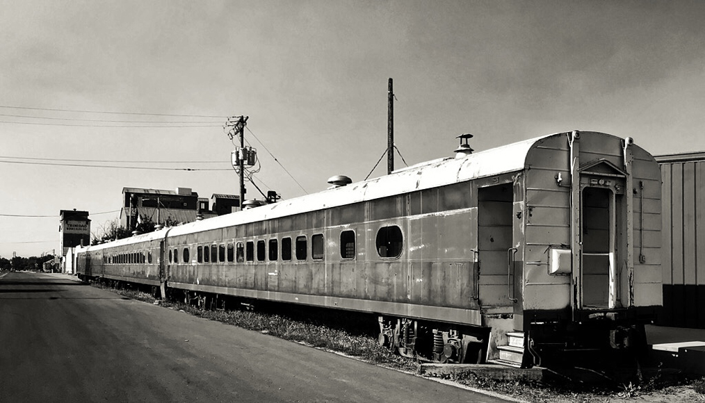
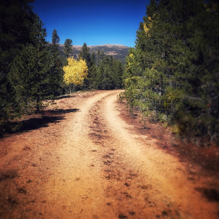
Dave, this was a great find. The textures and shapes in the tree roots and the rocks make an interesting study. The water and the sky add texture, too. The black and white conversion and your choice of crop highlight what you wanted the viewer to see. I hope you made other exposures at this location, too, since it is a photogenic place.
|
Aug 4th |
6 comments - 6 replies for Group 51
|
6 comments - 6 replies Total
|