|
| Group |
Round |
C/R |
Comment |
Date |
Image |
| 10 |
Mar 22 |
Comment |
Thanks to all for your helpful comments. The big advantage to using a mask is that I can vary the strength/opacity of the filter anywhere in the scene, bringing back or hiding any sharpness/details in the original image. If you like experimenting with filters, I recommend Filter Forge - it has over 10,000 filters! |
Mar 25th |
| 10 |
Mar 22 |
Comment |
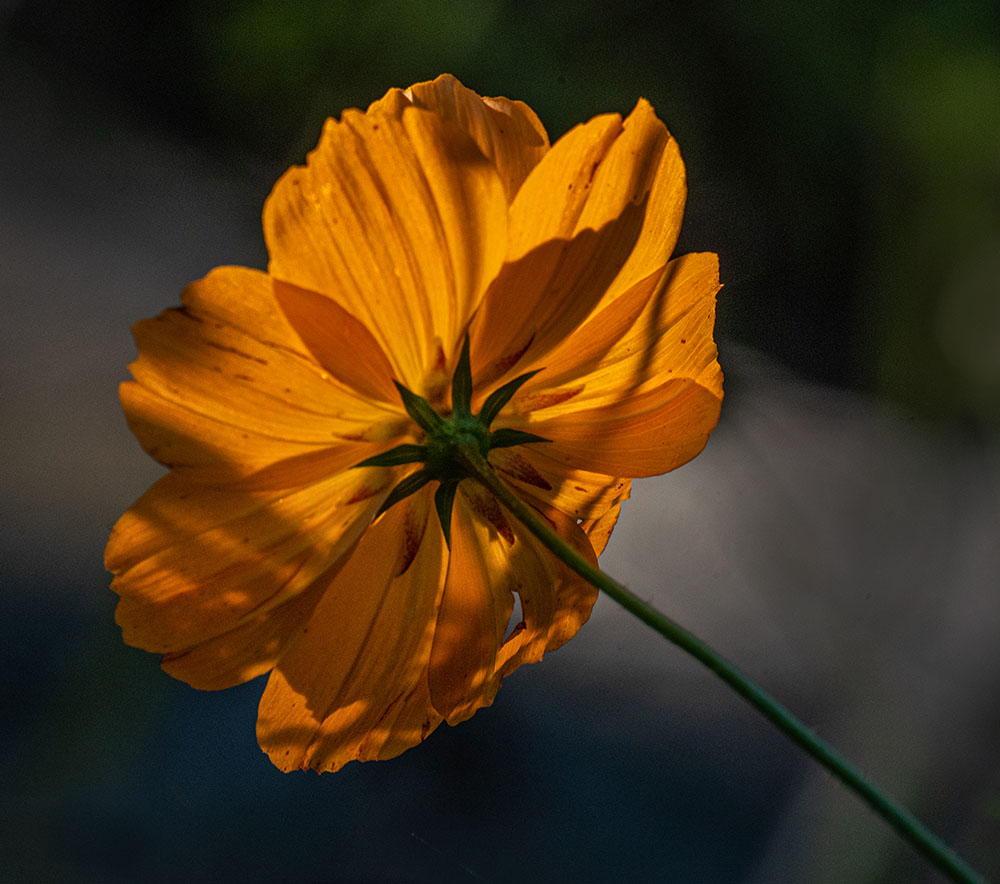
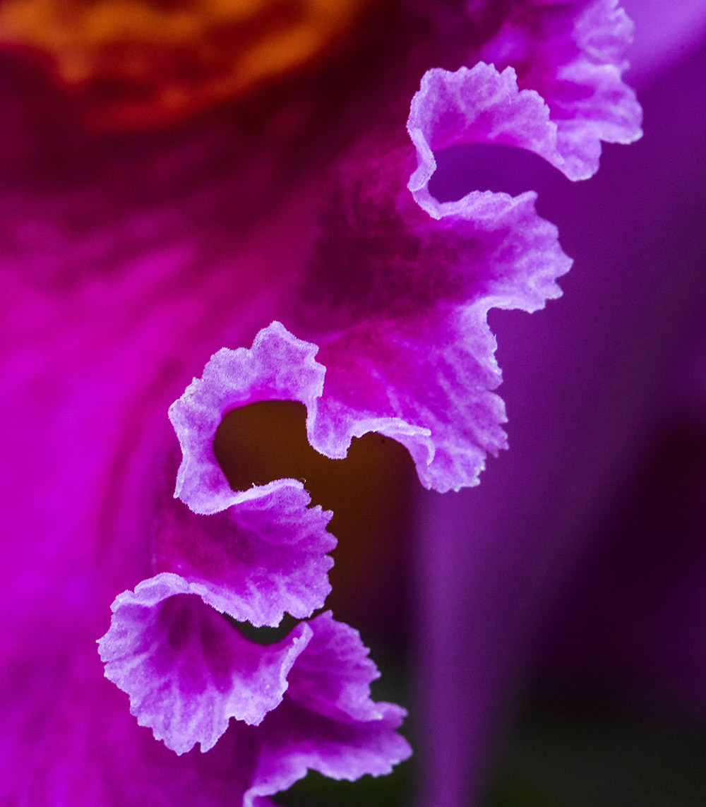
Another image with beautifully captured textures! I agree that removing the top petal improves the image but for me it was a close call. |
Mar 25th |
| 10 |
Mar 22 |
Comment |
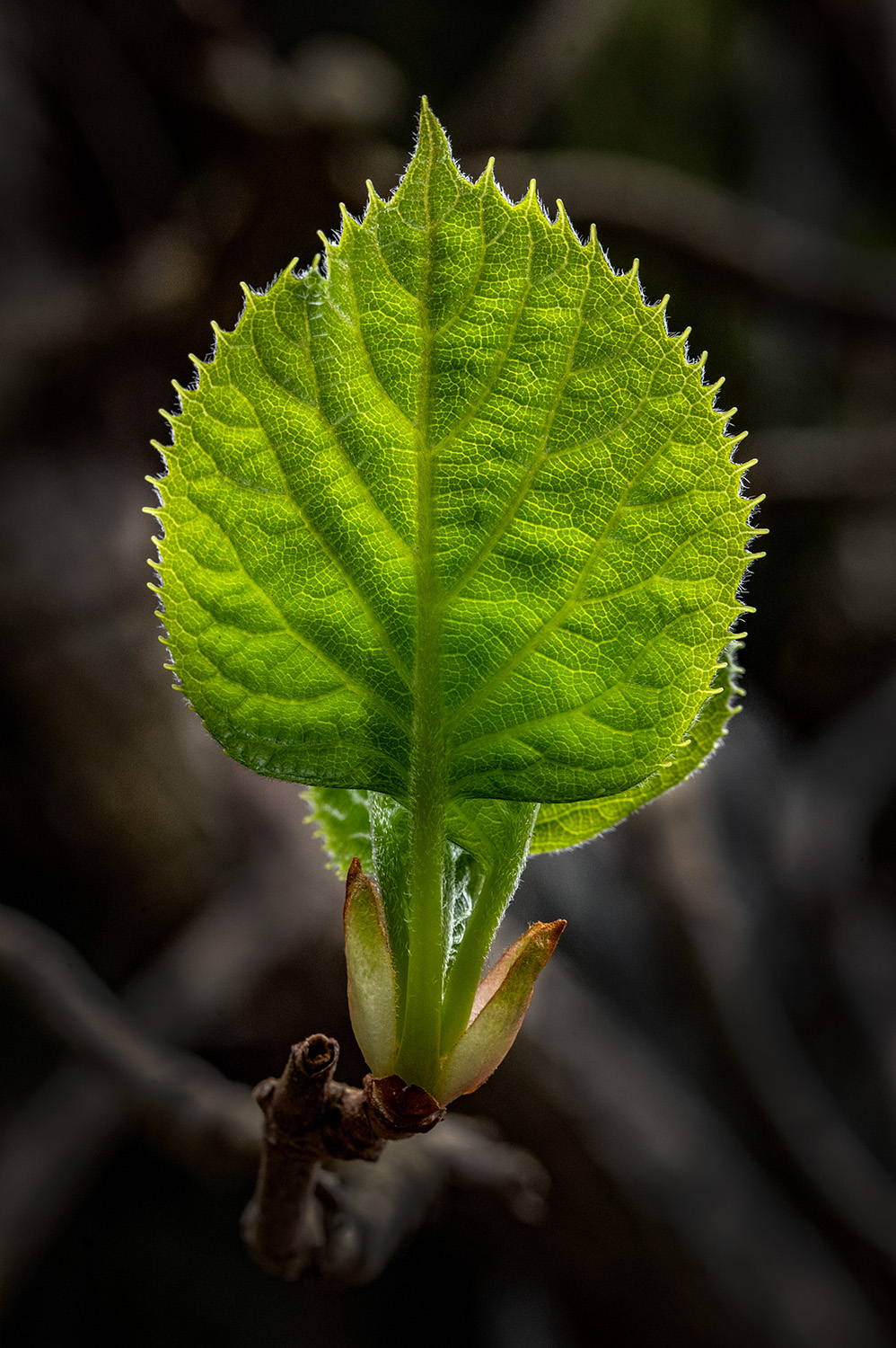
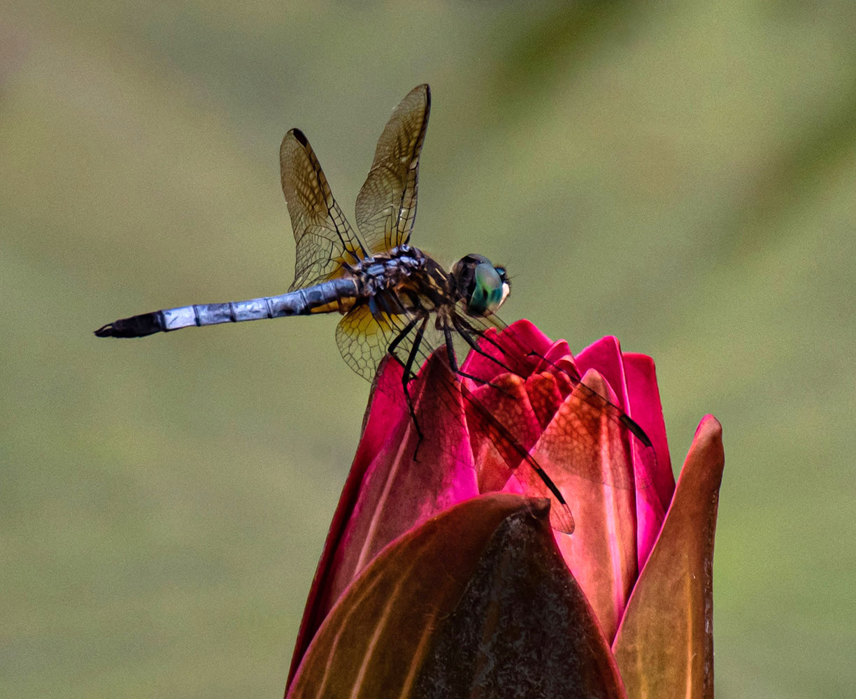
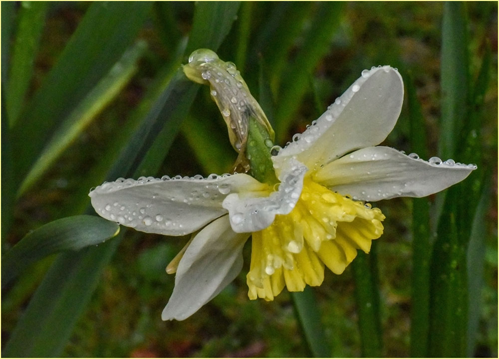
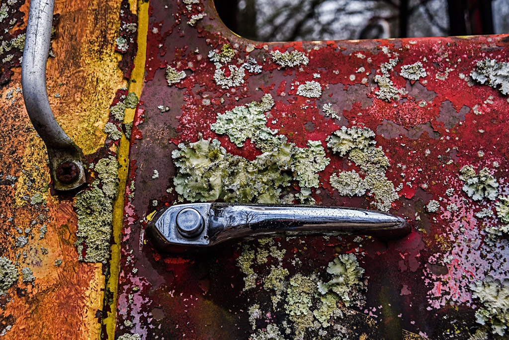
The textures show up beautifully in this pastel image, especially where the stem meets the flower! Close-cropping actually helps direct the eye to this part of the flower. I agree that the top background is blown out. Sometimes just moving foam board/diffuser with respect to camera and taking multiple shots may yield images with more even light. For this image, just try carefully cloning out the top using off-white color sampled from the bottom. |
Mar 25th |
| 10 |
Mar 22 |
Comment |
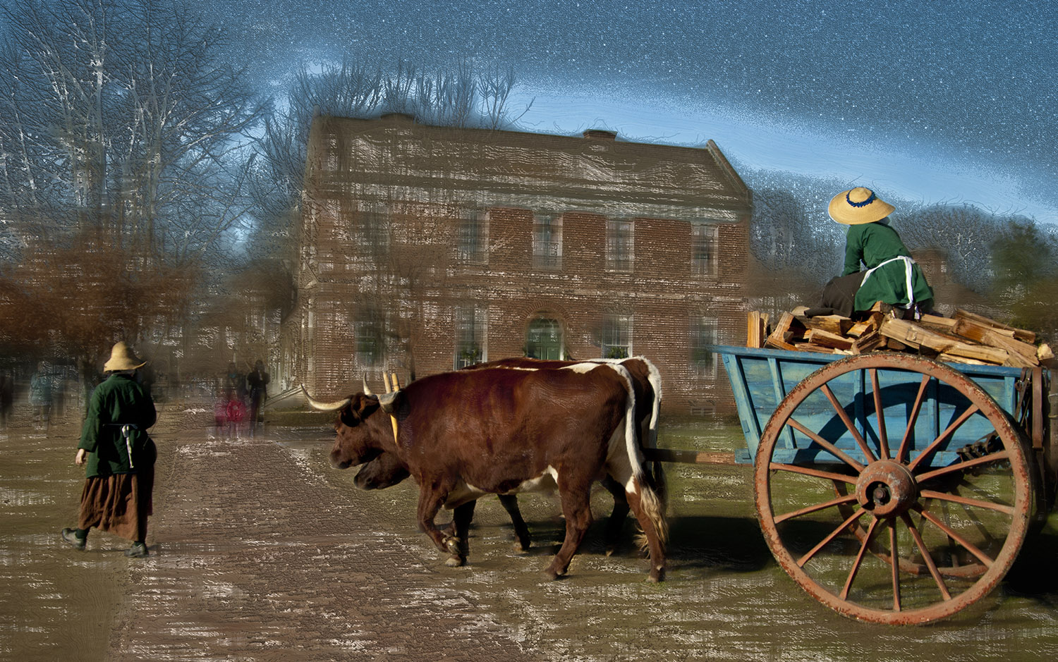
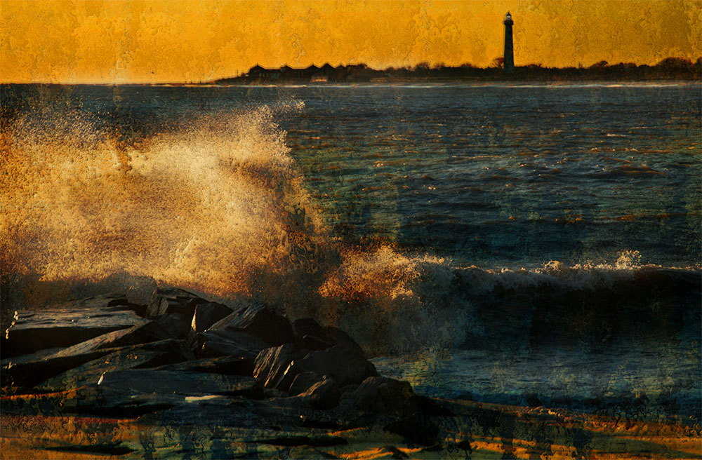
Nicely done, and with a well-chosen title! The varied textures and the other leaves trapped under the ice provide an interesting background for the main subject. I find the patch of leaf at upper left a bit distracting and agree that cropping in primarily from the left to a squarer format would create a stronger image. |
Mar 25th |
| 10 |
Mar 22 |
Comment |
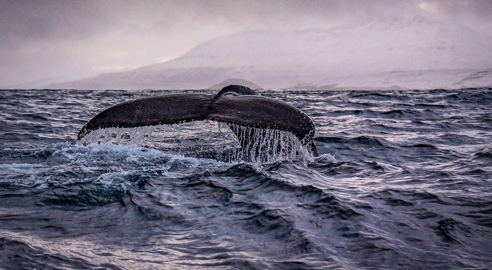
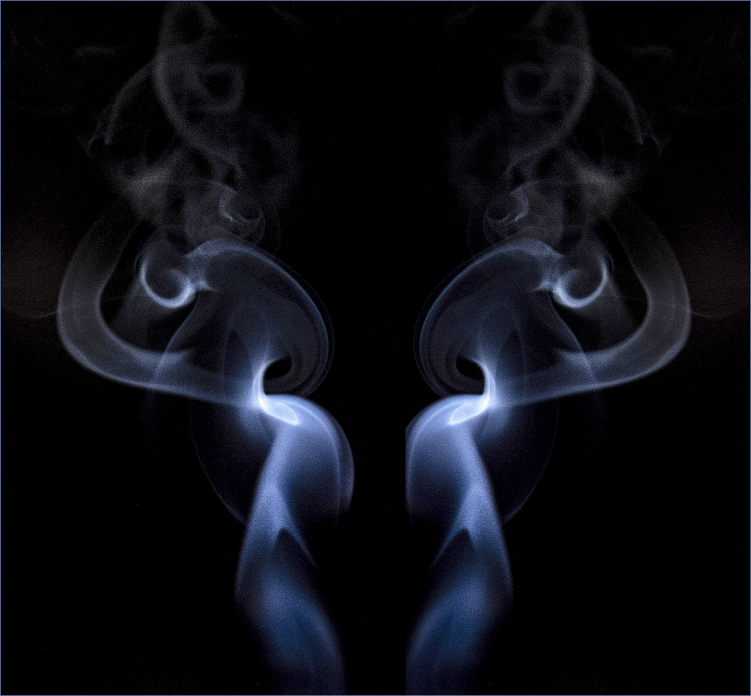
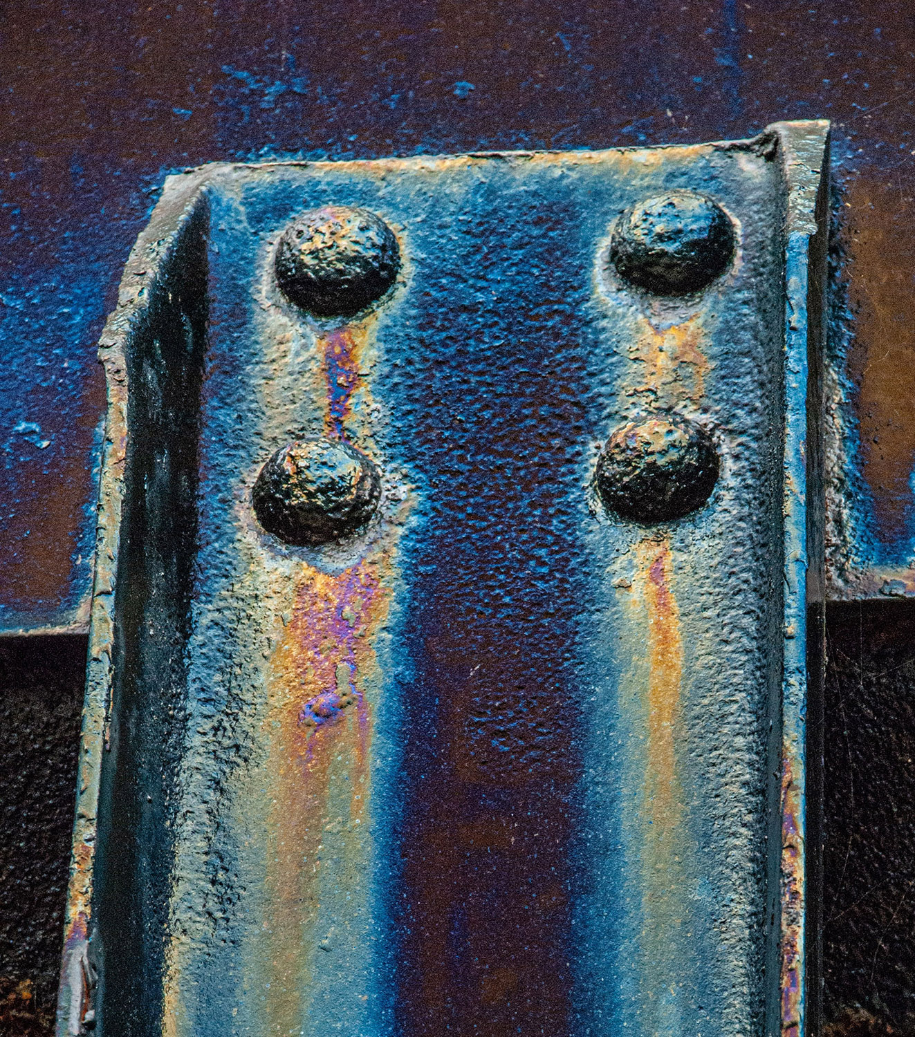
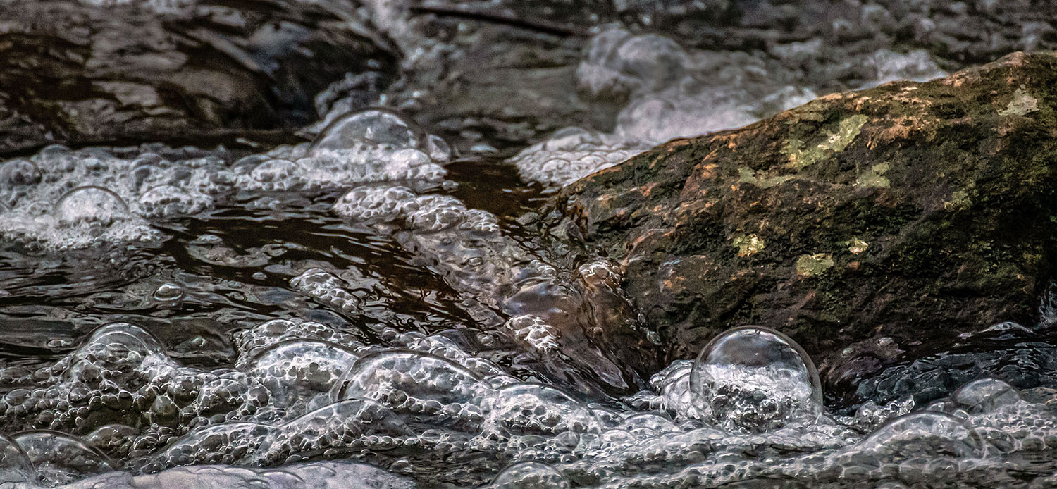
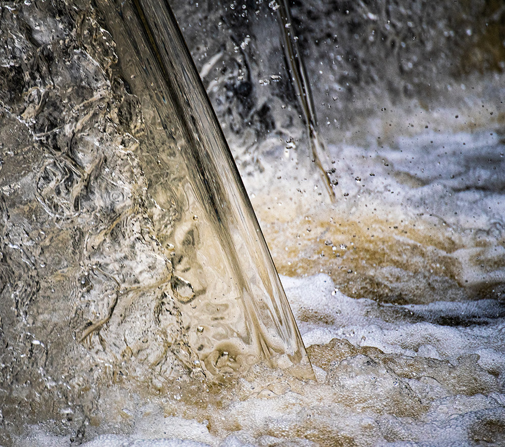
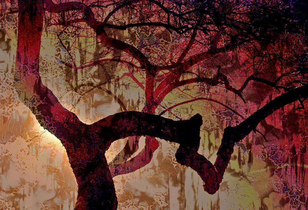
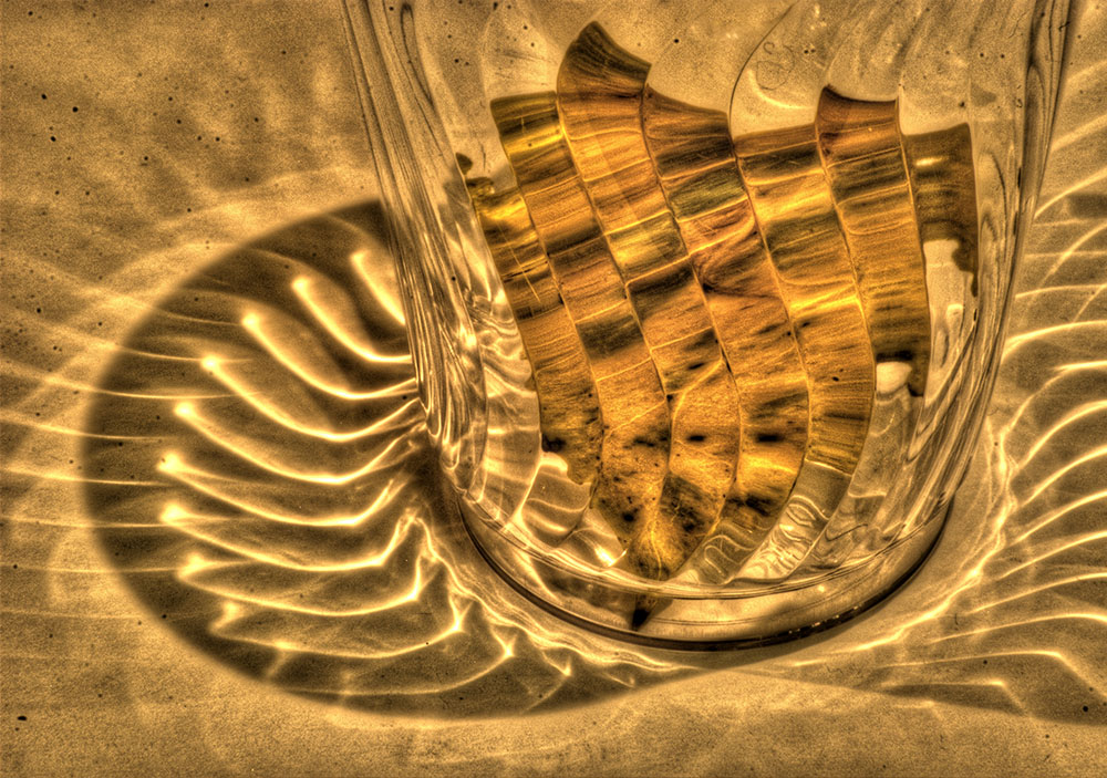
This image succeeds well as an abstract. Lots of detailed textures, and the blue at bottom adds color contrast and anchors the scene. The brown vertical curves act as leading lines guiding the eye down to the horizontal blue below. Well-done! |
Mar 25th |
| 10 |
Mar 22 |
Comment |
Hi Robert, welcome to our group! I, too, prefer your first image. Your wife adds human scale and color contrast to the scene, and the having the monastery at an angle adds depth. The monochrome also has definite potential - the clouds add drama. You could even try monochrome and added clouds on your original image. |
Mar 25th |
| 10 |
Mar 22 |
Comment |
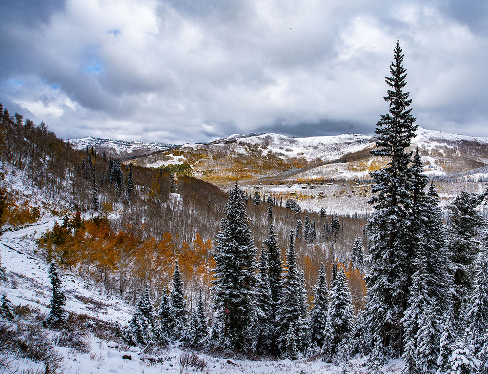
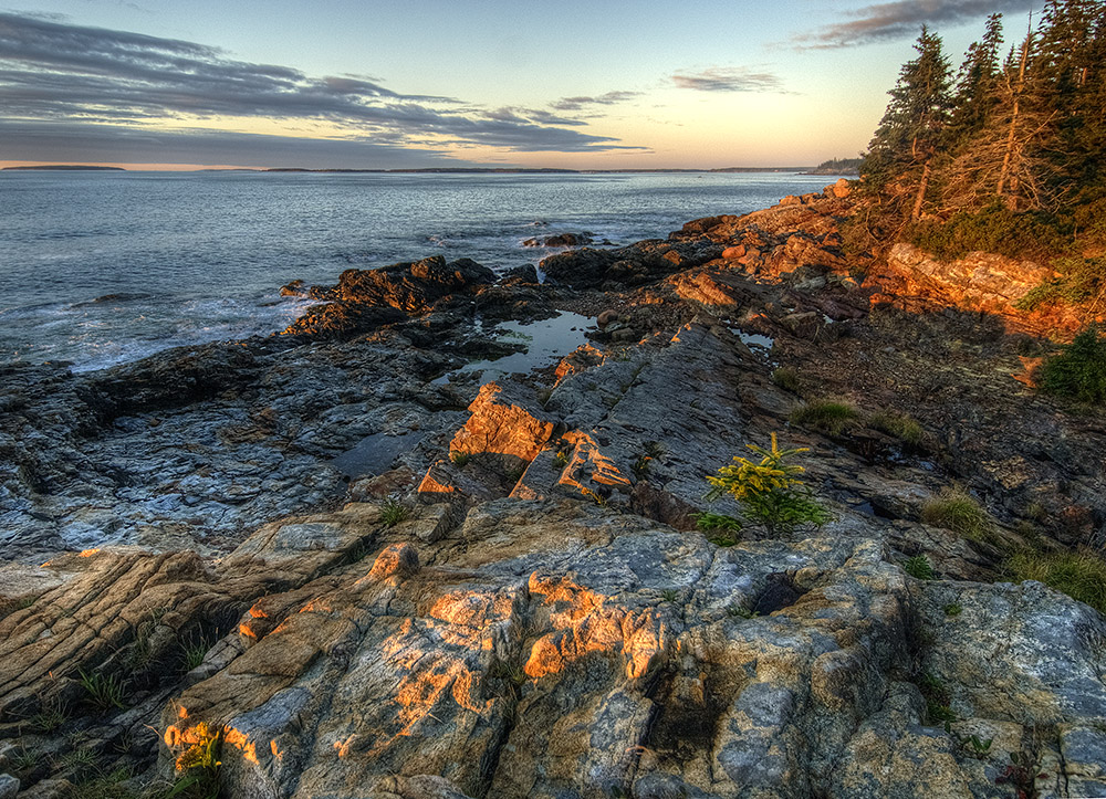
Rich, I envy you with having great scenic views so close to home!! The first pic is soft but mainly in the foreground. Increasing your depth of field from 4 to 8 helped, as the 2nd pic is sharp throughout. I also agree that the first image was too saturated - your later images have a more accurate blue color. I like the last 2 images most since the clouds around the mountains add drama to the scene. And finally, I agree with Carrie about dodging and burning (I use it often on my photos) which can bring back contrast to an otherwise flat scene. In your case, burning might help to emphasize the forested mid-ground areas. |
Mar 25th |
7 comments - 0 replies for Group 10
|
7 comments - 0 replies Total
|