|
| Group |
Round |
C/R |
Comment |
Date |
Image |
| 10 |
Mar 19 |
Reply |
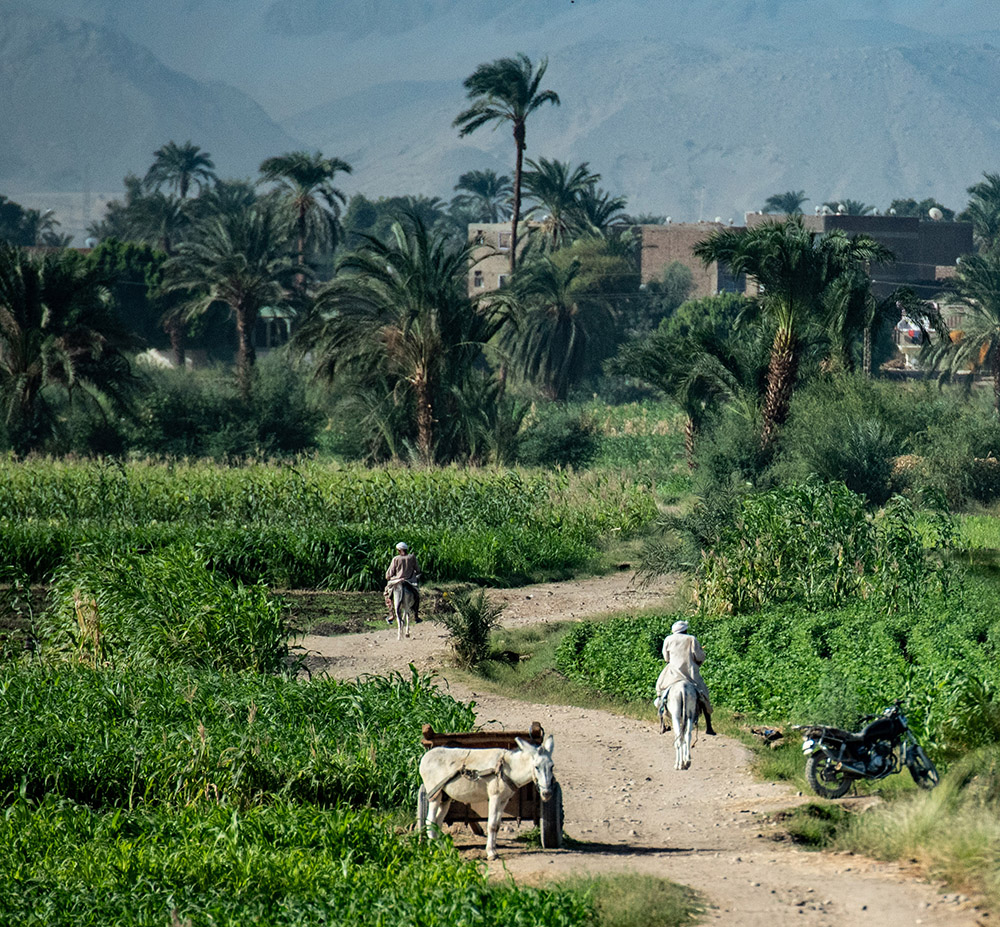
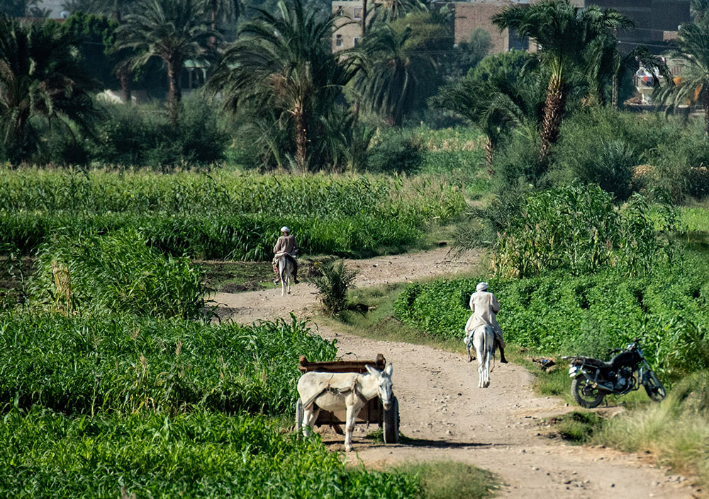
Donna, thanks for your suggestions! I did not add anything to this image. But you are right - there is no shadow on the middle donkey and rider. Perhaps there was a slight dip in the road on the right side and the shadow was not visible at the angle I took the shot. Darkening the pathway definitely helps. However, I am conflicted about cropping the image. I agree that the lower half of the image can hold its own as a separate picture. However, I also feel this crop removes too much of the background countryside and makes one wonder where the riders are going. Do you think a lesser crop would be a workable compromise?: |
Mar 25th |
 |
| 10 |
Mar 19 |
Comment |
A well-crafted portrait of an exotic subject! The fact that she is not looking at the camera I feel is a plus - it adds an air of mystery to the image. The side back-lighting also works well here and adds detail to her right side. The white background spots do not bother me, but I would consider toning down the tree branch in the upper right corner. |
Mar 25th |
| 10 |
Mar 19 |
Comment |
I would call your experience a real "photographic adventure" (though with potentially dark backstory)! I agree the eyes (and surrounding wrinkles) make this photo. The biker stands out well from the background and the contrasty monochromatic lighting adds to the mood. I feel the bike should be included in the scene - it adds context and story to the image. Well-done! |
Mar 25th |
| 10 |
Mar 19 |
Comment |
Subjects are nicely posed and give the impression they are emotionally connecting with each other in (as other members have stated) a delicate "dance"! "Letterbox" format also makes this image unusual. The 2 hotspots - on the girl's neck and especially the guy's forehead - can be toned down. Overall, well-done! |
Mar 25th |
| 10 |
Mar 19 |
Comment |
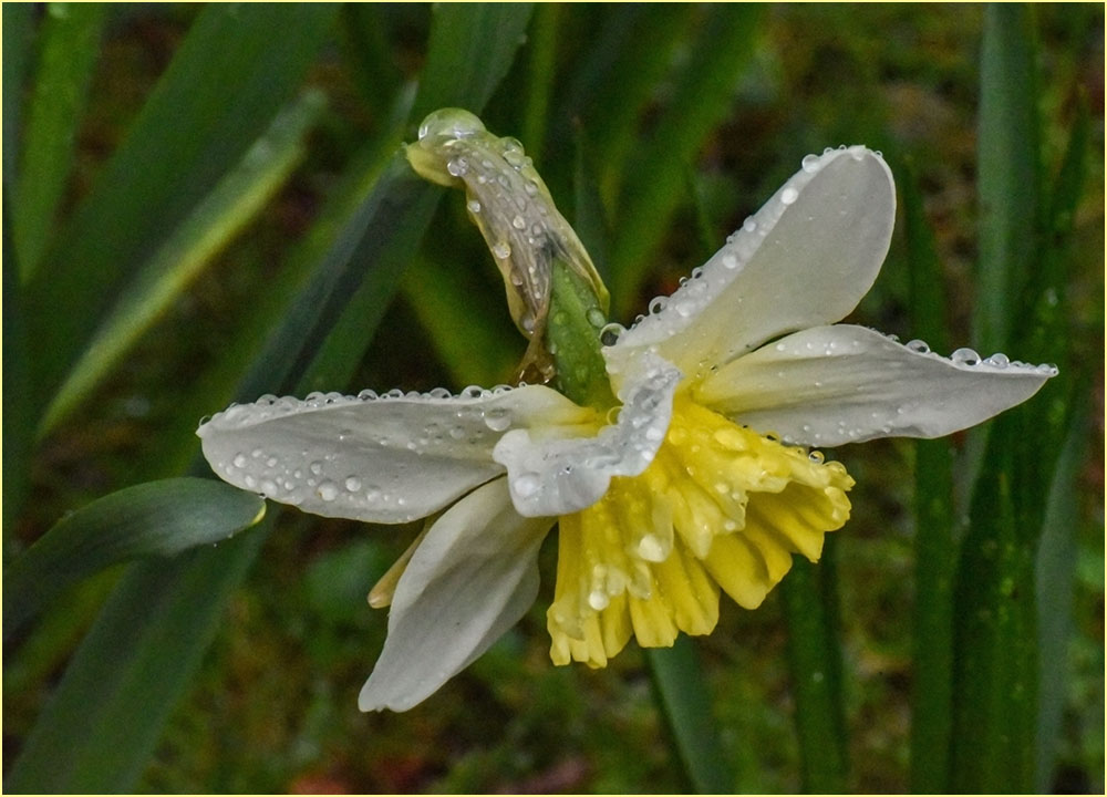
A great project for a snowy day! Flowers are well arranged, sharp, with vibrant colors. I agree that the lighting is too harsh on the white petals at upper left. Adding extra background space to the top also helps. A definite background distraction to avoid are bright leaves which lead the viewer's eye out of the scene, such as at lower right in the original image. These bottom background elements can be toned down with the burn tool. However, I feel that retaining the suggestion of a stem (if possible) is helpful to anchor the subjects and avoid the appearance that the blossoms are floating in space. |
Mar 25th |
| 10 |
Mar 19 |
Comment |
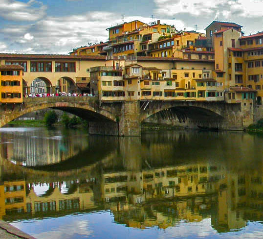
This image has a lot of potential with its detailed buildings, bridge and reflections. I agree with Christina's changes - especially toning down the blown-out sky. I think the bridge (and its reflection) could stand on its own as a strong second picture (see image below):
|
Mar 25th |
 |
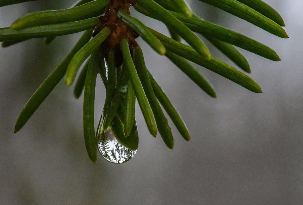
| 10 |
Mar 19 |
Comment |
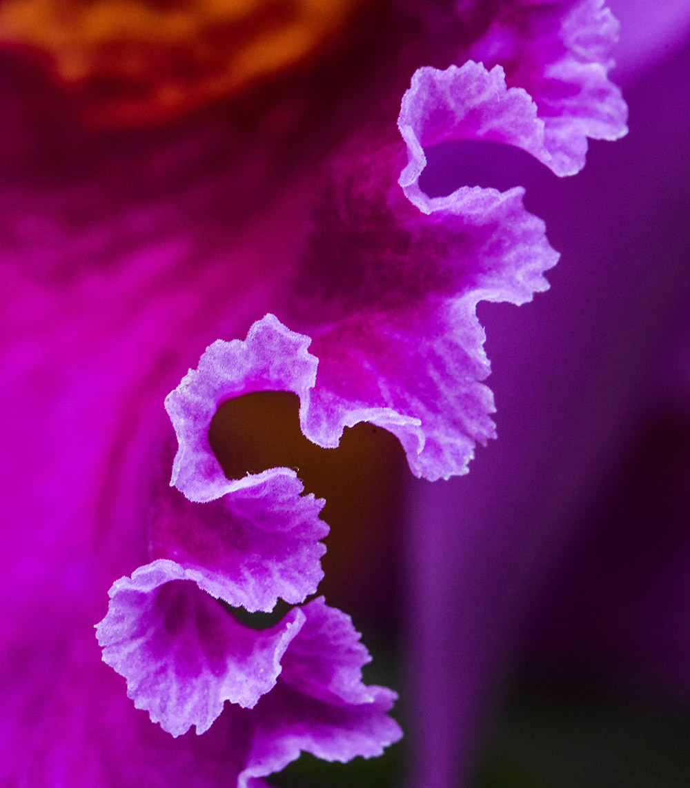
Well-done selective-focus macro with sharpness in just the right places! A real asset to the image is the droplet at the pink petal tip which stands out by reflecting the green underside of the petal. I agree with Christina that you might try reducing negative background space, by cropping in very slightly from left and bottom. |
Mar 25th |
6 comments - 1 reply for Group 10
|
6 comments - 1 reply Total
|