|
| Group |
Round |
C/R |
Comment |
Date |
Image |
| 7 |
Dec 19 |
Reply |
Barbara, Thank you for your comment. I attached revised copy. This revised photo per your comment is based on original version, but not on final version. Is that you what? |
Dec 20th |
 |
| 7 |
Dec 19 |
Reply |
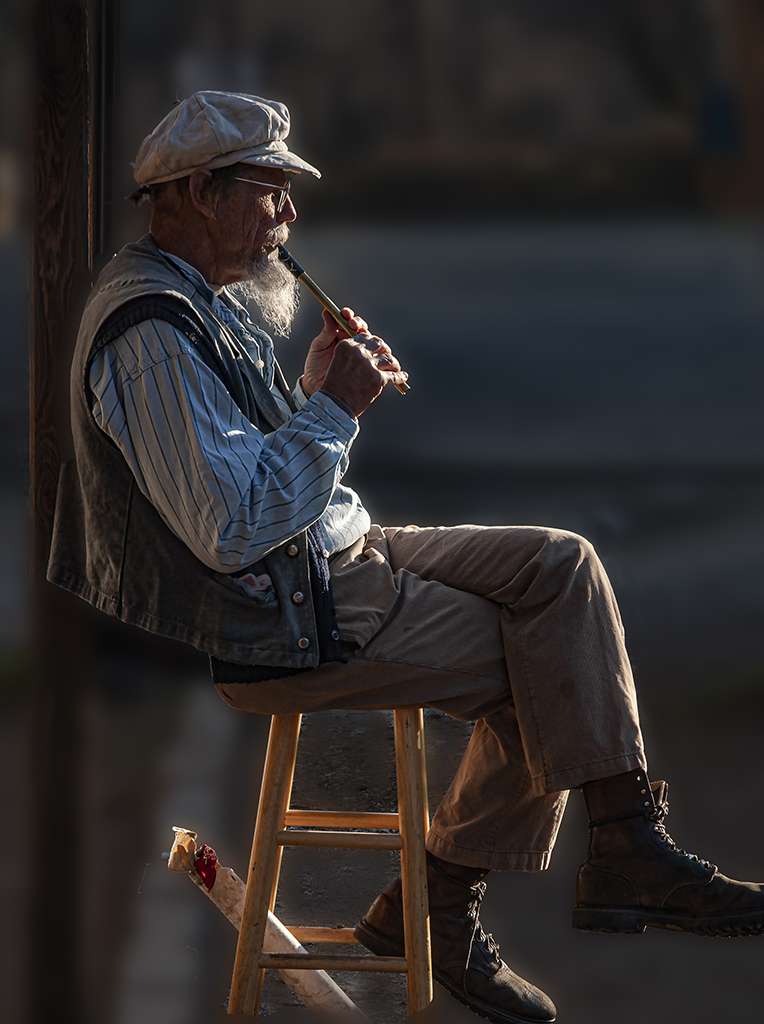
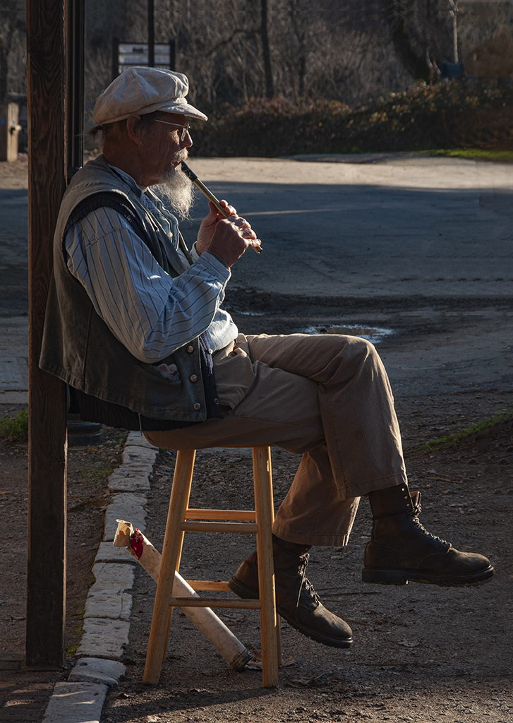
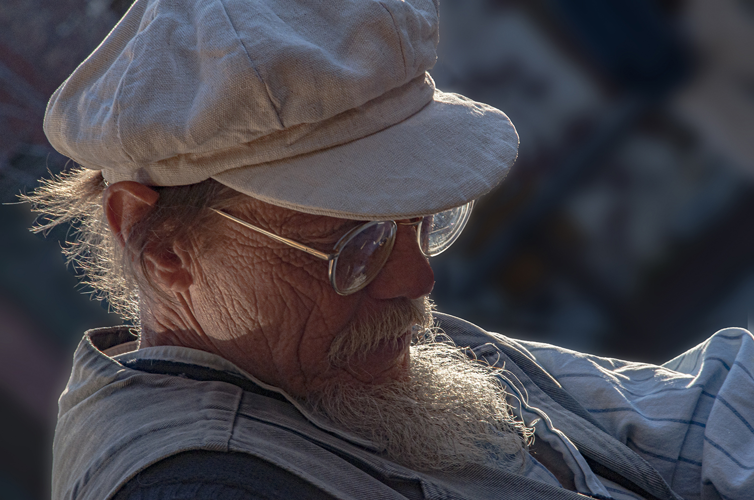
Thank you all for comments and suggestions !
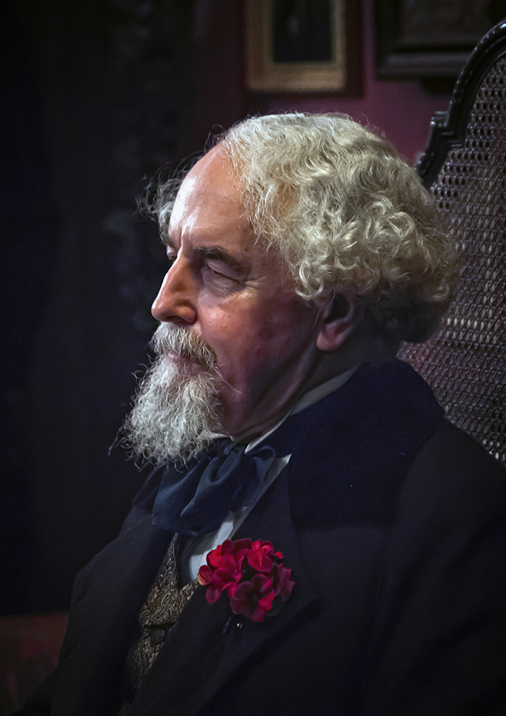
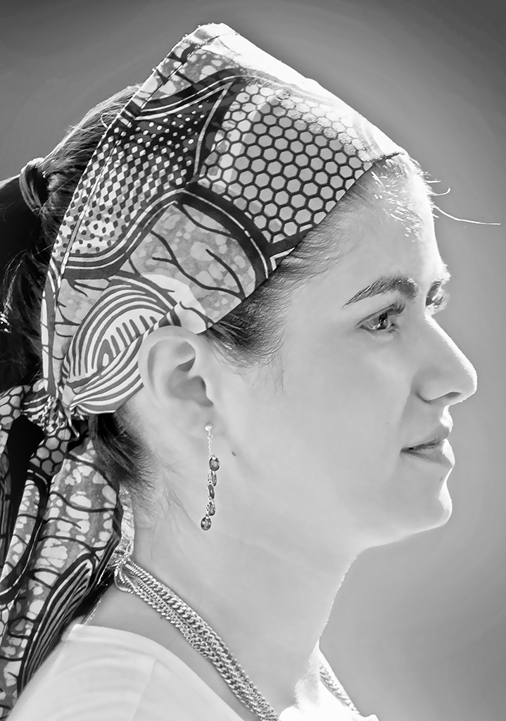
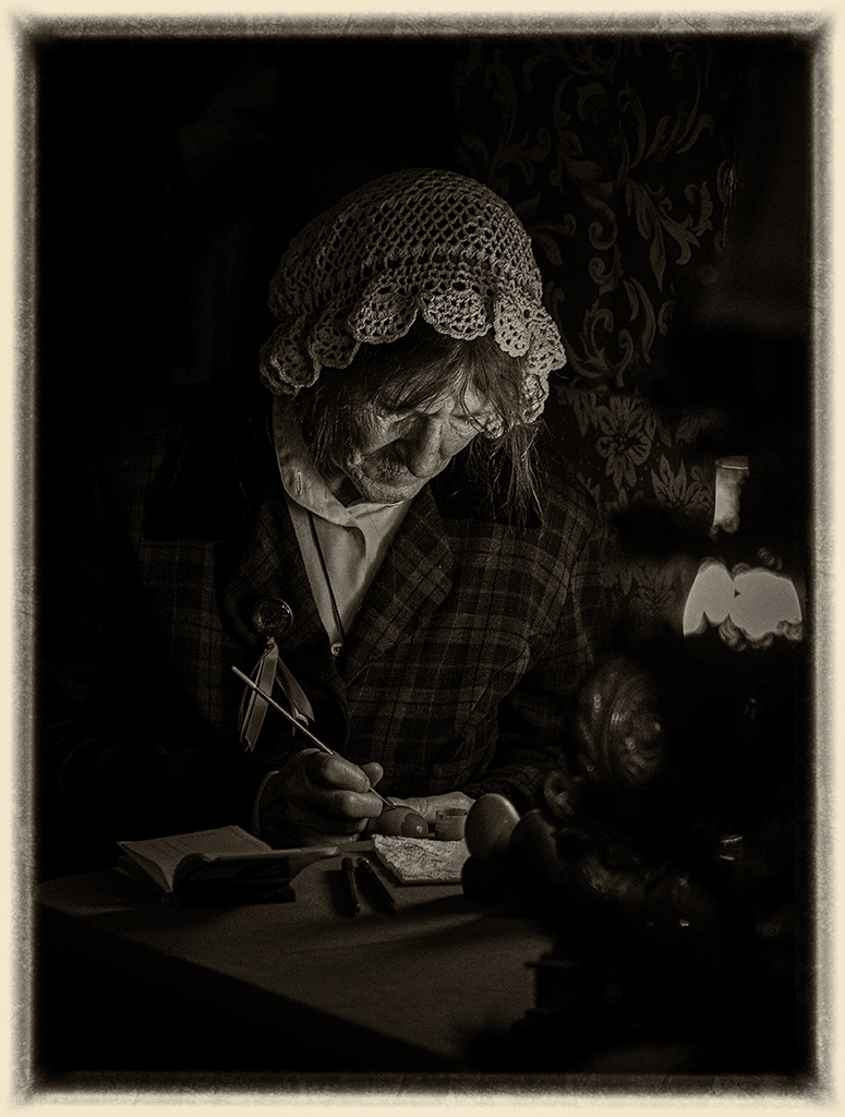
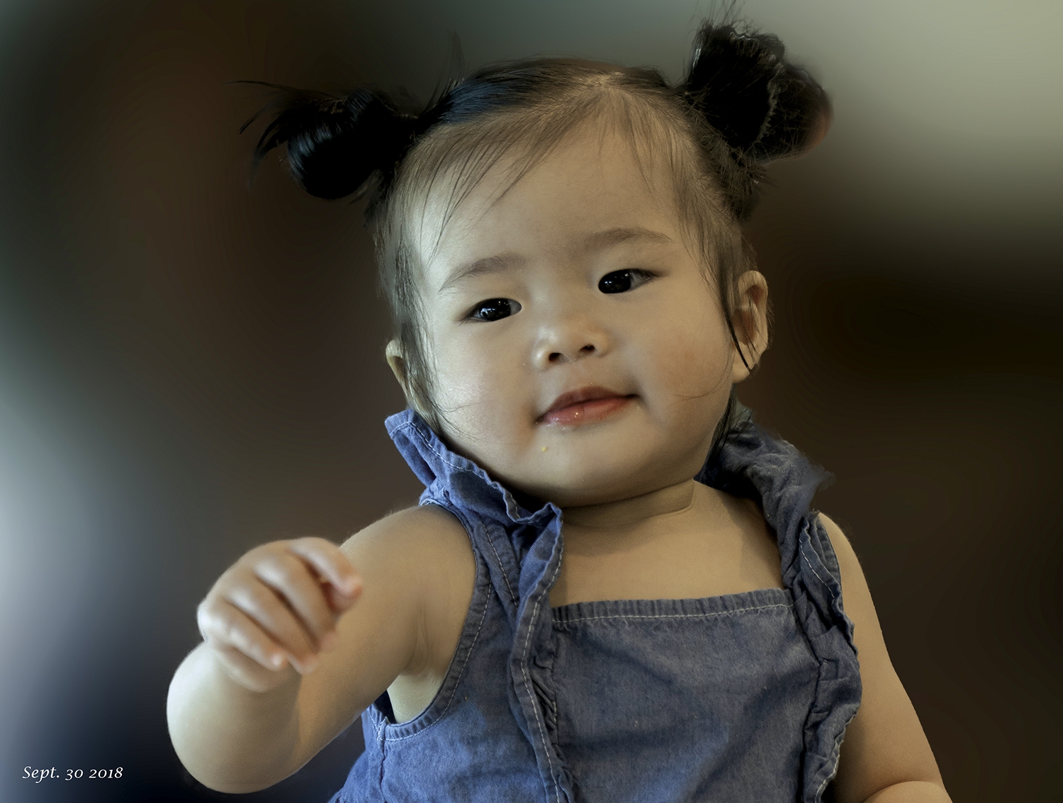
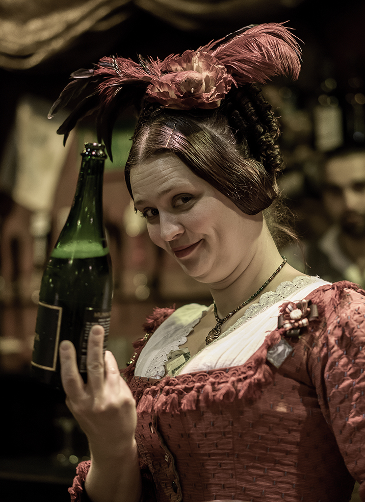
Rich, Your question about why use aperture of f1/13.
When I took this and other portrait of this old man, the sun light was perfect. This old man's character is his beard. The sun shines on his beard and fluffy hear is very bright, strong contrast. I must keep the beard not over expose, I don't mind under exposure in other area. When the light at 255 get in clipping, Then we can't get back the details. In the dark area some how I can retrieve the details. That's why I used small aperture. I have another portrait of him I used f/16. |
Dec 18th |
 |
| 7 |
Dec 19 |
Comment |
|
Dec 17th |
 |
| 7 |
Dec 19 |
Comment |
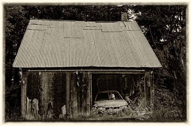
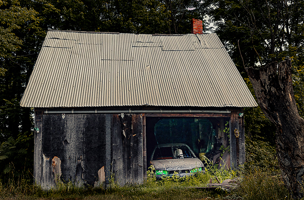
Comparing with original it much improved.
You adjust background around the barn too bright. I would have inside the garage lighter to retrieve more detail. lighten the barn and car is good, the old tree should darker or convert to sepia as antique mood. |
Dec 17th |
 |
| 7 |
Dec 19 |
Comment |
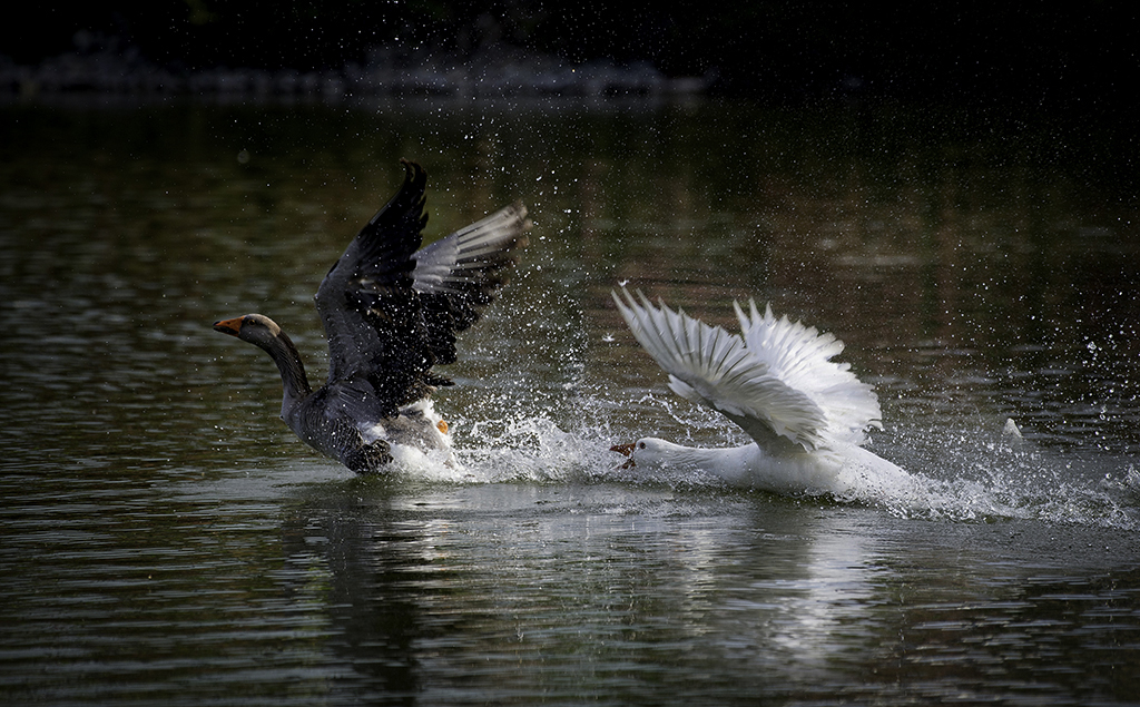
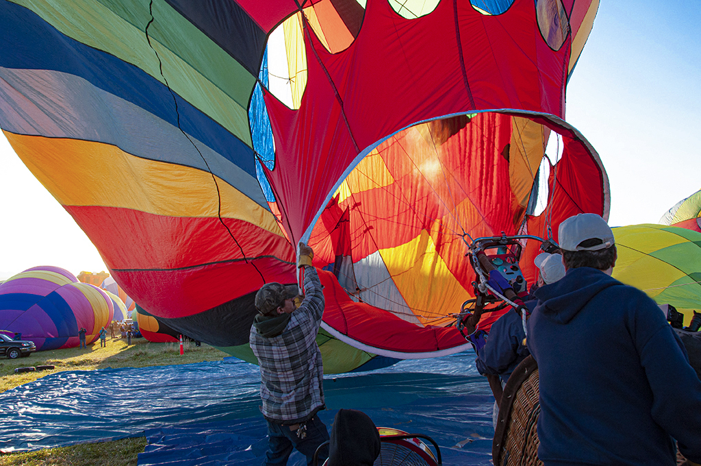
Very good action captured. I feel the guy and the back ground
stick together. I don't see he jump up on the air. If you shooting from low point up, it might better. |
Dec 17th |
| 7 |
Dec 19 |
Comment |
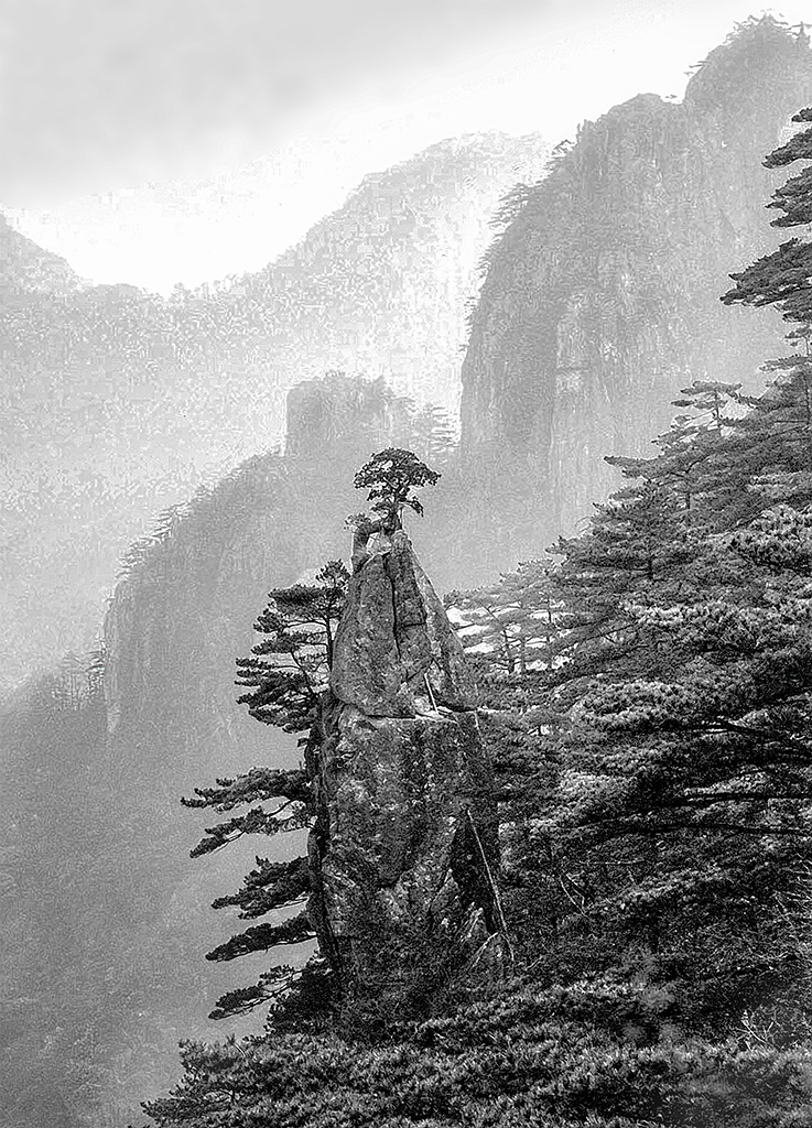
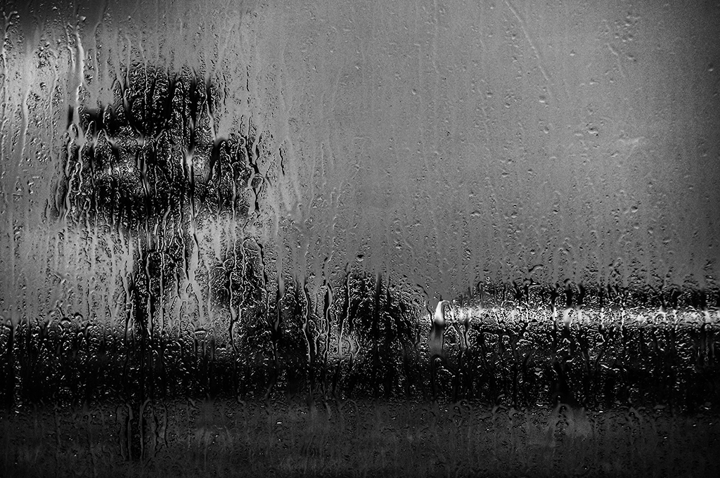
This horror prison image must be abandoned many years. I wondering the chair still looks good.
Les, you created a very good historical image, the lighting is good, but too bright, You might made it darker, like Paul did, but I would not too dark. |
Dec 17th |
| 7 |
Dec 19 |
Comment |
This kind of architectural photo would better keep it truly symmetrical, but the focus in 18 mm wide angle it has some distortion, may be hard to keep it truly symmetrical. I agree Barbara's comment to crop out a bit of right side edge.
I am not sure what is the real color tone, but I feel it is little bit too warm. You can try to adjust white balance to little cold and see the result. |
Dec 17th |
| 7 |
Dec 19 |
Comment |
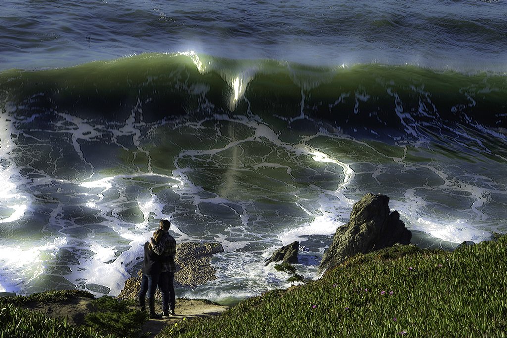
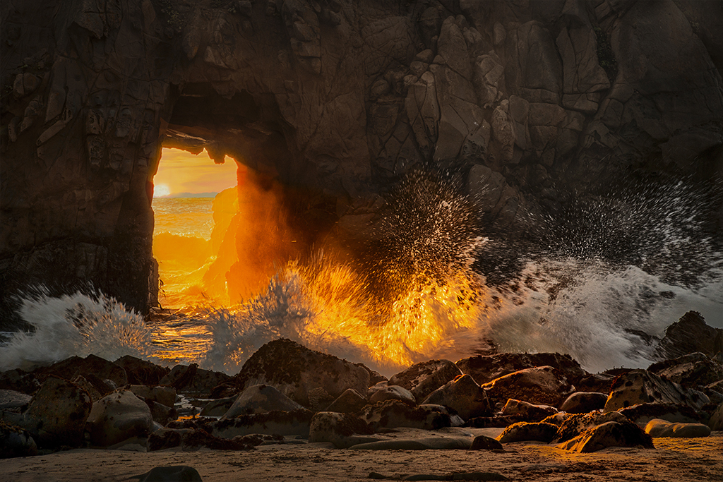
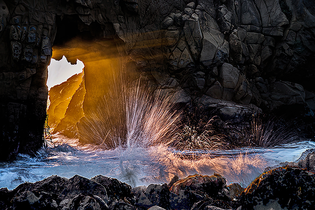
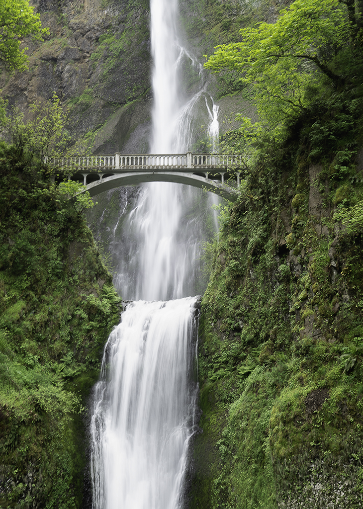
For me I more like the original. There is very interesting feeling, when I switch to original the pool and the water falls right away attracted my eyes. If stay on your version get into my eyes is the wall, but The pool and water falls are more interesting.
It's very calm and clean image. Nice shot.
|
Dec 17th |
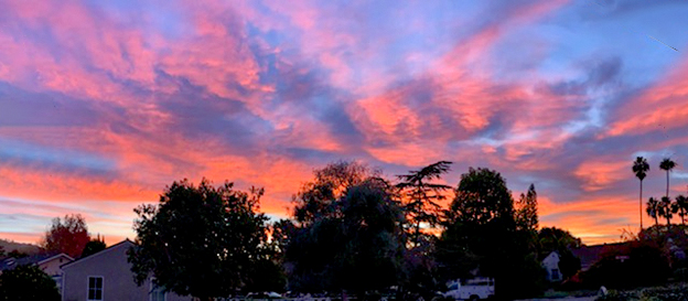
| 7 |
Dec 19 |
Comment |
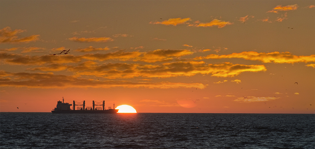
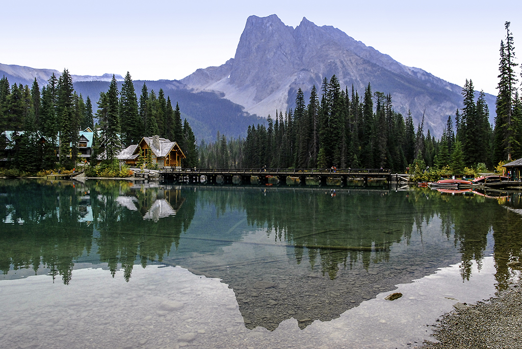
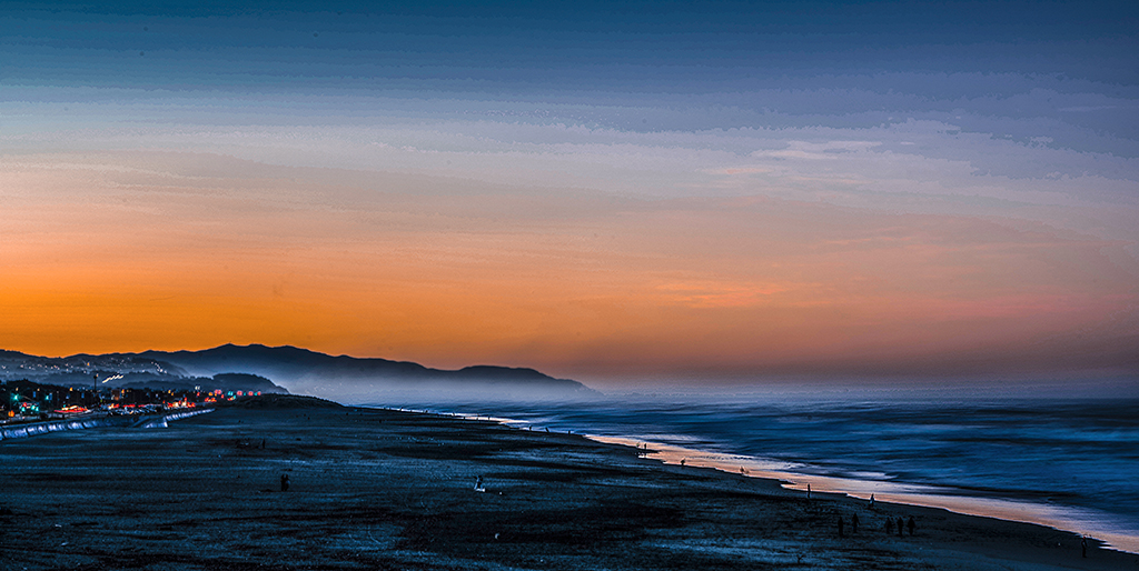
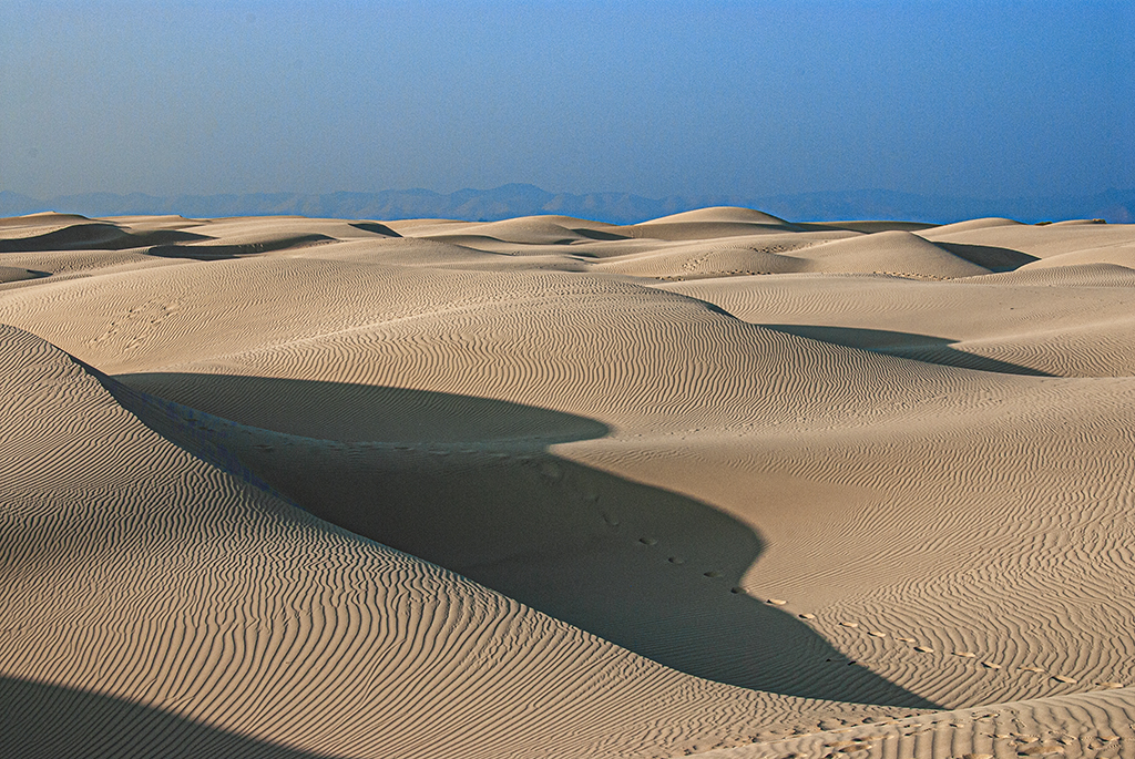
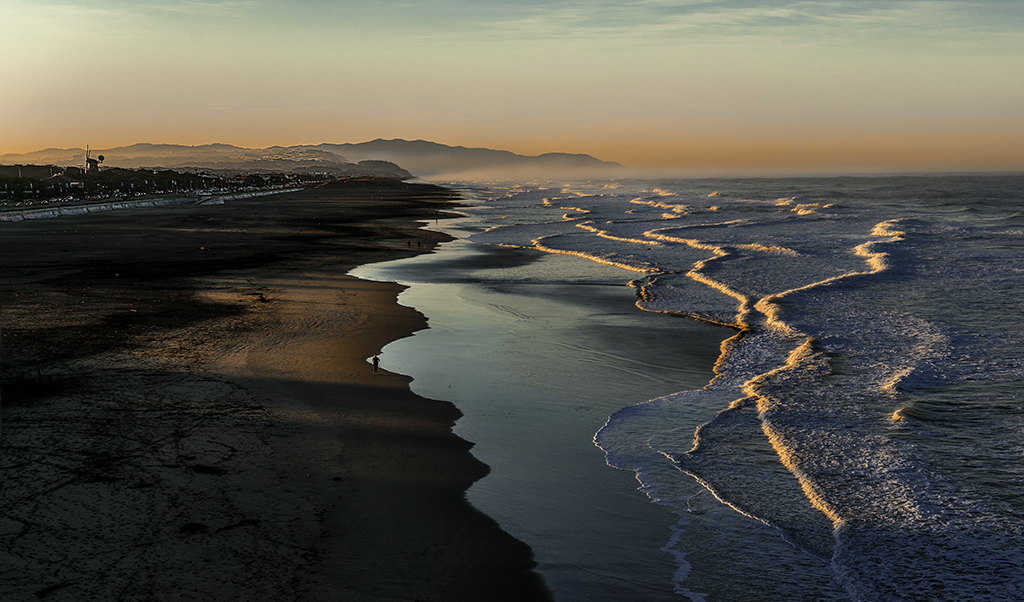
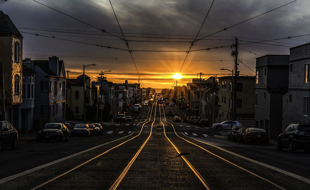
Nice dawn scenery image from iPhone.
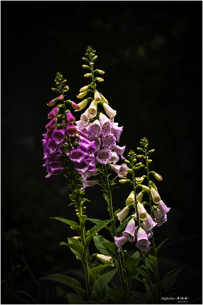
I agree Tom and Paul's comment to crop off left side partial tree, even I would remove right side partial tree to made the whole image more clean.
The iPhone photo viewing in iPhone and in small size on computer monitor is pretty Also I would, but if enlarged a little bit, then it will blurred.
|
Dec 14th |
 |
7 comments - 2 replies for Group 7
|
7 comments - 2 replies Total
|