|
| Group |
Round |
C/R |
Comment |
Date |
Image |
| 7 |
Dec 19 |
Comment |
Your photo would have more impact if you kept the area around the barn dark and lighting the car and barn as you did. The barn roof should be darkened as well. That would put the focus on the car and siding. |
Dec 15th |
| 7 |
Dec 19 |
Comment |
Really creative. I don't know why you kept the white "windows" along the top. I find them distracting. TH FIGURE IS FANTASTIC. |
Dec 15th |
| 7 |
Dec 19 |
Comment |
I like the subtle lighting that is lost in Paul's suggestion. It has the scary,, neglected old feel of a prison. Where prisoners are also forgotten. Well done! |
Dec 15th |
| 7 |
Dec 19 |
Comment |
Everything works very well, except for nicking the bits of the shoes. I don't tend to notice such things but others have been quite negative. The toe would not be hard the restore but the bottom of the foot would not. You do notice such wonderful lighting. |
Dec 15th |
| 7 |
Dec 19 |
Comment |
I would crop out the bit on the right hand edge so it would be truly symetrical. Nice image. I would add abit of contrast to make it pop. |
Dec 15th |
| 7 |
Dec 19 |
Comment |
To me the foreground road is way to bright. Also I think there may have been a better place to take the photo. The division of the pond and road are competing. I like ponds better, so I would have tried to make that the larger part of the foreground. My photo and yours look too bright on this computer. they both should be darker.
|
Dec 15th |
| 7 |
Dec 19 |
Comment |
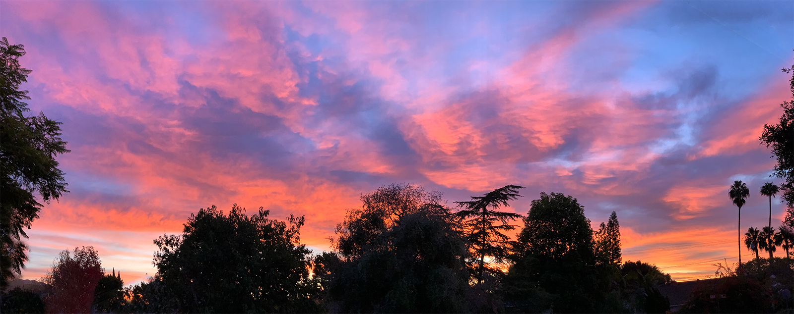
I should not have submitted this image. In a hurry. But now I have access to photoshop I made a few changes. I like Tony's cropping better. I rubber stamped out the houses and cropped out the cars. I also did content aware fill on the right top corned. |
Dec 15th |
 |
7 comments - 0 replies for Group 7
|
7 comments - 0 replies Total
|