|
| Group |
Round |
C/R |
Comment |
Date |
Image |
| 7 |
Oct 25 |
Comment |
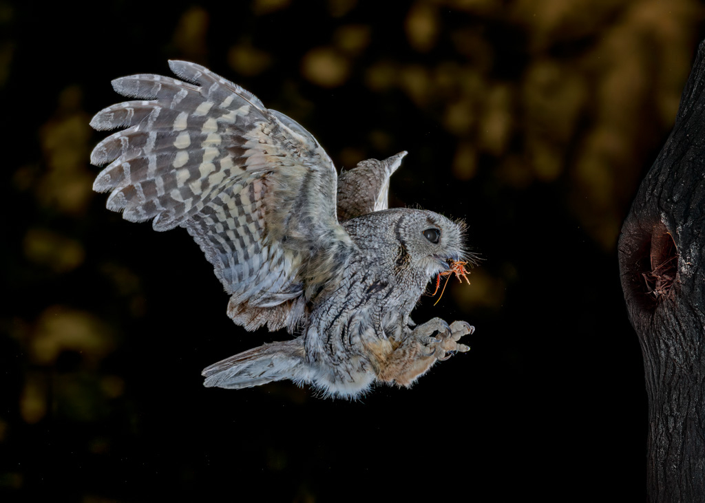
What a great friend to have! You have captured another great image, this time of an owl in flight toward the nest with food in the mouth. The owl is super sharp and stopped in motion in a perfect location. I agree that the blue eye is a distraction. Your replacement image taken without flash gets rid of the blue eye, but also the tree with the opening. (From what your write up said, the opening is the nest.) I adjusted your original image by reducing the saturation of blue just on the eye. |
Oct 23rd |
 |
| 7 |
Oct 25 |
Comment |
You have a really nice image. The hand being blurred does not bother me, as the bird is sharp. Like Barbara I am amazed that you were able to use only your right had to hold the camera. I do like what Butch did with the lighting on the bird. |
Oct 23rd |
| 7 |
Oct 25 |
Comment |
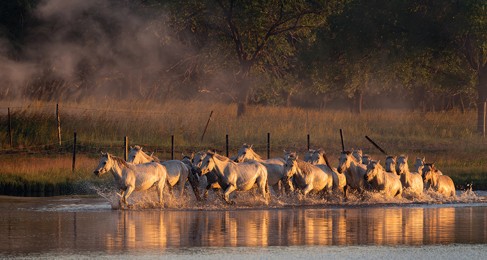
Great image, the lighting and the reflections in the water are really good. You captured several horses running and the shutter speed froze the horses and the water splashed up. So far, all of the comments have an issue with the grey water at the bottom. I like what Butch did, but took a different approach. First I reversed the image so that the horses are running into the image instead of out. Then I cropped off some of the bottom and the area in front of the horses. |
Oct 23rd |
 |
| 7 |
Oct 25 |
Comment |
You are so good at finding and arranging flowers. Everything is tack sharp and well exposed. The lighting doesn't bother me. You could have more top and bottom space if your border was smaller. I know that you like to add a single flower at the bottom, but I am not sure that I like it. It makes my eye bounce between the flowers at the top and the one on the bottom. |
Oct 21st |
| 7 |
Oct 25 |
Comment |
Very nice image under what I am sure is difficult lighting. It is a good pose with her turning her head back. I do like the crop by Butch and your revised image. It seemed wrong the the top of the arch was cut off. |
Oct 21st |
5 comments - 0 replies for Group 7
|
| 32 |
Oct 25 |
Reply |
Thanks for your comments. They used what was in the area for the outside coverings. Rock walled older homes are not uncommon in Oklahoma. A lot of the CC camp (voluntary government camps for young men during the Depression to give them work and teach them skills) buildings build in the 1930's are made entirely from stones found in the area around the camps. |
Oct 26th |
| 32 |
Oct 25 |
Comment |
Great shot with all of the bikes grouped close in a curve. I like the angle of the riders. I like your original crop of the legs and feet in the image. I like that you went to mono, as it simplifies the image and gets rid of all of the contrasting colors. |
Oct 21st |
| 32 |
Oct 25 |
Comment |
Interesting image with circles, ovals and square shapes. Even the small dots on the bowls. After reading your reply to Ed, I understand the cut off edges. I do like the color better. |
Oct 21st |
| 32 |
Oct 25 |
Comment |
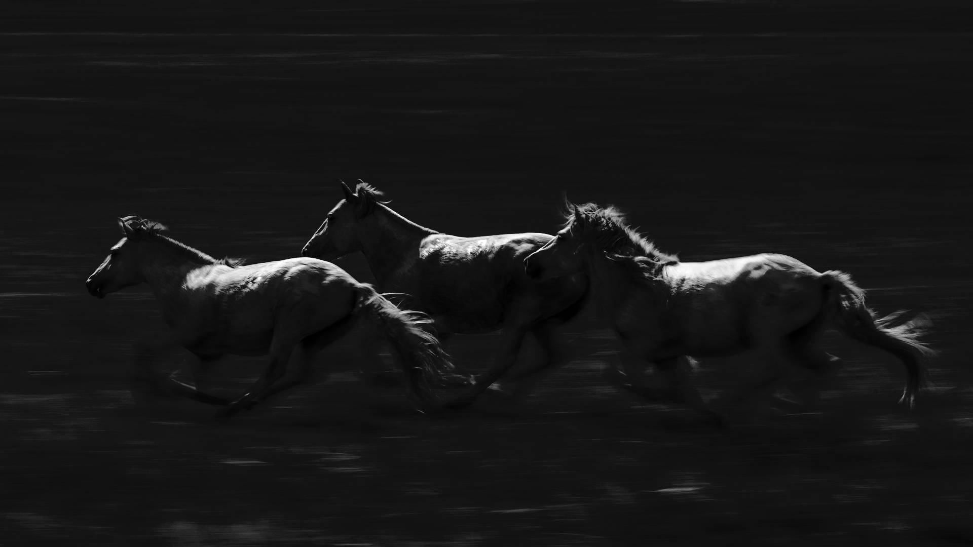
Using panning was a good choice and you did a really good job of executing it. You also have three horses which is good composition and you have good placement in the frame. Your creativity in your black and white conversion is a good idea. I went through your steps, but in the "color burn" I reduced the opacity to about 80 percent that allows more of the legs to show. Looking at it, if I had used less opacity, more of the legs would show. That is something that you could play with to get what you want and does not take much Photoshop skills at all. |
Oct 15th |
 |
| 32 |
Oct 25 |
Comment |
This is a nice find and your editing really helped the image. To me, the contrast is good, and the sharpness is great. What bothers me is the totally black windows. Congratulations on the Facebook group. |
Oct 15th |
| 32 |
Oct 25 |
Comment |
You have an interesting and creative image. I think that the wizards expression and pointing are great. What I have a problem with is the ghost looks more like what it is, smoke. But then, who knows what a ghost looks like? |
Oct 15th |
5 comments - 1 reply for Group 32
|
| 57 |
Oct 25 |
Comment |
Excellent use of focus stacking. The lighting is great and it really brings out the reflections. The screw driver going out of focus does not bother me, in fact I think that it adds to the image by adding depth. I would not change a thing. |
Oct 27th |
| 57 |
Oct 25 |
Comment |
A very nice image. The bright background does not bother me as it is good behind the black butterflies. The butterflies are sharp and well lighted. I like the tighter crop that
Cindy made. |
Oct 27th |
| 57 |
Oct 25 |
Comment |
I have tried Composite Mode, but have not been too successful with it. I need to try again. The top part of the watch and the numbers on the dial are super sharp. The blue really catches the eye. I like the angle of the watch and the lighting. I would remove the out of focus white area above the 40 -- it is the brightest part of the image and really draws my eye. |
Oct 27th |
| 57 |
Oct 25 |
Comment |
You have another lovely flower image. The flowers are very sharp and the background and composition are also very good. I would remove the lower dark purple flower at the bottom. |
Oct 26th |
| 57 |
Oct 25 |
Comment |
Interesting image with shells turned showing both the outside and inside. It is sharp and the textures are nice. |
Oct 26th |
5 comments - 0 replies for Group 57
|
15 comments - 1 reply Total
|