|
| Group |
Round |
C/R |
Comment |
Date |
Image |
| 7 |
Sep 25 |
Reply |
Thanks to all of you. It was the end of a great day on the water. |
Sep 24th |
| 7 |
Sep 25 |
Comment |
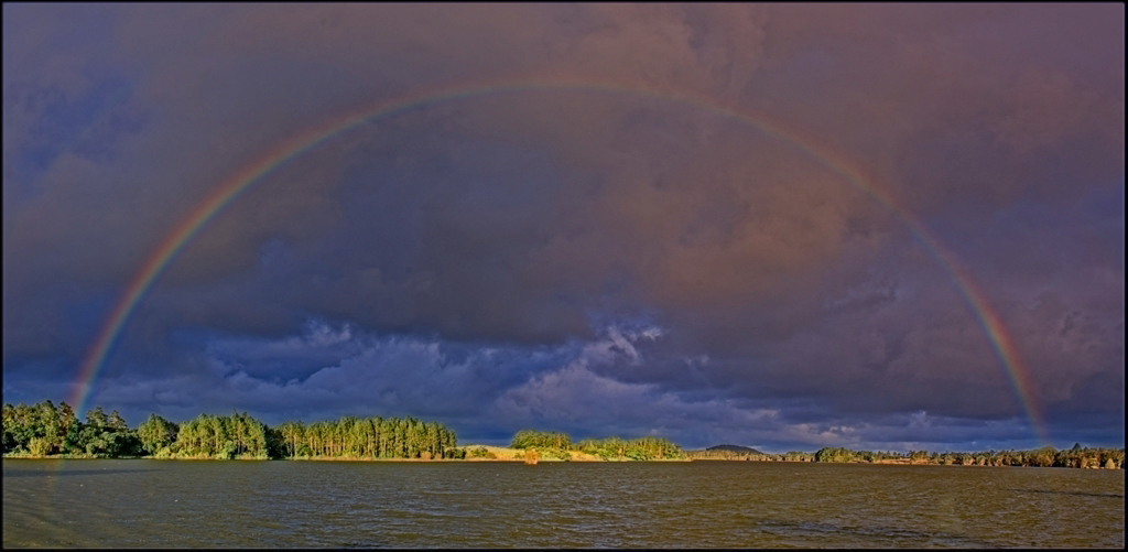
Wow, great thinking to take 2 images to make a panorama showing both ends of the rainbow. You put the images together very well. Your exposure was excellent to show both the sunlit trees on the far bank and the rainbow. To me, the image seems a bit green. I did adjust the color to what I think looks better, but it may not be accurate to the actual scene. |
Sep 14th |
 |
| 7 |
Sep 25 |
Comment |
Thank you for the story (and danger) of capturing the image. Your planning paid off to capture a great image. The image is super sharp and his expression tells the whole story. |
Sep 14th |
| 7 |
Sep 25 |
Comment |
You are very fortunate that the glacier had this large calving while you were there. Without that you would not have such a good story telling image. You captured a very good image. I do wonder how much that it has changed since I was there in 1973, more that 50 years ago. I read that the glacier (Muir) that the tour boat took us to see then that terminated in salt water now has receded to be on land and is barely even visible now.
You actually did capture a bird in the image. I had to enlarge the image with Topaz Gigapixel to make an image to better show the bird. You can see how small that it is in front of the glacier. Click on the image to enlarge. |
Sep 14th |
 |
| 7 |
Sep 25 |
Comment |
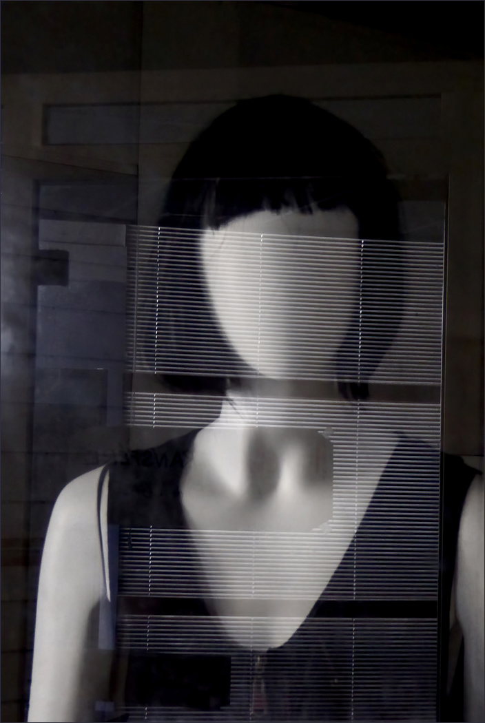
You found and captured a very creative image. The reflections really make this image. It is good that they are not quite straight. It is also fortunate that the reflections have some open areas. Selecting a faceless mannequin was a great choice. The image is very thought provoking as you said. It is not monochrome as Butch said, as I can see some blue tones in it. I don't know if conversion to mono would help or hurt the image. I did crop off the window area on the left as it was drawing my eye from the mannequin, but that may distract from the story. I think that this could be hung on a wall as modern art. |
Sep 14th |
 |
| 7 |
Sep 25 |
Comment |
What a great shot. I don't think that a closeup shot would be as good. You captured the condor with the wings fully spread out and in a good area of the frame against a blue sky. The condor is sharp and well lighted. The background area places where the image was taken. I do have a small suggestion. I don't know why (maybe because it is dark), but the small dark clouds in the upper left edge draw my eye. I would get rid of them. Again, well done. |
Sep 14th |
| 7 |
Sep 25 |
Reply |
Thanks for the comments and FV. Looking at your VF, I agree that removing the second sailboat is a very good idea. It simplifies the image and it is not needed to show depth as there is the bank on the other side and the boat shadow in front. And while the second boat added to the story of the image, it is again not needed. I think that you maybe overdid opening the shadows on the sailboat. |
Sep 10th |
5 comments - 2 replies for Group 7
|
| 32 |
Sep 25 |
Comment |
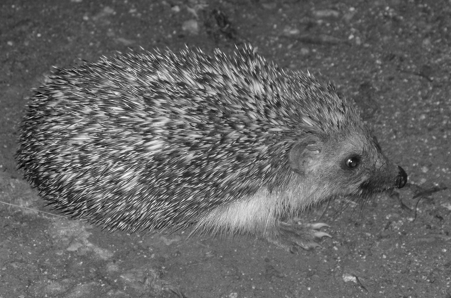
One of my daughters had a pet hedgehog when she was working on her advanced degree at Ohio University. She was living in an apartment and wanted a pet but could not have a cat or dog, and maybe some others, so decided to get a hedgehog. She studied up on how to feed and keep them and it was an interesting pet. She let it out of the cage at times and if I remember right it had a treadmill to walk on.
As to you image, it is curious that the spines are not as sharp as the face and feet. I also did some editing and used Topaz to sharpen and then added some contrast and used levels to make sure that there was a black and white in the image. |
Sep 21st |
 |
| 32 |
Sep 25 |
Comment |
The colors are very nice, but your objective seems to have been to capture the interesting tree, so mono is a better choice. It is good that you got rid of the trees and bushes on the horizon line. I like Ed's editing. Being off center doesn't bother me at all, in fact I like leaving more room on the left. |
Sep 21st |
| 32 |
Sep 25 |
Reply |
Thanks, yes, the color had a lot of distractions from the back-lit horse. |
Sep 21st |
| 32 |
Sep 25 |
Reply |
I did add a catch light to the eye, but don't know about making it brighter. Looking at the image now, maybe I should have brought back more detail to the nose? |
Sep 21st |
| 32 |
Sep 25 |
Reply |
I don't remember that I reduced the background too much on the left side, but maybe I did. |
Sep 21st |
| 32 |
Sep 25 |
Comment |
Interesting image and story about it. I think that you have the correct shutter speed. You stopped the plane but have the water spray smooth. I do like Ed's crop. |
Sep 21st |
| 32 |
Sep 25 |
Comment |
You did a very nice conversion to mono. I disagree with the comments above about leaving more sky, you do not need it to show that it is a remote place. The sky is not interesting and you were correct in cropping it off. If your objective was to show an old truck in an isolated mountainous location, then you don't need the yellow flowers brought out. If your objective was to show the truck in a very pretty mountain area, then the color is better. I like the brown and grey tones of the truck against the yellow, greens and blue sky. |
Sep 21st |
| 32 |
Sep 25 |
Comment |
An unusual sculpture to say the least. The pattern in the stonework around the sculpture is interesting, and I like that it is tilted. The image that you chose is not a bad one, but you need to crop off part of the top to the 2 people and the bike. There are plenty of people in the image you selected, but they don't show up like in image 3 because of the color. That said, I agree with the comments above the image 3 is better, but get rid of the partial legs at the top. I like it because of the building reflected in it and the 3 people at the bottom. |
Sep 21st |
5 comments - 3 replies for Group 32
|
| 57 |
Sep 25 |
Comment |
You found a very interesting item to photograph, but also one that is difficult to photograph. I like that you took it at an angle to add interest, but it looks like that created a depth of field problem. It makes me marvel at the ingenuity of people to create machines to listen to music. |
Sep 24th |
| 57 |
Sep 25 |
Comment |
The lily is very shape with good depth of field. The orange contrasts nicely with the green foliage. I like Jessica's suggestion to brighten the lower part of the flower. |
Sep 24th |
| 57 |
Sep 25 |
Comment |
Your editing really improved the image. The patterns and textures are very interesting. The small square area in the upper center creates a point of interest to draw the eye. Well done. Congratulations on your image in the Member Showcase. Well deserved for a very good image. |
Sep 24th |
| 57 |
Sep 25 |
Comment |
The image is very sharp with great contrast and a lot of different textures. The image has some mystery because the viewer can wonder why the chain is holding up the wheel. Jessica's suggesting is an interesting one. It would simplify the image but make it much different. |
Sep 24th |
| 57 |
Sep 25 |
Comment |
The bee is sharp and you have good depth of field. I like the mostly square format with the bee in the center and some petals around the edges to keep the eye in the frame. The image clearly shows the structure of the sunflower blossom that is actually a collection, of many tiny flowers called disk florets the open from the edge to the center. Well done. |
Sep 24th |
| 57 |
Sep 25 |
Comment |
Sharp eyes to spot the green lizard among the foliage. The lizard is sharp, well exposed and busy doing something. I would crop some more off the bottom to make the lizard bigger in the frame. |
Sep 24th |
6 comments - 0 replies for Group 57
|
16 comments - 5 replies Total
|