|
| Group |
Round |
C/R |
Comment |
Date |
Image |
| 7 |
Jul 25 |
Reply |
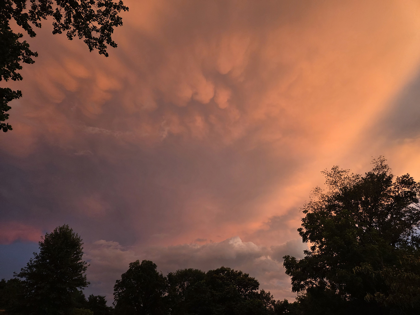
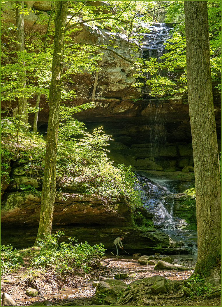
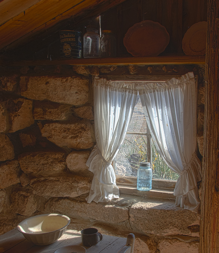
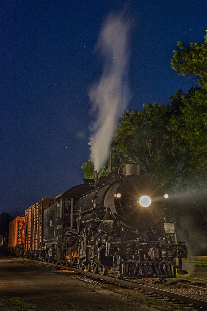
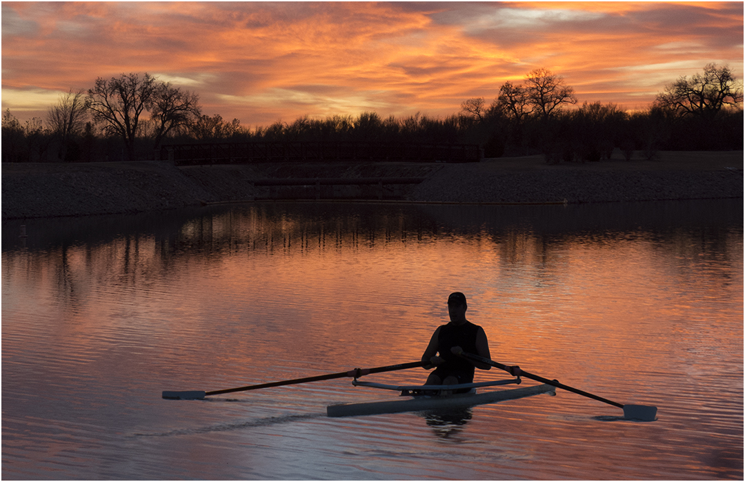
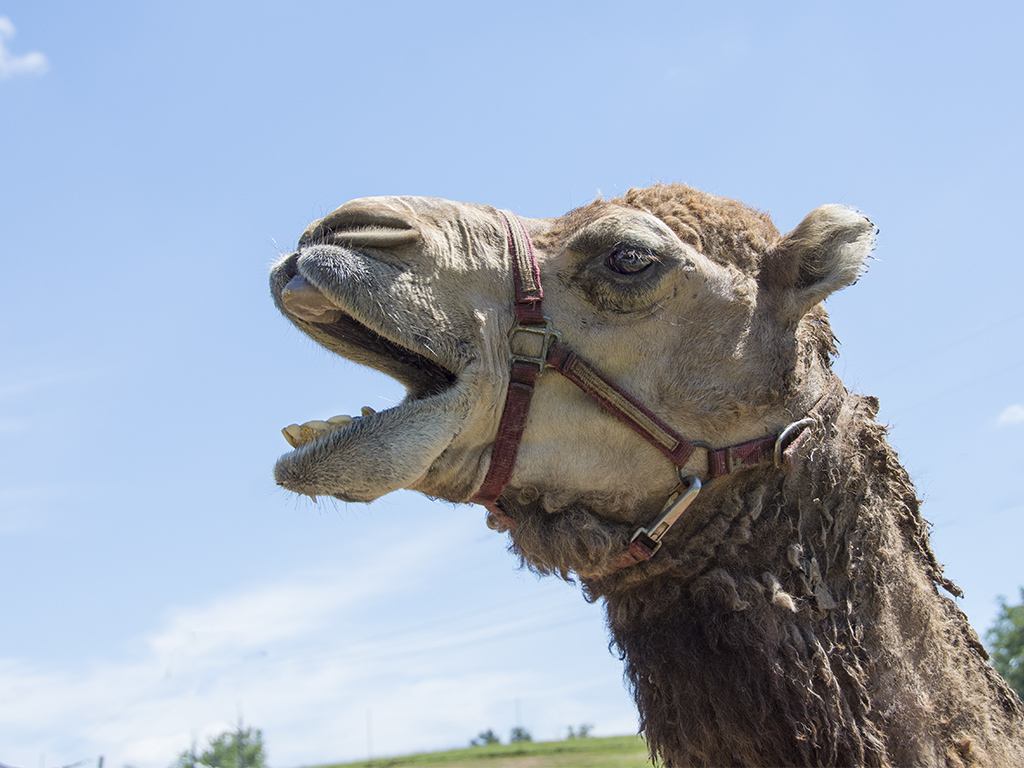
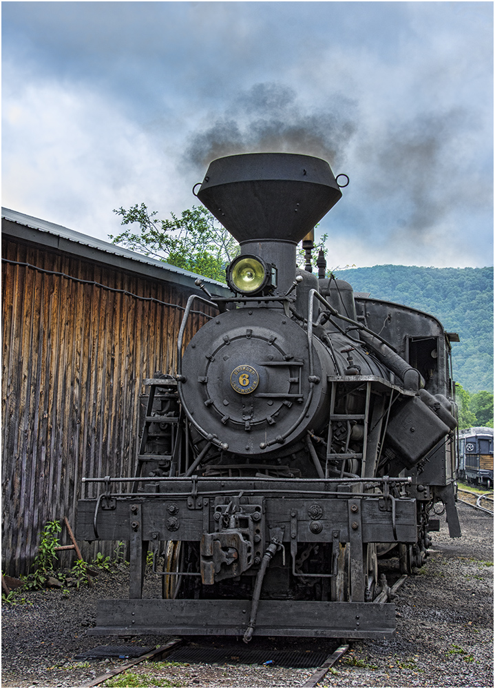
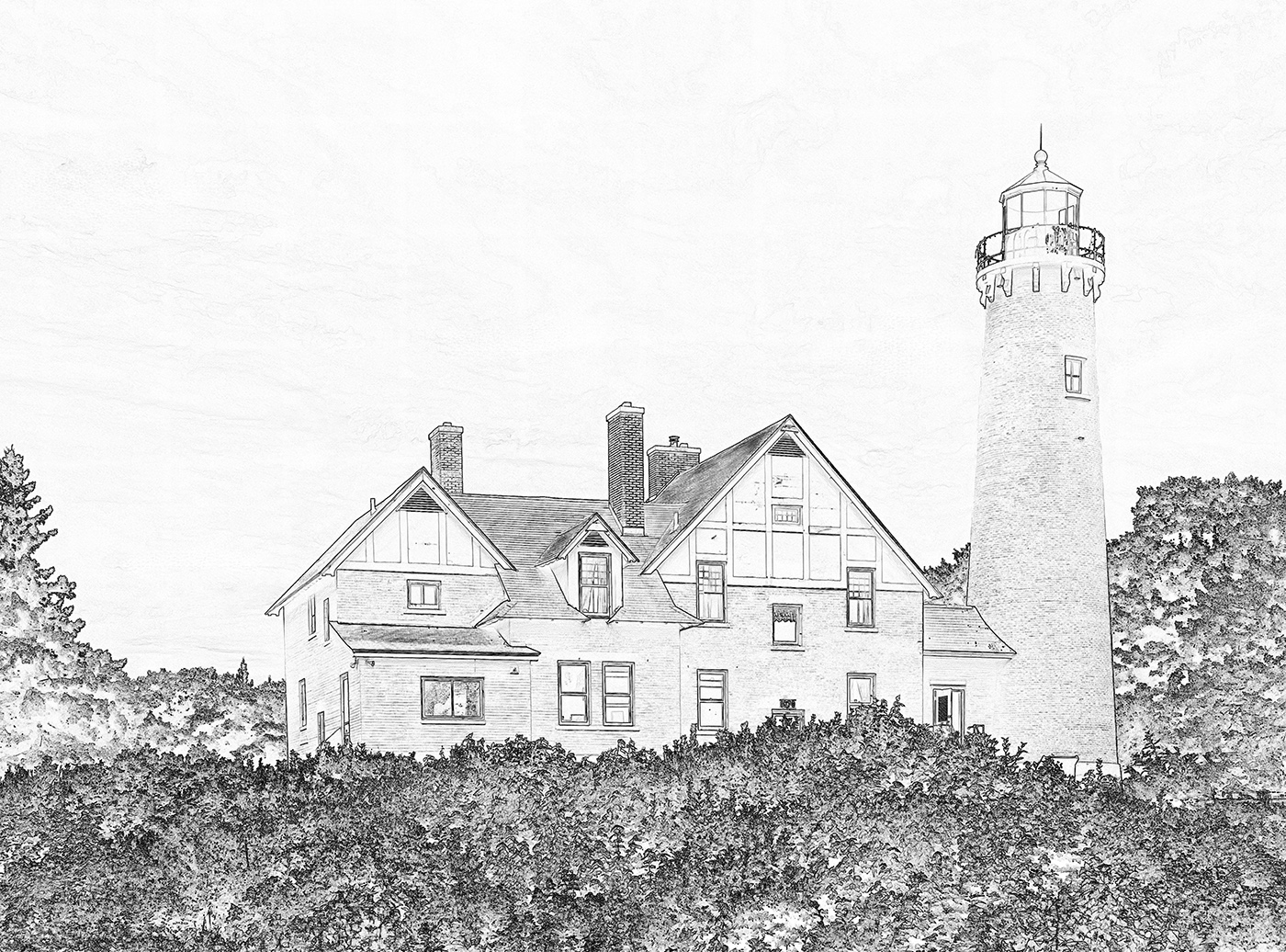
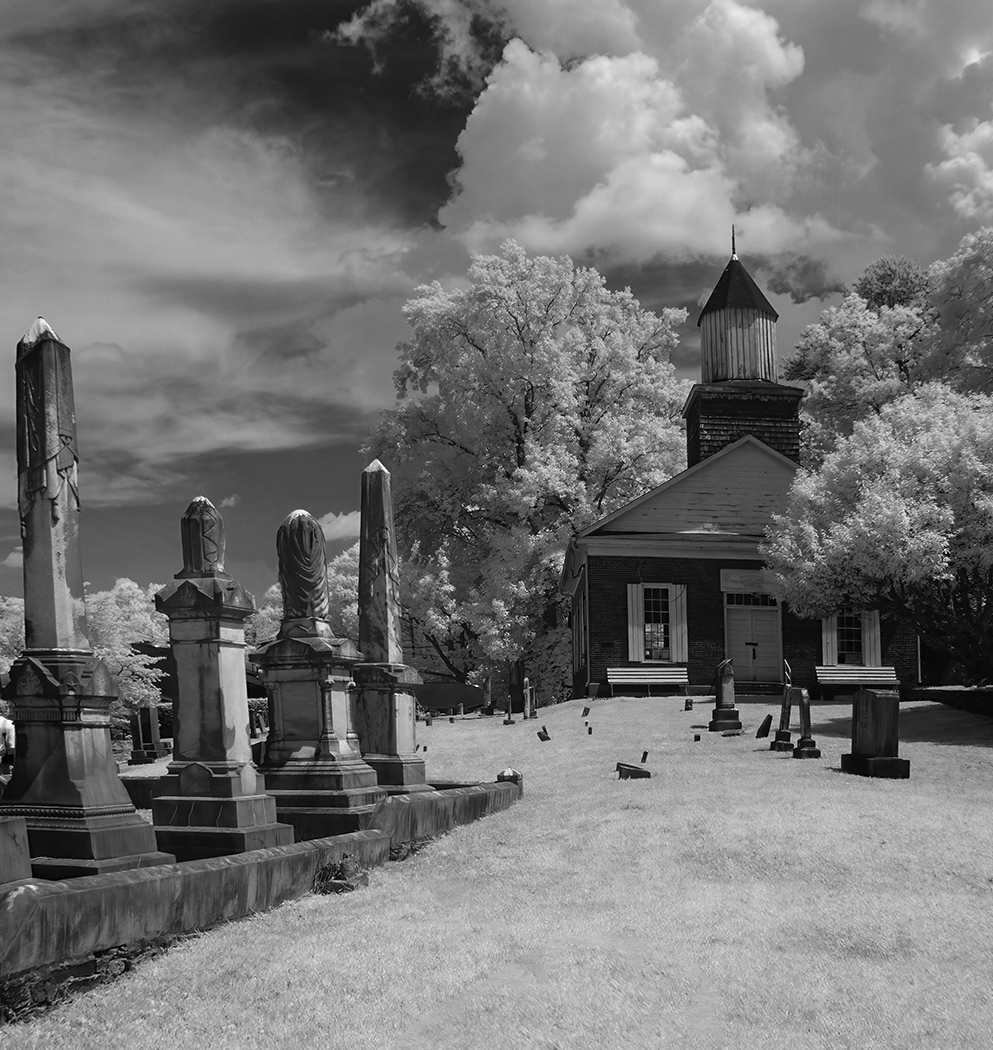
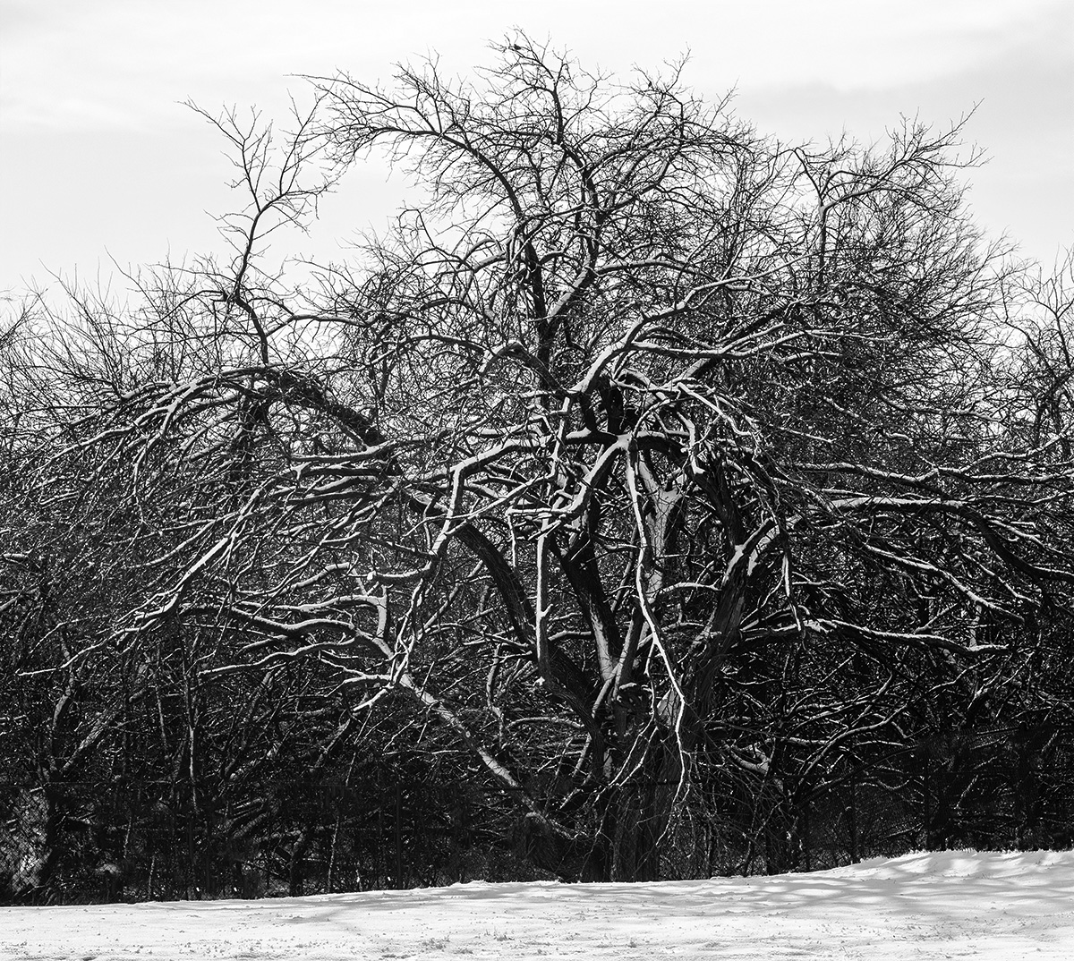
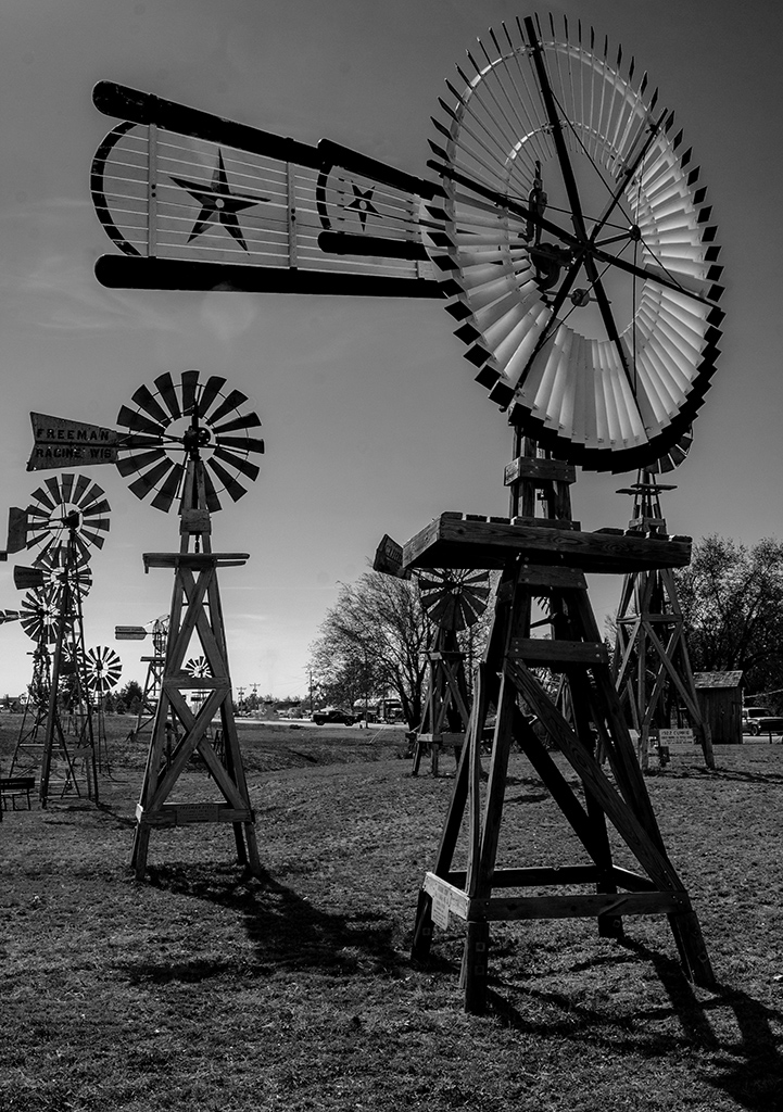
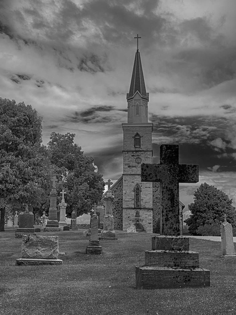
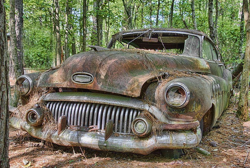
I converted an Olympus camera that I was not using. I don't use it too much, but I really like the dark skies that you can get. If there are clouds they really stand out. I should probably use it more, and look for unusual image like this one. There are 2 DD groups that are IR, 35 and 66. Look at their images to get a better idea of how other members are using IR. |
Jul 31st |
| 7 |
Jul 25 |
Reply |
Great image with both the hummingbird and the bee, and the hummer is looking at the bee. I like the unusual straight up position of the hummer. |
Jul 31st |
| 7 |
Jul 25 |
Reply |
Yes, I like this one better. |
Jul 31st |
| 7 |
Jul 25 |
Reply |
Thanks, I think that this sky is better for the mood then a blue sky would be. Also, replacing with a blue sky would look unrealistic as there are no shadows. |
Jul 31st |
| 7 |
Jul 25 |
Reply |
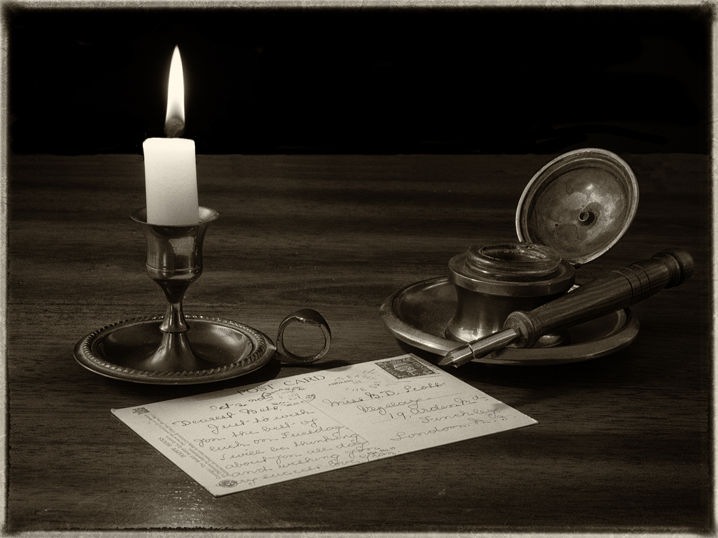
Barbara, I don't know that you are talking about. There is a bit of haze in the image that looks natural, but not smoke. And on my monitor I don't see any spotty light or any over editing. |
Jul 14th |
| 7 |
Jul 25 |
Comment |
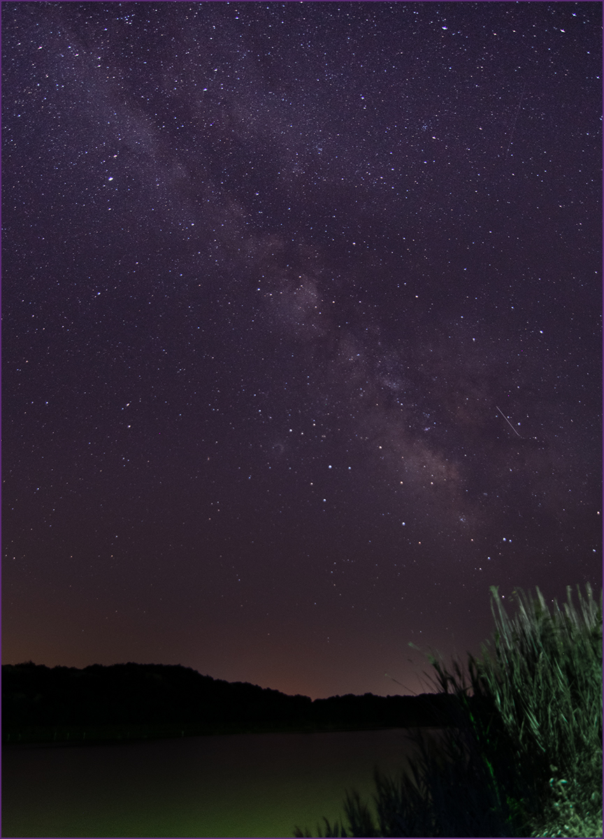
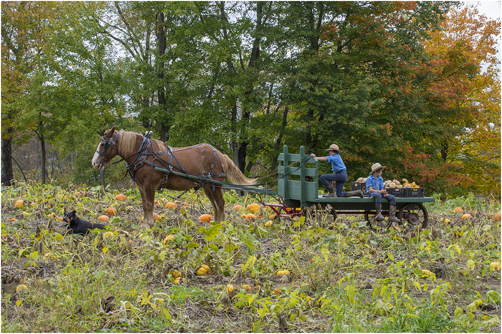
That sounds like a fun trip, and I look forward to some of the wild horse images. I did try photographing the milky way about 5 years ago. They did not turn out nearly good as yours. I think that the foreground is okay, the reflections in the lake and the lakeside areas are nice. Of course having something unique in the image would be good, but that would be hard to find.
With all of the light pollution now, it is hard to find a dark area. I can remember when I was a kid (I am now 80) the milky way was very visible when out camping not too far from towns. Keep trying new things and have fun with your photography. |
Jul 11th |
| 7 |
Jul 25 |
Reply |
I added the stroke to separate it from the black webpage. |
Jul 11th |
| 7 |
Jul 25 |
Comment |
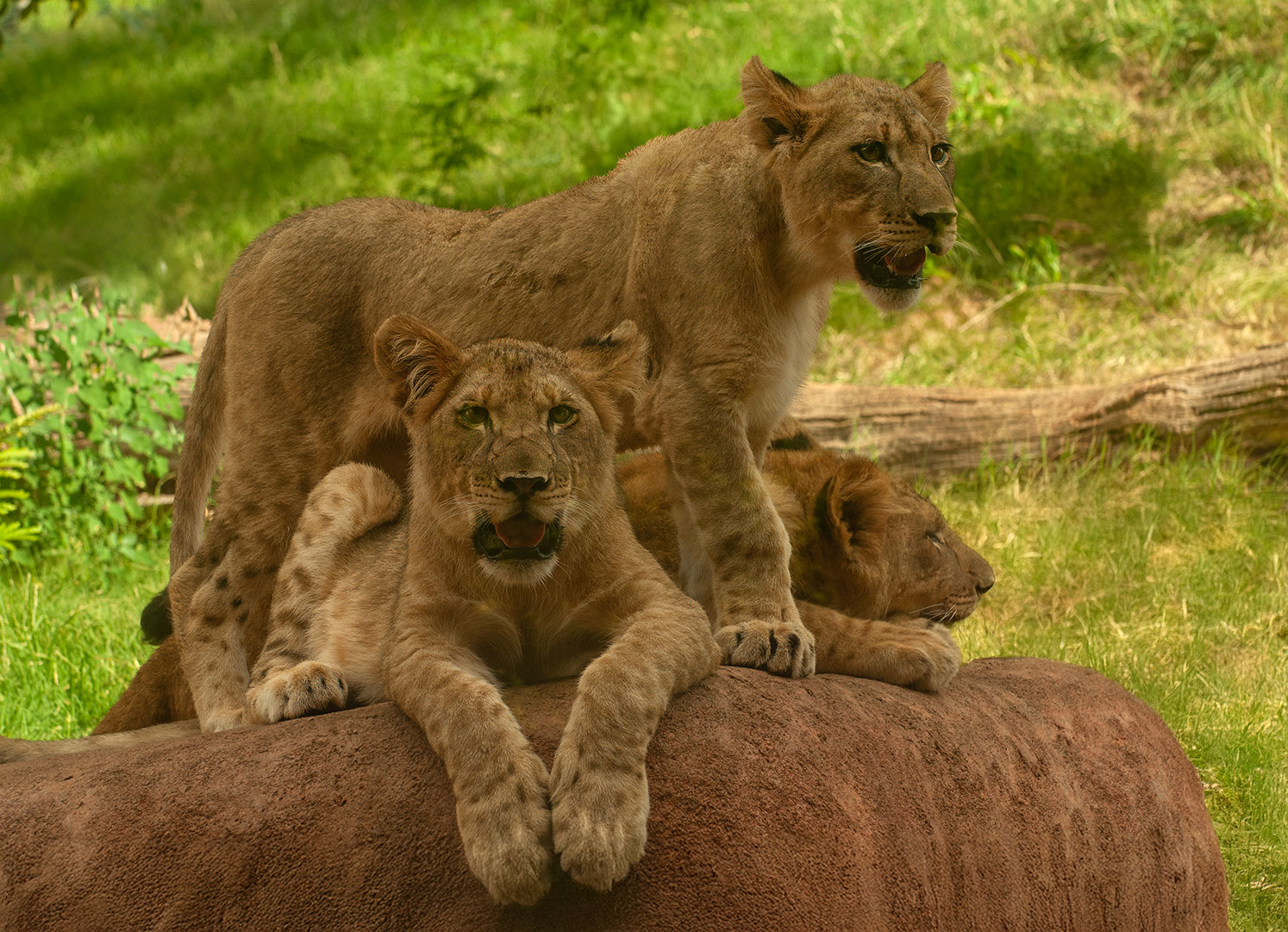
I agree with the title that this is a classic Africa image with the distinctive tree and many animals in its shade. It is good that there are several other animals in the image, maybe some heading to the tree in the distance. The image is very well done. And thanks for the story about the lionesses. |
Jul 10th |
| 7 |
Jul 25 |
Comment |
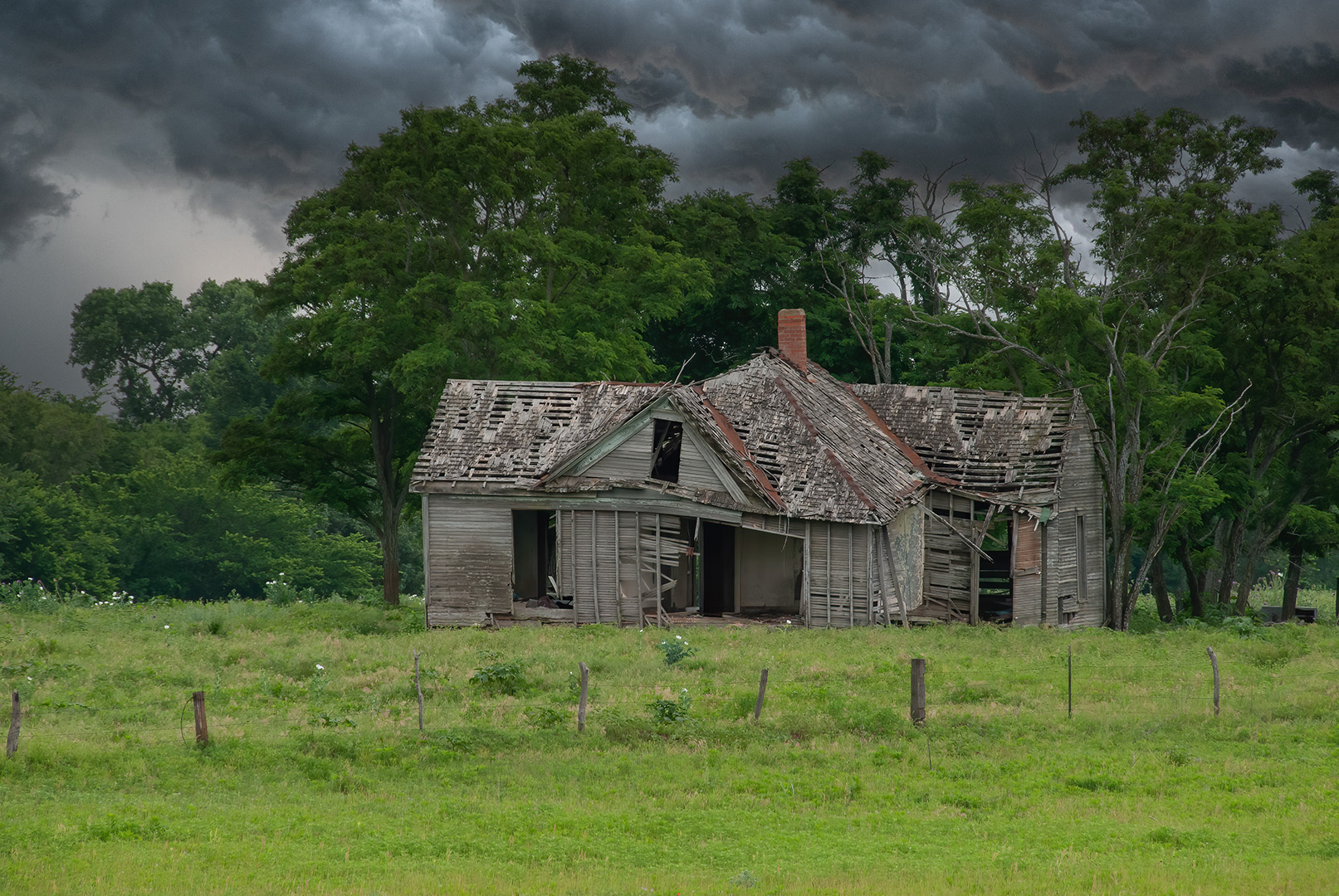
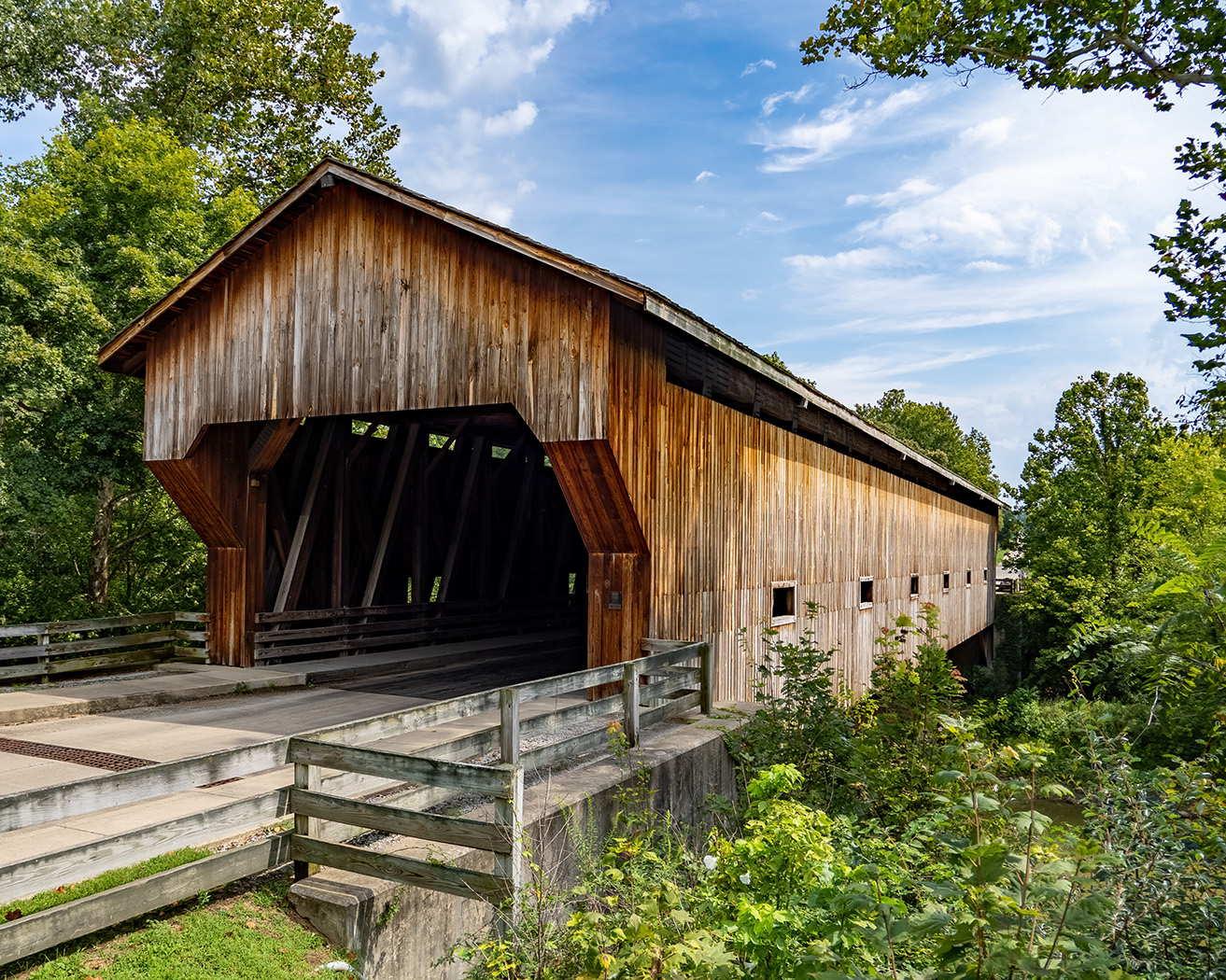
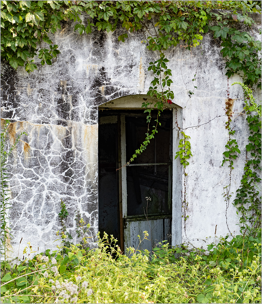
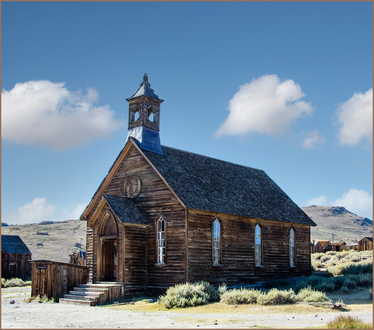
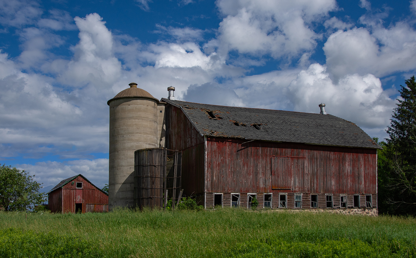
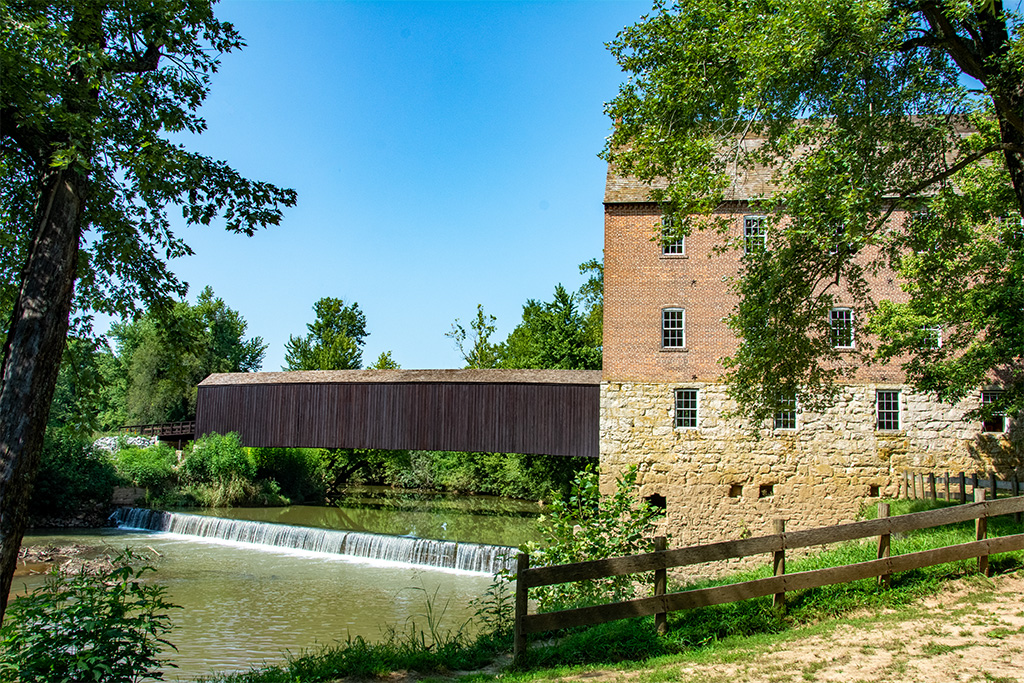
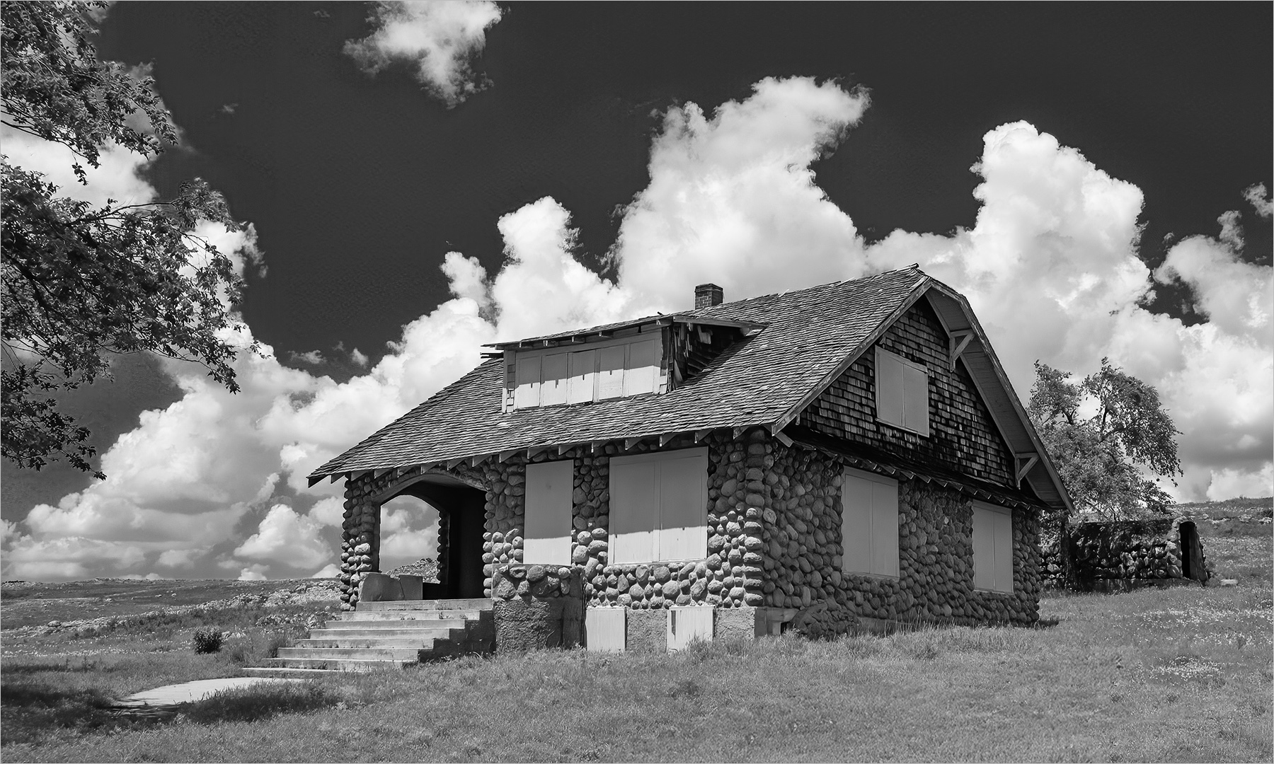
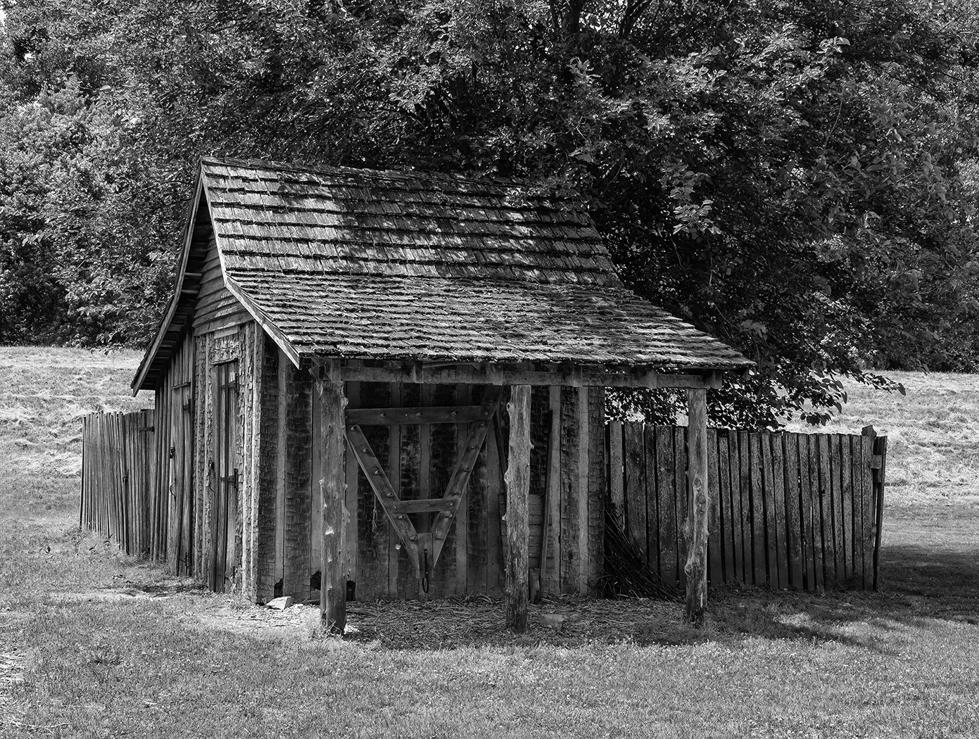
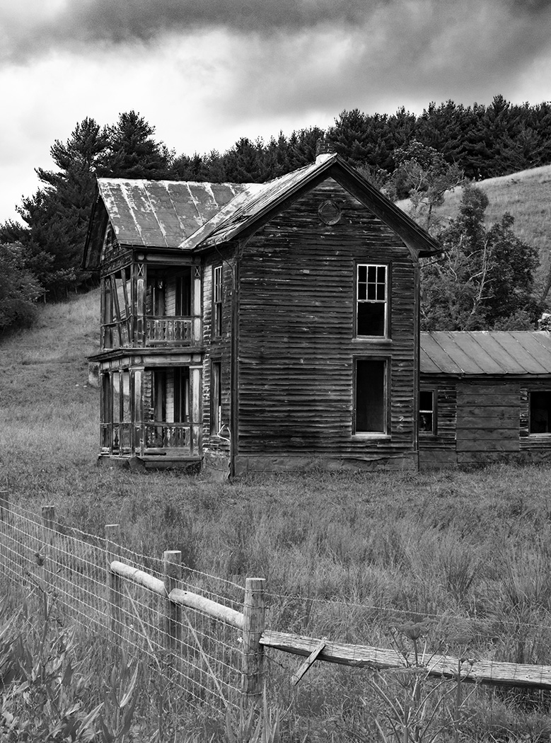
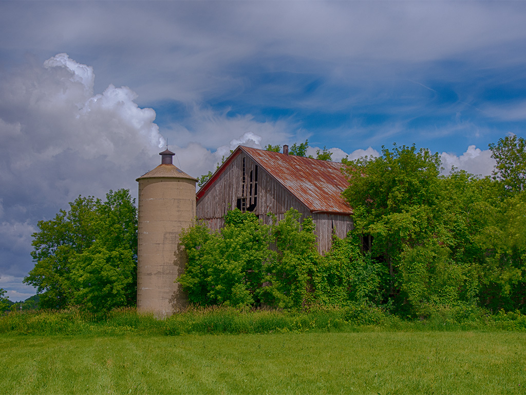
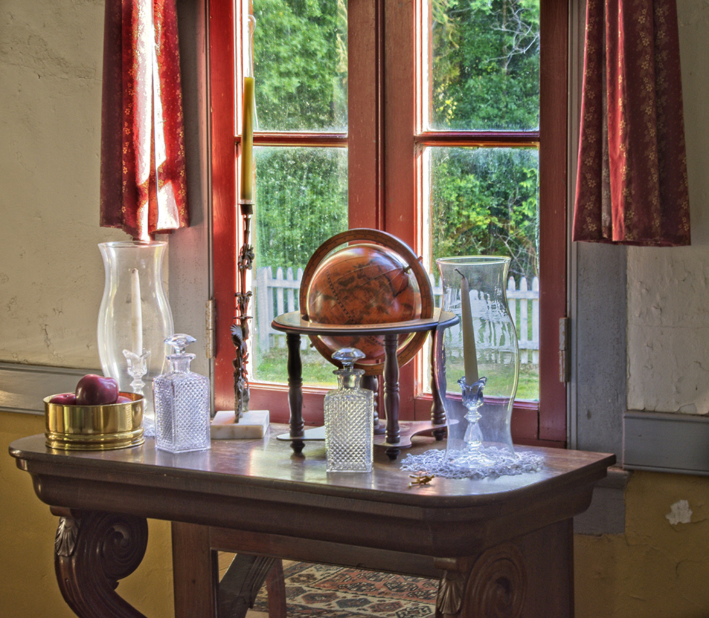
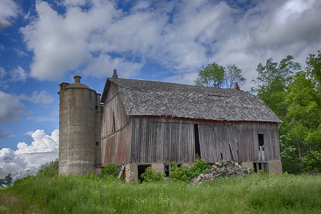
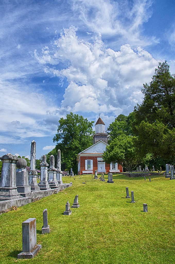
Gaetan, welcome back to the group. This is a nice rural image and the building creates a point of interest. The fence going into the distance helps the image. I do understand that this was a dark day, but the image seems a bit dark to me. I like that Butch lightened the shadows and cropped the image some. I would crop just slightly more on the right, to the edge of the fence. That would add an element of mystery to the image as the eye would wonder how far the fence goes, rather than it ending. |
Jul 10th |
| 7 |
Jul 25 |
Comment |
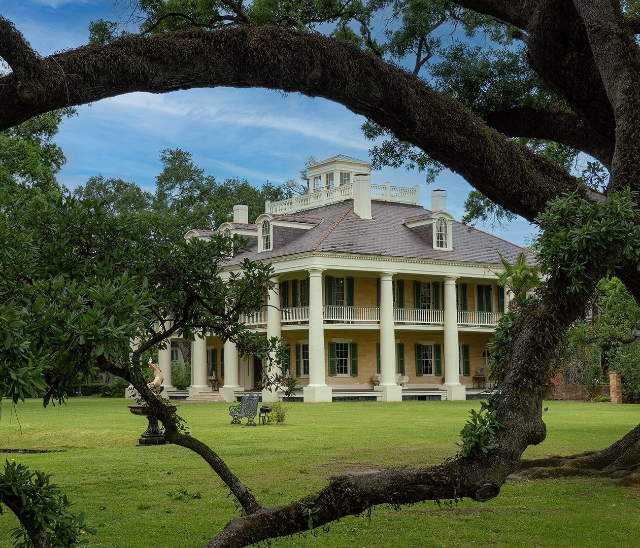
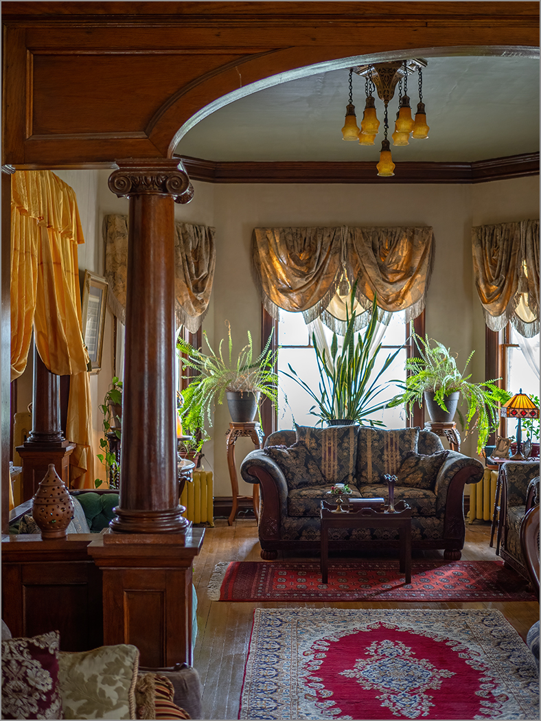
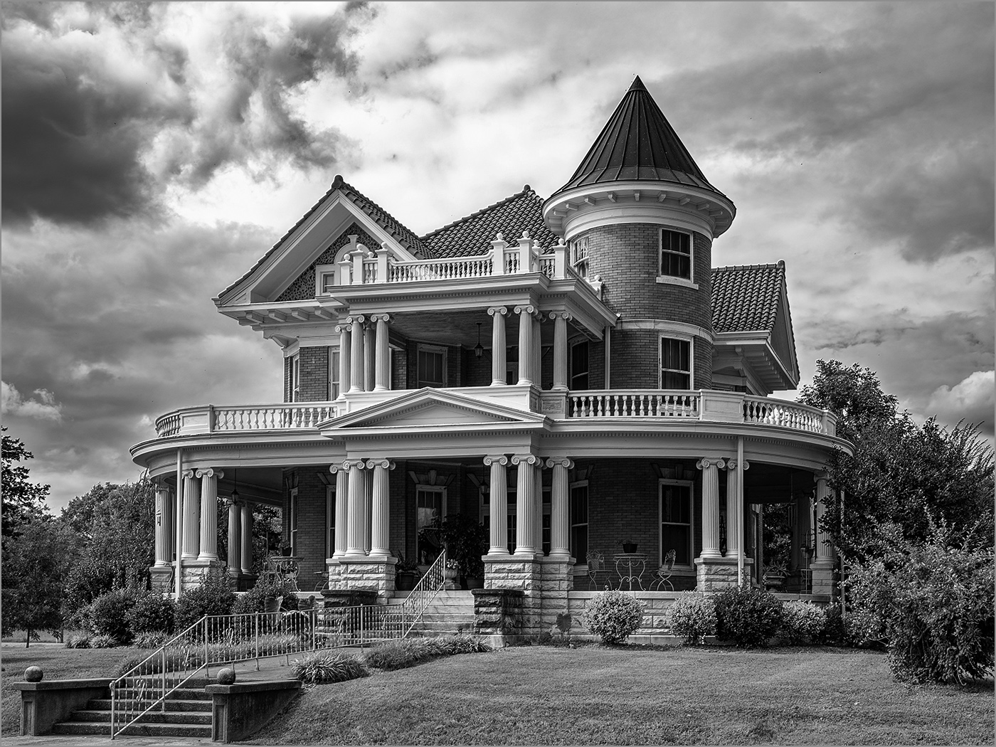
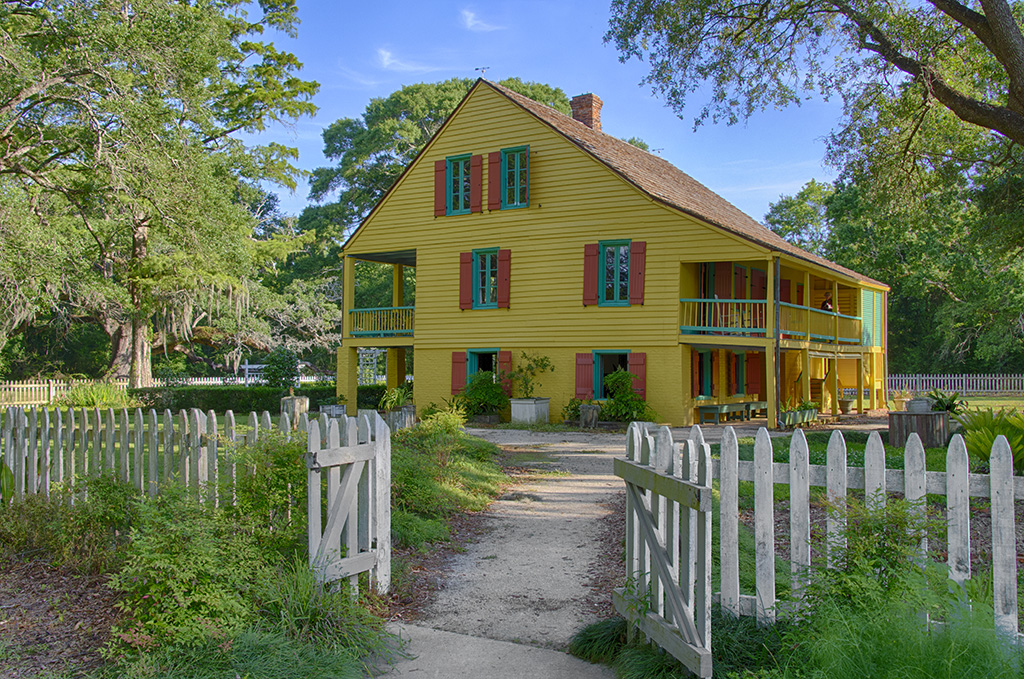
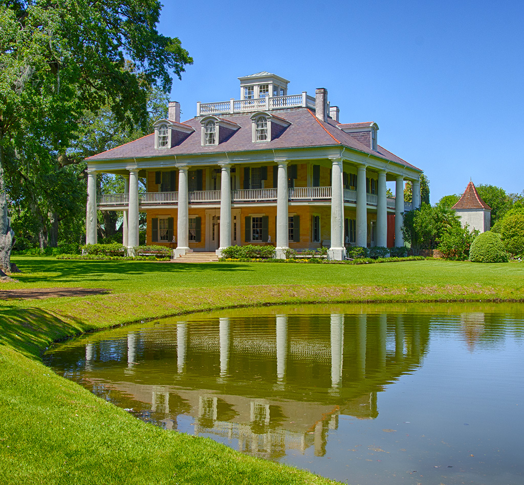
Your classic image is very well done, with good lighting, sharpness and depth of field. But like you said, this is more of a "postcard" image of a view that anyone could take (but probably not as well). Your varied image shows creativity and imagination and is very sharp and well lighted. I like the symmetry of the image.
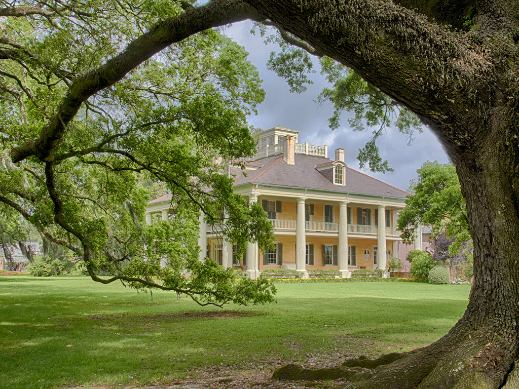
I do agree somewhat with Butch, the pillars seem to overpower the image. I did flip the image top to bottom. I think that makes the pillars act like they are bringing us into the image and are a base of the image. I understand that this is not what the beautiful building looks like and that may be a problem. But I think that the composition is better. What do you think? |
Jul 10th |
 |
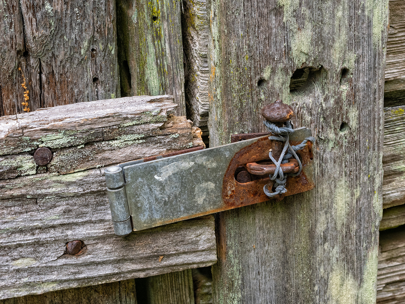
| 7 |
Jul 25 |
Comment |
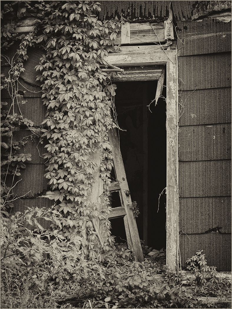
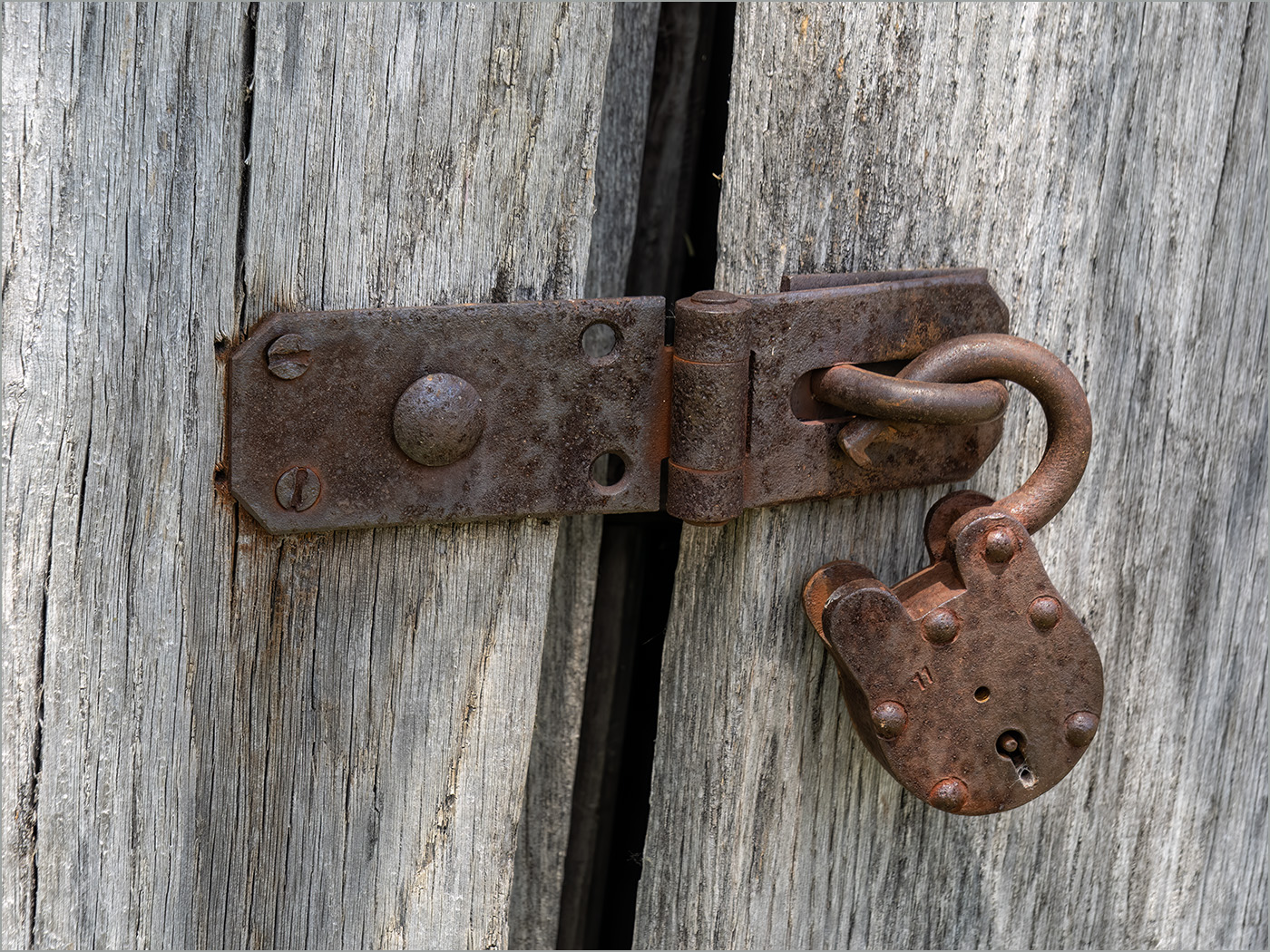
Great idea to see and capture this, and with IR to make the leaves white. If they were green it would not be nearly as good of an image. The leaves are very sharp and the veins stand out nicely. I do agree with Butch that the area on the right is too much and too bright. I did crop off some of it (maybe too close to the vine), and made it darker. |
Jul 10th |
 |
| 7 |
Jul 25 |
Comment |
You are fortunate to have such a beautiful backyard with hummingbirds. The hummingbird body and the flower it is going to are super sharp, even with a catch light in the eye. The background is great. I am I don't believe that the back wing is blurry because of movement. The front wing is pretty sharp with only a bit of blur to show movement. Thinking that both wings are going at about the same speed, then the back wing is blurry because of depth of field. If you are at f10, then you don't have much room to correct this.
I did reverse the image, as I think that has better composition. |
Jul 10th |
 |
| 7 |
Jul 25 |
Reply |
Thanks, I like what you did -- now the truck is not so close to the edge and cropping off some sky was good. |
Jul 9th |
6 comments - 7 replies for Group 7
|
| 32 |
Jul 25 |
Reply |
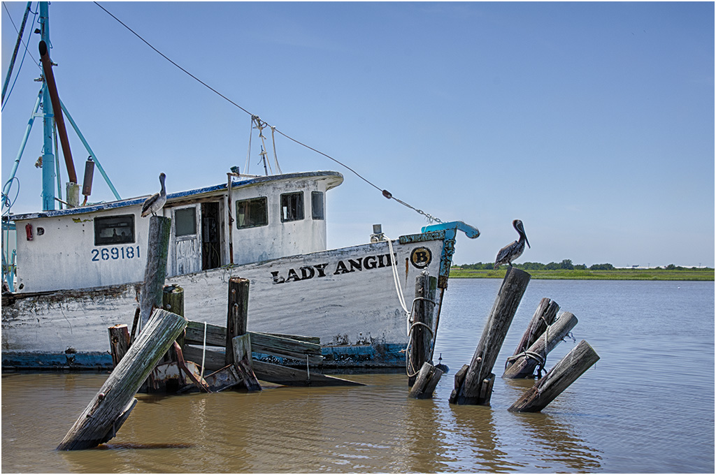
Thanks, the color is nice, but since it is a shipwreck I thought that more somber was a good choice. |
Jul 30th |
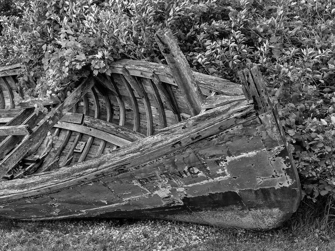
| 32 |
Jul 25 |
Reply |
Thank you. I had not really noticed the water running from under the boat, the tide must have been going out. There had been a bit foggy and light drizzle, that is why the couple had an umbrella. |
Jul 28th |
| 32 |
Jul 25 |
Reply |
The monochrome is better, but thanks for showing us the color. The color image has to me, some distracting colors, especially the brown areas. |
Jul 21st |
| 32 |
Jul 25 |
Comment |
Nice image with the fence as a lead in. Well composed with the mountains in the background and a good sky. I agree with Stephen that the color is better because of the trees. |
Jul 14th |
| 32 |
Jul 25 |
Comment |
Nice idea to capture this as the pattern is very nice. I like the mono better than the color and it does seem sharper. Too bad that part of the top is missing, but I think that you would have a stronger image anyway, if you cropped off the top to where the triangle area ends. That would put more emphasis to the pattern and fountain area. You should get rid of the small white dots in the center right. |
Jul 12th |
| 32 |
Jul 25 |
Comment |
The lioness has a nice pose with the eyes open and she is doing something. I like the effect that you have created and the mono is much better than the color. |
Jul 12th |
| 32 |
Jul 25 |
Comment |
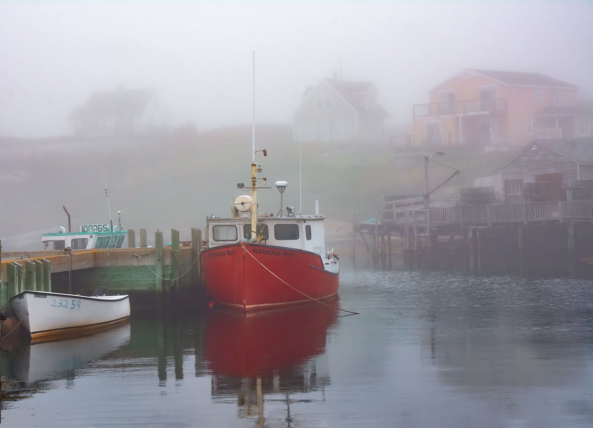
I like the moody effect of the image with the distance going white with the fog. The curve of the seashore on the right is very nice. I don't think that you want the image any brighter, and the grain does not bother me and looks natural. I have no idea about getting the grain out of a foggy image -- never is much fog where I have ever lived. |
Jul 12th |
| 32 |
Jul 25 |
Comment |
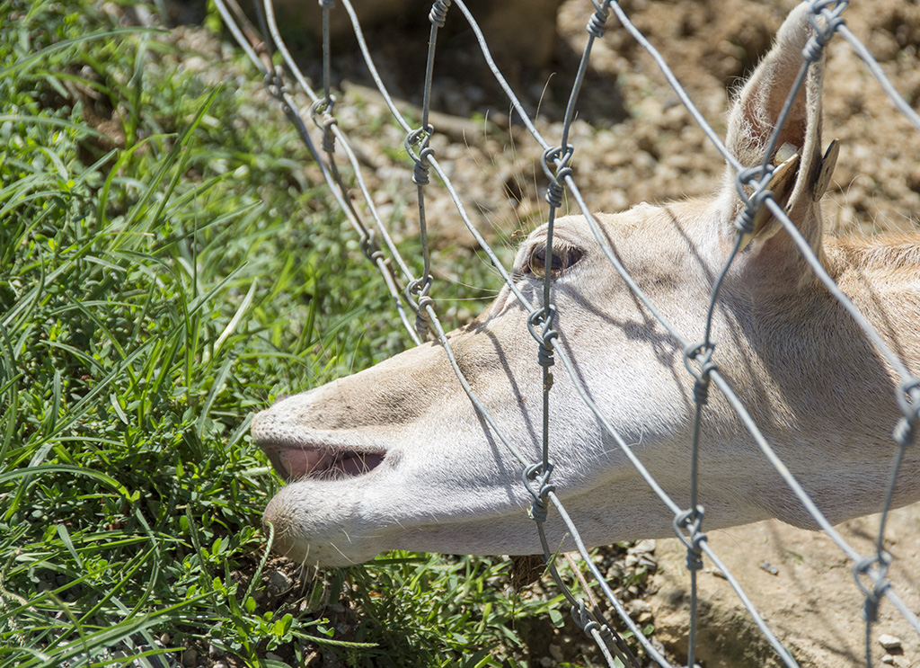
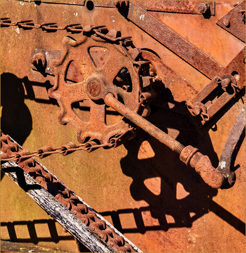
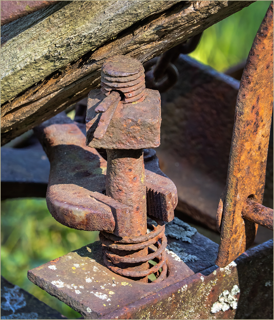
I have never used a fisheye lens, but this is very interesting. This is a very creative image using a chain link fence. Going to monochrome was a good choice, as the colors distract from the fence. I find it interesting that the building looks pretty normal and the horizon is flat. I agree that you should take an image without the sun because while it is a nice star burst, it is a distraction from the fence. I would not worry about the post. |
Jul 12th |
| 32 |
Jul 25 |
Comment |
Good perspective image, and think that going to mono was the way to go. I especially like the v coming out of the lower left corner as it points us up into the image. I think that you should remove the white areas on the windows. |
Jul 12th |
6 comments - 3 replies for Group 32
|
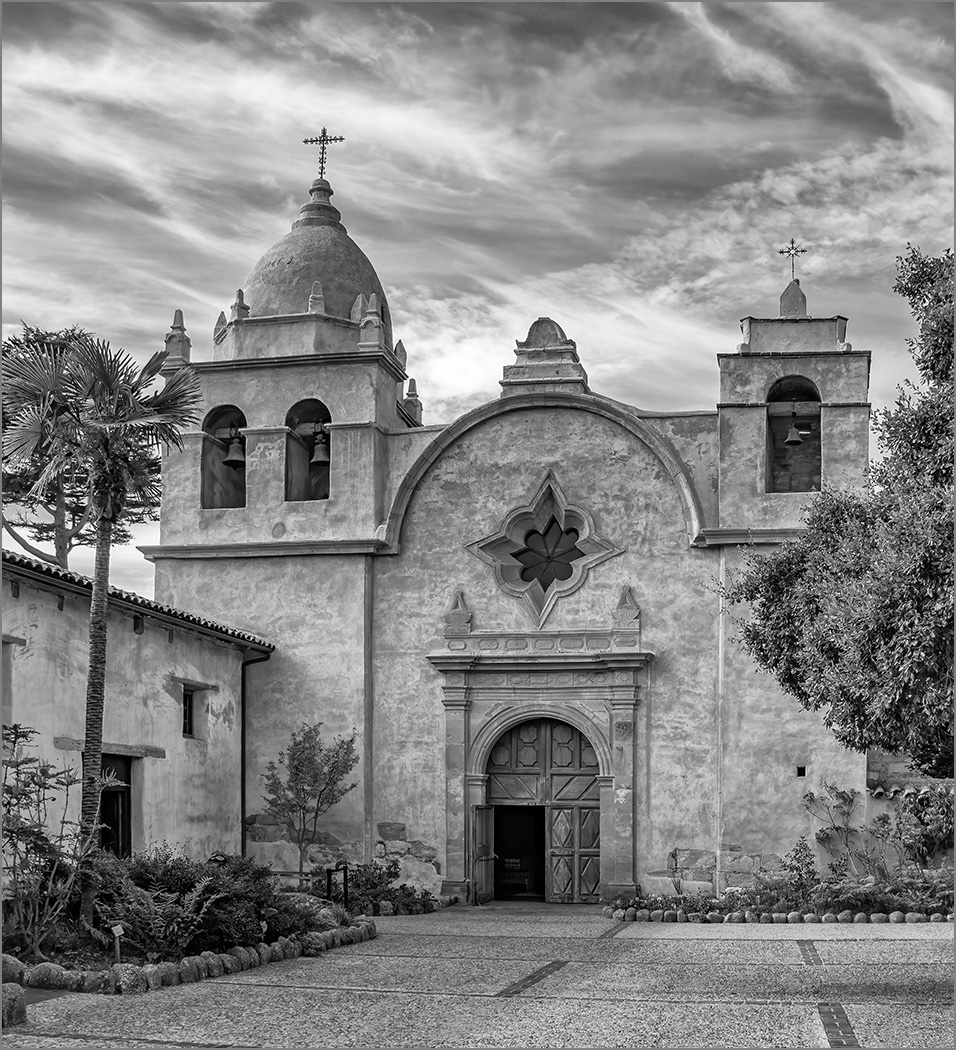
| 44 |
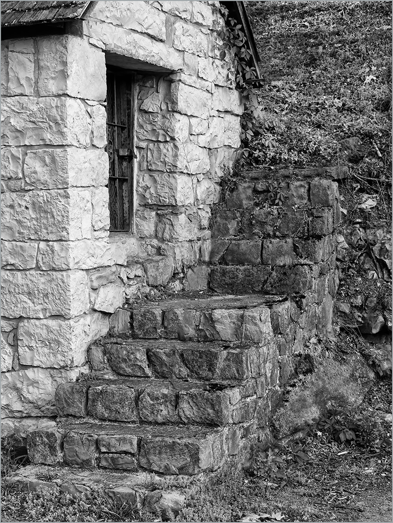
Jul 25 |
Comment |
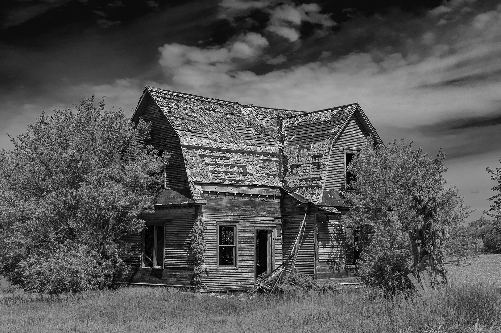
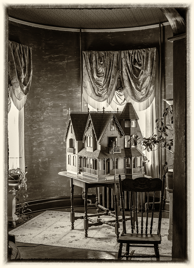
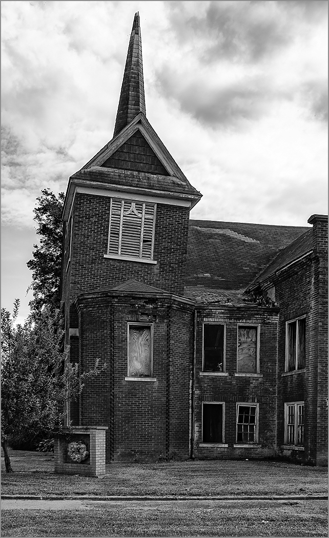
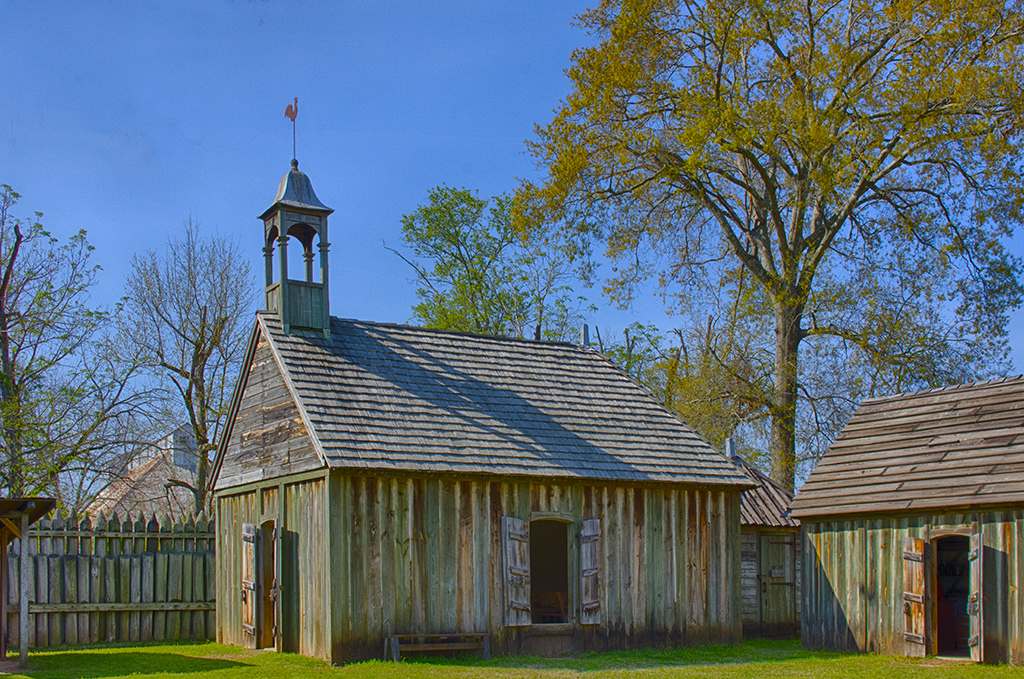
Nicely done, of this unusual old school house. Most of the top area are on the end. |
Jul 31st |
1 comment - 0 replies for Group 44
|
| 57 |
Jul 25 |
Reply |
I like the tighter crop. |
Jul 31st |
| 57 |
Jul 25 |
Reply |
Thanks. |
Jul 26th |
| 57 |
Jul 25 |
Reply |
Thanks |
Jul 26th |
| 57 |
Jul 25 |
Comment |
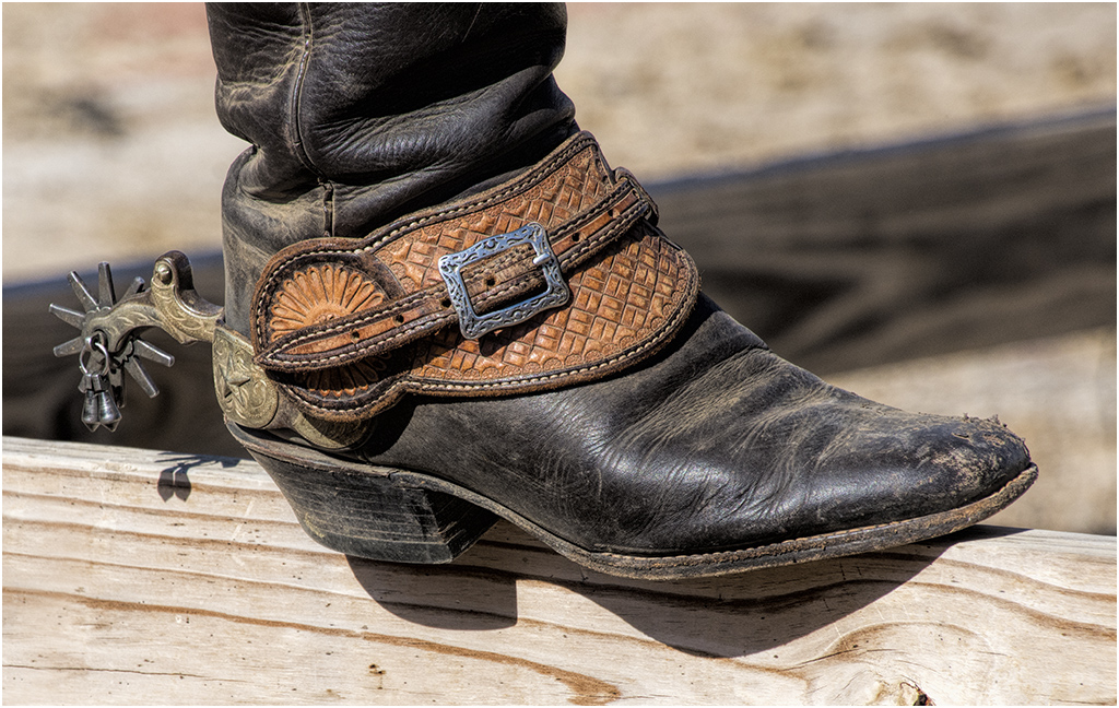
It looks like the shoe string was carefully placed as the composition is very good. I especially like the two red areas coming together in a kind of a V at the bottom. You are really lucky to have it look so good with just a toss.
The shoe string and trellis are sharp with a nicely blurred background. The pattern of what looks like a cyclone fence in the left middle is a bit distracting and draws my eye from the pattern of the shoe string. That said, you have a very nice image. |
Jul 21st |
| 57 |
Jul 25 |
Comment |
The rat is super sharp and I like the reflection as it gives him a base to stand on. The composition and crop are very good. As Jessica said, the contrast of textures is very good. I think that the bright red behind the rat distracts from him, and so I lowered the saturation of the red and darkened it just a bit. |
Jul 21st |
 |
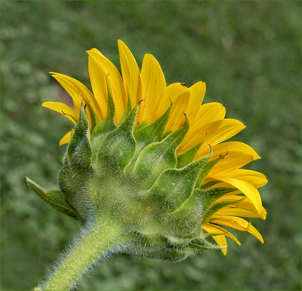
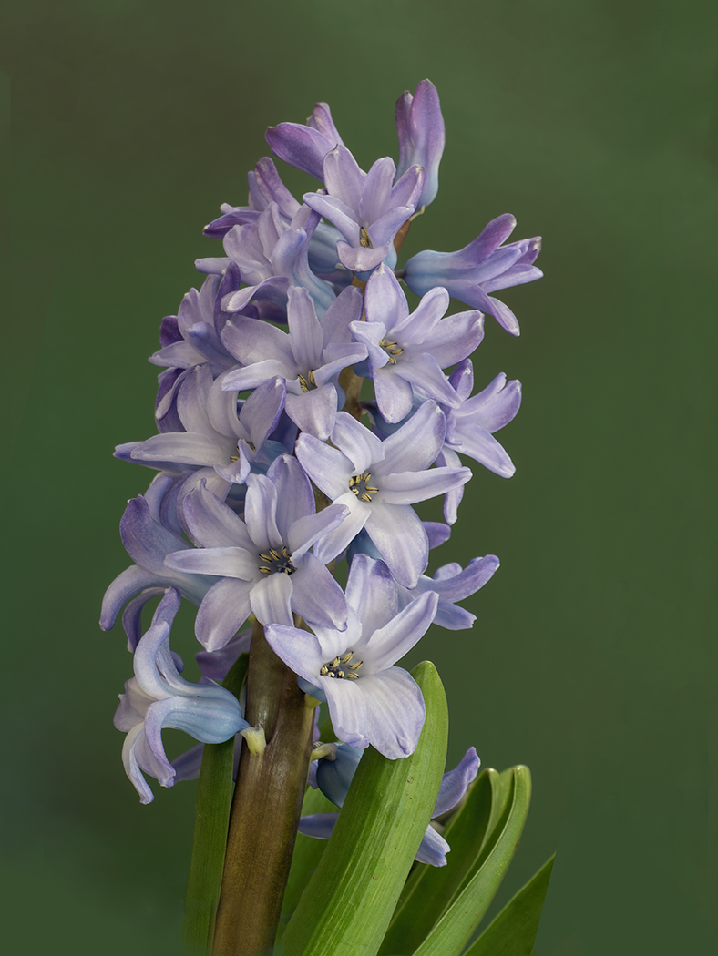
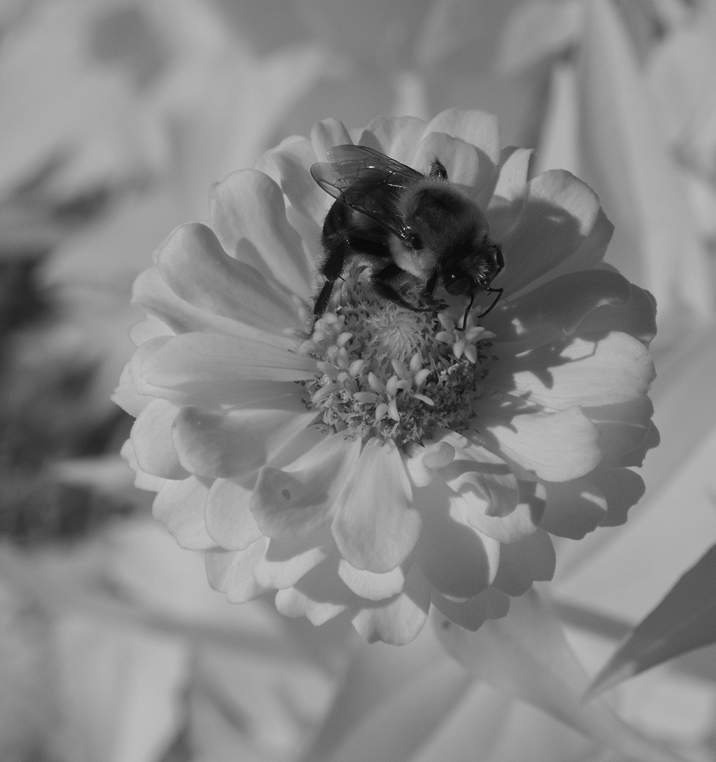
| 57 |
Jul 25 |
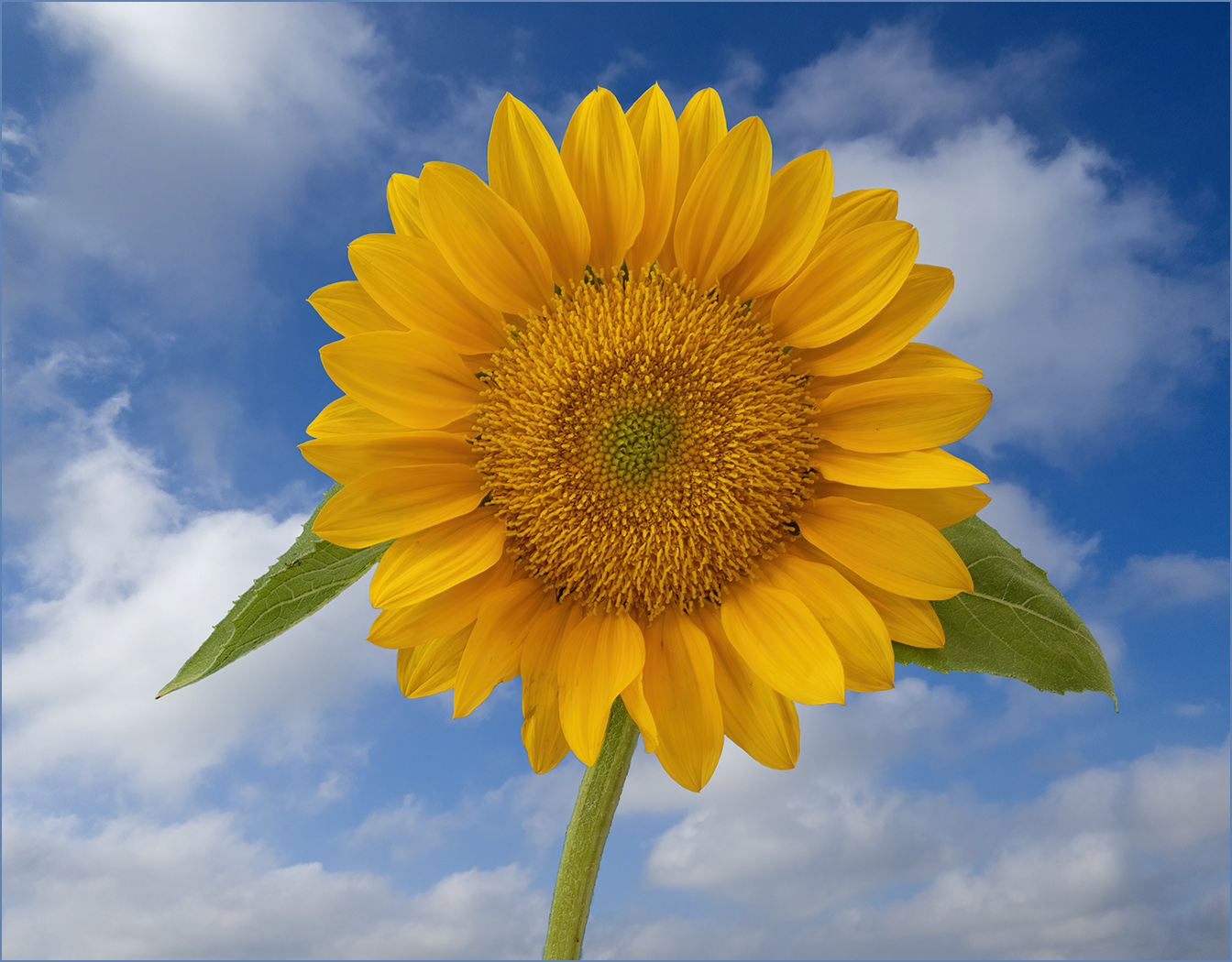
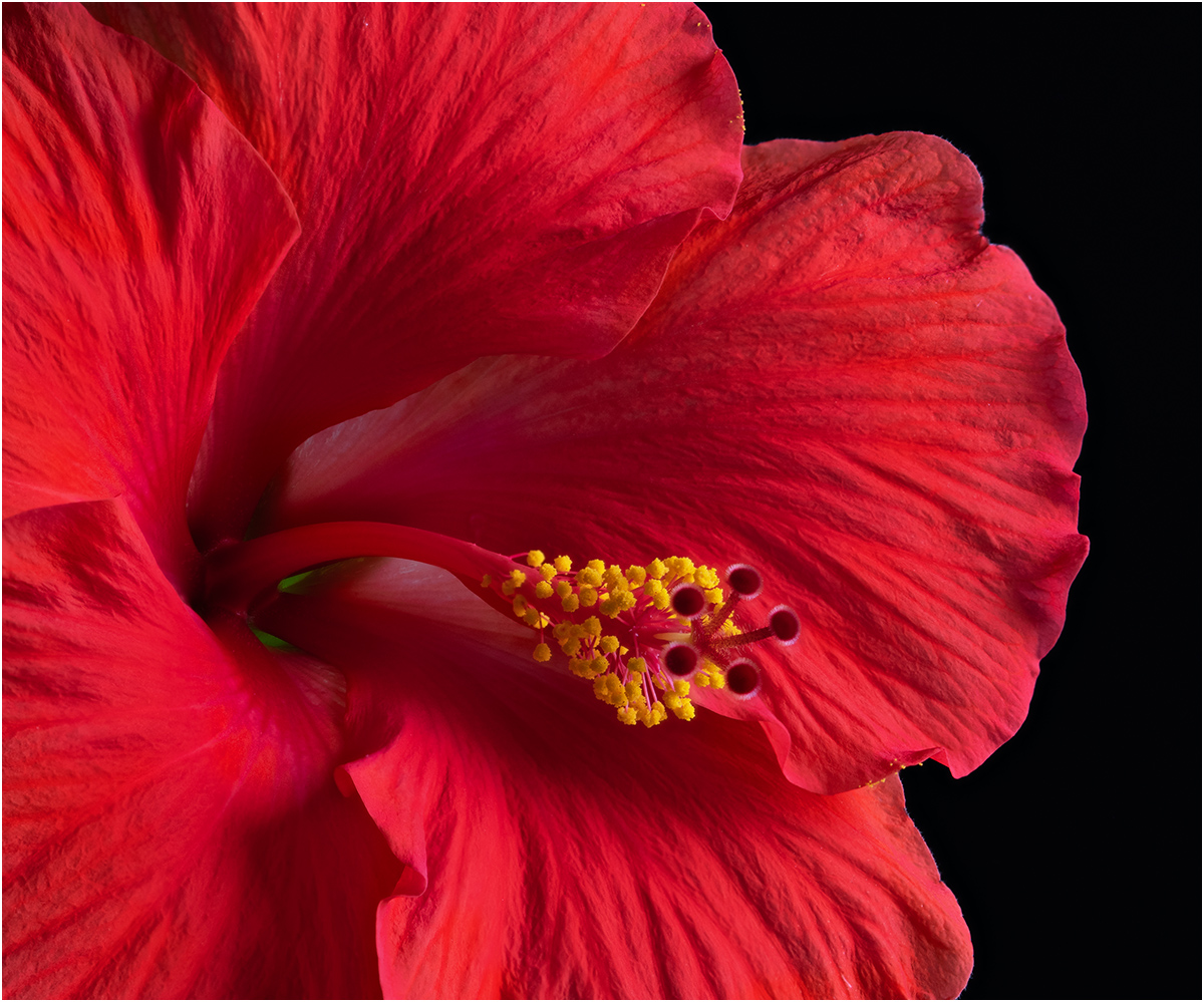
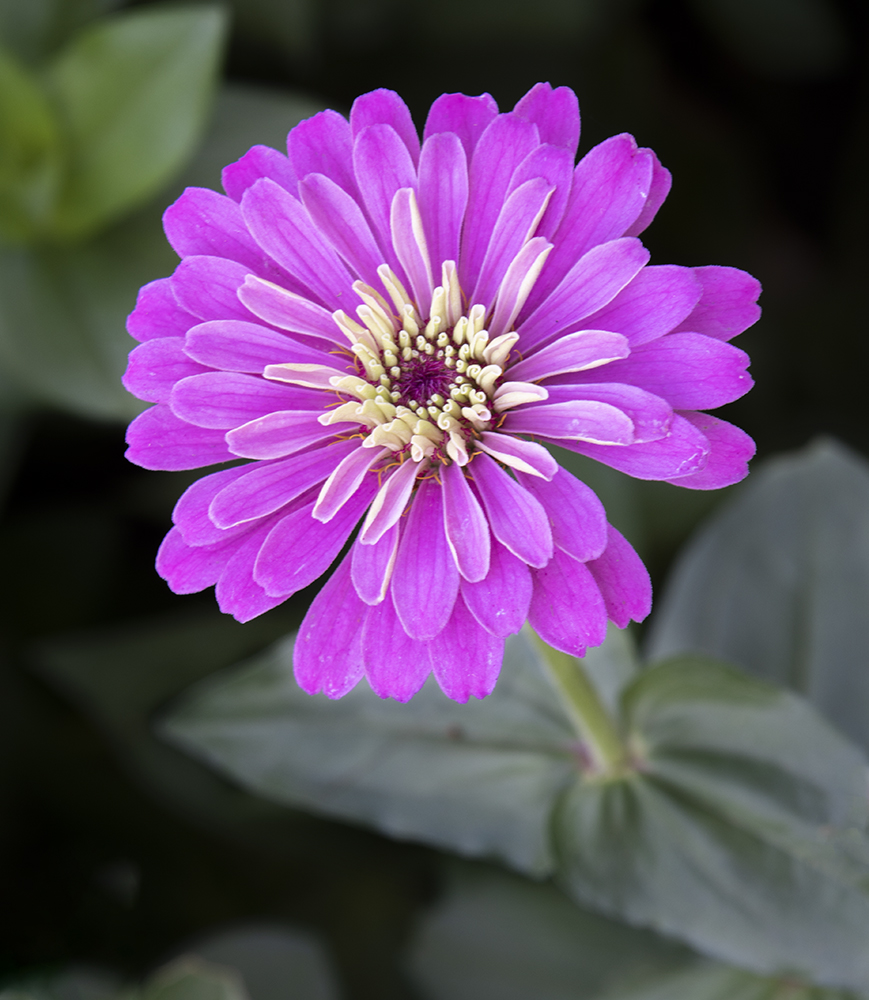
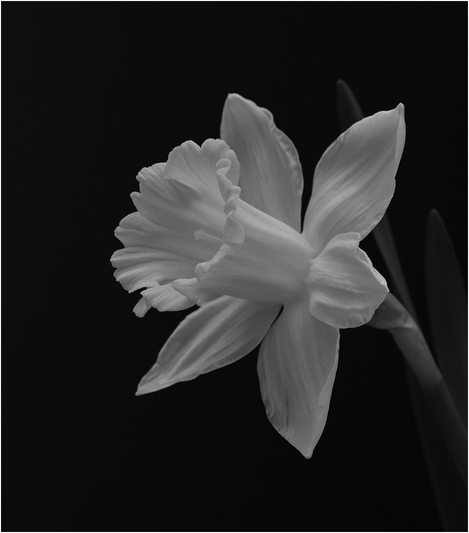
Comment |
Great composition, and I like the close cropping and square format. You captured a small part of the flower that we would not see unless we got really close it. The lighting is interesting and the image has a lot of impact. The colors may be natural, but it seems a bit over saturated to me. |
Jul 21st |
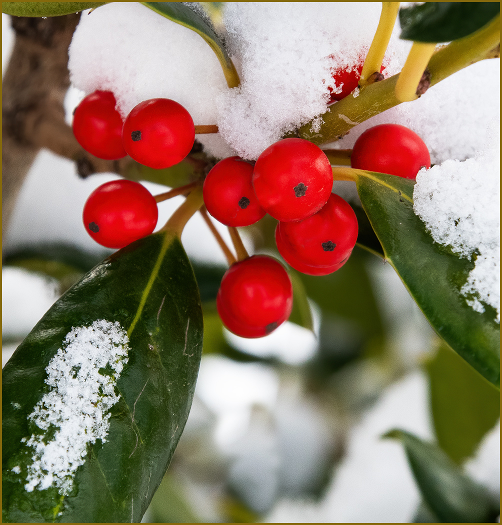
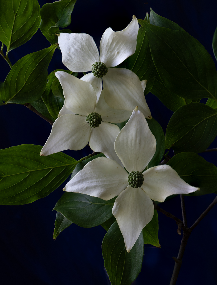
| 57 |
Jul 25 |
Comment |
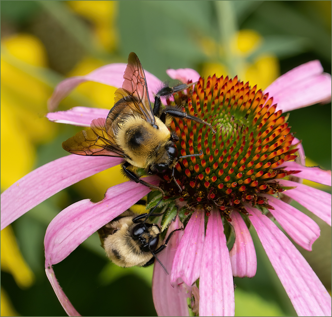
Really nice edge to edge sharpness in the flower. I like the close crop and the square format. The background is distracting to me. I darkened and blurred it some. |
Jul 21st |
 |
4 comments - 3 replies for Group 57
|
17 comments - 13 replies Total
|