|
| Group |
Round |
C/R |
Comment |
Date |
Image |
| 1 |
Jun 25 |
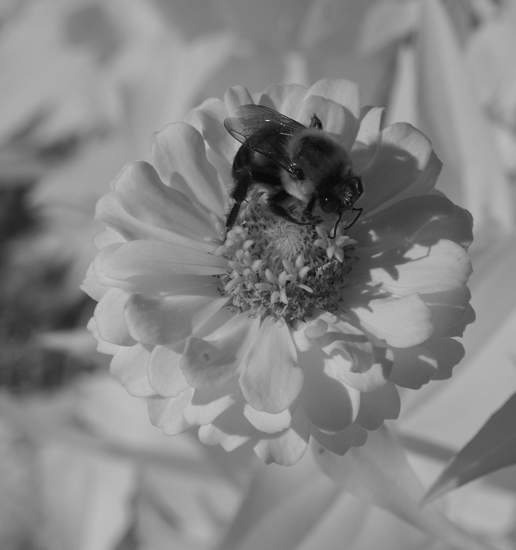
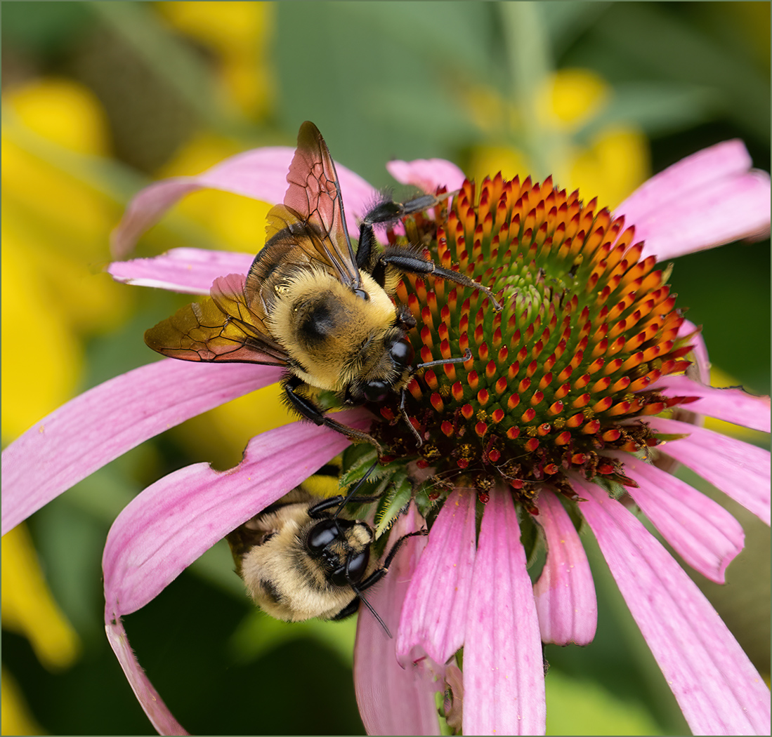
Comment |
Don't apologize for only capturing "only" one bee! To capture the flying bee so sharply heading to a flower is really good. And the flower is also very interesting. |
Jun 4th |
1 comment - 0 replies for Group 1
|
| 7 |
Jun 25 |
Reply |
I used the Mode of "Soft Light" on the brush to paint in the red color. That seemed to leave the texture of her lips. When I first tried the "Normal" mode it made her lips totally smooth which was not realistic. |
Jun 23rd |
| 7 |
Jun 25 |
Reply |
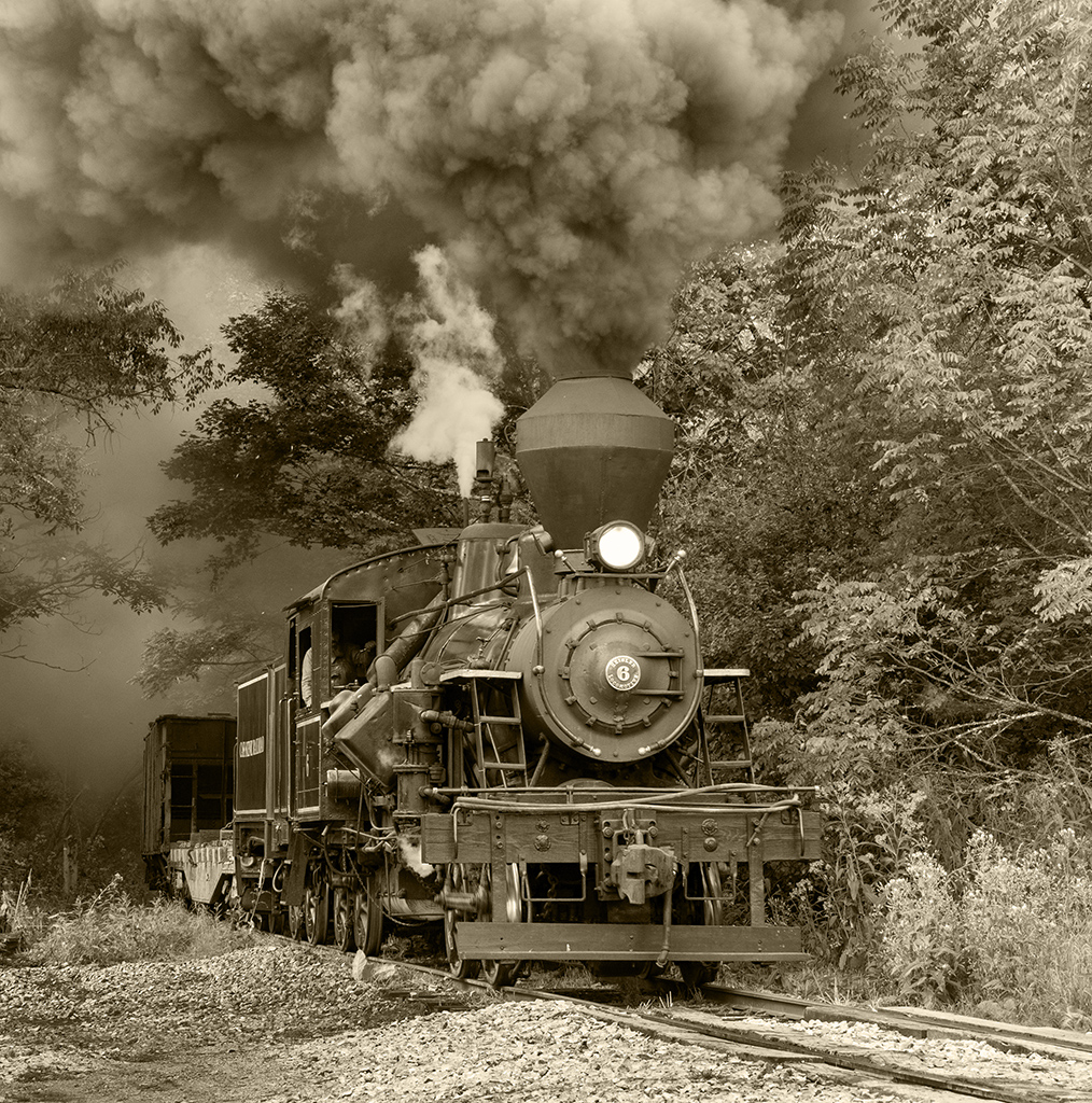
Like I said in my "How I Did It", it had been very cloudy and I did not think to change the settings of ISO or shutter when the sun quickly came out. I was using aperture priority. So of course, your comment is correct I just was not thinking. |
Jun 23rd |
| 7 |
Jun 25 |
Reply |
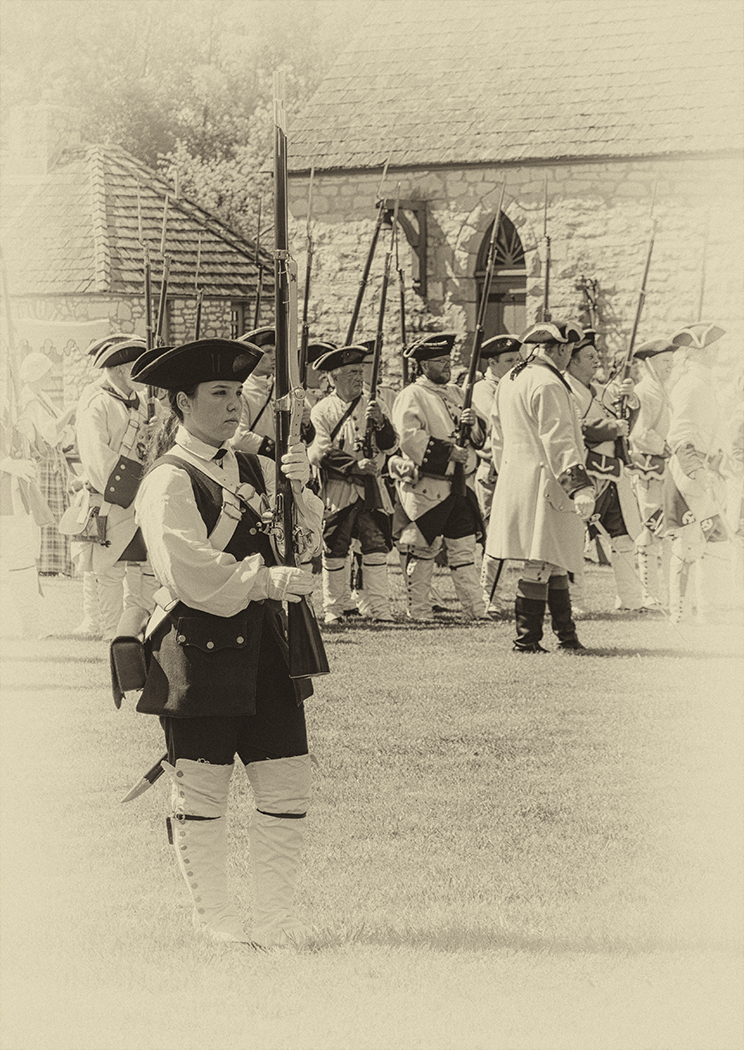
Thanks. Hard to find period dressed people, let alone get them to move where you want them to, but a good idea. |
Jun 20th |
| 7 |
Jun 25 |
Comment |
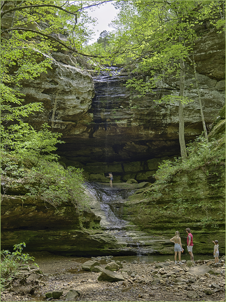
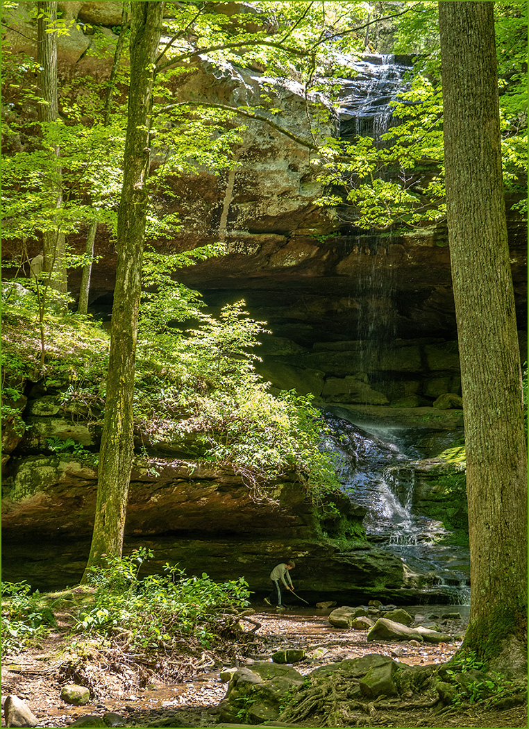
My thoughts on people in landscapes is that they can help add a sense of scale to an image, if it needs it. They can also add interest to the foreground, again if needed. This image has the flowers and green contrast area at the bottom so I would not include people. The flowers also add scale, so again people are not needed.
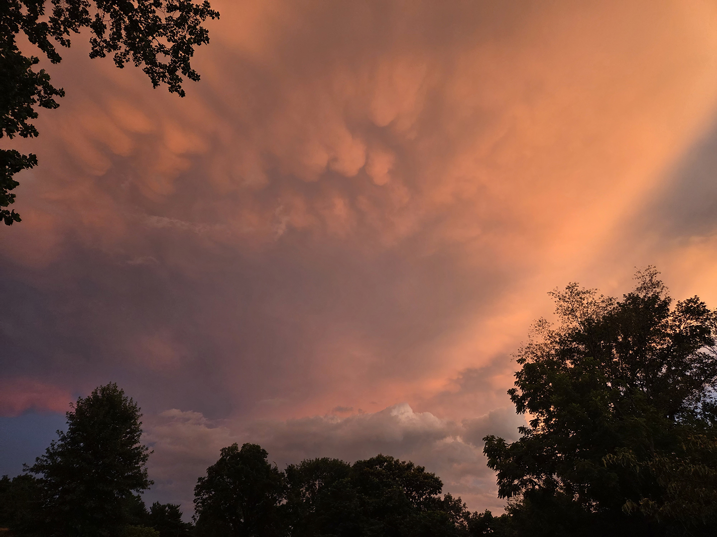
You captured an interesting area because of the rocks and also with a nice sunset. I like the composition with the gentle incline of the rocks from left to right, and ending with a higher ridge area on the right. Since it is a sunset, I added an orange filter to bring out more of the sunset. |
Jun 10th |
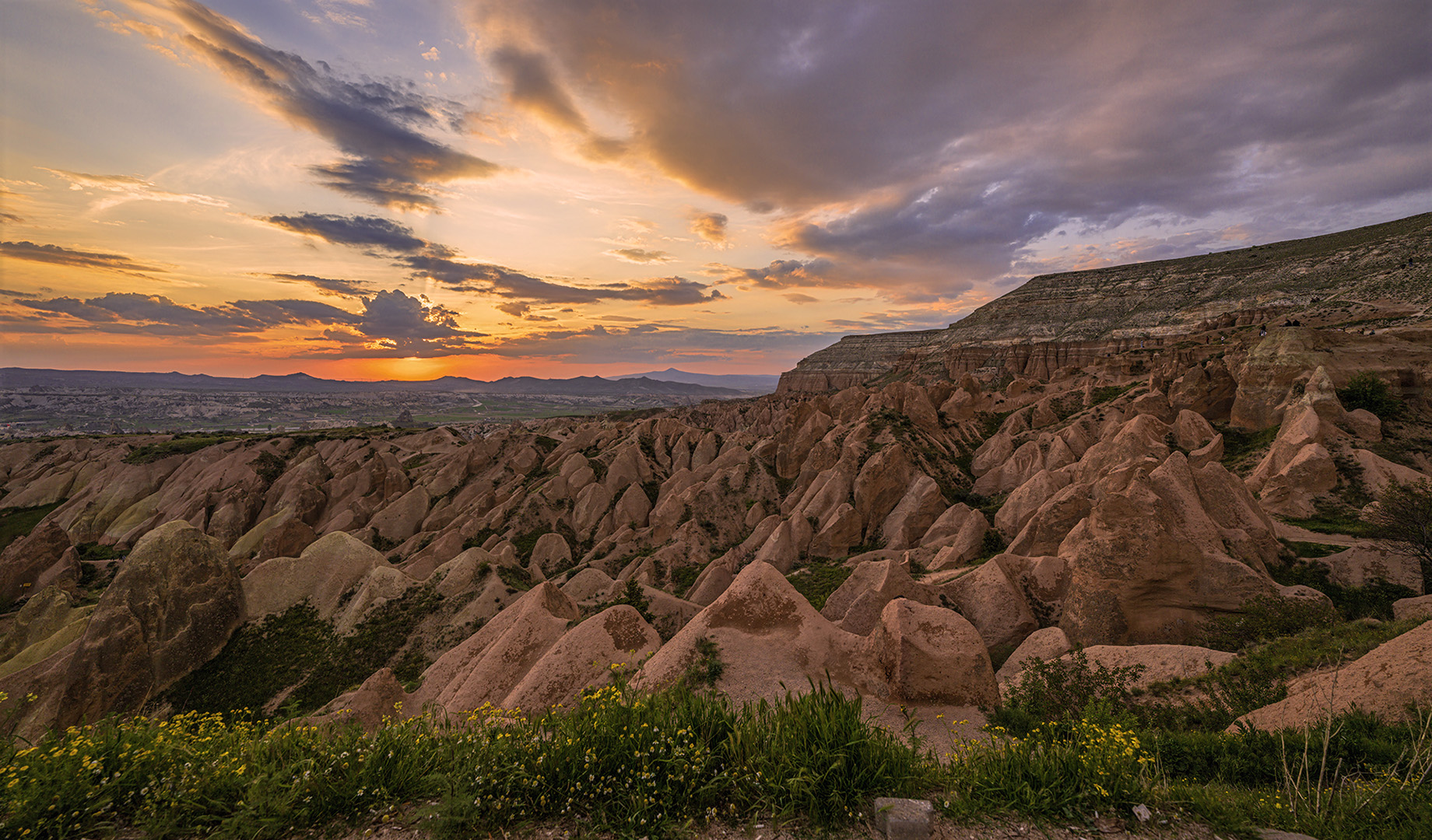 |
| 7 |
Jun 25 |
Comment |
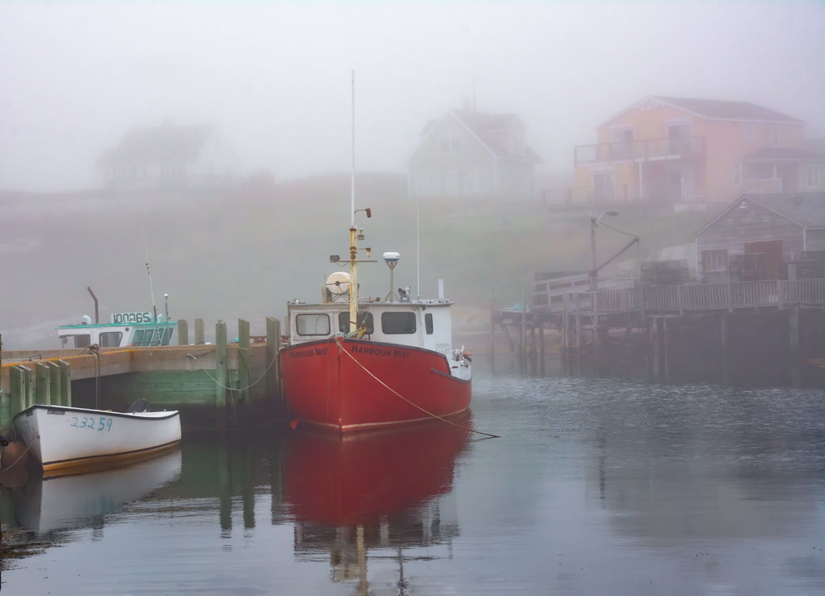
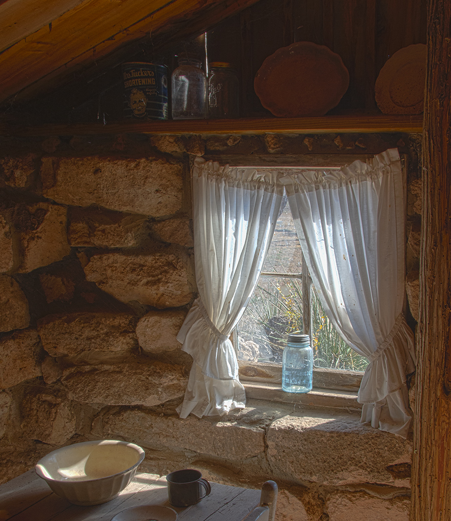
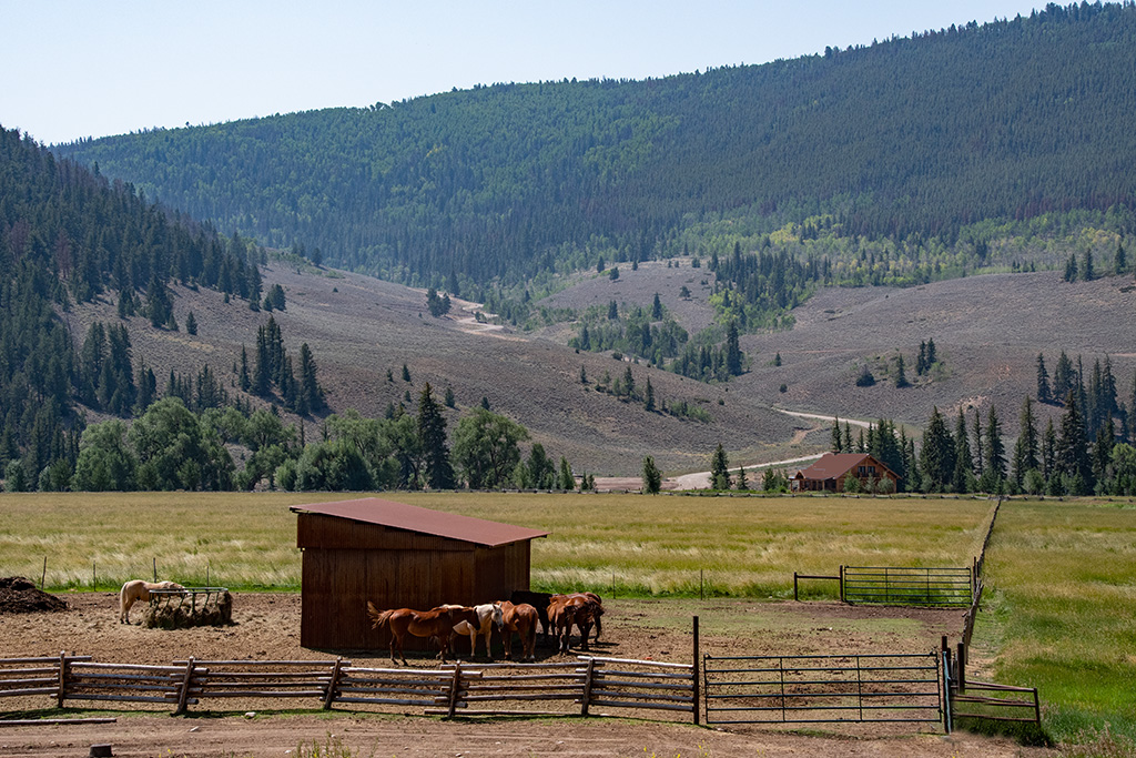
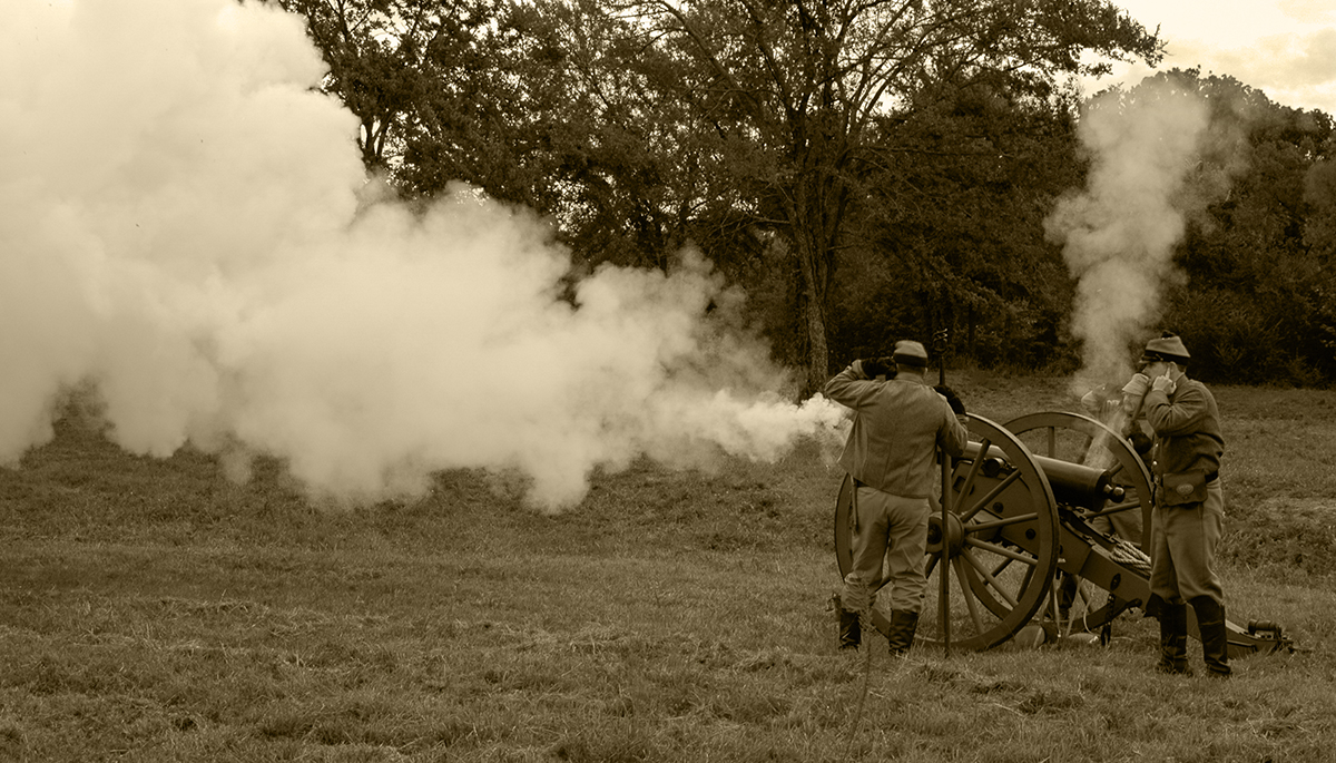
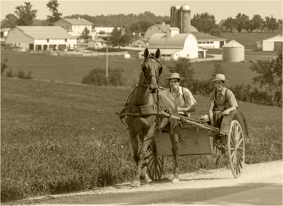
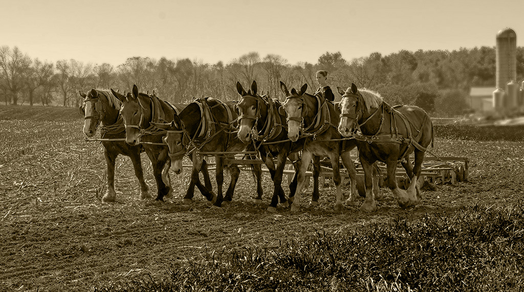
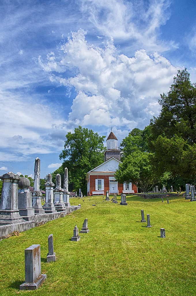
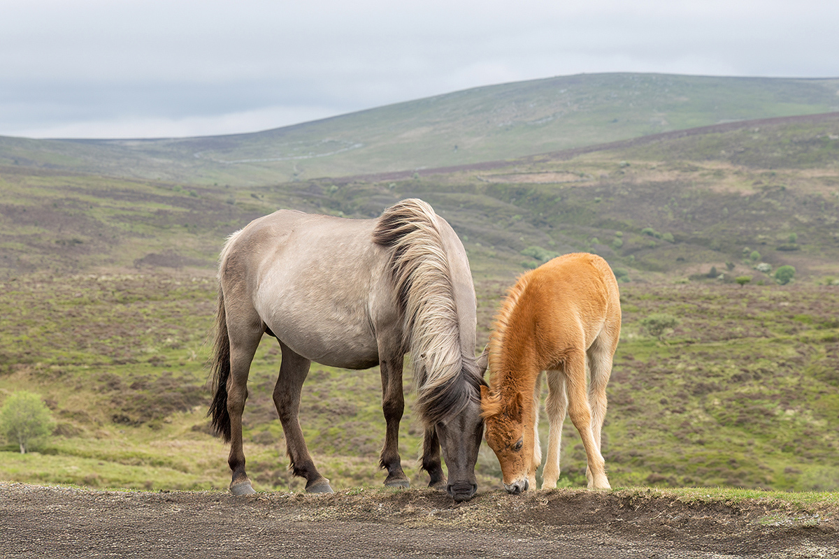
That looks like a lovely countryside with the rolling hills. It must be an open range area with the horses allowed to roam free, including on the roadways. When I was a kid (now 80), that was allowed around here but not anymore. I really like the image as it looks very peaceful and the muted colors add to that. I like the composition and that you have left plenty of space around them. I thought that the gravel was a distraction, so I used generative fill to get rid of it. But since the dirt area was so thin, I had to select the gravel and fill it the first time but it added a thin grass strip at the bottom. So I used generative fill again, selecting the grass area at the bottom and then all I had was a dirt area at the bottom. |
Jun 10th |
 |
| 7 |
Jun 25 |
Comment |
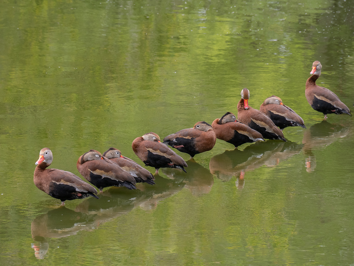
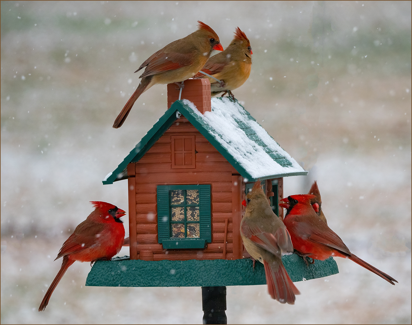
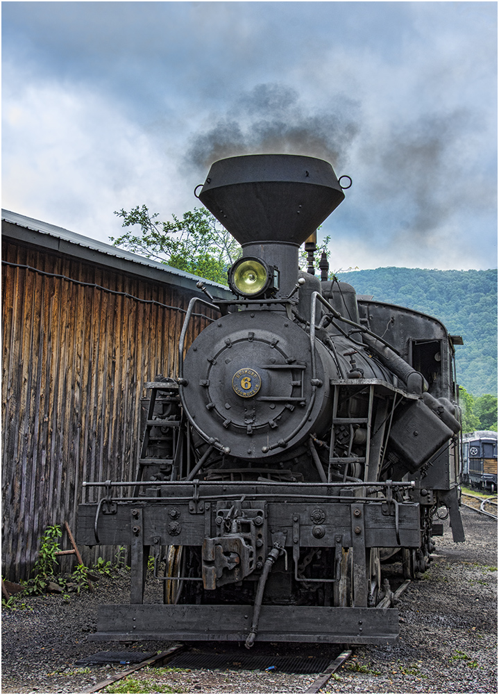
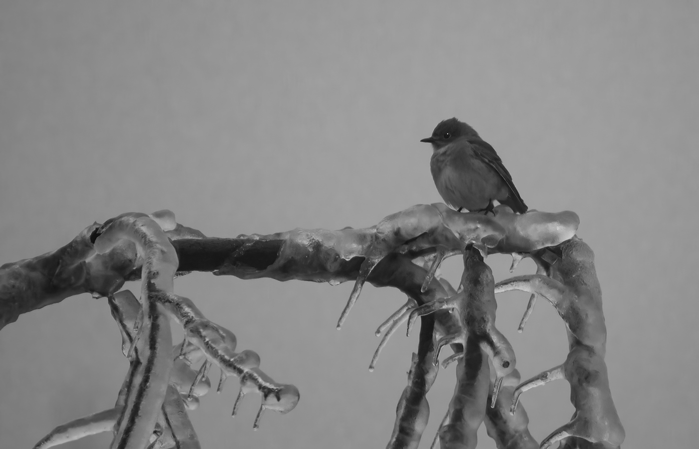
I am not sure of your explanation of the editing, but like what you ended up with. The image has very good depth of field. The birds are very sharp and the background is nicely blurred. I like the effect of the lower bird on the left seeming to be talking to the taller bird on the right. You do not need all of the fence, I would crop maybe 2/3rd off the bottom of the fence, and maybe some from the right side of the image. I find the blurred fence on the right to be a distraction and cropping would get rid of most of that. |
Jun 10th |
| 7 |
Jun 25 |
Comment |
I am not a good judge of this image, it is not my style of photography. I did try something like this once, and it was not nearly as good as this one. I like the composition with the green swirl to the left and below the poppy and the poppy being in the upper right. I like the contrast between the colors and that you can tell that it is an orange flower. Judith's suggestion to blur the center of the swirl is a good one, as it is now it draws attention from the flower. It is always good to experiment with new things, keep it up. |
Jun 10th |
| 7 |
Jun 25 |
Comment |
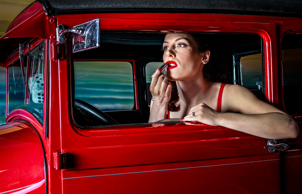
The young woman in the red antique car would have been a good image, but her doing something like putting on lipstick turns this into a really excellent image. The lighting is kind of harsh but I don't think that is bad for this image. It kind of goes back to your May image where you wanted more of an old time film effect. The composition and tight frame are good. I would not call this at all dark and evil like Judith suggested. I had not noticed the elbow until Judith mentioned it -- my eye went straight to the face. I am glad that you have all of the elbow in the image.
I made some minor adjustments, the main one was to make the lipstick the same color as the red car (and the dress strap and finger nail). I did this by making a quick selection of the lips, and using soft light to leave texture in the lips. I also, somewhat poorly removed the line below the eye, and corrected the elbow. |
Jun 10th |
 |
| 7 |
Jun 25 |
Reply |
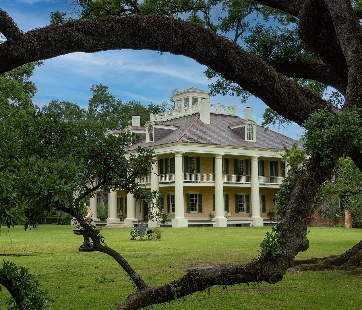
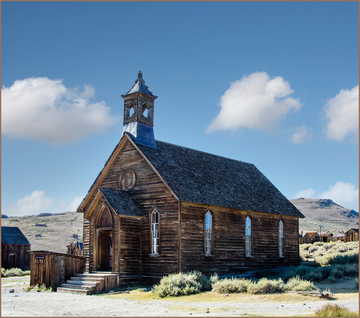
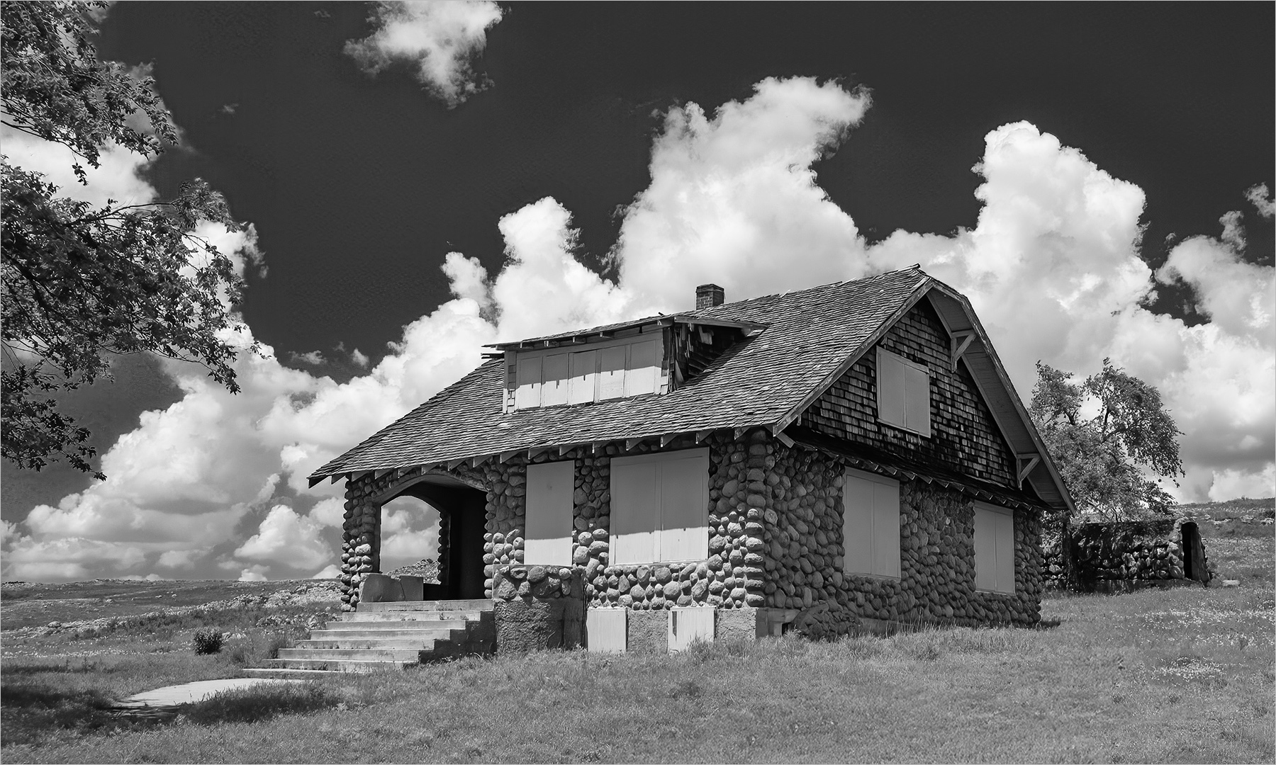
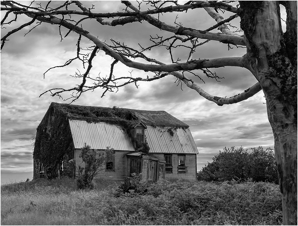
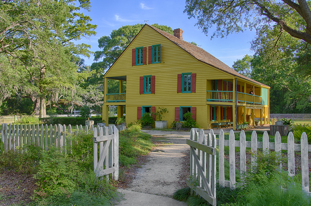
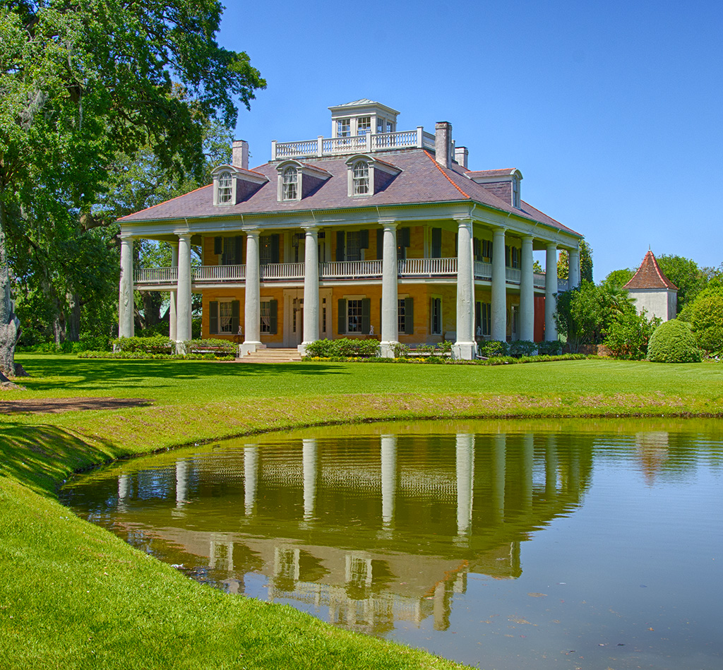
Thanks, I like everything that you did, except the color on the house. This is an historical house, and maybe it is better as an image, but the color is not realistic. |
Jun 8th |
| 7 |
Jun 25 |
Reply |
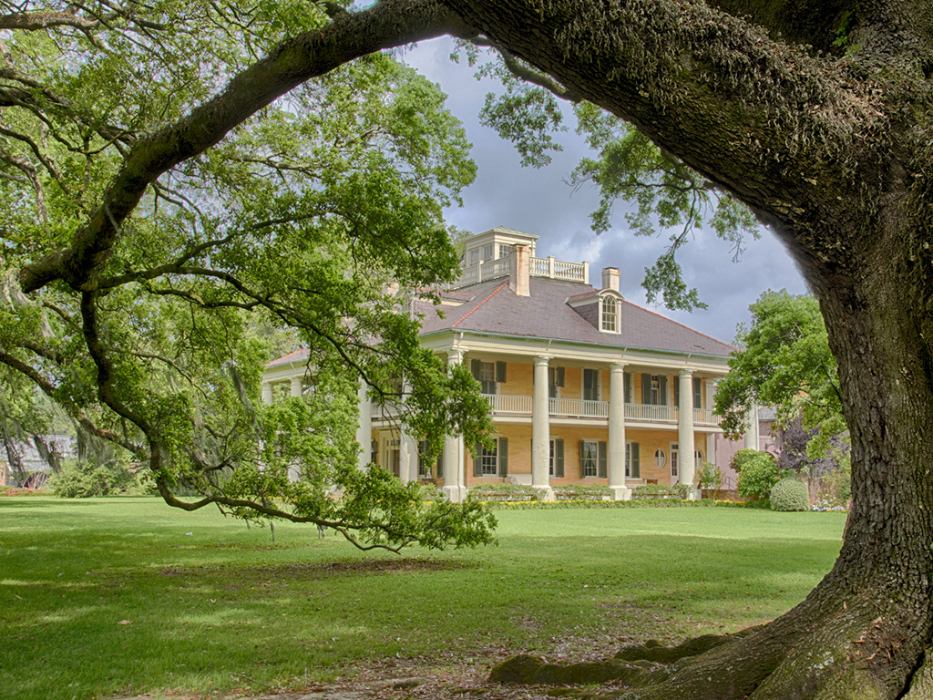
Thanks. The old live oak trees are really very amazing. They can survive hurricanes that destroy other trees. |
Jun 4th |
5 comments - 5 replies for Group 7
|
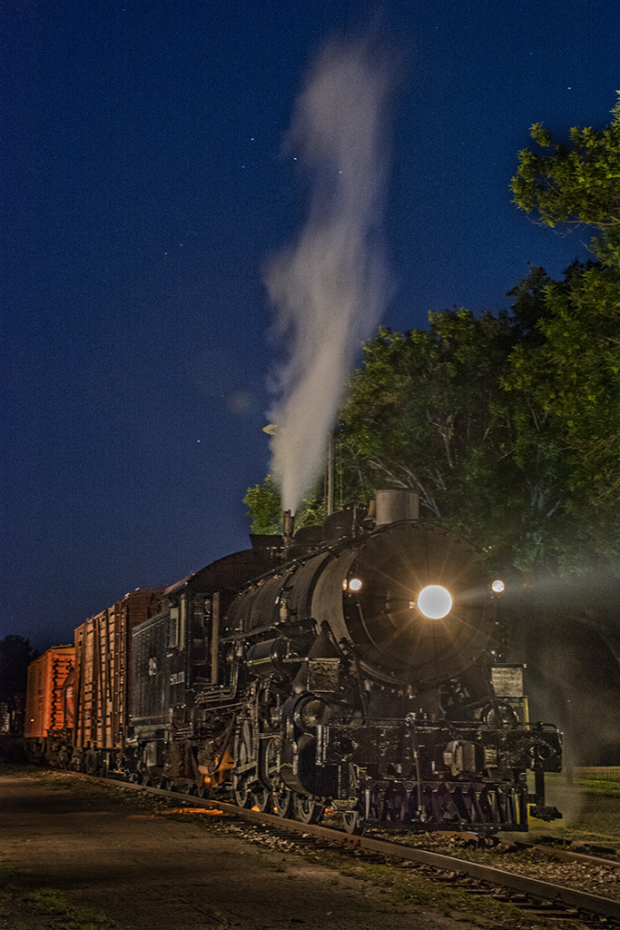
| 30 |
Jun 25 |
Reply |
I was talking about the person in the photograph holding a twin lens reflex camera. |
Jun 5th |
| 30 |
Jun 25 |
Comment |
An interesting idea, but I don't think that you could hold and shoot a twin lens reflex like that. |
Jun 4th |
1 comment - 1 reply for Group 30
|
| 32 |
Jun 25 |
Reply |
I can see some improvement, thanks. |
Jun 30th |
| 32 |
Jun 25 |
Reply |
The selections in Photoshop are much improved, so can catch a lot of the smaller branches. |
Jun 30th |
| 32 |
Jun 25 |
Reply |
Driving down country roads mostly. |
Jun 30th |
| 32 |
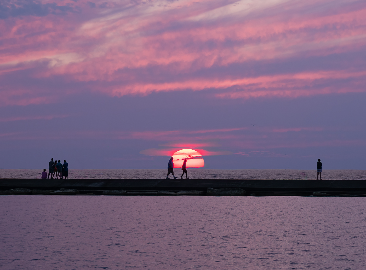
Jun 25 |
Comment |
You have a nice silhouette. The arms of the forth person do add interest to the image. It was a good idea to center them. I am not sure that mono was the way to go, because the sunset is nice, but a bit over saturated. |
Jun 18th |
| 32 |
Jun 25 |
Comment |
Enjoy your trip to Turkey, and stay safe with all that is now going on in the Middle East. It is a very unusual and beautiful faucet. You can see the water if you look for it. You did a good job of converting to mono, but I prefer the color as the color of the faucet is very nice. |
Jun 14th |
| 32 |
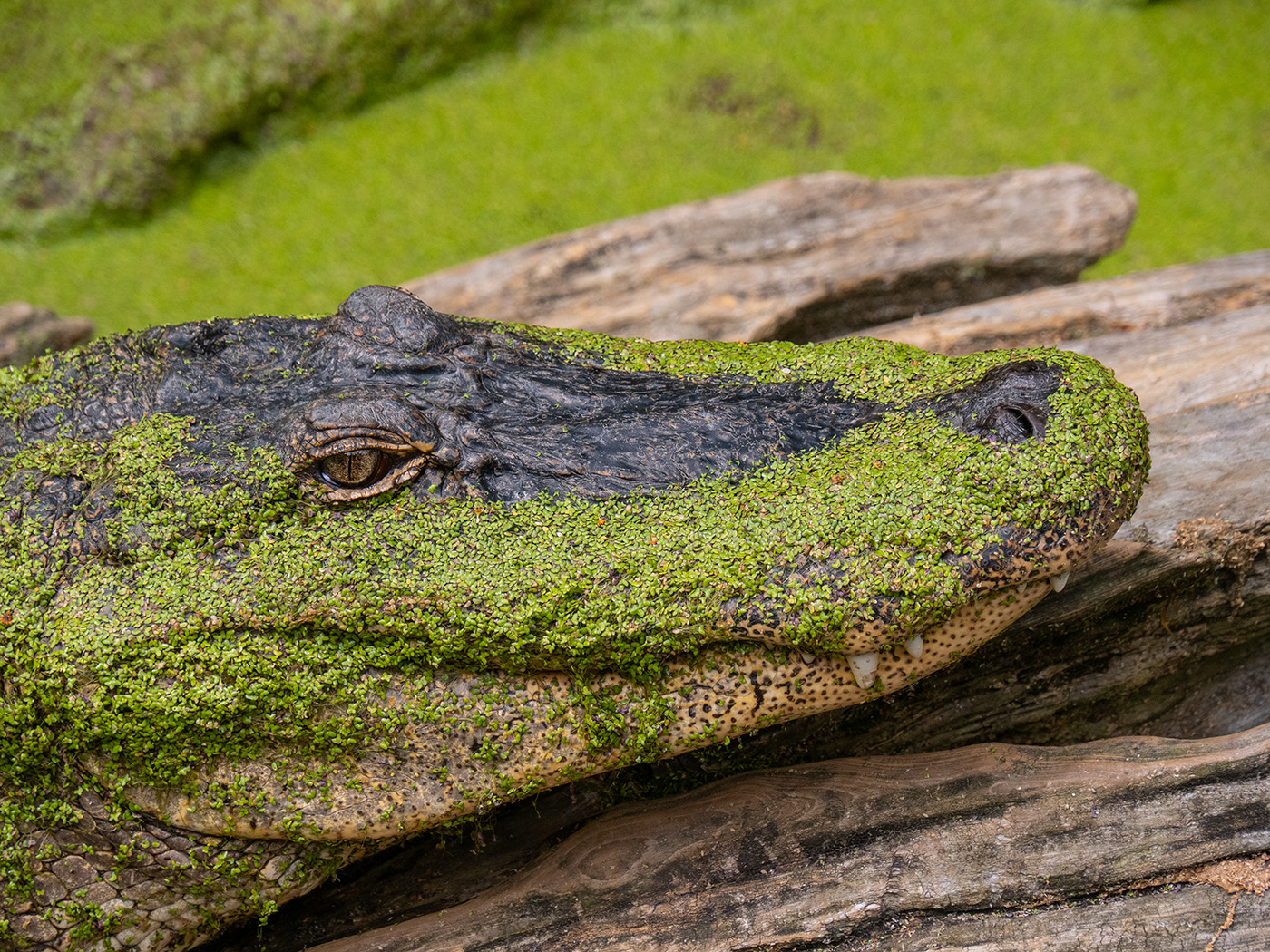
Jun 25 |
Comment |
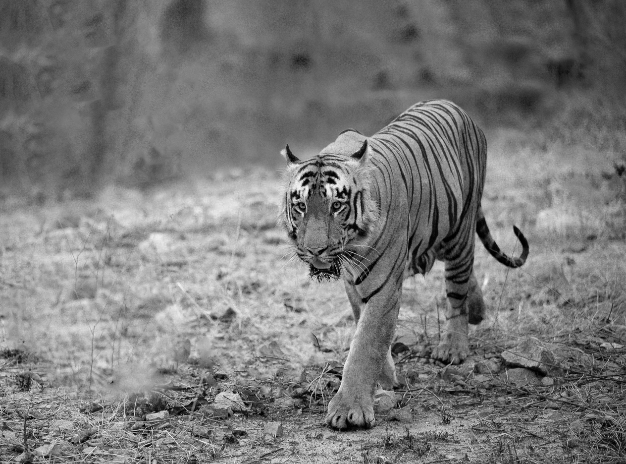
You captured a beautiful tiger coming toward you and looking at you. The tiger is very sharp and you have good depth of field. Too bad about the bricks in the background, but to me, the colors are kind of distracting anyway. I used Diana's suggestion and cloned some of the foliage lower into the image. |
Jun 14th |
 |
| 32 |
Jun 25 |
Comment |
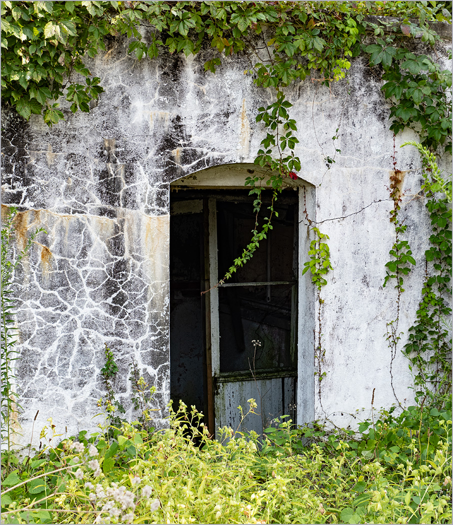
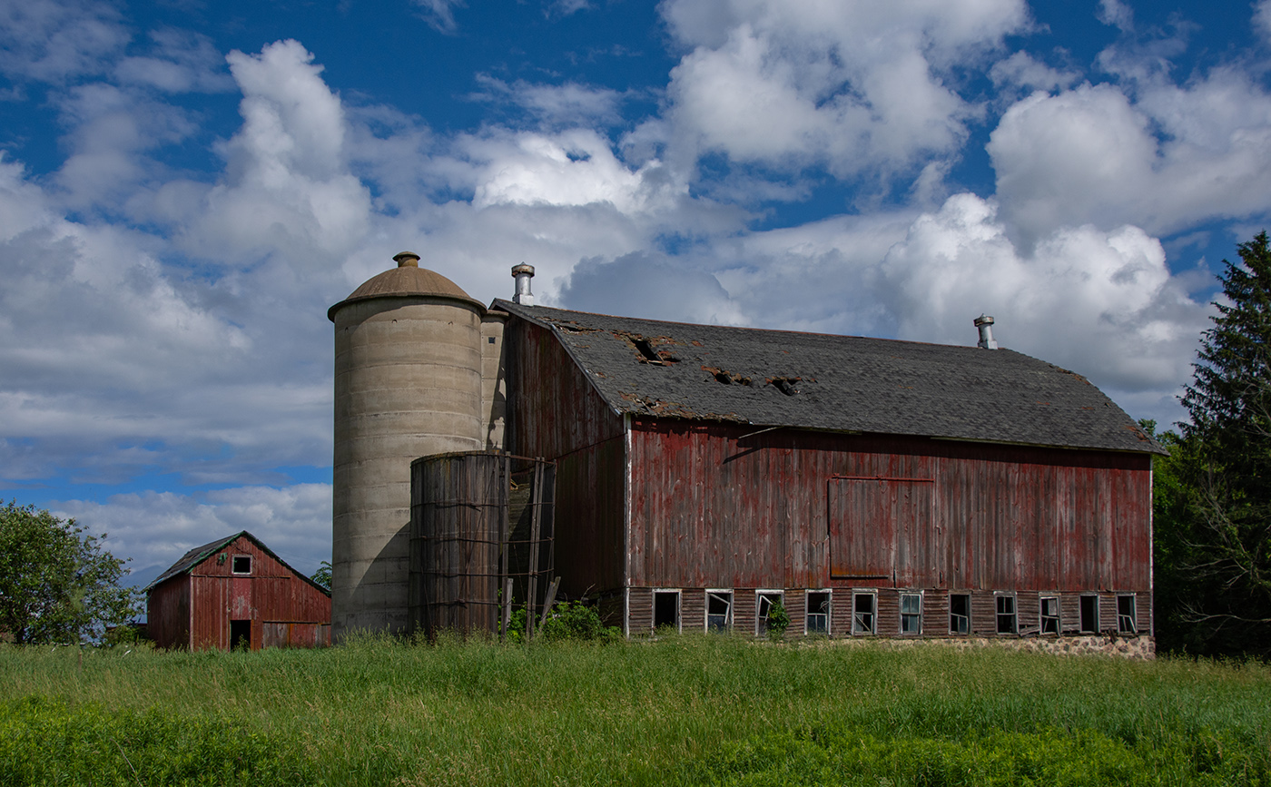
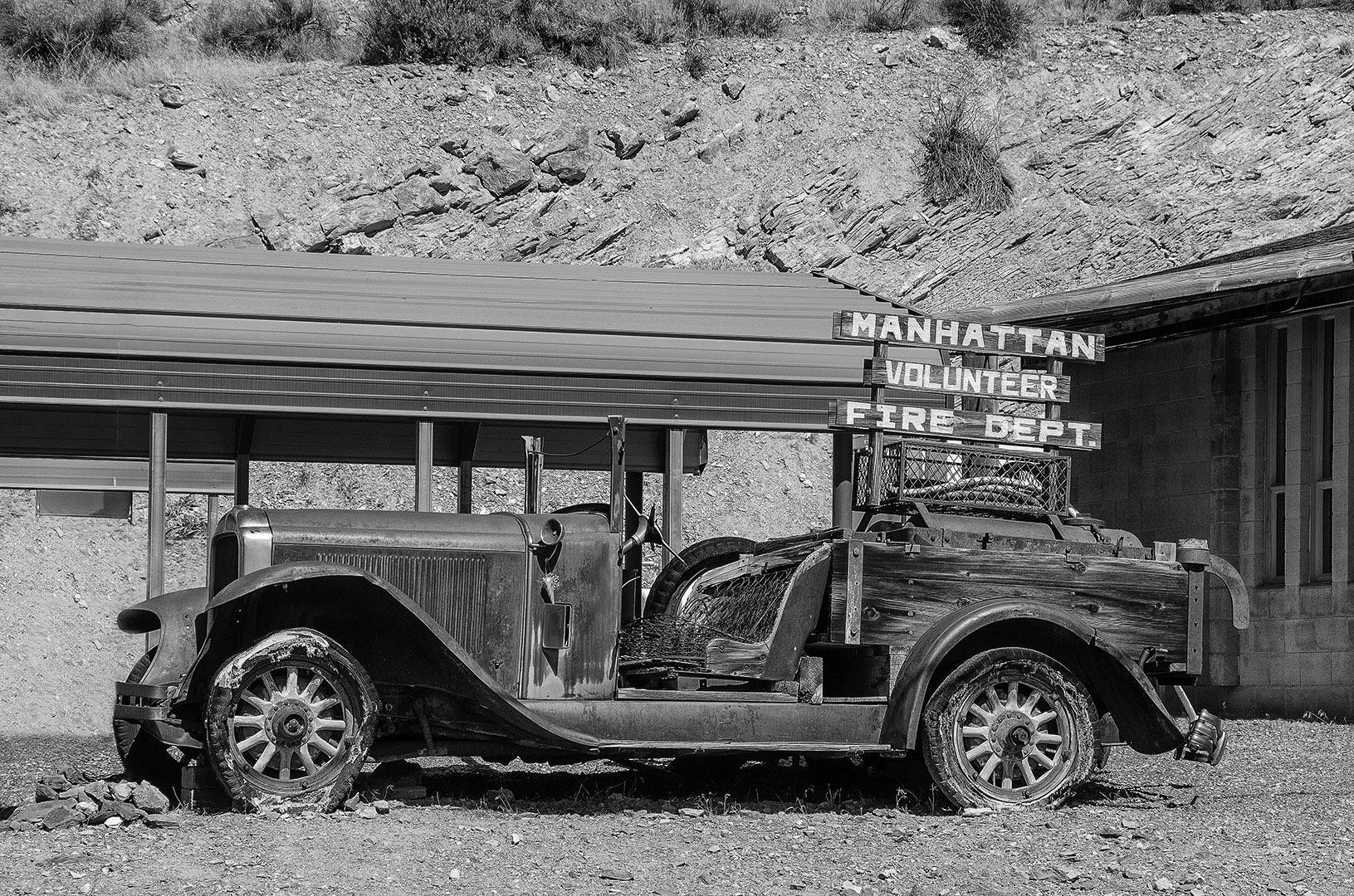
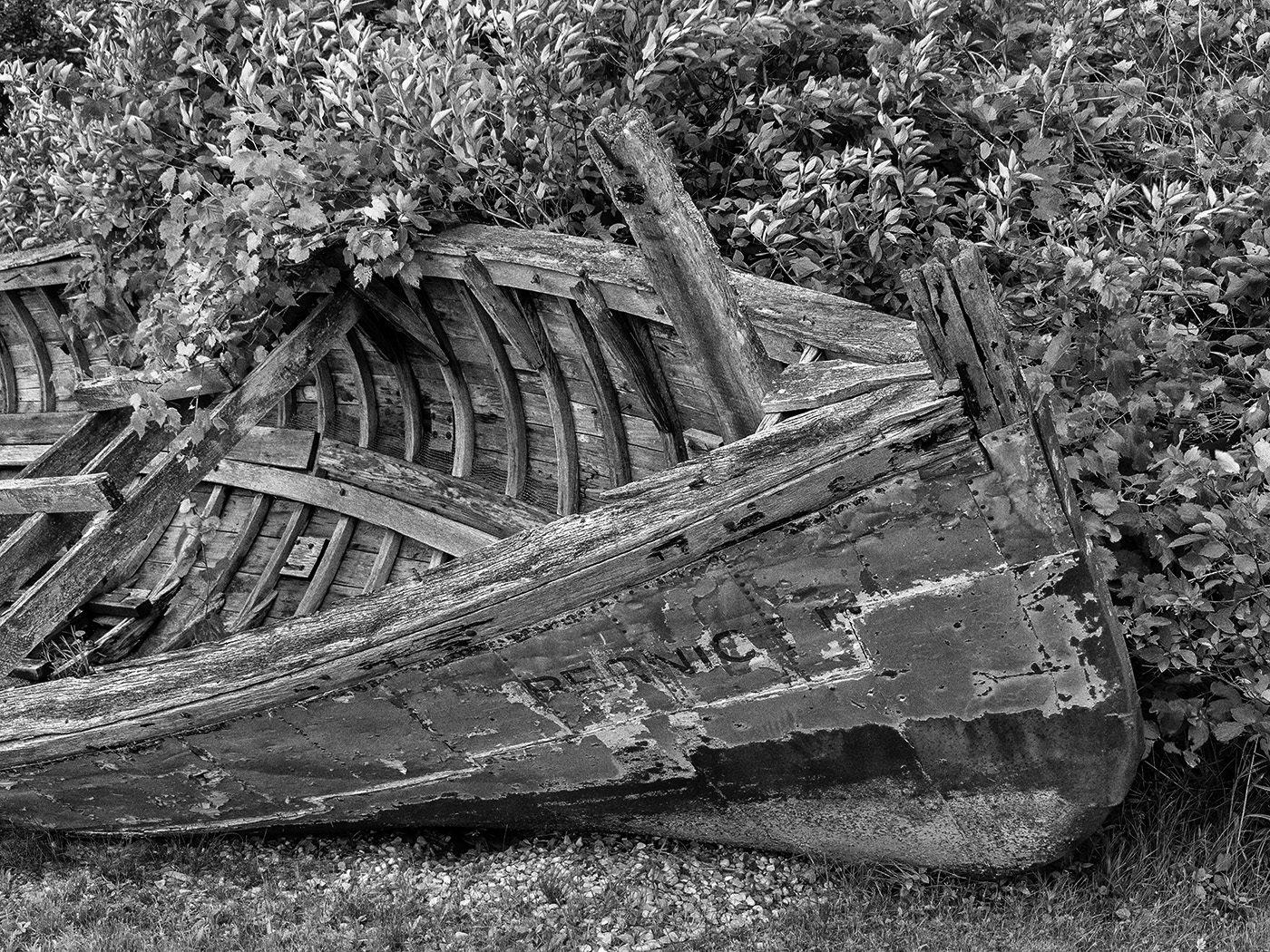
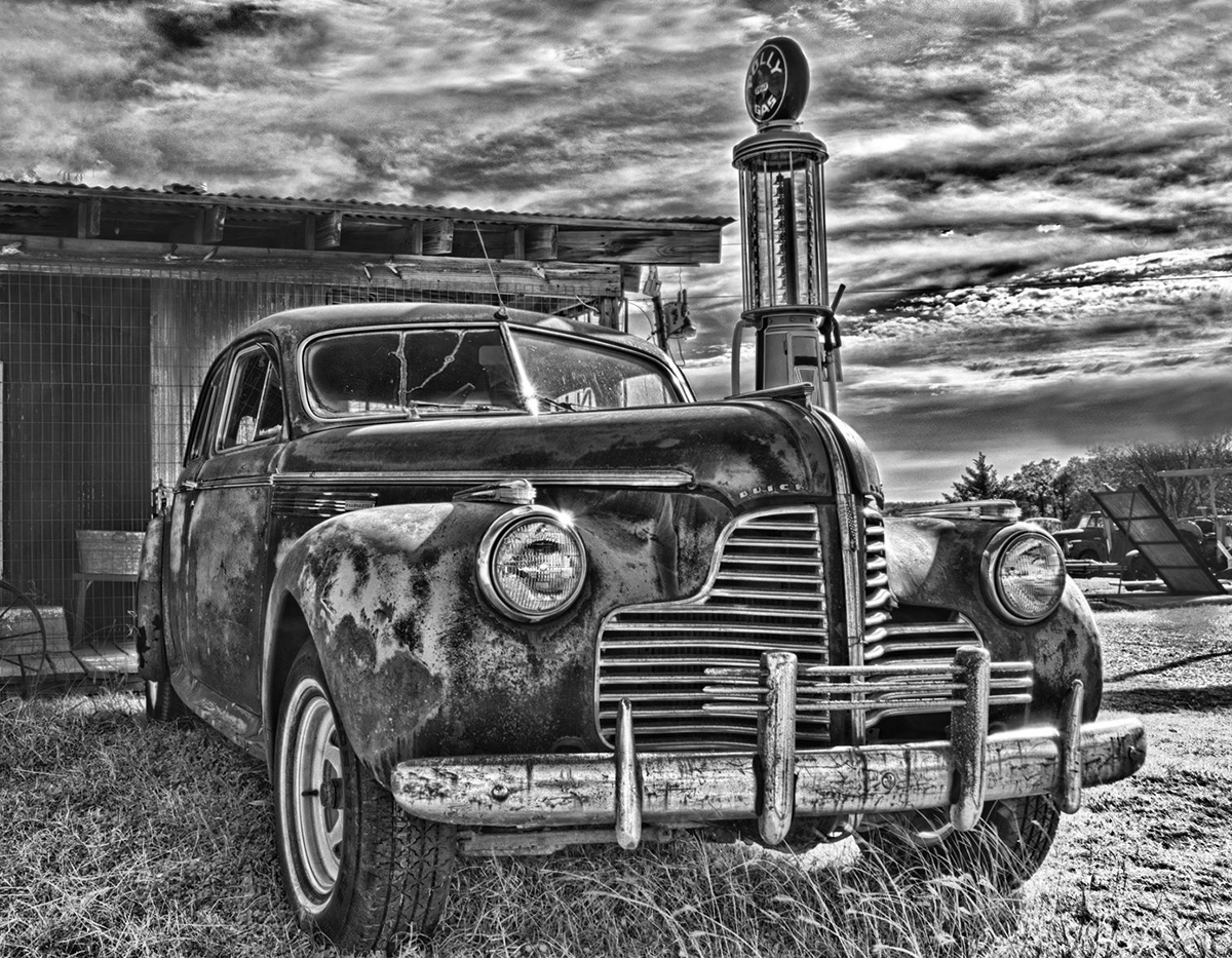
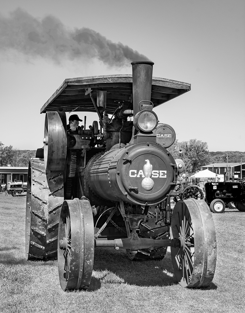
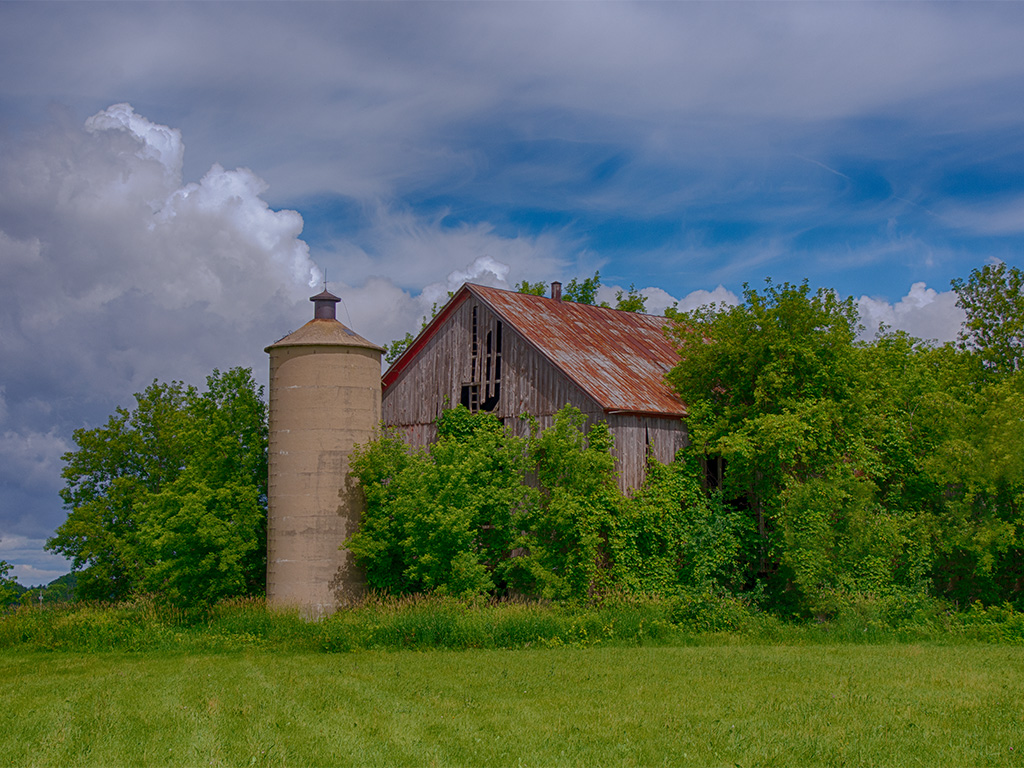
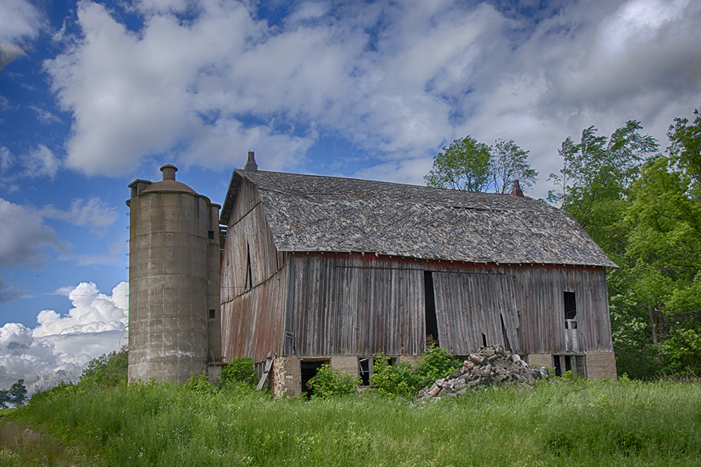
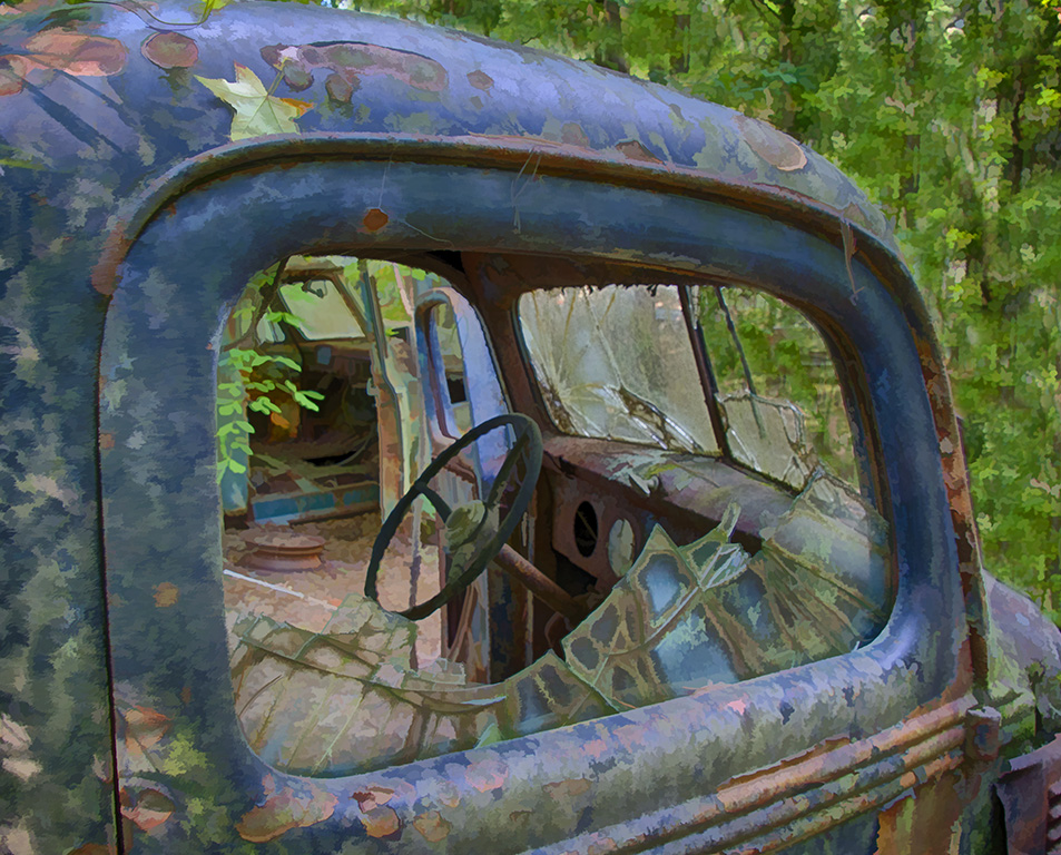
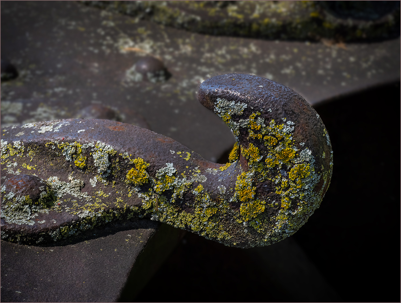
You did a really great job of getting rid of the stop sign. I like that you cropped some off the top. I don't know about the truck in the image. It seems to create two images, the truck and the silo above. The building looks abandoned with all of the glass broken out of many of the windows. I also like all the rust. I cropped off the truck and used NIK color Efex and the "Vintage" preset to bring out more of the rust. |
Jun 14th |
 |
| 32 |
Jun 25 |
Comment |
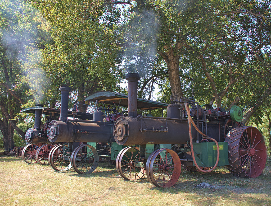
You did a really nice job of combining the two images, and the building with the steam roller was an excellent choice. The color is nice but I like the mono much better, because of the subject matter. Also, the goggles on the hat in color are to me a distraction. I would not worry about the top of the hat and the roof line. The roof line is much longer and so looks totally separate. Maybe whiten his teeth? |
Jun 14th |
| 32 |
Jun 25 |
Reply |
I am sure that it would, but foliage would still be light. |
Jun 8th |
5 comments - 4 replies for Group 32
|
| 57 |
Jun 25 |
Reply |
Thanks, the flowers should be whiter, but I like what Cindy did better. |
Jun 30th |
| 57 |
Jun 25 |
Reply |
Thanks. |
Jun 28th |
| 57 |
Jun 25 |
Comment |
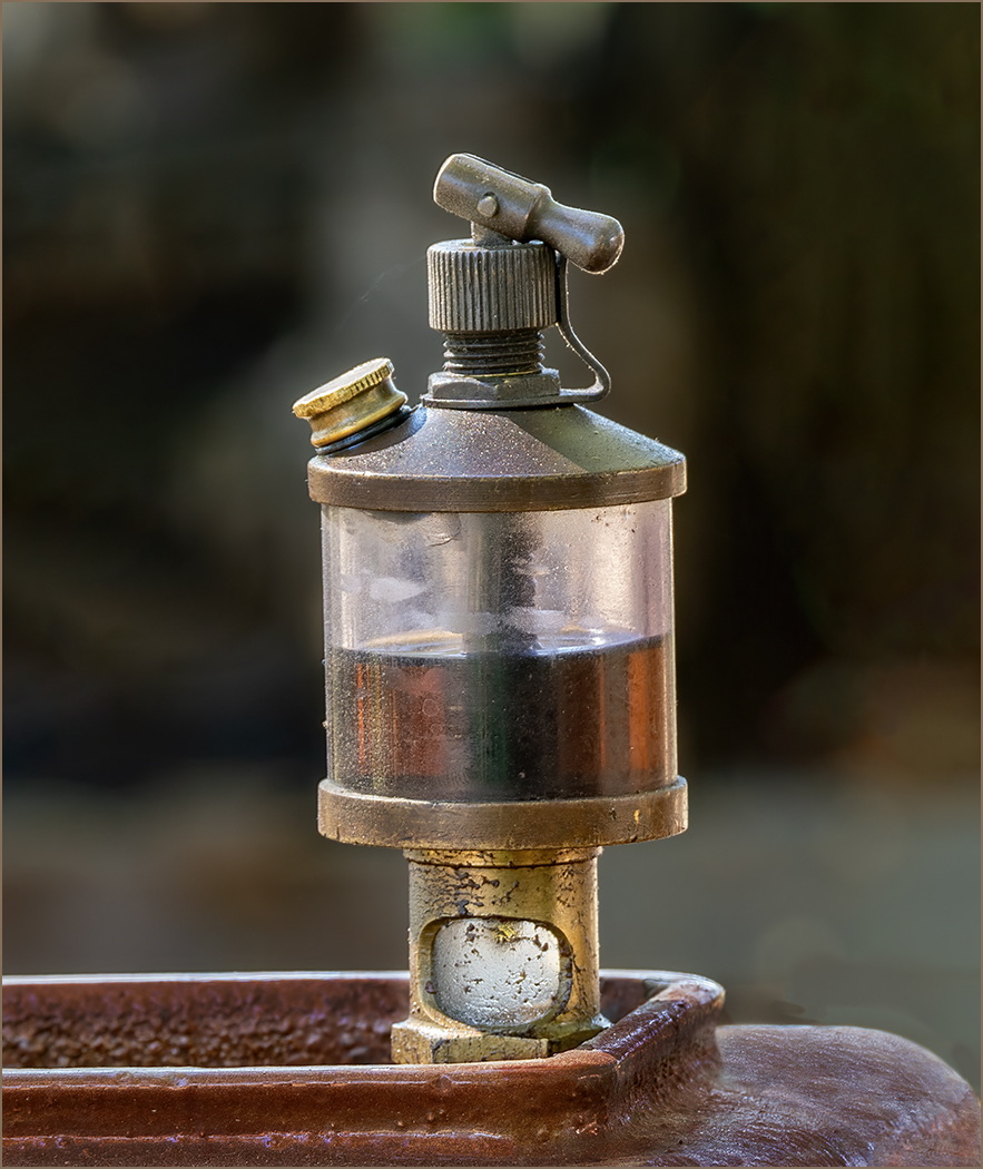
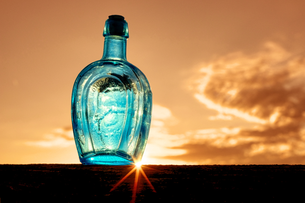
I really like the idea of the bottle with a sunburst in the perfect location. The bottle is nice and sharp and well lighted. I decided to play with the image, and made the sky orange like the bottle was against a sunset with the sun low in the sky. |
Jun 20th |
 |
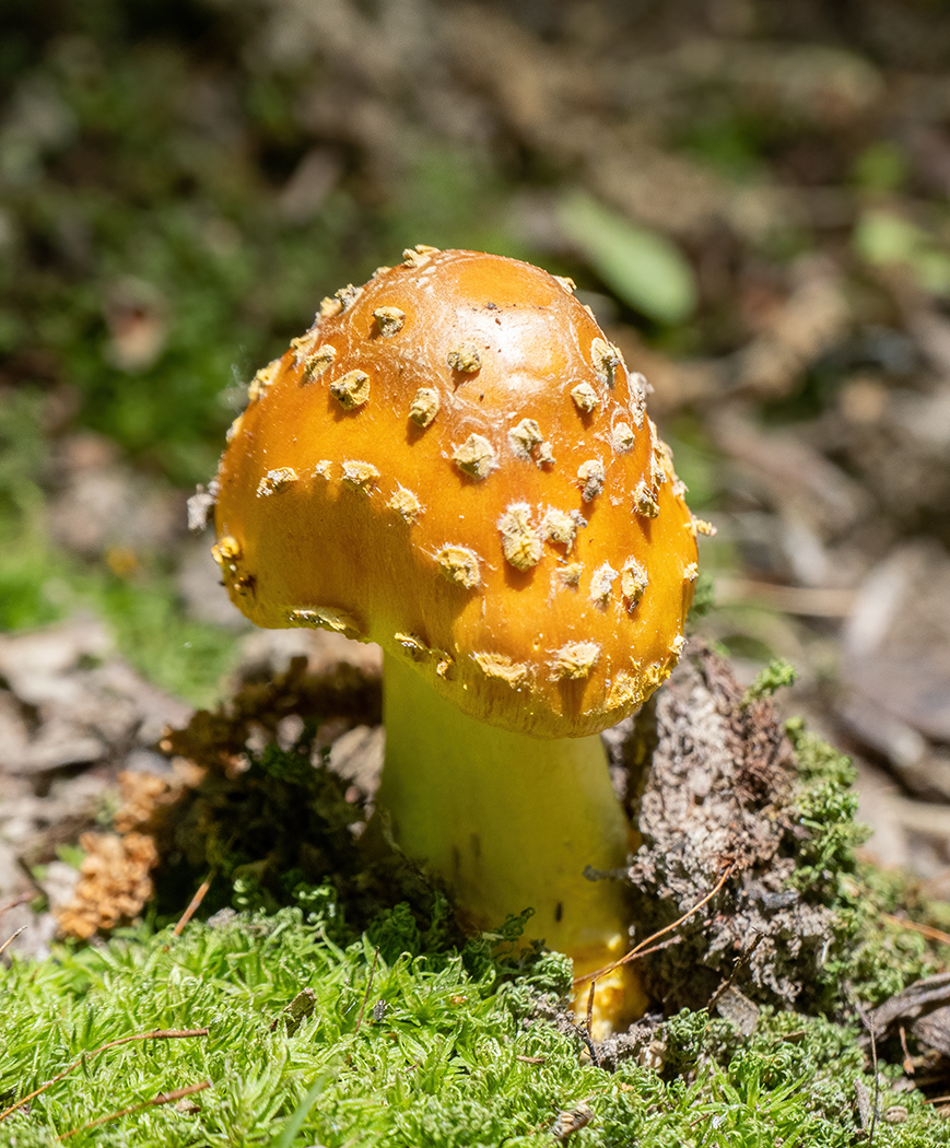
| 57 |
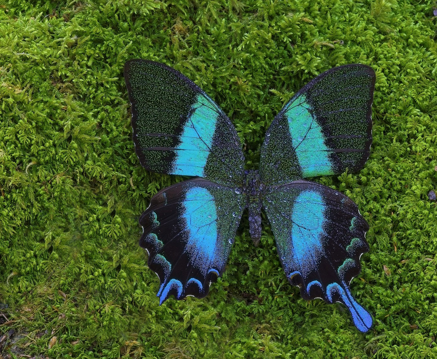
Jun 25 |
Comment |
The image is very sharp. I really like the butterfly against the moss. The tight cropping is good. I used the clone tool to get rid of the distracting areas with no moss (after first selecting the butterfly and reversing the selection to make it easy to not include the butterfly). I did not tone down the green as Cindy suggested because I like the contrast between it and the butterfly. |
Jun 20th |
 |
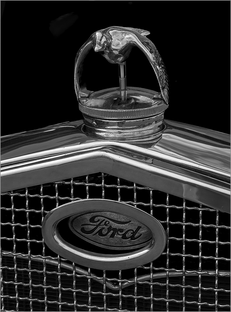
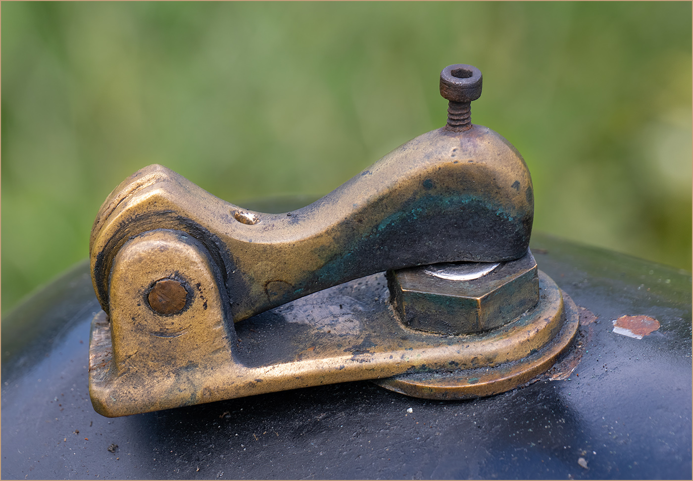
| 57 |
Jun 25 |
Comment |
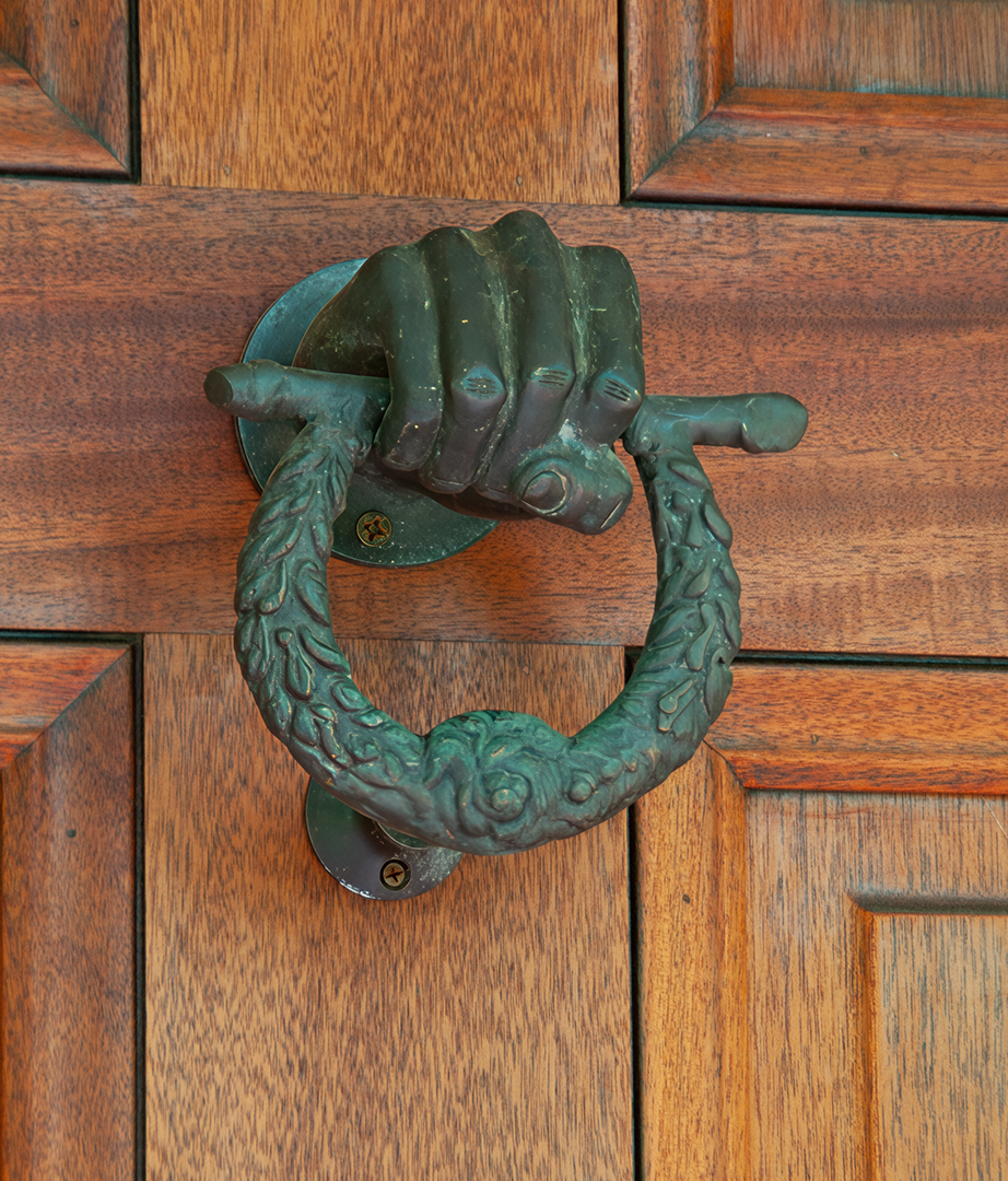
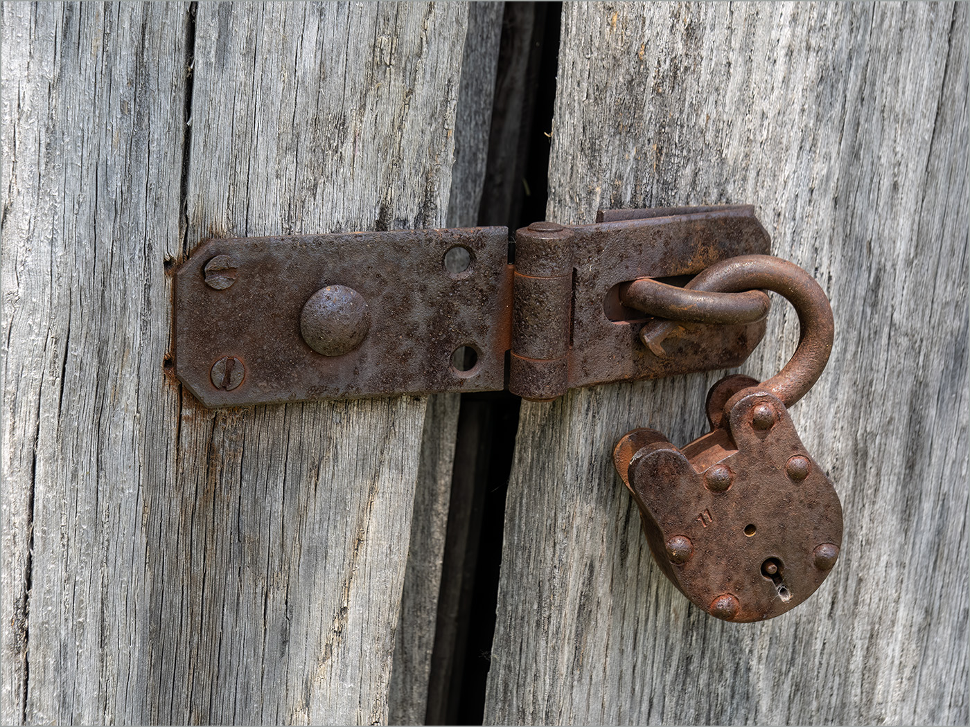
This is a subject that I like. A really striking image with chrome against the bright red. I like the composition with the handle at an angle. The lighting must have been very good, to not have any noticeable shadows. I would not change a thing. |
Jun 20th |
| 57 |
Jun 25 |
Comment |
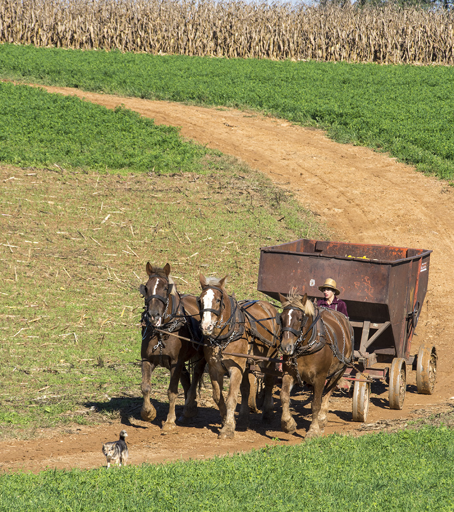
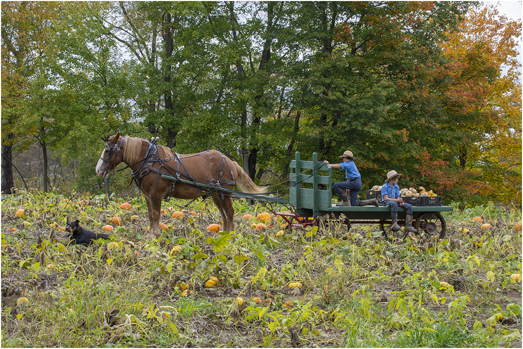
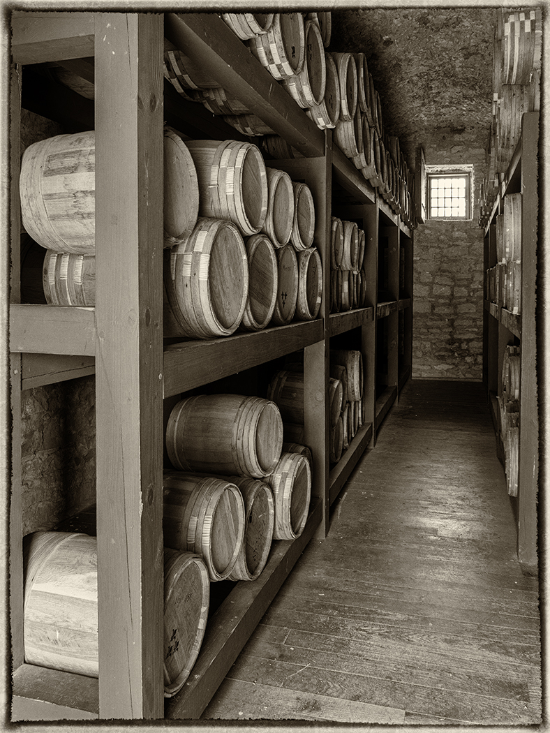
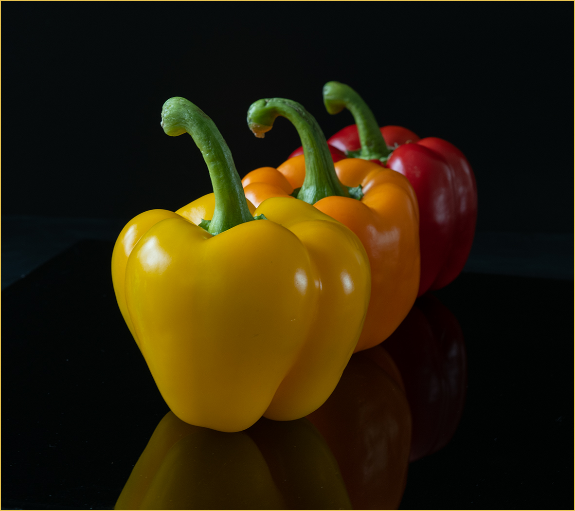
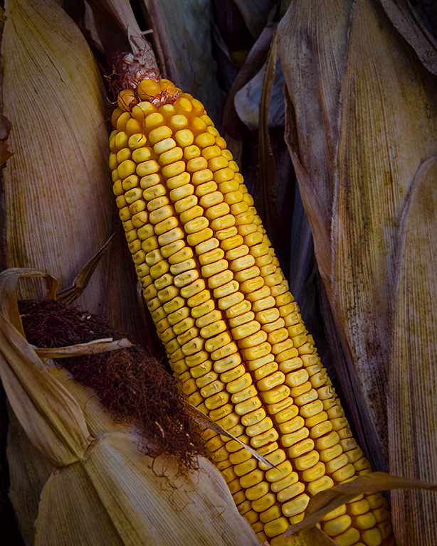
You saw and captured an image of fall harvest. I like the simplicity that also tells a story. I did use camera raw to add a bit more saturation and also the shadow slider to bring out more detail to the silk in the lower left (I used a mask to only lighten that area). |
Jun 18th |
 |
| 57 |
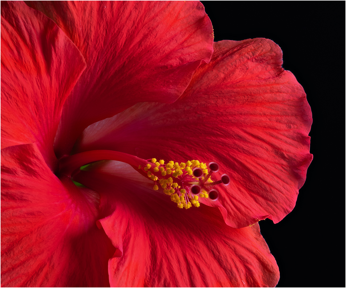
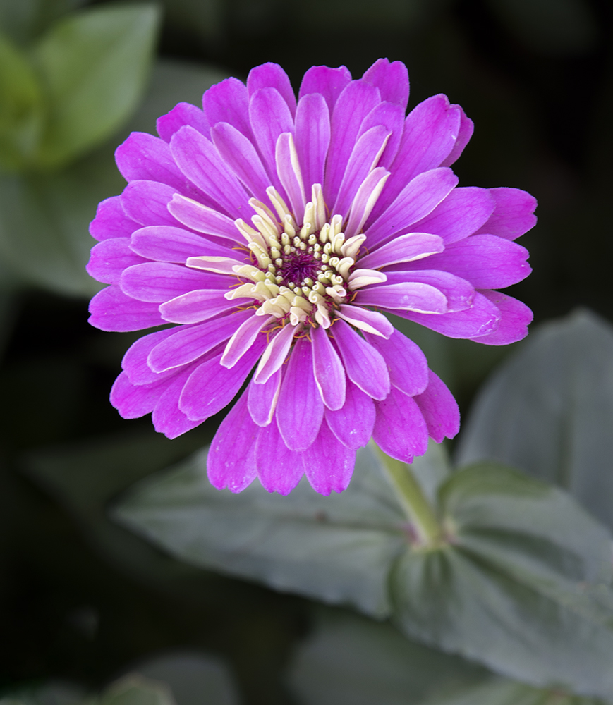
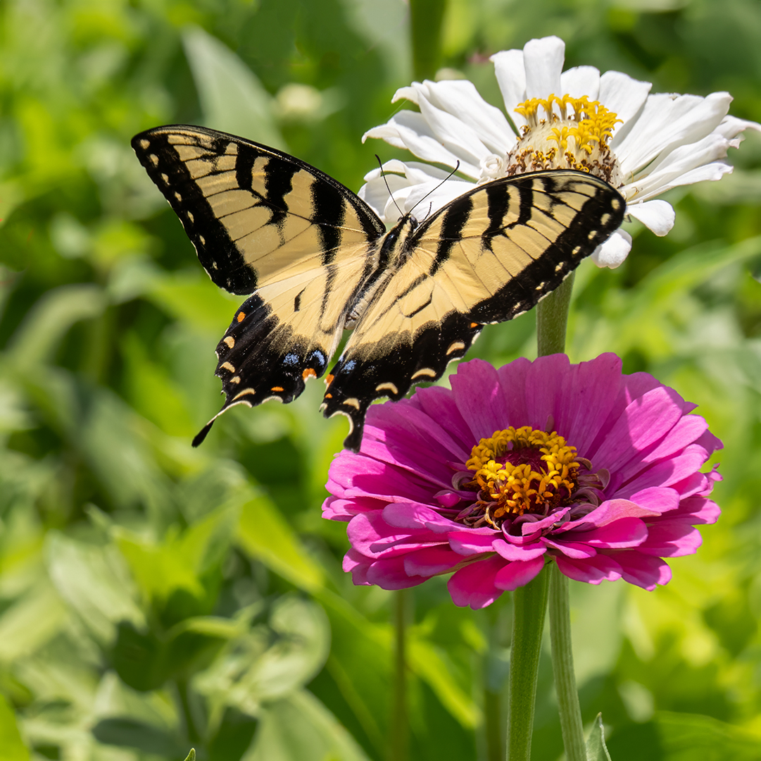
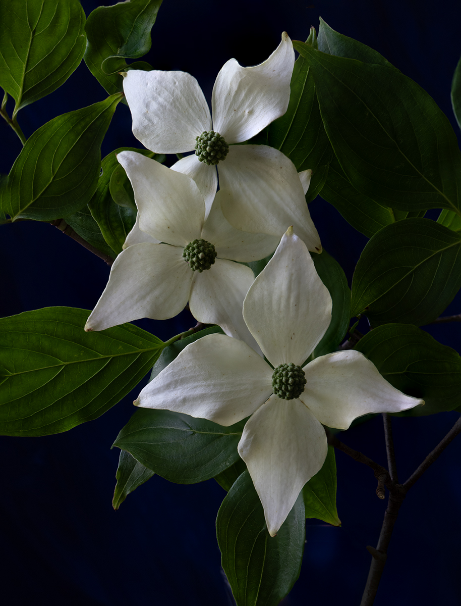
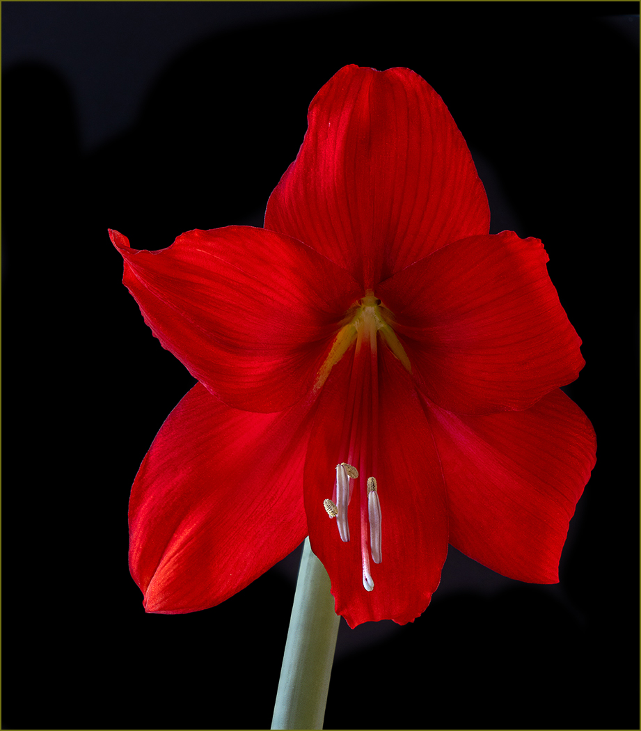
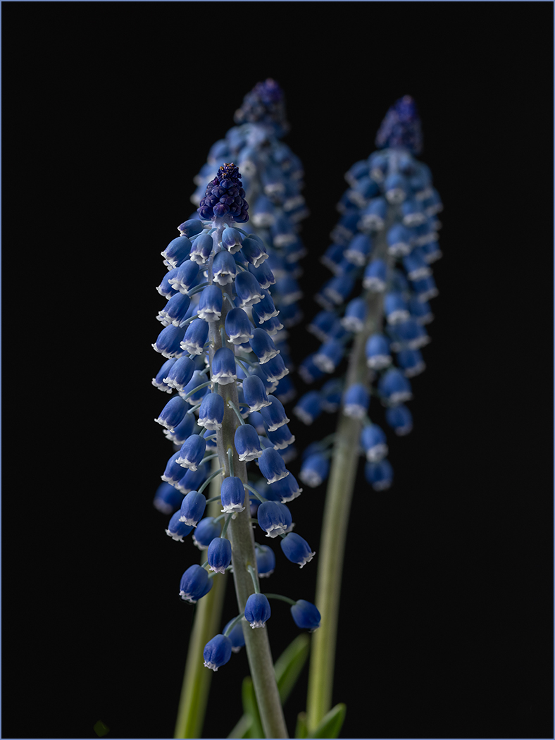
Jun 25 |
Comment |
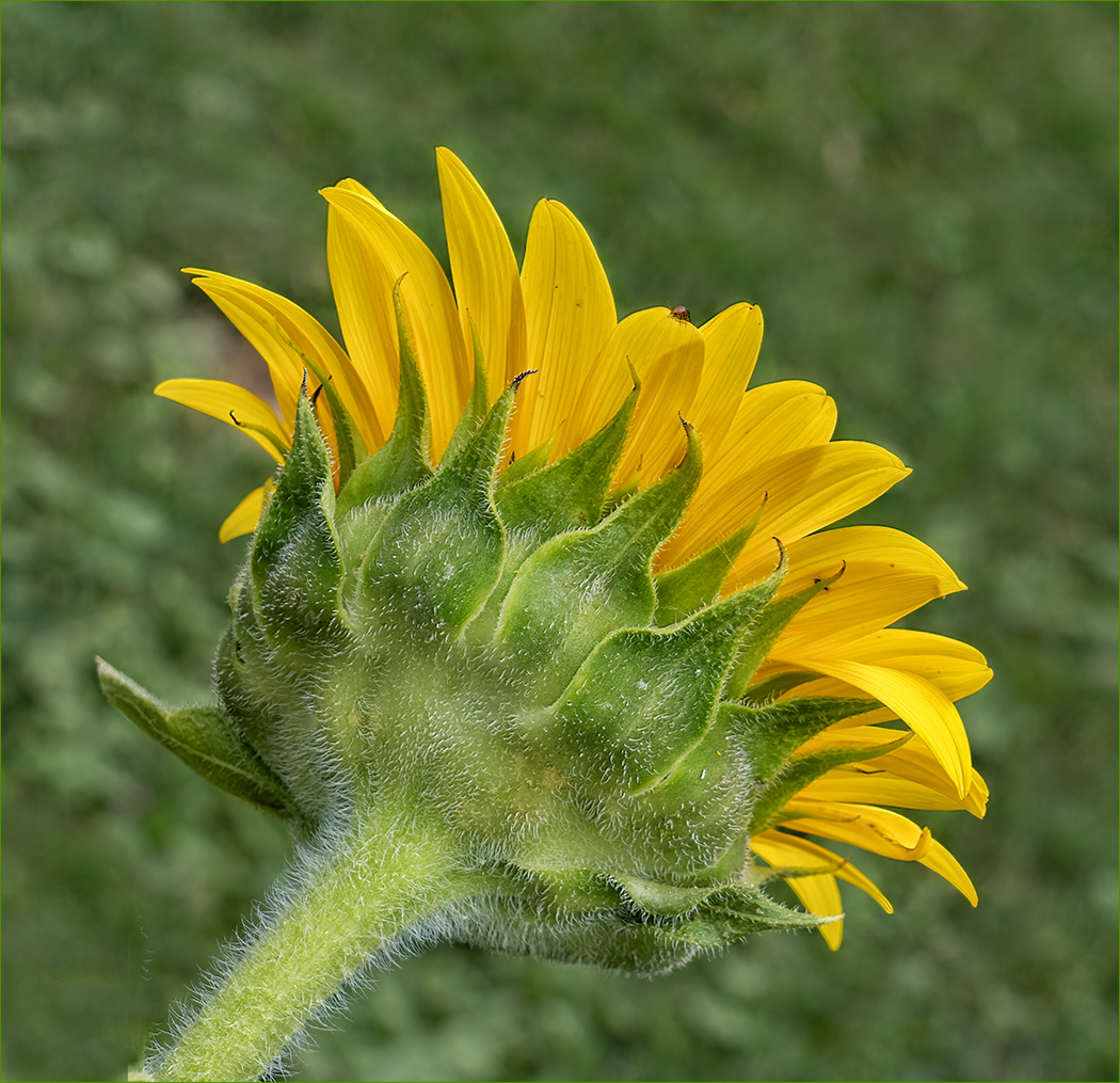
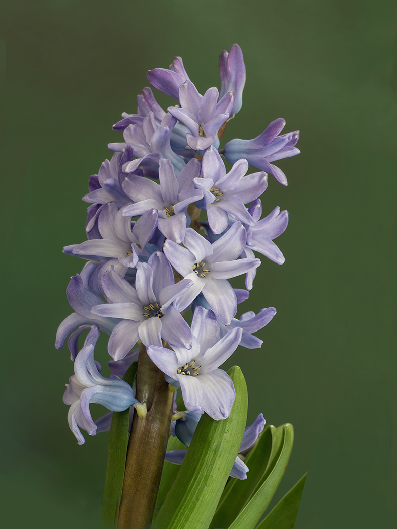
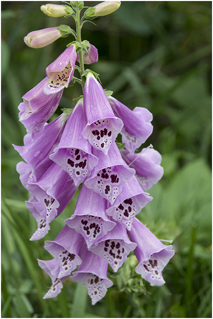
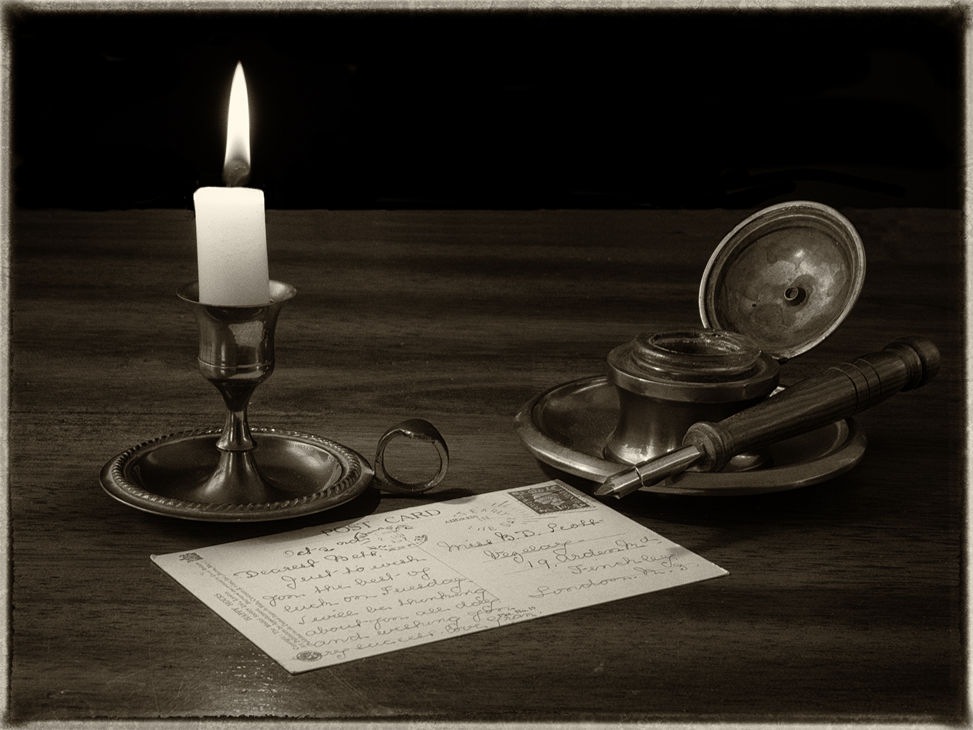
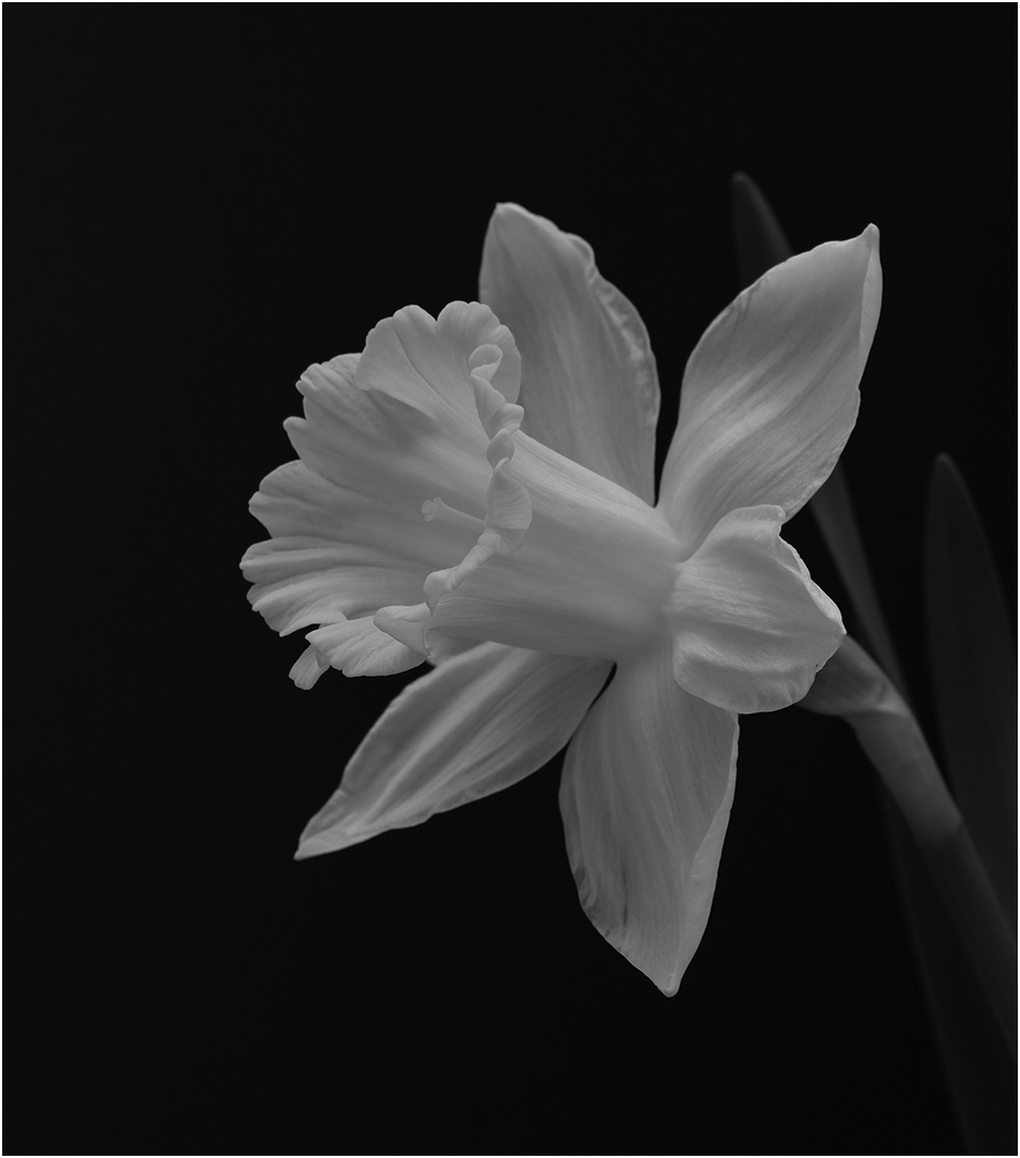
Great colors for this image of an interesting flower. The vivid center colors are contrasted nicely with the pale colors of the petals. I like the sharpness, depth of field and the dark background. I am glad that you have all of the center parts even though they do get close to the bottom. Well done and a great farmer's market find. |
Jun 18th |
| 57 |
Jun 25 |
Reply |
Yes, thank you, they are white and need to be lighter. |
Jun 12th |
5 comments - 3 replies for Group 57
|
| 73 |
Jun 25 |
Reply |
It really improves the image. When I first saw it I thought that it should be reversed, but doing that and your crop are great. |
Jun 28th |
| 73 |
Jun 25 |
Comment |
Beautiful sunrise image. Sorry to hear that the area was badly damaged. |
Jun 28th |
1 comment - 1 reply for Group 73
|
18 comments - 14 replies Total
|