|
| Group |
Round |
C/R |
Comment |
Date |
Image |
| 7 |
May 25 |
Reply |
Thanks for the comments. Please see my reply to Judith. |
May 25th |
| 7 |
May 25 |
Reply |
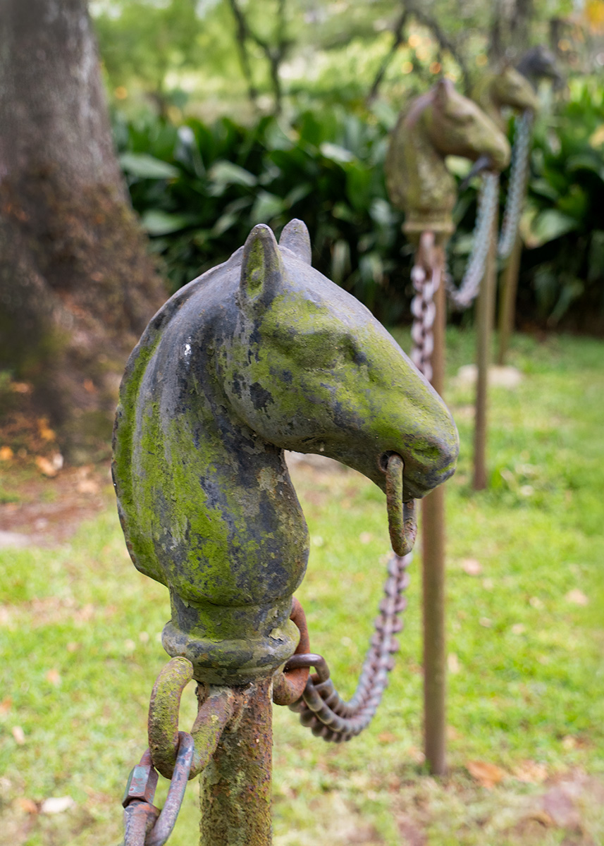
I looked at my photos, and do not have from this direction with more separation. However I do have one from the other direction, but not from the end, but part way with fewer horse heads. I have included that image. |
May 25th |
 |
| 7 |
May 25 |
Reply |
It was pretty cloudy that day. My Olympus camera has really good image stabilization. The plantation is on the lower Mississippi river and so is a humid area. |
May 24th |
| 7 |
May 25 |
Reply |
Very good suggestion. They do draw the eye up, and are not needed. Cropping would still allow it to be entered in PJ or photo travel. |
May 19th |
| 7 |
May 25 |
Comment |
I can see why the other group did not like the glare, as it draws the eye to it. I am old enough (80) to remember watching movies and TV shows in B&W. I still watch some of the old B&W TV shows and really like the lighting in them. So, after your comments I did some research on the lighting they used and you are correct about the glare and shadows.
You created what you were wanting to do. This could have been a scene in one of the old shows. The high heals and strong back lighting are very dramatic. The shadows are really part of the image and are a good lead in. I did add some grain using NIK Silver Efex. |
May 10th |
 |
| 7 |
May 25 |
Comment |
What a privilege to be able to attend the event and thanks for sharing it with us as well as the story of the image. You did a really excellent job of capturing this, as the image is sharp, with excellent depth of field and good exposure. It tells an excellent story with the crowd in the background. I like that you have left in the person on the left adding in more fuel. You captured the Theyyam with a good expression with his mouth open. The composition is good with the Theyyam's face in a power point in the upper right. I did use Hue/Saturation to tone down the yellow flames some and make them slightly more orange. I also removed the whitish areas in the upper right as they drew my eye, but that maybe a mistake if they are part of the ritual.
I think that you have an excellent image that is a metal winner in PJ or Travel, and maybe pictorial. |
May 10th |
 |
| 7 |
May 25 |
Comment |
You have another excellent still life. The bright flowers against a black background and the muted vase alone would be a great image. But you went beyond that by adding a wilting flower at the bottom to elevate the image. I am glad that you added a very thin boarder to separate the image from the black webpage. |
May 10th |
| 7 |
May 25 |
Comment |
The focus and depth of field are very good. The rabbit is sharp and the background in nicely blurred. The lighting is very good, with a bonus of a catch light in the eye. The composition and crop is good, with plenty of room for it to move into. It looks like it is really to hop away if you get any closer. Well done. |
May 10th |
| 7 |
May 25 |
Comment |
You captured the bird in an unusual pose, and with the feathers fanned out. The image is sharp, and you even have a catch light in the eye. I reversed the image so that the wooden area makes a lead in to the bird. Also, the fanned out feathers make a stopping point to hold the eye in the frame. What do you think? |
May 10th |
 |
| 7 |
May 25 |
Reply |
Thanks, getting rid of the trees helps a lot. |
May 7th |
5 comments - 5 replies for Group 7
|
| 32 |
May 25 |
Reply |
Thanks for sharing the color image. It is really very colorful. The reflections are great. |
May 28th |
| 32 |
May 25 |
Reply |
Thanks, the patina is nice. |
May 28th |
| 32 |
May 25 |
Comment |
I like your crop. Good job of getting the sawdust flying. You also did a nice job of converting to mono. |
May 12th |
| 32 |
May 25 |
Reply |
It is an improvement. Diana went way too far. |
May 12th |
| 32 |
May 25 |
Comment |
Not having seen how colorful it is, I am not missing the colors. And sometimes too much color can distract from the details of an image. The image is too flat. I increased the contrast significantly. Doing anything with the sky would have it's problems, even sky replacement because of the sky in the reflection. So, I just cropped off some of the sky, to make it smaller in the image. |
May 11th |
 |
| 32 |
May 25 |
Comment |
I like the composition with the opening in the wall area in the foreground leading us to the houses. Going with monochrome did away with the distraction of the bright colors and made the emphasis on the texture of the rocks. But, the sky is the problem as pointed out by Ed and Diana. I have been told that if you have a bad sky, to crop it off, so that is what I would suggest. Crop off to just above the hill area on the left. I think that Ed's image is too dark. |
May 7th |
| 32 |
May 25 |
Reply |
Thanks, I like the patina also. Some months I look for an image that would look good as mono, and make it mono really only for the group. I also tried to adjust the color to increase saturation and contrast and darkened the background. |
May 7th |
 |
| 32 |
May 25 |
Comment |
A great image and your crop is very good. The monochrome is much better than the color because the bright colors distract from the woman. I also like that you darkened the sides, but think that you have too much contrast in the woman's face. |
May 7th |
| 32 |
May 25 |
Comment |
An interesting image, and going to mono was a good choice. I like the crop. I do agree with Stephen that you should darken the stone on the right, but understand that may be difficult has it has a lot of white in it. |
May 7th |
| 32 |
May 25 |
Comment |
I like the image, and it is a good use of monochrome. I had no idea that Lightroom can do so much -- I just use it to review images and make minor adjustments to RAW images. I need to look into using it more. I do like what Ed did with the image, it has plenty of room for the cheetah to look into. |
May 7th |
6 comments - 4 replies for Group 32
|
| 57 |
May 25 |
Comment |
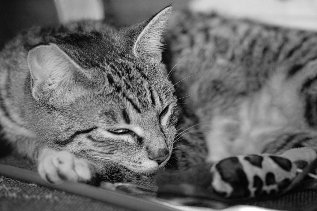
Good depth of field to have the face and eye sharp and the rest nicely blurred. You caught the eye a bit open which adds to the image. I think that the color of the toy is distracting. The cat is mostly monochrome, so I converted the image to mono. |
May 23rd |
 |
| 57 |
May 25 |
Comment |
Excellent depth of field with a very good background and the butterfly and flower very sharp. The subject is centered, but that works well for this image. The contrasting colors of the flower and background add a lot of impact. I would not change a thing. |
May 23rd |
| 57 |
May 25 |
Comment |
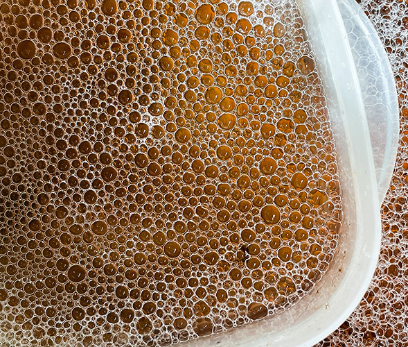
I am glad to know that I am not the only person not to have a dishwasher. I agree that the various sizes of the bubbles and the different shades of brown are interesting. The plastic dish really adds to the image. I think that it would be a better image if you rotated it so the the dish becomes sort of a stopping point. I did that, and also cropped off a bit of the now right side. |
May 23rd |
 |
3 comments - 0 replies for Group 57
|
14 comments - 9 replies Total
|