|
| Group |
Round |
C/R |
Comment |
Date |
Image |
| 7 |
Mar 25 |
Reply |
Glad that you liked the idea of the reversal. |
Mar 15th |
| 7 |
Mar 25 |
Comment |
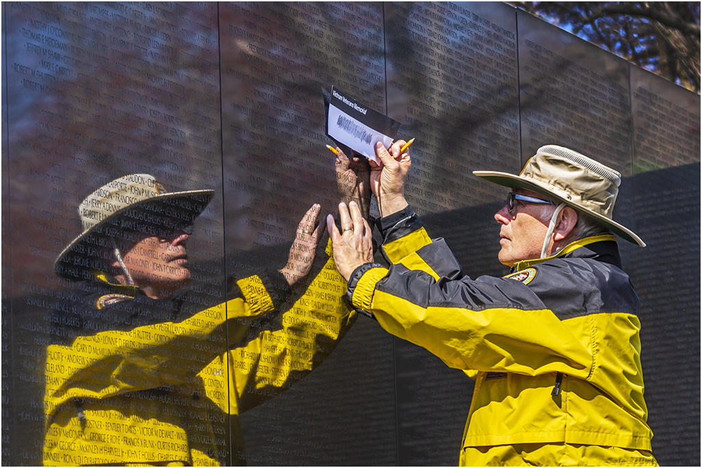
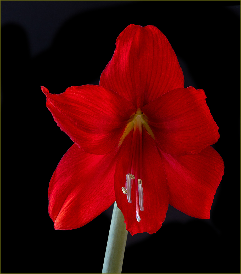
You have a very striking image. You have an attractive woman with an unusual but interesting pose. It is good that the reflection is a bit darker and maybe a bit less sharp, so that it looks like a reflection and not just a mirror image that you created. The lighting is very good, and the black background is very effective. I do think that Stephen has a good point, that maybe the reflection was not needed. |
Mar 15th |
| 7 |
Mar 25 |
Comment |
Next, I moved the sunset area to the left some, by selecting and moving it. I then selected a narrow strip where the original part and the moved part met, and used generative fill to blend the parts together. |
Mar 15th |
 |
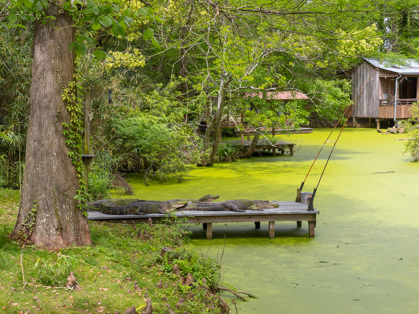
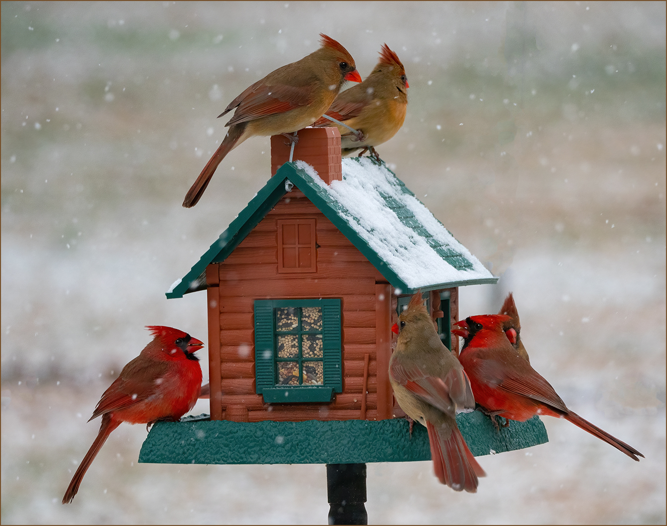
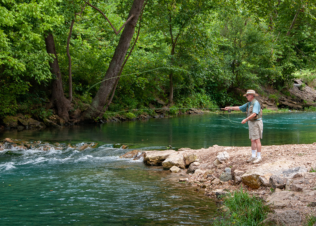
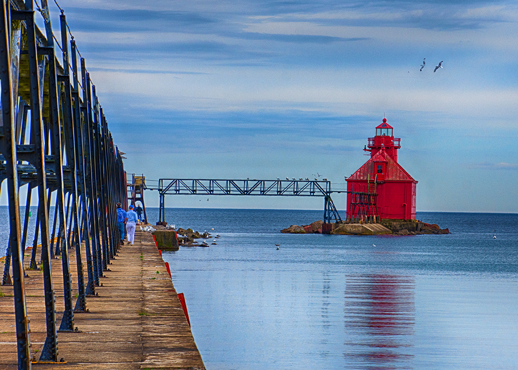
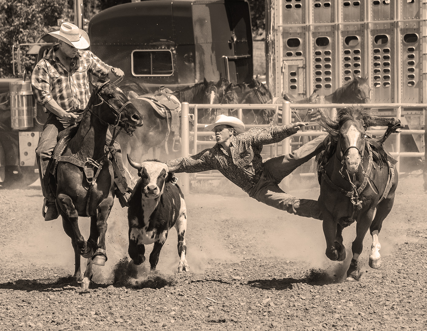
| 7 |
Mar 25 |
Comment |
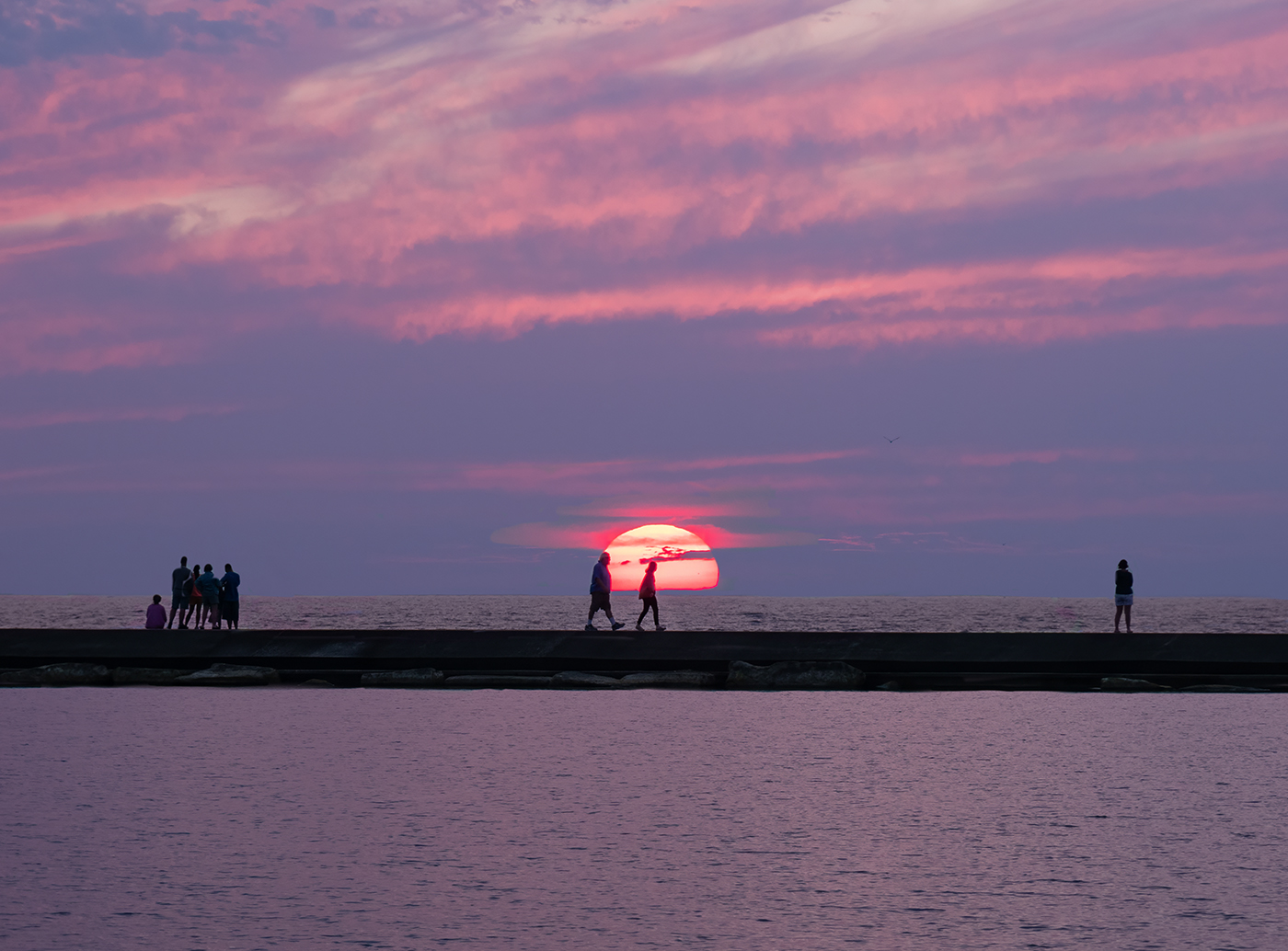
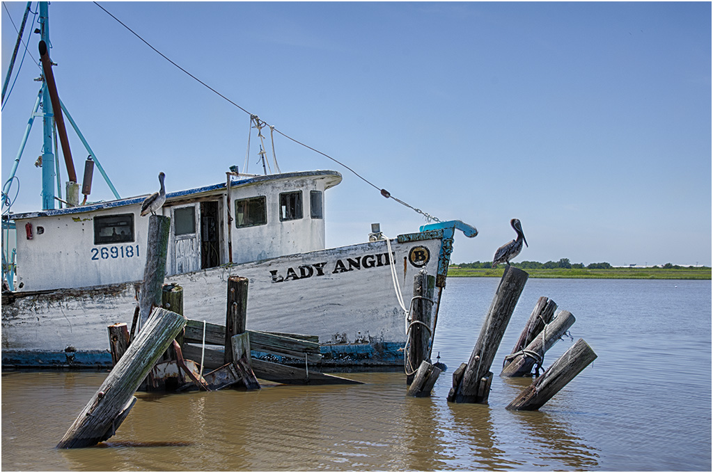
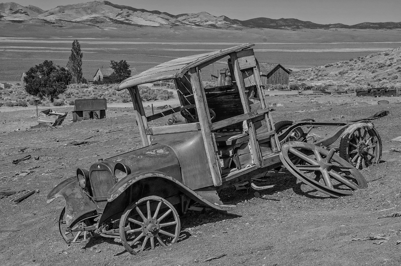
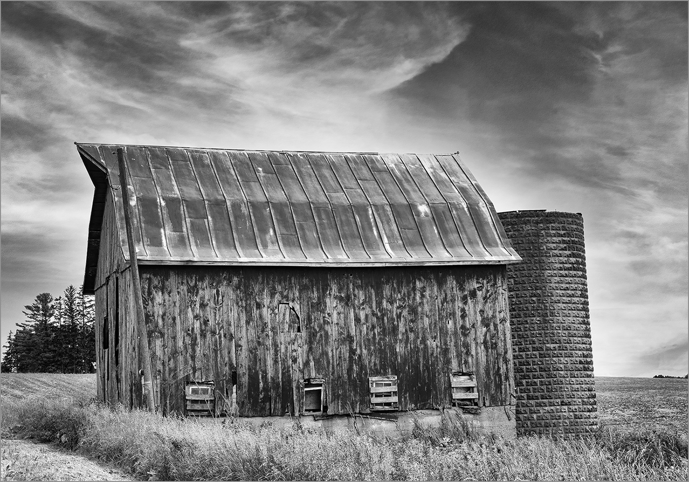
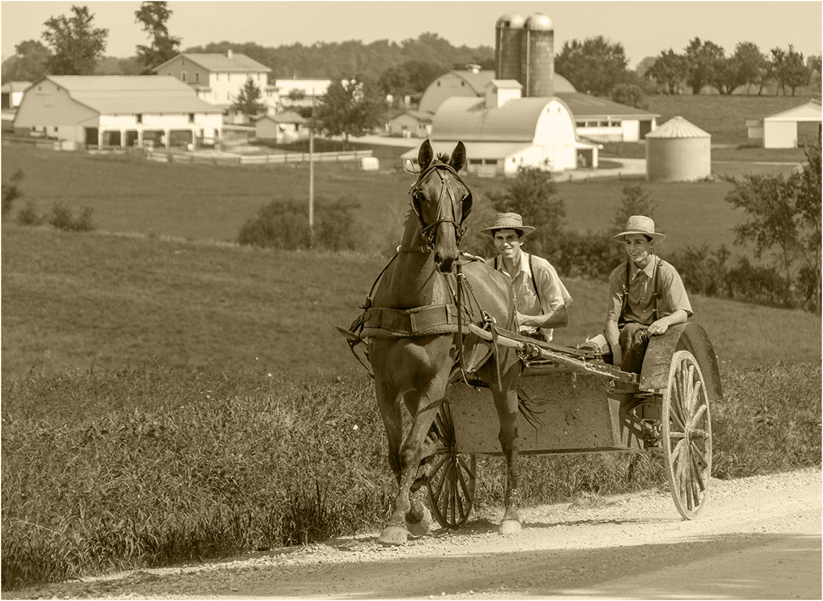
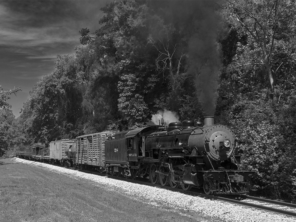
You captured a really great image of this unusual fishing method very well. The time of day and your exposure are right on. I really like that the one fisherman is closer and so appears taller than the rest, making him a great center if interest. I can see what you are saying about the setting sun. It is off to the right, and in some ways seems not a part of the image, but I think that you should leave it as it adds to the image. You have a really great image! But to play with the image, I did remove the stand on the right that appears larger and has no one on it. |
Mar 15th |
 |
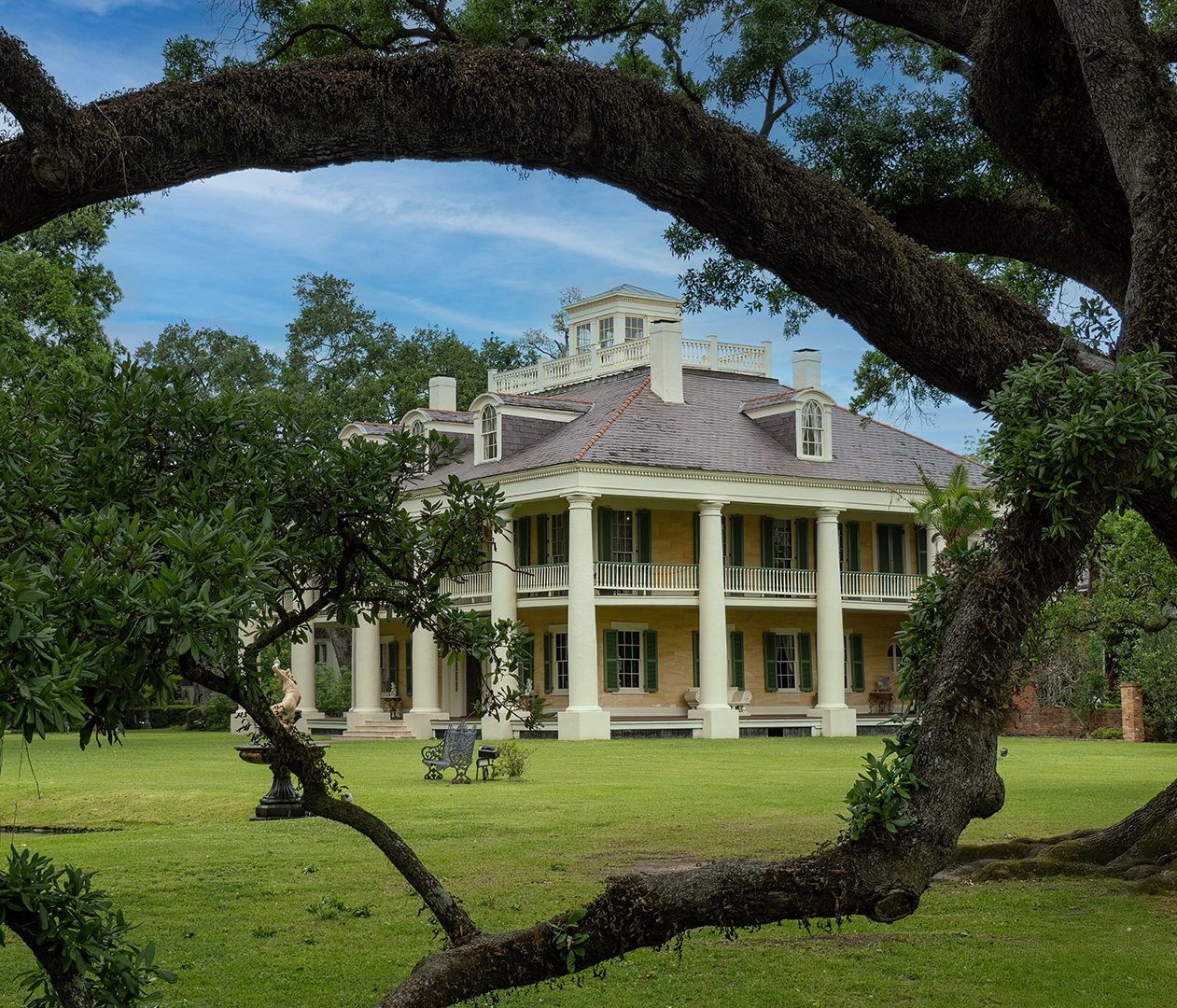
| 7 |
Mar 25 |
Comment |
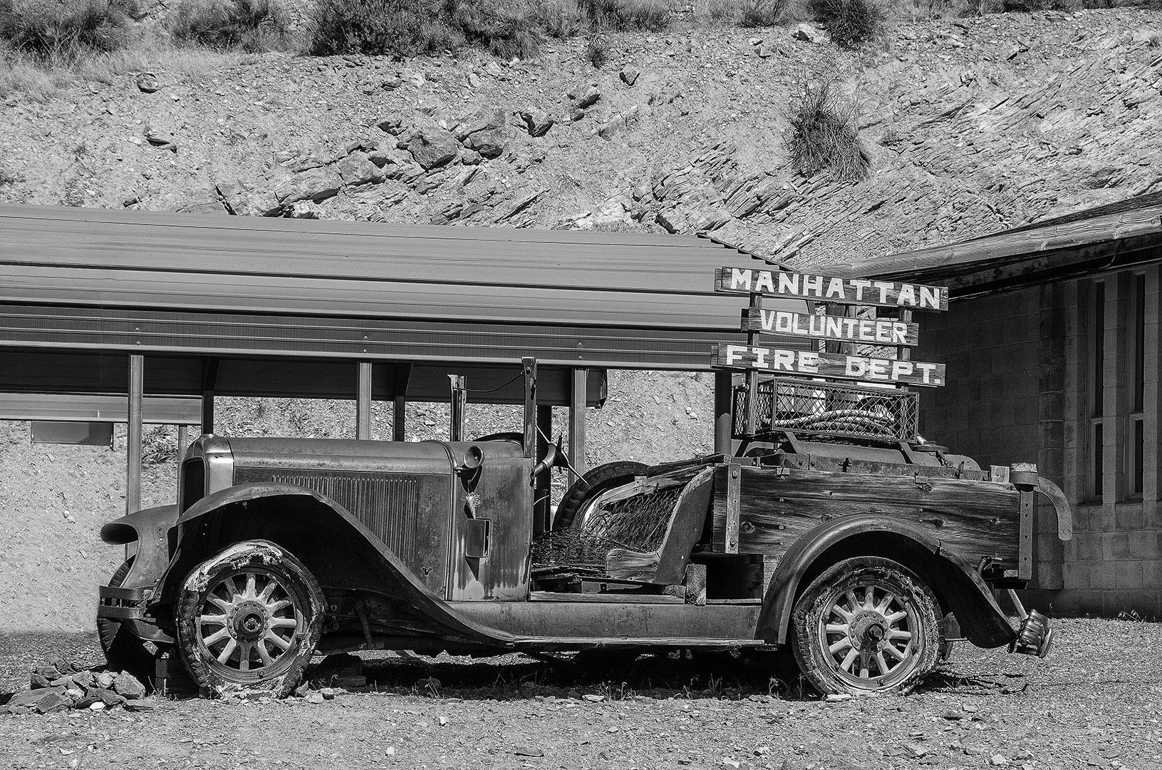
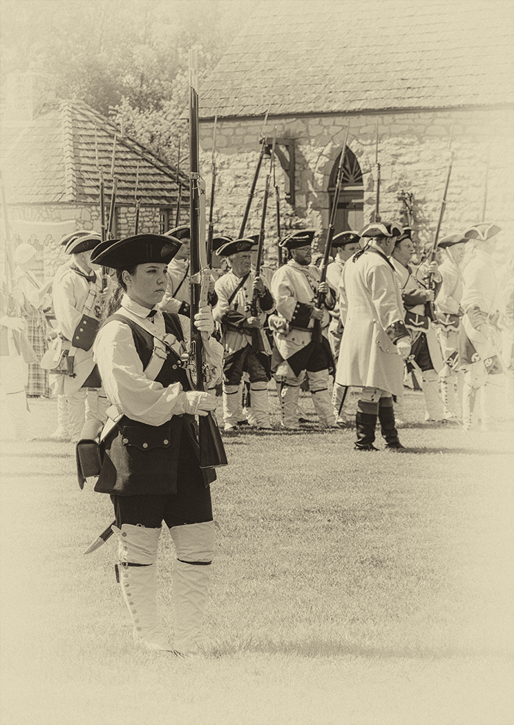
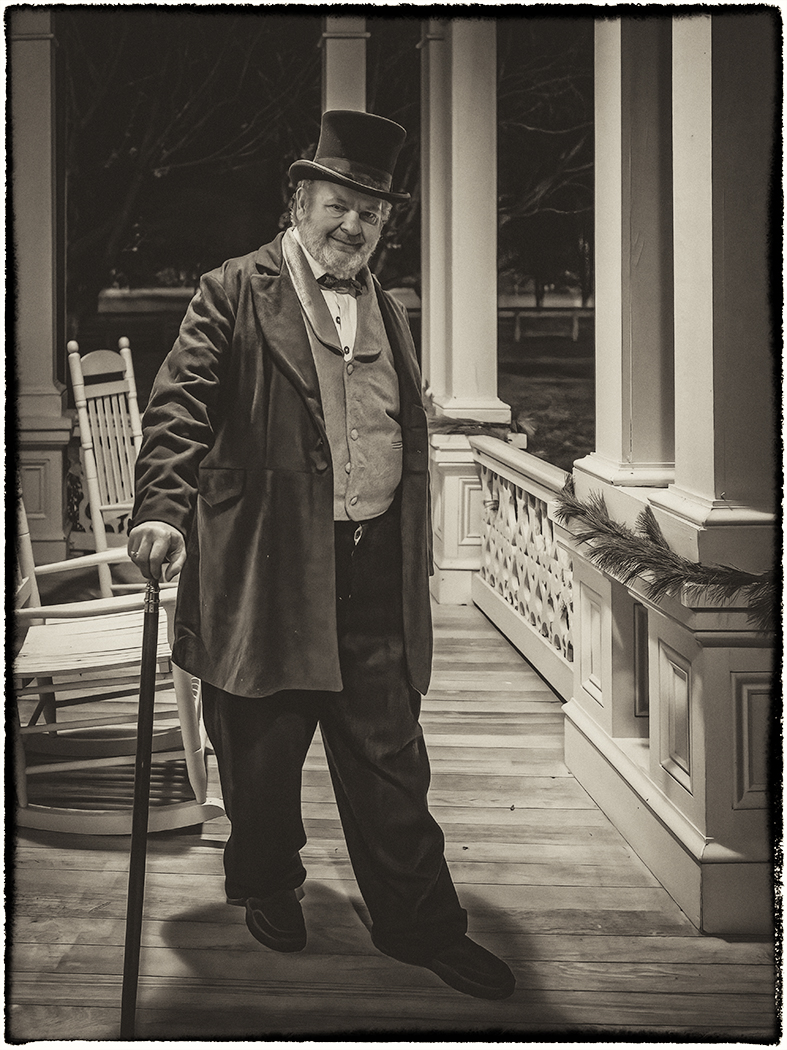
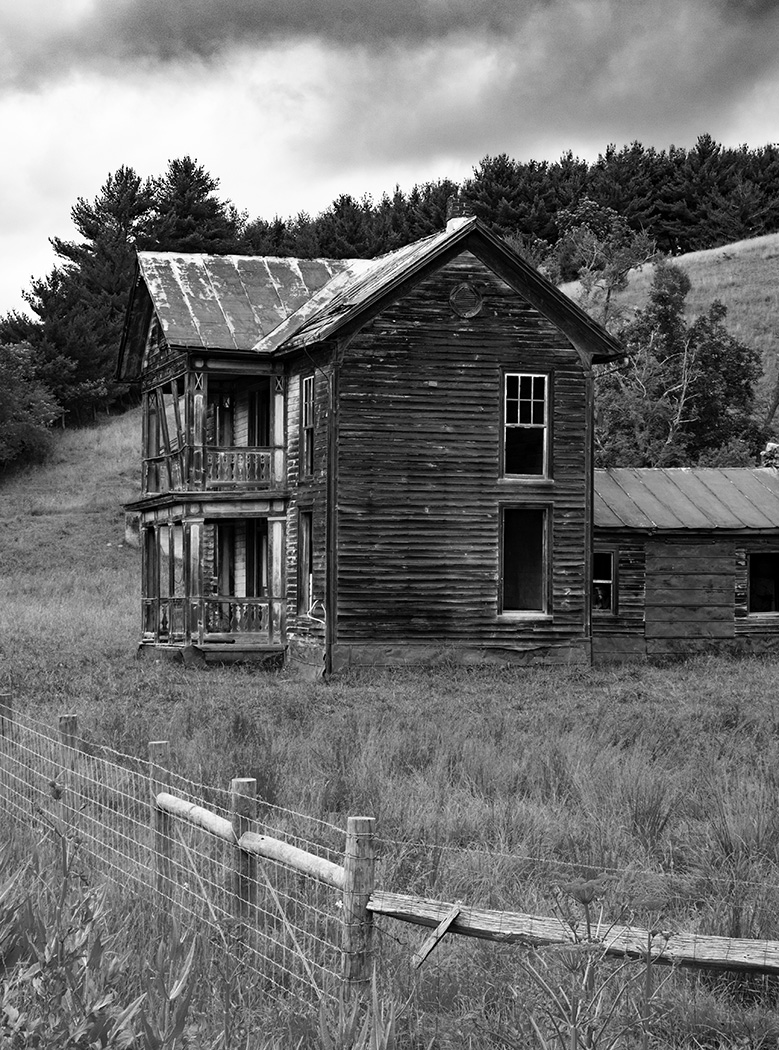
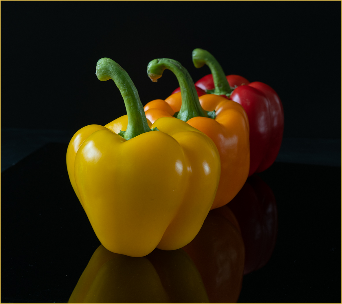
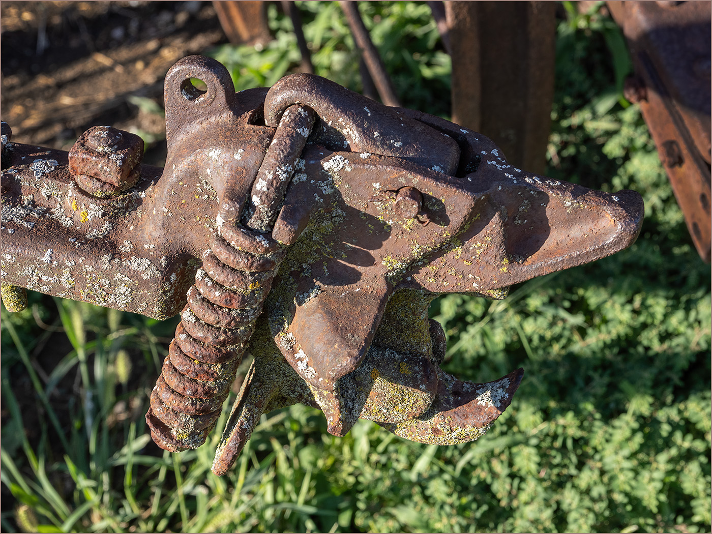
Congratulations on getting your new camera, and getting started using it. I looked the model up, and it is a really great camera. The shape of the peppers and the lighting to show the shape is what really sets this image apart. As Butch said, using an odd number is the correct (at least as we are taught) composition to use, and is good for this image. The stem of the pepper on the right pointing out of the image bothers me, but that is how you needed to place it to match the shape with the other 2 peppers. To correct that, and to have the peppers getting larger from left to right, I reversed the image. I also cropped off the black on the bottom as I think that it distracts. I did darken the stem that is now on the right some. What do you think? |
Mar 15th |
 |
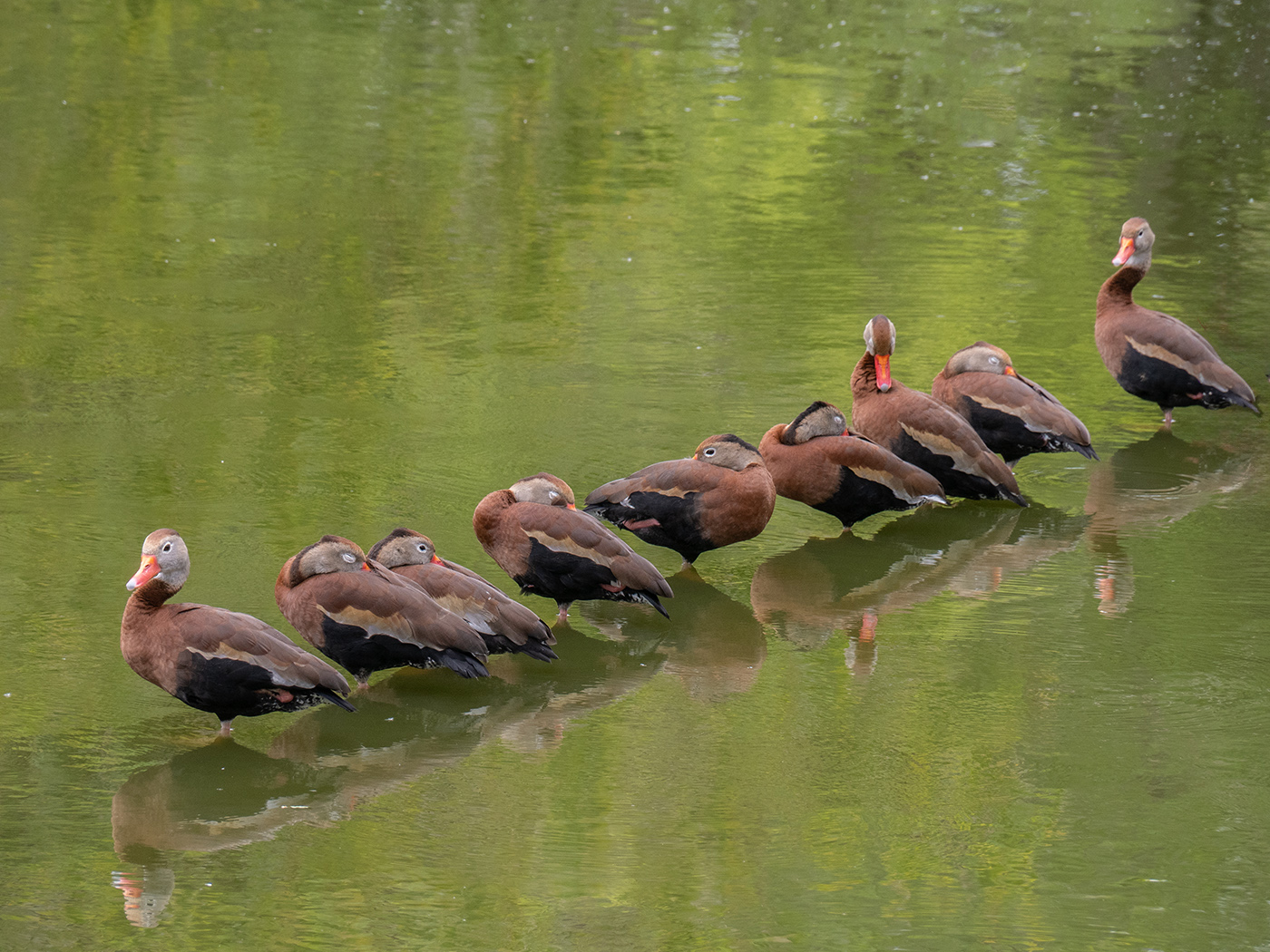
| 7 |
Mar 25 |
Comment |
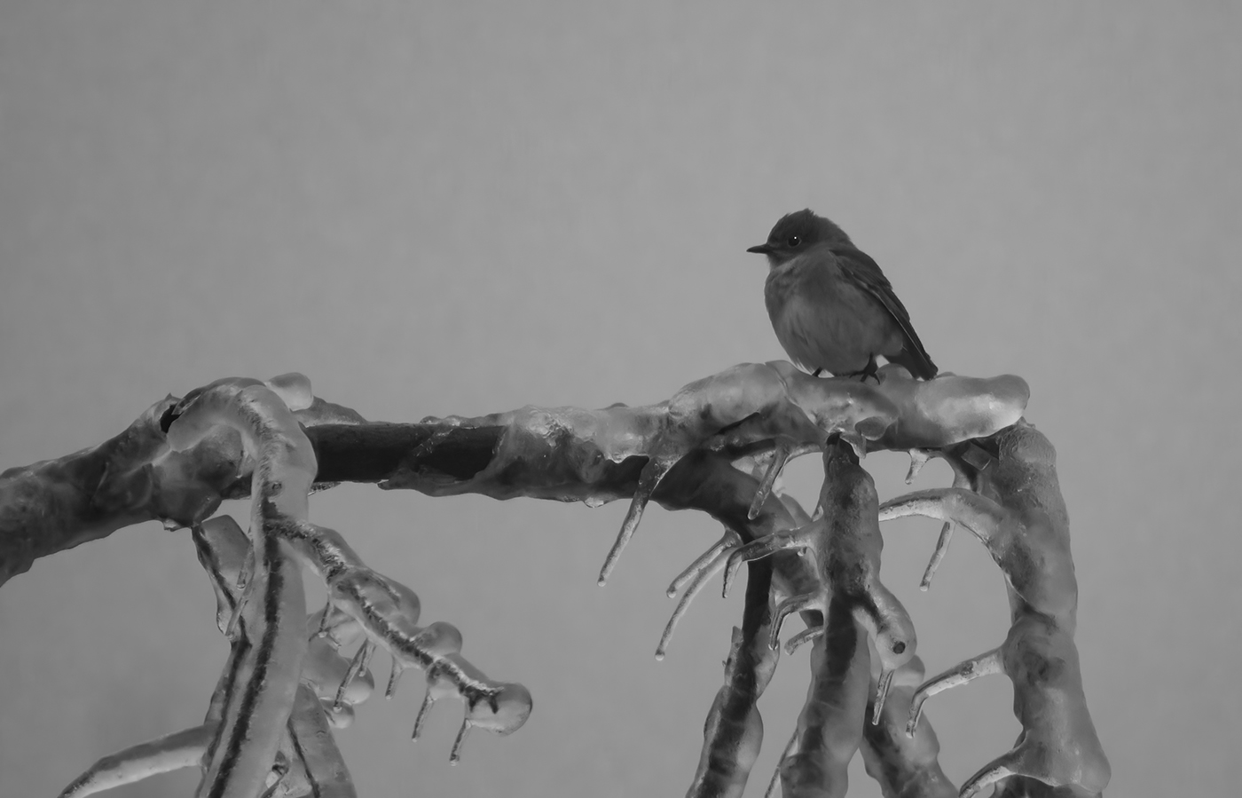
I really like the colors and the effect. The bird is placed perfectly in the frame. You have a good photographic eye to have seen this. I think that the reed to the lower right of the bird is very good, as it points to the bird. I would crop off the right side to get rid of the 2 reeds there. That would make more of a square image, which I think is fine because the bird and moon are the center of attention and belong in the center. |
Mar 15th |
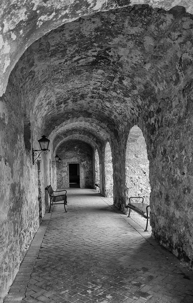
| 7 |
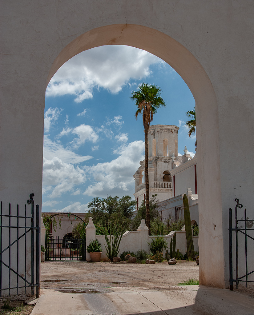
Mar 25 |
Reply |
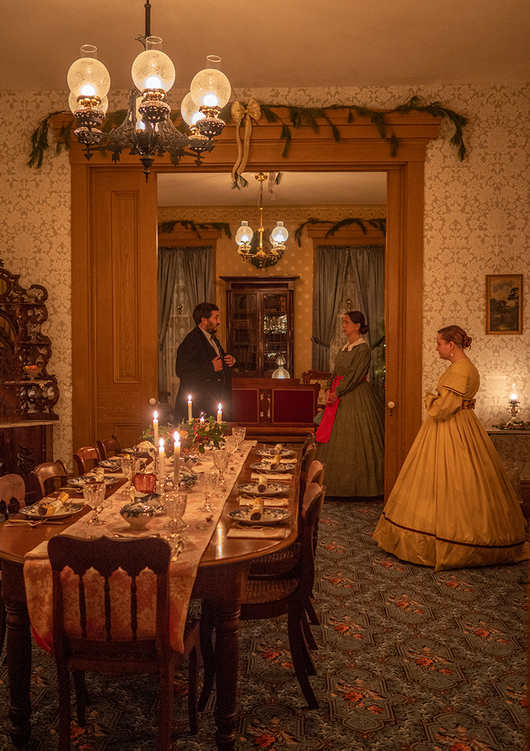
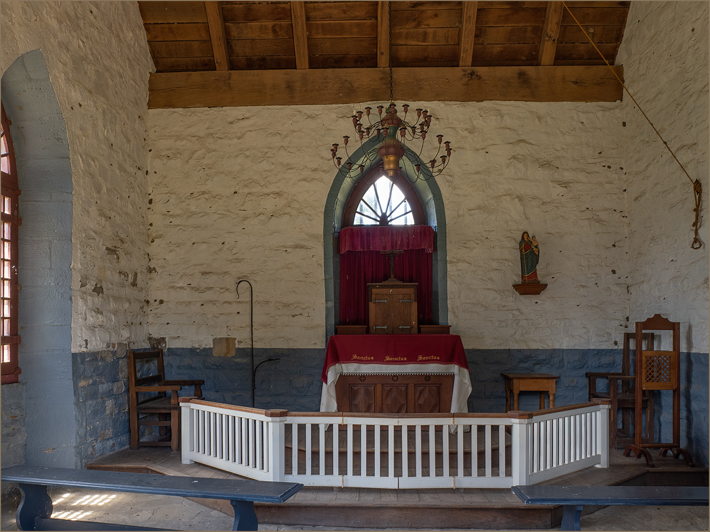
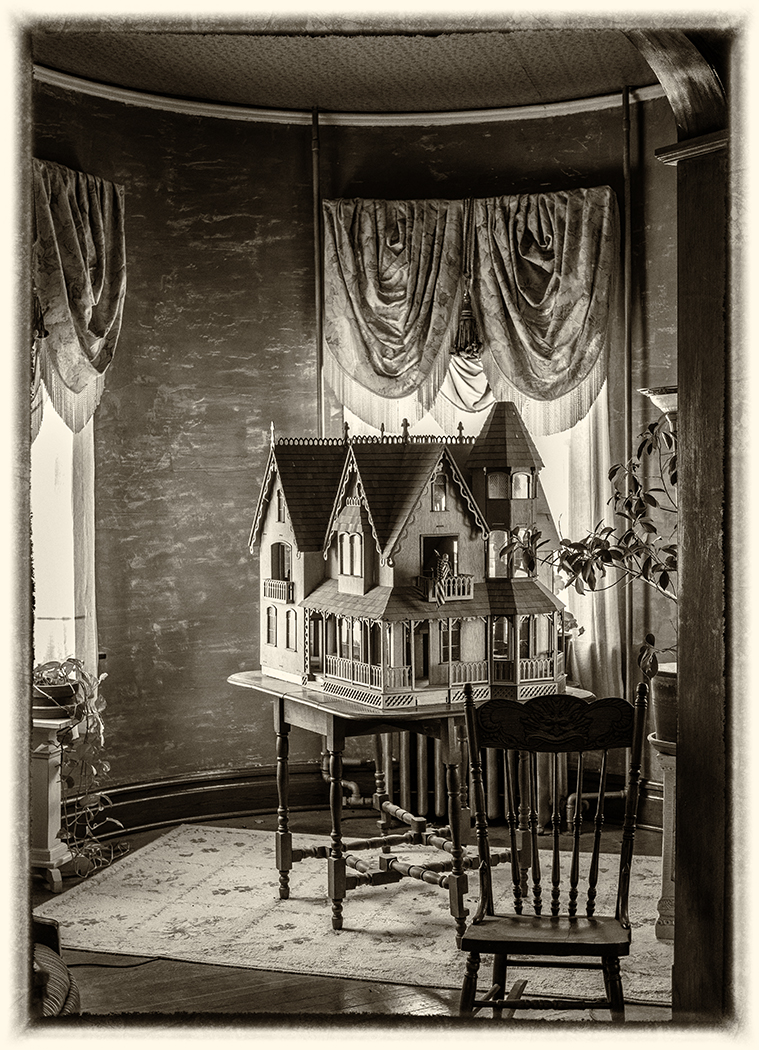
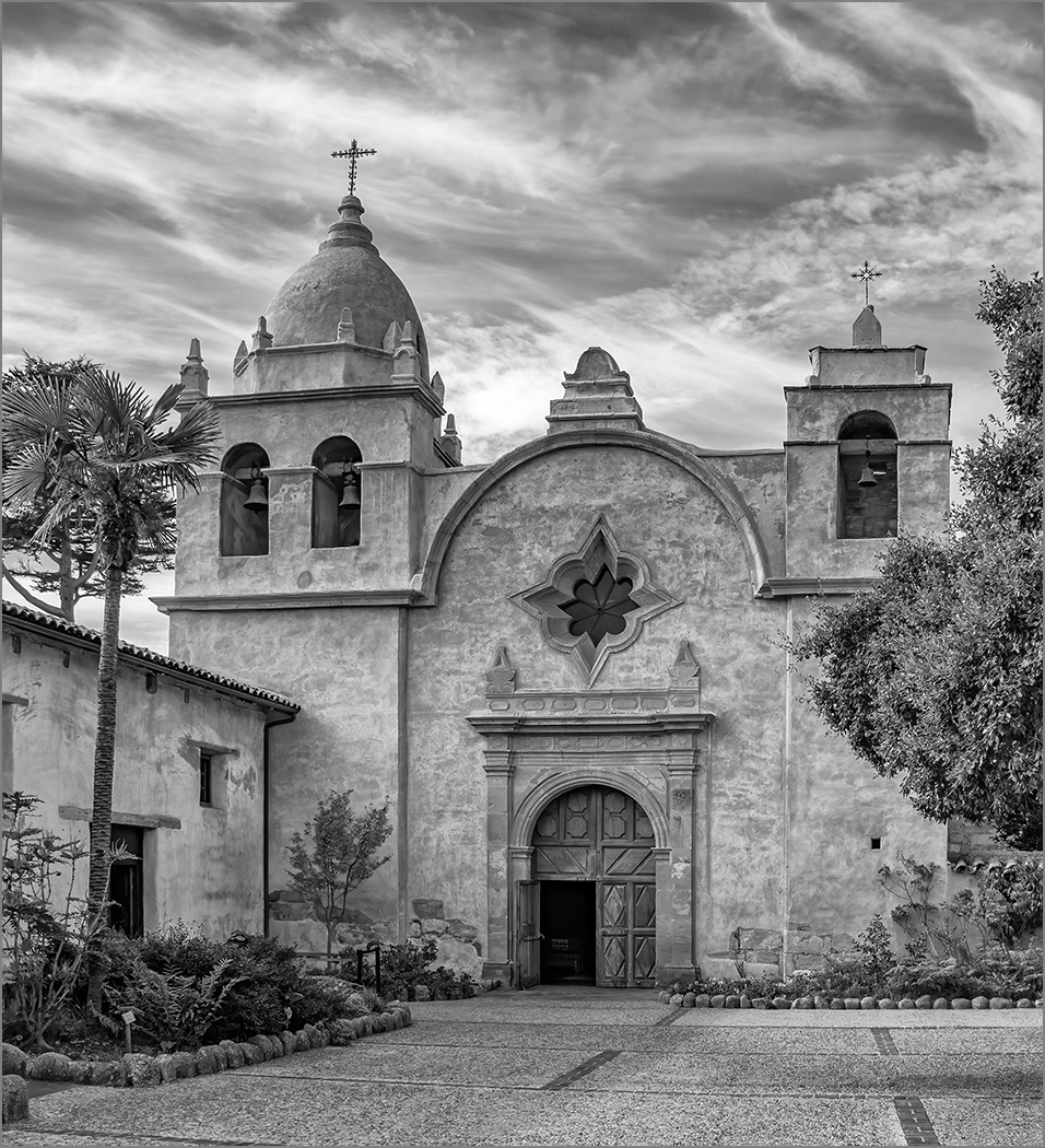
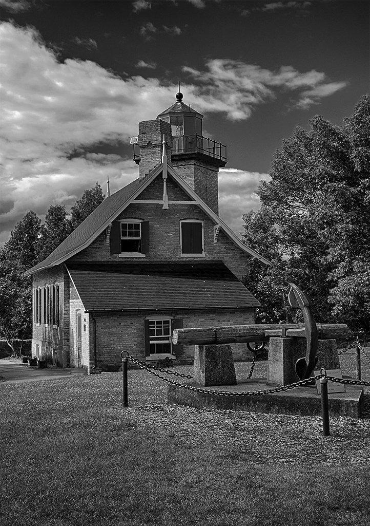
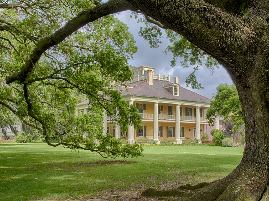
Thanks, and thanks for the adjustments. It is a beautiful mission. |
Mar 5th |
5 comments - 2 replies for Group 7
|
| 32 |
Mar 25 |
Reply |
Titles can really help, like this image. But in almost all PSA judgings, the titles are not read unless it is nature or photo journalism. So the image needs to stand by itself. |
Mar 28th |
| 32 |
Mar 25 |
Reply |
How long have you been doing this??? It is different judges. I know a club member that has an image that received a medal in one salon and did not get it accepted in the next. |
Mar 28th |
| 32 |
Mar 25 |
Reply |
I like this image much better, and Stephen is right about the lettering on the bricks. |
Mar 19th |
| 32 |
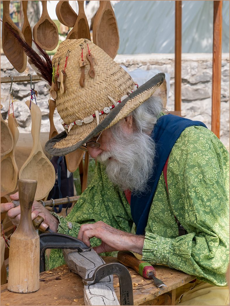
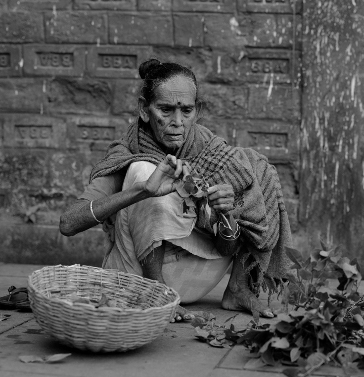
Mar 25 |
Reply |
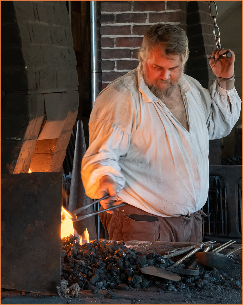
I have no idea whether this is a hobby, part-time income work, or full time. But he is more elderly, so it might be something to make extra money and keep him busy in retirement. I was just walking along seeing the craft people and their items. I did not stop to talk to him as he seemed very intent in his work. |
Mar 11th |
| 32 |
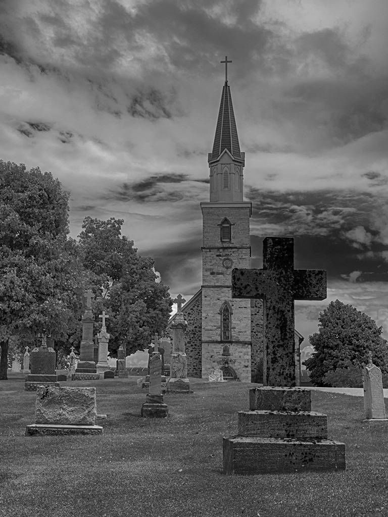
Mar 25 |
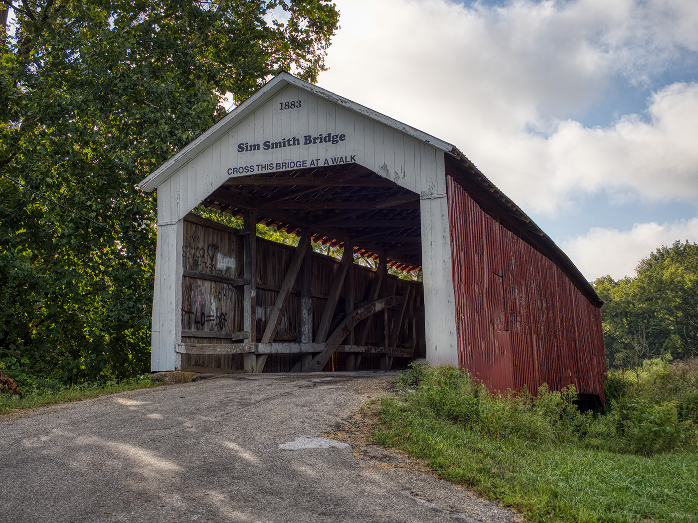
Comment |
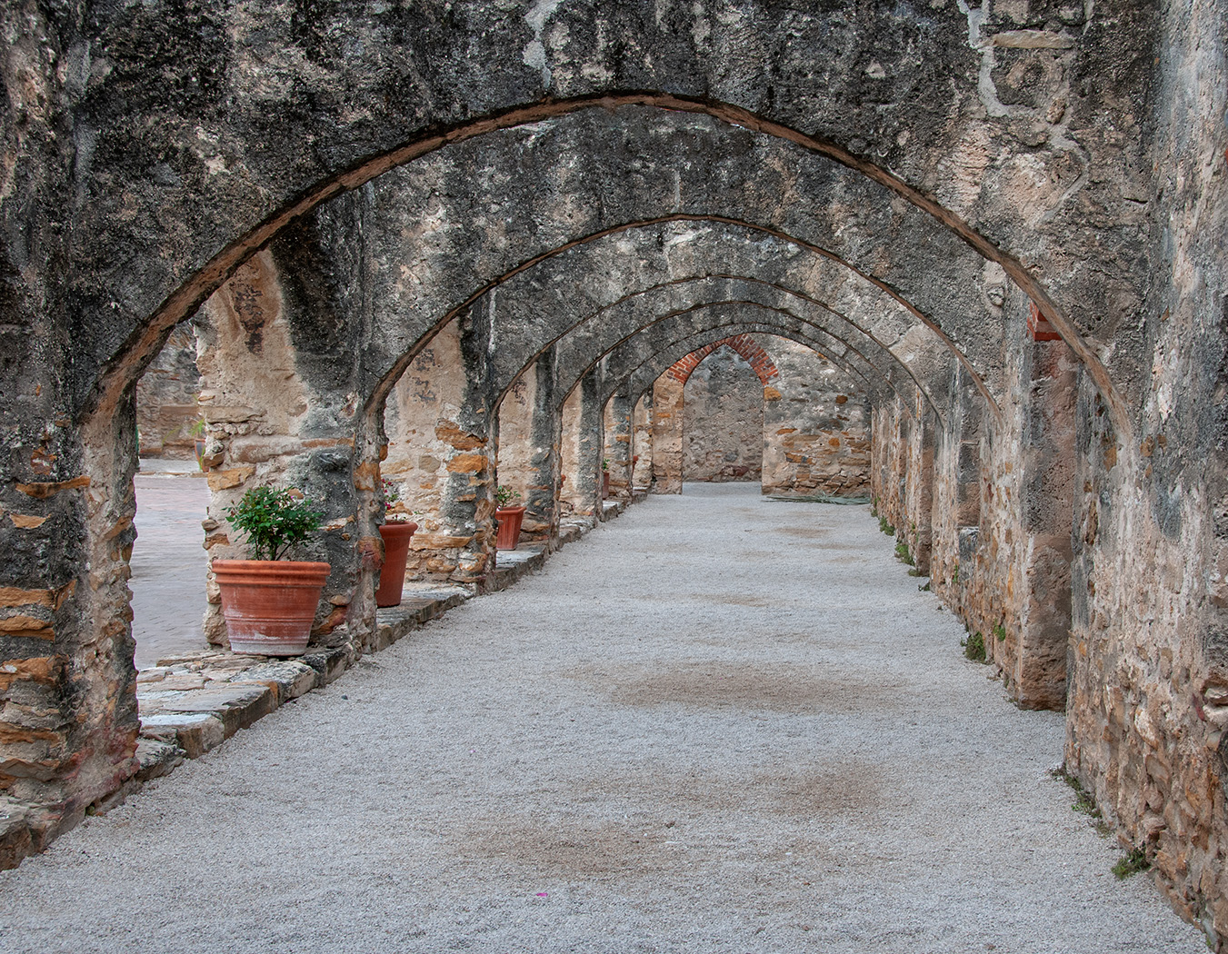
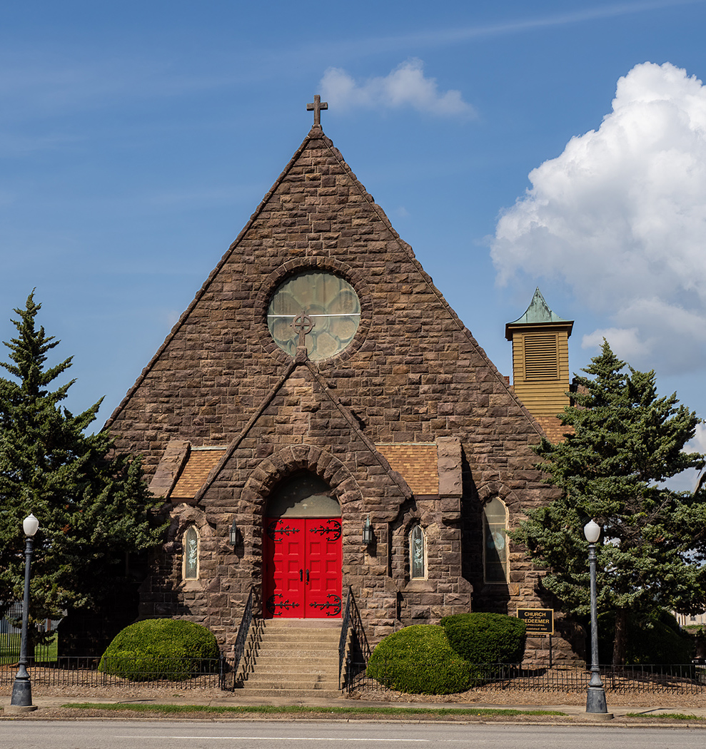
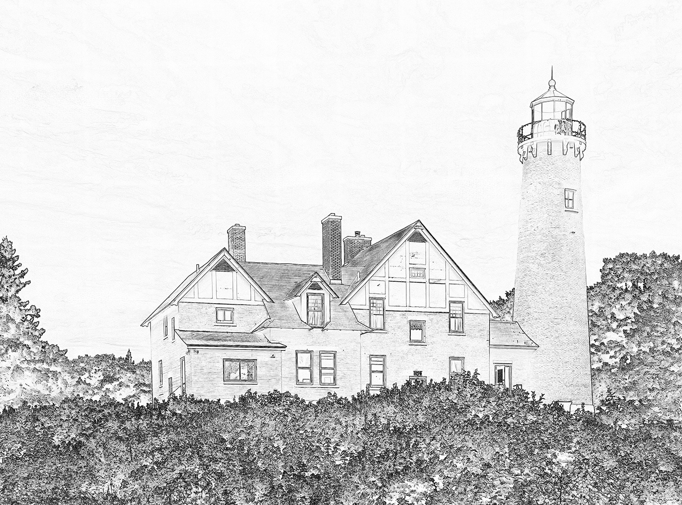
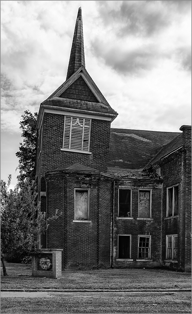
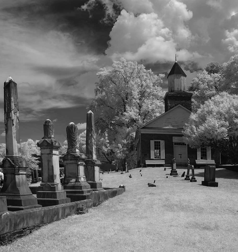
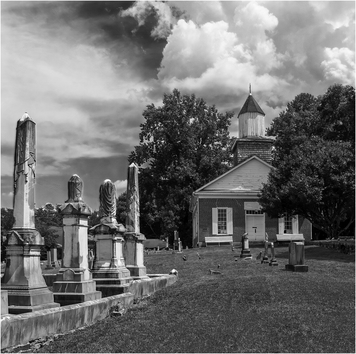
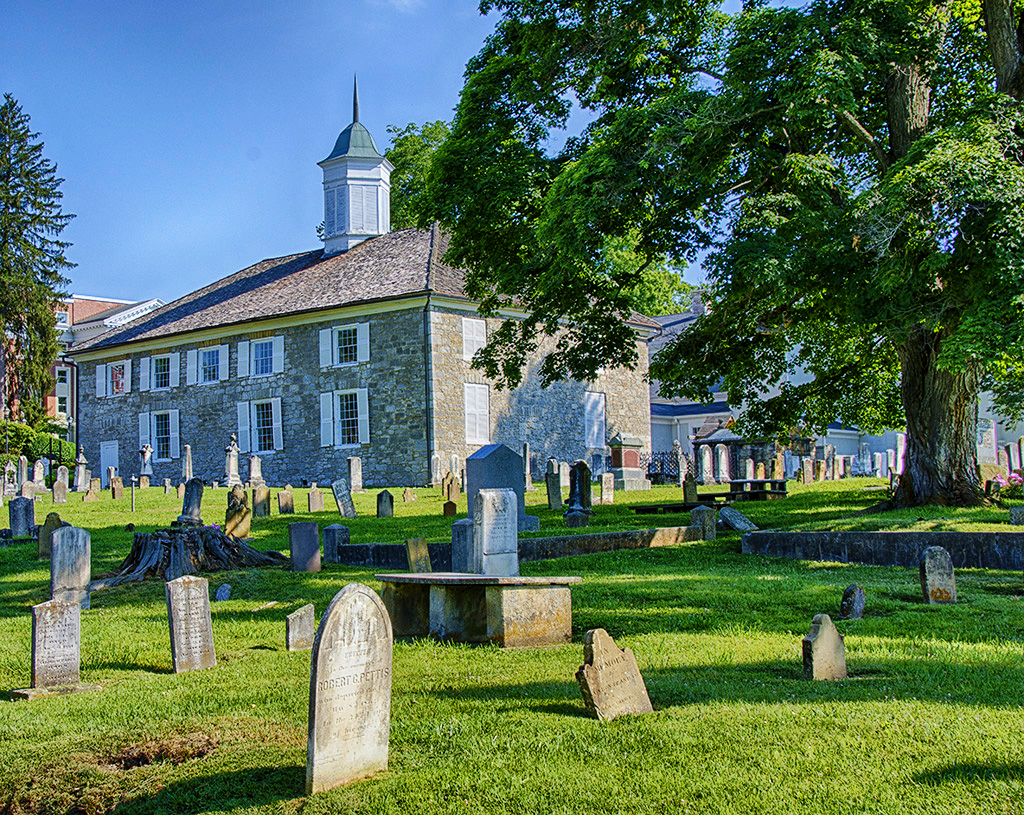
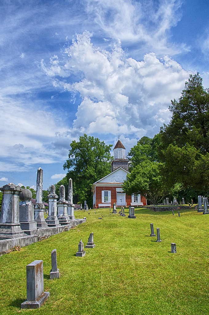
It is an interesting old church, and thanks for telling us about the church and the area. The symmetry is very good, and going to mono was good, as I think that the green carpet distracts in the color image. I agree with using a tripod, although I do not use one enough. I can handhold mine pretty well to get sharp images in building interiors, but they aren't as straight or as well composed as they should be. Using a tripod makes me slow down and look at the image better. I really like what Ed did to the image. |
Mar 11th |
| 32 |
Mar 25 |
Comment |
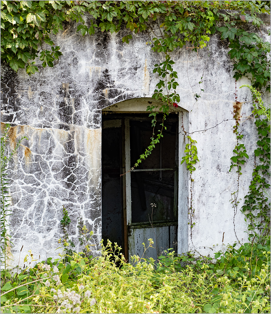
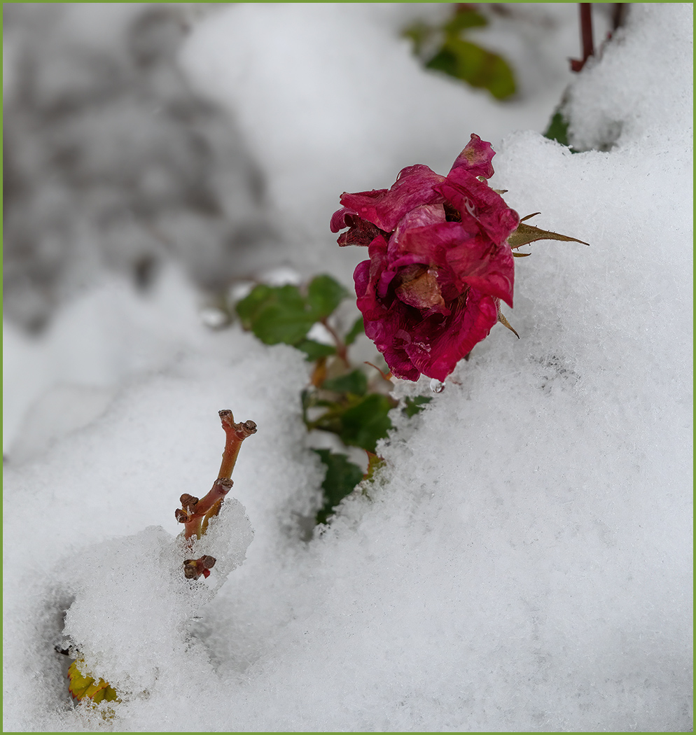
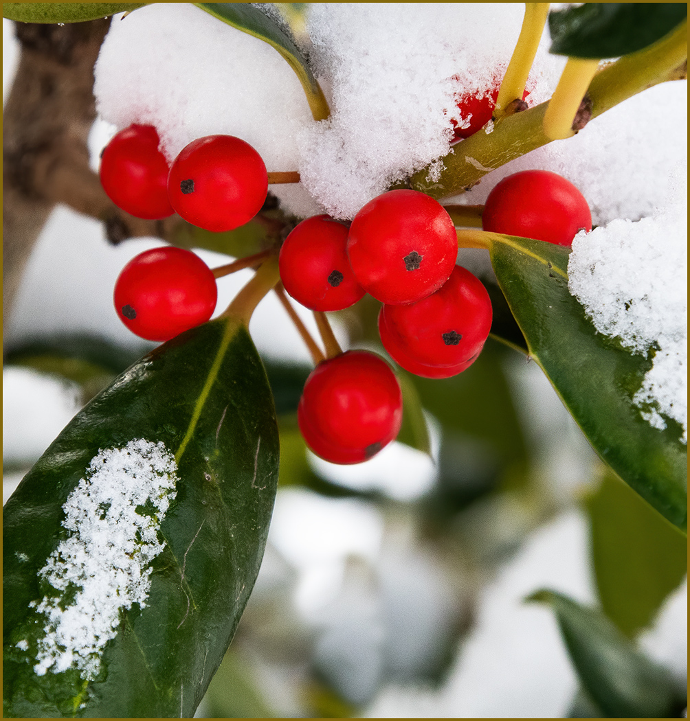
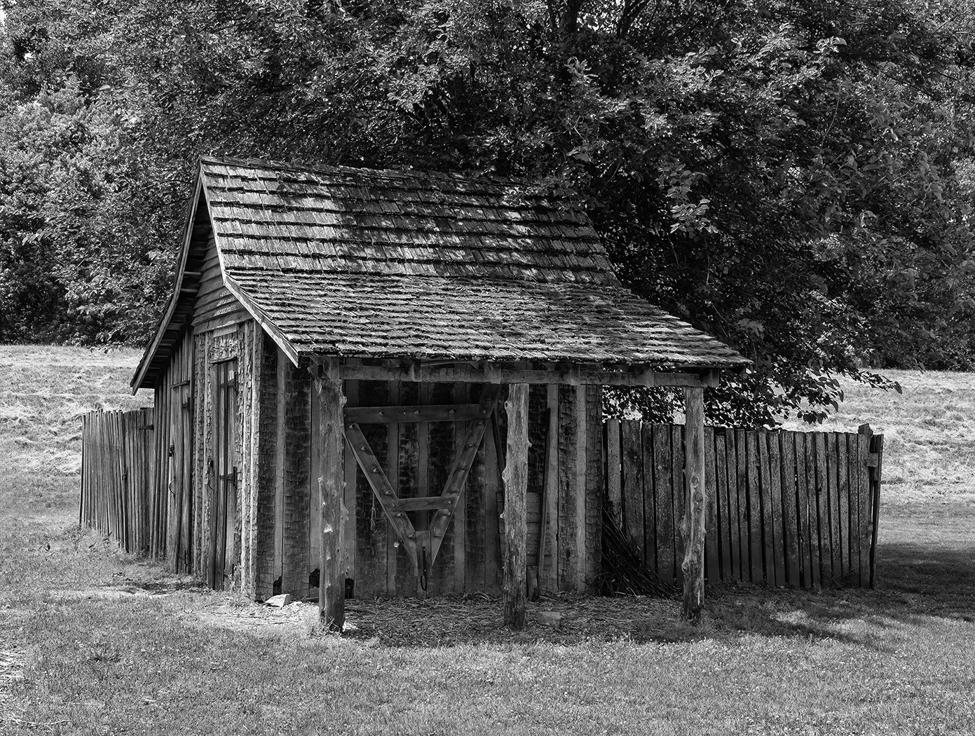
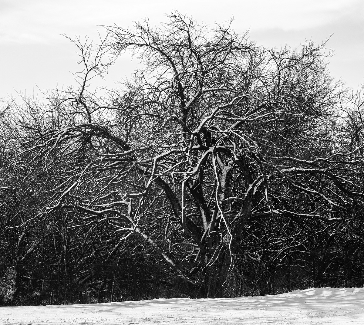
You have a nice pattern image, but with out knowing what it is, we would not know that it is snow on a fence. I agree with Diana that it is not a stand alone image. |
Mar 11th |
| 32 |
Mar 25 |
Comment |
You found a great subject to photograph, and caught her very intense in her work. The expression is great. I think that the crop is very good. But, I think that the image is too dark overall, and the bricks being so dark makes her blend into the wall too much. I did make the bricks lighter and also dodged her face some. |
Mar 11th |
 |
| 32 |
Mar 25 |
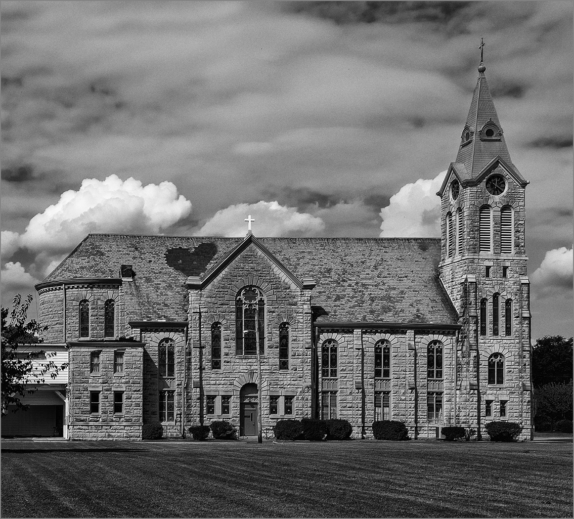
Comment |
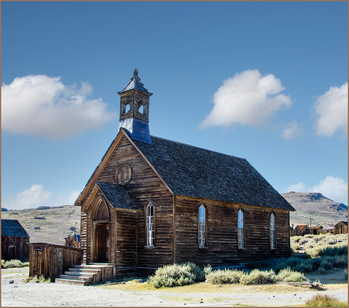
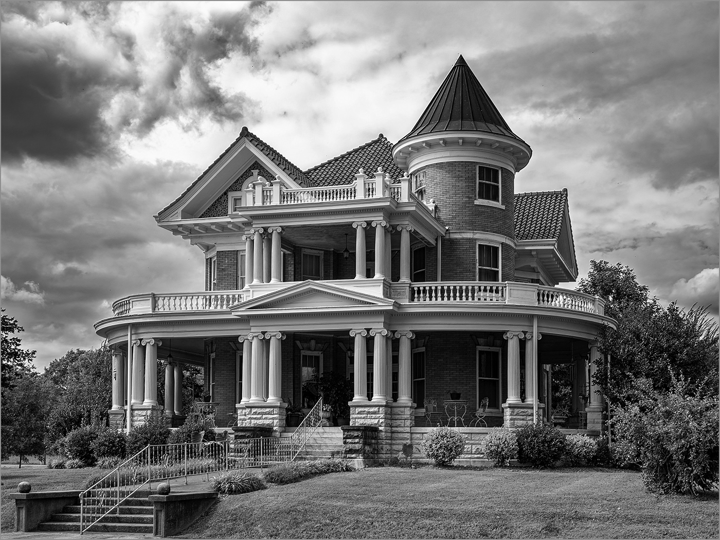
I like the dark sky against the white church. I don't think that the right side is a problem. There is a bit of distortion, but it is not really bothersome. I think that Stephen's adjustments made it worse. Overall, I like the image and it is one that I would have taken. |
Mar 11th |
| 32 |
Mar 25 |
Comment |
Welcome to the group. I made a few business trip to Argentina a long time ago (more that 50 years), and I really made note of the wires that went across the street between the buildings. I really like the symmetry of the image. Going to mono was a good choice, and you did a good job of conversion. I do agree with Diana about cropping off the top, the transformers at the top right distract from the symmetry. |
Mar 11th |
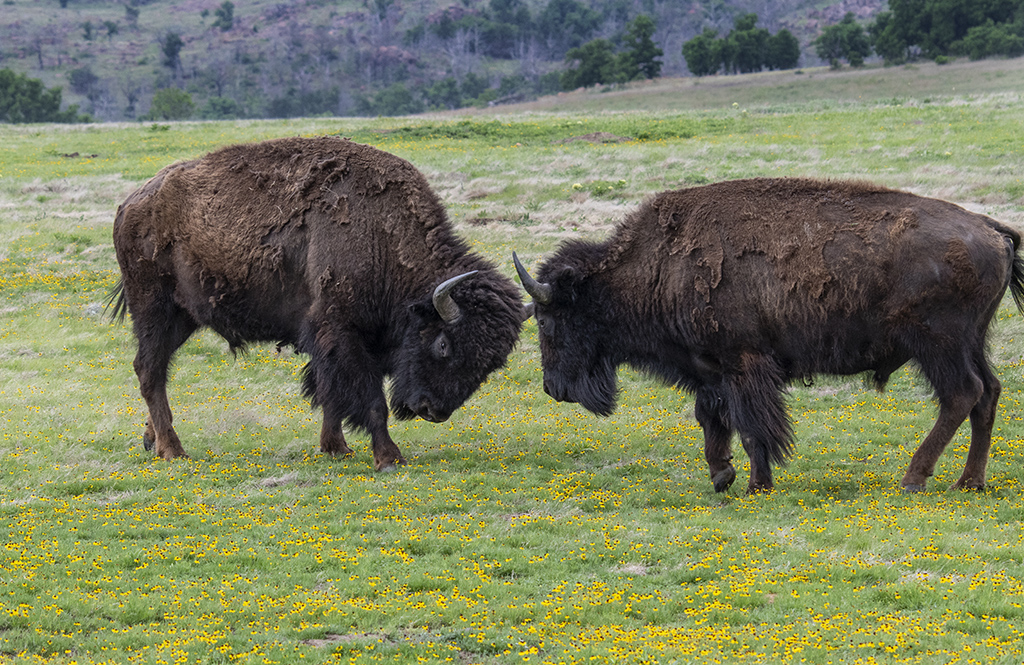
| 32 |
Mar 25 |
Comment |
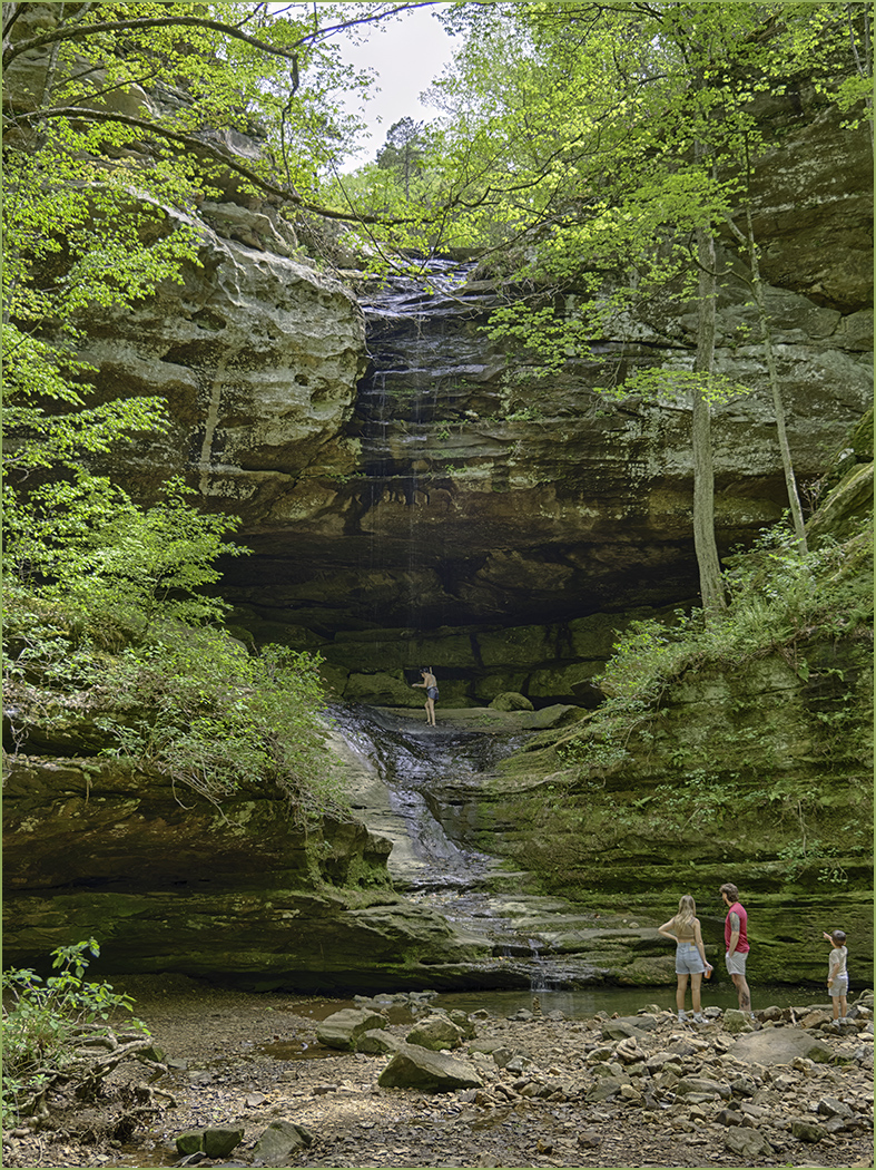
I really like the image, and the composition with plenty of room for the bear to move into. The separation from the background is good. I agree with removing the tracks and rock. |
Mar 11th |
| 32 |
Mar 25 |
Reply |
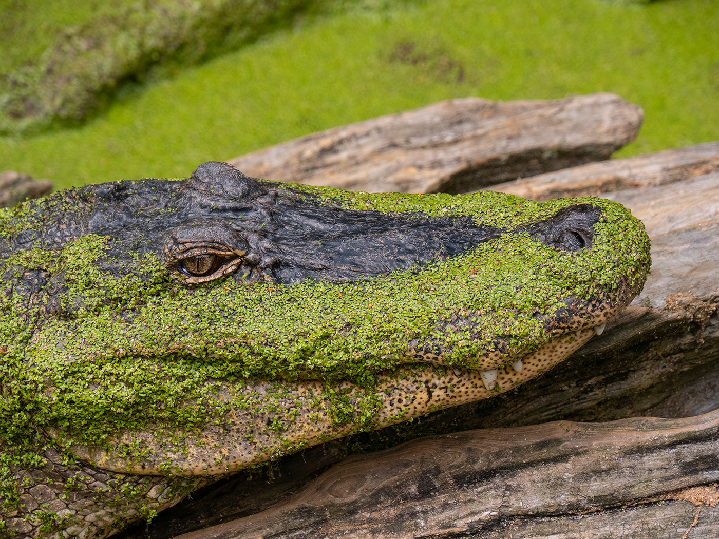
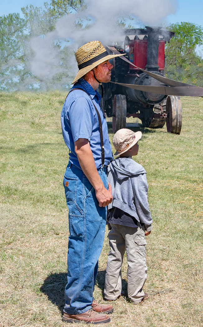
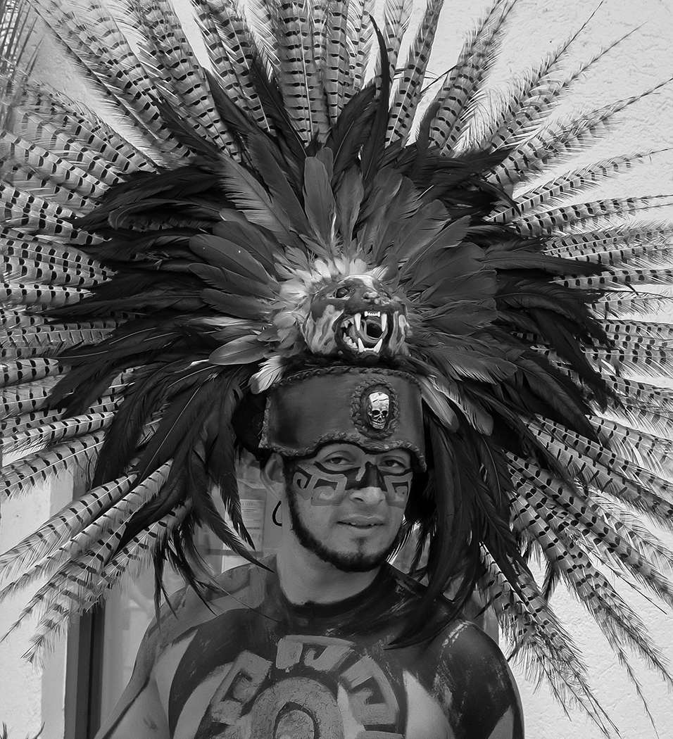
I have been using OM system cameras for a few years. I really like the smaller and much lighter weight, especially telephoto and you get 2 times as close. A 400mm lens on an OM system is the same as a 800mm lens on a 35mm full frame. I had a Nikon D7500 (crop sensor) with a 100-400 Tamron lens (150-600mm full frame equivalent), and my Olympus M1 Mark III camera with the Olympus 75-300mm has the same reach at about 1/3 the weight. I have attached an image I entered in January 2023 to this group. It was shot at ISO 1250, with a 17mm lens and there is really no noise. I don't go really high ISO so I could not say how a really high ISO would be. |
Mar 10th |
 |
| 32 |
Mar 25 |
Reply |
After Somdutt's adjustments his face and glasses are way to dark. |
Mar 10th |
| 32 |
Mar 25 |
Reply |
You darkened the skin and especially the face too much. Now you can hardly see his face and glasses. |
Mar 10th |
| 32 |
Mar 25 |
Reply |
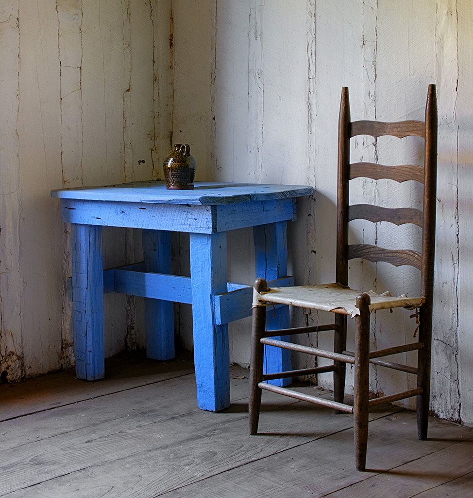
I like what you did, with darkening the shirt. |
Mar 10th |
6 comments - 8 replies for Group 32
|
| 57 |
Mar 25 |
Reply |
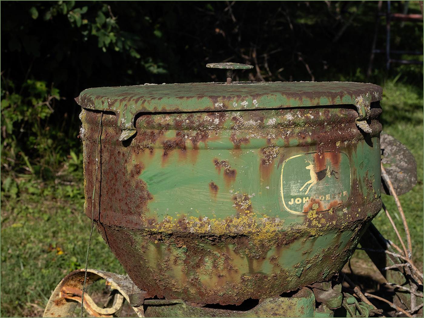
Thanks to all of your comments. I agree that the petals on the ground should be darkened. But I would not want to blur them, as I liked the idea of the petals on the ground. |
Mar 28th |
| 57 |
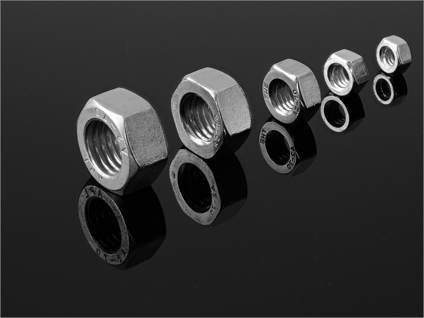
Mar 25 |
Comment |
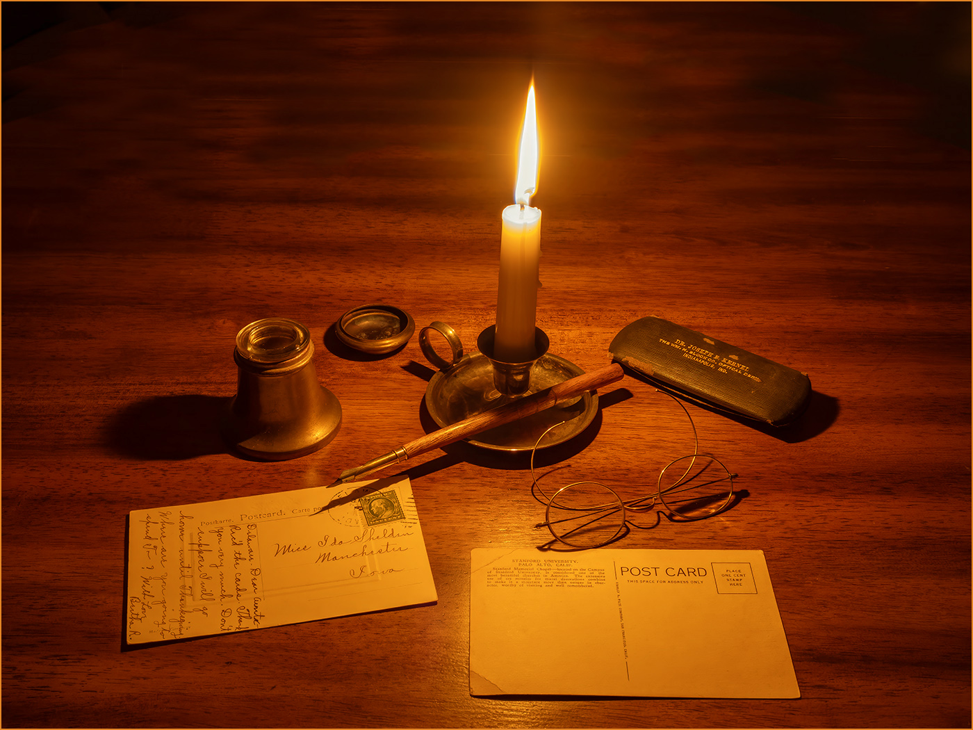
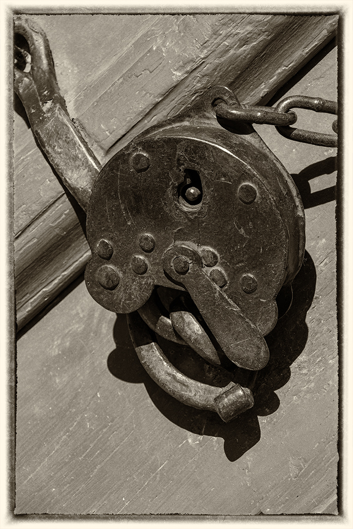
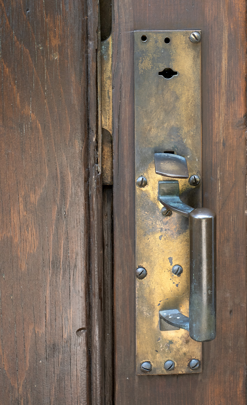
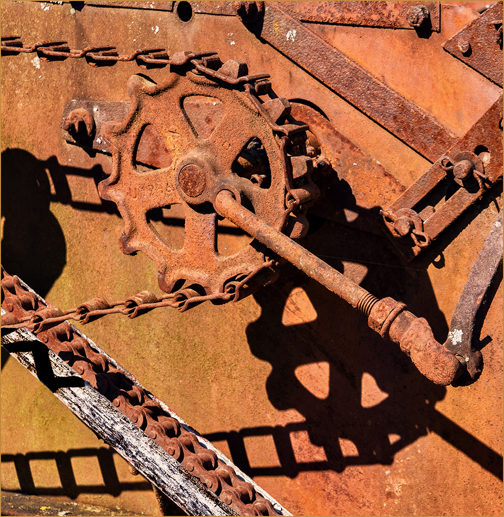
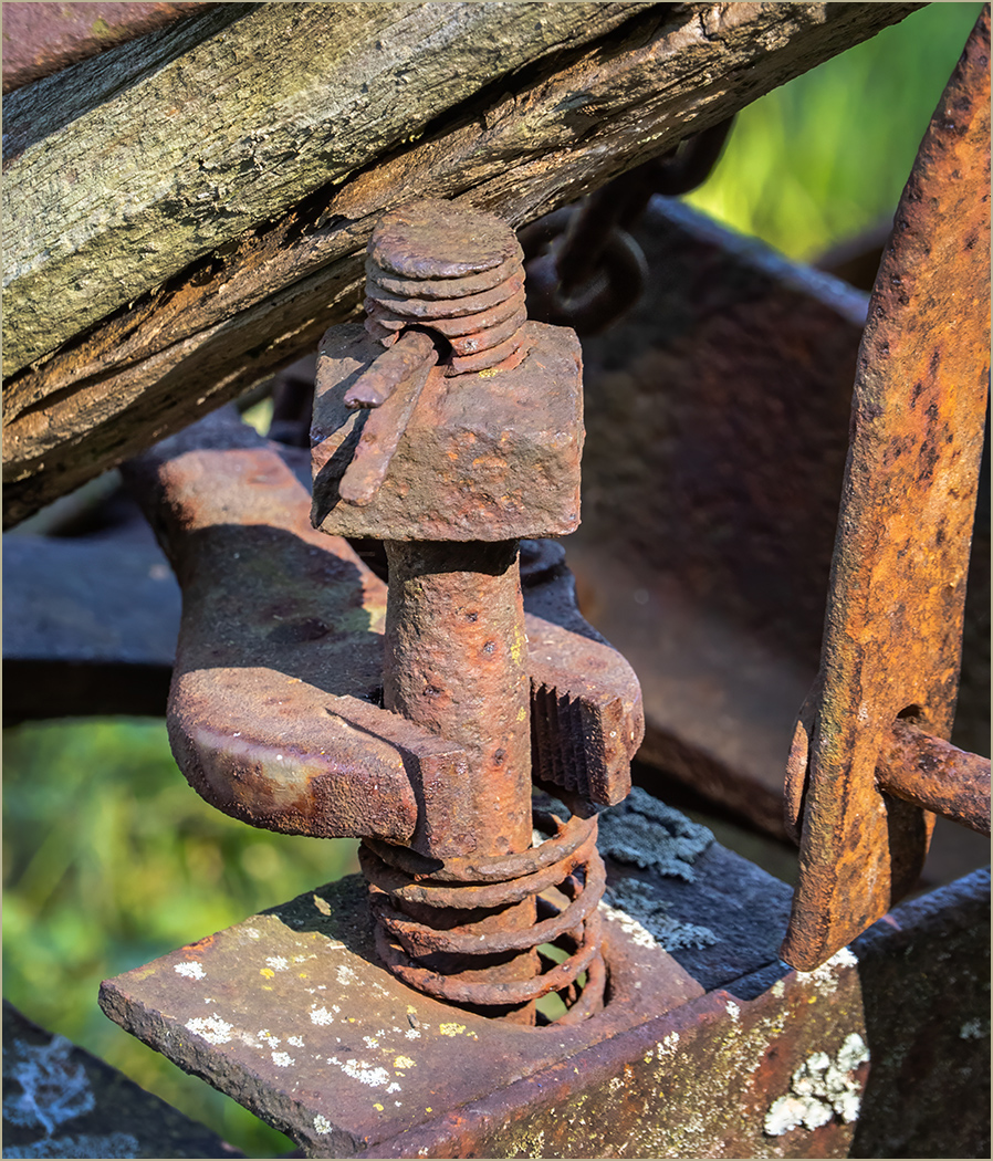
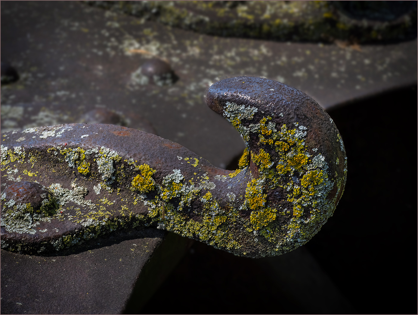
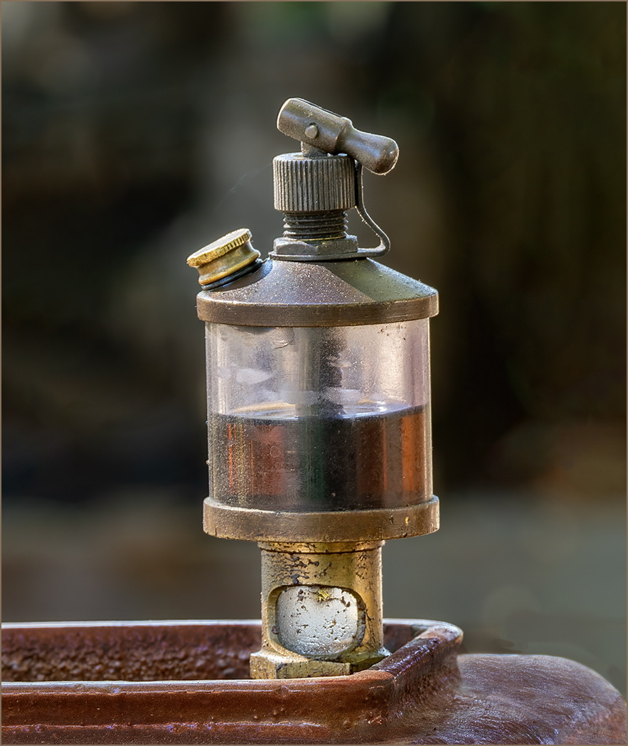
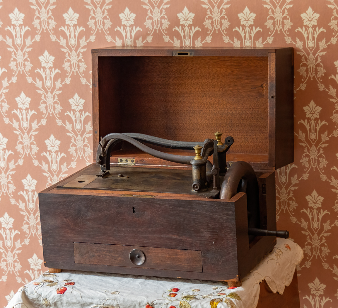
You captured these interesting items very well. Thank you for telling us about them. I like the placement of them, the lighting is very good and the background is good. Your focus stacking made everything sharp. Very well done. |
Mar 19th |
| 57 |
Mar 25 |
Comment |
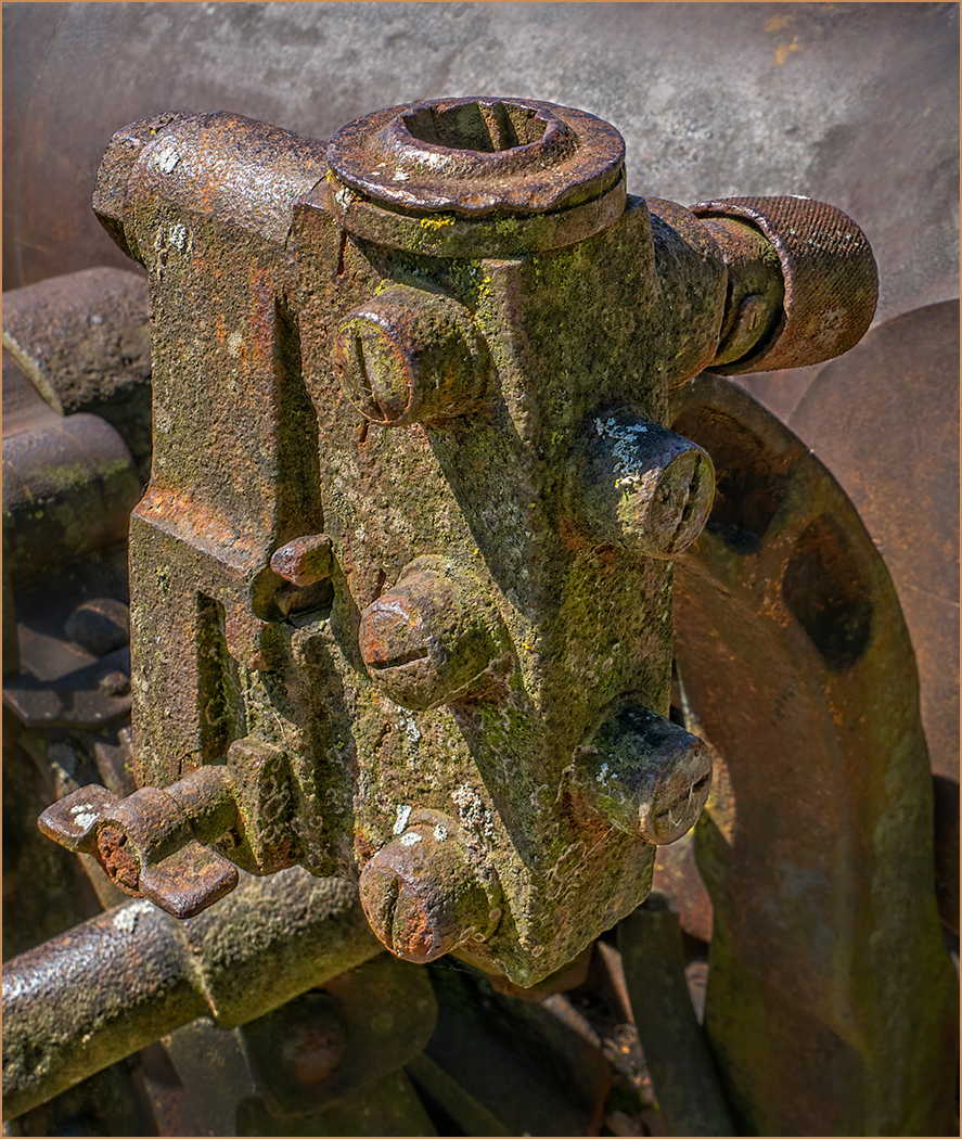
Interesting to have the feather silhouetted. The image is sharp, the background is very effective, and the texture in the upper part of the background is good. I like the image and would not change a thing. |
Mar 19th |
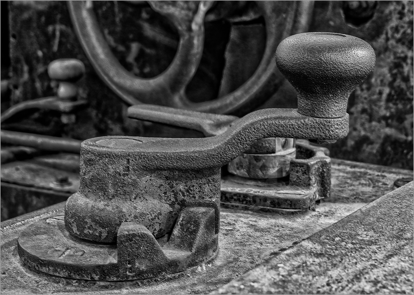
| 57 |
Mar 25 |
Comment |
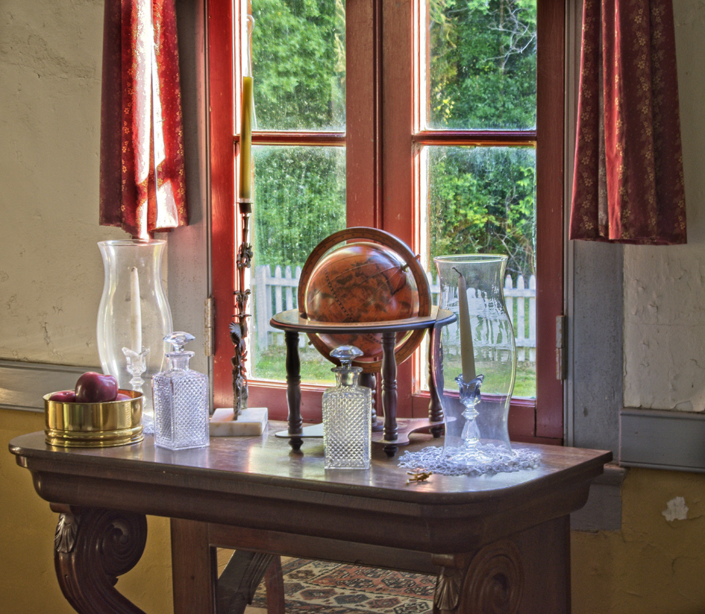
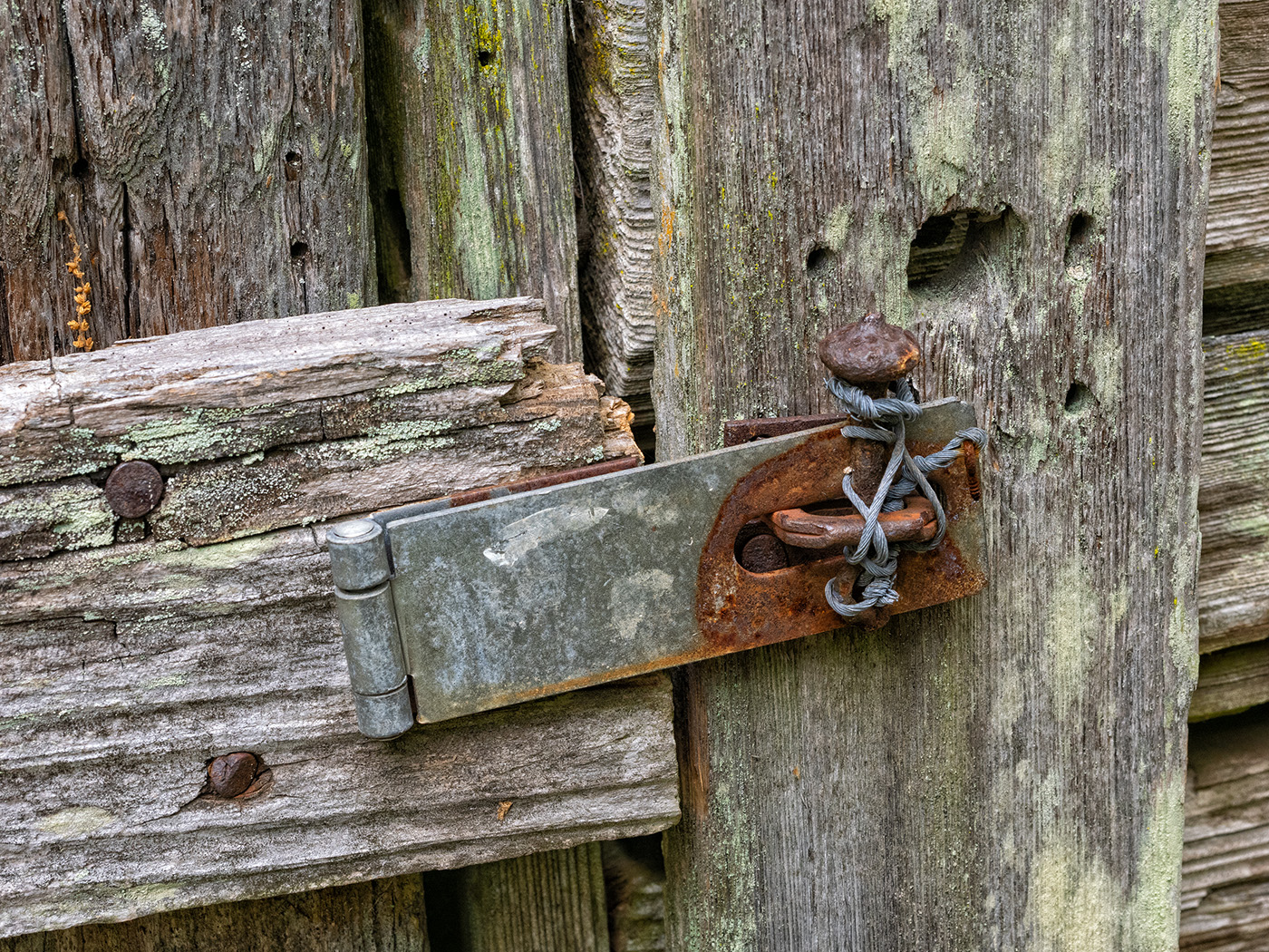
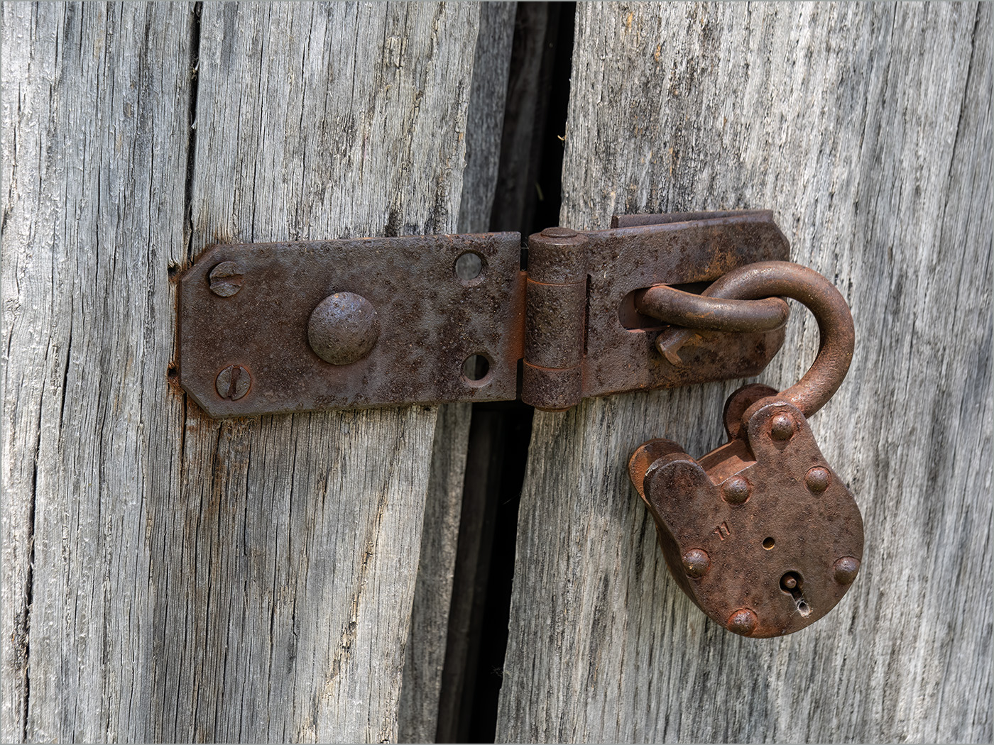
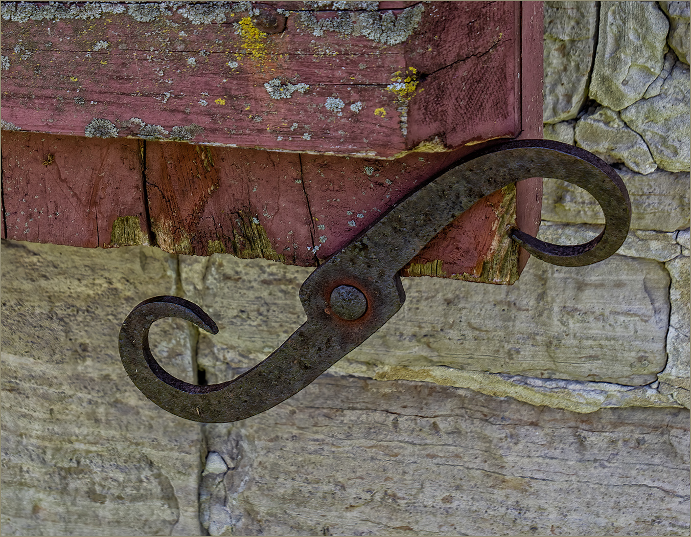
Sorry to hear that you were in the hospital, and hope that you get well soon. You did find an interesting thing to photograph. The textures are very good, and your editing brought them out very well. I also like the crop. To play with the image, I flipped it both vertically and horizontally. To me the center of interest is the dark area in the wood (maybe a small knot?) So by flipping it, that wood area is now in the upper right corner. |
Mar 19th |
 |
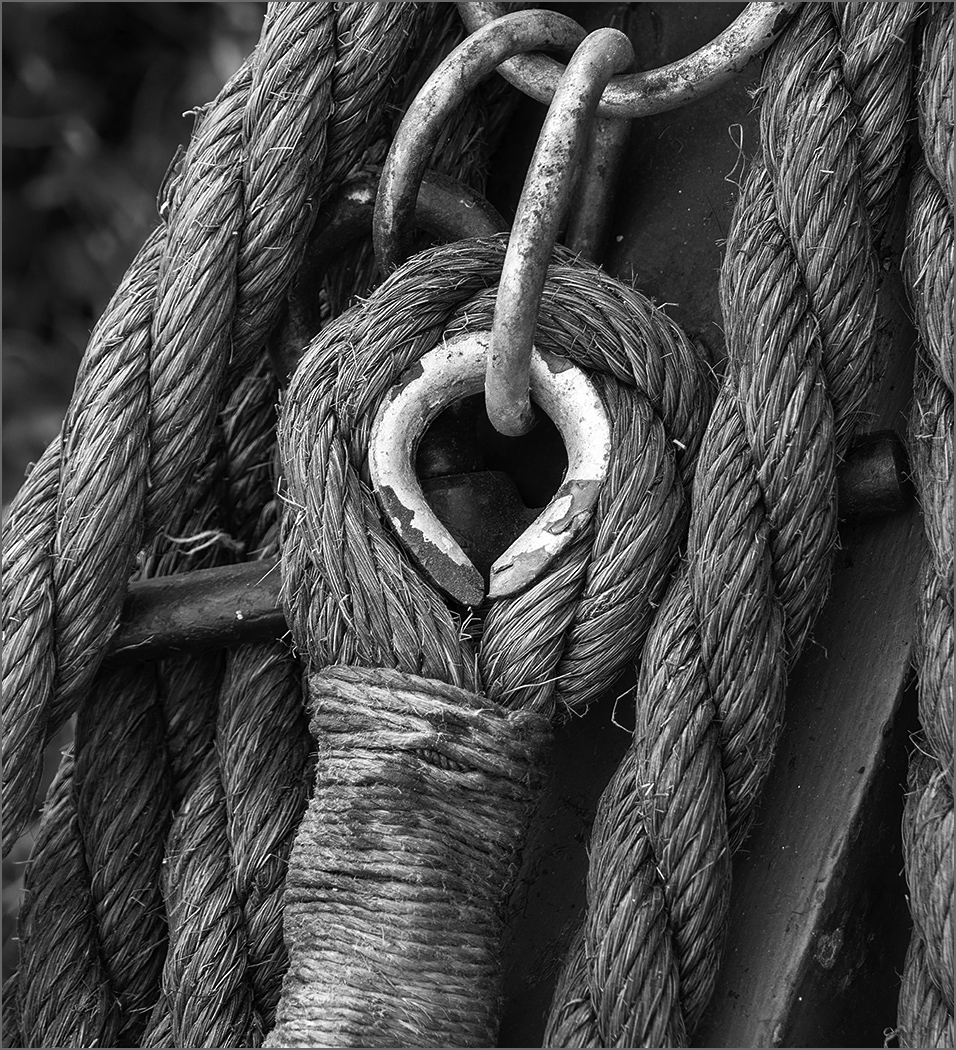
| 57 |
Mar 25 |
Comment |
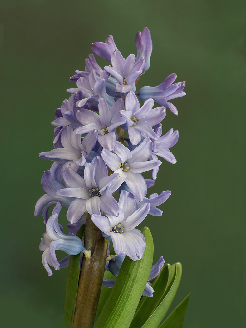
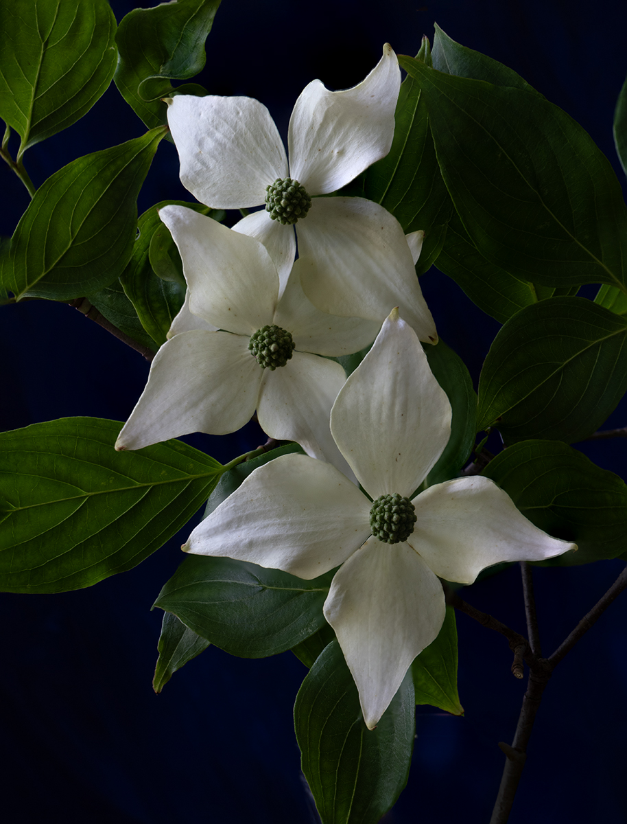
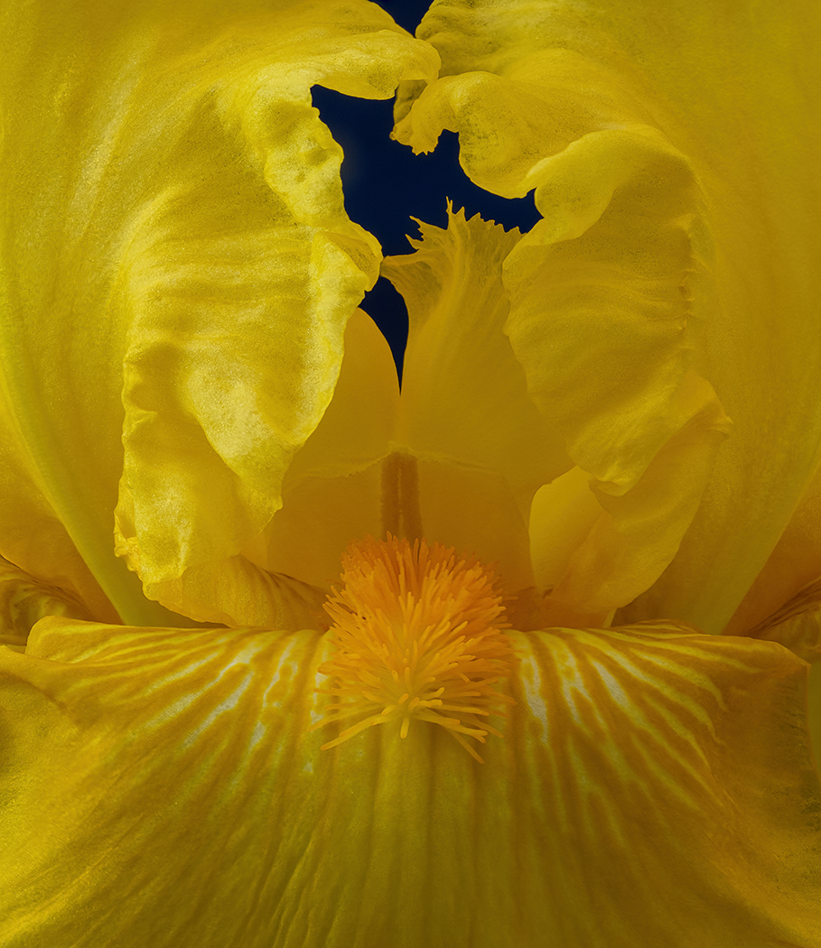
You did a really good job of taking this orchid closeup. I like the composition with the center part in the upper right, and the square format. The lines in the yellow draw us to the center, and the "cap" over the center keeps us in the frame. You succeeded very well with this new type of photo. |
Mar 19th |
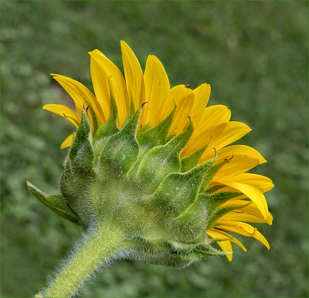
| 57 |
Mar 25 |
Comment |
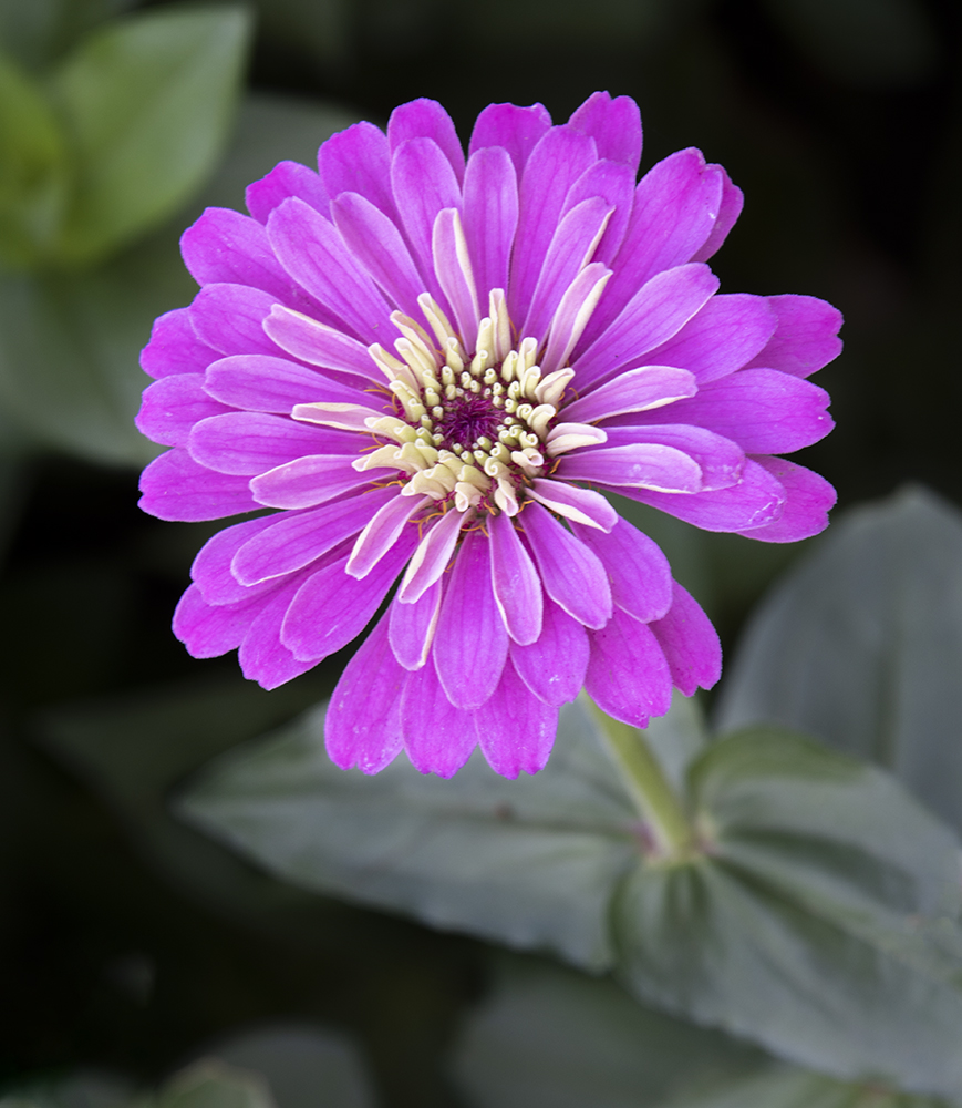
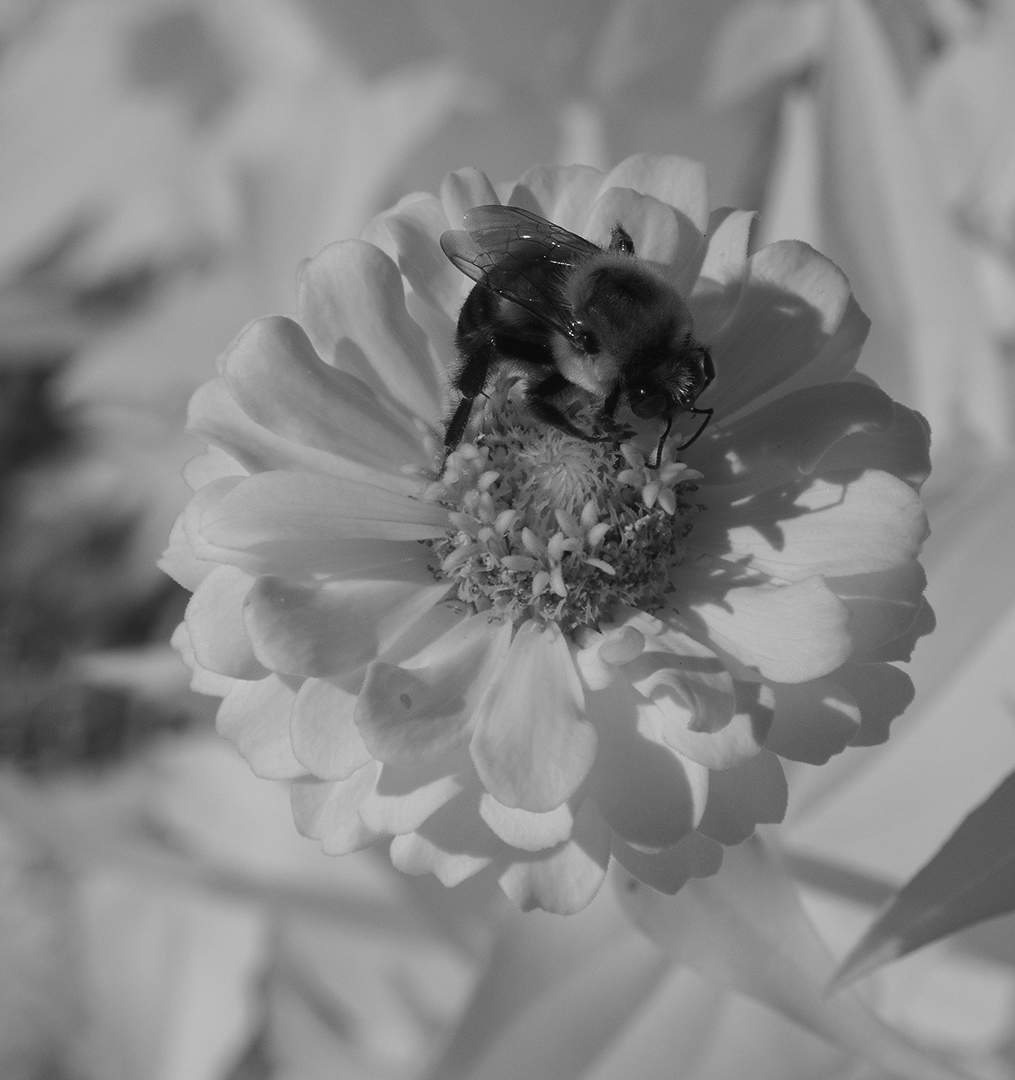
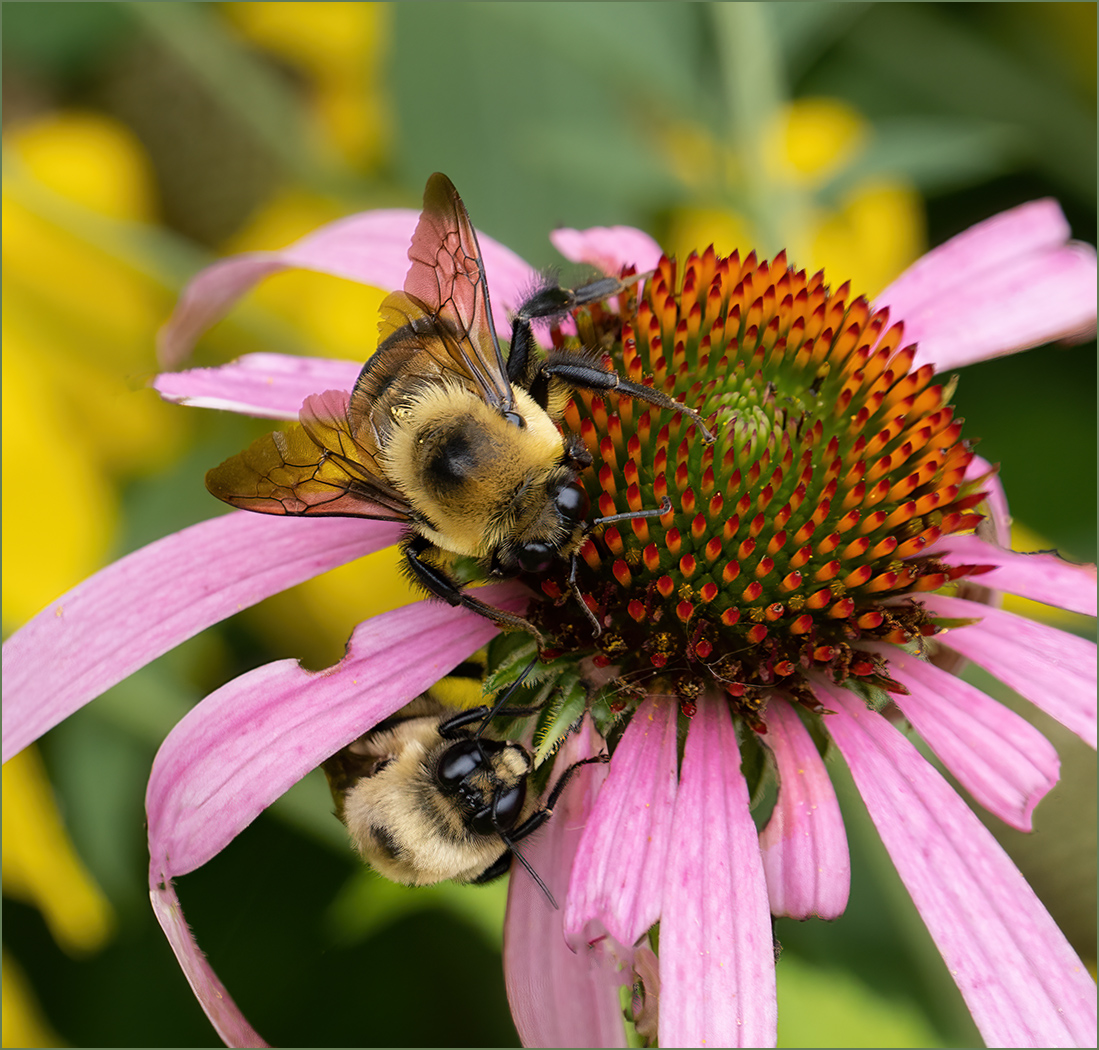
I agree with you, that the fuzz on the flower is great. The shape and colors of the flower are also very good. I like the square format, and I think that Cindy's light vignette is a good idea. I do wish that you would have had more depth of field so that more of the flower was sharp and showed more fuzz. |
Mar 19th |
5 comments - 1 reply for Group 57
|
16 comments - 11 replies Total
|