|
| Group |
Round |
C/R |
Comment |
Date |
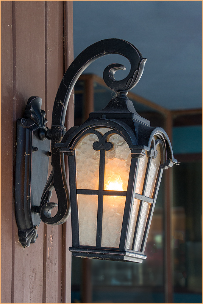
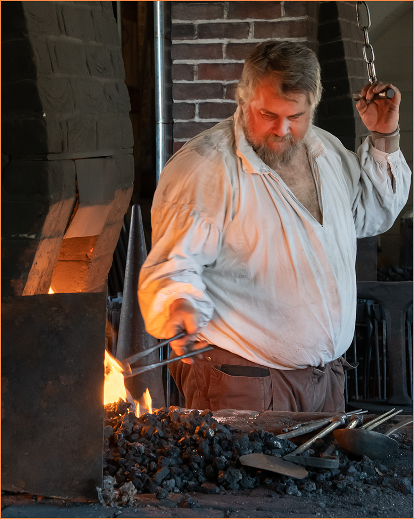
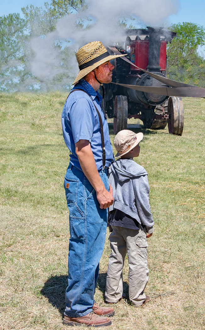
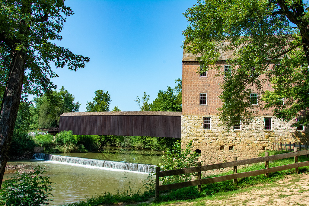
Image |
| 7 |
Feb 25 |
Reply |
Your editing has completely changed the image from green to brown tones, but I think that it is also another good option. |
Feb 26th |
| 7 |
Feb 25 |
Reply |
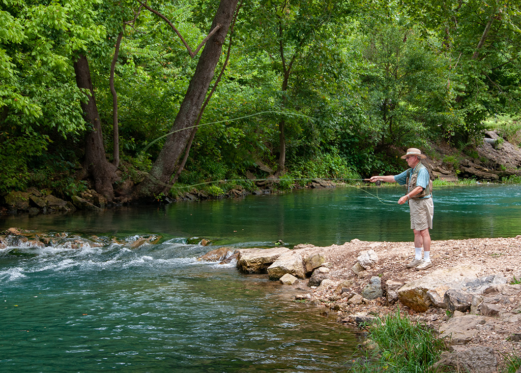
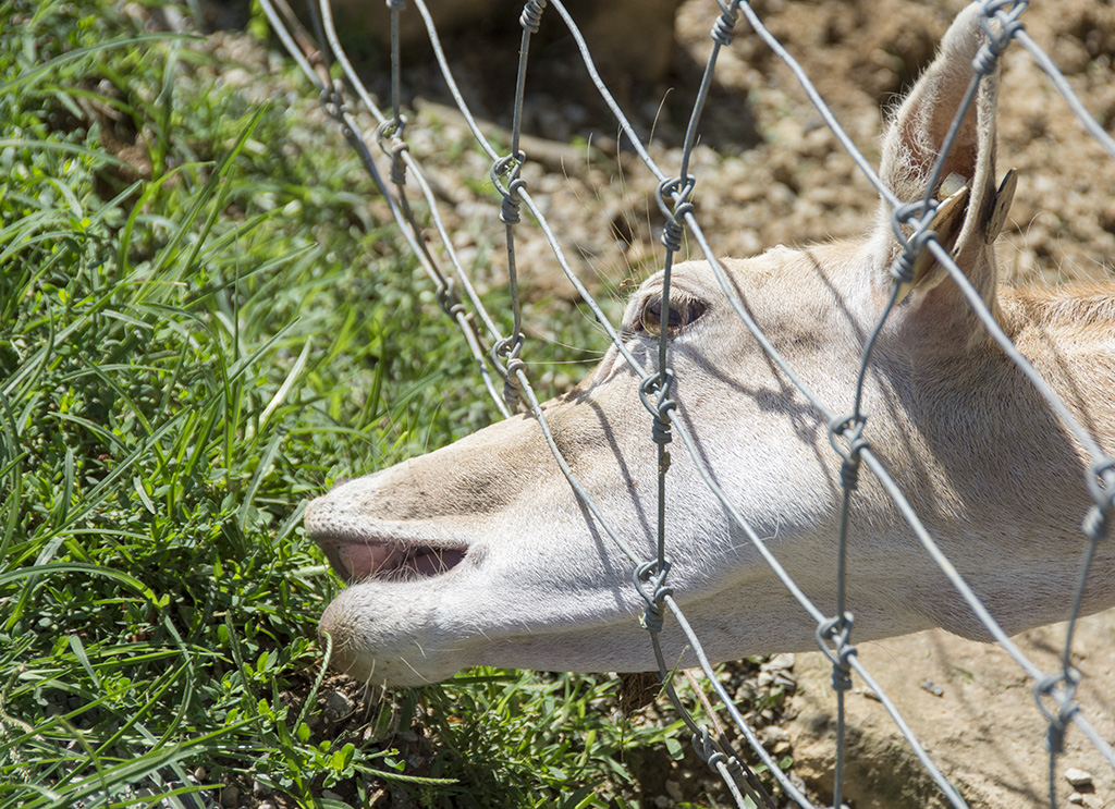
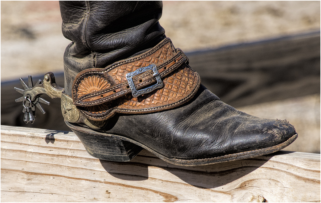
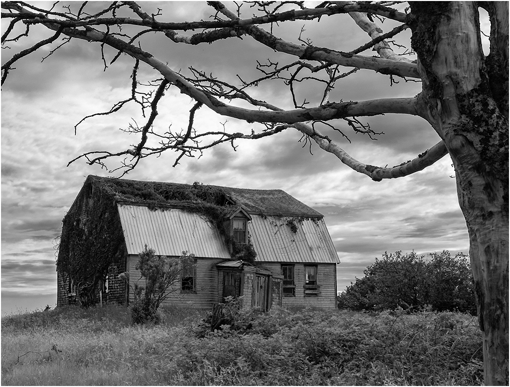
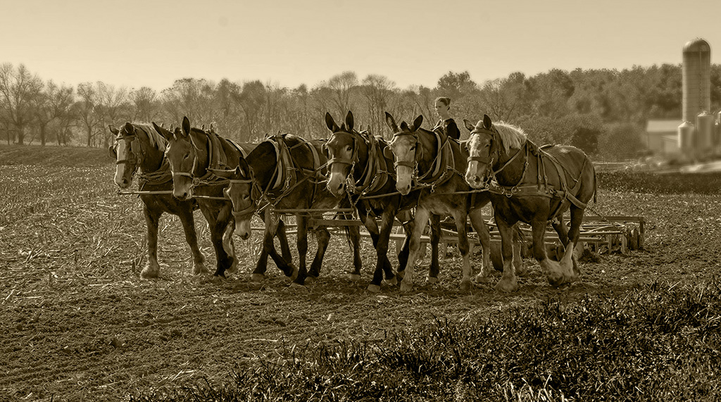
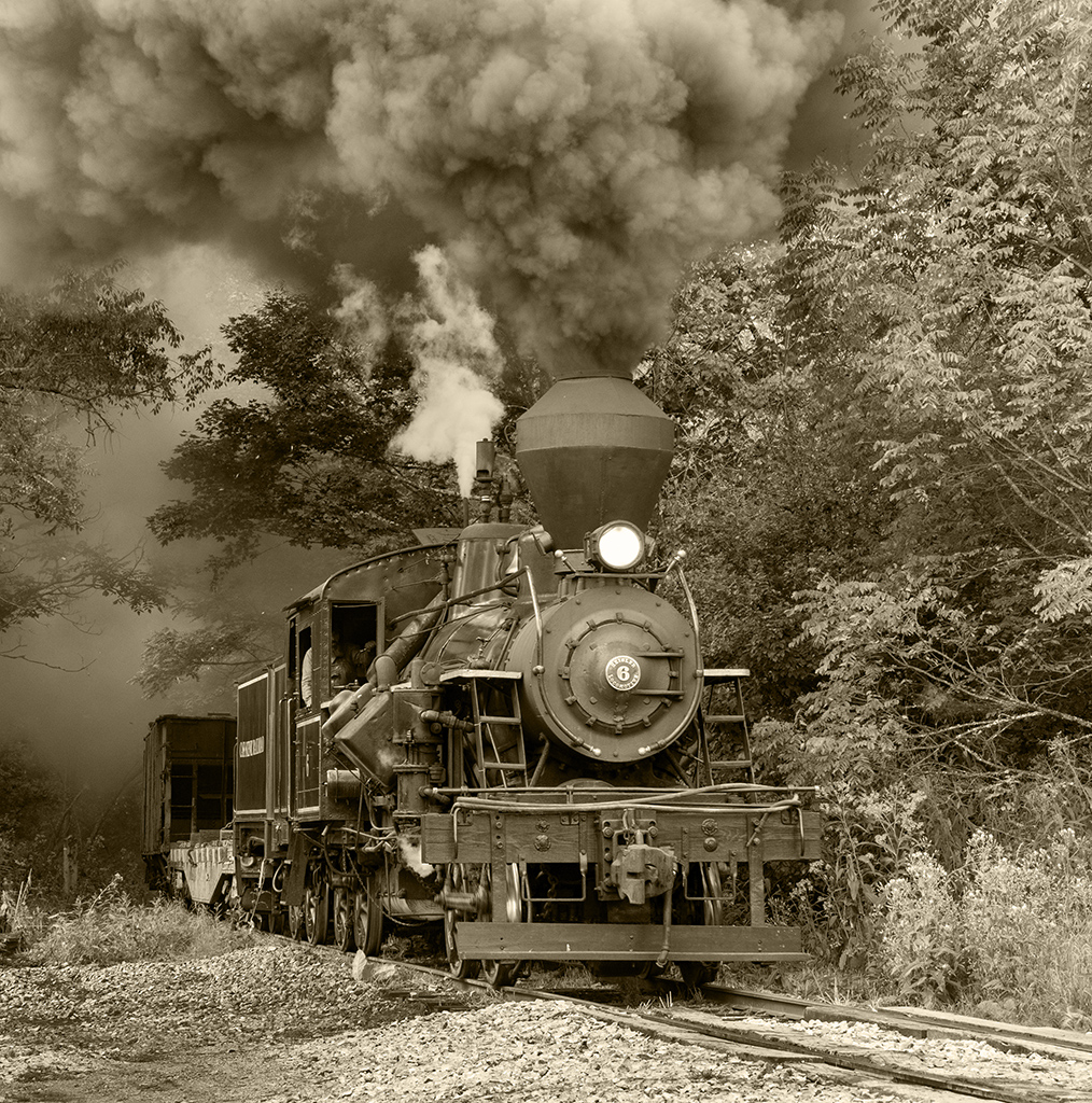
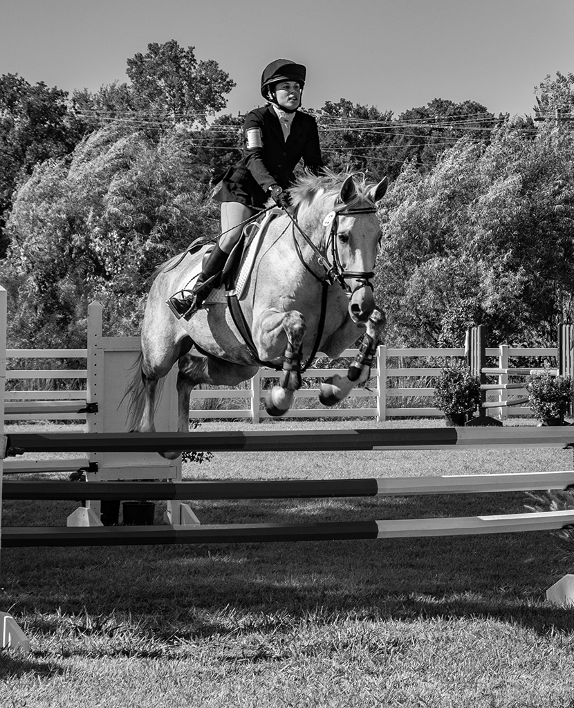
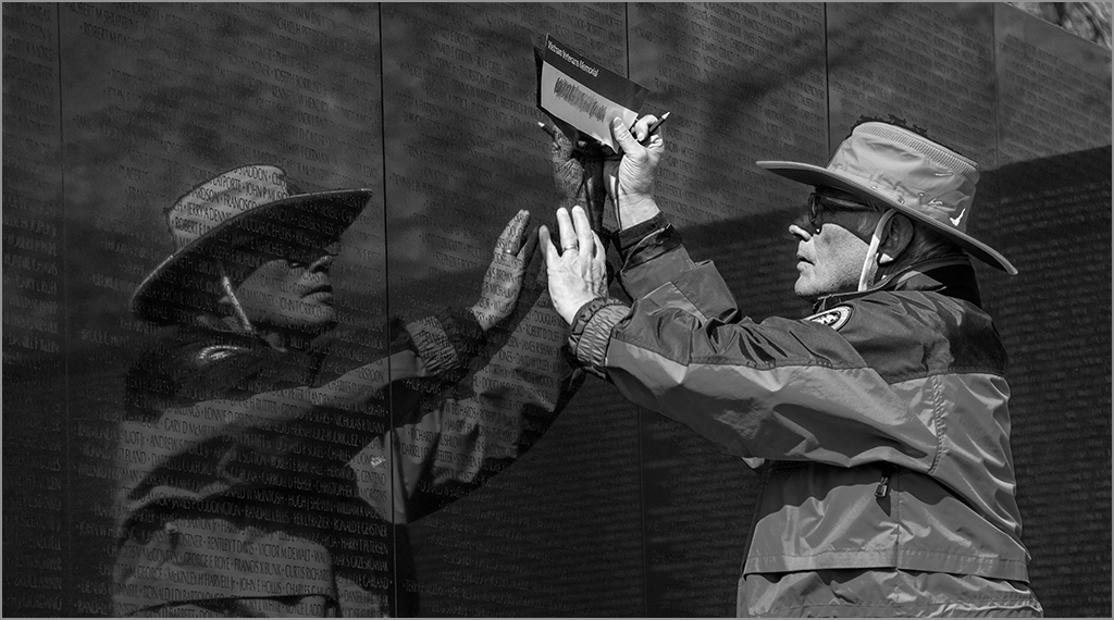
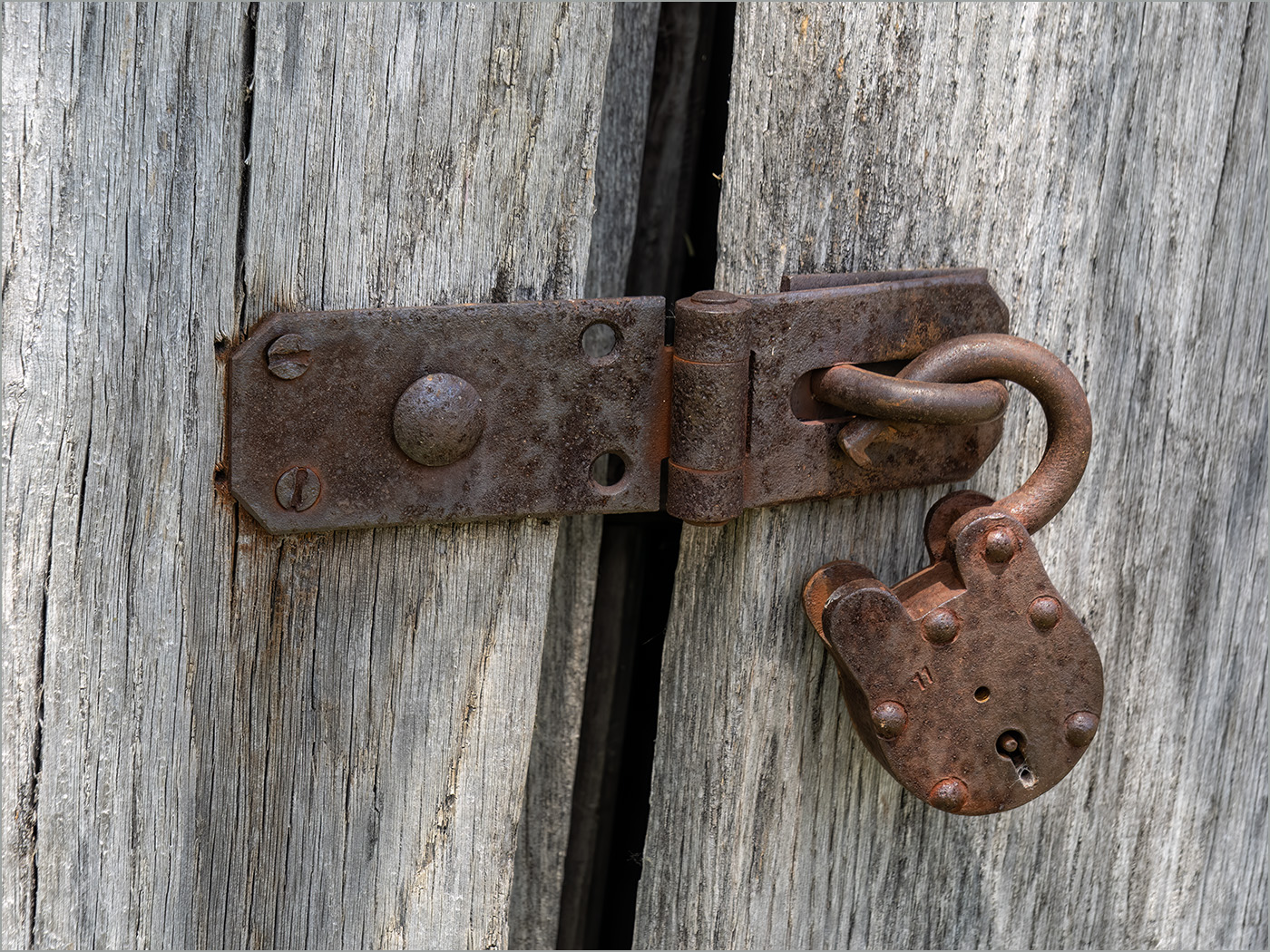
Hoshedar, the shadow is an important part of the image, and it had been taken from a lower angle the shadow would be much different. |
Feb 26th |
| 7 |
Feb 25 |
Reply |
You may be correct about being acceptable for nature, as I really have not keep up with the rule changes since I quit entering after receiving my MPSA a few years ago. |
Feb 26th |
| 7 |
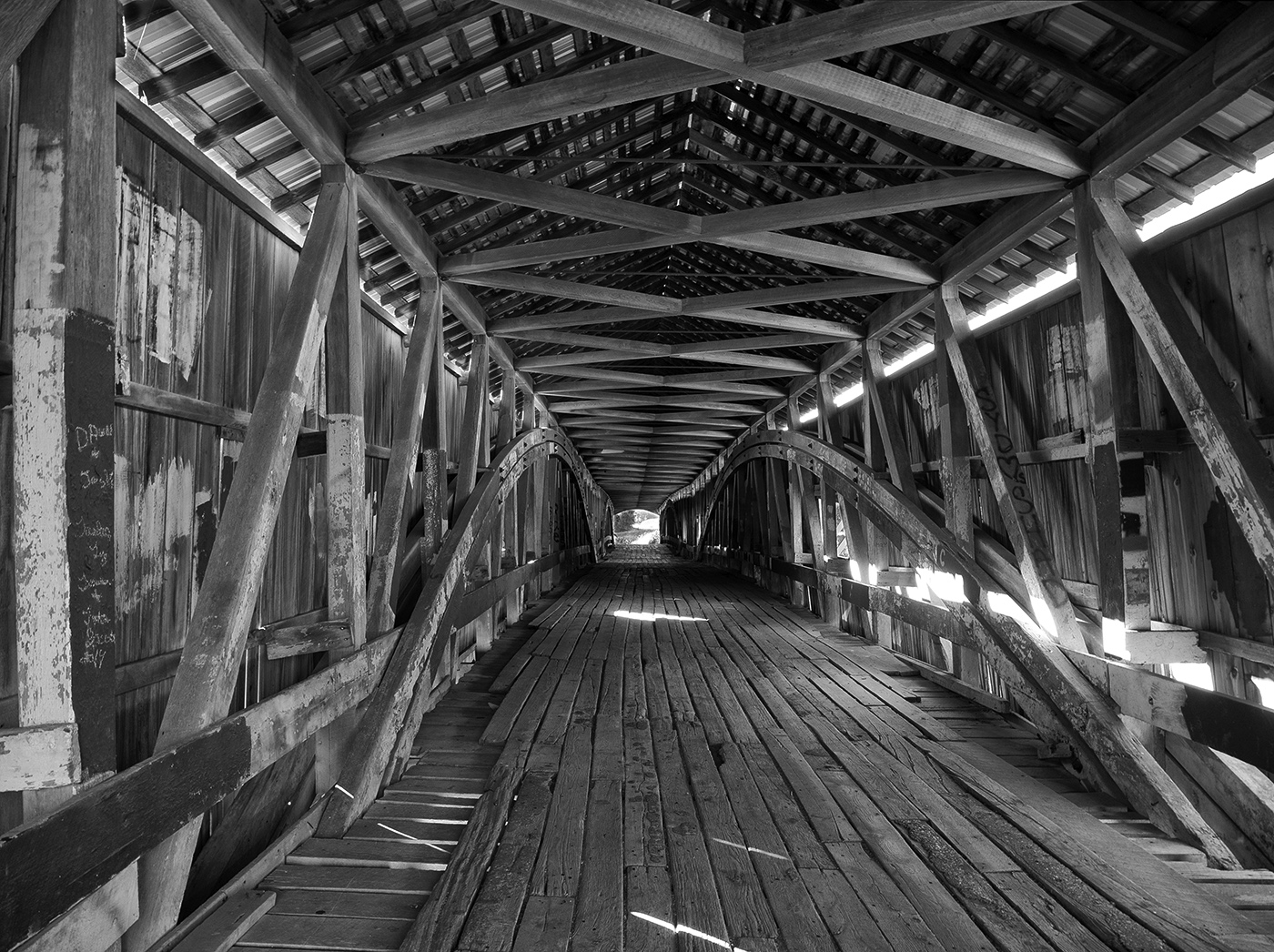
Feb 25 |
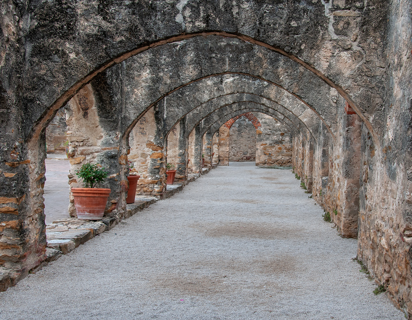
Comment |
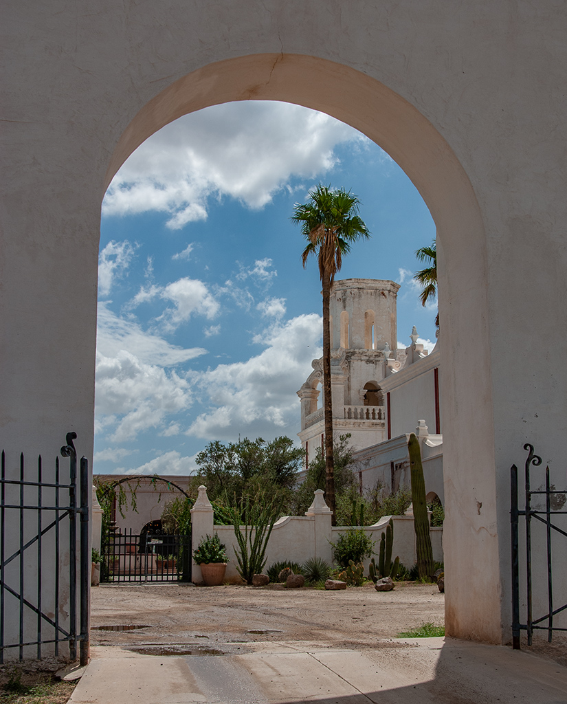
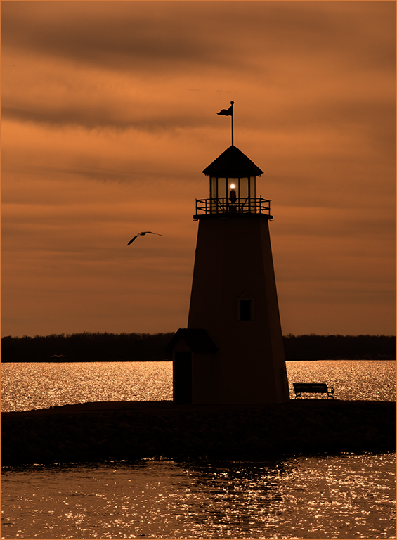
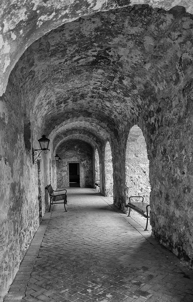
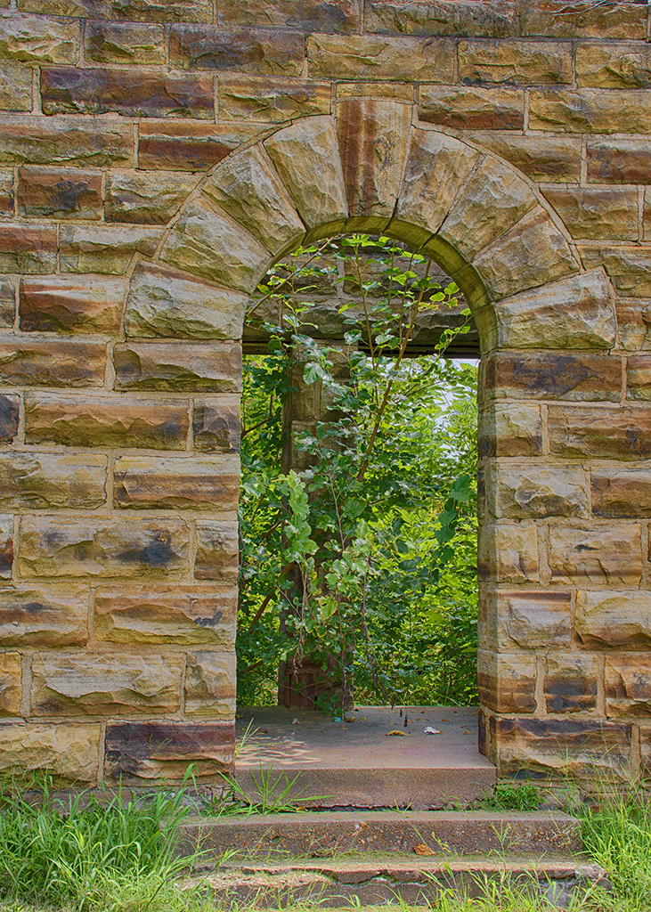
What a great image, and the light painting really added to it. Too bad that they do not allow this anymore, but some people there may not want you to do that. That sounds like quite an adventure to get the image. I really like the image as presented, but wonder how it would look if the arch was just a little bit darker? I went to hue/saturation, selected the arch color, and used the slider to darken only the arch. |
Feb 15th |
 |
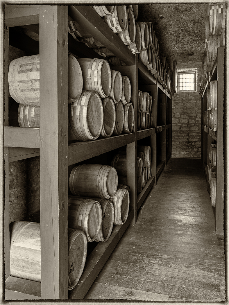
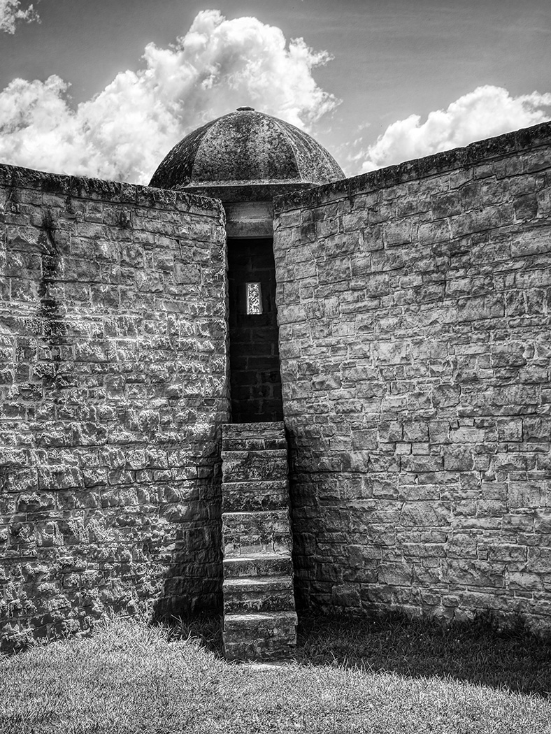
| 7 |
Feb 25 |
Comment |
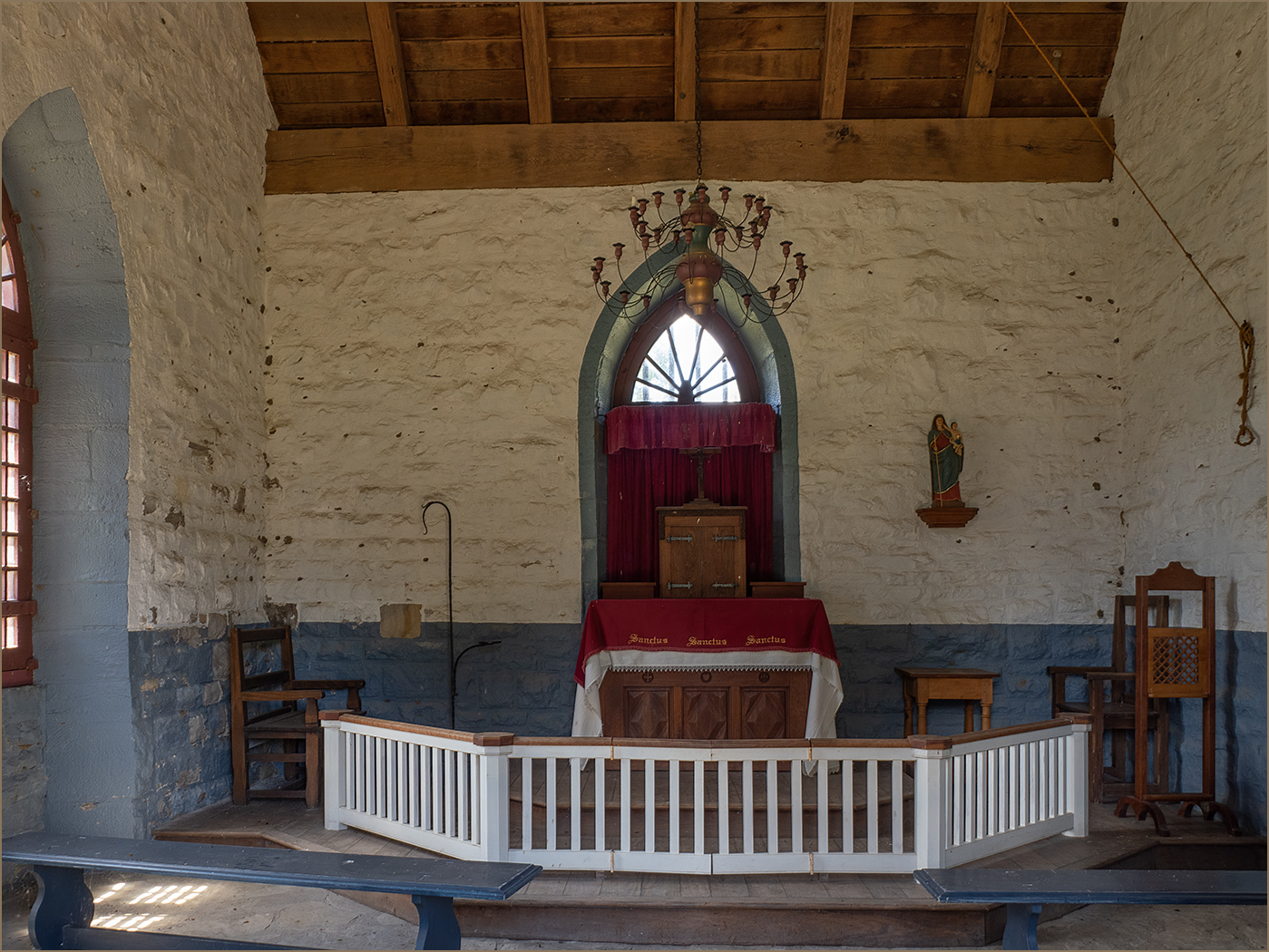
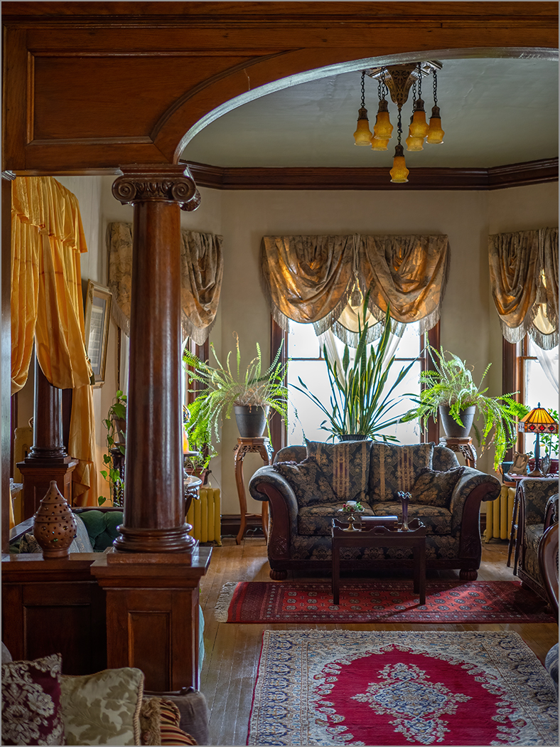
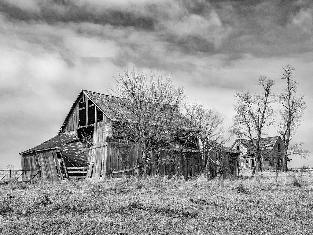
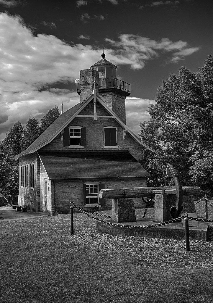
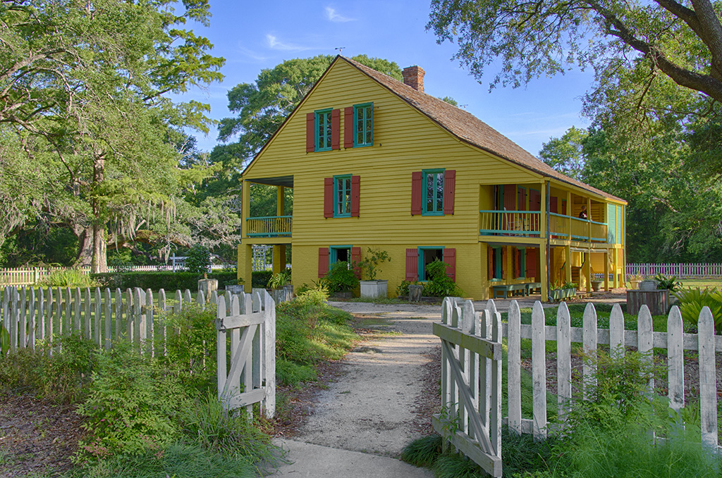
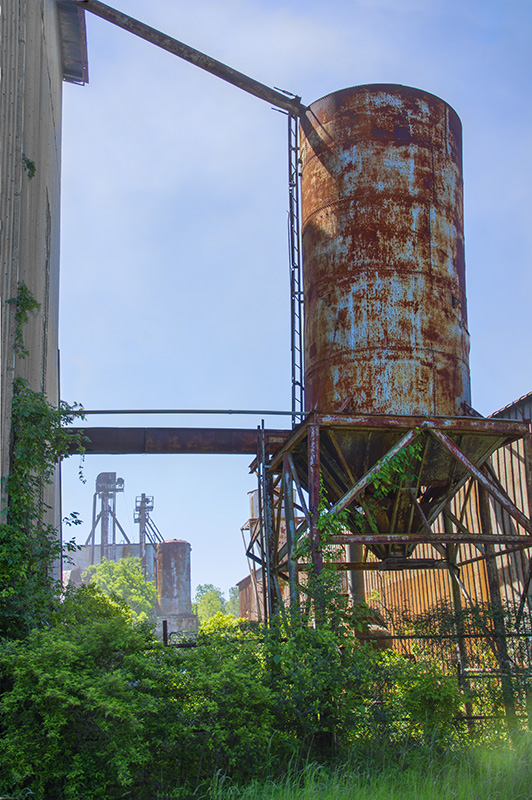
The black background is perfect. This is a stunning architecture that you captured very well. I do like what Judith did with the image as that helped clean up the bottom area. But I went a bit farther, and removed the item in the lower left that is pointing out of the frame. I really like the image, and hope that you are able to go back to this museum when it is finished to take more images. |
Feb 15th |
| 7 |
Feb 25 |
Comment |
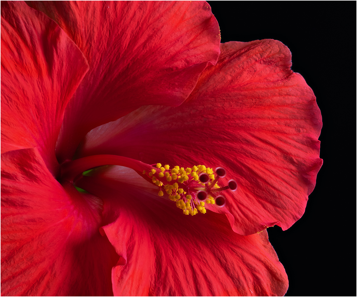
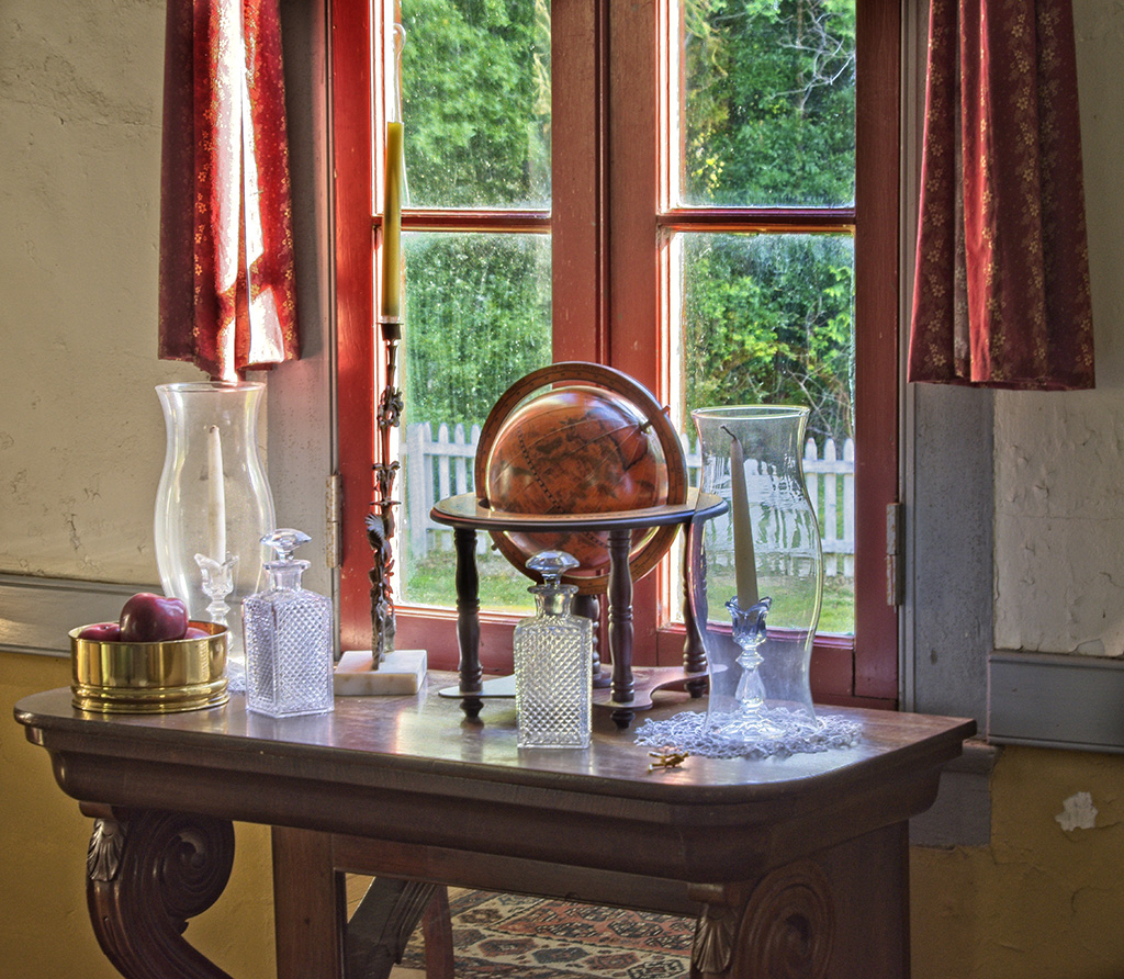
What an unusual but beautiful vase that you used very effectively. The reflections do not bother me. The plants are also very unusual. You are an artist to have arranged the plants in the vase. The slight textured background adds to the image. I like the reflection of the lower part of the vase, as it gives the vase something to stand on, and I think that you are showing just the right amount. I really like the image, and can see nothing to improve it. |
Feb 15th |
| 7 |
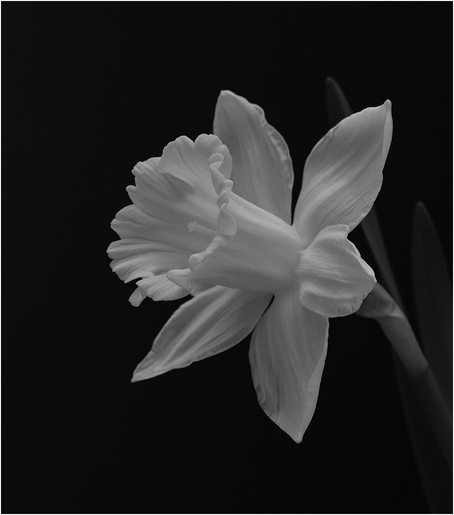
Feb 25 |
Comment |
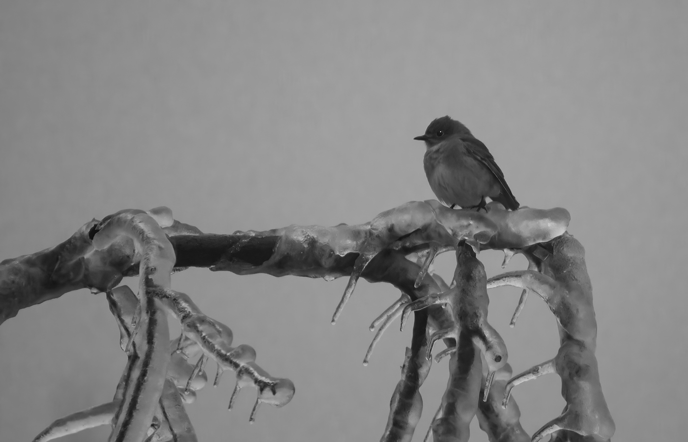
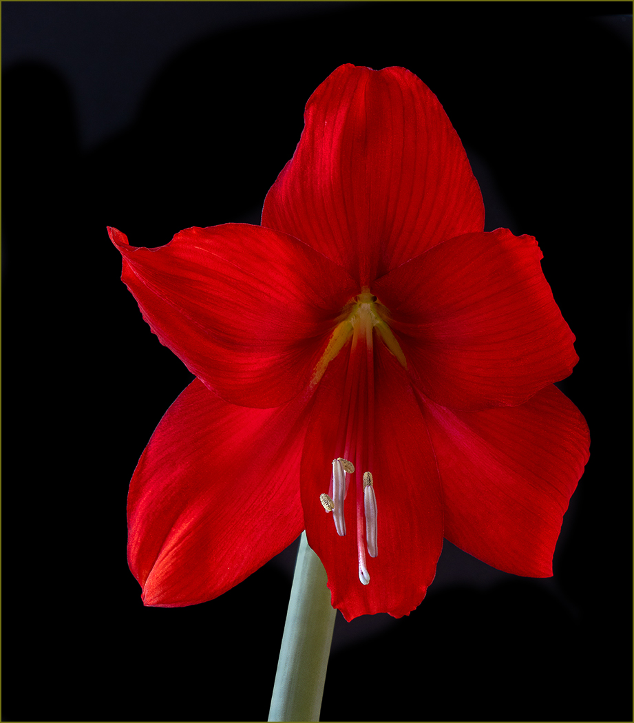
Great shot, to have the hummingbird sitting still and the lovely flowers below it. The blue sky background it great, and you have good depth of field. I like what Judith did with the image.
I like flipping the image that Butch did, it helps a lot with the composition to move the bird into the upper right, and then the stem is a great lead-in. However, I would leave the branch, now on the left. I think that it adds balance to the bird. |
Feb 14th |
| 7 |
Feb 25 |
Reply |
The jackal now seems to be walking out of the image, so I like the image without being flipped. |
Feb 14th |
| 7 |
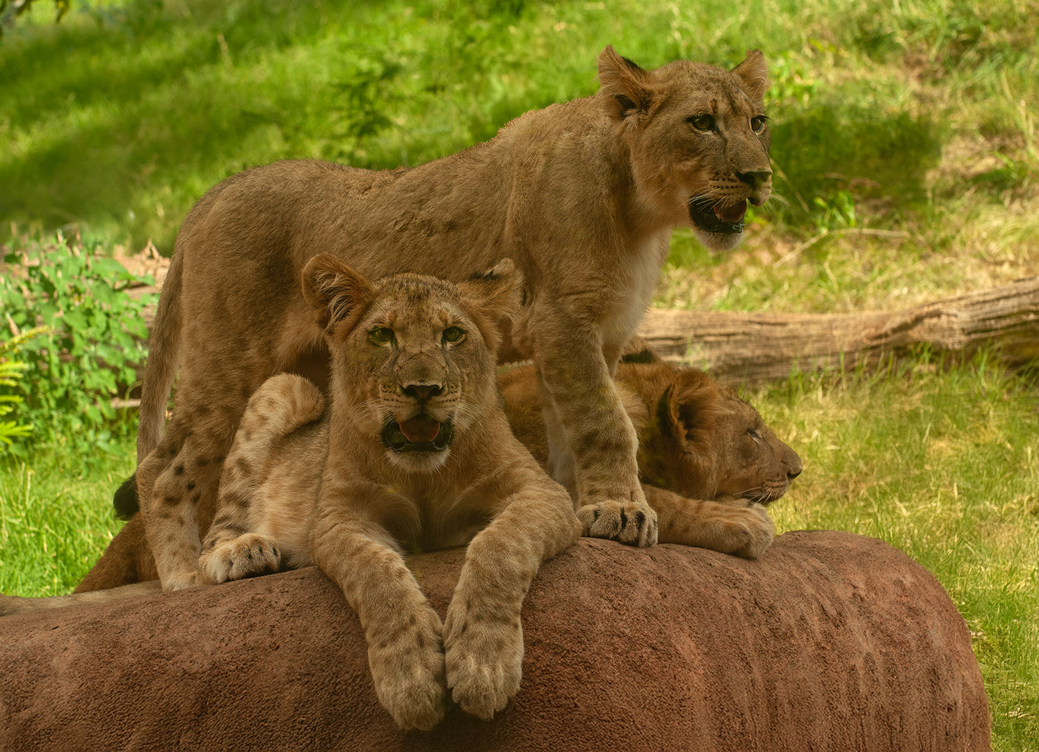
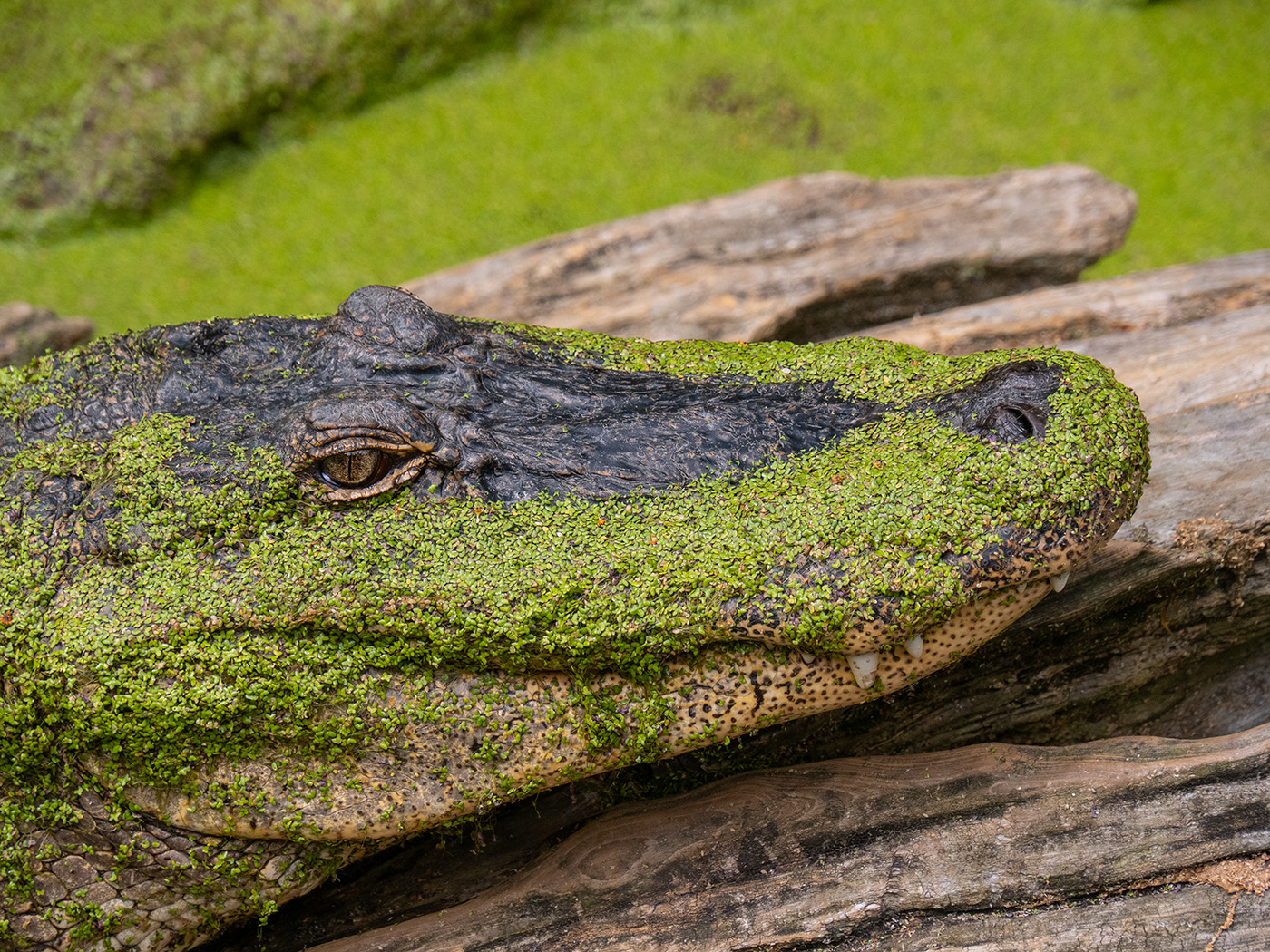
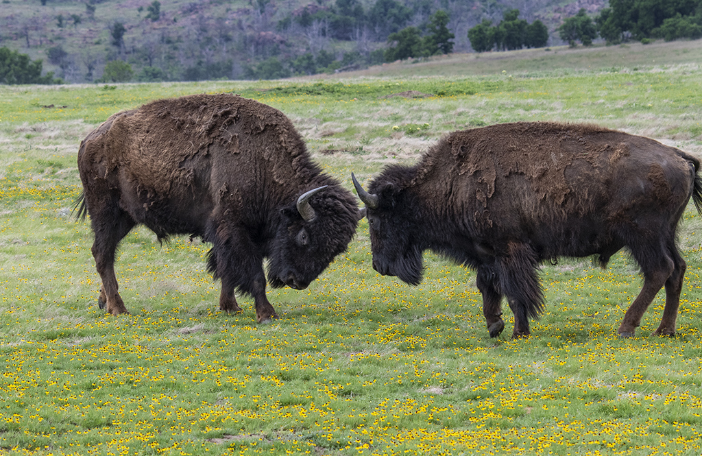
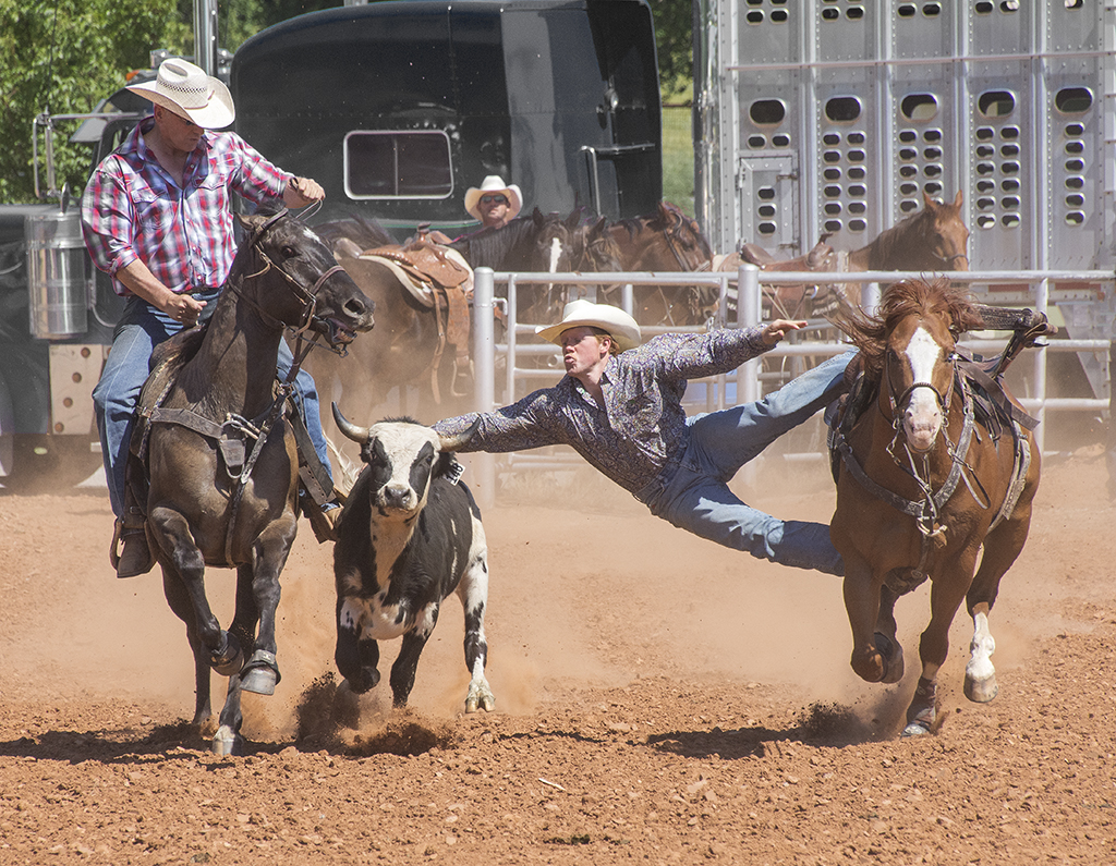
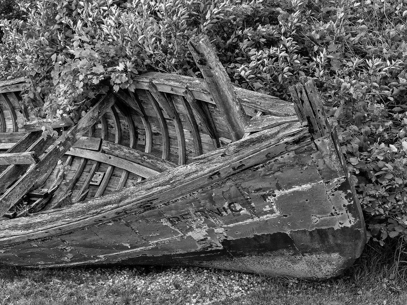
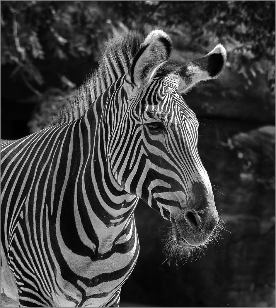
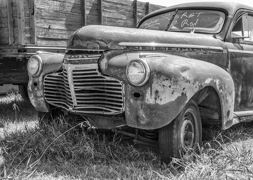
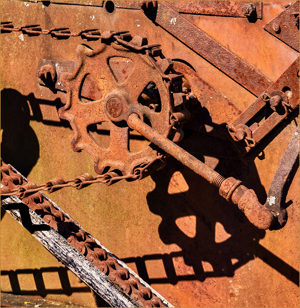
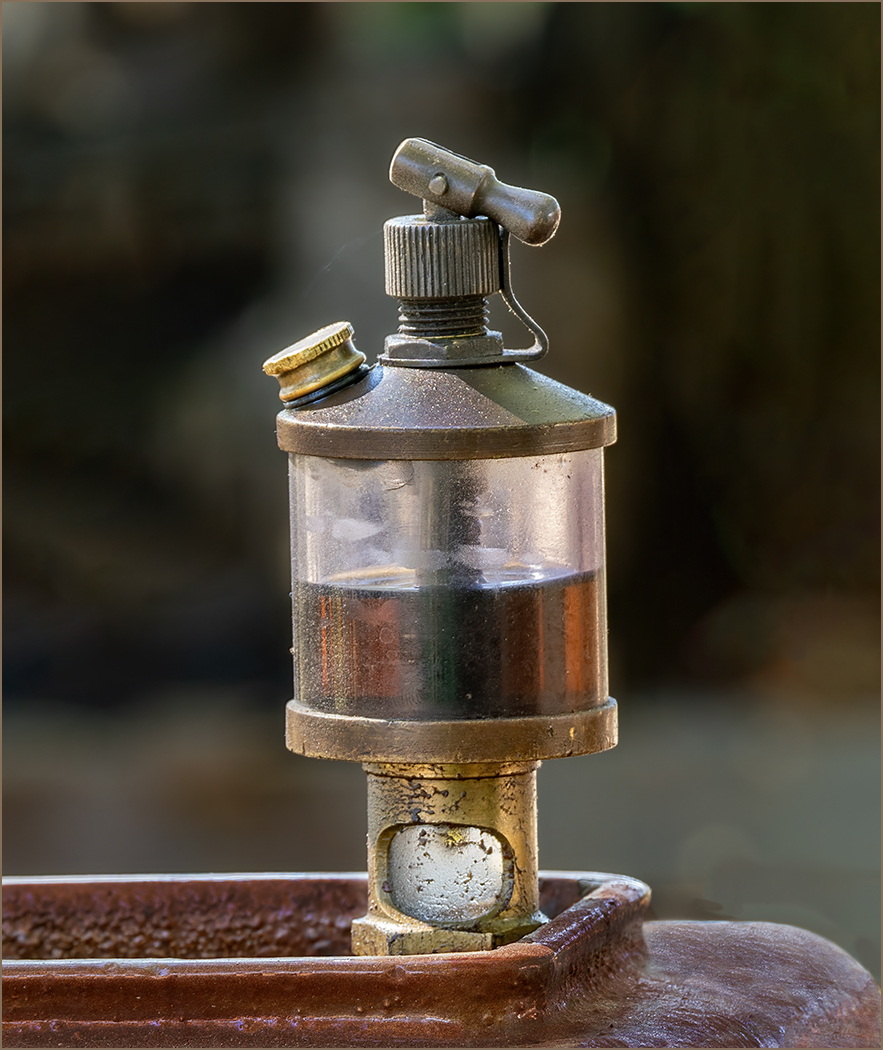
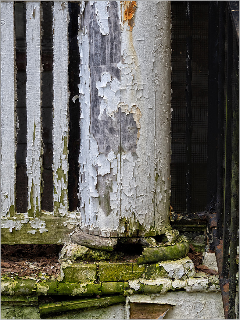
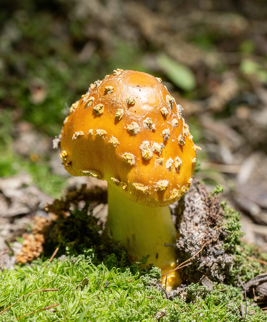
Feb 25 |
Comment |
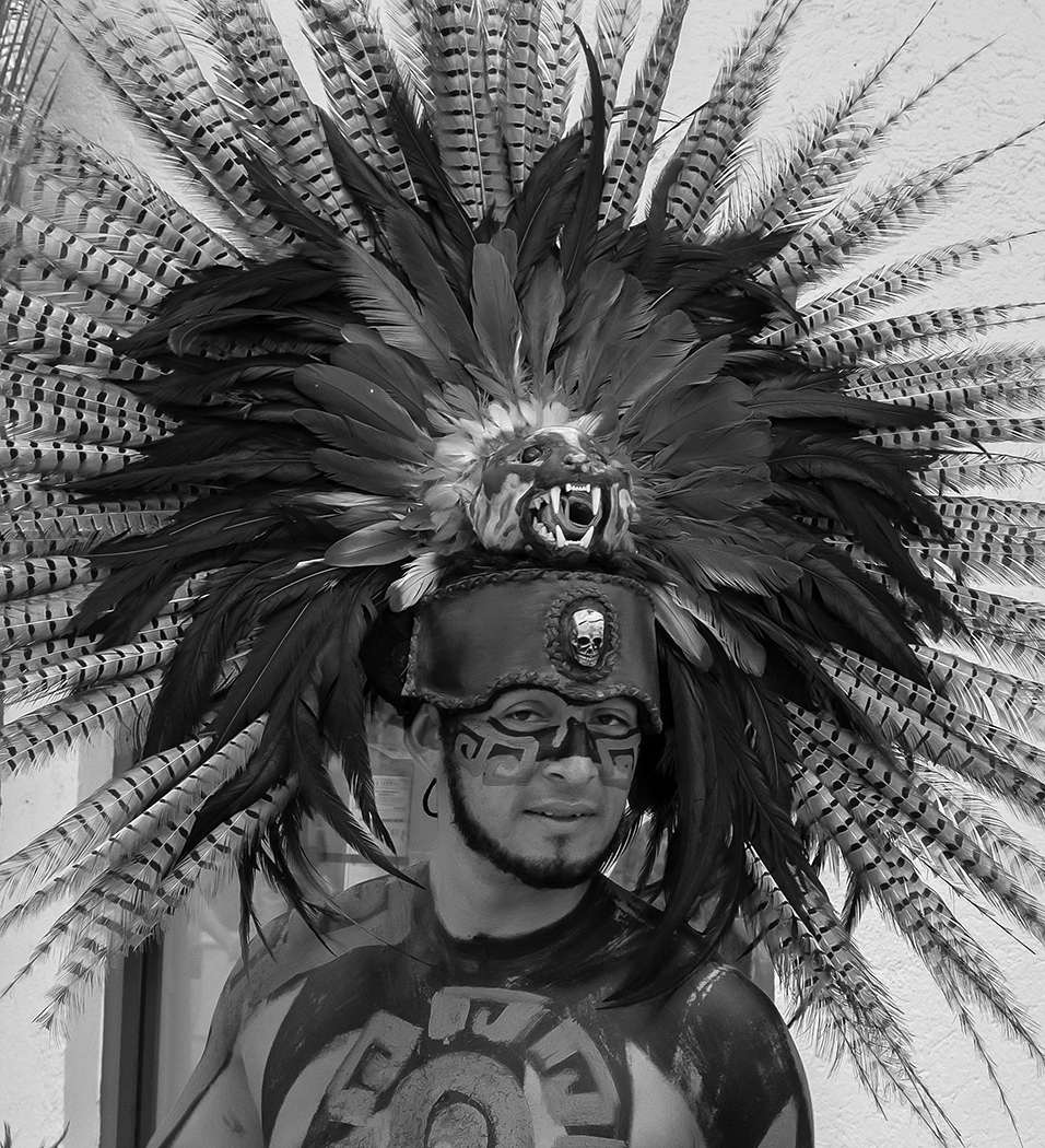
Very nice image of this young jackal, and has been stated above, it is the shadow that really makes this image. The composition is great, and you caught it with its head turned toward the camera. I like the tighter crop that Judith made, and the lowering of the saturation.
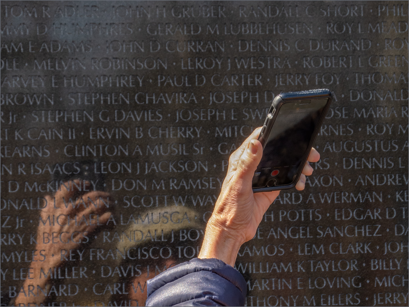
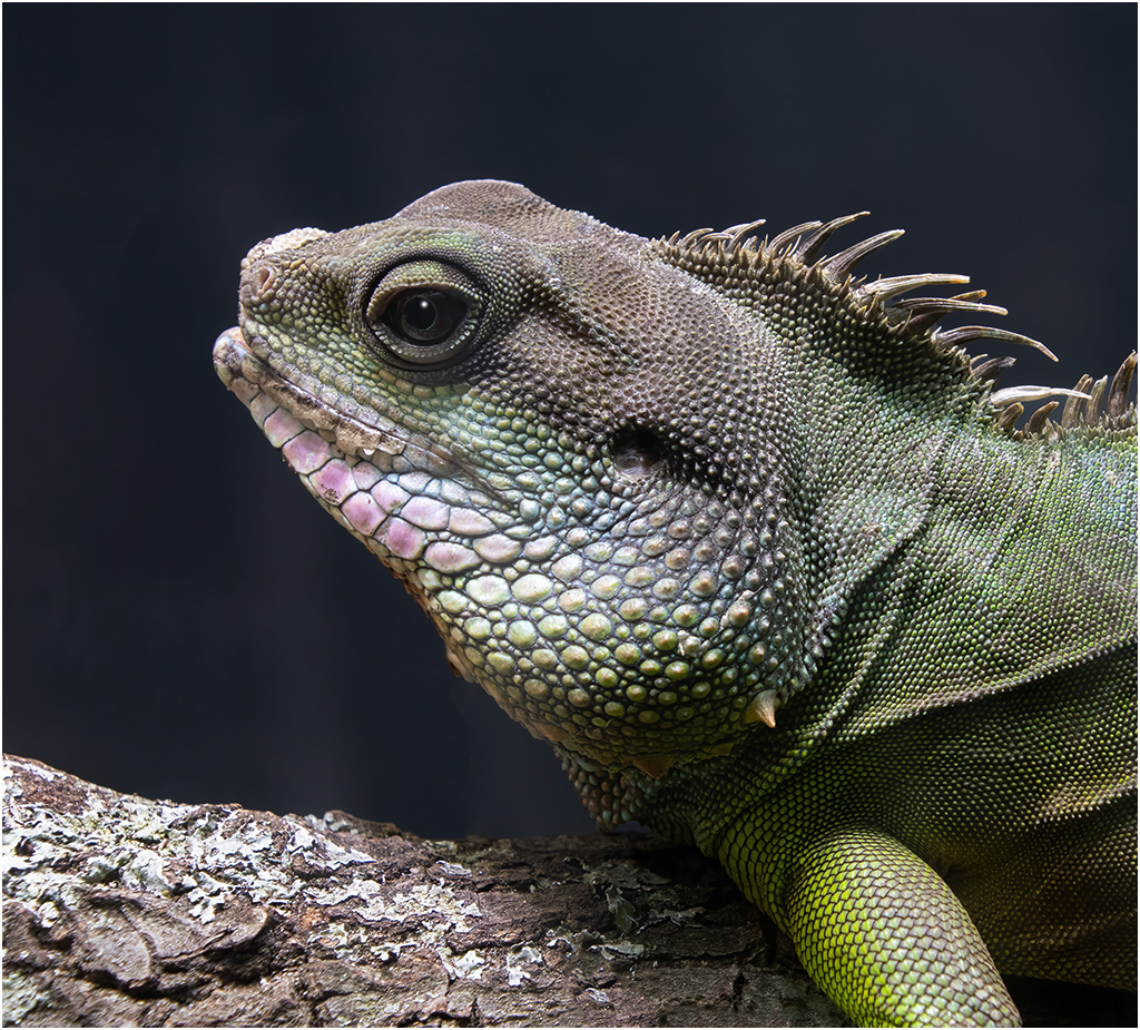
However, the color of the dirt, to me, is a distraction. I went to Hues/Saturation, selected the color of the dirt, and greatly desaturated it. The color of the jackal is more yellow, so its color was not changed as much. I then painted on the mask with black, to bring back the full color of the jackal. You could not do this if you want to use it in a PSA nature salon. What do you think? |
Feb 14th |
 |
| 7 |
Feb 25 |
Reply |
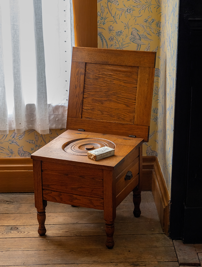
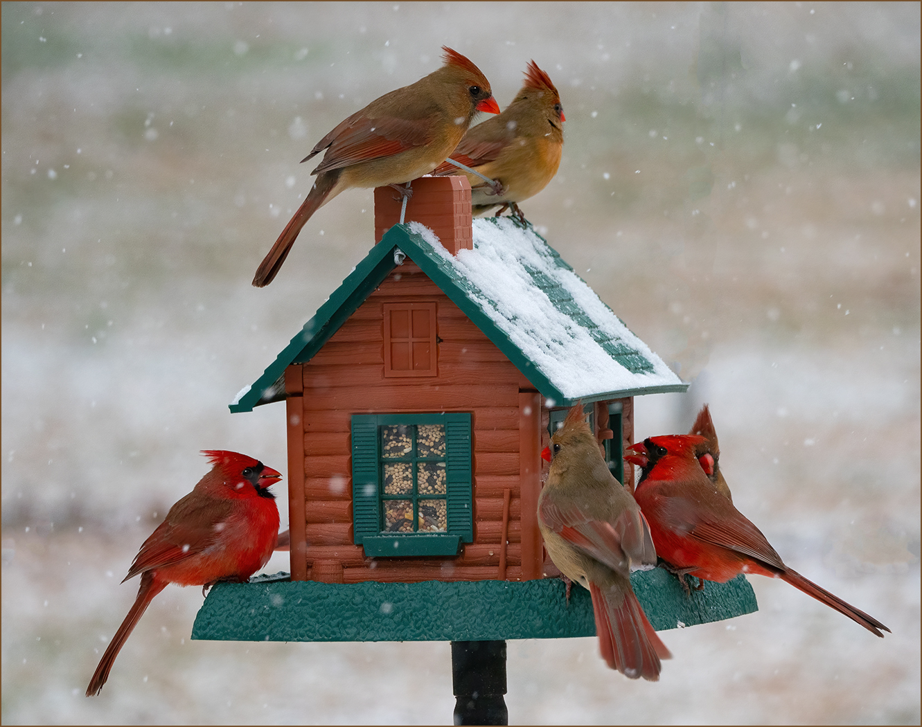
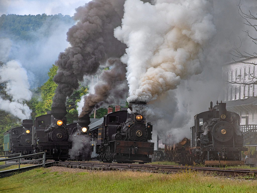
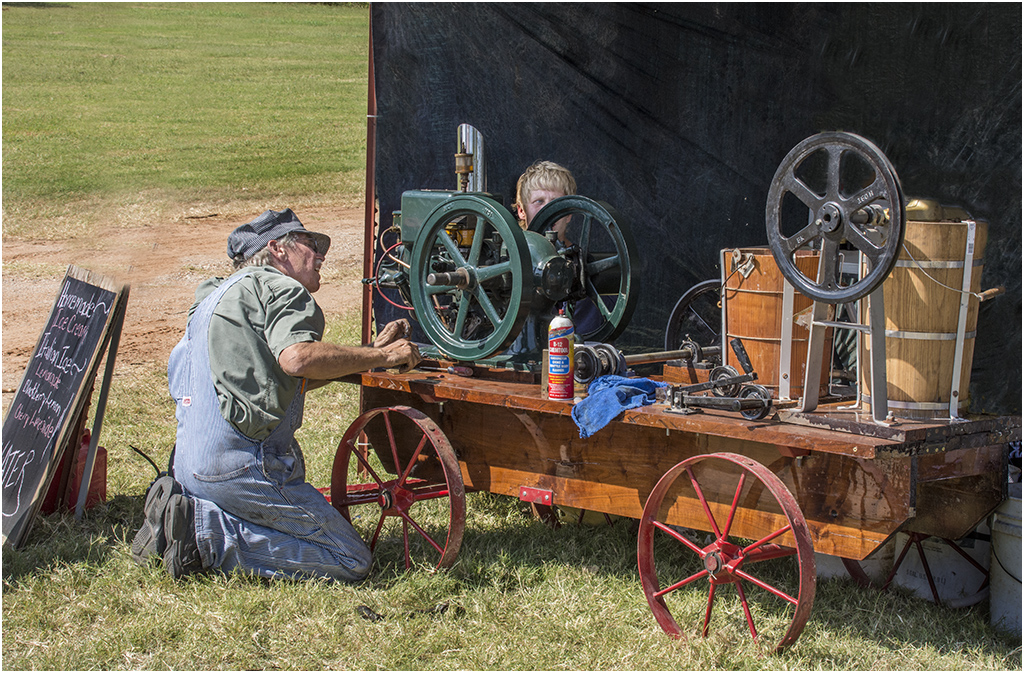
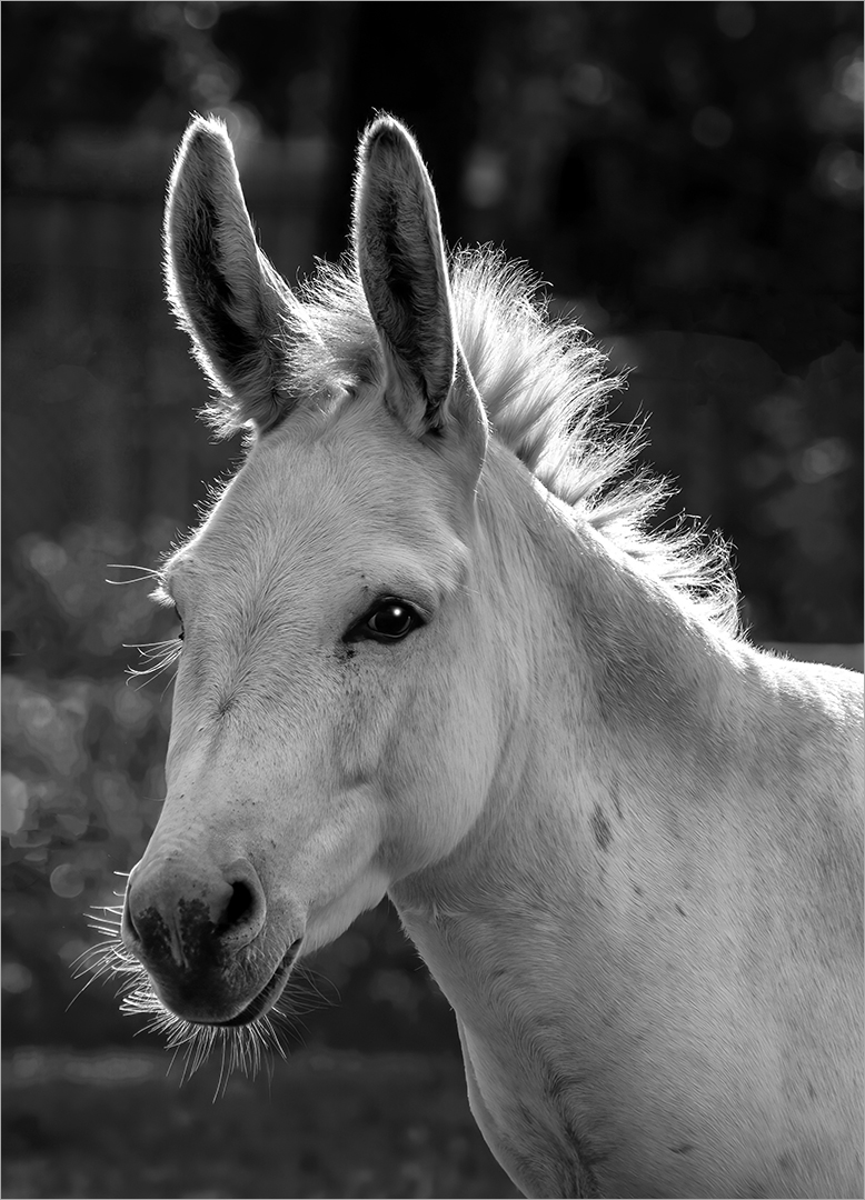
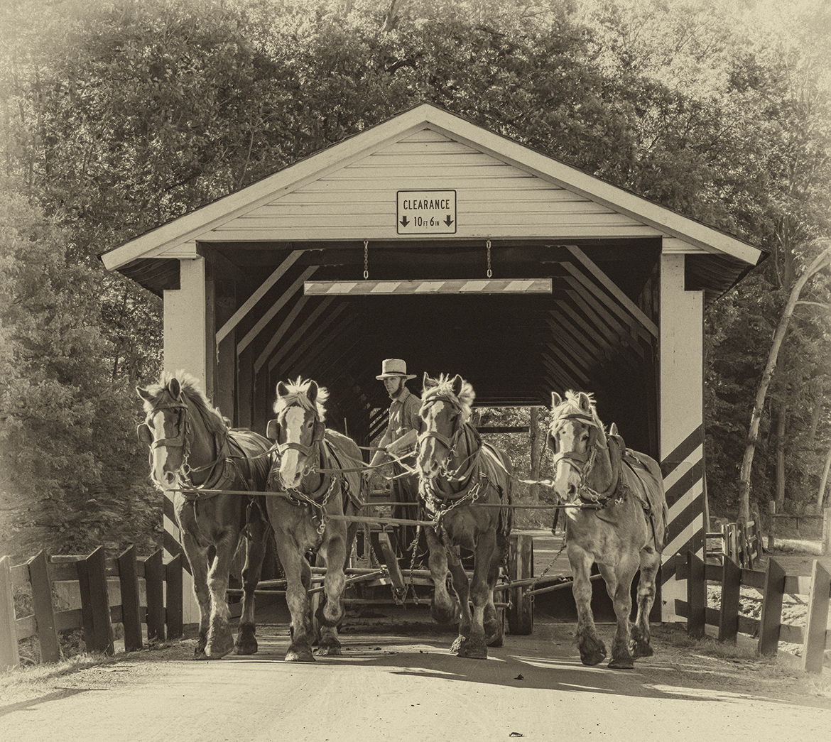
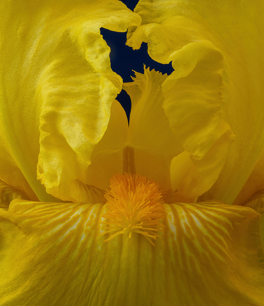
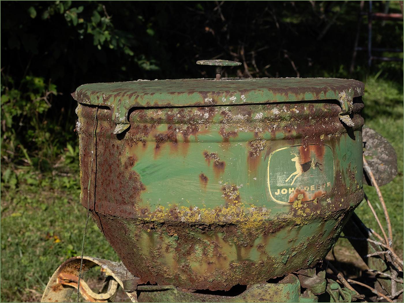
Thanks. It is on a bird feeder, so I am sure it would not be eligible for nature. |
Feb 8th |
5 comments - 5 replies for Group 7
|
| 32 |
Feb 25 |
Reply |
This new software is amazing and keeps getting better. |
Feb 14th |
| 32 |
Feb 25 |
Comment |
I agree that you captured a very attractive young woman and I like that the face fills the frame. But I do agree with Diana that she is a bit soft. I do not like what Diana did to soften the image, to me that makes her look like plastic. I did use Topaz Photo AI to sharpen the image, and then NIK Silver Efex to convert to mono. |
Feb 12th |
 |
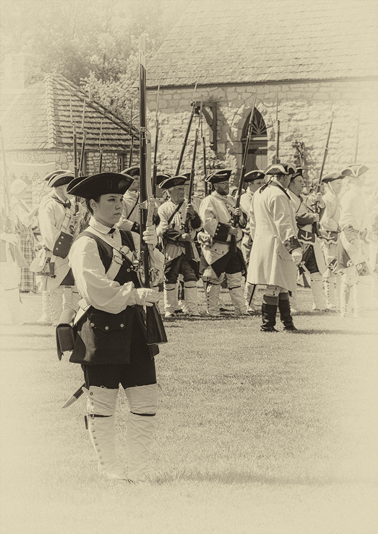
| 32 |
Feb 25 |
Comment |
I really like this image of a very good looking couple in great period clothing. I like their expressions, the fact that they are looking at the camera and the connection between the two. It helps that the man is taller and on the right. The pose looks like you would see in an old time photo.
I agree that conversion to gray is not a good choice. The young woman seems to have freckles or something in the color, and that makes her skin look bad to me in the conversion to mono. So, I used Topaz Photo AI to clear up her face. I then tried to use the default filter in NIK Silver Efex, and the Yellow 2 default, and reduced the border size.
To me that default added too much grain. So, I used the NIK Silver Efex default monochrome preset and added the toning of 20, and added a small border. |
Feb 12th |
 |
| 32 |
Feb 25 |
Reply |
I think that it has been there for quite awhile. You do need to click on the right pointing arrow to open up the border adjustments. Note that the ones above are pointing to right and adjustments are pointing down. You can also look at different borders, Type is the default but there are others that you can scroll through. |
Feb 11th |
 |
| 32 |
Feb 25 |
Comment |
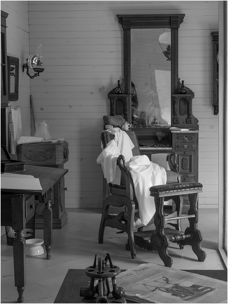
I am glad that you went with monochrome, as the red carpet is overpowering. I think that the mid-tone is good. I like the grouping of some of the people, and the movement especially the man in the upper right. I like the crop, except that I would crop off the bust of Kennedy at the bottom. I think that it would simplify the image so that it is not too busy. I would clone out the feet coming in at the top and lower right side. |
Feb 11th |
| 32 |
Feb 25 |
Reply |
Thanks. |
Feb 10th |
| 32 |
Feb 25 |
Comment |
It is easy to change the border size. Just adjust these sliders to you get what you like. |
Feb 10th |
 |
| 32 |
Feb 25 |
Reply |
It was a digital Nikon camera. |
Feb 5th |
4 comments - 4 replies for Group 32
|
| 57 |
Feb 25 |
Comment |
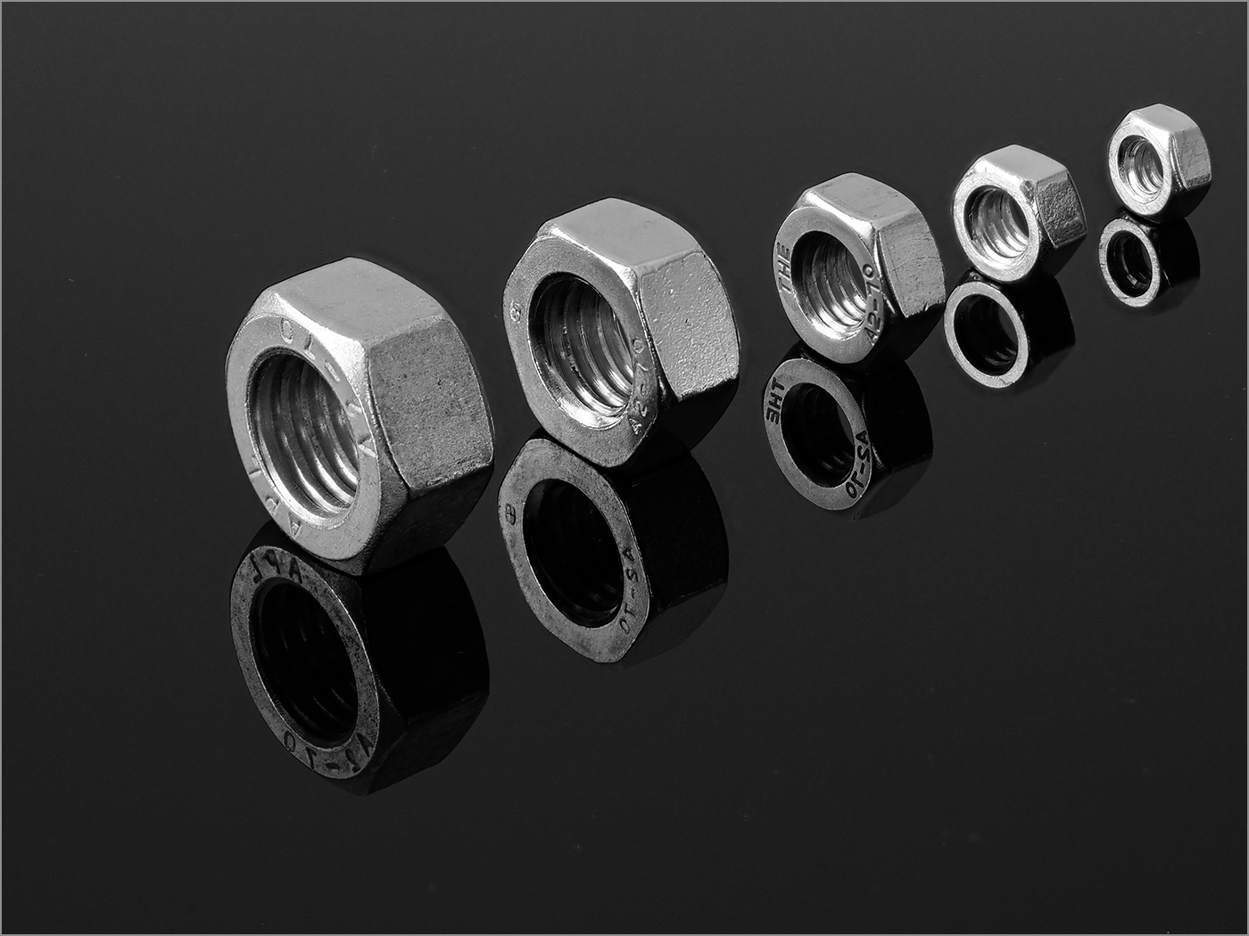
The bright colors and strong lines make for a lot of visual impact. The bubbles add to the image. Taking closeup images of items show us details that we normally do not see. It can be a lot of fun to experiment with objects indoors when the weather keeps us indoors. To me, the yellows look over saturated and maybe blown out. |
Feb 23rd |
| 57 |
Feb 25 |
Comment |
You have good lighting, good depth of field, and I really like the texture of the wood on the front of the drawer. The pull is also interesting. I am wondering why you put the marbles in front of the drawer? To me, they distract from the beautiful drawer and the green plant. I agree with you and Cindy about the green thing. I also think that the blue/pink area in the upper left is a distraction. |
Feb 23rd |
| 57 |
Feb 25 |
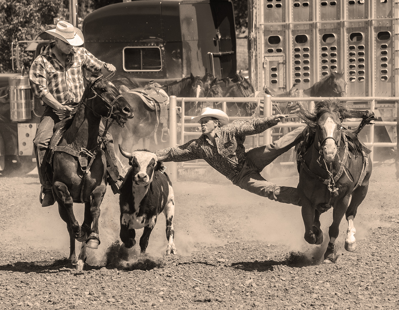
Comment |
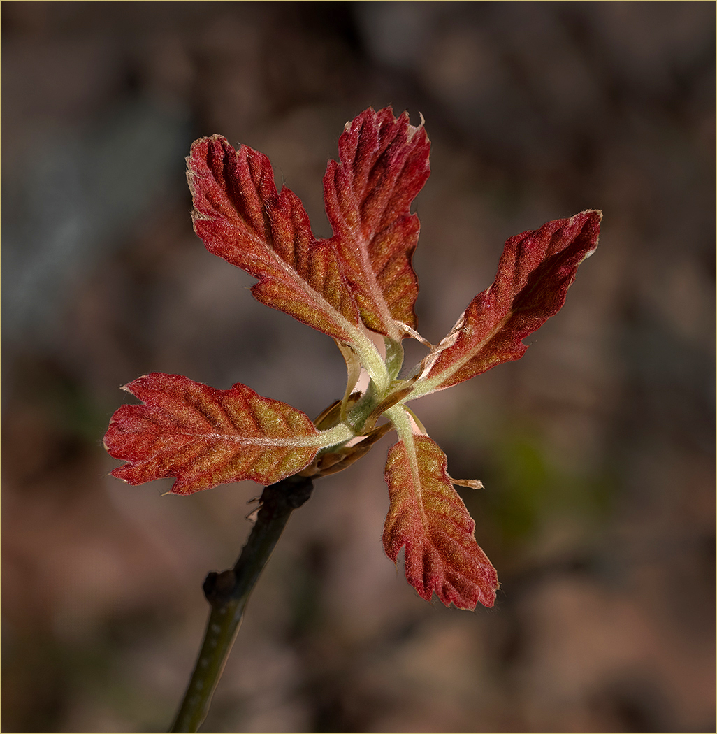
Those must be strong spikes to puncture a tire. Your editing improved the image. I like the tight composition and the bend of the stem at the end. Having the leaves pointing in from the left brings the eye straight into the image, and the bend makes a good center of interest. As Cindy said, the water droplets add to the image. Too bad that you had to stop, but it did give you time to take the image. |
Feb 23rd |
| 57 |
Feb 25 |
Comment |
Interesting use of a 590nm infrared camera. The rose has excellent depth of field, being sharp from front to back. The exposure is right on, with the rose not being blown out and detail in the petals. Making the leaves blue instead of green adds a lot of interest to the image. I like that the rose fills the frame. As a matter of curiosity, what color was the rose? |
Feb 23rd |
| 57 |
Feb 25 |
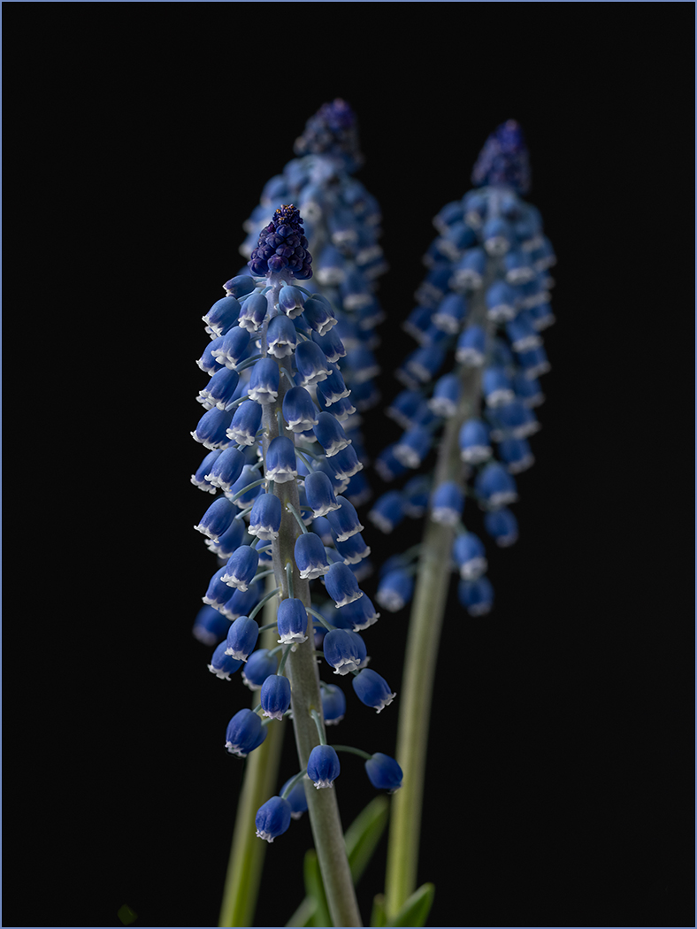
Comment |
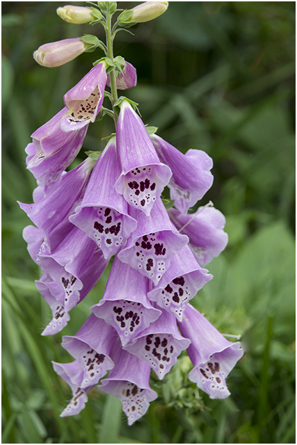
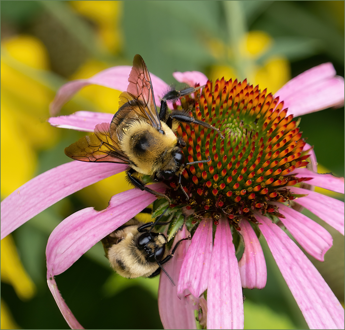
You captured a nice grouping of the flowers. I think that the depth of field is perfect, to have the two near flowers sharp, and the flowers further back slightly blurred. As Bob said, it is good that you did not make the background go completely black. That keeps the flowers from looking like they are floating in the frame. I would not change a thing. |
Feb 23rd |
| 57 |
Feb 25 |
Comment |
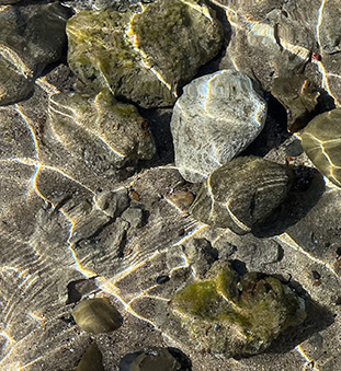
What a great photographer eye to have noticed this image. The reflections from small ripples in the very clear water are very interesting. There is a lot going on in the image which makes it kind of busy. I like idea that Cindy had of cropping in on the image. There are several possibilities, but I chose the lower left. I like the larger light grey rock as a focal point and the ripples making a lead-in. |
Feb 23rd |
 |
6 comments - 0 replies for Group 57
|
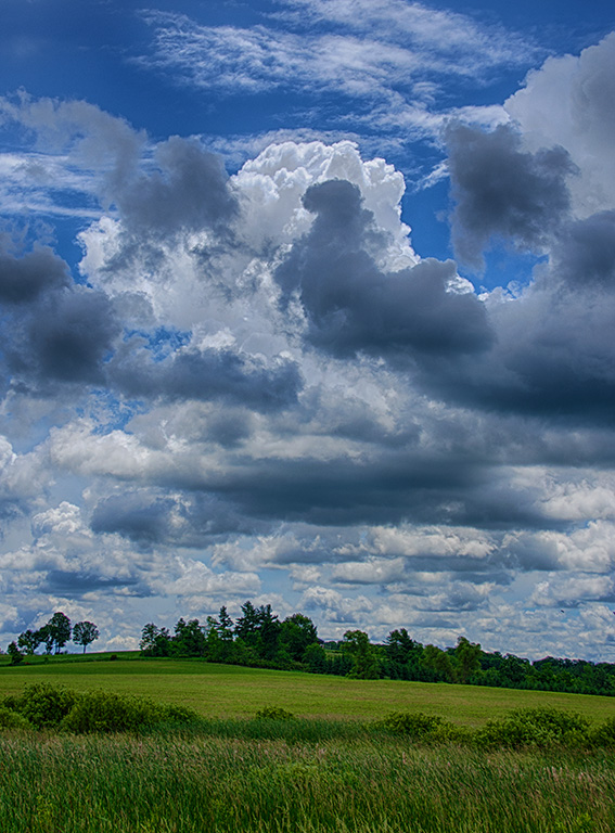
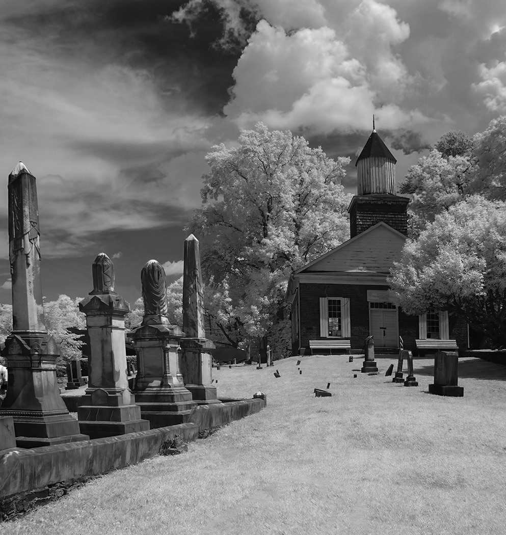
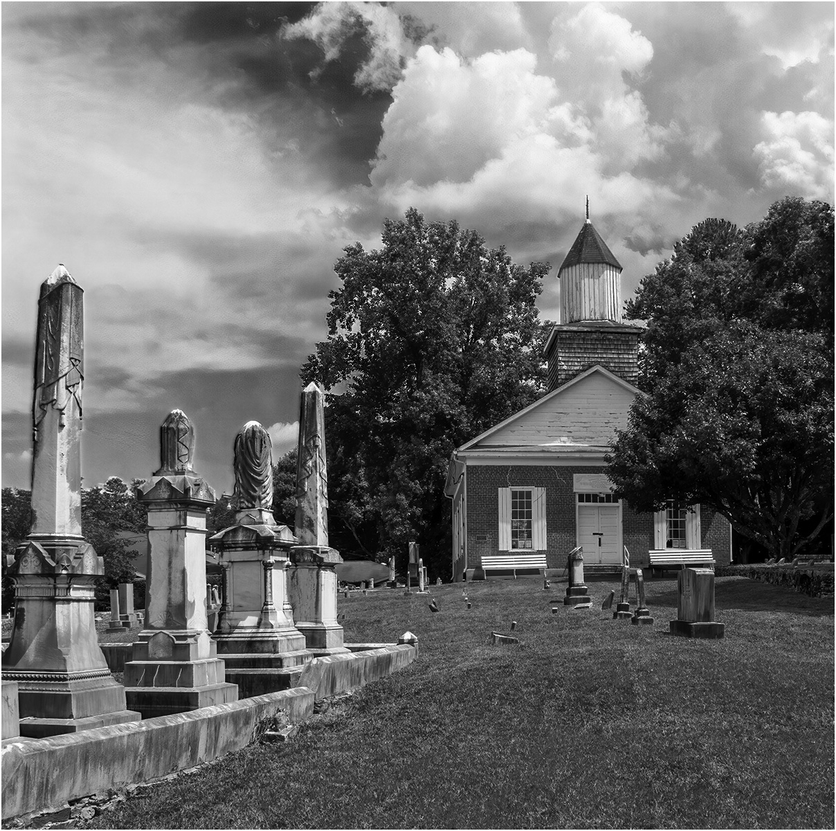
| 66 |
Feb 25 |
Comment |
I agree with Arik that the composition is very good. I think that winter is a good time to use IR, because at least here in Missouri it is the time of the year with dark blue skies and good high clouds. |
Feb 2nd |
1 comment - 0 replies for Group 66
|
16 comments - 9 replies Total
|