|
| Group |
Round |
C/R |
Comment |
Date |
Image |
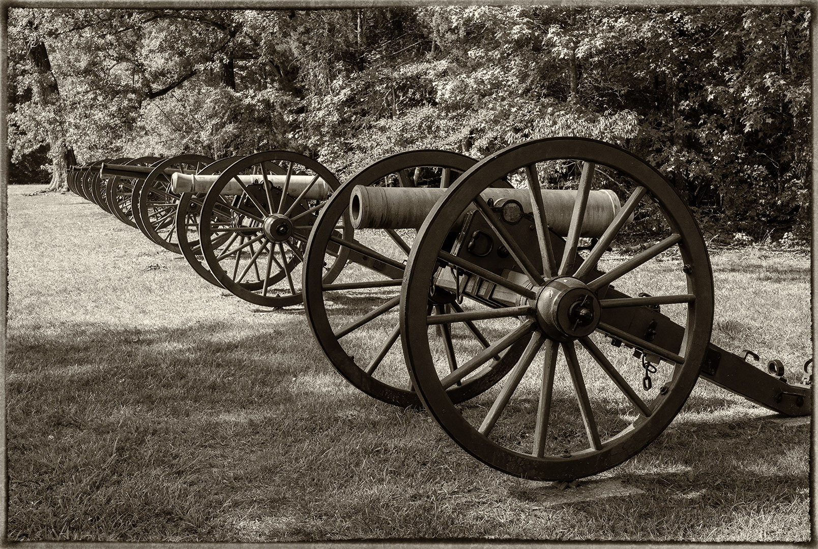
| 7 |
Nov 24 |
Reply |
Thanks for your comments. |
Nov 17th |
| 7 |
Nov 24 |
Reply |
Thanks. On the comments on the framing, leaving it was 3, and cropping was 2. |
Nov 17th |
| 7 |
Nov 24 |
Reply |
Thanks. On the comments on the framing, leaving it was 3, and cropping was 2. |
Nov 17th |
| 7 |
Nov 24 |
Reply |
Thanks. On the comments on the framing, leaving it was 3, and cropping was 2. |
Nov 17th |
| 7 |
Nov 24 |
Reply |
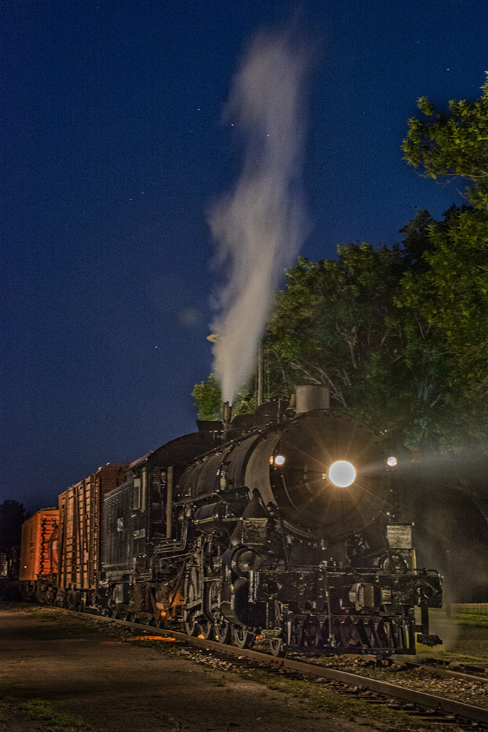
The image flipped as I did is more natural, because it was the way that you photographed it. But the image vertical catches the eye, makes the viewer think, and I am sure would score higher in a competition. |
Nov 15th |
| 7 |
Nov 24 |
Comment |
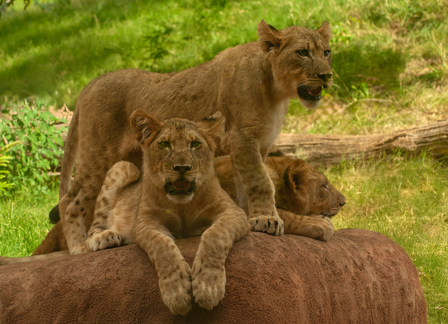
I like the image. It is something quite different from what you usually show us, as it is creative with combined images. You did a good job of combining and blending the images. I like that there are some tree branches at the edge of the image. The point that bothers me is that the puppy is much sharper than the moon. But then, the viewer knows that the image is not real so that is maybe not a concern. |
Nov 14th |
| 7 |
Nov 24 |
Reply |
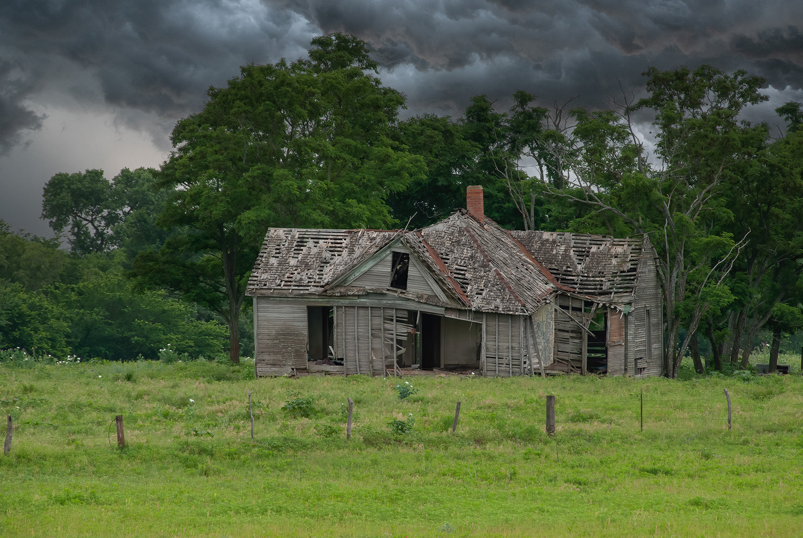
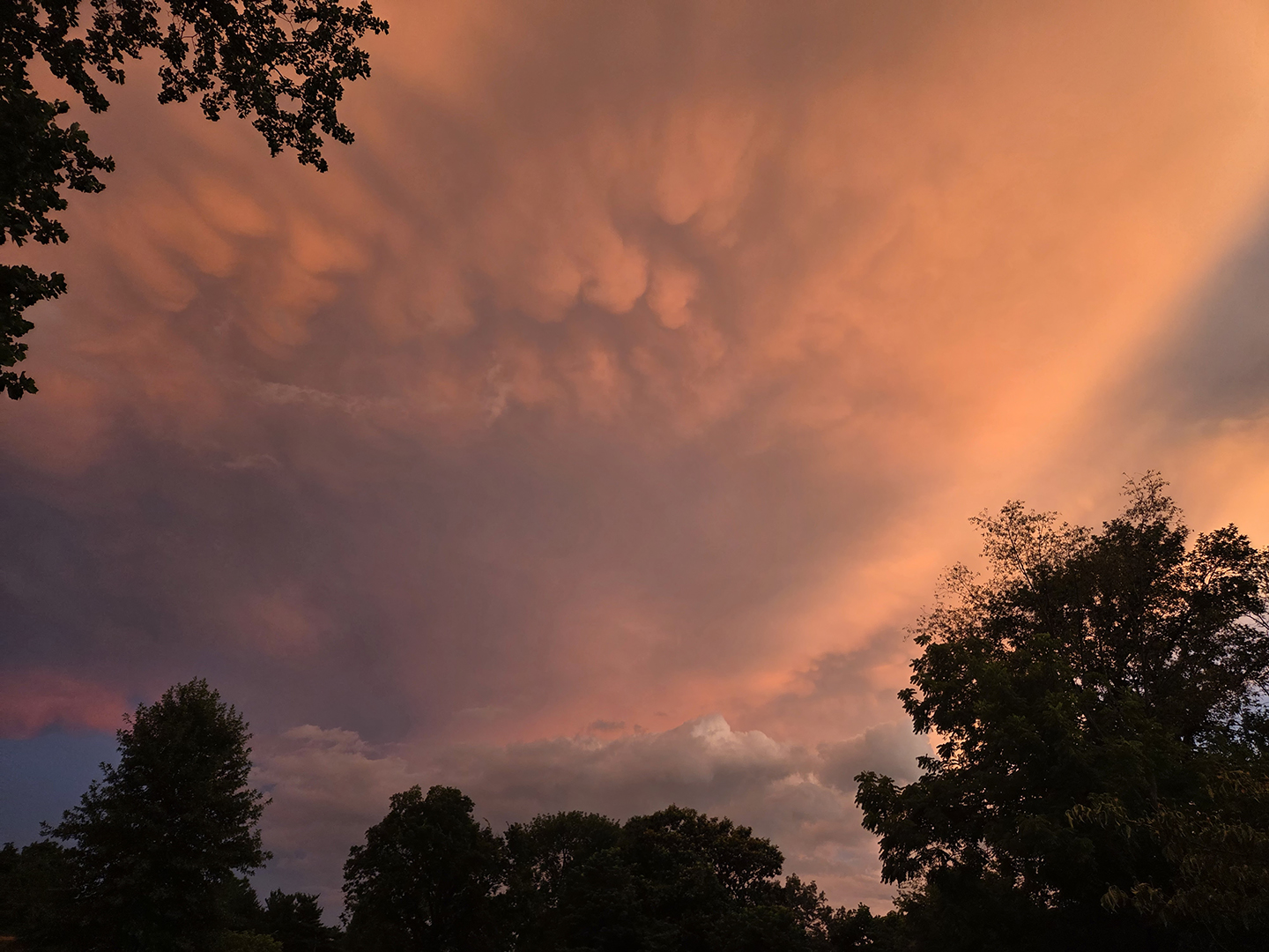
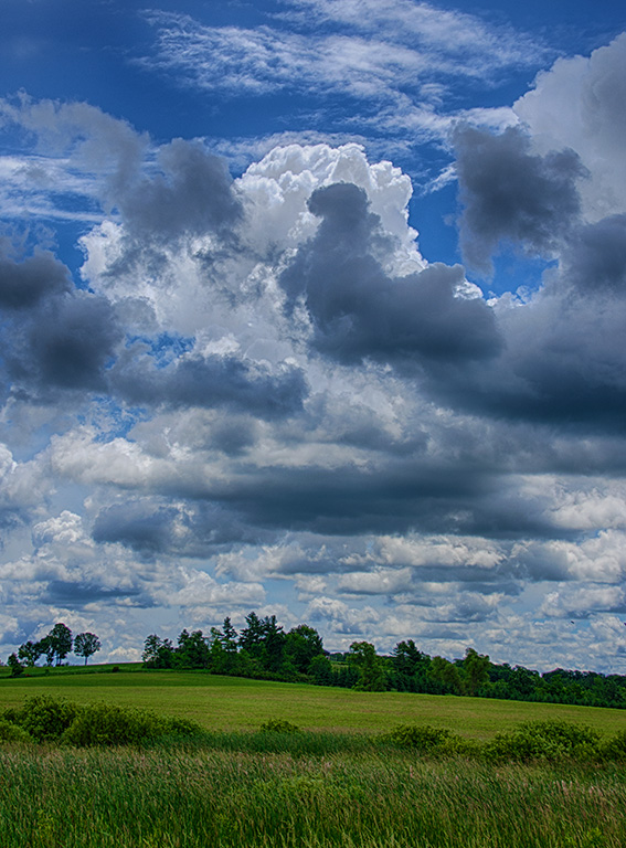
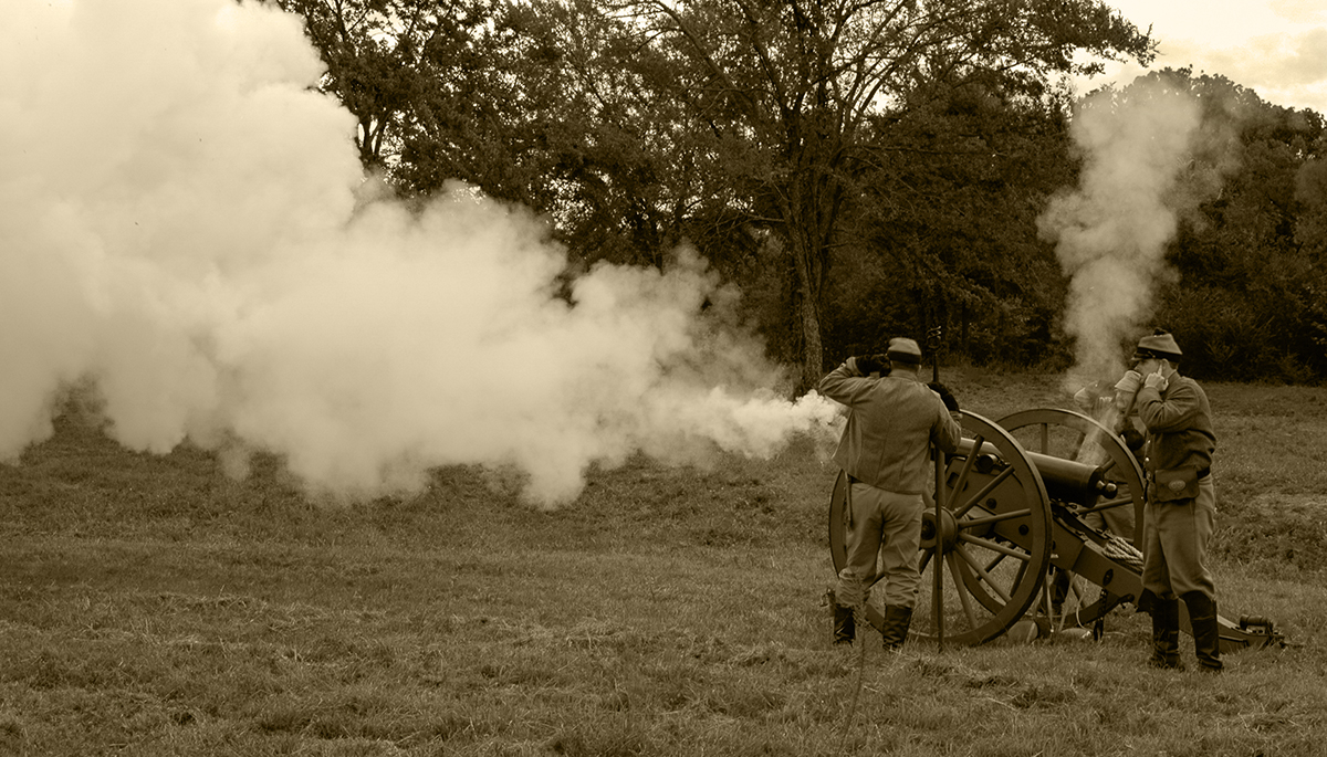
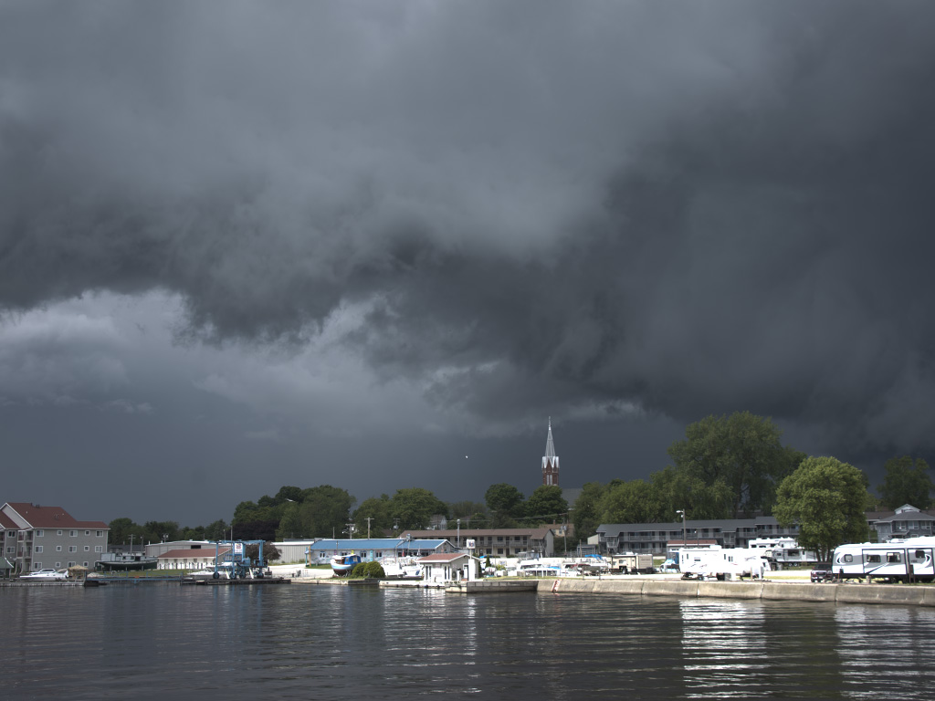
Storms in the desert SW US can come up rather quickly and violently, and then be short lived. The clouds look real to me, other than being over processed. |
Nov 14th |
| 7 |
Nov 24 |
Comment |
I agree with the above 2 that the image looks over processed, especially the black clouds. I do disagree with them that you need a point of interest at the end of the road. The story here is the curve of the road and the clouds. |
Nov 14th |
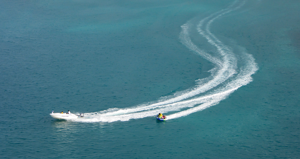
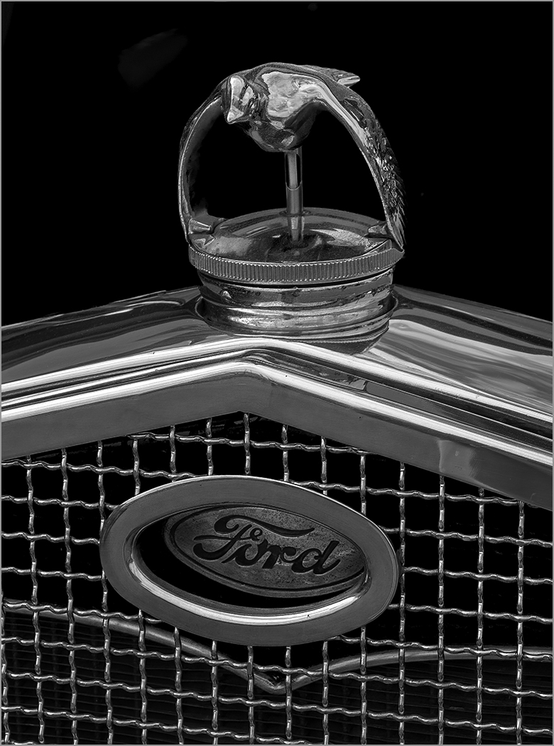
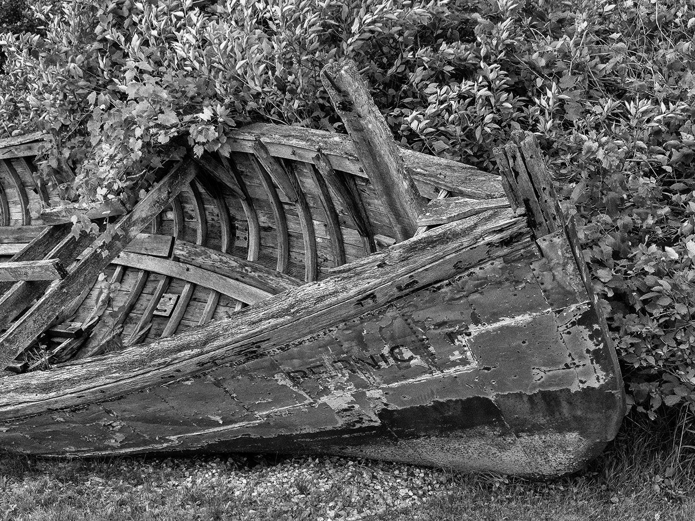
| 7 |
Nov 24 |
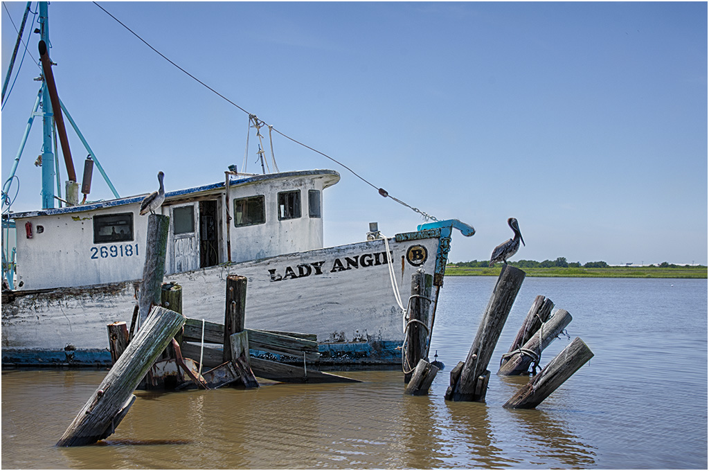
Comment |
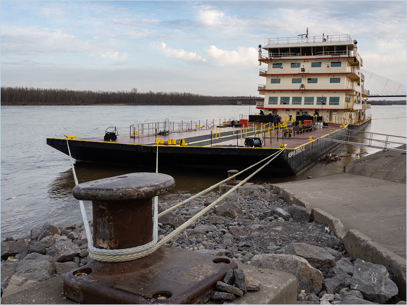
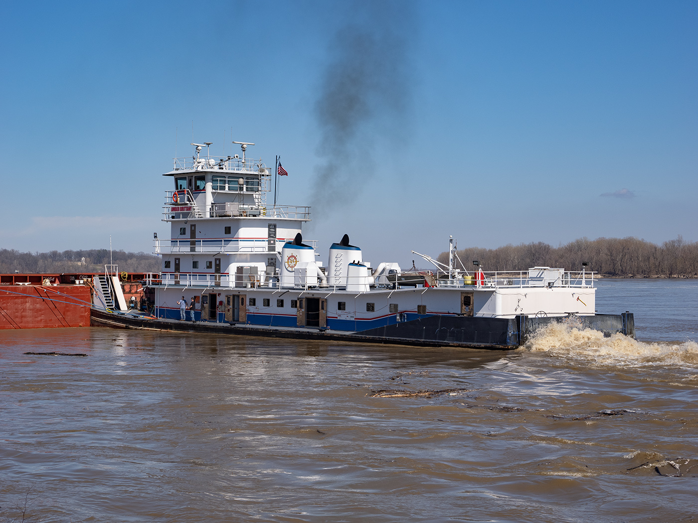
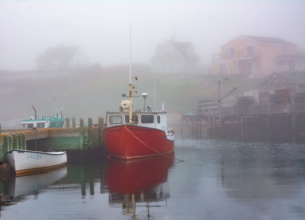
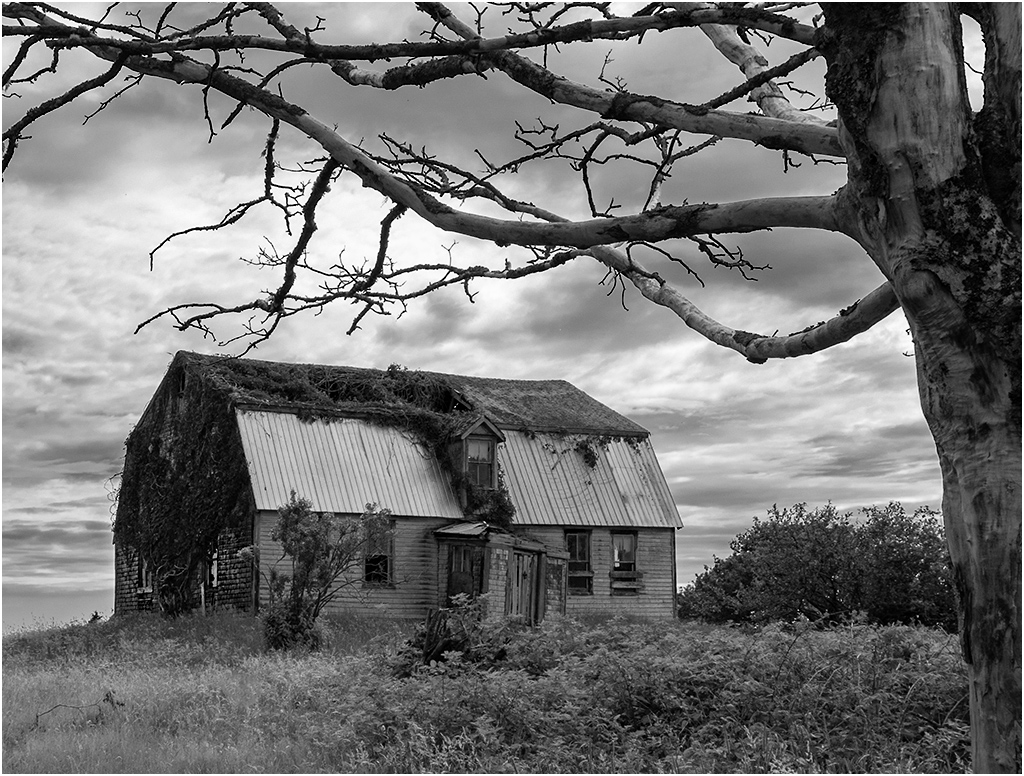
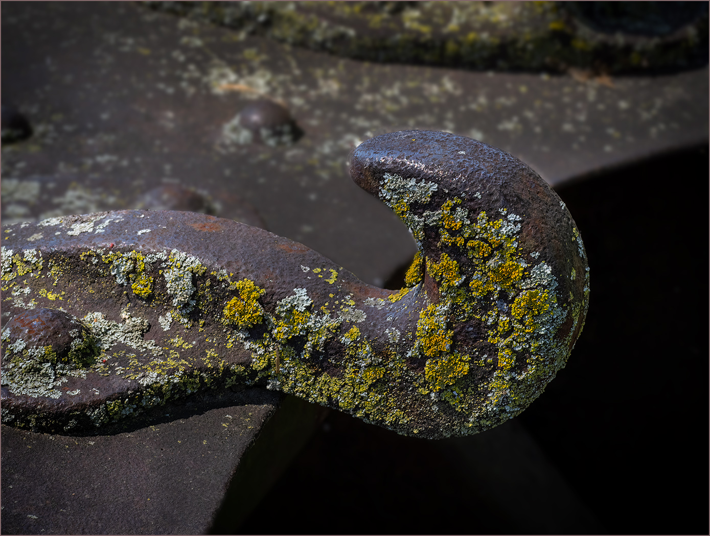
You found and photographed an interesting old boat. I like that you have space around it showing the surroundings. I really like what Butch did with the image, especially the flip of the image. |
Nov 14th |
| 7 |
Nov 24 |
Comment |
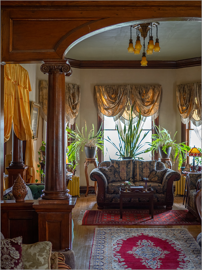
Really nice image, and I like the monochrome. The image is very sharp and there is great lighting. Like Gaetan said, she has a great expression. I like the angle shift that Butch made but think that he cropped in too much on the left and did not leave enough in the background. I also tried to select the woman and blur the background some more. I see that I did miss part of the violin and lost some hair. Using a full resolution image would make a better selection of the woman. |
Nov 14th |
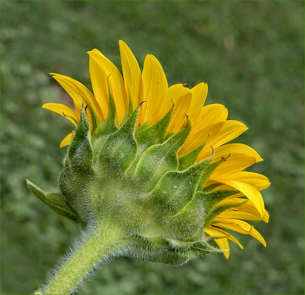
 |
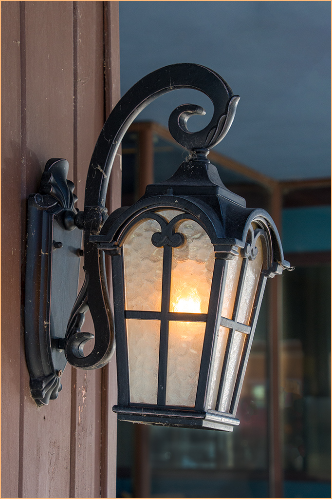
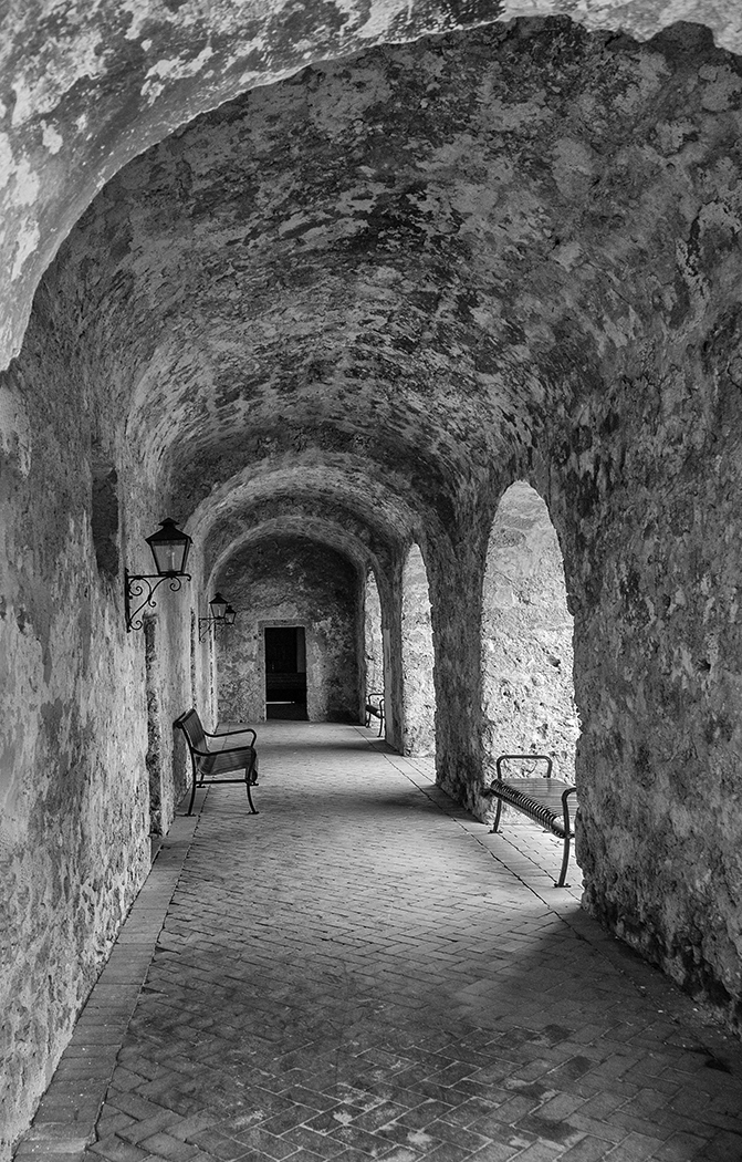
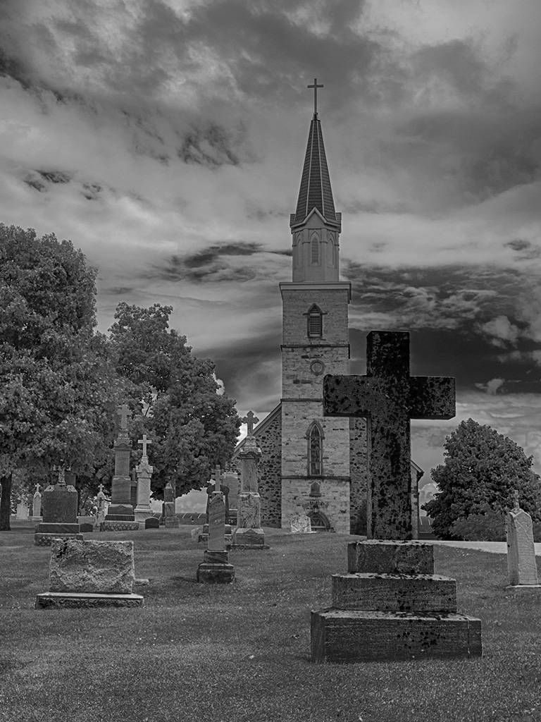
| 7 |
Nov 24 |
Comment |
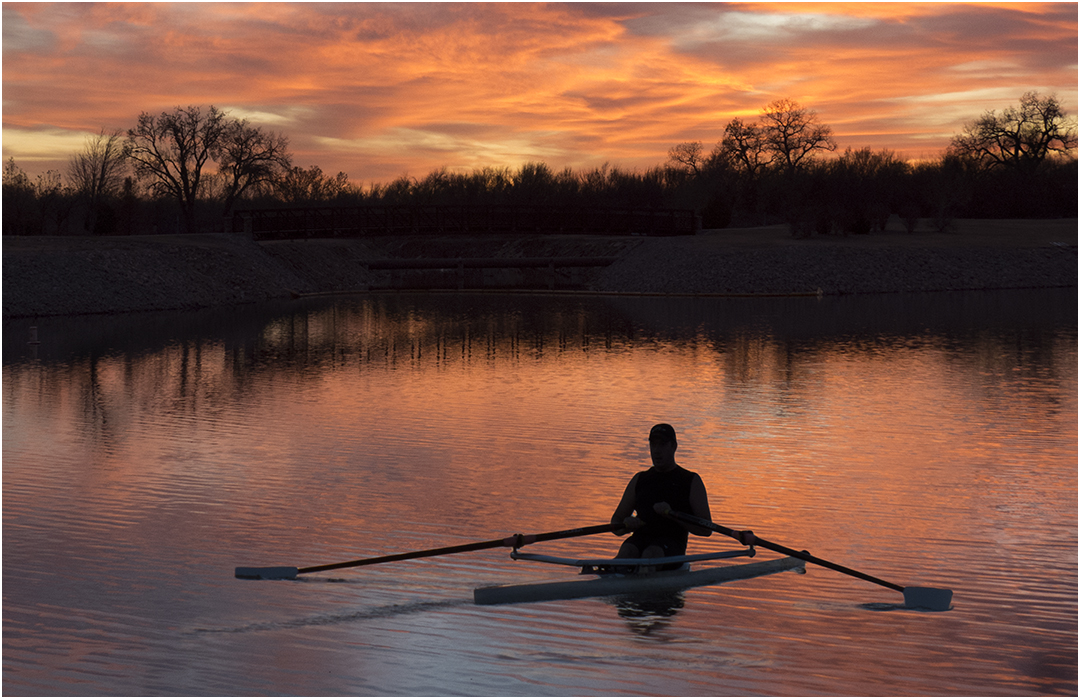
A very simple but elegant image. I find it interesting that the reflection is so black. I think that monochrome is a great choice. I am wondering what you would think of rotating the image so that the black is on the bottom? |
Nov 14th |
 |
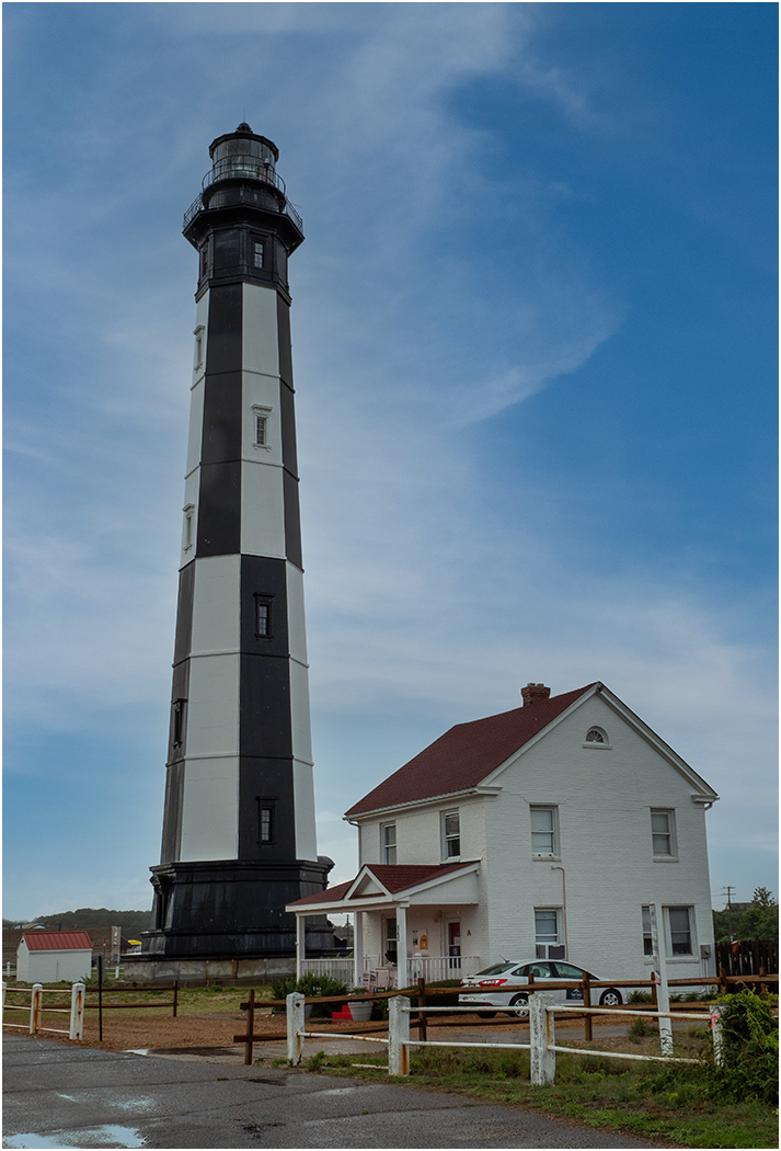
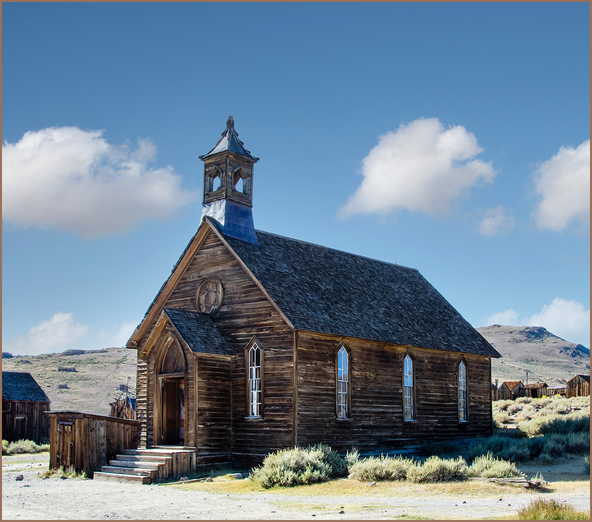
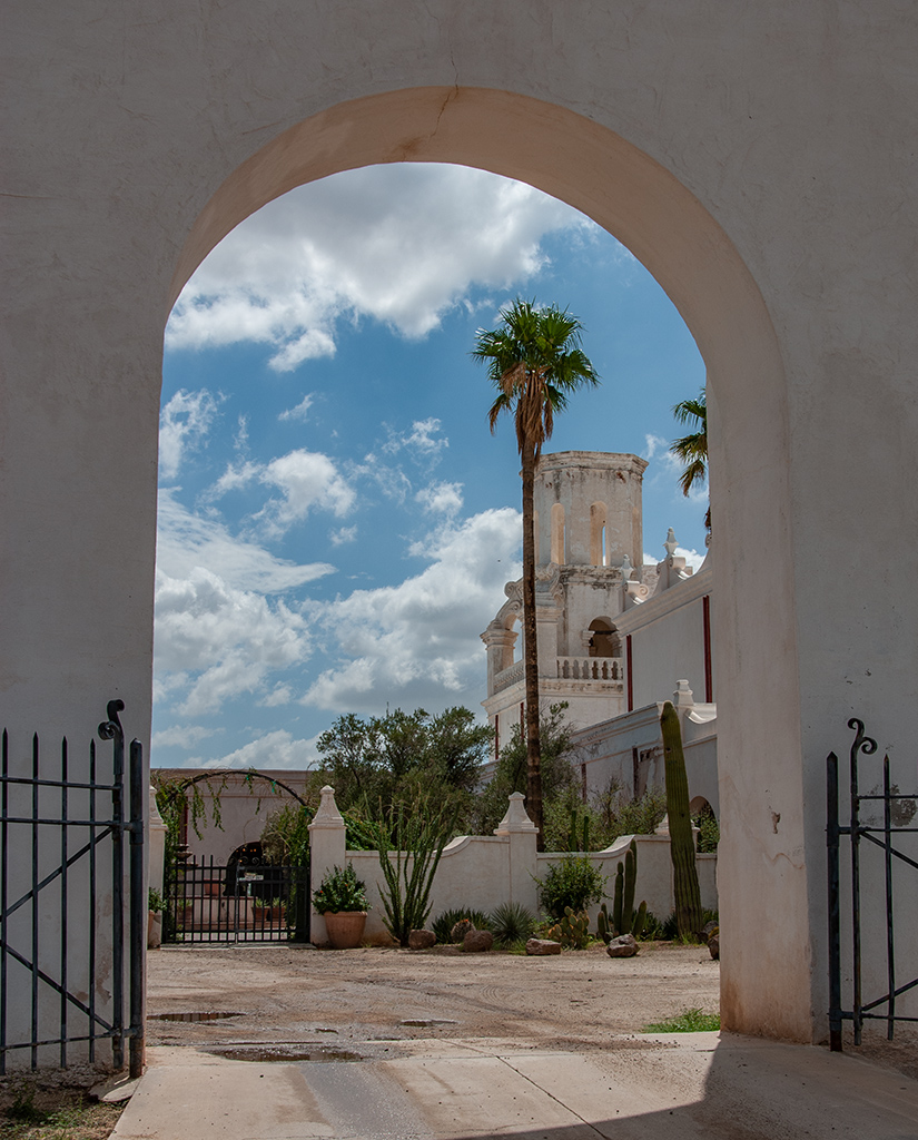
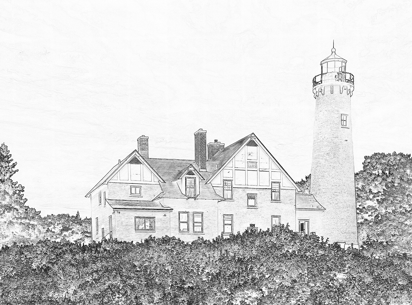
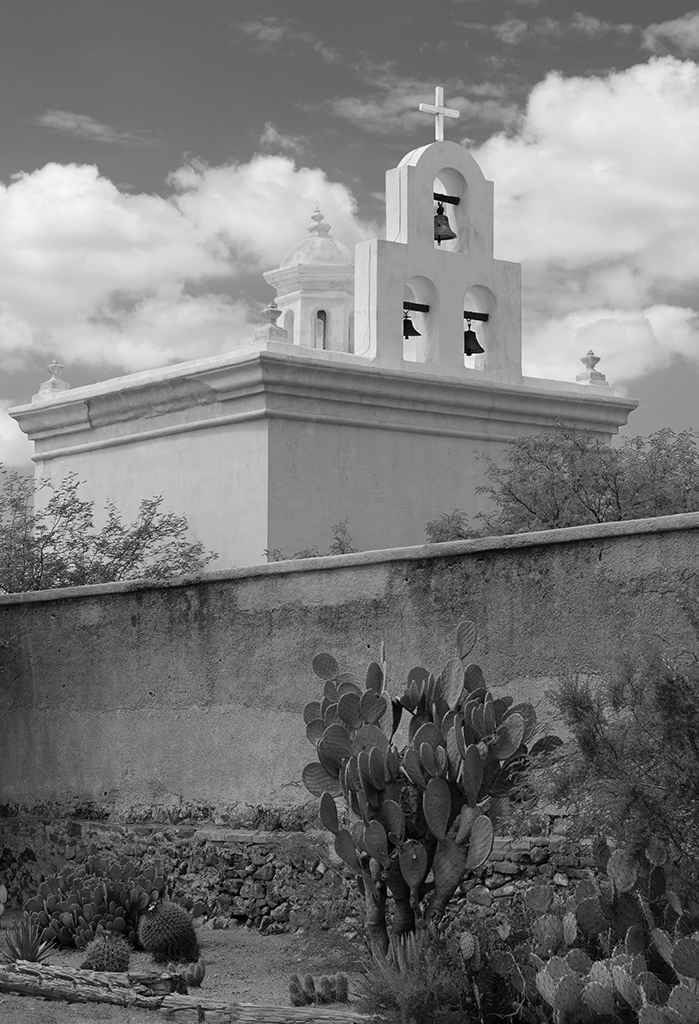
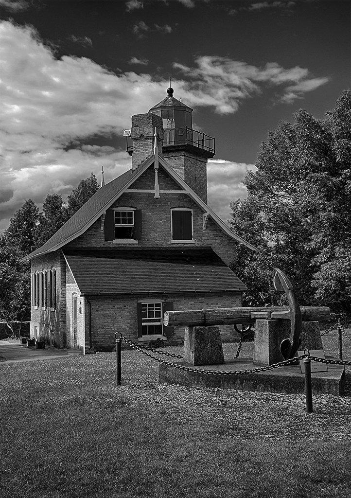
| 7 |
Nov 24 |
Reply |
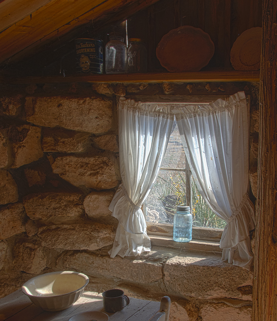
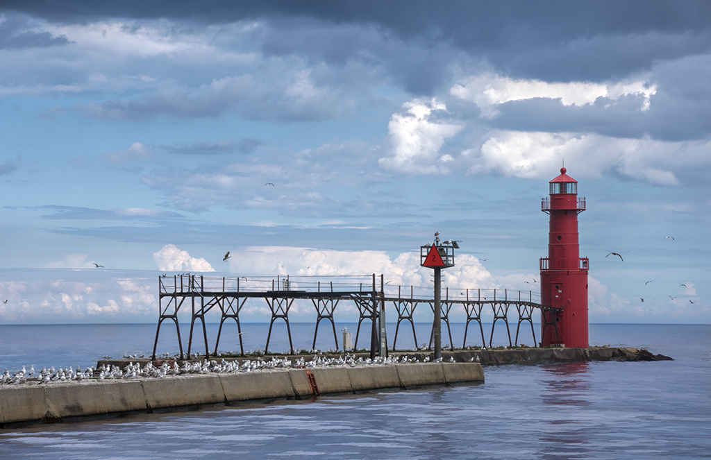
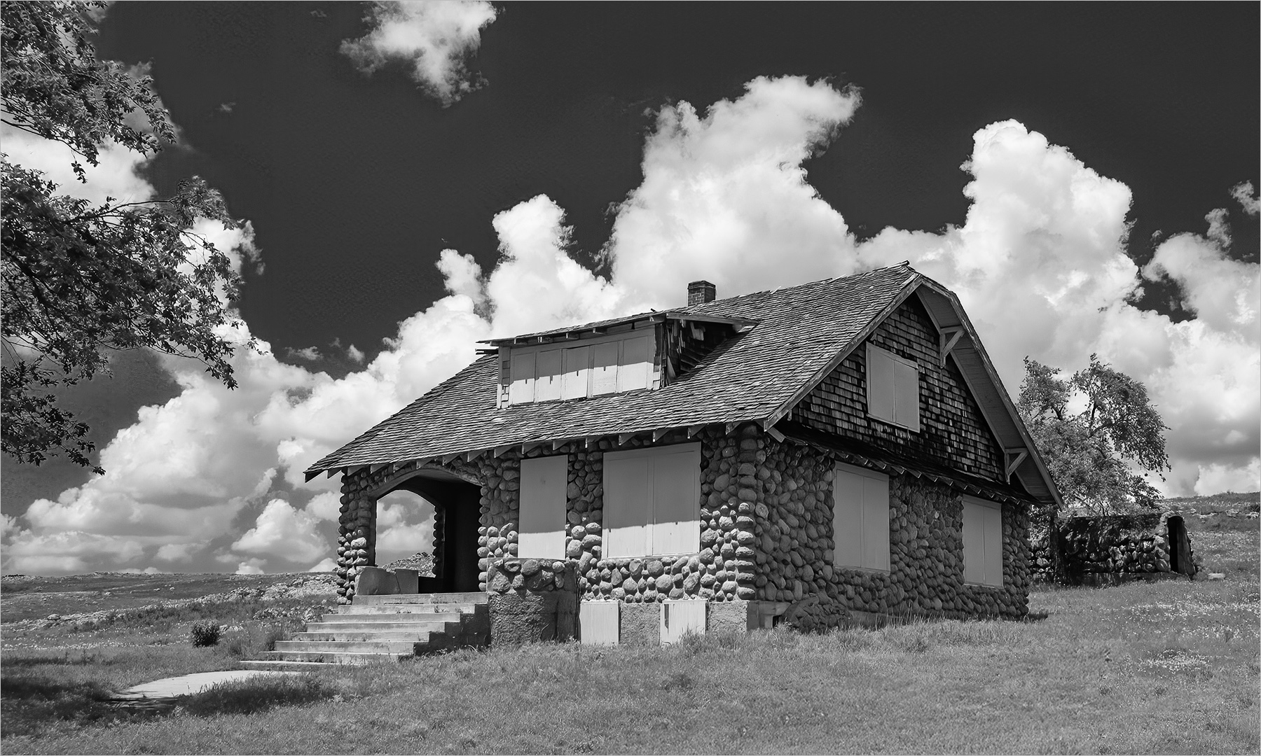
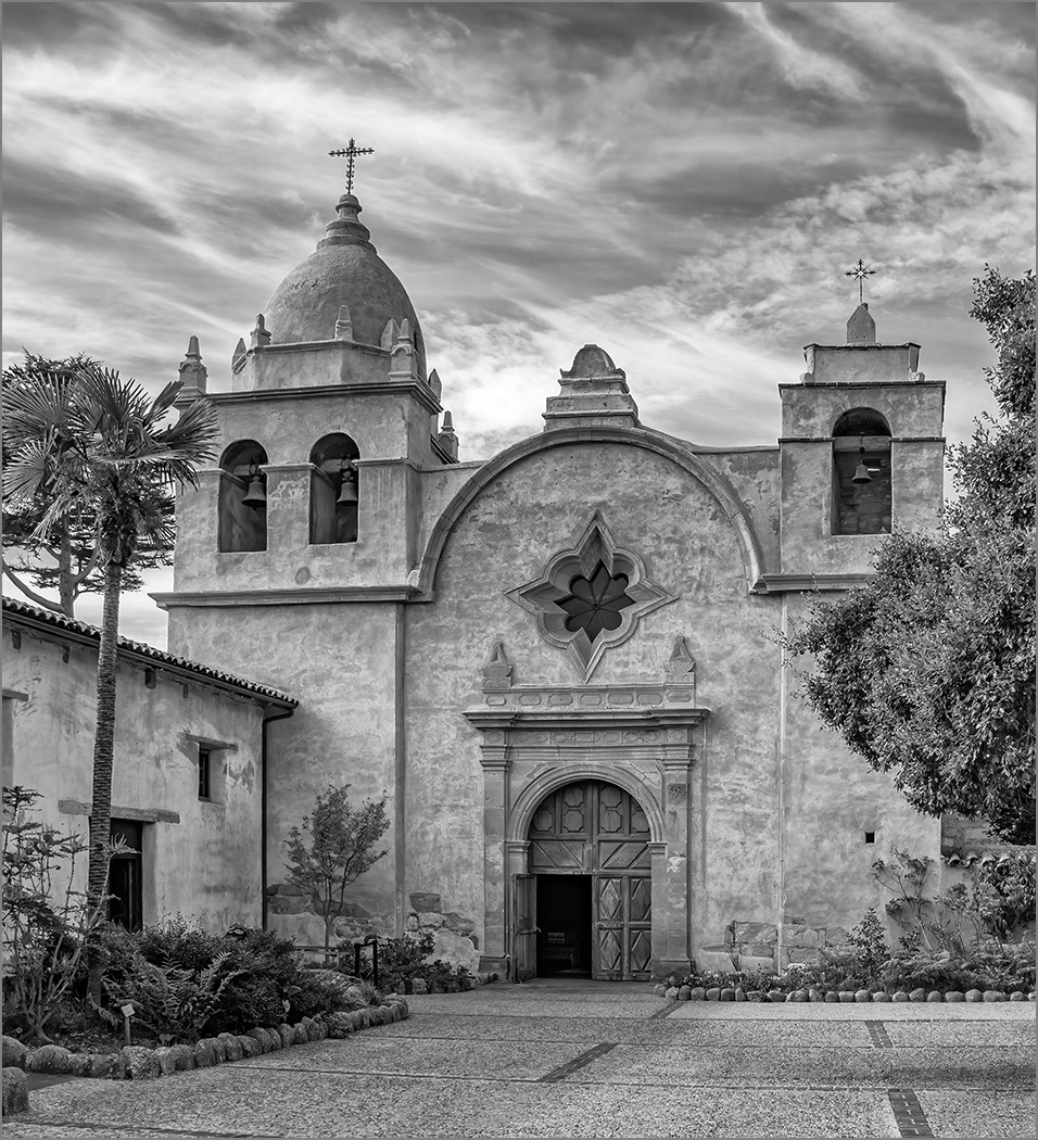
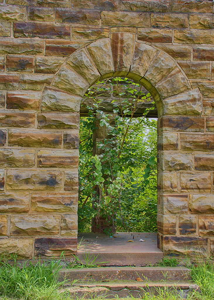
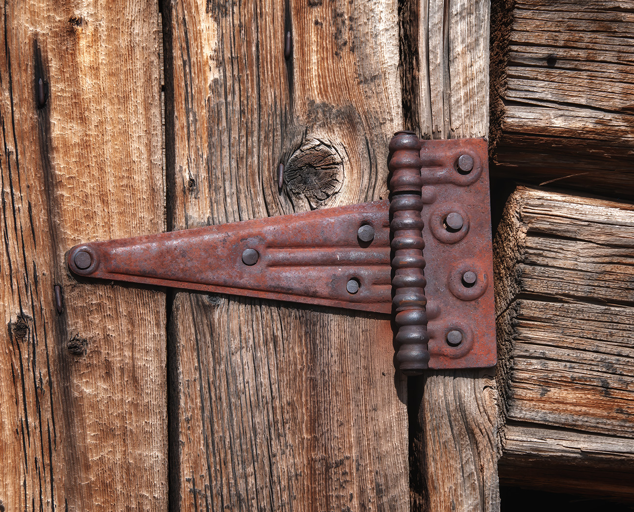
Thank you for your comments and your VF, cropping in on the lighthouse. It is a lovely location and I was wanting to show more of the surroundings. I know that having a wall at the front of the image is one of the composition rules to avoid. But, I liked the rock wall and think that it is close enough to the bottom to not be a distraction.
As to the title, I like titles that help describe the image so that the viewer doesn't have to guess what they are seeing.
I am glad that you like the image, and am not being negative about your comments but are just explaining my thoughts. That is what these DD groups are really about, hearing other photographers ideas and suggestions. |
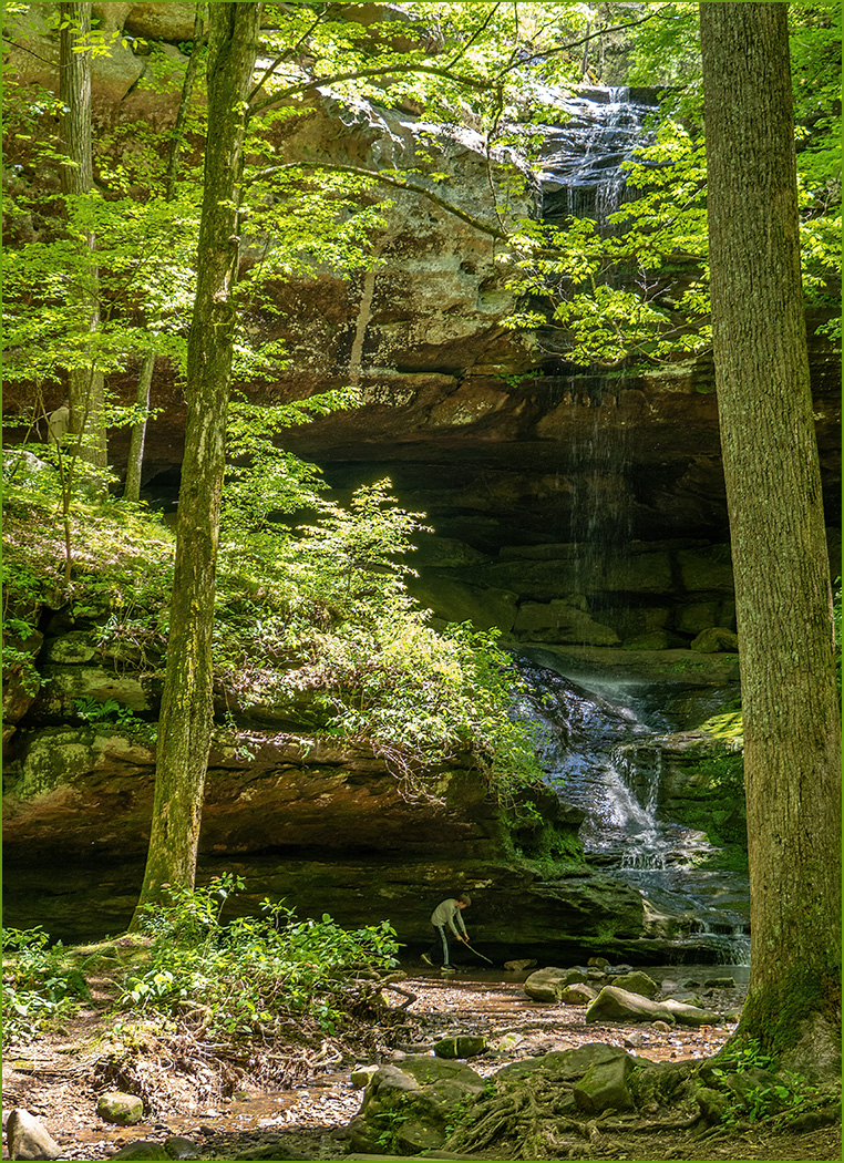
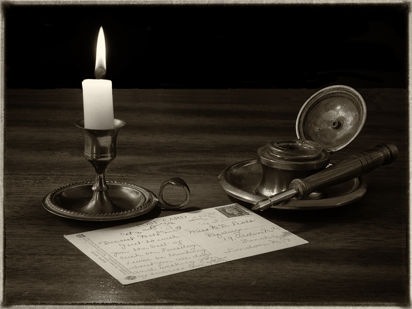
Nov 8th |
5 comments - 7 replies for Group 7
|
| 32 |
Nov 24 |
Comment |
You have a very pretty model that is well lighted and in an interesting location. The rock that she is on is a perfect flat, but reclining location. You have very good depth of field with the background nicely blurred. Converting to mono was a very good choice, and well done. I also like your crop. It is a tastefully done nude without revealing what some may say is offensive. As mentioned above, the leg clamp is a distraction. I would not change a thing. |
Nov 22nd |
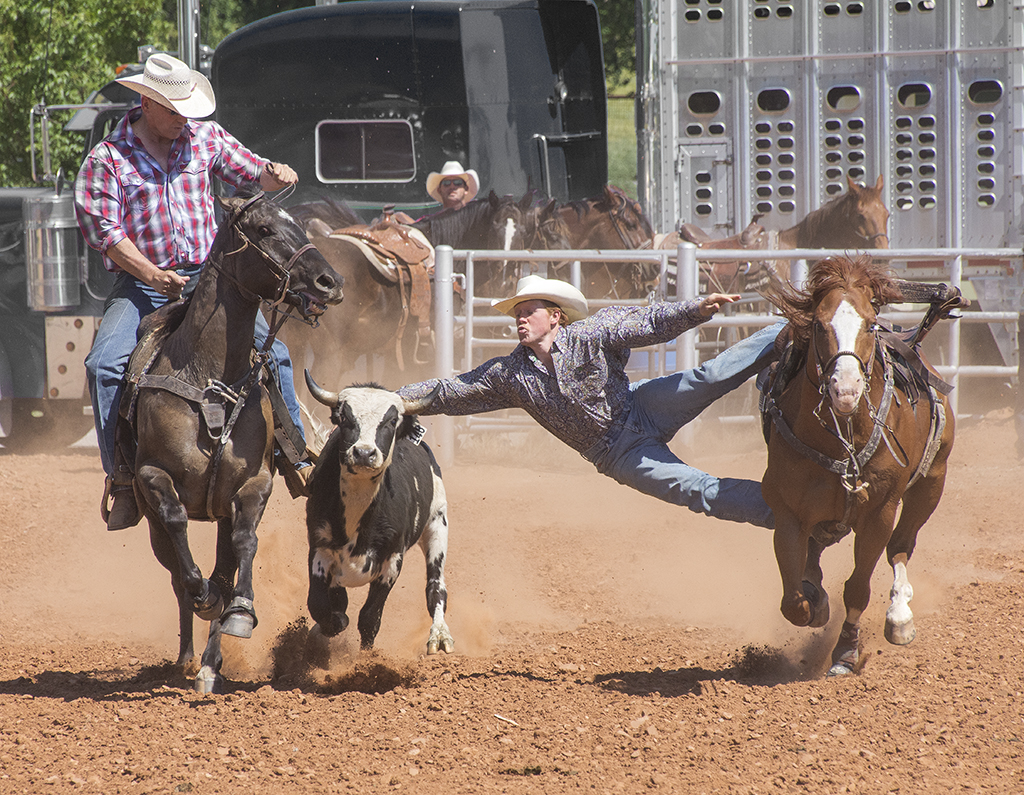
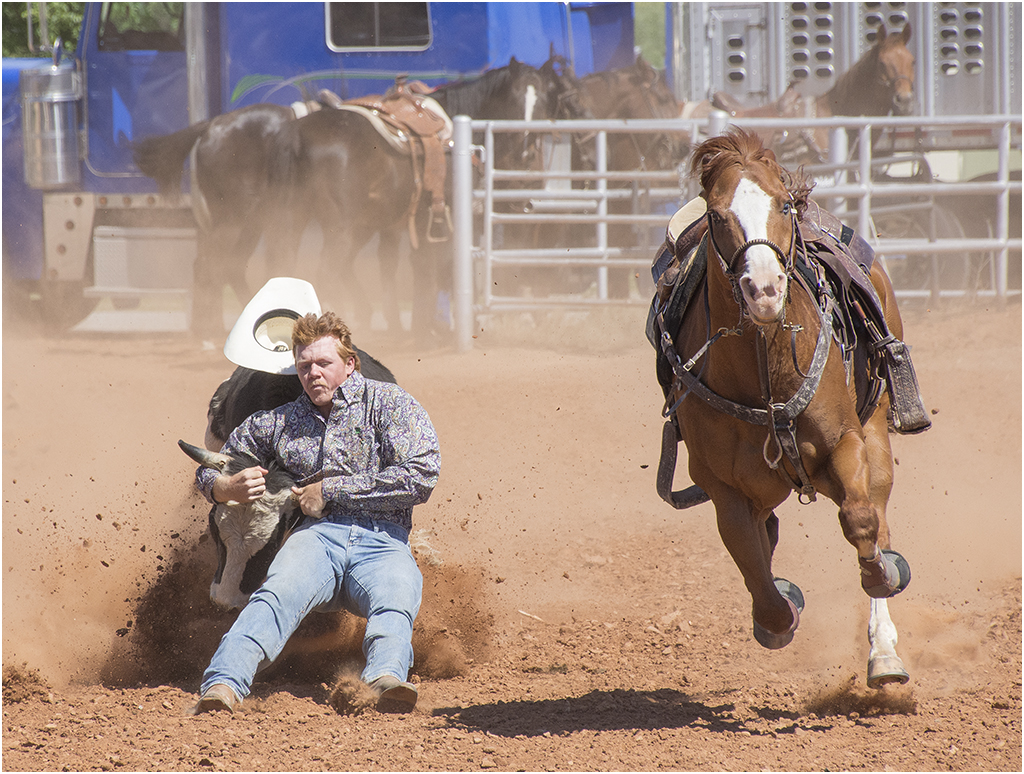
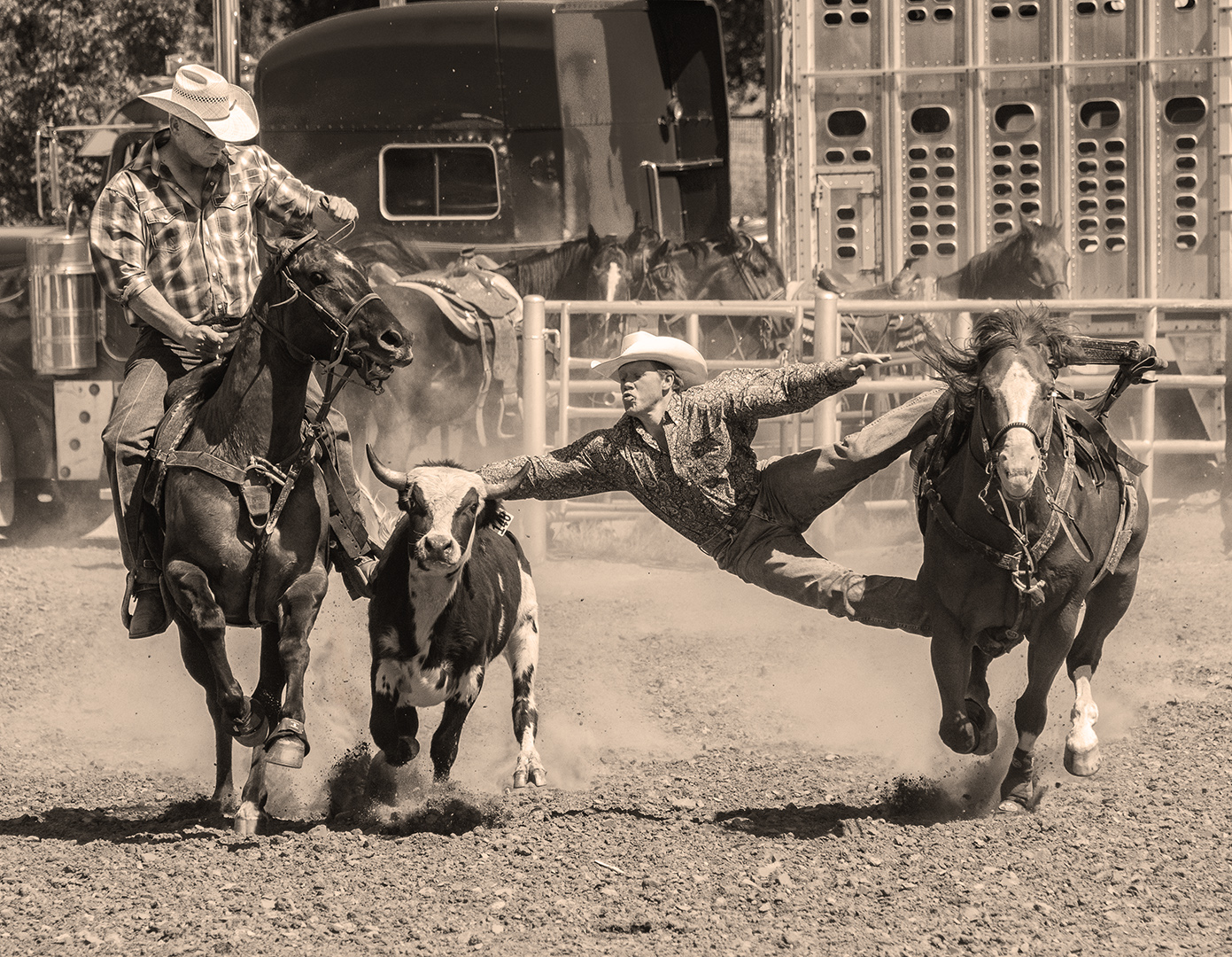
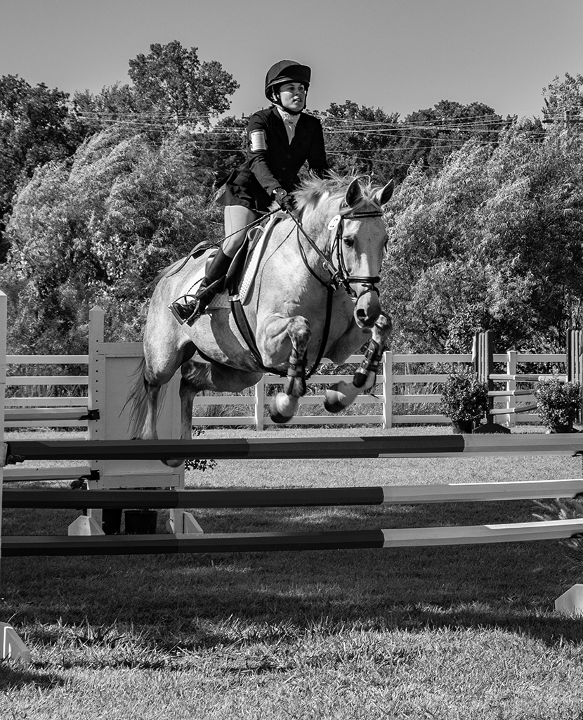
| 32 |
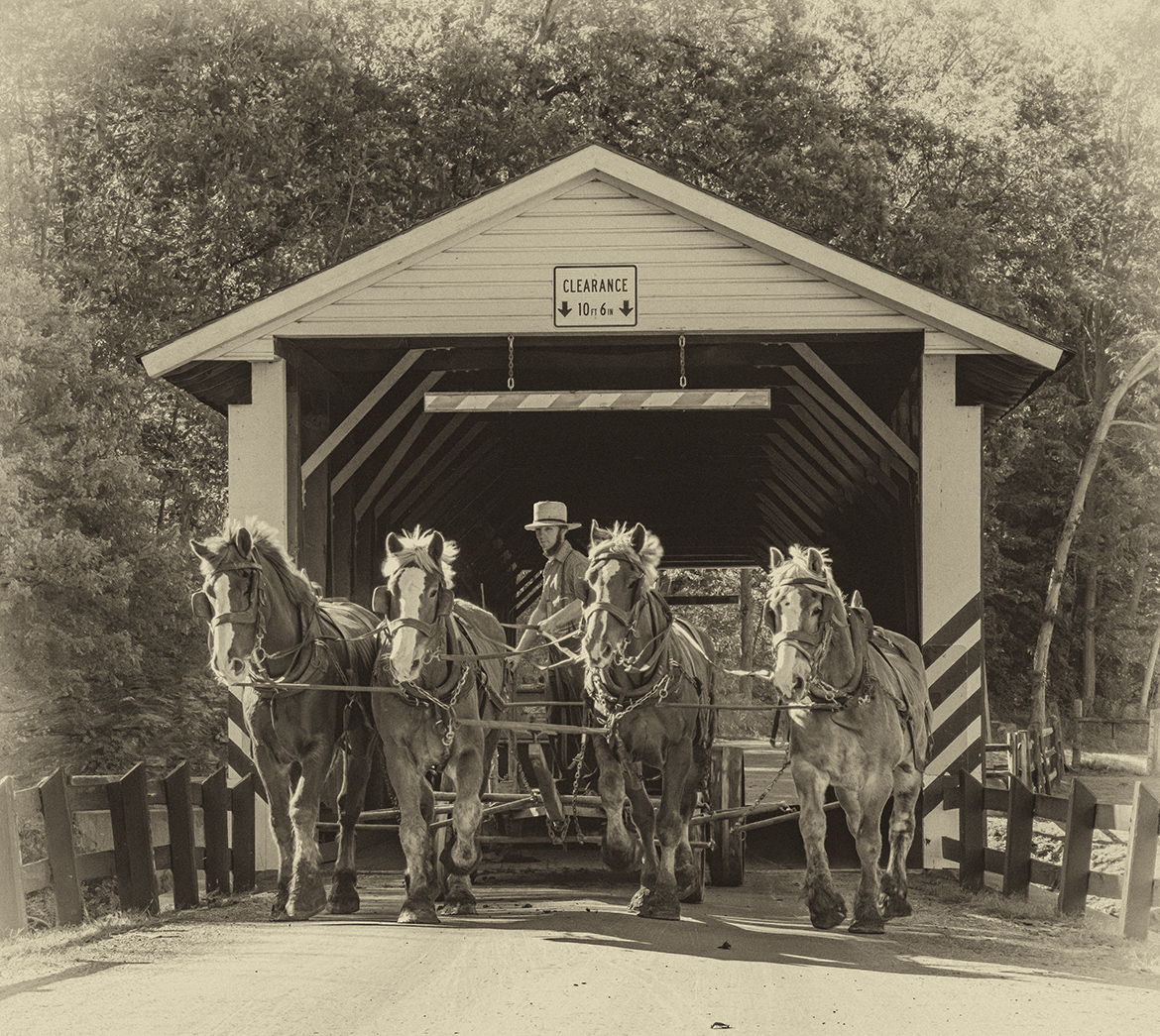
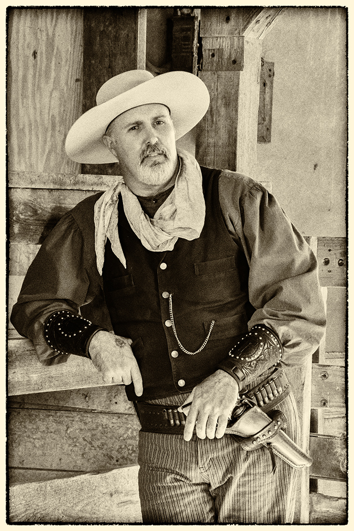
Nov 24 |
Comment |
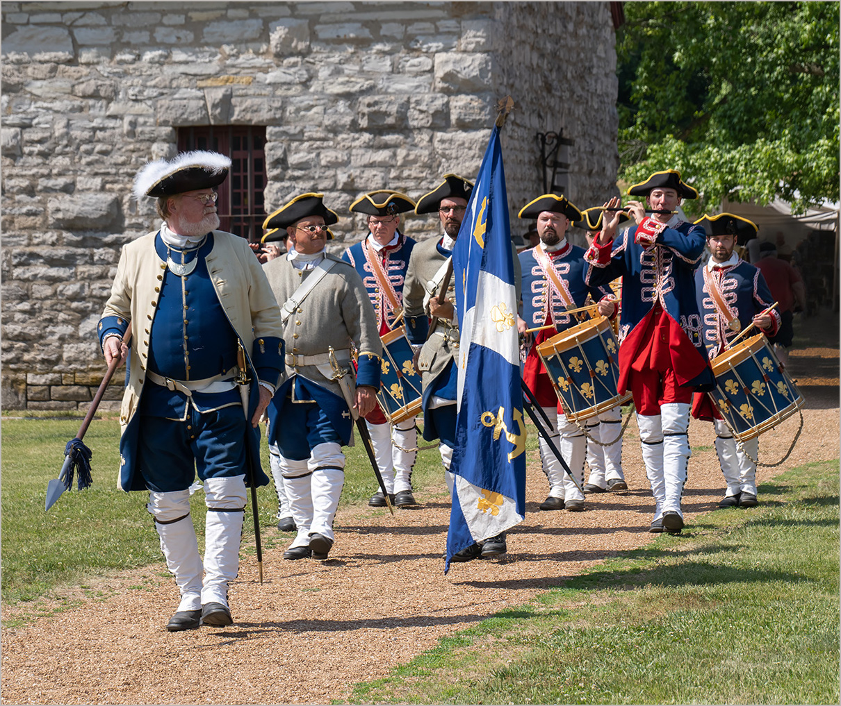
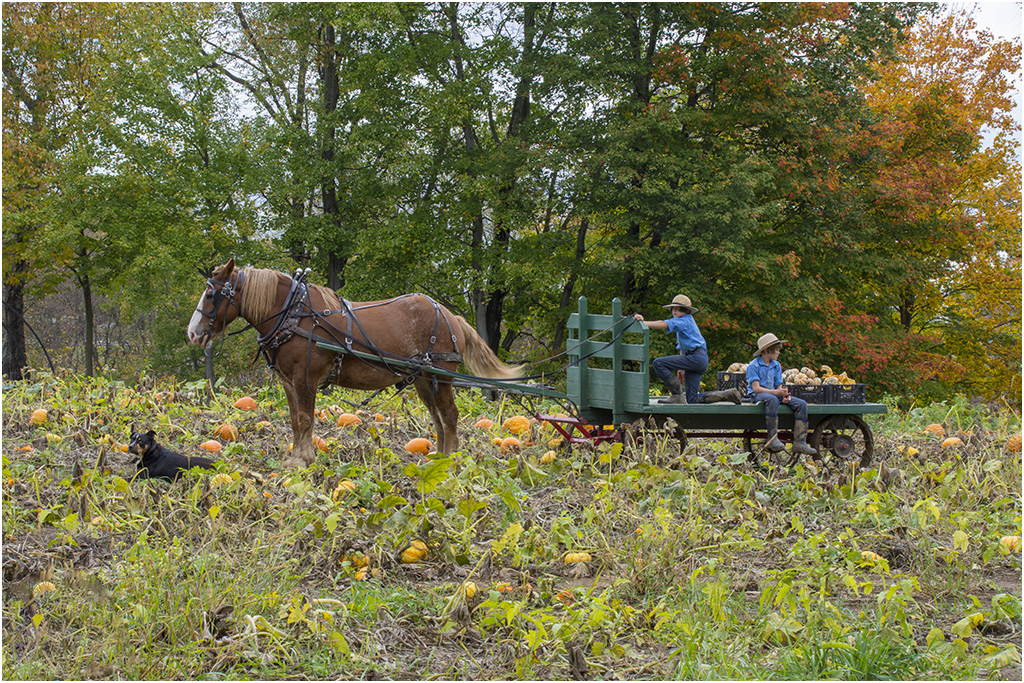
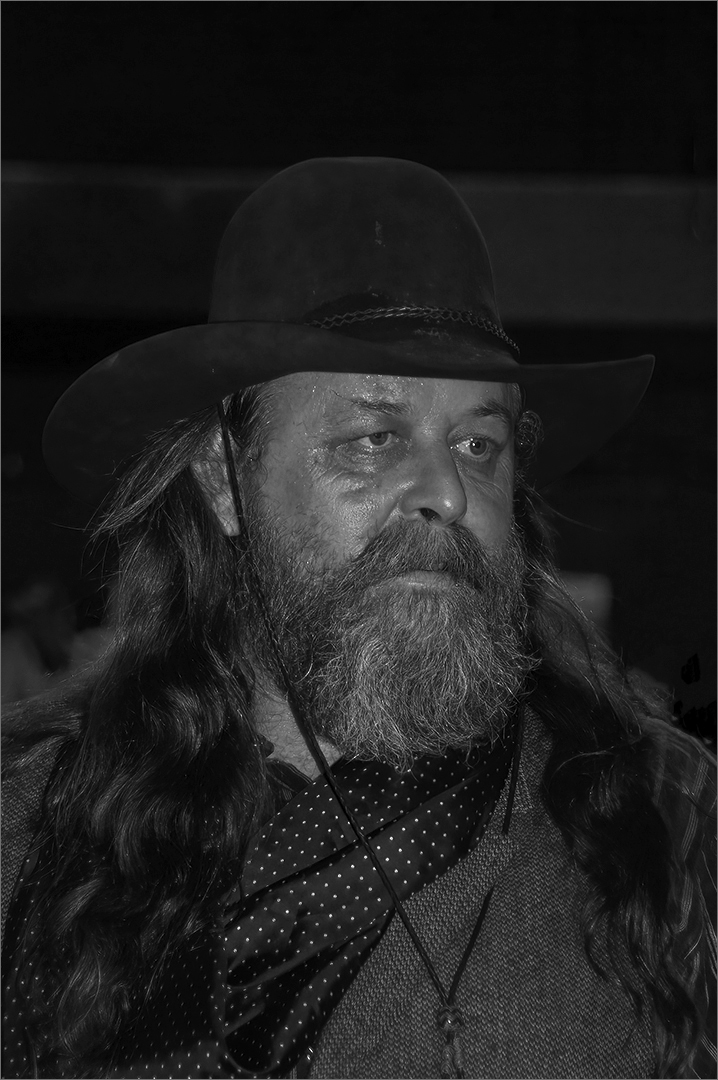
Of course he is in Texas, he has a cowboy hat on. Interesting that there is a group like this in Texas. As mentioned above, the horse on the right has blown out white spots on it which distracts from the image. I did try reversing the image, but then the team and rider seemed to be going toward nothing and out of the frame. This way they are coming into the frame, much better composition. |
Nov 15th |
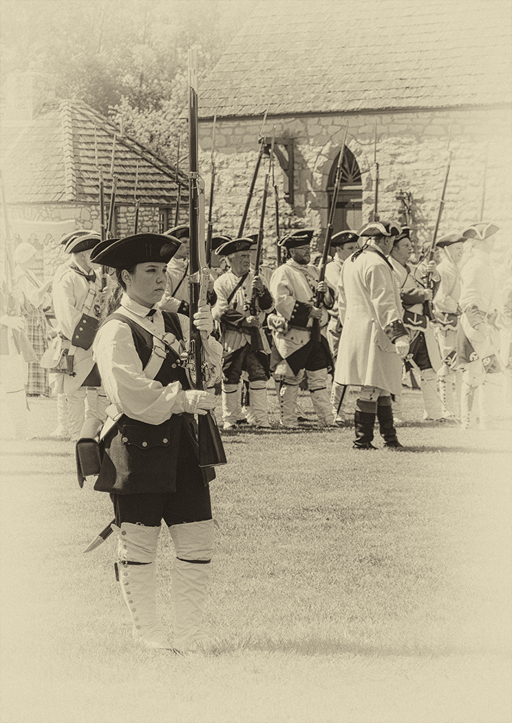
| 32 |
Nov 24 |
Comment |
Going with monochrome was the way to go. The flag doesn't bother me, and as Michele said it does help balance the image. I would crop off a bit from the bottom, to lessen the confusing area in the lower left, but leave some room below the people walking. I like the tower centered, so would not crop off any of the building on the left. Your making the building on the left lighter and bringing out details helps the image. If it was darker as in the color image, than it should be cropped off.
Your image with the vertical lines corrected makes the tower look too squatty. |
Nov 15th |
| 32 |
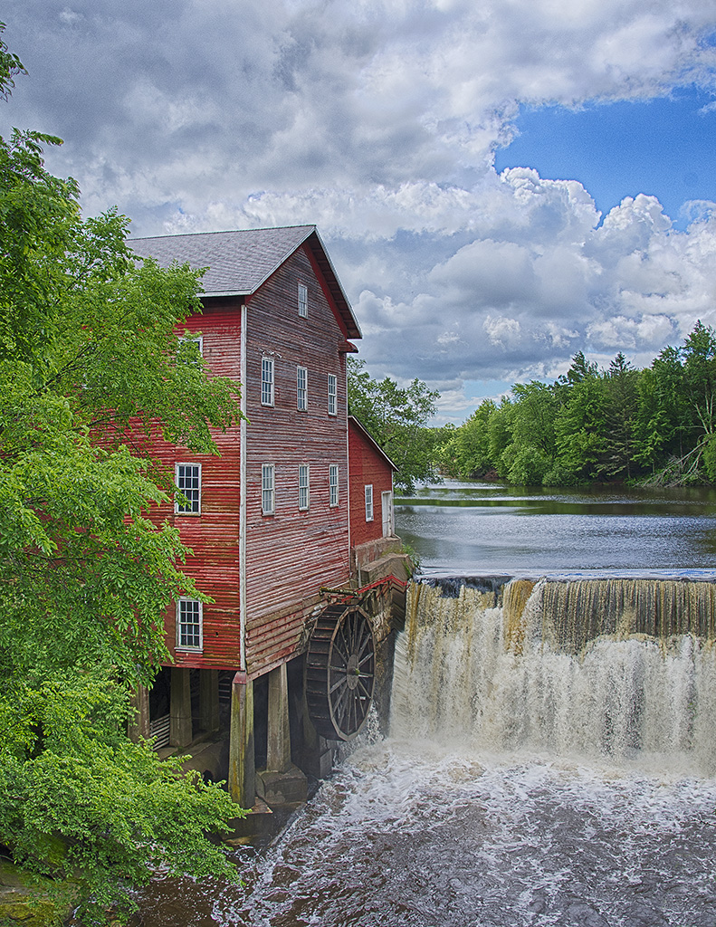
Nov 24 |
Reply |
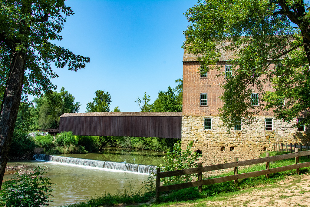
Yes, it is a very pretty mill in a very nice location. I have been there a couple of times. |
Nov 13th |
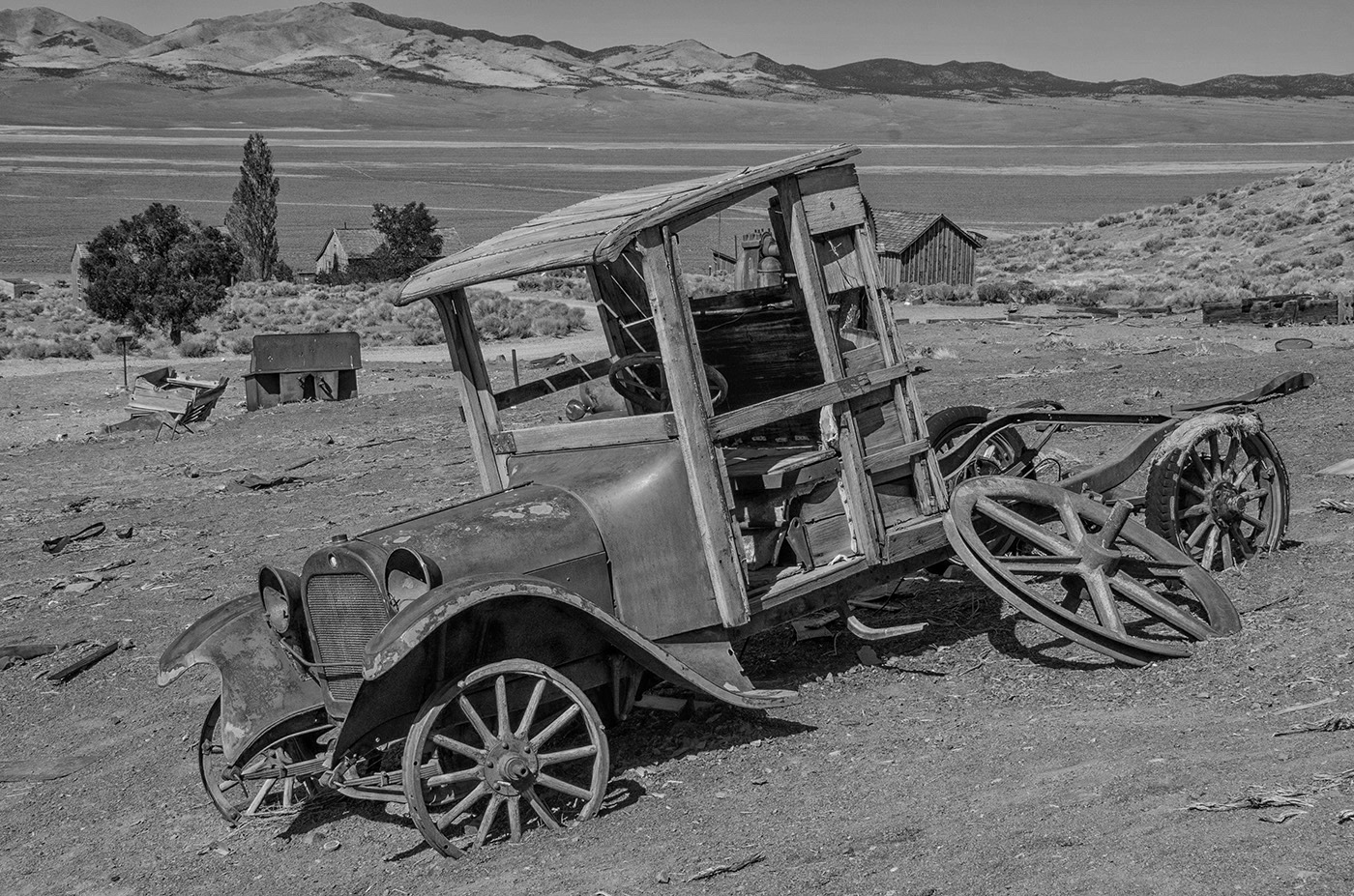
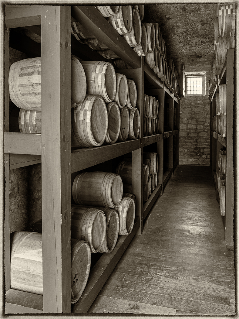
| 32 |
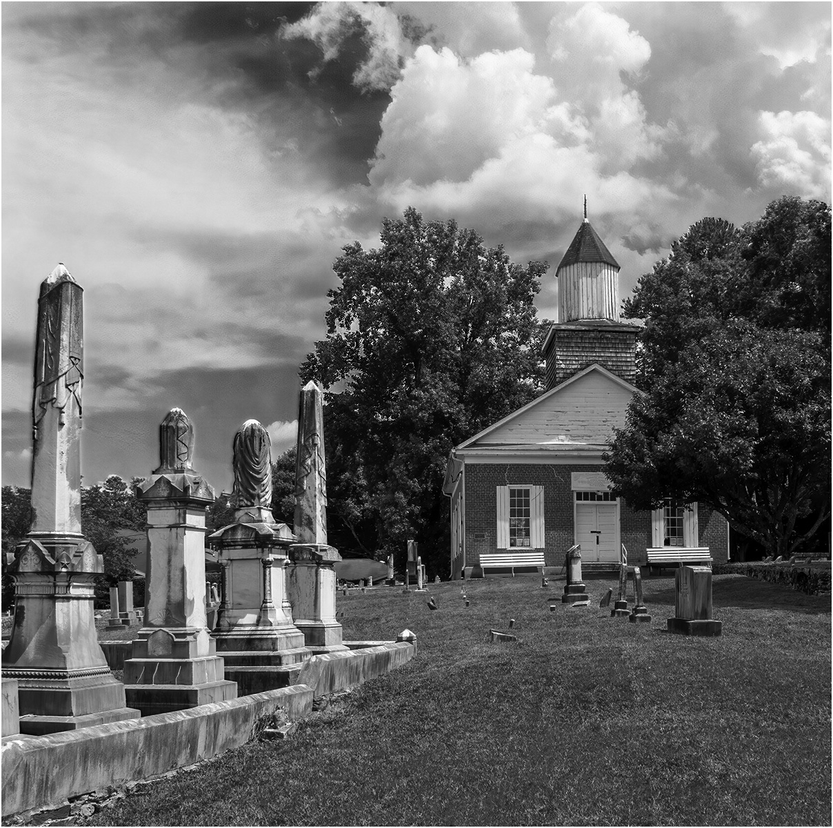
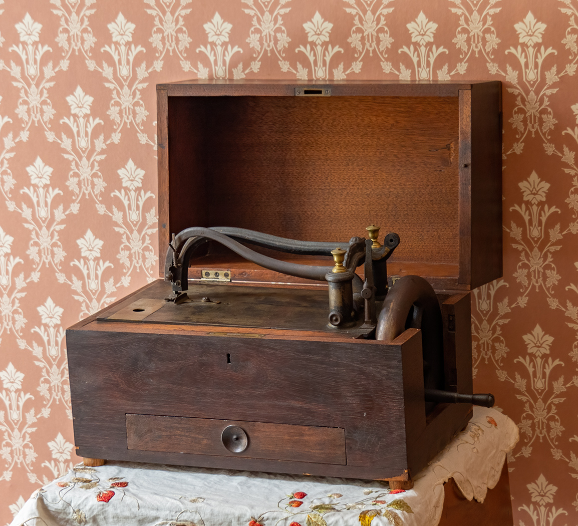
Nov 24 |
Reply |
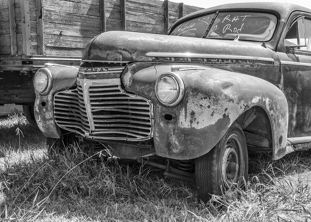
I looked at it while using NIK Silver Efex, but wanted the old antique photo look. I have added one that is grey. |
Nov 5th |
 |
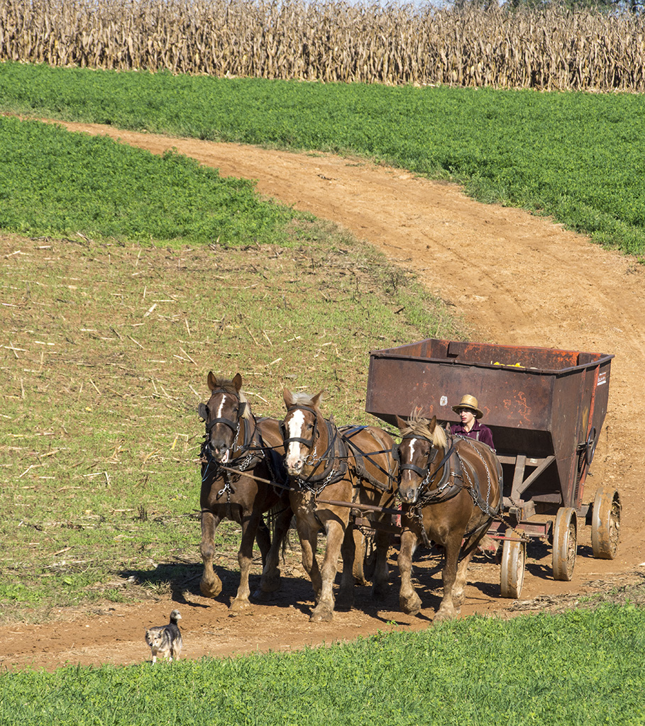
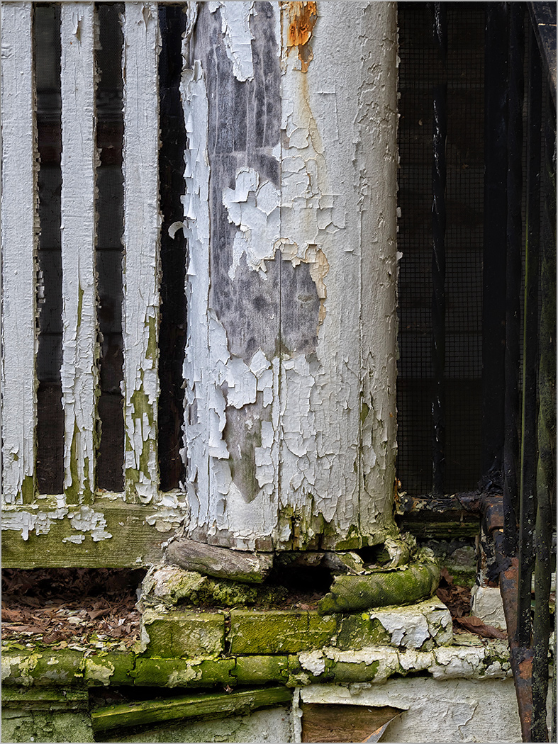
| 32 |
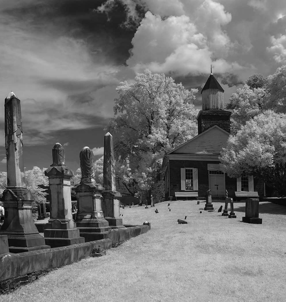
Nov 24 |
Comment |
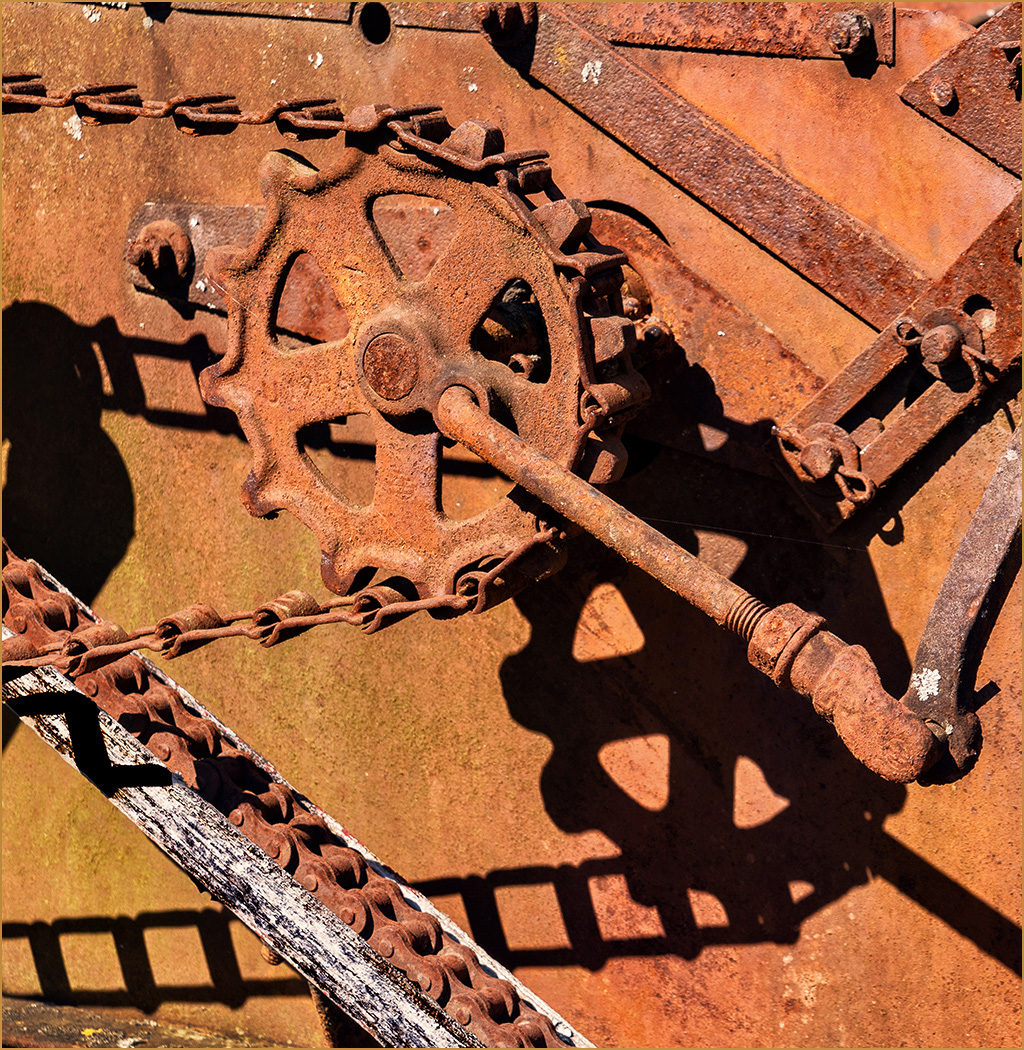
Thank you for your comments. The machinery probably would be, but the mill is shut down for restoration. The race has damaged areas that allow the water to flow out the side in places. When we were there several years ago, it was grinding corn at times for demonstration, but they said that it was not save for human consumption and I think was used it for animal feed. |
Nov 3rd |
4 comments - 2 replies for Group 32
|
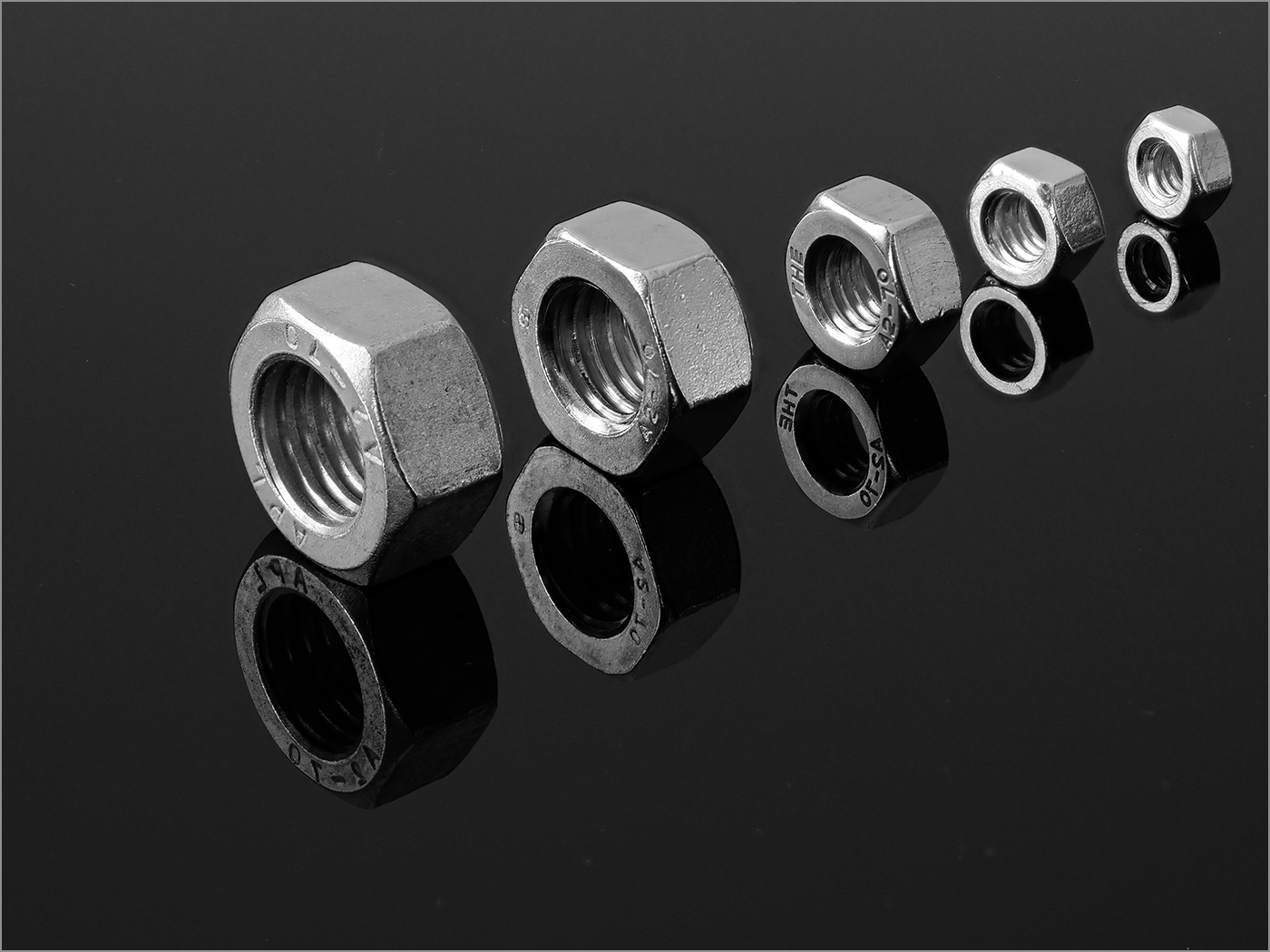
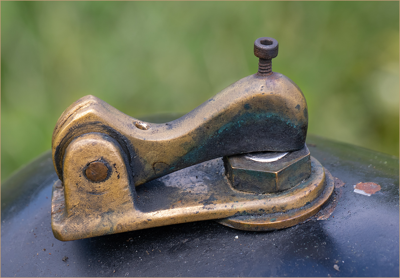
| 57 |
Nov 24 |
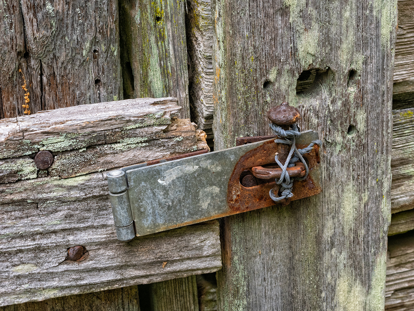
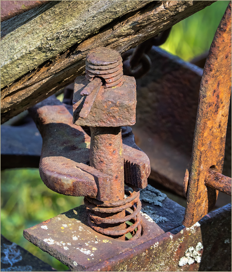
Comment |
The sharpness and lighting on the pin are very good, and the muted reflection adds a lot to the image. I like that the pin is at a slight angle as that adds a lot in interest to the image. It is a great looking pin, and you photographed it very well. |
Nov 23rd |
| 57 |
Nov 24 |
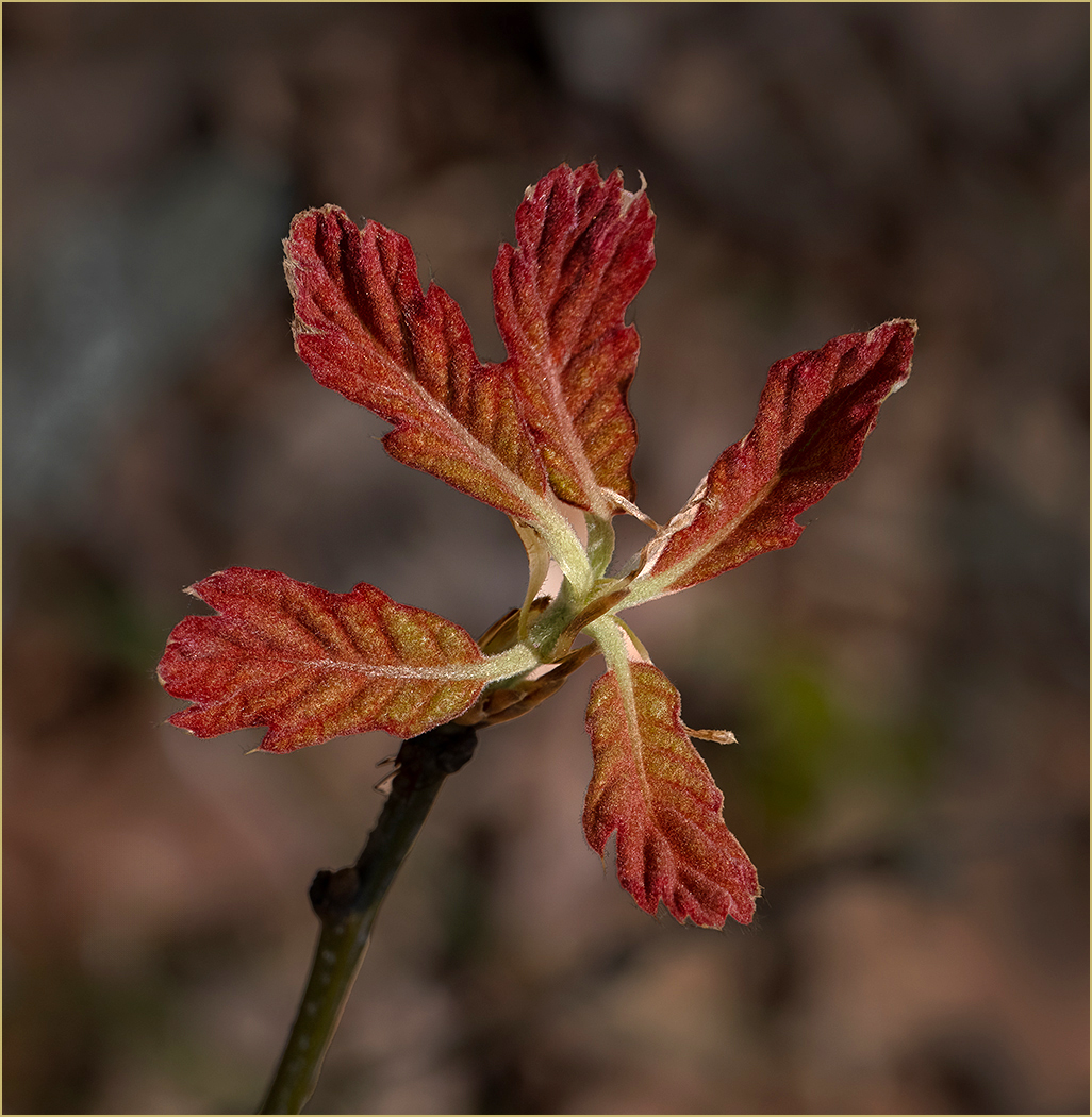
Comment |
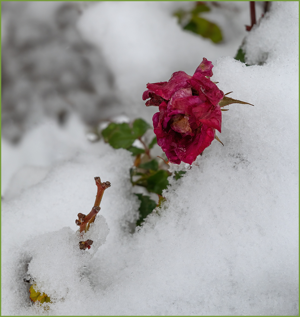
The image has great depth of field and the leaf is super sharp. I think that you selected a good leaf, as it is not perfect, and appears to be drying up. To me, that helps with the story of fall and that the greens of summer are gone. As mentioned above, the composition is good with the leaf at an angle. I like that the texture goes from light to dark, from lower left to upper right. I think that the texture is good, but that it should be overall blurred the same as it is in the lower left. To me, the texture around the leaf distracts from the sharpness of the leaf. |
Nov 23rd |
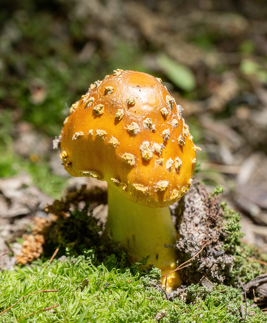
| 57 |
Nov 24 |
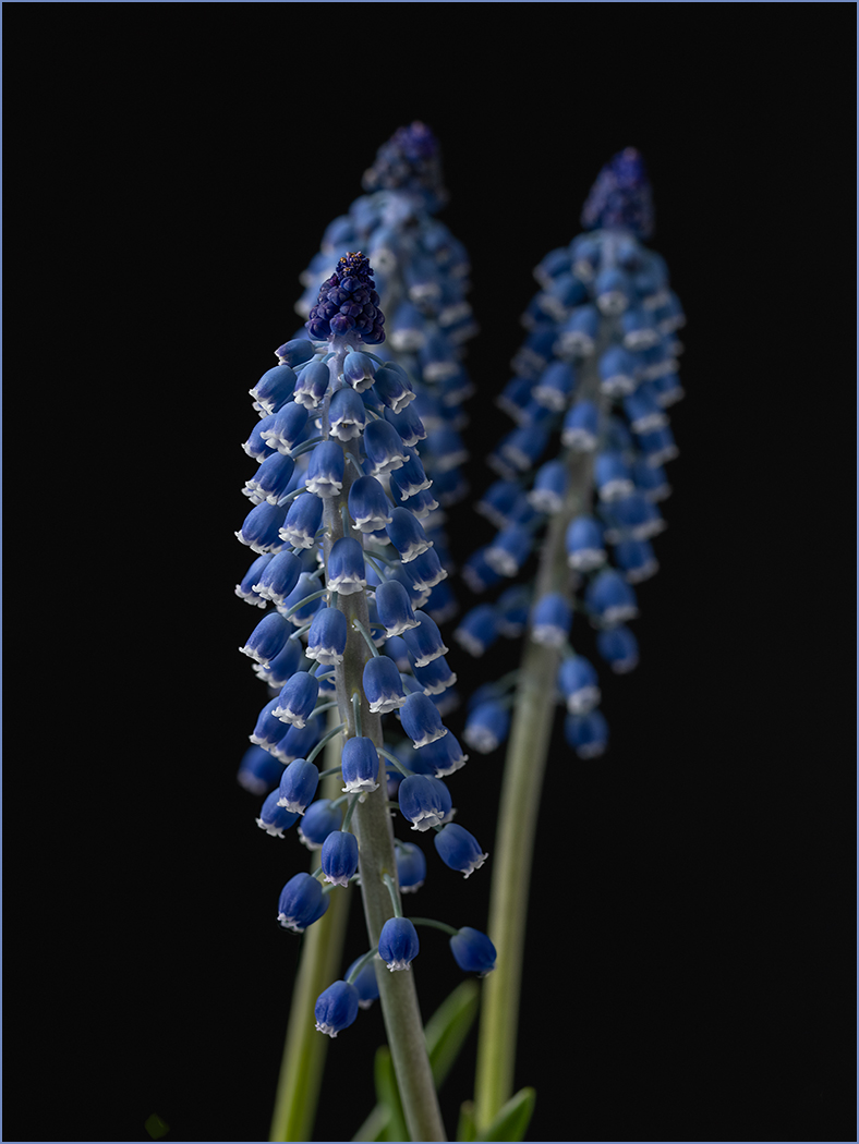
Comment |
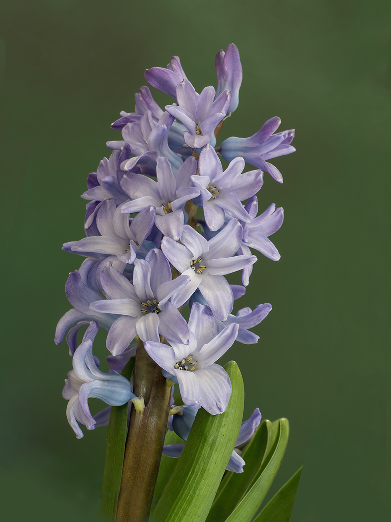
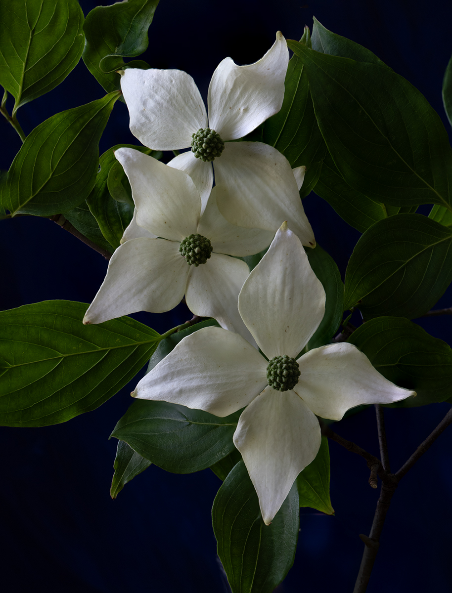
I prefer the monochrome. The colors are great, but they over power the subject. I like the composition with the sharp part in the upper right. The out of focus flower in the lower left is leading us to the sharp part. The tones are great, going from black to the white of the center of the upper flower, without anything appearing to be blown out. I have never used a Lensbaby, but it looks like you have a new lens to experiment with and learn more about using. I think that it is great for photographers to try new things, as it helps to keep us interested in photography. |
Nov 23rd |
| 57 |
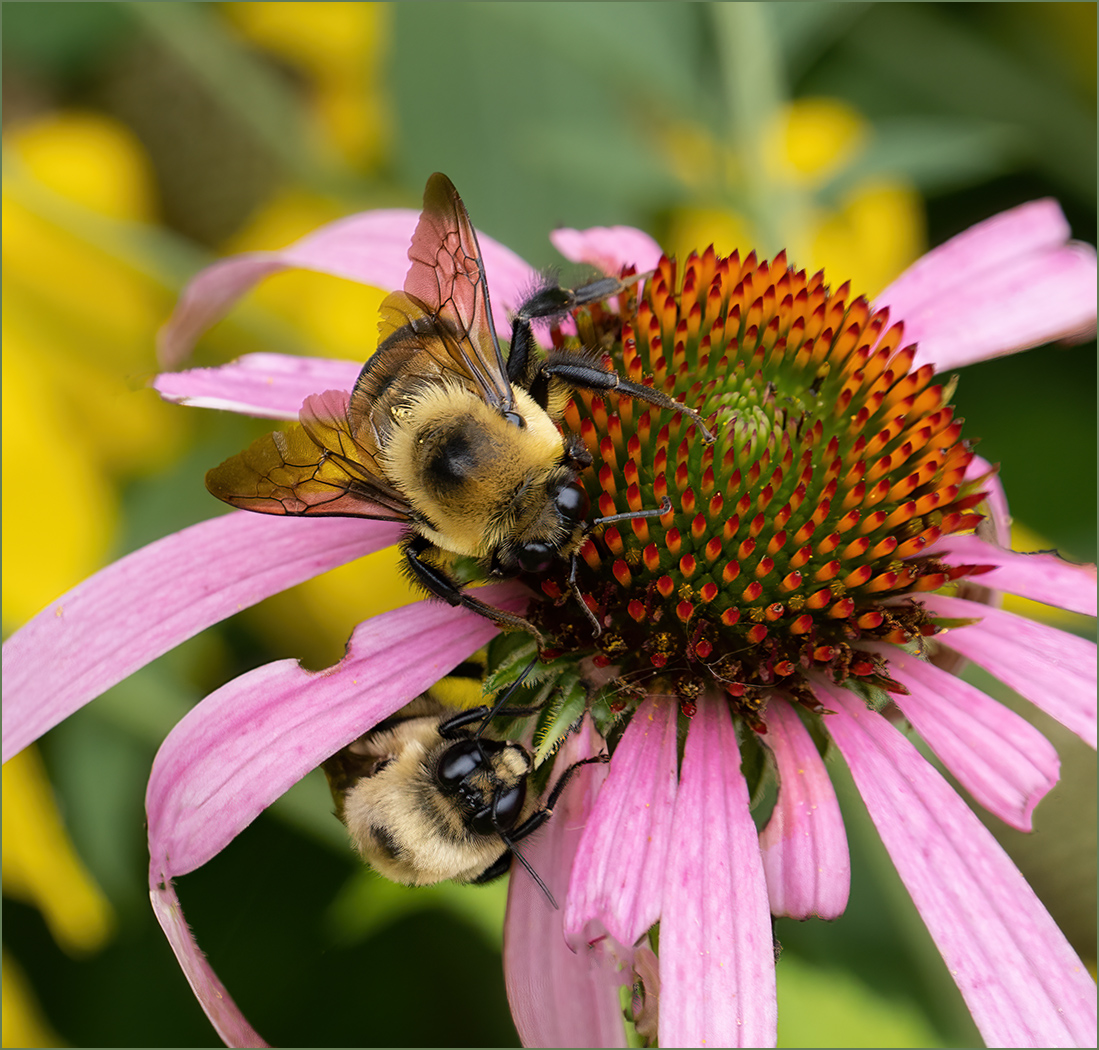
Nov 24 |
Comment |
Good job seeing this interesting grouping to photograph. I like that the top and bottom rows angle away from the center. The image caught my eye when I was first looking at the thumbnails on the group webpage, to want to know more about the image. The image could use more depth of field, but from your settings, the light prevented that. Well done, and I would not change a thing. |
Nov 23rd |
| 57 |
Nov 24 |
Comment |
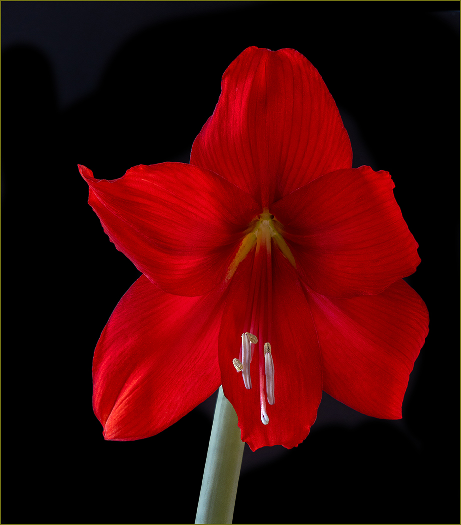
You accomplished getting the orchid sharp from front to back. Like Bob said, the texture in the petals is great. Putting the flower on a black background was a good choice. I like that the orchid is slightly tilted and that the stem is visible. No suggestions as how to improve it, well done. |
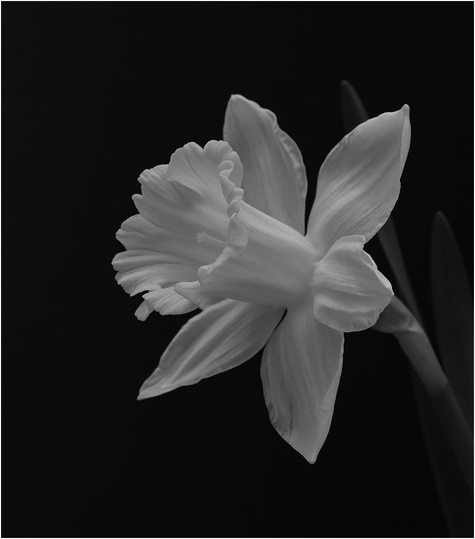
Nov 23rd |
| 57 |
Nov 24 |
Comment |
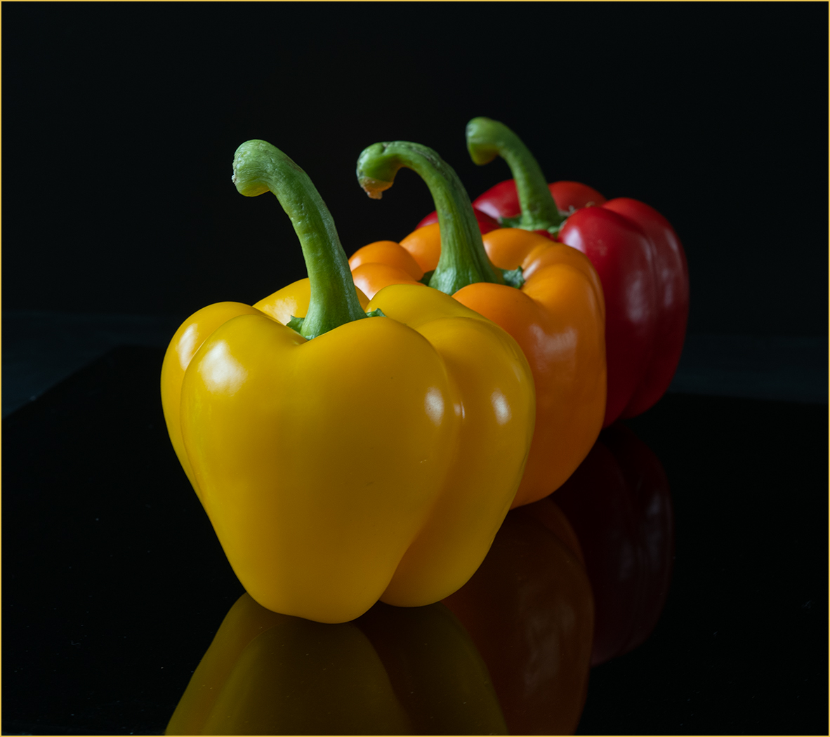
Very nice image of the peppers. They are all so sharp and the lighting is great. Good idea to take them looking straight down. I would not change a thing. |
Nov 23rd |
| 57 |
Nov 24 |
Reply |
Thanks, that helps the image a lot. |
Nov 6th |
6 comments - 1 reply for Group 57
|
15 comments - 10 replies Total
|