|
| Group |
Round |
C/R |
Comment |
Date |
Image |
| 1 |
Oct 24 |
Comment |
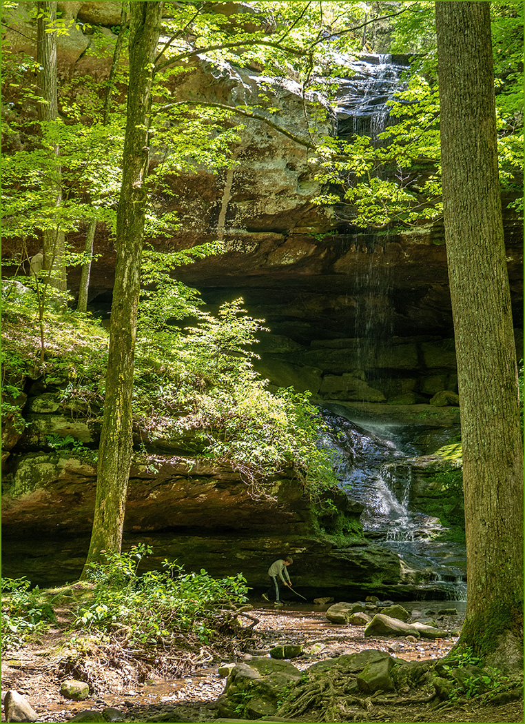
Great image of a beautiful old state capitol. They do not make building like this anymore. |
Oct 21st |
1 comment - 0 replies for Group 1
|
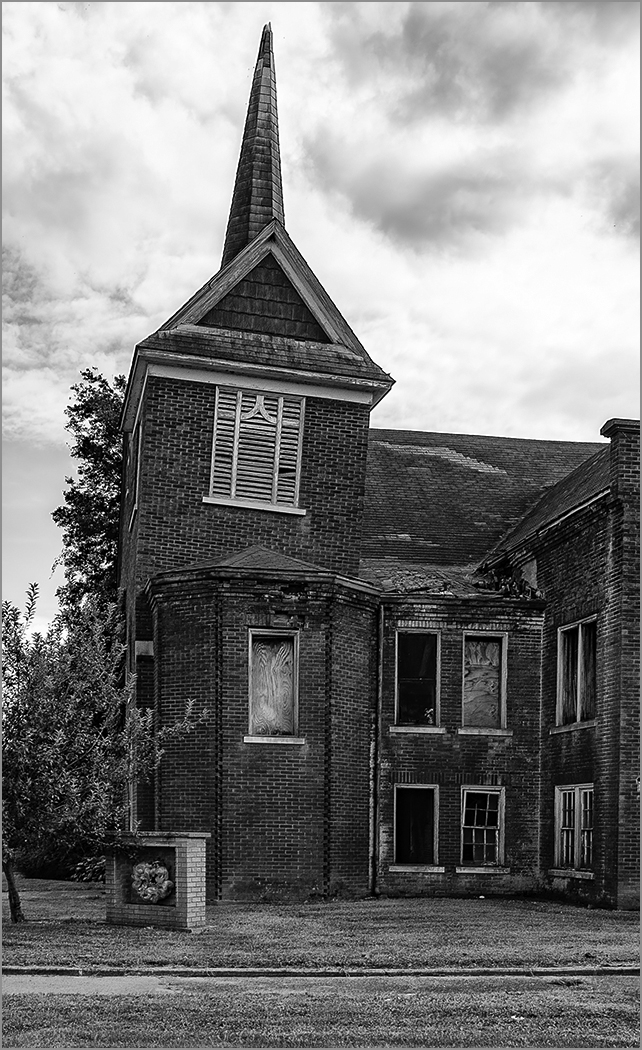
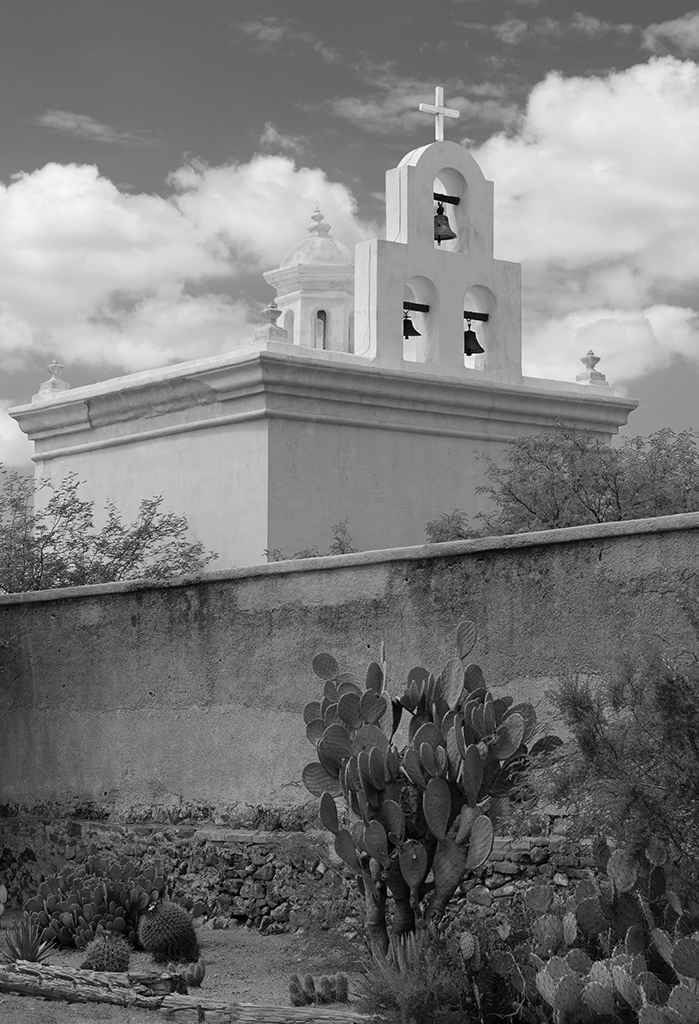
| 4 |
Oct 24 |
Comment |
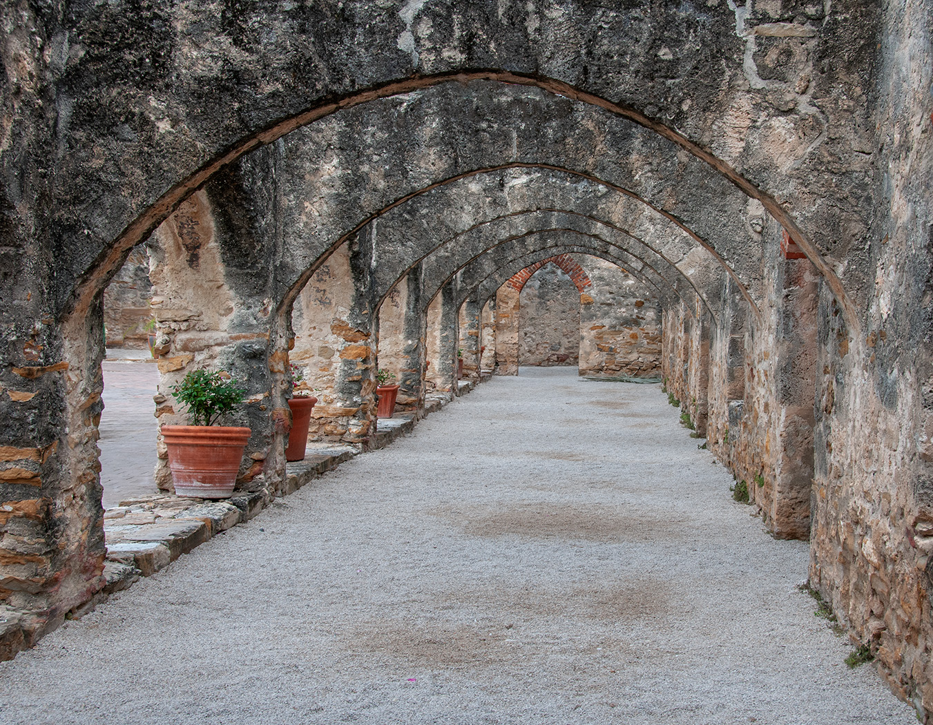
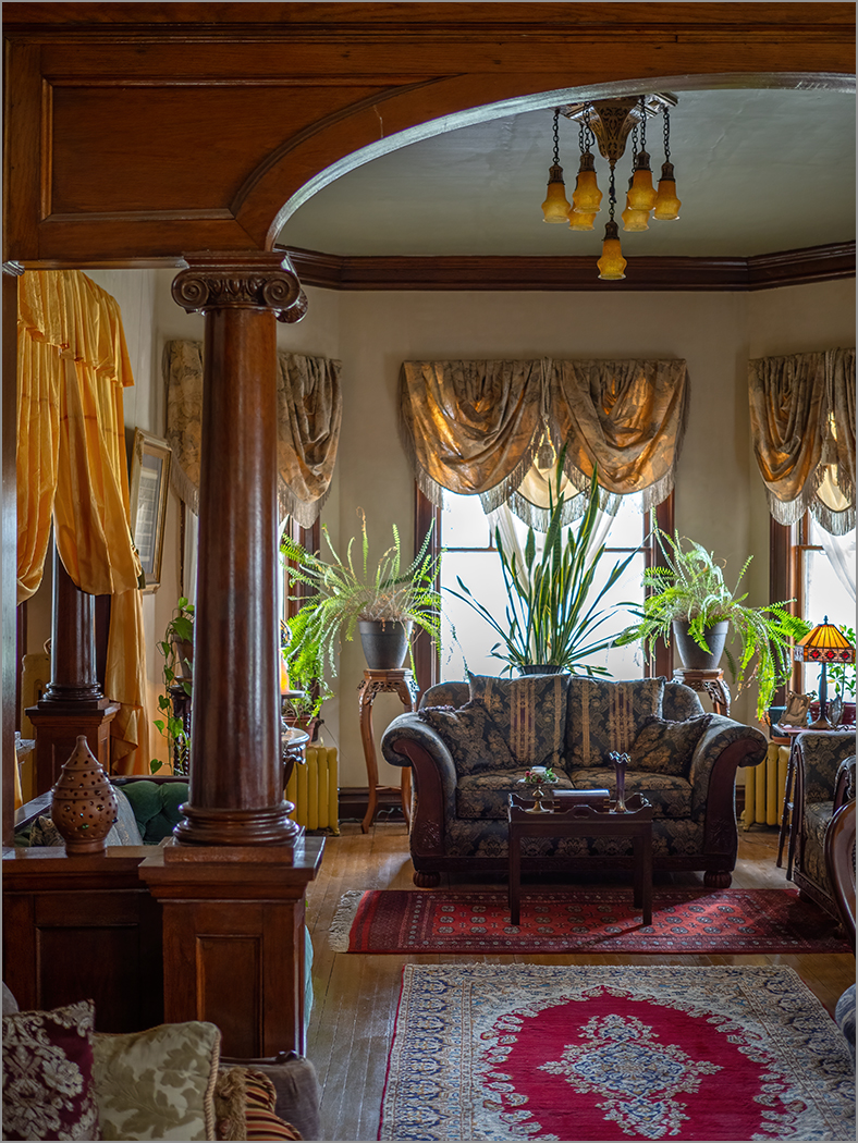
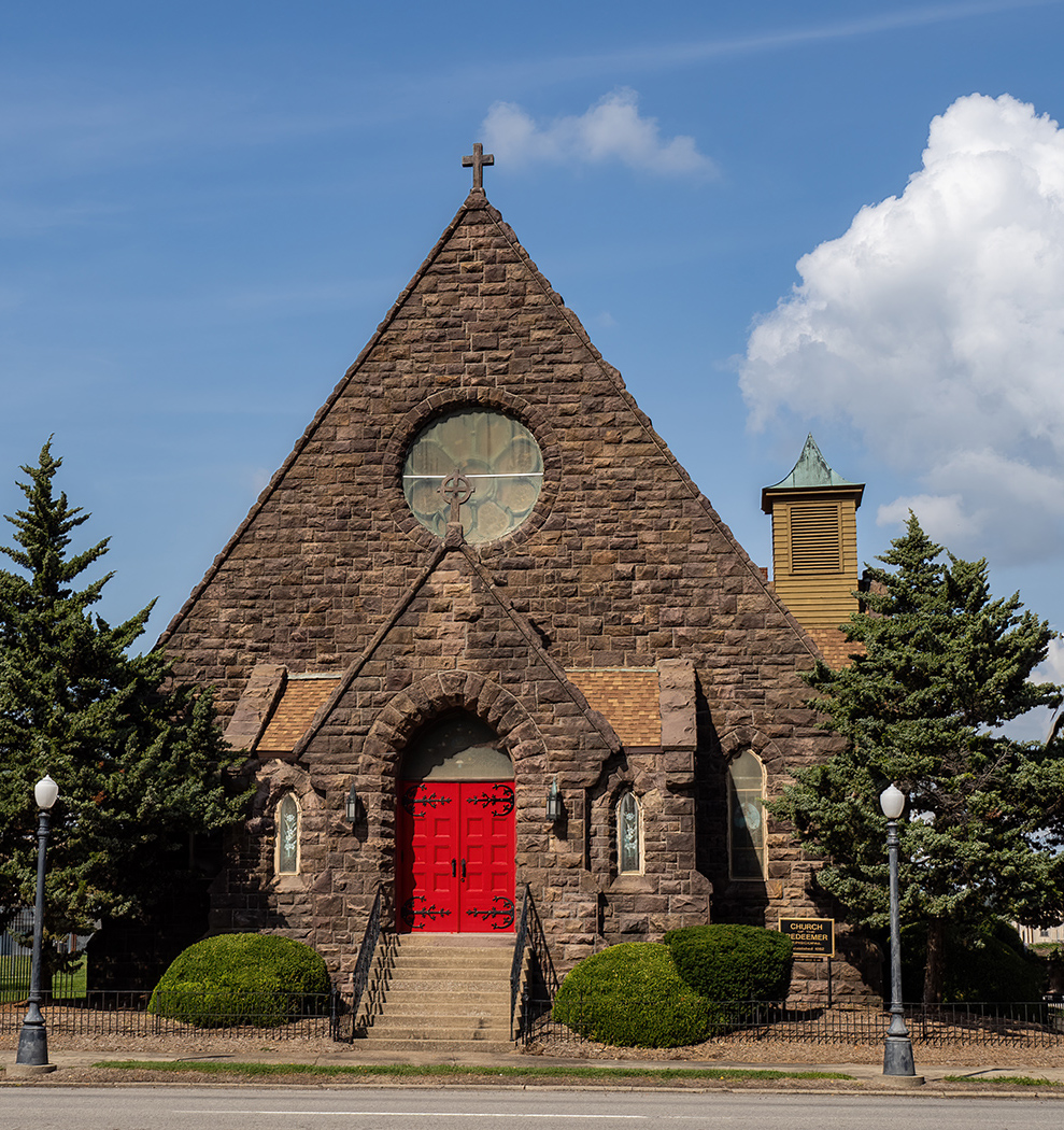
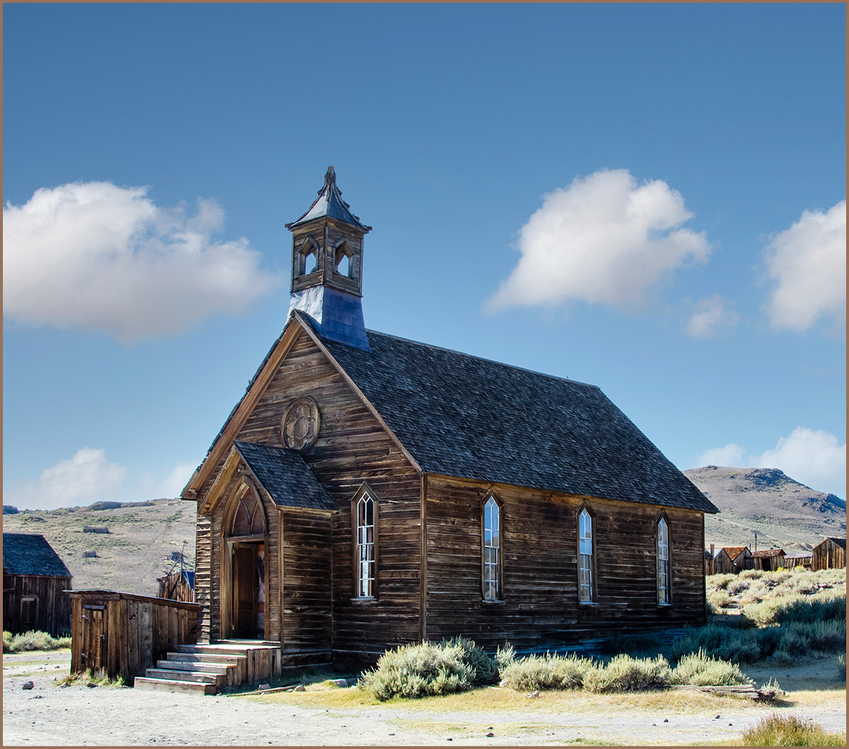
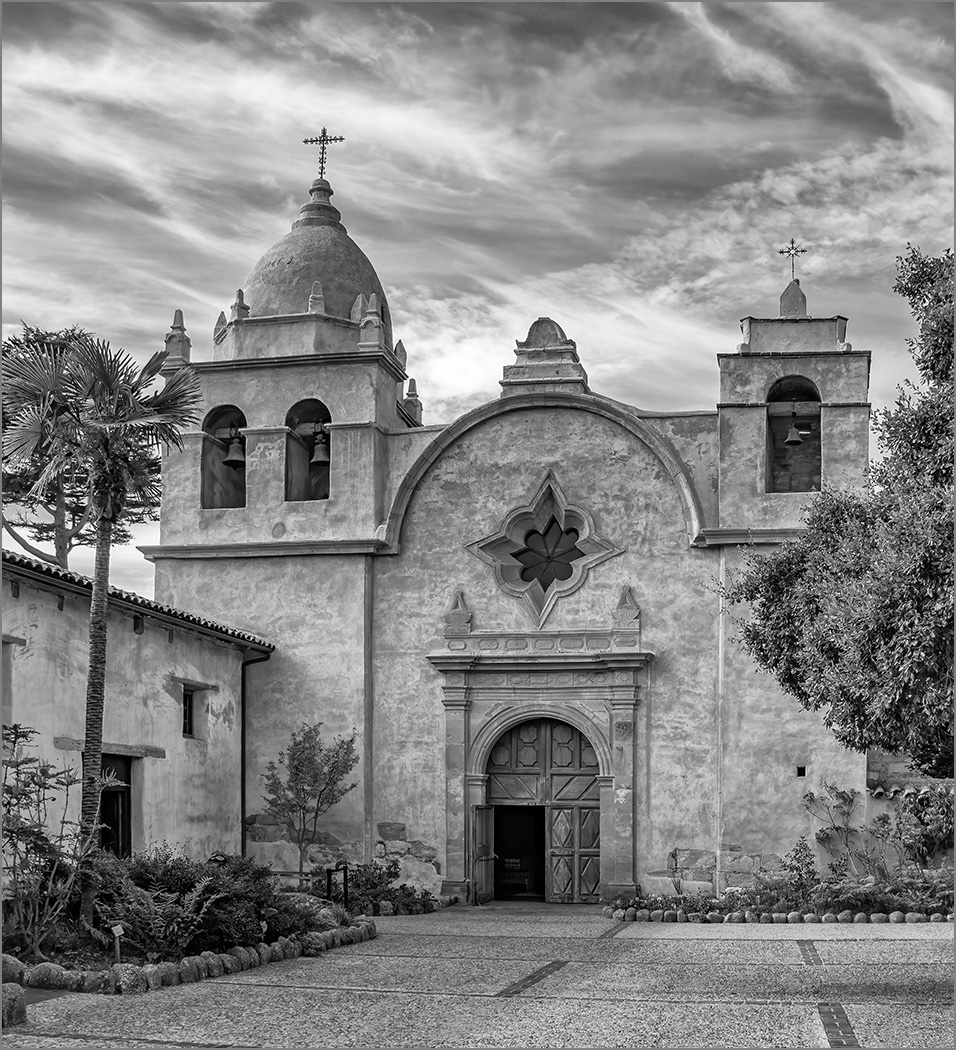
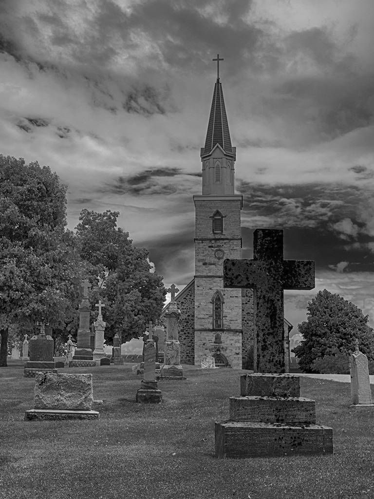
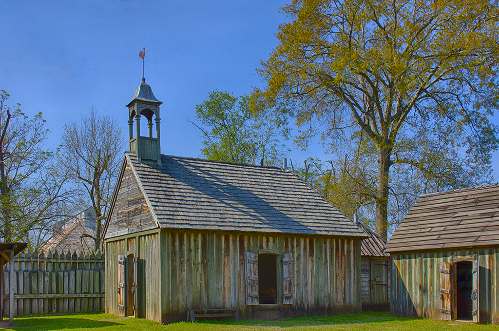
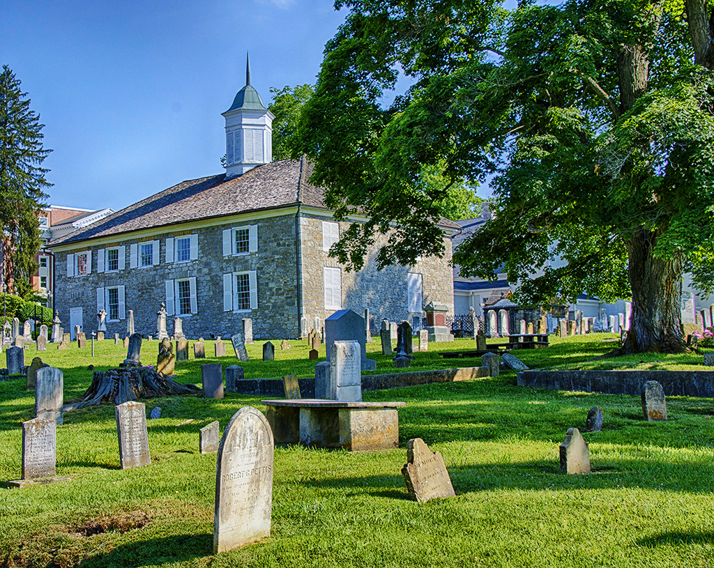
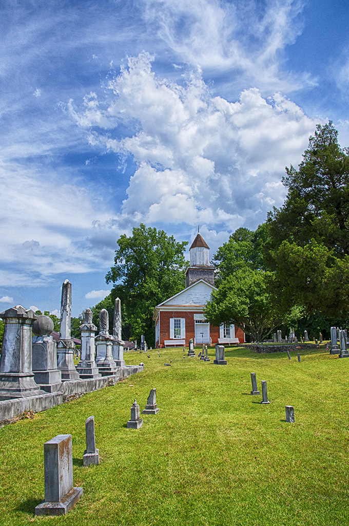
Great image of this beautiful old church. Your photo technique and editing created the image that our eyes would have seen. Very well done. |
Oct 21st |
1 comment - 0 replies for Group 4
|
| 7 |
Oct 24 |
Reply |
Thanks Barbara. |
Oct 28th |
| 7 |
Oct 24 |
Comment |
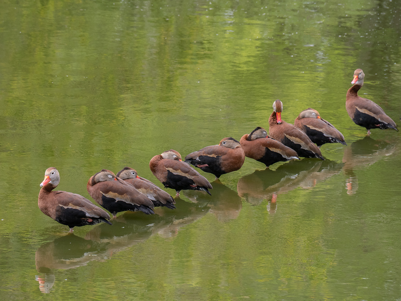
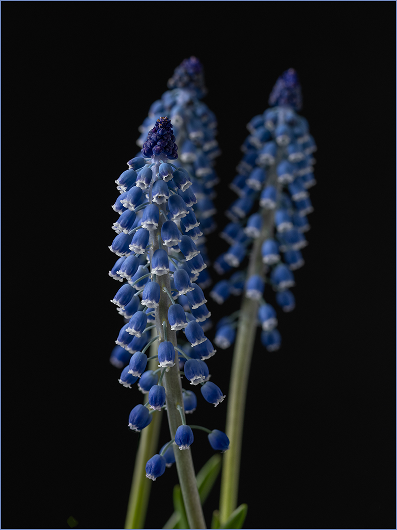
You captured the bird posing with great plumage. Most of us see this common bird without the mating plumage which takes this image out of the ordinary. It is very sharp and has good depth of field. The blue sky background is very good.
Was the wind blowing the plumage on the right, or does it normally in? If it was the wind, then I can see why you needed a fast shutter speed. |
Oct 10th |
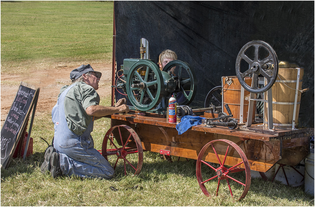
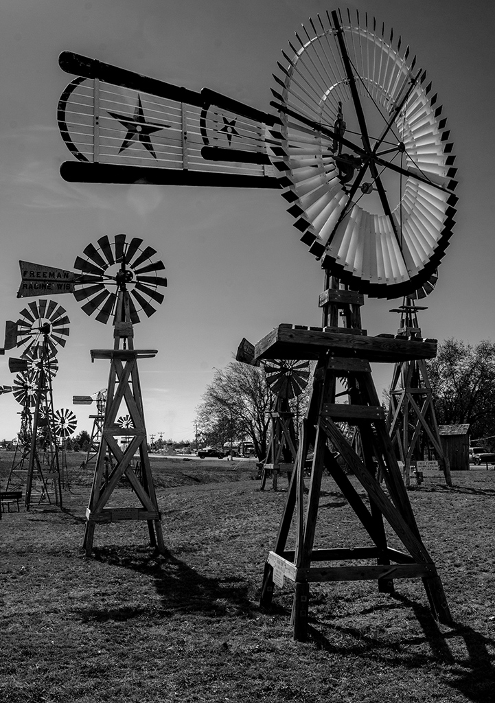
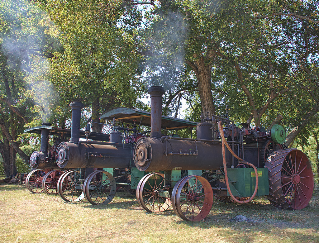
| 7 |
Oct 24 |
Comment |
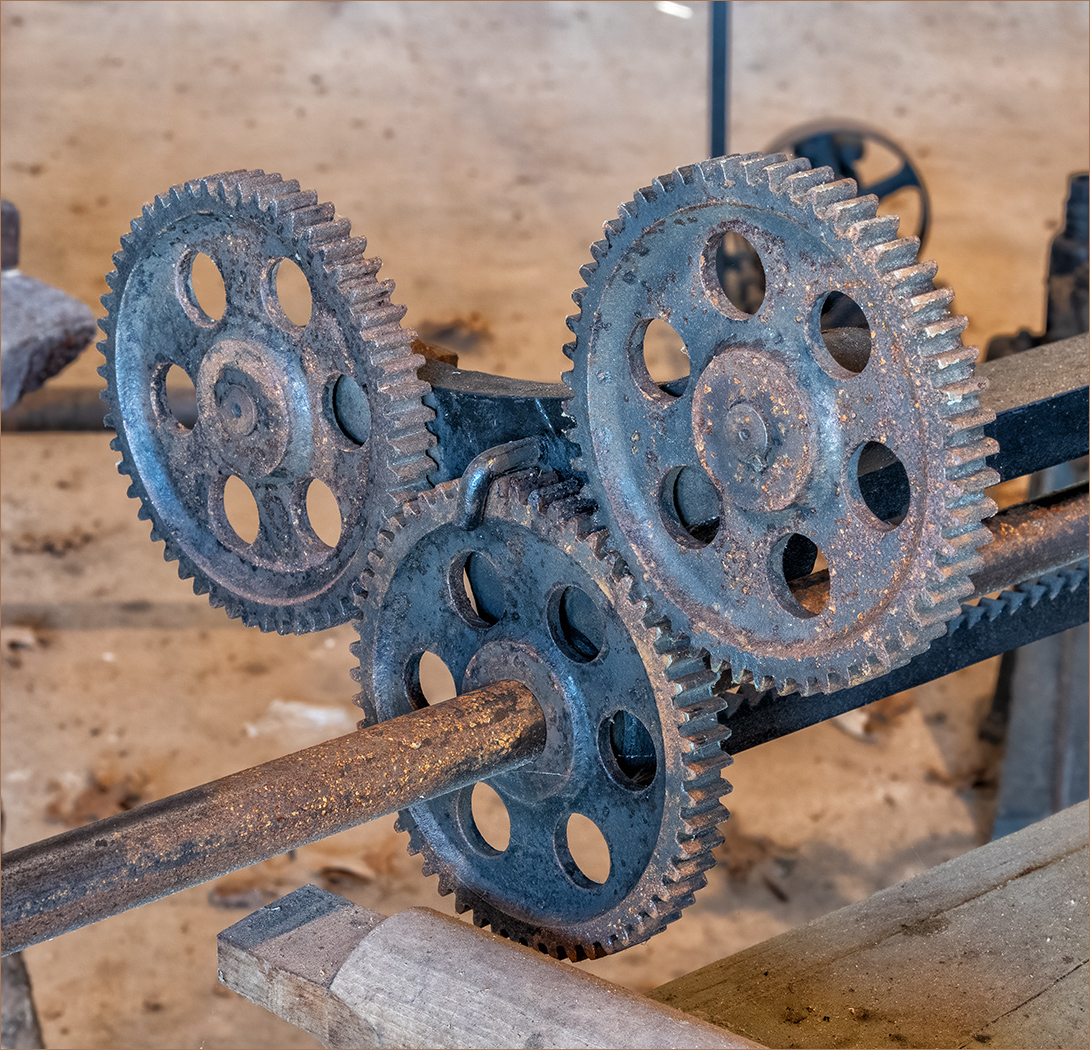
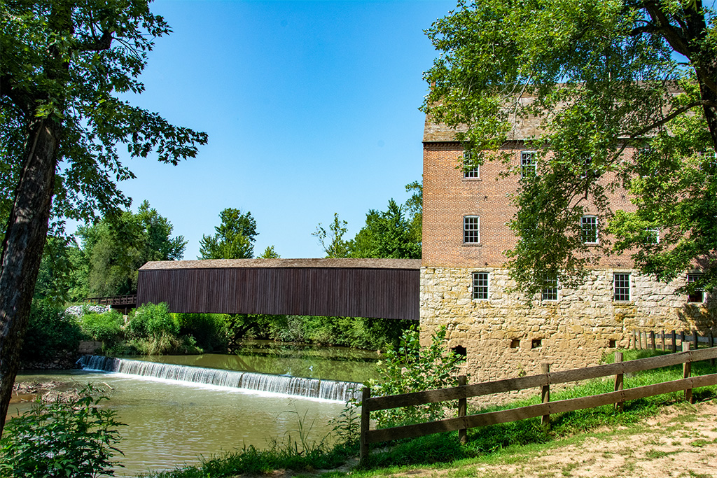
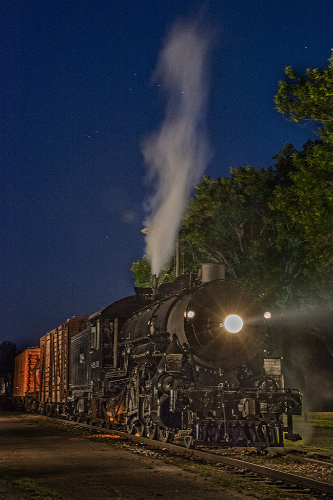
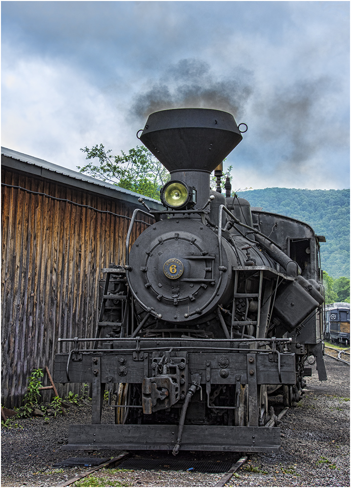
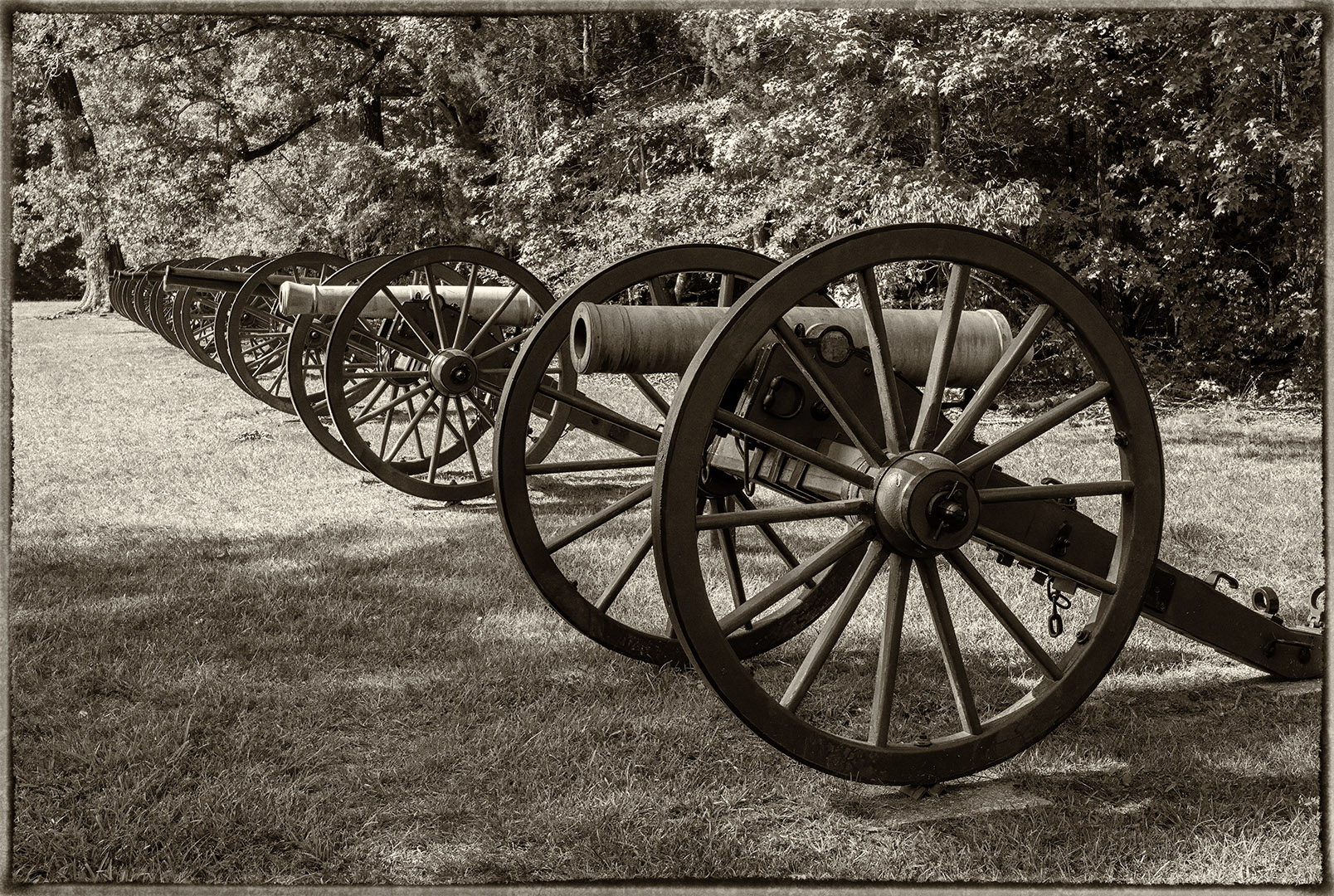
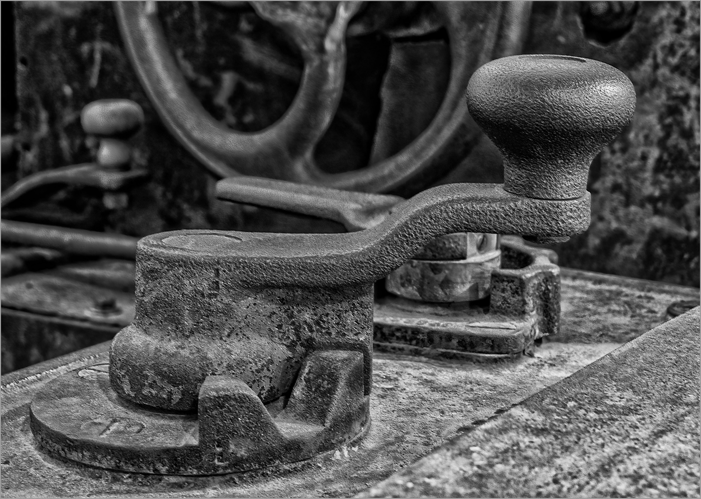
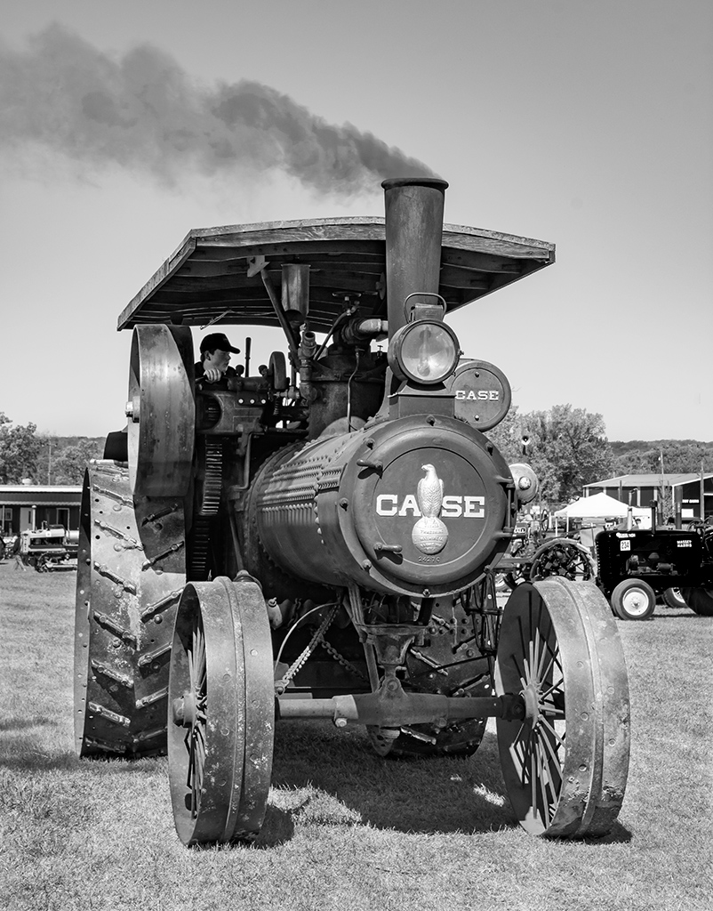
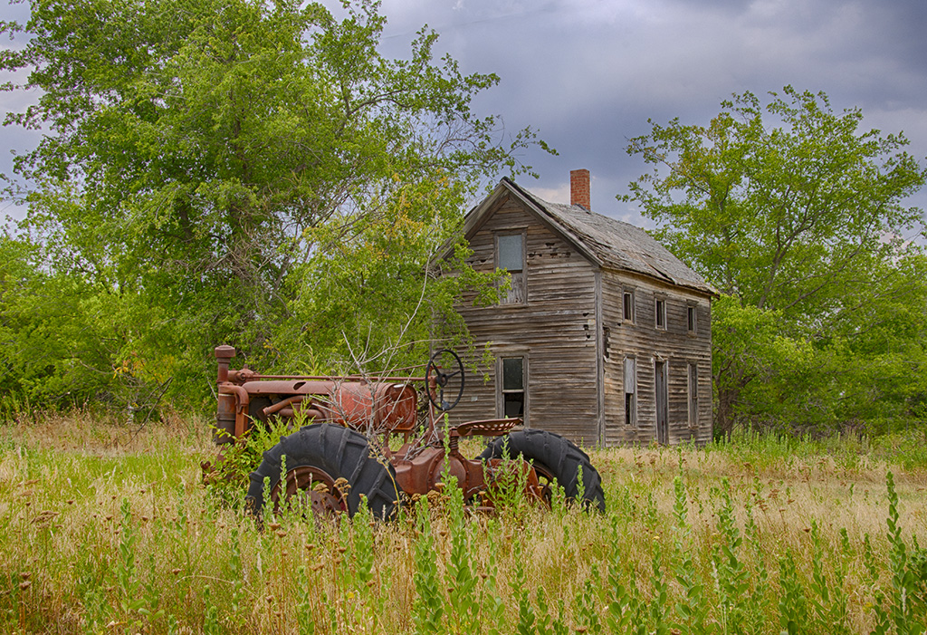
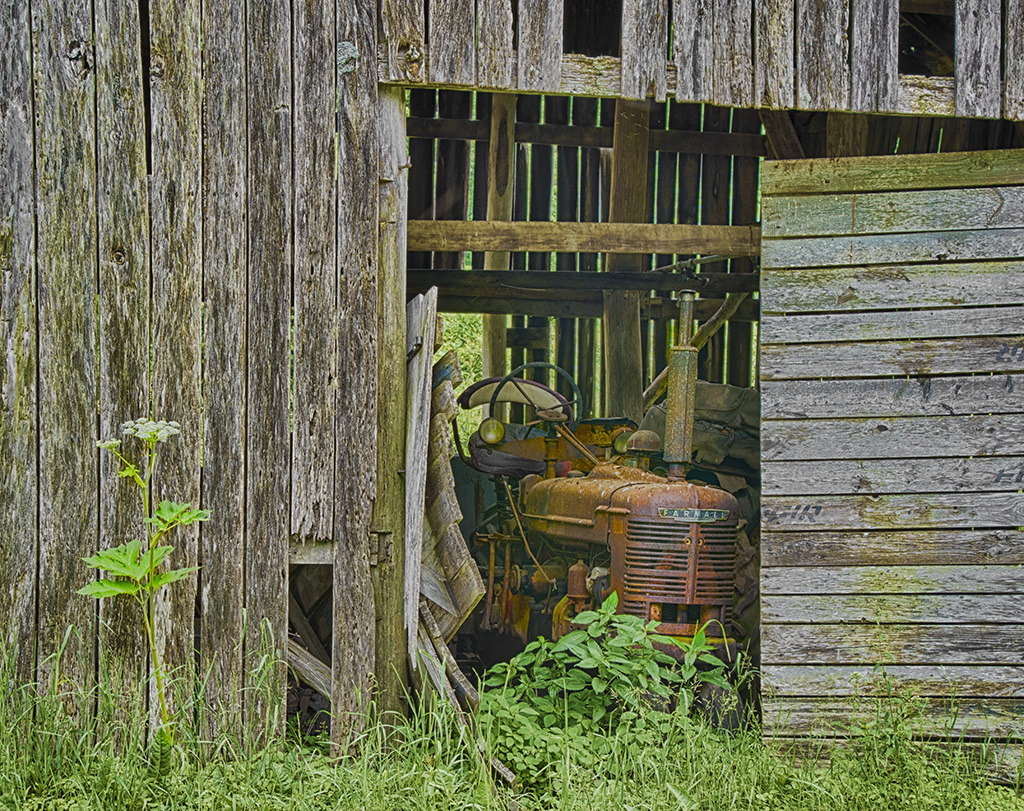
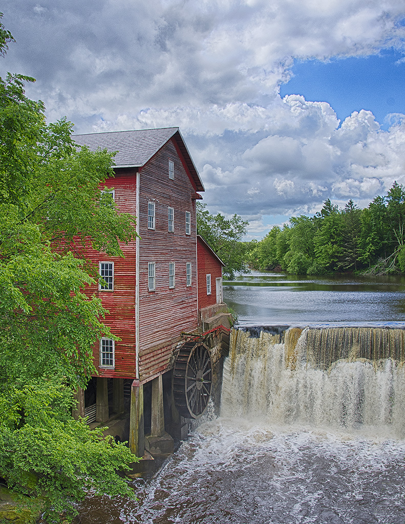
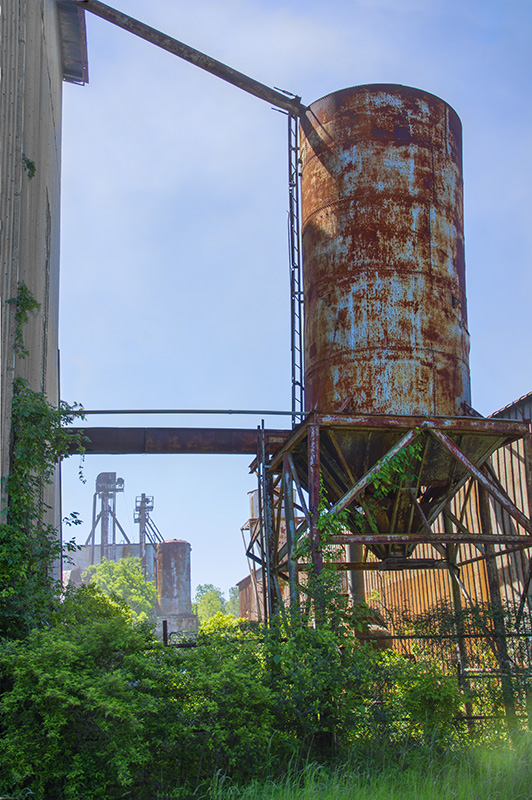
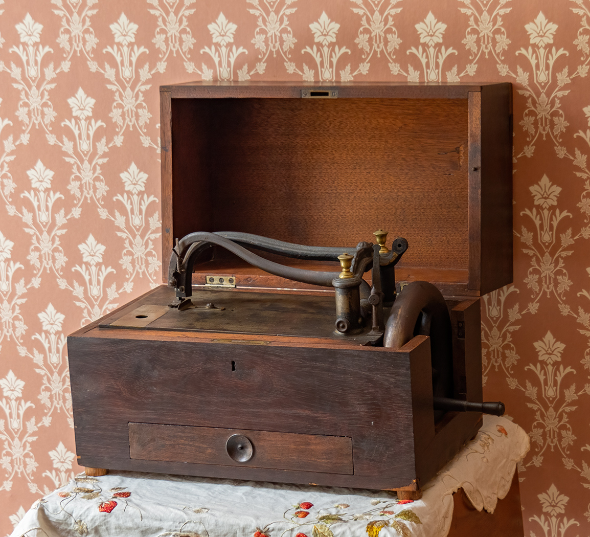
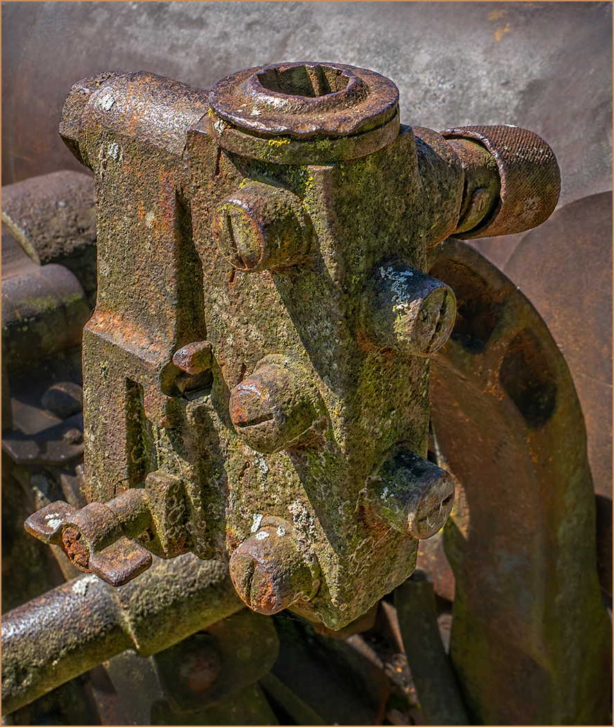
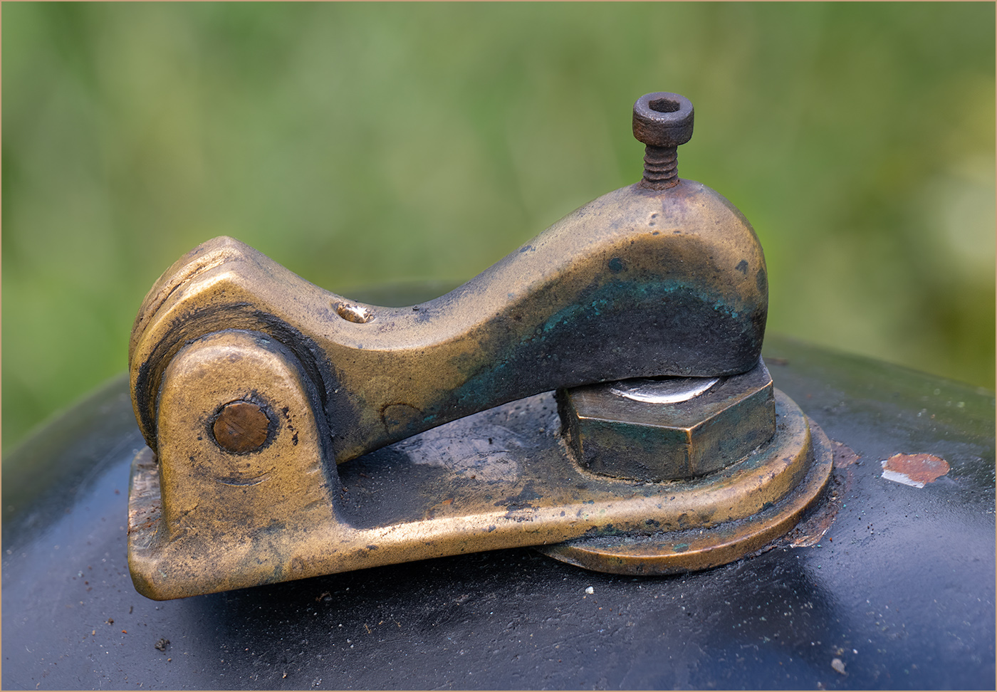
It looks like a very interesting place to visit and photograph. You did a good job of capturing the machinery, with good lighting and good depth of field. I like the angled composition of the machinery. Museums like to inform the visitors with sighs explaining things, but they are a distractions for photographers. I used "Generative Fill" in Photoshop to get rid of the sign. Photoshop has gotten scary good with removing items. |
Oct 10th |
 |
| 7 |
Oct 24 |
Reply |
Enjoy your weekend away! |
Oct 10th |
| 7 |
Oct 24 |
Comment |
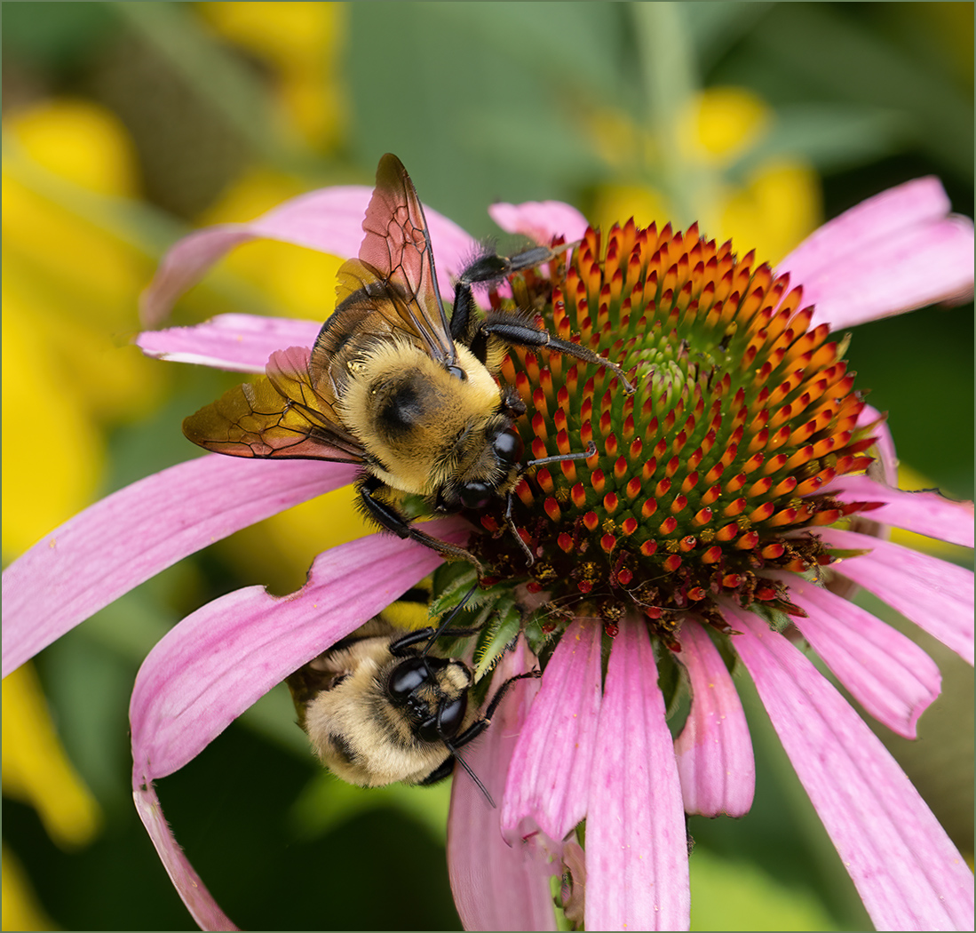
Great timing to capture 2 bees in flight at the same time. It sounds like you captured what you were trying for. However, the crop that Butch made to just have the very sharp bee is a better image photographically. The bee is super sharp, but still has movement in the wings. Two bees so far apart is also one of the rules of composition to not have 2 items in an image, as there is a tendency for the eye to bounce back and forth between the two.
The image as cropped is a really good image. |
Oct 10th |
| 7 |
Oct 24 |
Comment |
Great composition with the 2 edge seed heads pointing in toward the center. The image is very sharp with great depth of field. Like Butch said, it really does catch the eye. |
Oct 10th |
| 7 |
Oct 24 |
Comment |
You have done an excellent job of converting from a slide. You captured a great moment. There seems to be something wrong with the center part of the image, the colors shift from the edges. It is very obvious in the mountains and the bluff edge. |
Oct 10th |
| 7 |
Oct 24 |
Reply |
Thanks for the edit, but I think that you cropped it too close. |
Oct 10th |
| 7 |
Oct 24 |
Reply |
Where is your imagination? I added an image with the head circled. I also increased the saturation and brightness, as Butch had done. |
Oct 10th |
 |
5 comments - 4 replies for Group 7
|
| 32 |
Oct 24 |
Reply |
Wes, sorry to hear that your wife is needing that. She is lucky to have you! |
Oct 21st |
| 32 |
Oct 24 |
Comment |
How lucky you were to capture this beautiful bird posing for you. Your conversion to mono was very good and there is separation between the bird and the background. As both Manel and Diana pointed out, the color is much better. I really like the dried grass and the colors of the bird. |
Oct 11th |
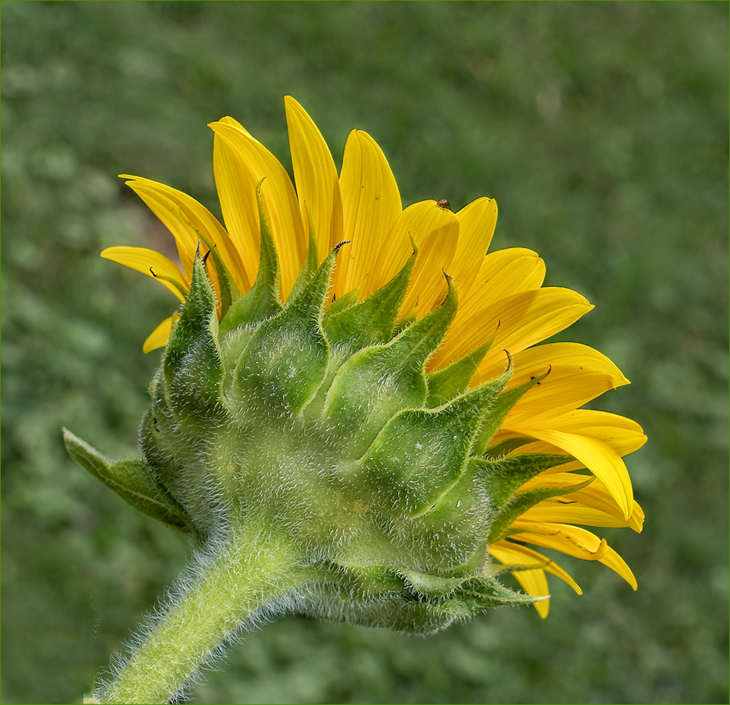
| 32 |
Oct 24 |
Comment |
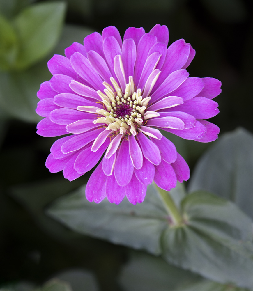
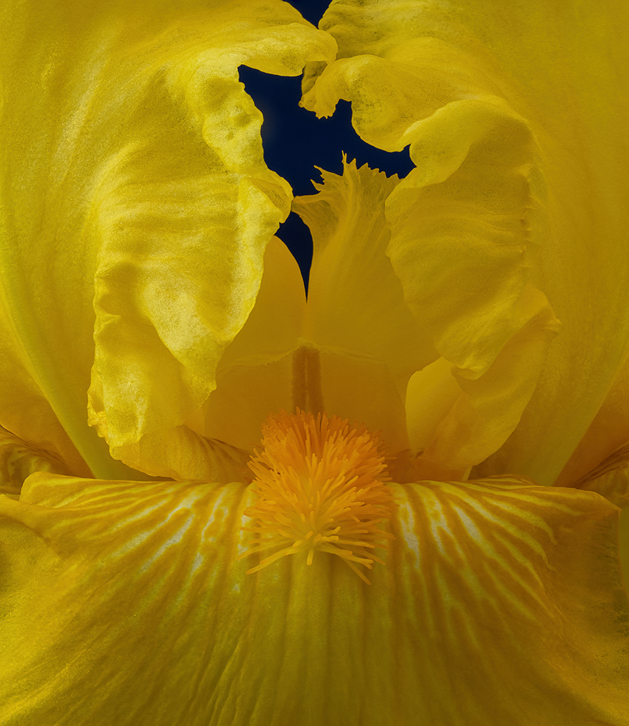
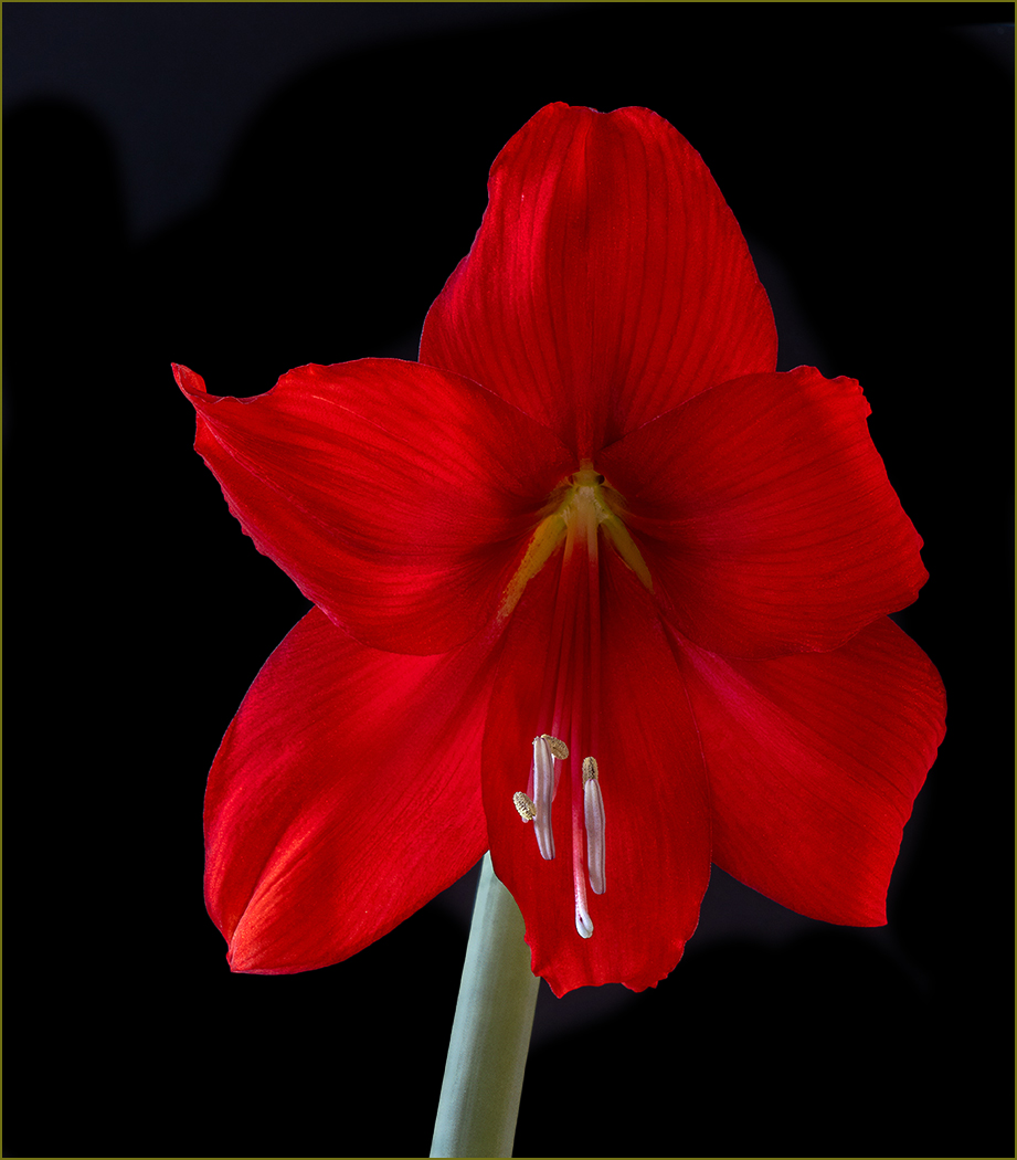
I am glad that you enjoyed your walk. It is an interesting flower that you captured well with good sharpness and depth of field. I think that the composition works well because of the flower parts going out in all directions. That said, I agree with Wes and Diana that it looks much better in color as the flower gets lost in the foliage in mono. |
Oct 11th |
| 32 |
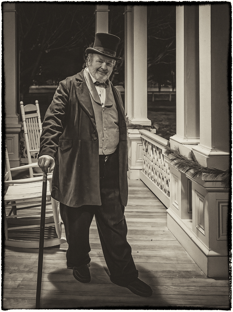
Oct 24 |
Comment |
I like the mono better. The color has such vivid colors that they distract from the story. You captured the man very well and I like his expression. I like the black hat, and the darker eye on the left does not bother me. I do agree with Diana that you are lacking separation between the hat and the background. I played with the sliders in conversion to mono to add separation. Overall, I really like the image and the story that it tells. |
Oct 11th |
 |
| 32 |
Oct 24 |
Comment |
This sounds like an interesting project and I think that you accomplished what you were wanting. I think that the sky is a good addition. I am not sure that the viewer would know that the "hills" are bodies without being told. I agree with Diana that the rise on the far right looks out of place. I like the shadings and tones and overall, say that you did a good job with the image. |
Oct 11th |
| 32 |
Oct 24 |
Comment |
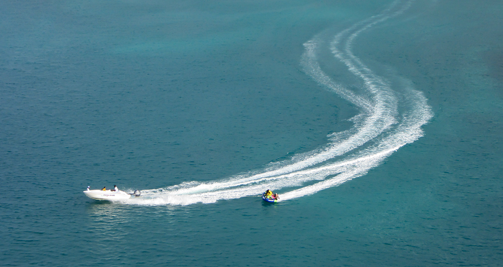
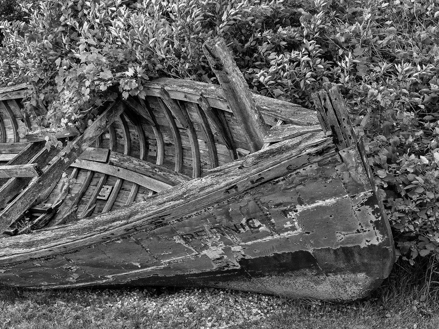
I like the row of boats, and the angle of them. I also like your crop, and do not mind the sky. The white area in the lower right is a distraction. I played with your conversion to mono to reduce it. I also got rid of the building above the row of boats. |
Oct 11th |
 |
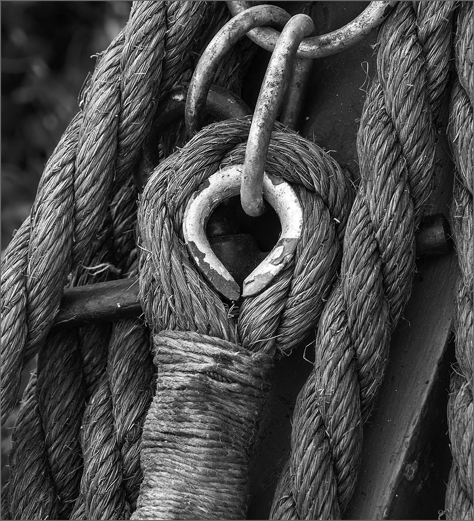
| 32 |
Oct 24 |
Reply |
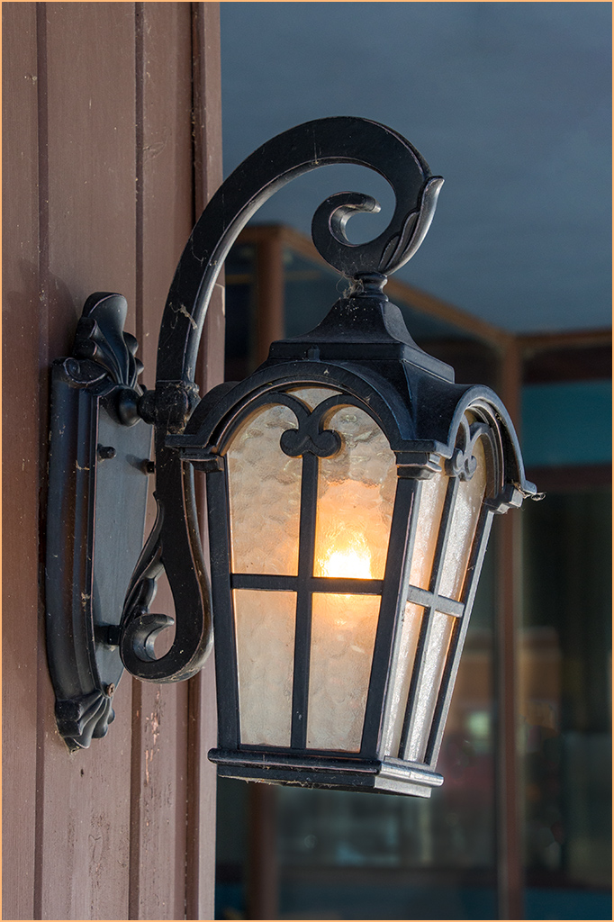
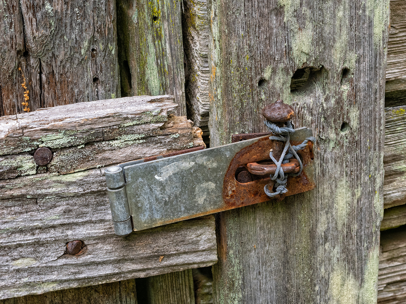
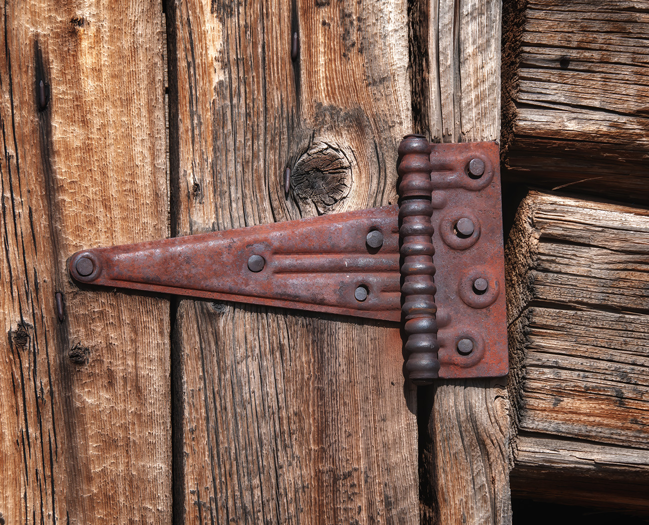
I thought that photographers in Europe like to have more room around the subject? That said, I do like the crop, it leaves plenty of wood above the chain. I also agree with you about the black area at the bottom serving as a stop. |
Oct 10th |
| 32 |
Oct 24 |
Reply |
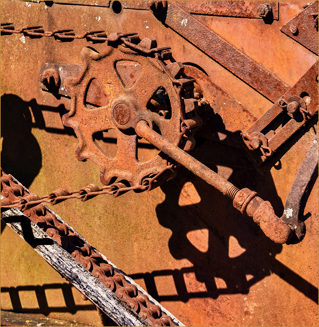
The strong shadow is such a strong feature in the image that I think that the dark area and distorted shadow below it are a distraction. If I was there at a time without the shadows, then the lower links would be good to be left.
I was there only a couple of weeks before all the flooding in the area of North Carolina. I had just come down the Blue Ridge Parkway and had spent a night in one of the towns that they showed on the news as flooding. What a tragedy! |
Oct 4th |
| 32 |
Oct 24 |
Reply |
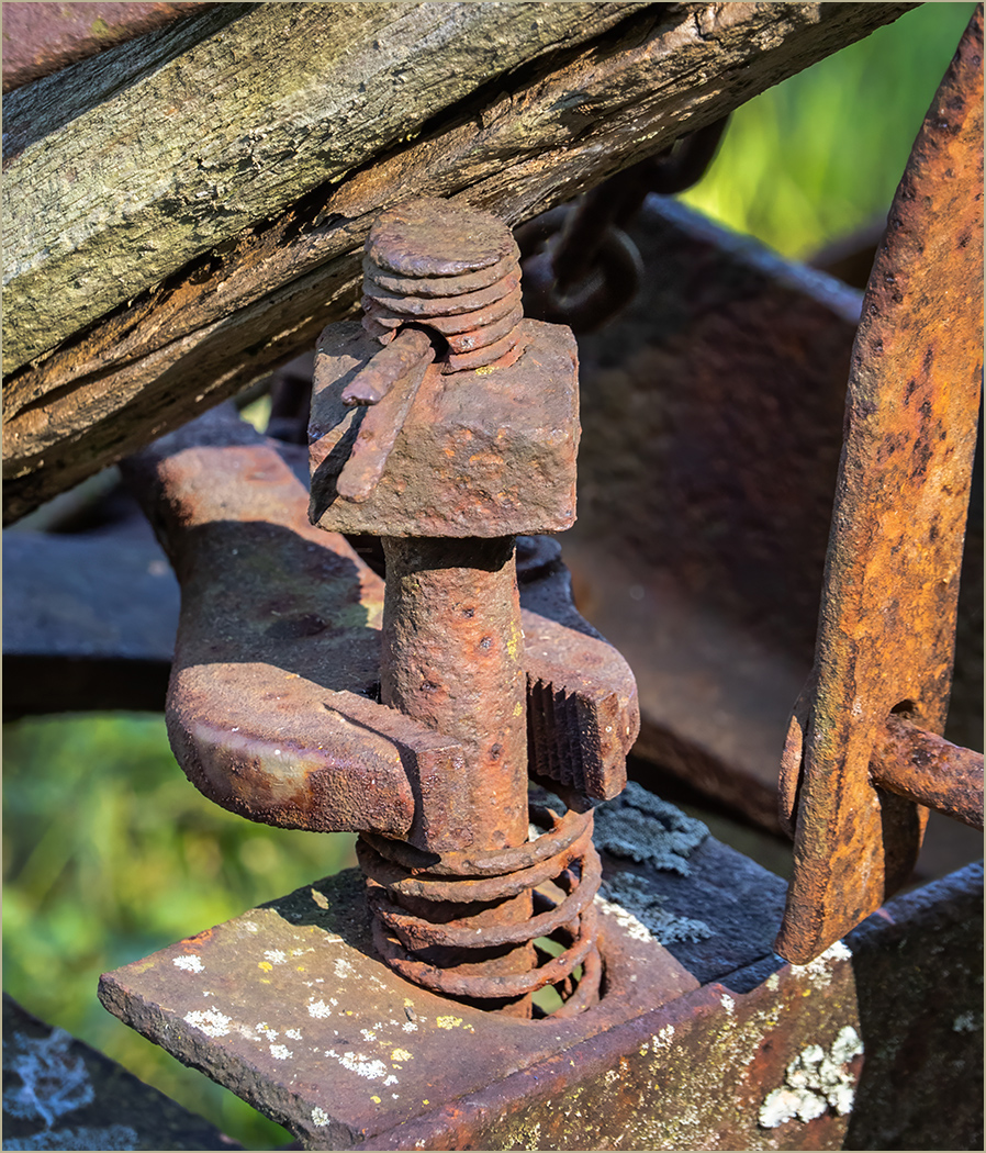
Thanks, it is a very interesting chain. |
Oct 3rd |
5 comments - 4 replies for Group 32
|
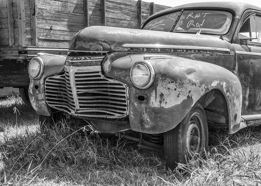
| 49 |
Oct 24 |
Comment |
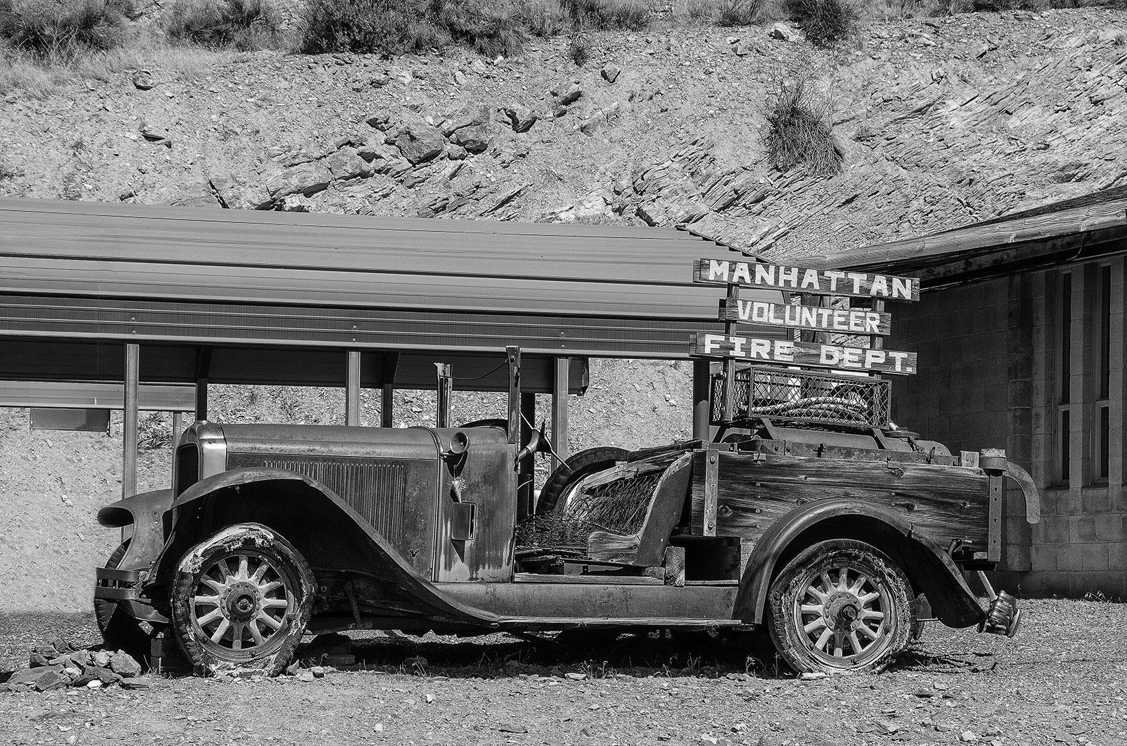
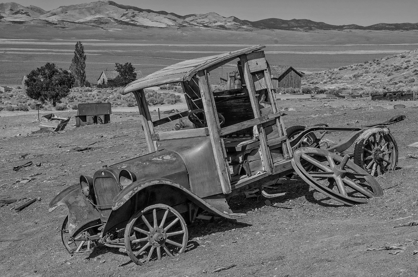
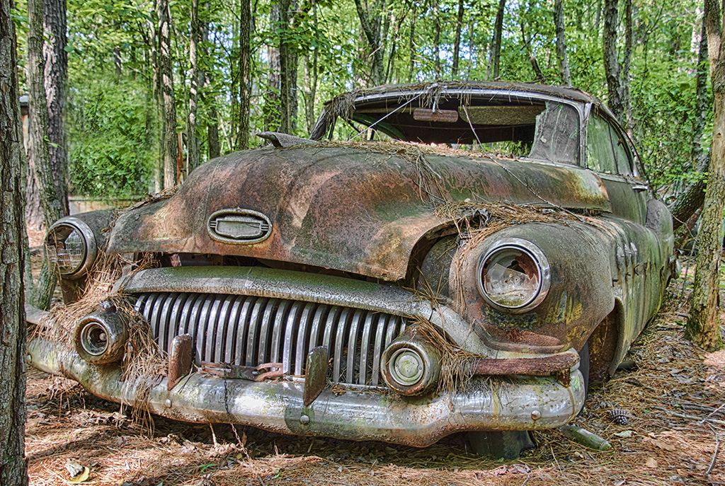
I can see why you will be making a print of the great looking classic car. I would not worry about the sky. |
Oct 21st |
1 comment - 0 replies for Group 49
|
| 57 |
Oct 24 |
Comment |
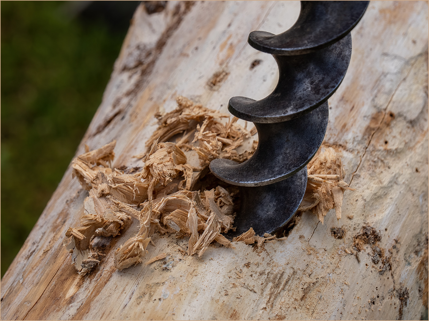
It looks like an old well used chain saw. Having the chain off, and adding the file improves the image. I like that you included the white lettering. The angle of the blade and having sawdust and other items around the blade also adds. I like what Cindy did with the image and also agree with her that the image seems a bit soft. |
Oct 21st |
| 57 |
Oct 24 |
Comment |
The image has a lot of impact and really catches the eye. When I first saw it, I thought that it was a balloon because of the detail. It is hard to believe that it is a carved pumpkin. When my kids were small I was doing good when I got a simple eyes, nose and mouth carved. Orange on black is the perfect way to go. You have great depth of field to have the curved pumpkin sharp from edge to edge. It is very sharp for a long exposure without using a tripod -- great job. |
Oct 21st |
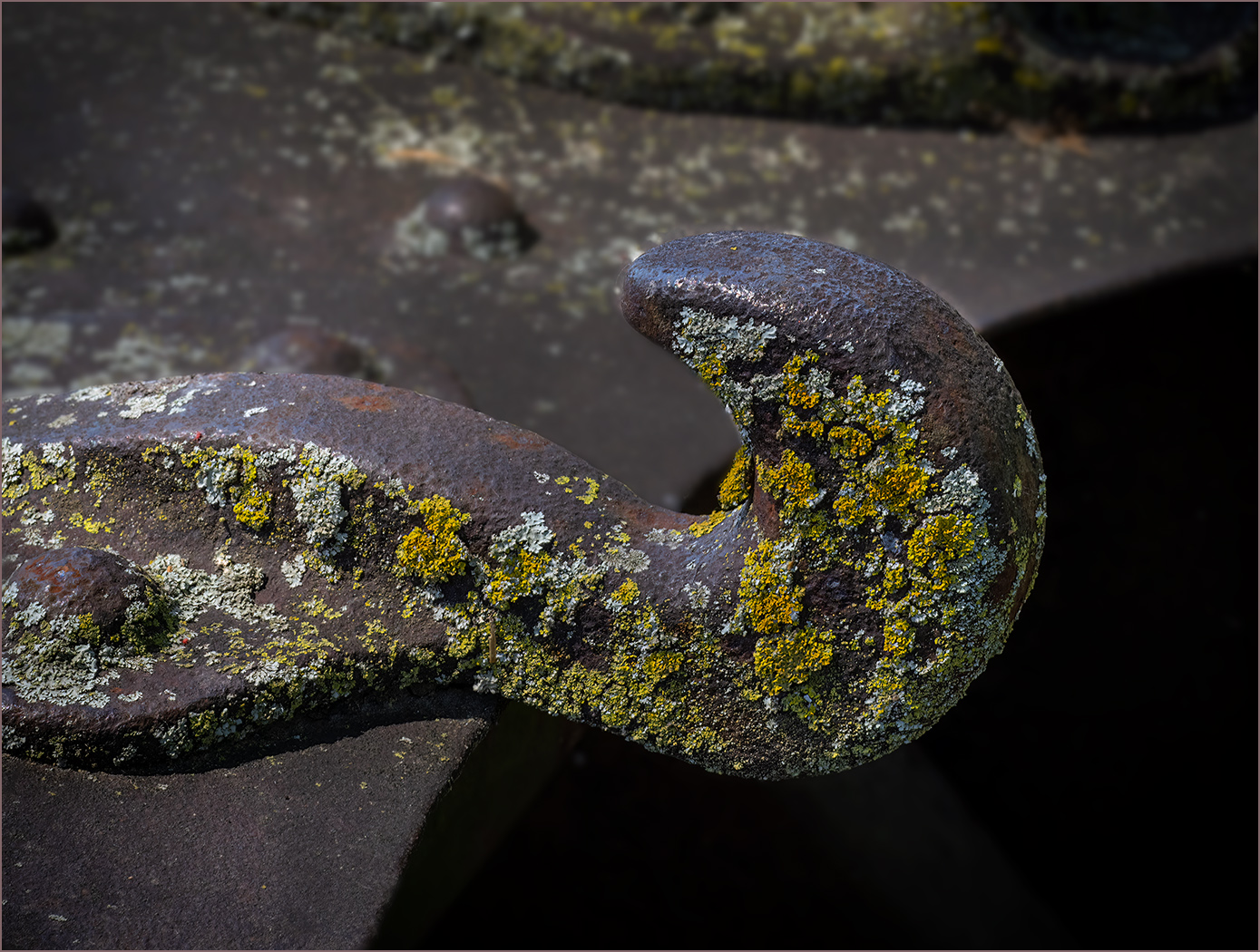
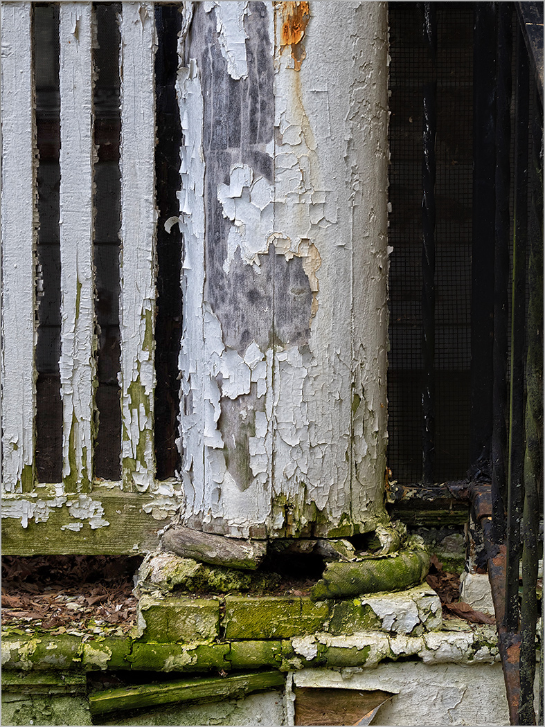
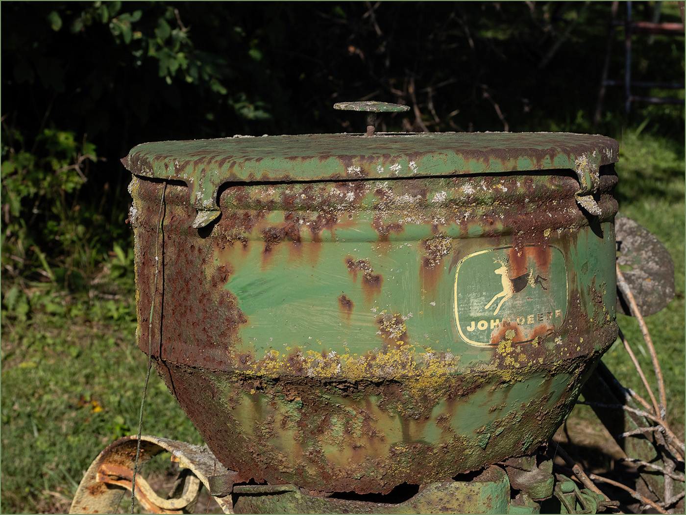
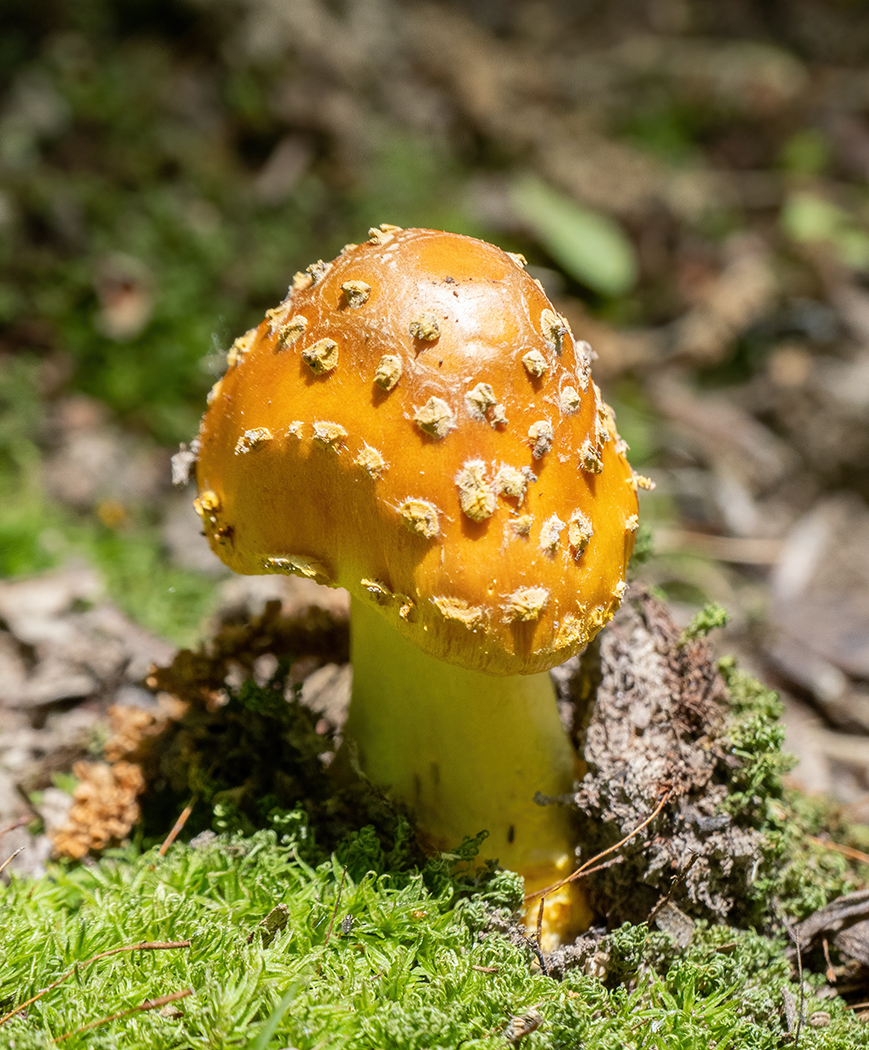
| 57 |
Oct 24 |
Comment |
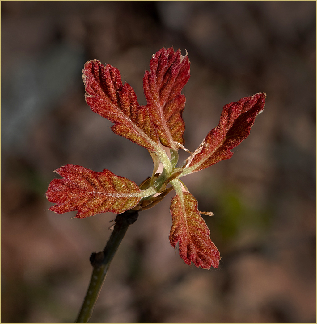
I like the colors and textures. I never thought about lichens being new life on old items that are deteriorating, an interesting thought. Your editing really helped the image. I like the composition and crop. It does look like you may have a bit of a depth of field issue, as the areas around the center lichen are not as sharp as they could be. But then maybe that was your intent, to put more emphasis on the center lichen. |
Oct 21st |
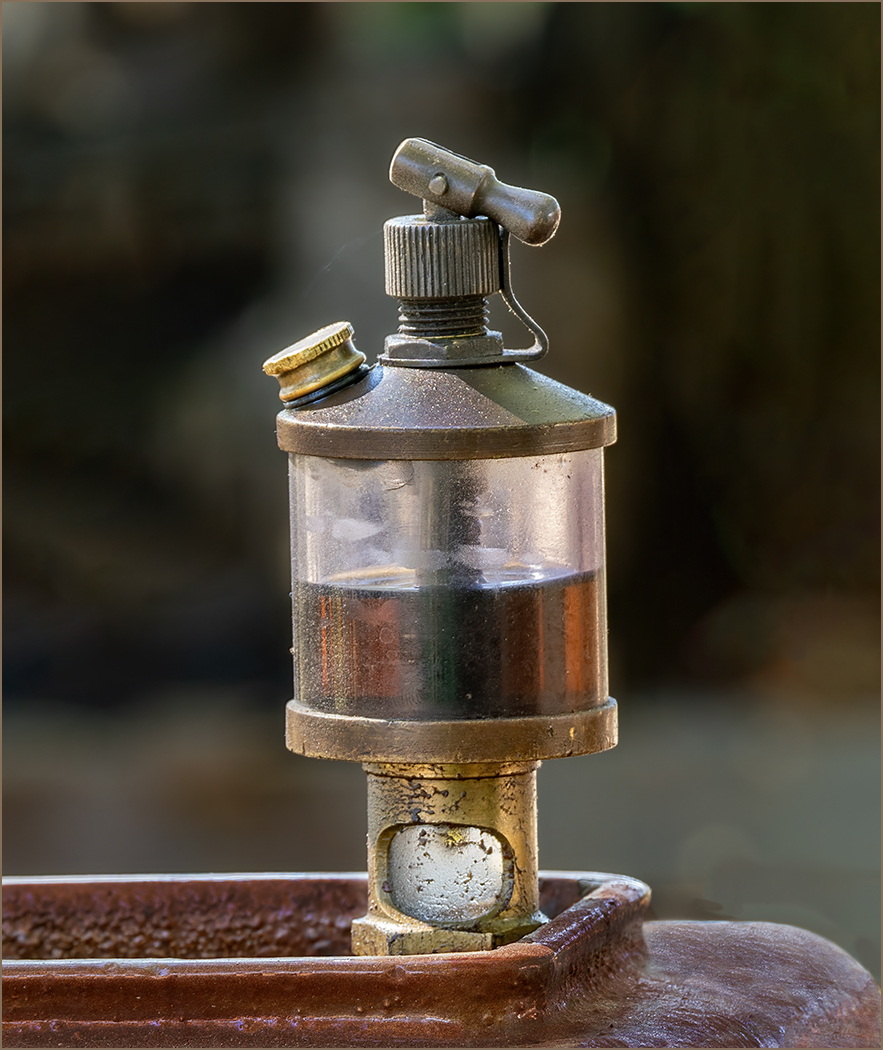
| 57 |
Oct 24 |
Comment |
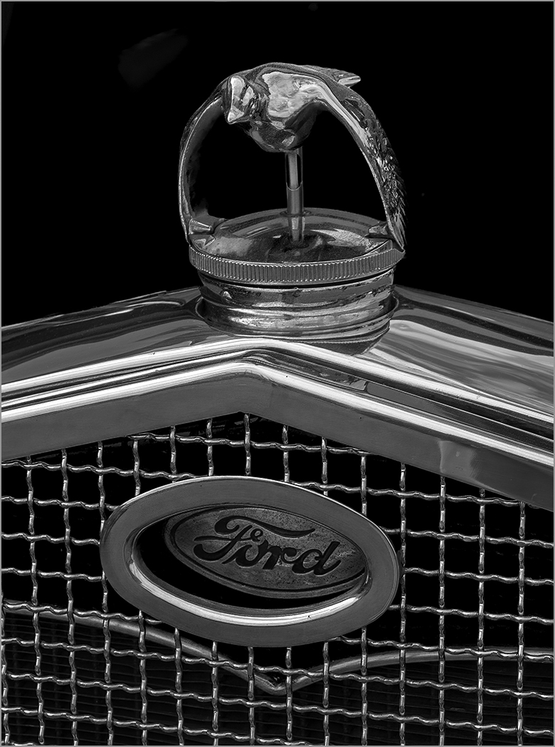
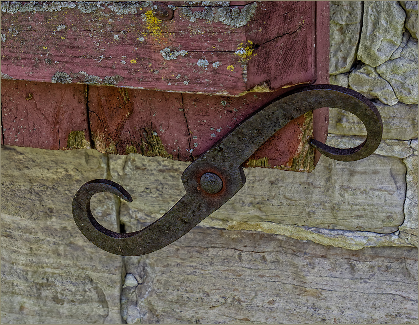
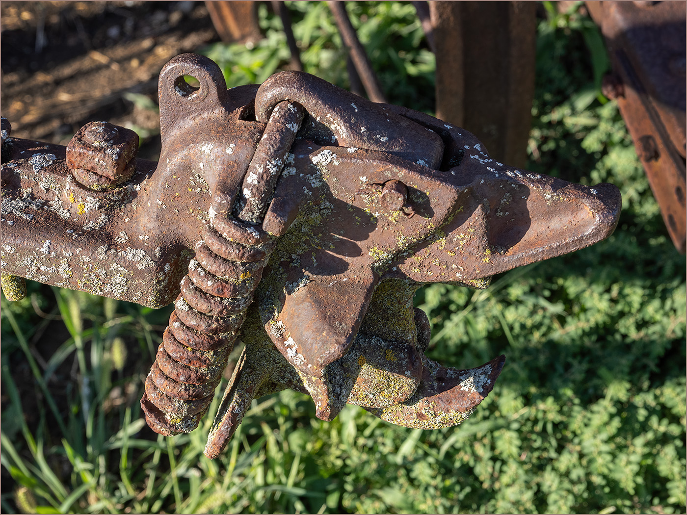
Great image of this old radiator cap. I like the two sets of wings. It is very sharp with great depth of field. You are very fortunate to have such a good background, because when I have seen car shows the cars are close and the background is distracting. It looks like there may have been some interesting reflections in front of the ornament, but it is hard to tell without having been there. I like the image and would not change a thing. |
Oct 21st |
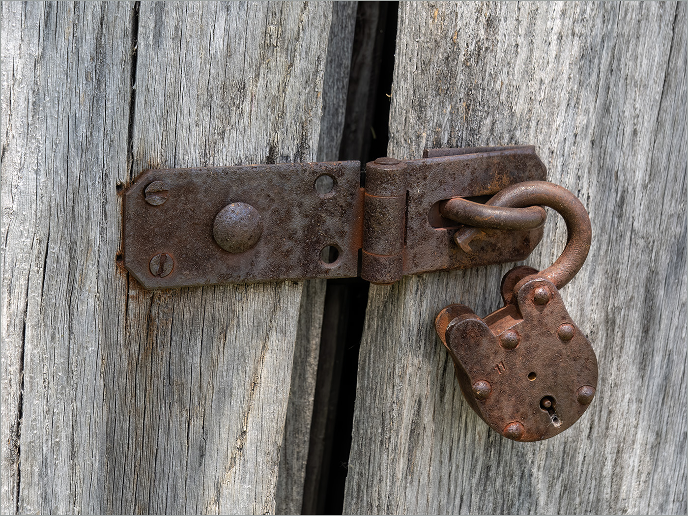
| 57 |
Oct 24 |
Comment |
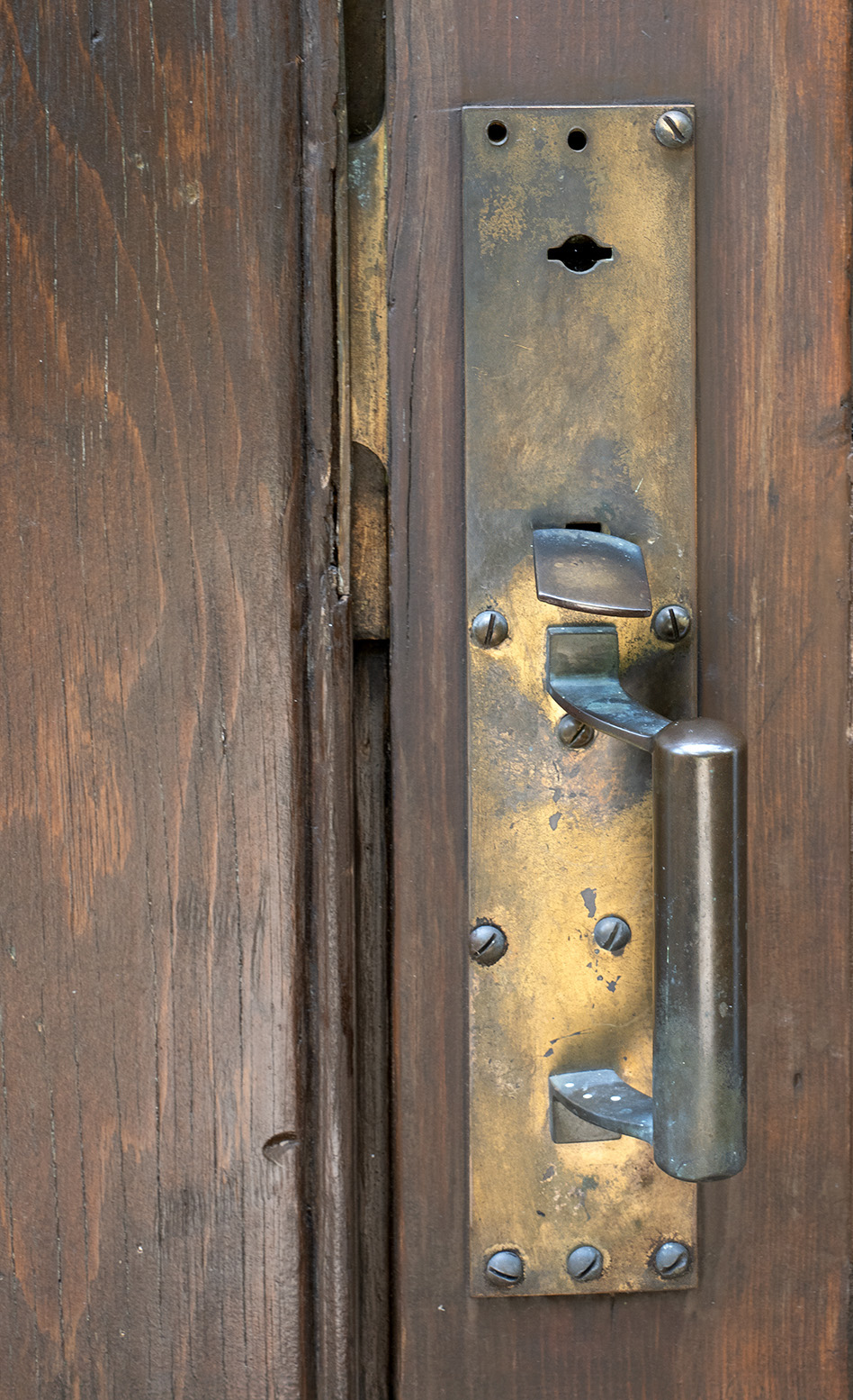
We seem to like similar subjects, and you found a great one here. The colors are great, and the chain is very old and rusty. You have good depth of field because the chain and lock are in front of the aqua background, yet there is detail in the background. I would crop off some on the right to get rid of the damaged area in the center right. It seems to draw my eye from the lock and chain. That would also move the lock and chain more out of the center for better composition. I really like the image. |
Oct 21st |
5 comments - 0 replies for Group 57
|
18 comments - 8 replies Total
|