|
| Group |
Round |
C/R |
Comment |
Date |
Image |
| 7 |
Aug 24 |
Reply |
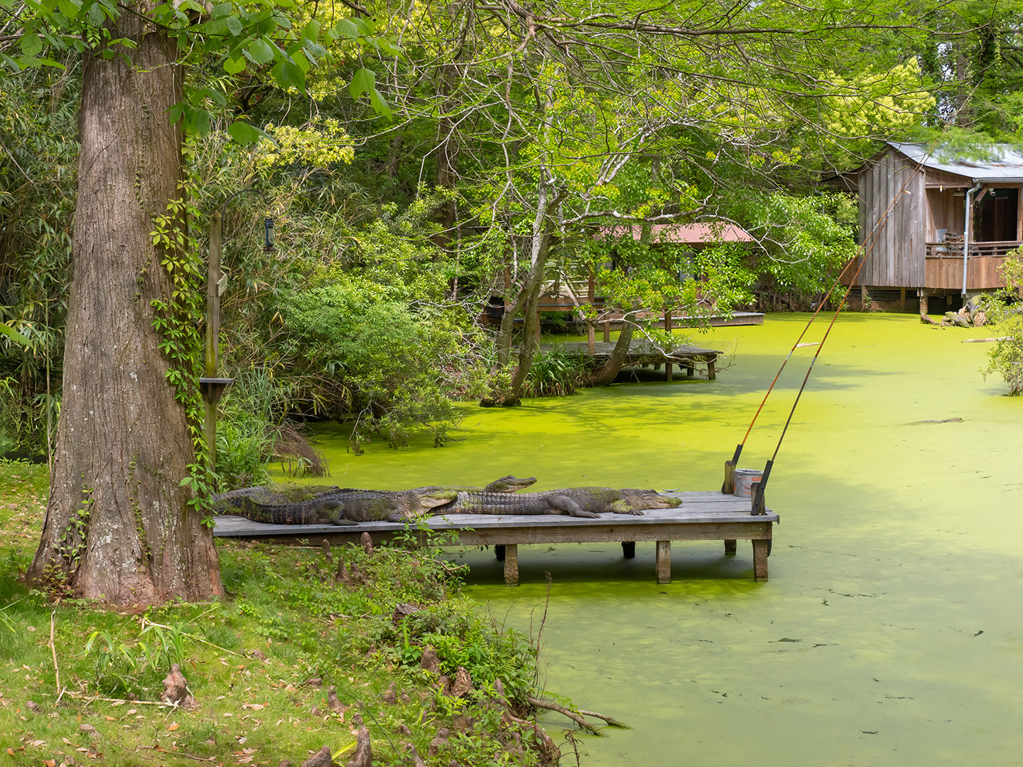
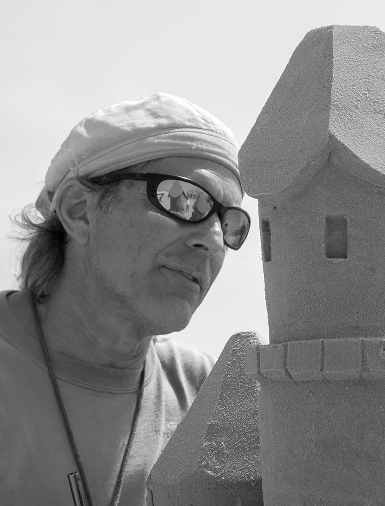
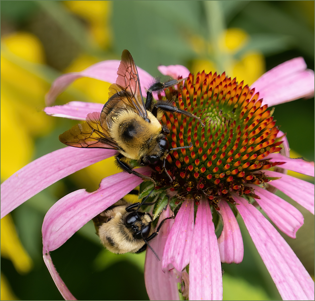
Those are not wires, they are long cane fishing poles that are part of the story. The light is a hanging lantern that would be used for night fishing, but could be removed. |
Aug 27th |
| 7 |
Aug 24 |
Reply |
I see that Butch agreed with me and cropped it off. But you are the artist and you presented the image with the story that you wanted to tell. And it does tell that story of a lot going on. |
Aug 27th |
| 7 |
Aug 24 |
Reply |
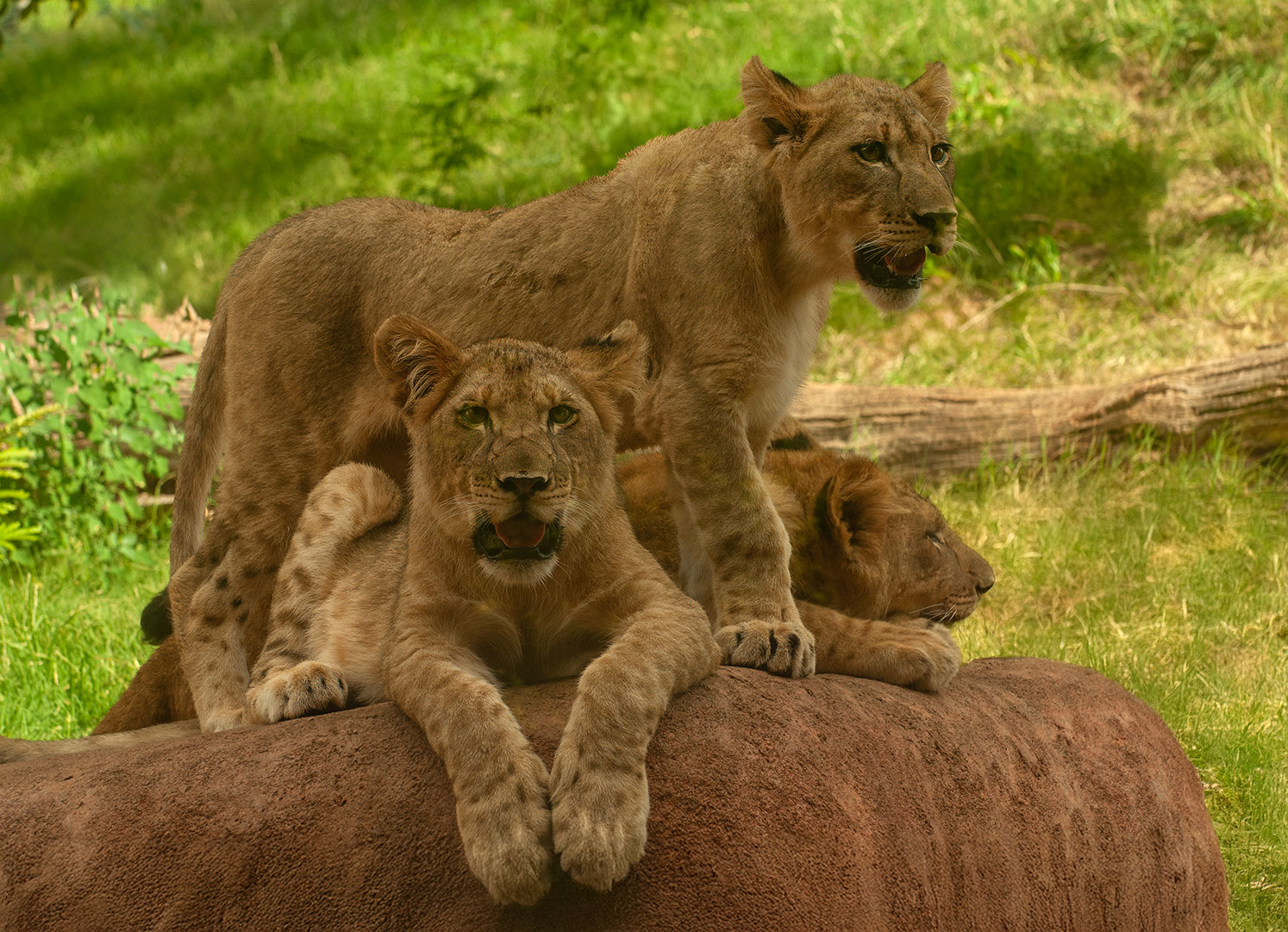
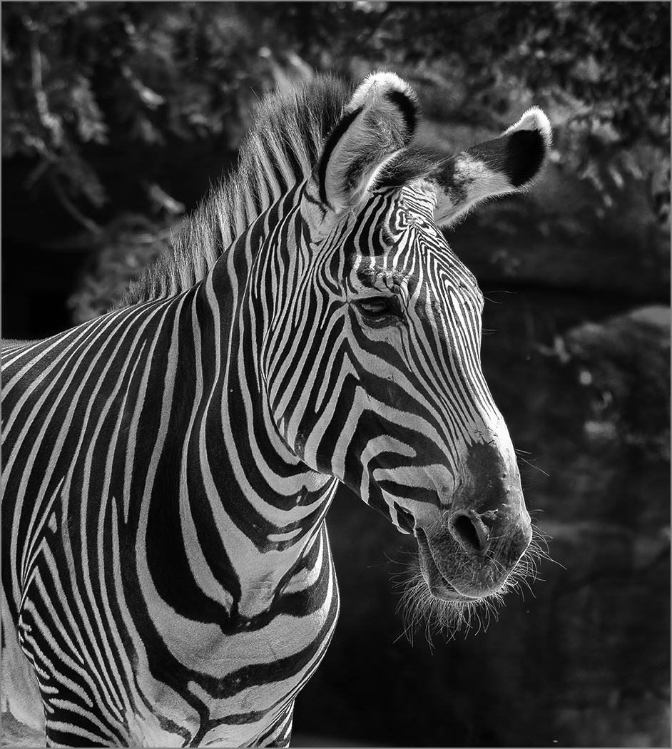
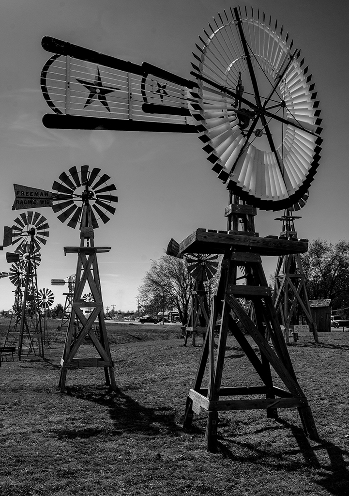
Yes, I like what you did. It is a really nice zoo. |
Aug 26th |
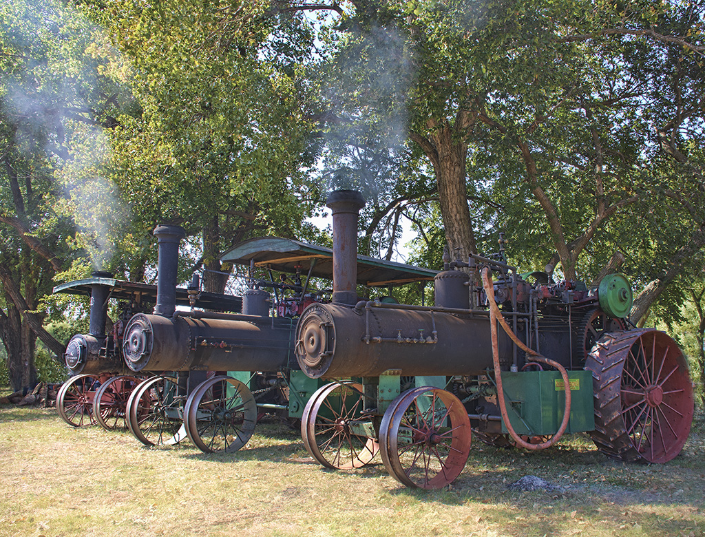
| 7 |
Aug 24 |
Comment |
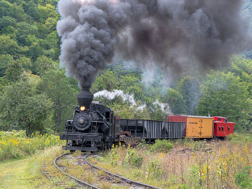
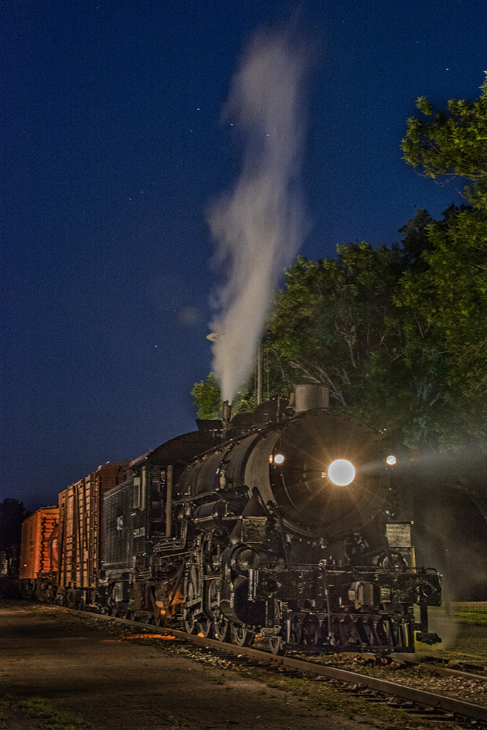
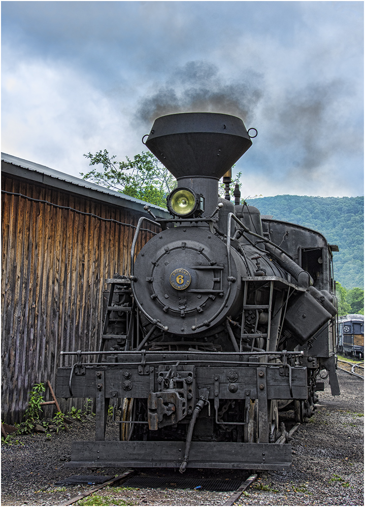
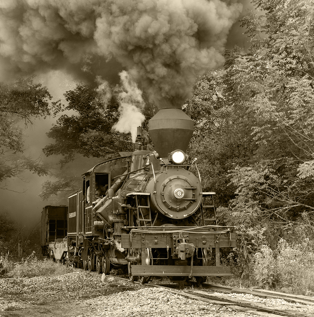
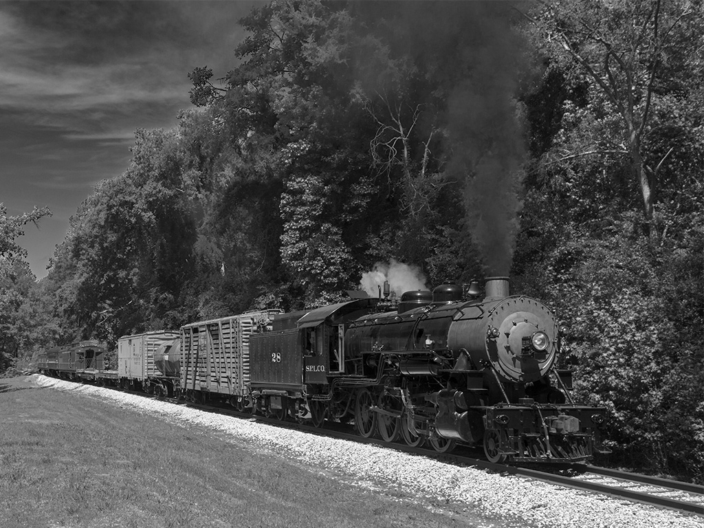
Very nice image, the train fills the frame with the engine coming straight toward us and then the orange cars (with conductor) to the right. Great composition. Good depth of field with the train super sharp and the background somewhat blurred. The green trees are a good contrast to the orange cars. The sun glasses caught my eye also and I would remove them, but you as the artist decided to leave them. ISO 5000 with no noise, that is great.
I went with micro 4 third cameras 3 years ago because of the size an weight of full frame and even cropped sensor cameras. But then I am 79 and only really take images anymore for myself and maybe a camera club entry. I do use noise reduction software, but ISO 5000 would not be usable even with them. |
Aug 11th |
| 7 |
Aug 24 |
Comment |
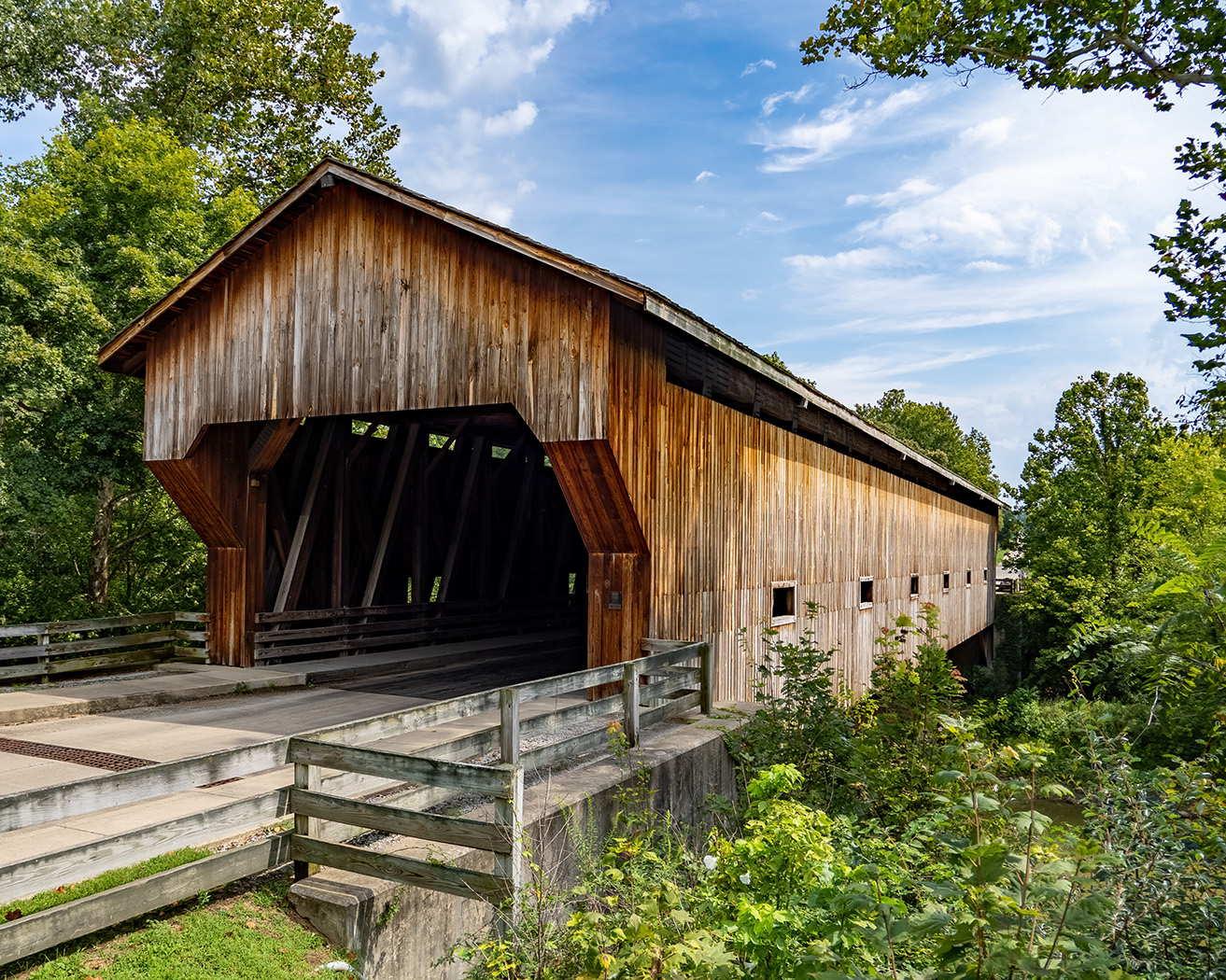
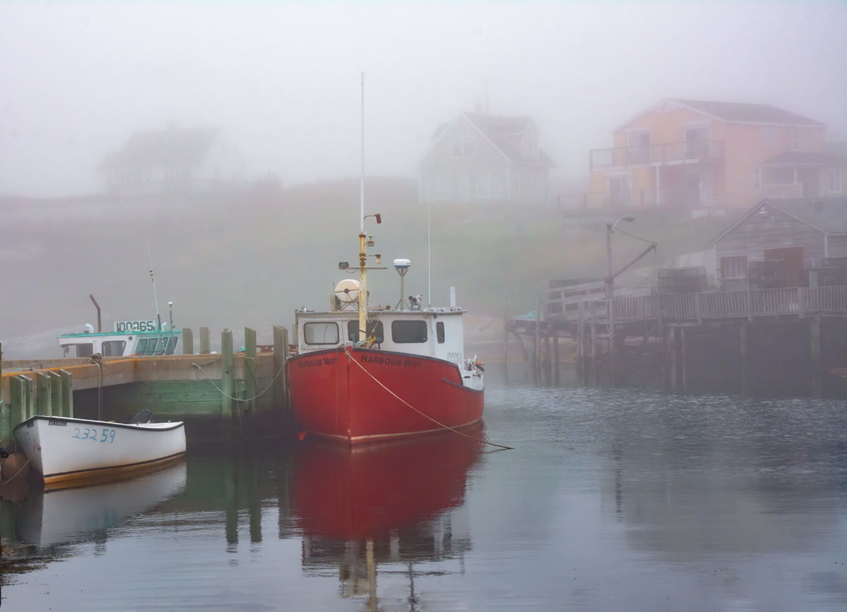
Interesting image of 3 different bridges. I like the boats in front of the bridges. The red bus and its reflection really adds to the image. I agree with Judith and Barbara that there is too much water and Judith's crop is very good. |
Aug 11th |
| 7 |
Aug 24 |
Comment |
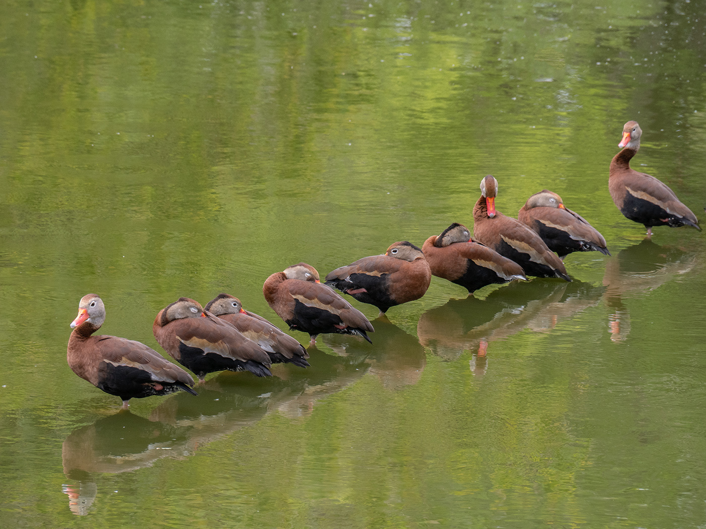
A very interesting shot of a unique way for a bird to hunt for fish. Thank you for telling us what is going on. I think that it is a great nature image and as Gaetan said, right place at the right time. I am not seeing any noise from the high ISO, what a great camera. |
Aug 11th |
| 7 |
Aug 24 |
Comment |
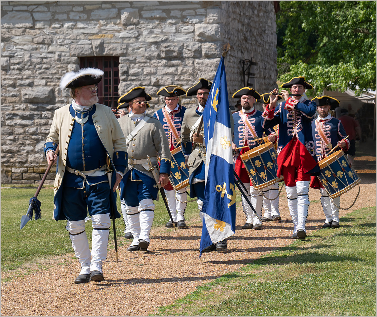
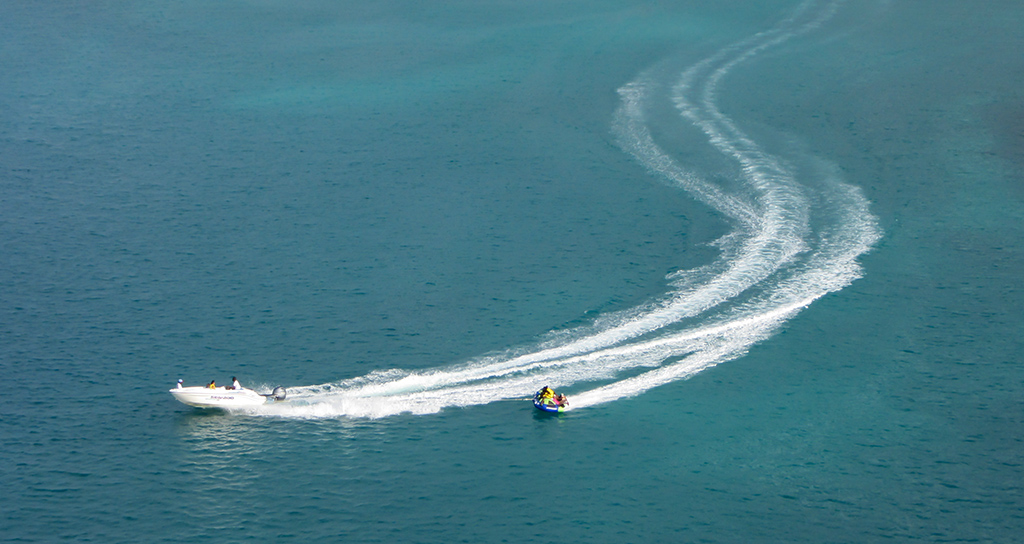
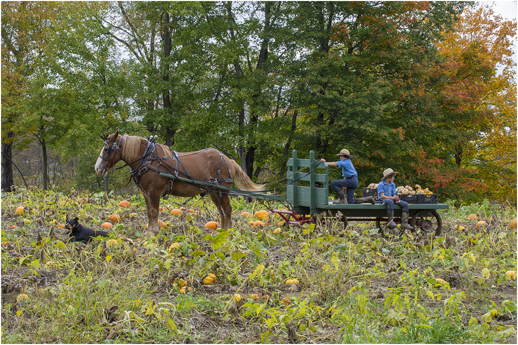
It looks like a fun day, and lots going on. The large crowd on the wall shows that it is very popular. I like the stages of the people on the paddle boards, getting on the boards and bringing them to the water. My suggestion would be to remove (or for PJ to crop off) the sailboat on the right. I don't know if it is because it is white, or the placement, but it draws my eye away from the action. |
Aug 11th |
| 7 |
Aug 24 |
Comment |
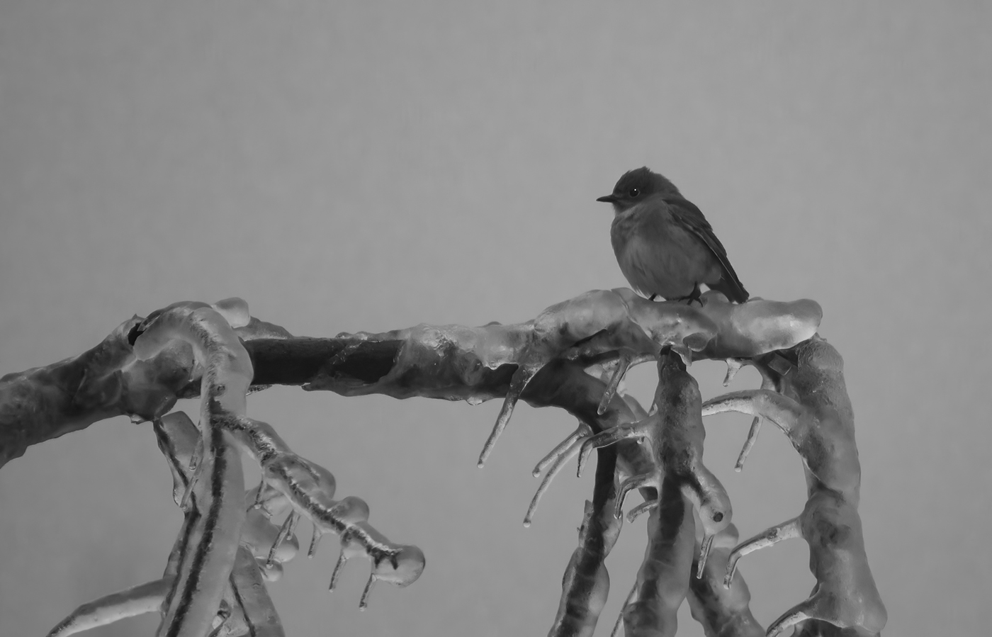
I like this, the bird is sharp and the sepia tone is very nice. The background is very nicely blurred and the bird is well placed in the frame. Unlike Judith, I would not worry about removing the grass above the bird's head -- it is not totally sharp and so not a distraction. It looks like you left so much room at the top to show the tips of the grass stems. I don't think that is important, and would crop some off the top. |
Aug 11th |
| 7 |
Aug 24 |
Comment |
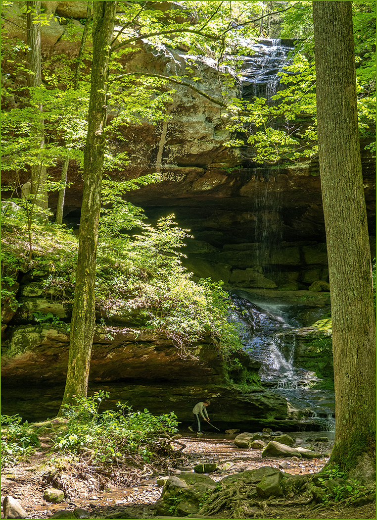
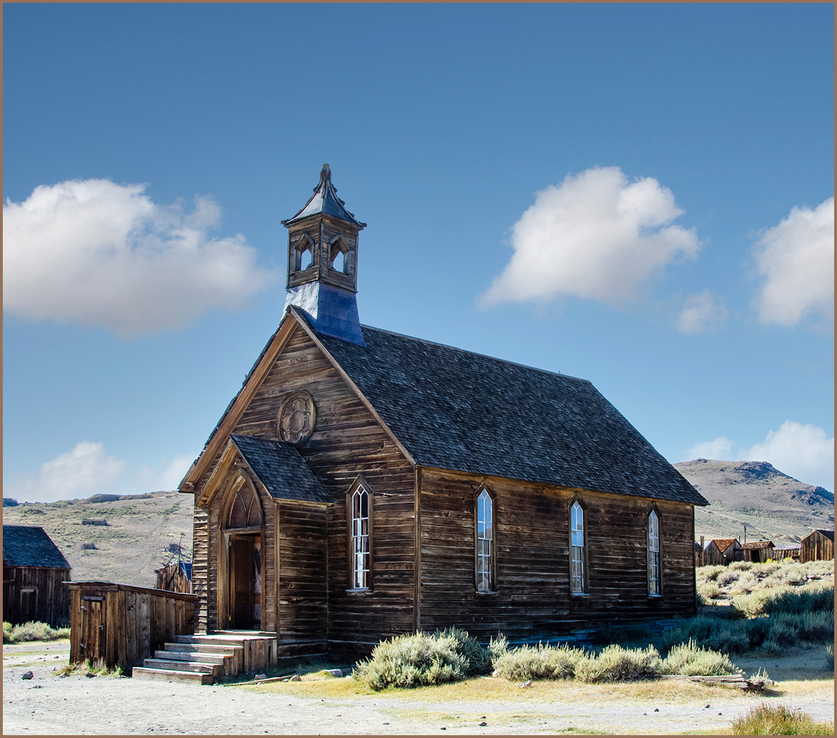
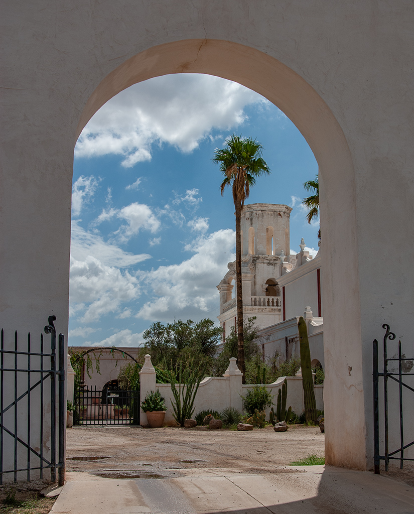
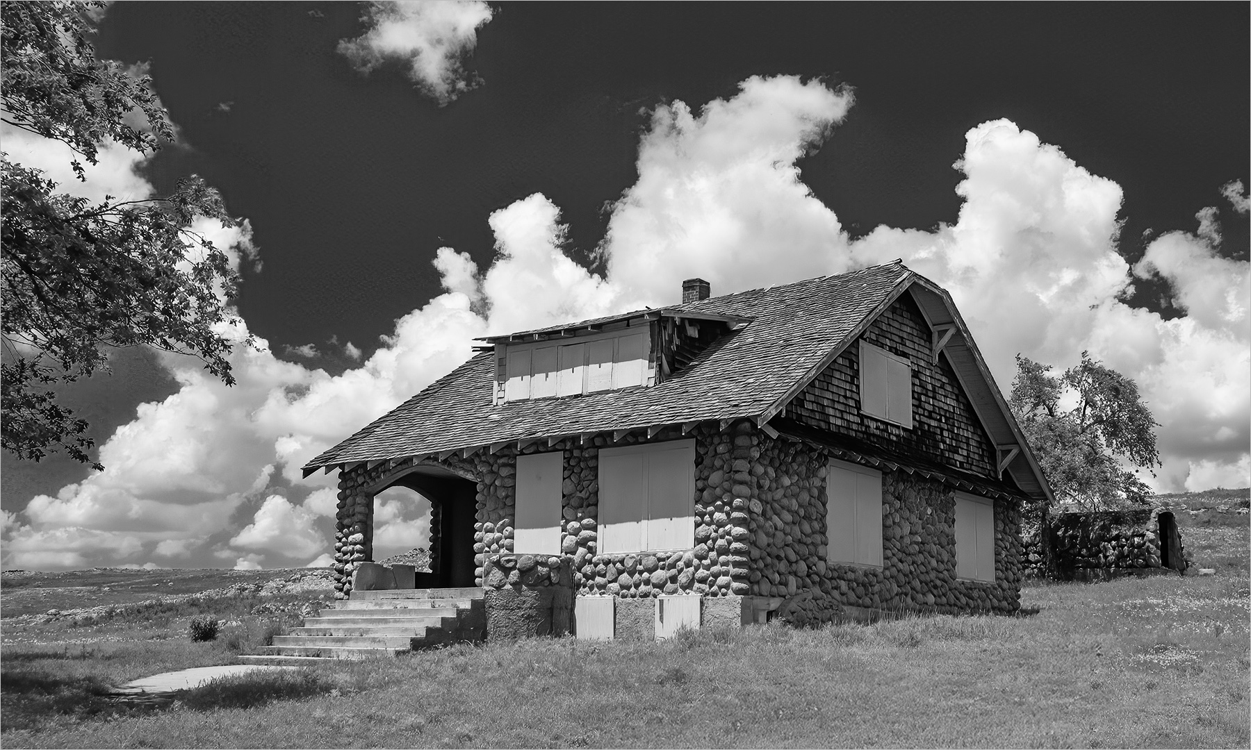
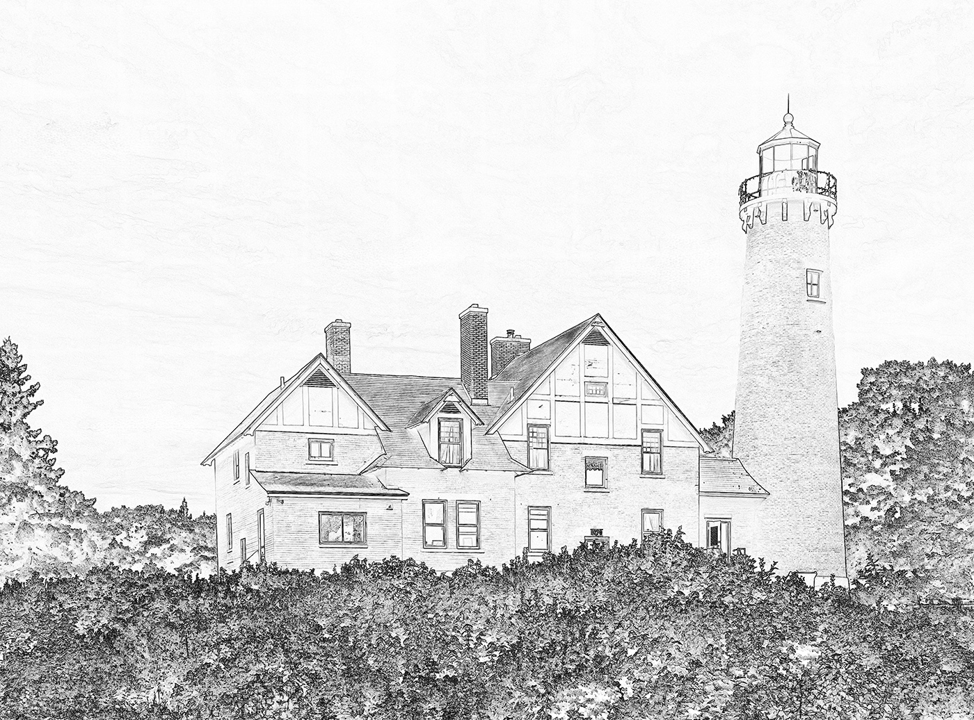
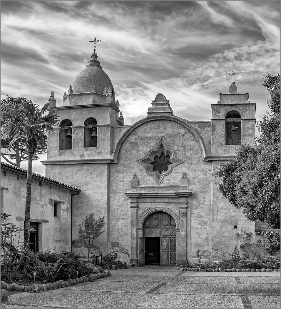
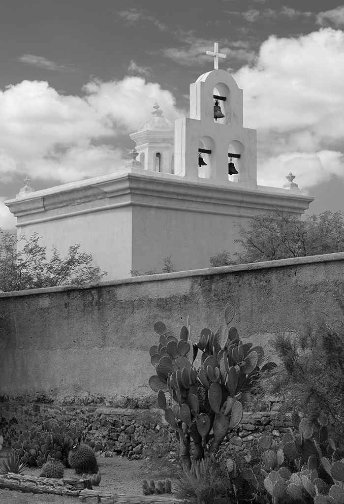
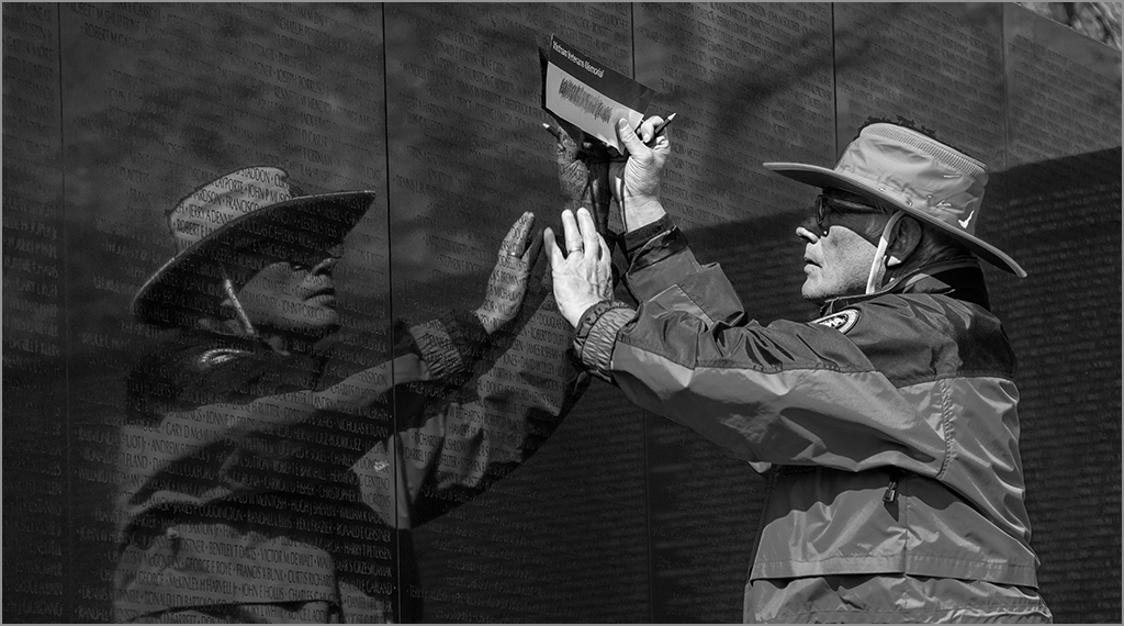
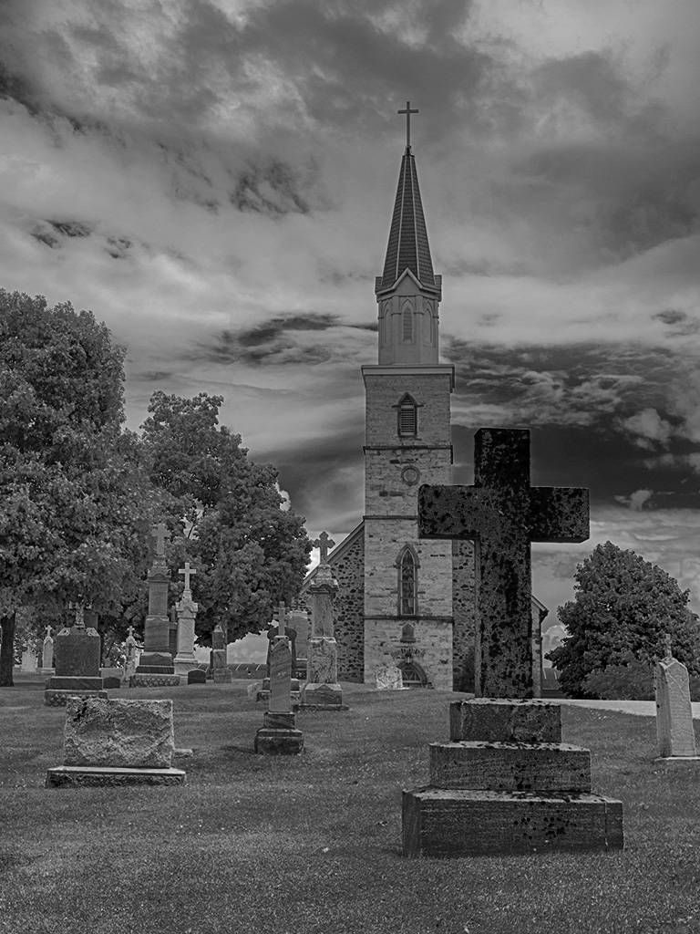
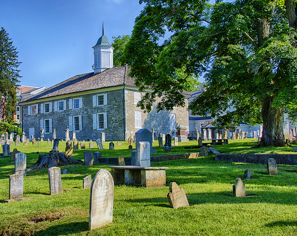
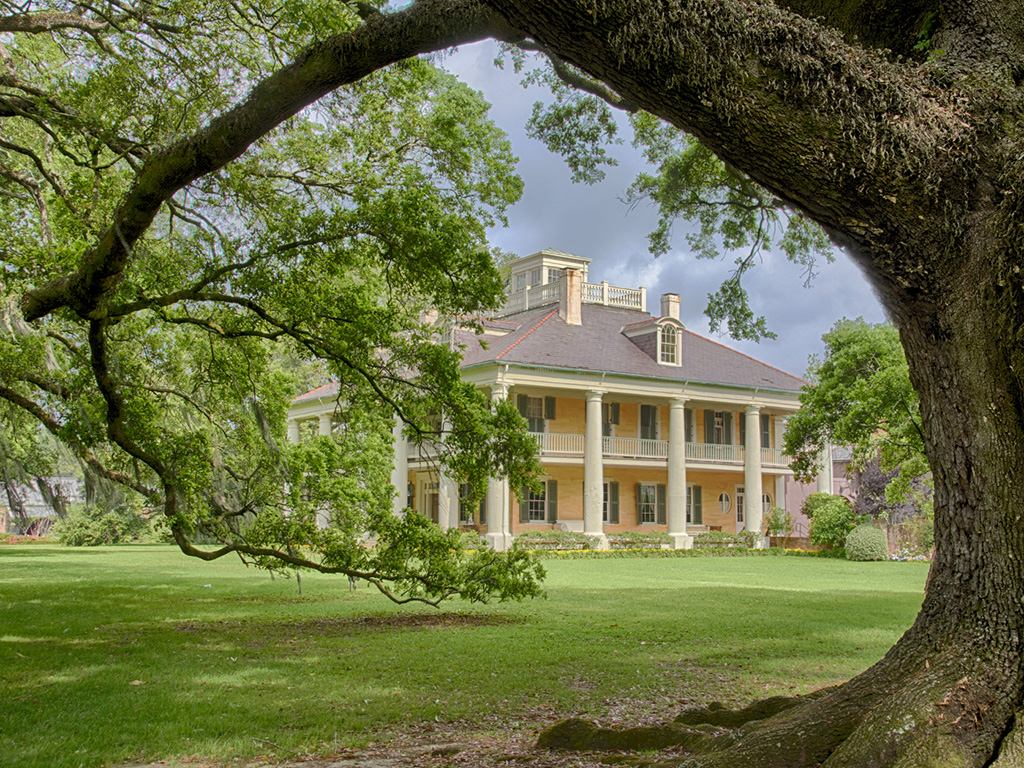
Thanks for showing us this lovely monument. Without a point of reference, we would not know how tall it is unless you had told us. I disagree with Gaetan, and like the blue sky behind it. Having an opening in the trees was a good choice, because if it had trees in the background I feel that the detail would have been lost. There is a lot of area on the right, but that does show the surroundings. |
Aug 11th |
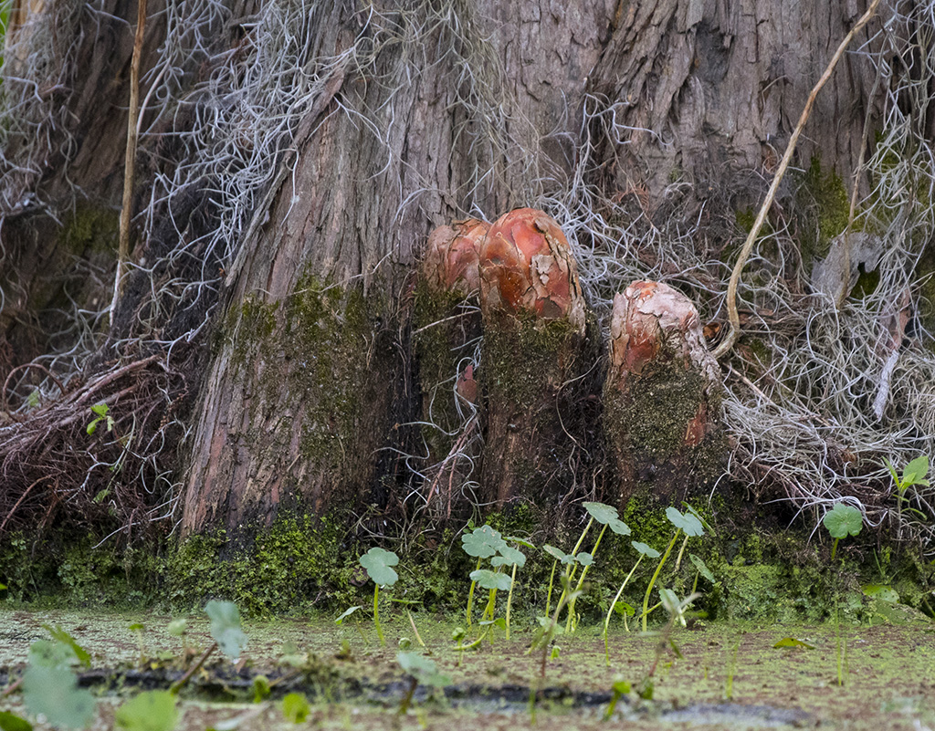
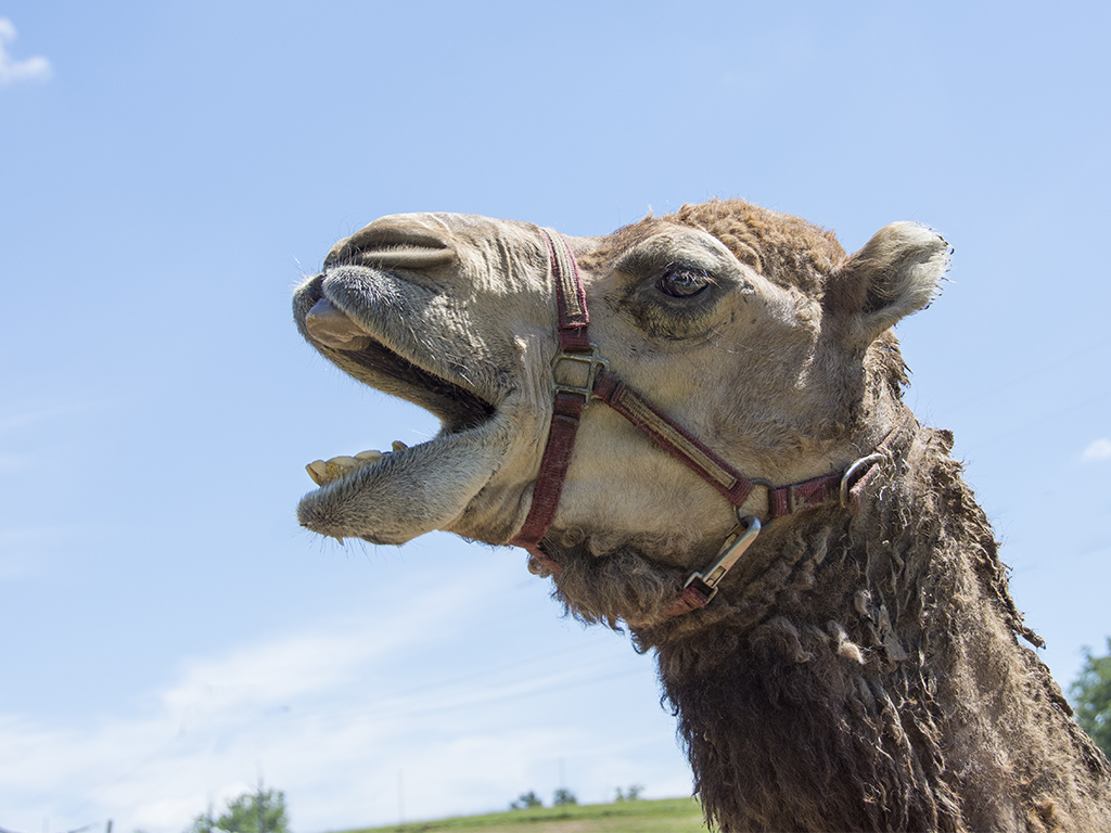
| 7 |
Aug 24 |
Reply |
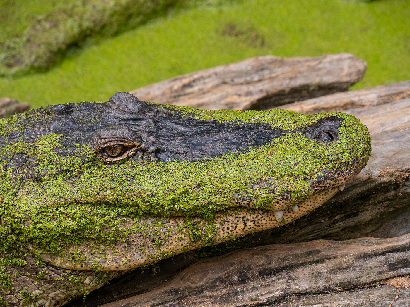
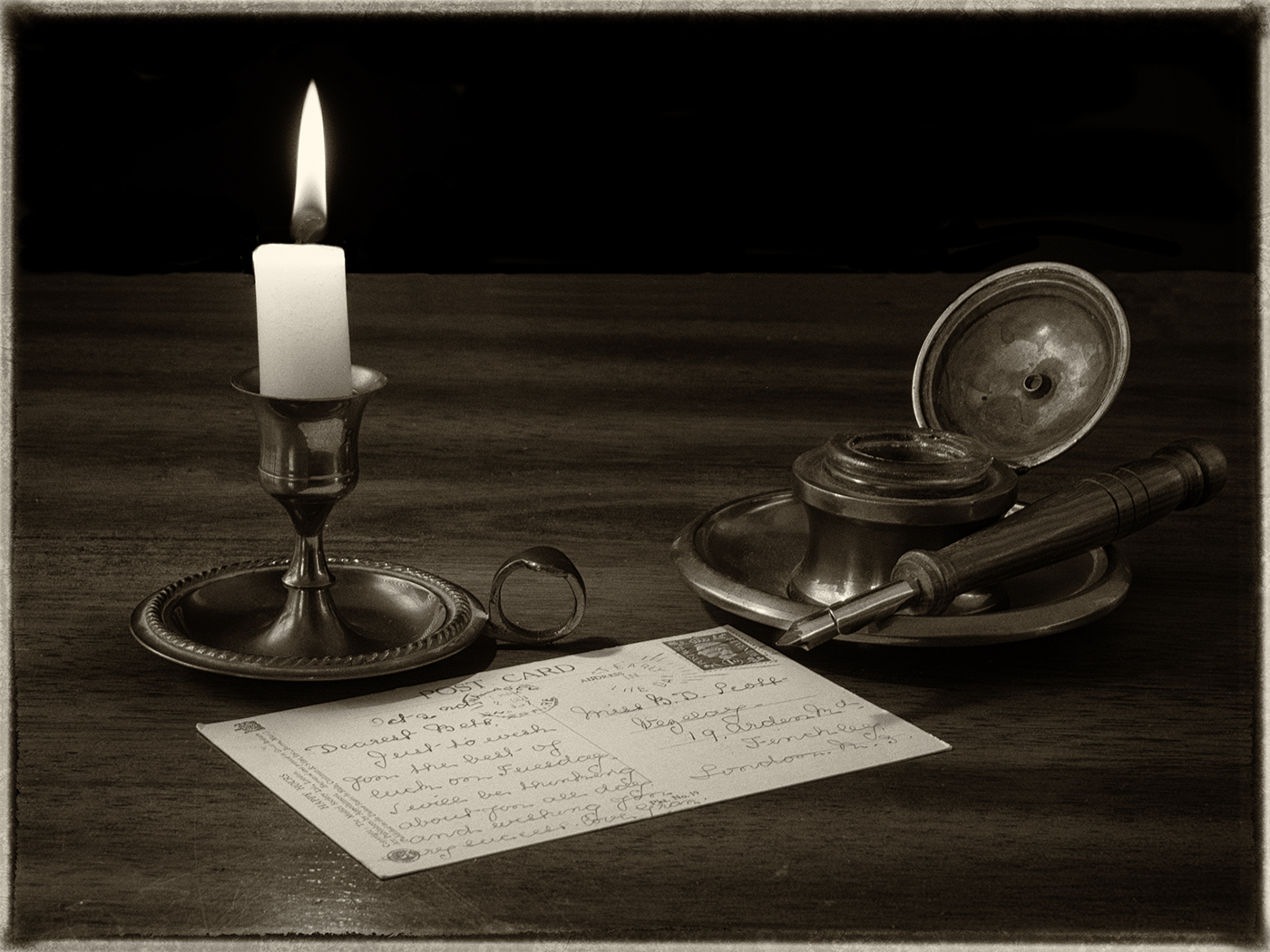
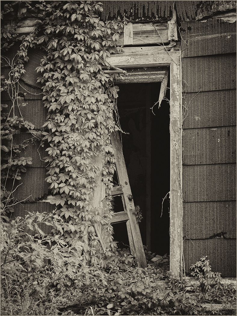
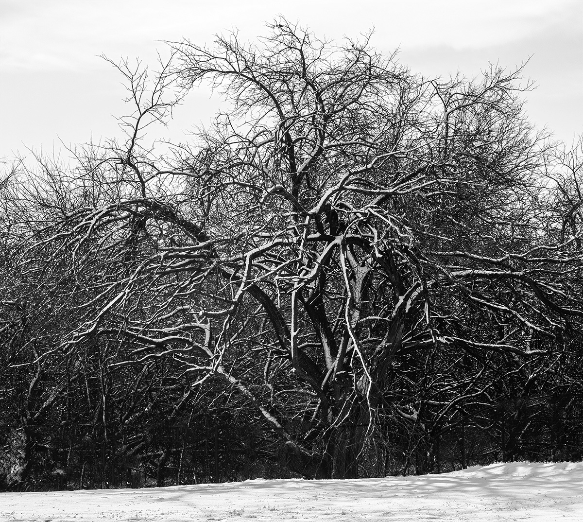
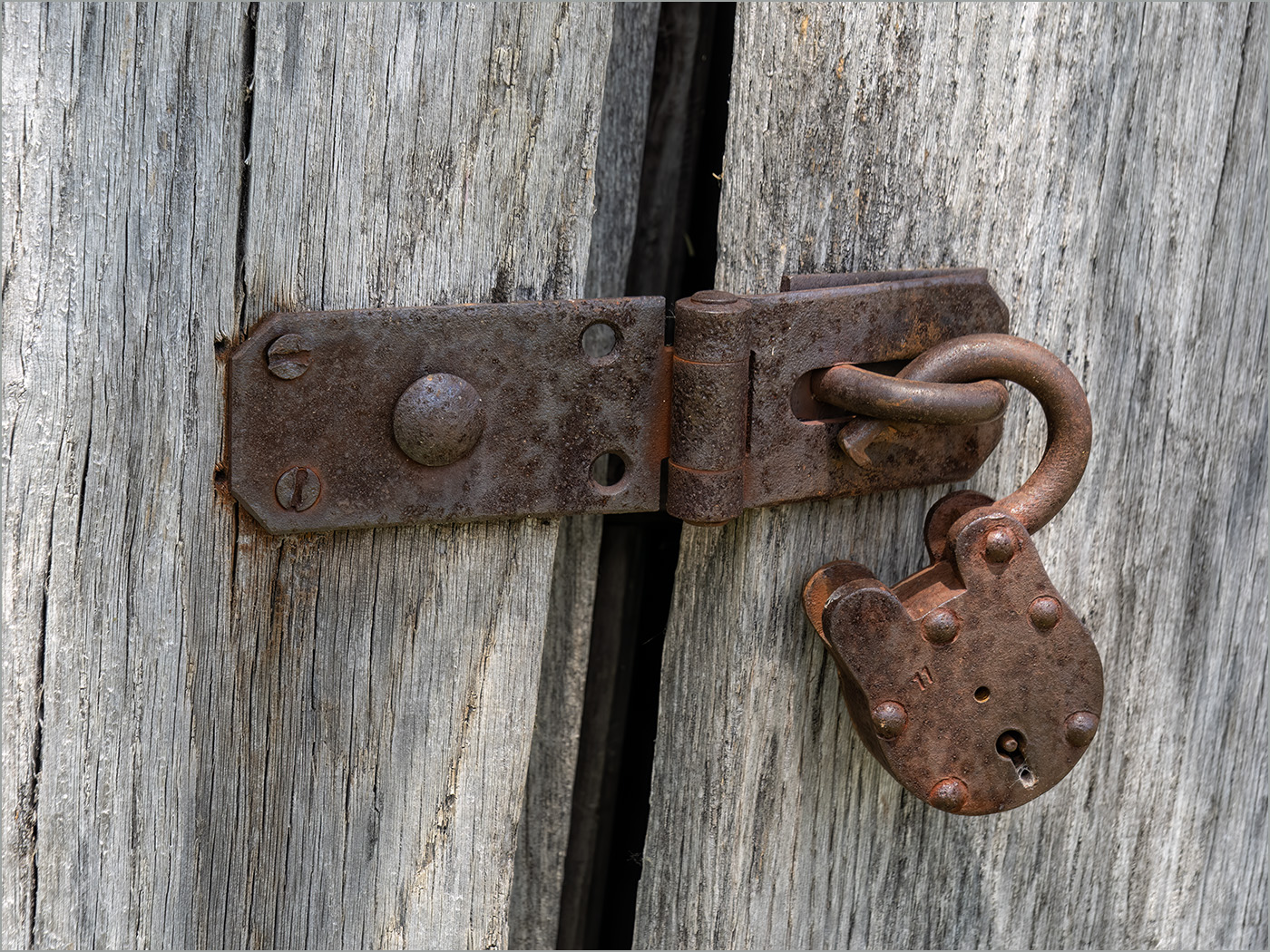
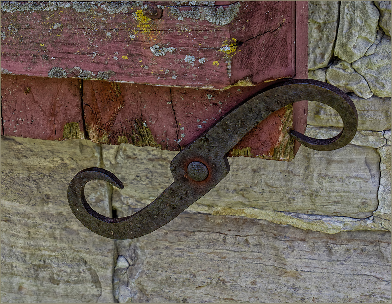
Those are roots of the cypress tree that poke up from the ground in warm wet or swampy places. They are called knees. Since they are part of the story, I don't want to remove them, but I understand that doing so would improve the pictorial quality. |
Aug 1st |
6 comments - 4 replies for Group 7
|
| 32 |
Aug 24 |
Reply |
I would think so, but I haven't judged or viewed an international judging for several years. You could always throw it in if you need one. |
Aug 16th |
| 32 |
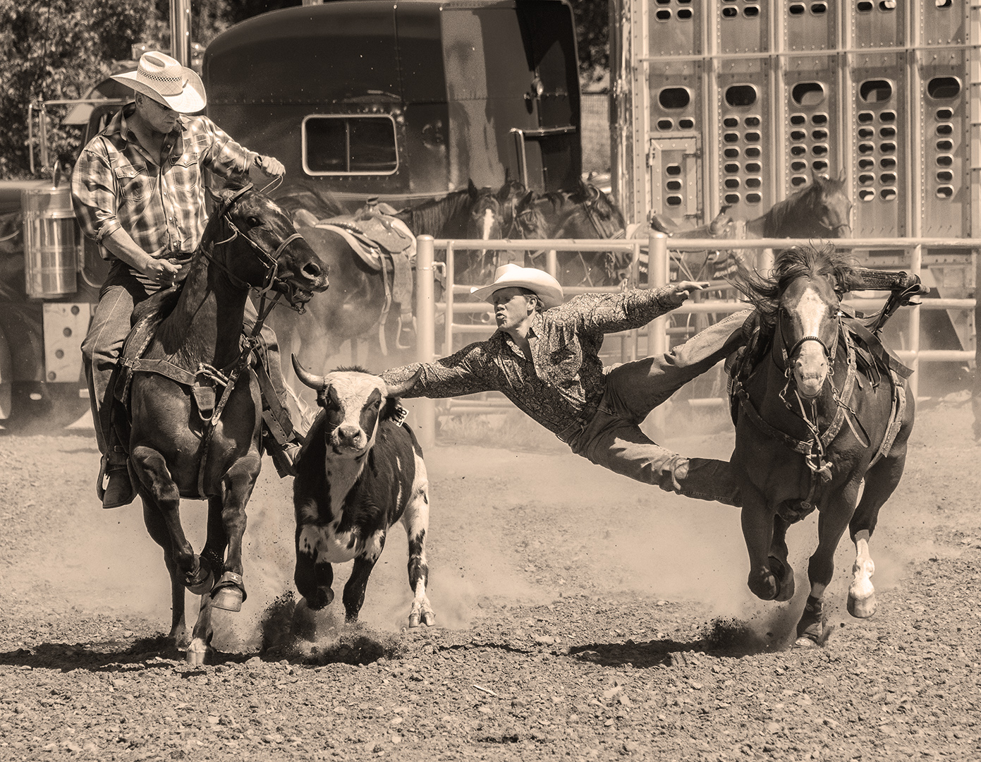
Aug 24 |
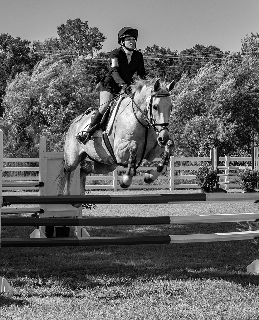
Comment |
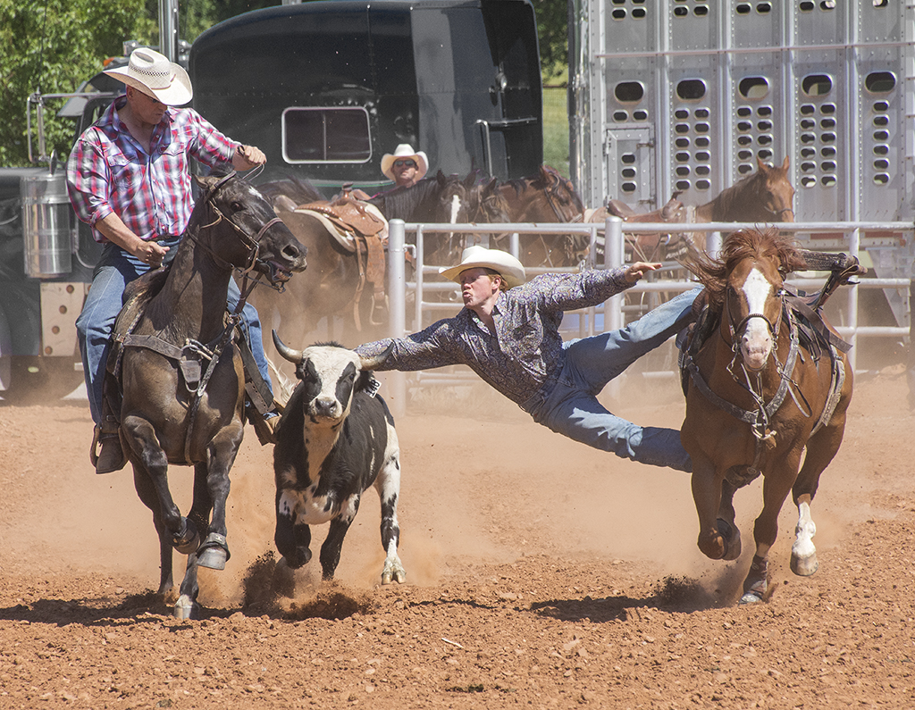
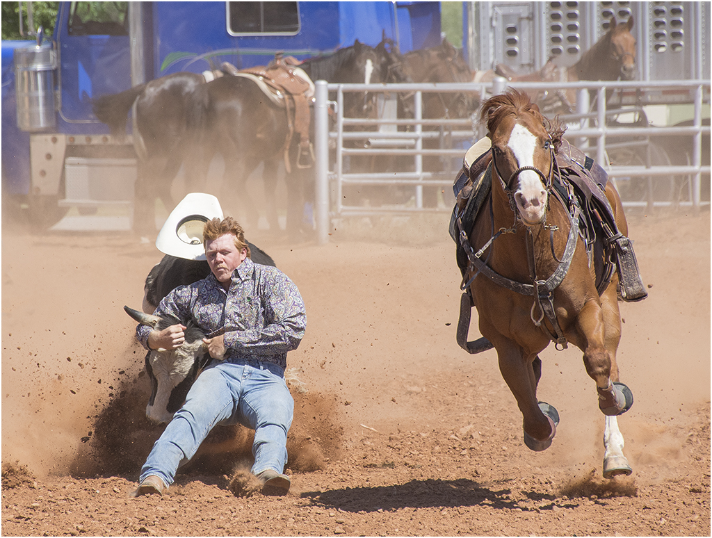
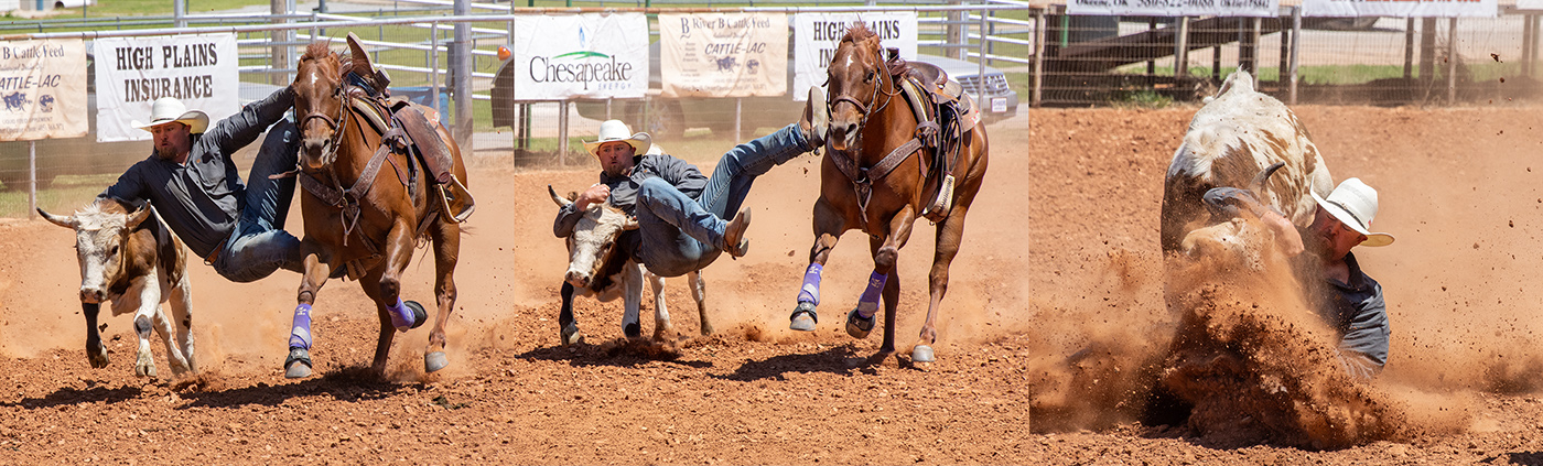
You captured a good action shot at a peak of action. The image is very sharp, but there is still some motion in the calf's leg. The background is great, and is really hard to do in rodeo images. When I saw bulldoging, the cowboy does not throw his leg over the calf, but grabs the back and horns of the calf and pulls it down. The image that you further edited is a big improvement.
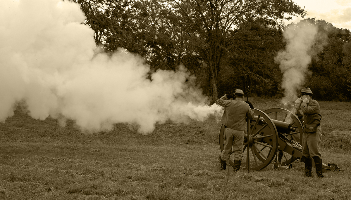
Most cowboys do it to make a living, but they don't last too many years at it and they must be good. The cowboy wants to look good, and there is always Tide to clean the shirt. I have added sequence showing a calf being pulled down. |
Aug 16th |
 |
| 32 |
Aug 24 |
Comment |
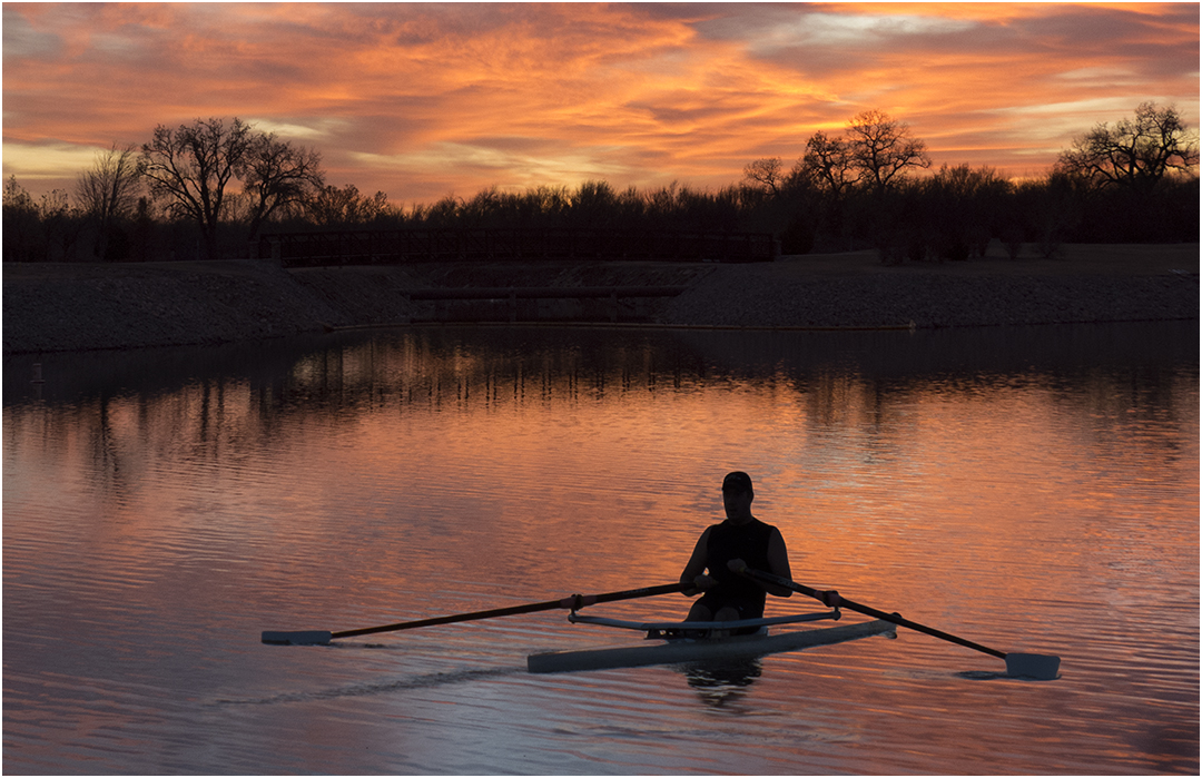
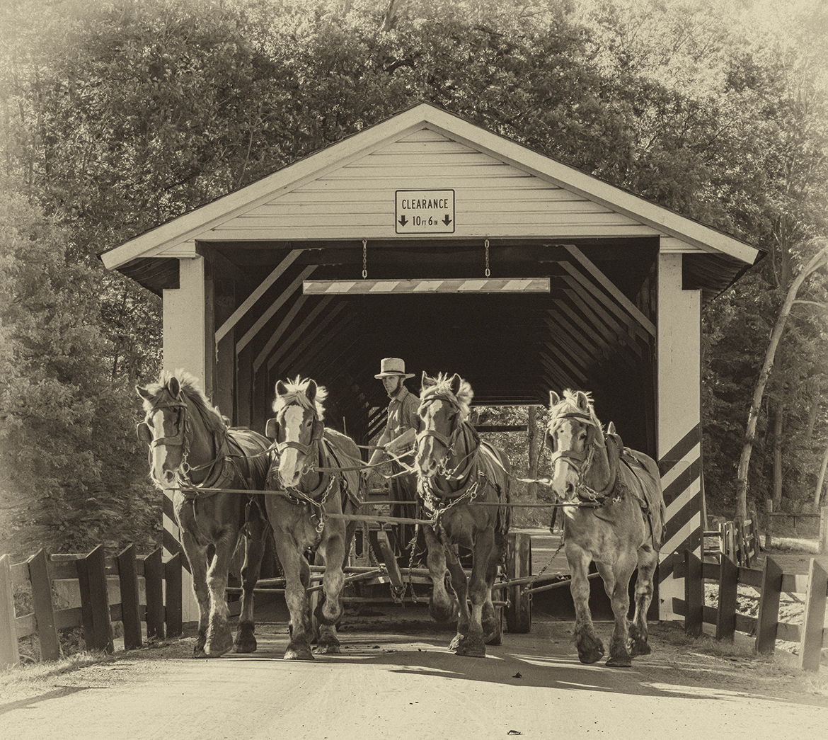
Thank you for explaining the location for the image. It is nice to tour locations that I will never visit in person. The slide survived time very well, and must be Kodachrome. The image does have dark shadows but that is what you got from the old slides. I think that conversion to mono was the way to go since the bright colors in the foreground distract from the subject. Also your conversion to mono is good. It looks like some disagreement on the cyclist, but I like it as it adds scale which would otherwise be missing. |
Aug 16th |
| 32 |
Aug 24 |
Comment |
A great subject for a high key image. The face is very sharp and the fur on the body is well done to keep detail in it. I would crop off quite a bit of the area on the right as there is nothing there and by doing so would make the bear larger in the frame. On my monitor also, the right side of the bear fads away. My monitor has been calibrated and is made for photography. |
Aug 16th |
| 32 |
Aug 24 |
Comment |
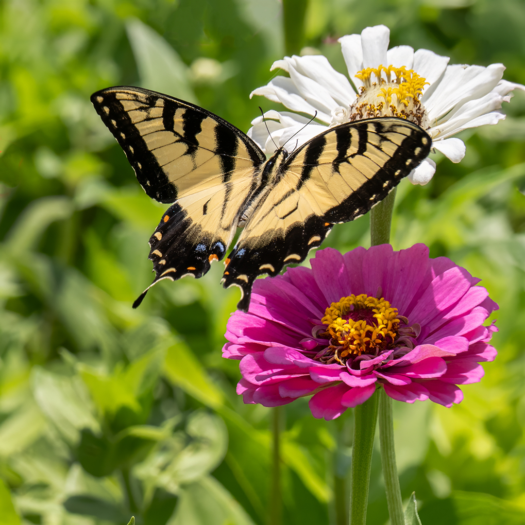
The image is very sharp and your conversion to mono is very good. The background is very blurred which provides excellent separation from the butterfly. I like the composition and would not show the full leaf. That said, I am wondering why you went with monochrome, since in doing so the flower in front of the butterfly is merging with the butterfly. |
Aug 16th |
| 32 |
Aug 24 |
Comment |
The skin tones and textures are great, as is the lighting. I do not like the composition. The diagonal leads the eye to the legs and out of the image. To me the most interesting part of the image are the face and breasts, and the diagonal leads you away from them. I also think that a small white stroke around the image would help define the image since it has black areas on the black web page. Sorry to be critical but I wanted to give you my honest thoughts. |
Aug 16th |
| 32 |
Aug 24 |
Comment |
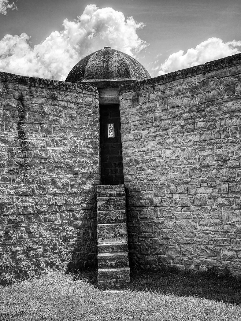
I like the "V" composition with a rounded area at the top. All of the shapes and angles and rounded items in the image certainly add a lot of interest and keep the eye moving around the image. I would leave the dark area around the dome alone. The image is very sharp so you did well with the slower shutter speed. I like the image, but do not know if it would do well in a competition because it is a complex image that grows with you and not one for a snap judgement. |
Aug 16th |
| 32 |
Aug 24 |
Reply |
Don, thanks for working with the image. I really like what you did with it. The aspect looked off to me, but I didn't know how to make it look good. |
Aug 11th |
| 32 |
Aug 24 |
Reply |
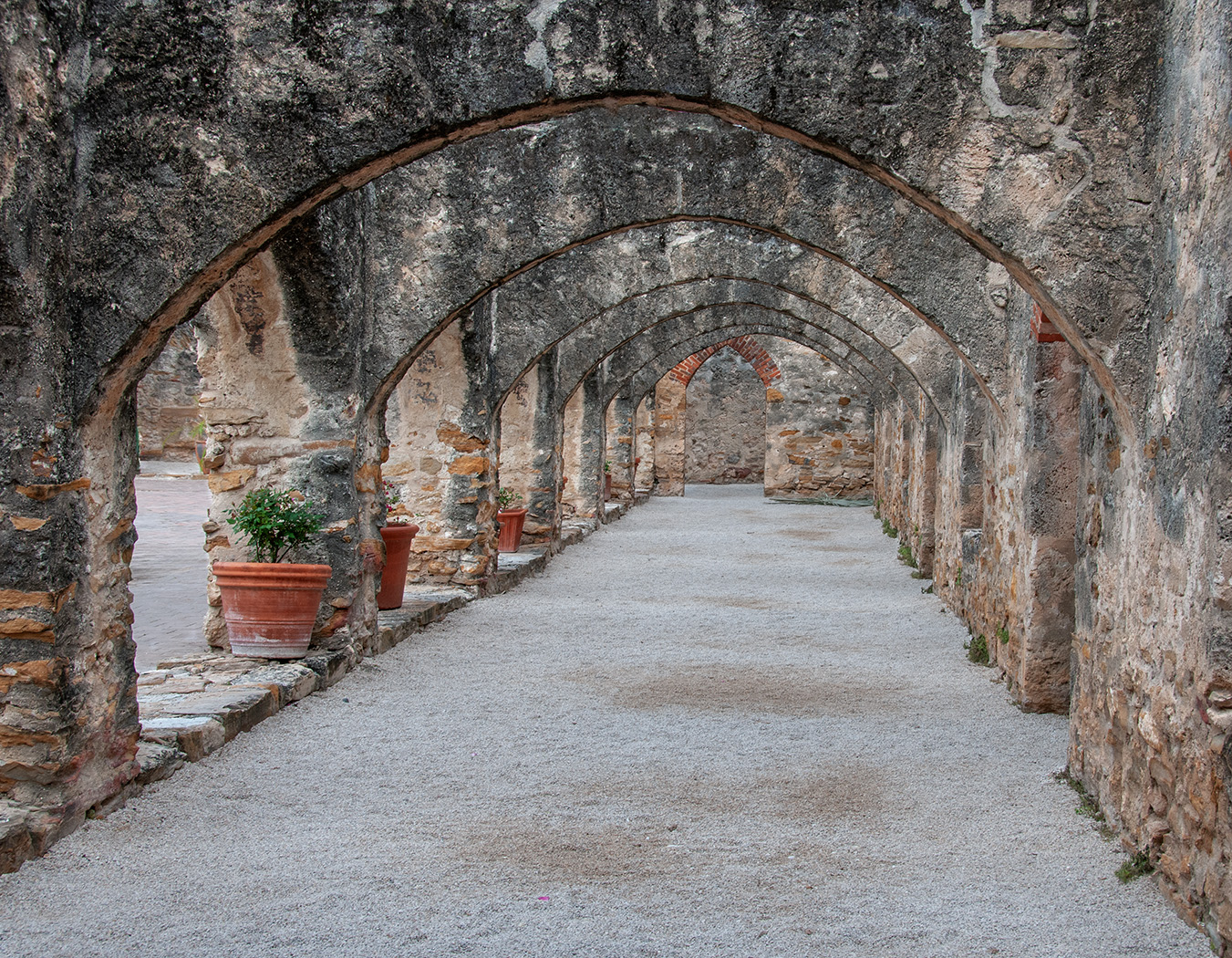
You are right, it would look better with the arches on the left. This is that way it actually is, I did not reverse it. |
Aug 9th |
6 comments - 3 replies for Group 32
|
| 57 |
Aug 24 |
Reply |
Thanks, I will try next spring. |
Aug 22nd |
| 57 |
Aug 24 |
Reply |
Thanks, seeing your adjustment, it did look a bit dark. |
Aug 21st |
| 57 |
Aug 24 |
Comment |
A very simple and good image. The part in the lower left makes for a great lead in. The lighting is very good. Well done. |
Aug 21st |
| 57 |
Aug 24 |
Comment |
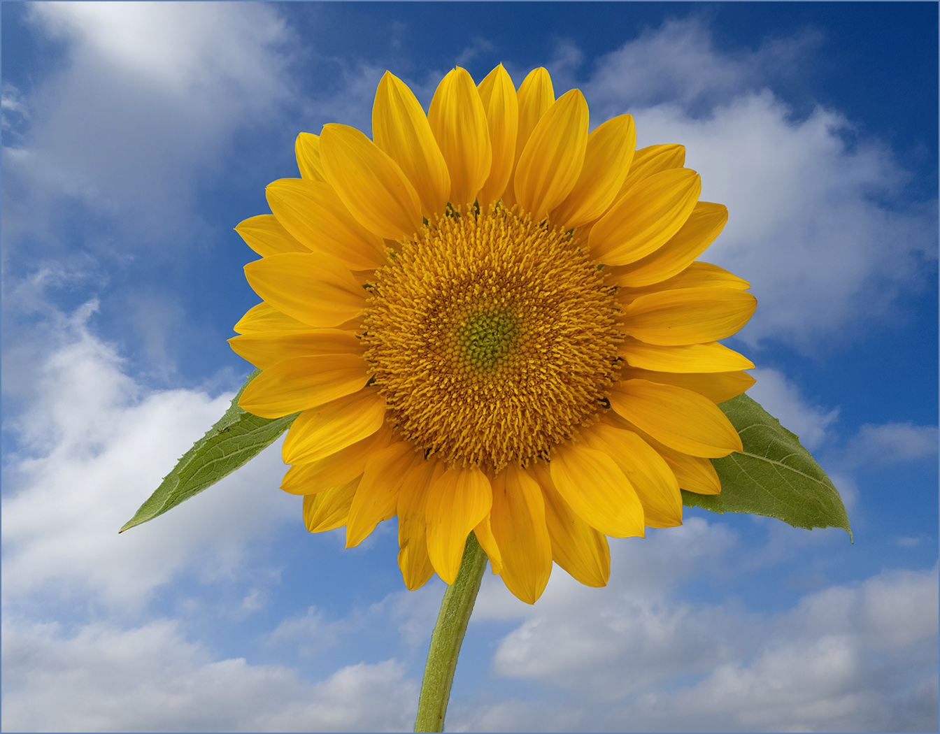
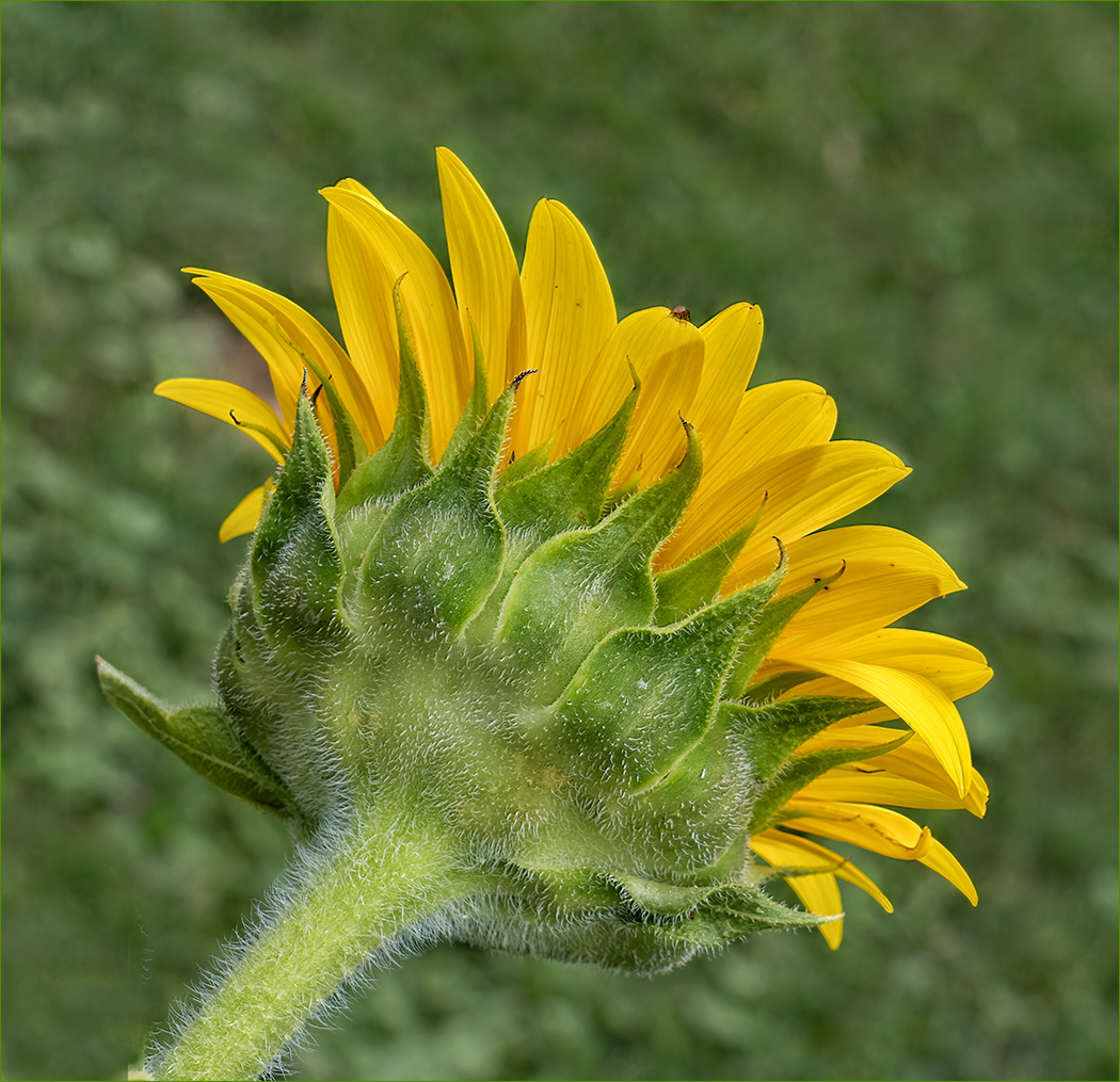
The sunflower and sun glasses are very sharp, and the depth of field allows the flowers in the field to be sharp. It is a fun image but the color of the sun glasses frame give the image lots of visual impact. And, you even captured a self portrait. Would not change a thing. |
Aug 21st |
| 57 |
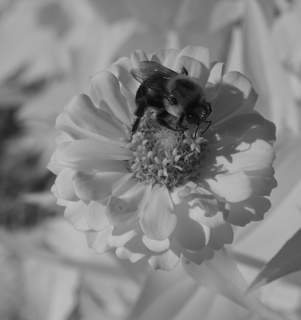
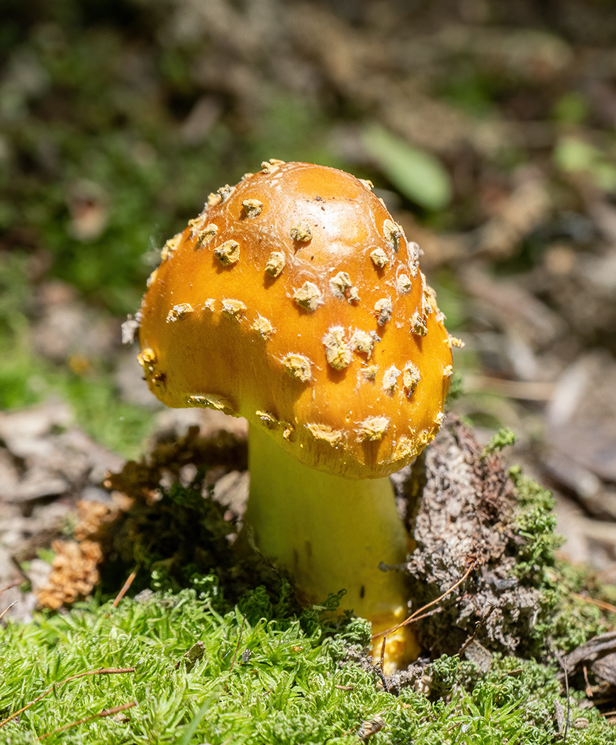
Aug 24 |
Comment |
The frog is so colorful with mixed colors. The eye is very sharp which is important in an animal image. Noise does not seem bad, even cropped in with ISO 6400. Aren't these new cameras wonderful! When I started my photography hobby, fast film was ISO 400. I like the adjustments that Cindy made, it makes the frog stand out even more. |
Aug 21st |
| 57 |
Aug 24 |
Comment |
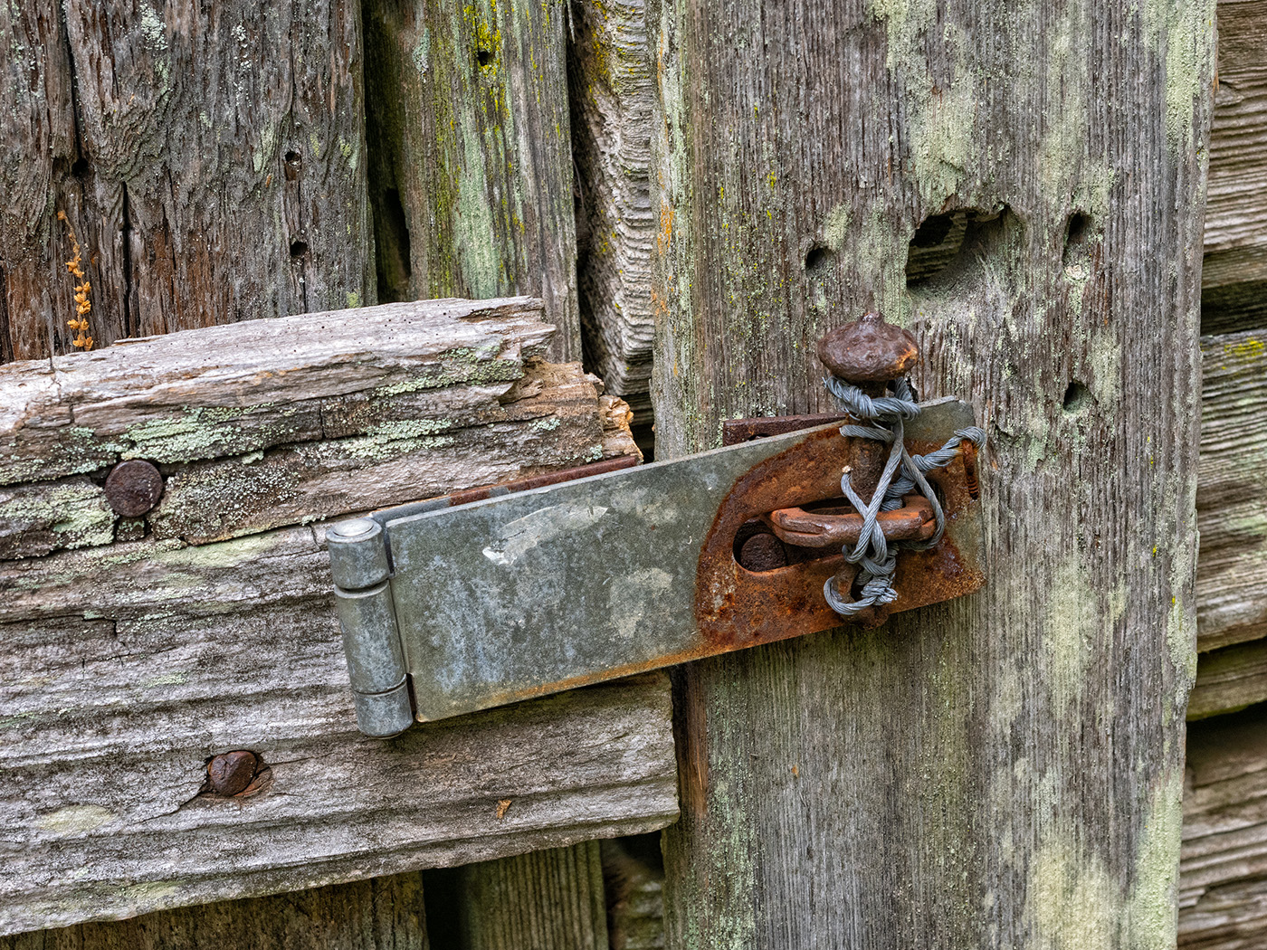
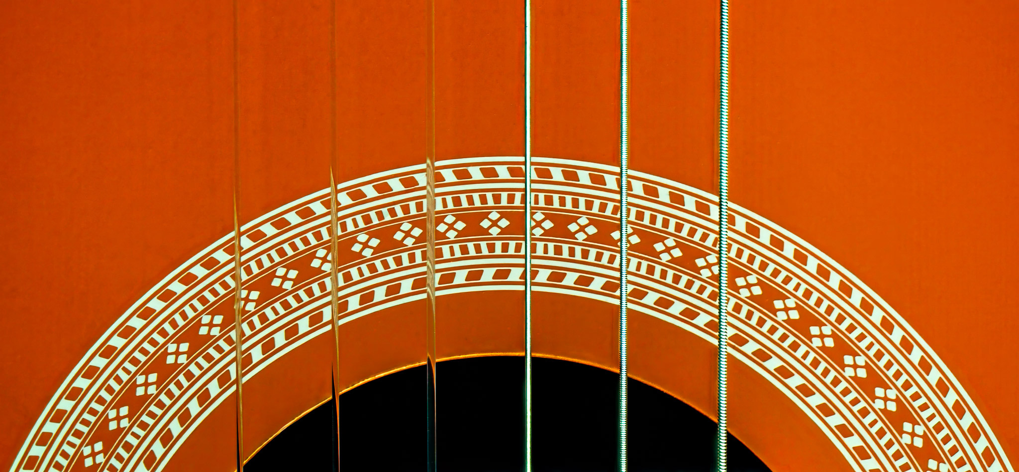
The strings and the opening tell us that it is a string instrument. It is very sharp and the closeup creates an abstract image. I do not know how the strings should be arranged, but pictorially I am wondering if you should reverse the image. That would place the large string on the right and become more of a center of interest and also a stopping point to keep the eye in the frame. |
Aug 21st |
 |
| 57 |
Aug 24 |
Comment |
Very sharp with good depth of field. The texture and color of the kumquat make it really stand out. I think that the composition is good to be centered, as that lets you show all of the large leafs of the plant. You might think about cropping some off the top, back to above the large leafs. |
Aug 21st |
| 57 |
Aug 24 |
Comment |
Very nicely done, he appears to be very small. He is very sharp with good even lighting. I like the crop that Cindy made. |
Aug 21st |
6 comments - 2 replies for Group 57
|
18 comments - 9 replies Total
|