|
| Group |
Round |
C/R |
Comment |
Date |
Image |
| 7 |
Jun 24 |
Comment |
I like the cluster of cherry blossoms going out in different directions. The depth of field is great, to have the blossoms sharp with a very blurry background. It is good that the stem is shown, to keep the blossoms from looking like they are floating.
I would like to know what effect that you were trying to accomplish. I think that the overall lavender tone gives the image a dreamy look. |
Jun 14th |
| 7 |
Jun 24 |
Comment |
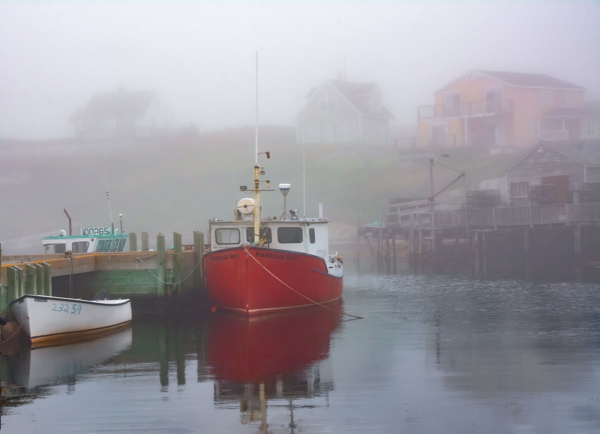
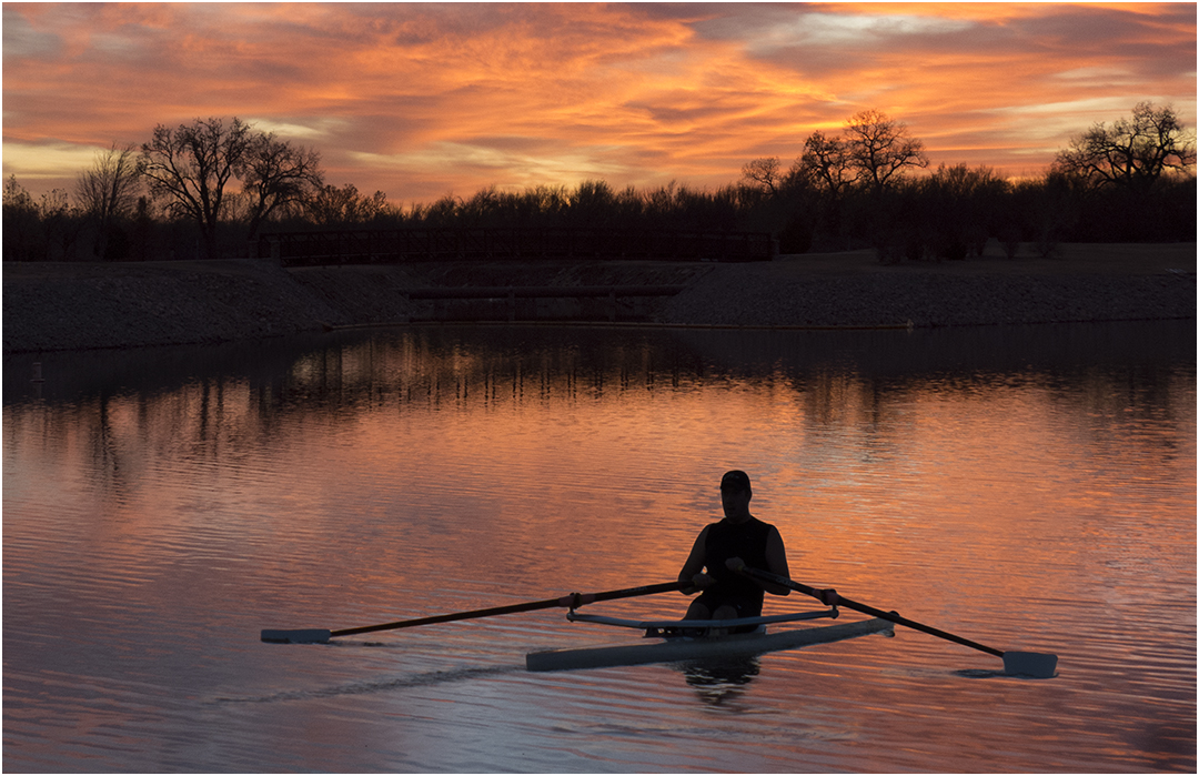
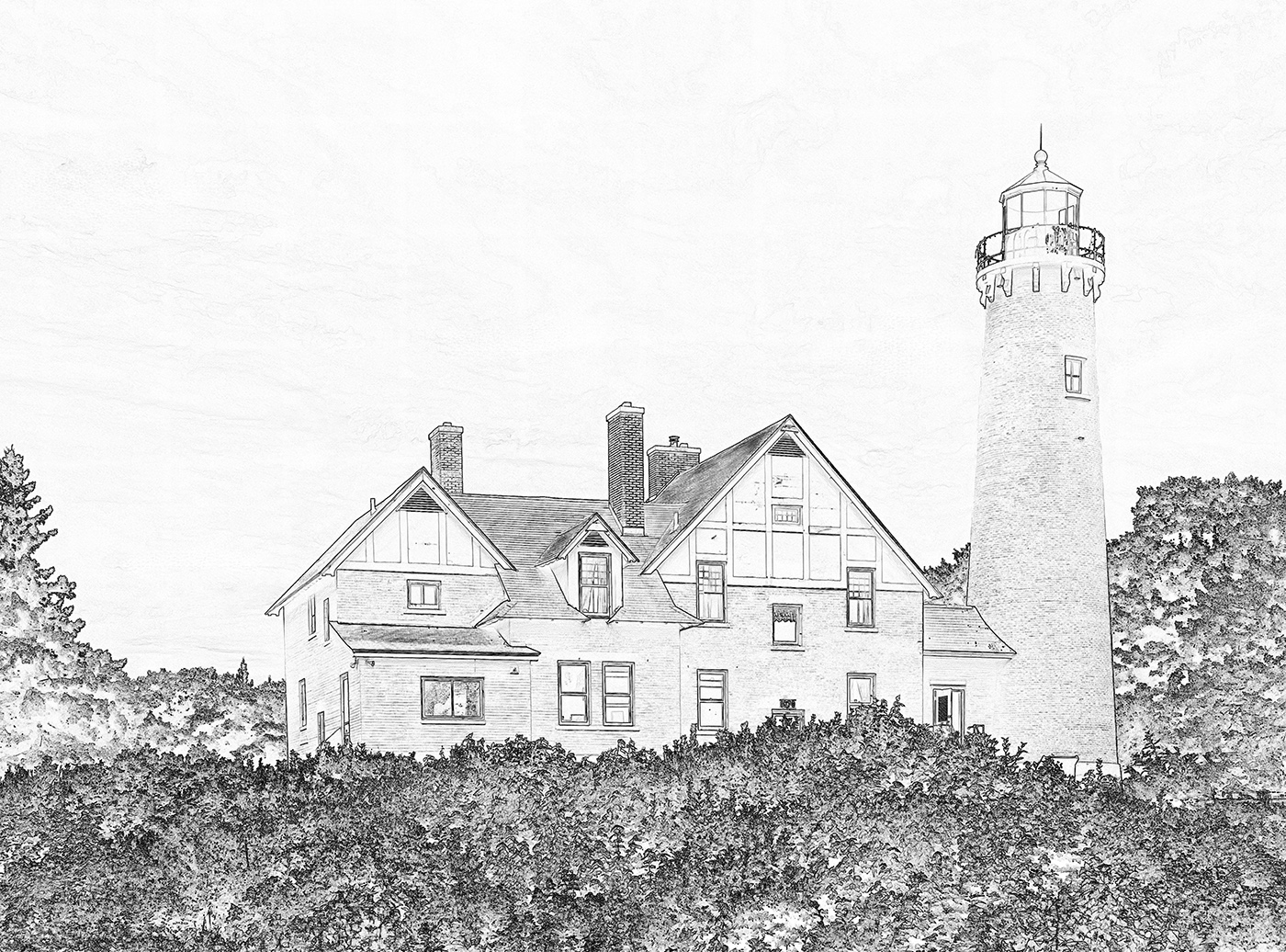
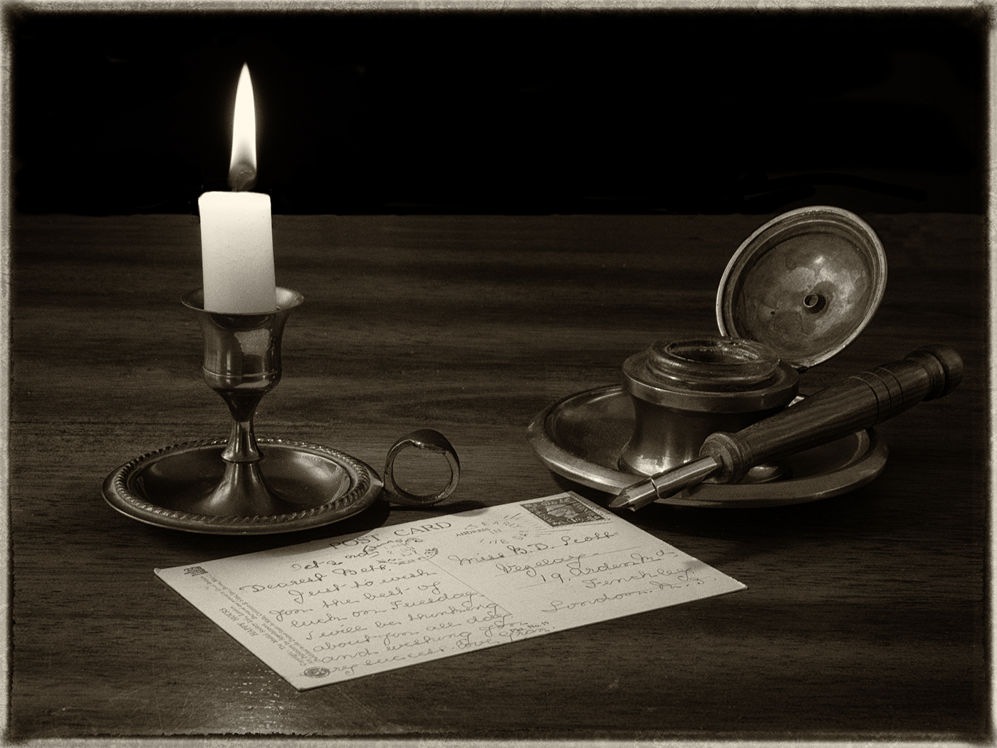
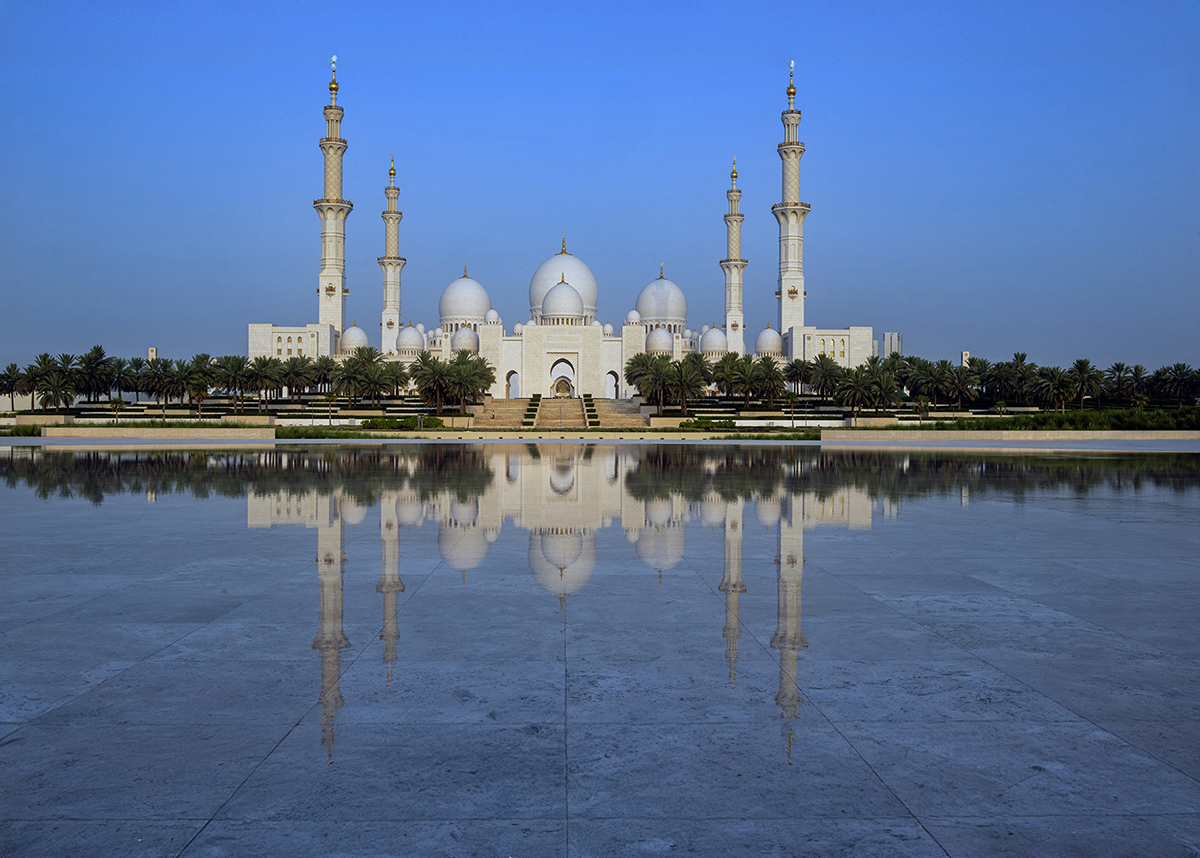
Beautiful image showing great symmetry. The blue sky and the reflection on the mostly calm water is very good. I agree that the top and bottom are a bit tight. I know that you are a good enough photographer so that the lens must have limited you.
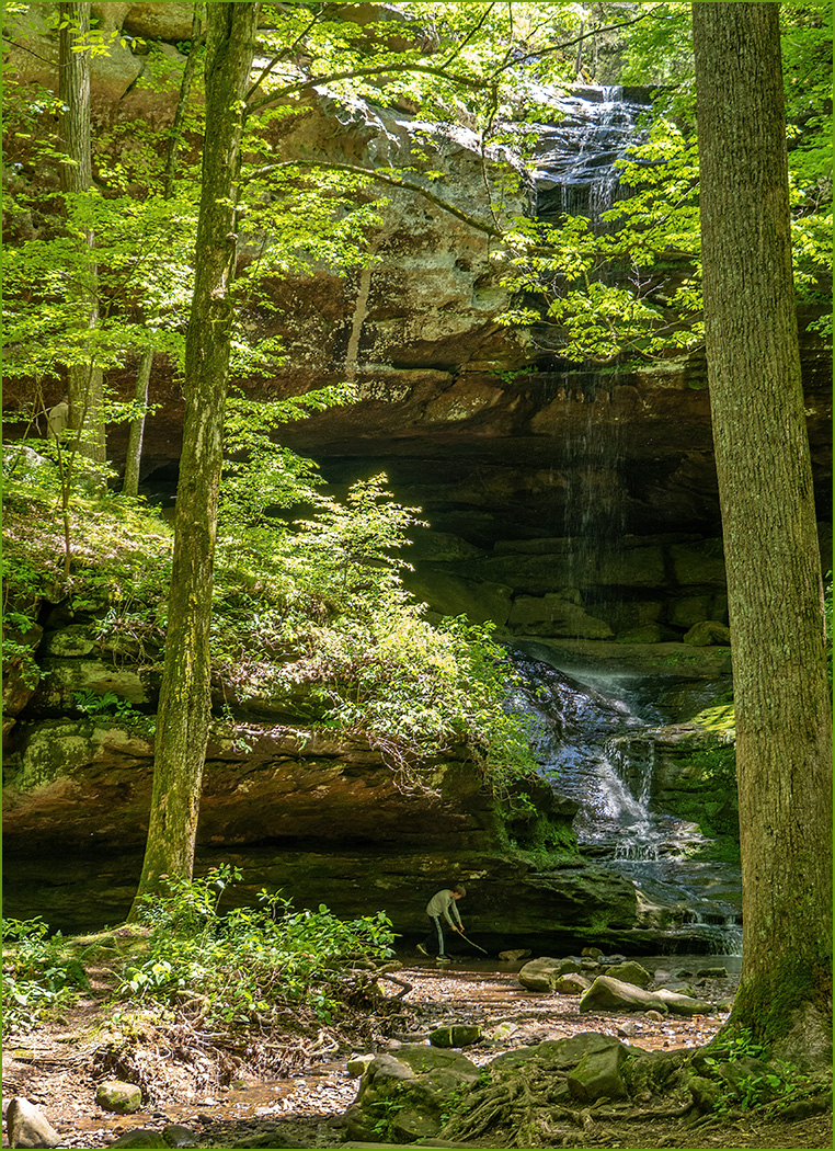
One thing that you could do in situations like this, is to take 4 or 5 images in portrait mode to get all the area that you want, then stitch together as a panorama in Photoshop and crop. Of course this is an solution in situations like this that I always think about later when it is too late.
I did use Photoshop Beta to add area at the top and bottom, which turned out very well. I should have cropped more off the bottom, but wanted to show how well it expanded the bottom. Of course at this time PSA does not allow AI in images for competition. |
Jun 10th |
 |
| 7 |
Jun 24 |
Comment |
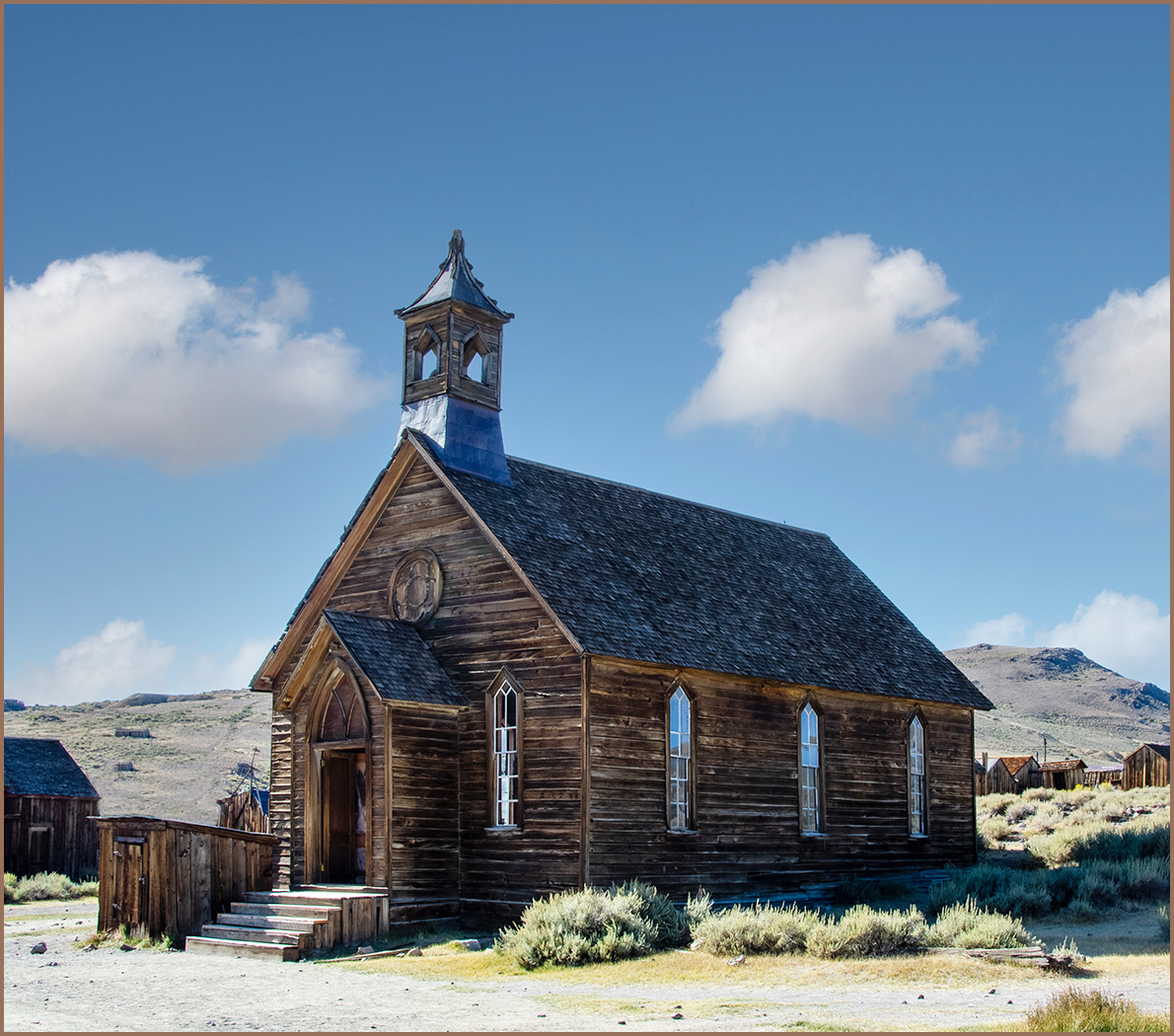
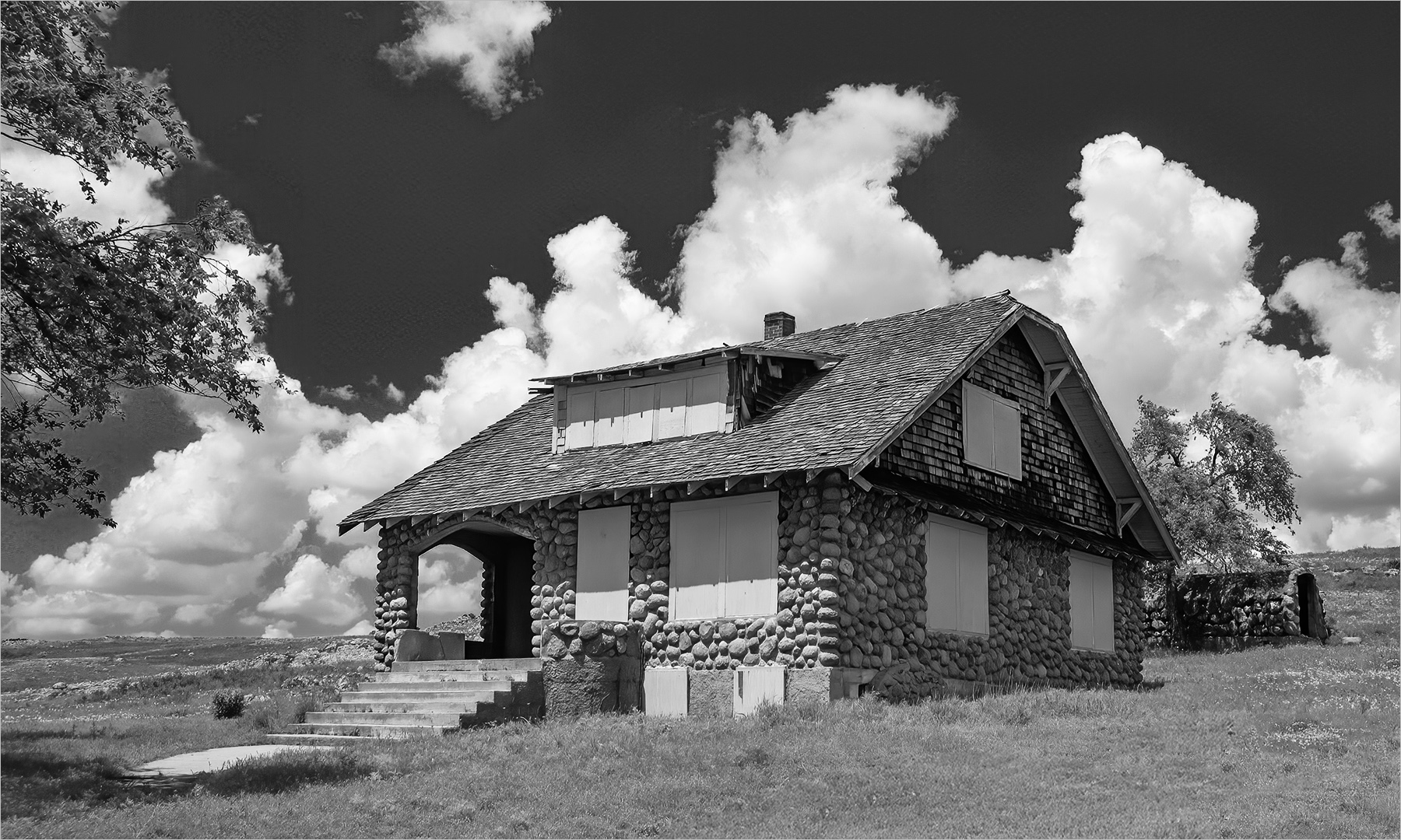
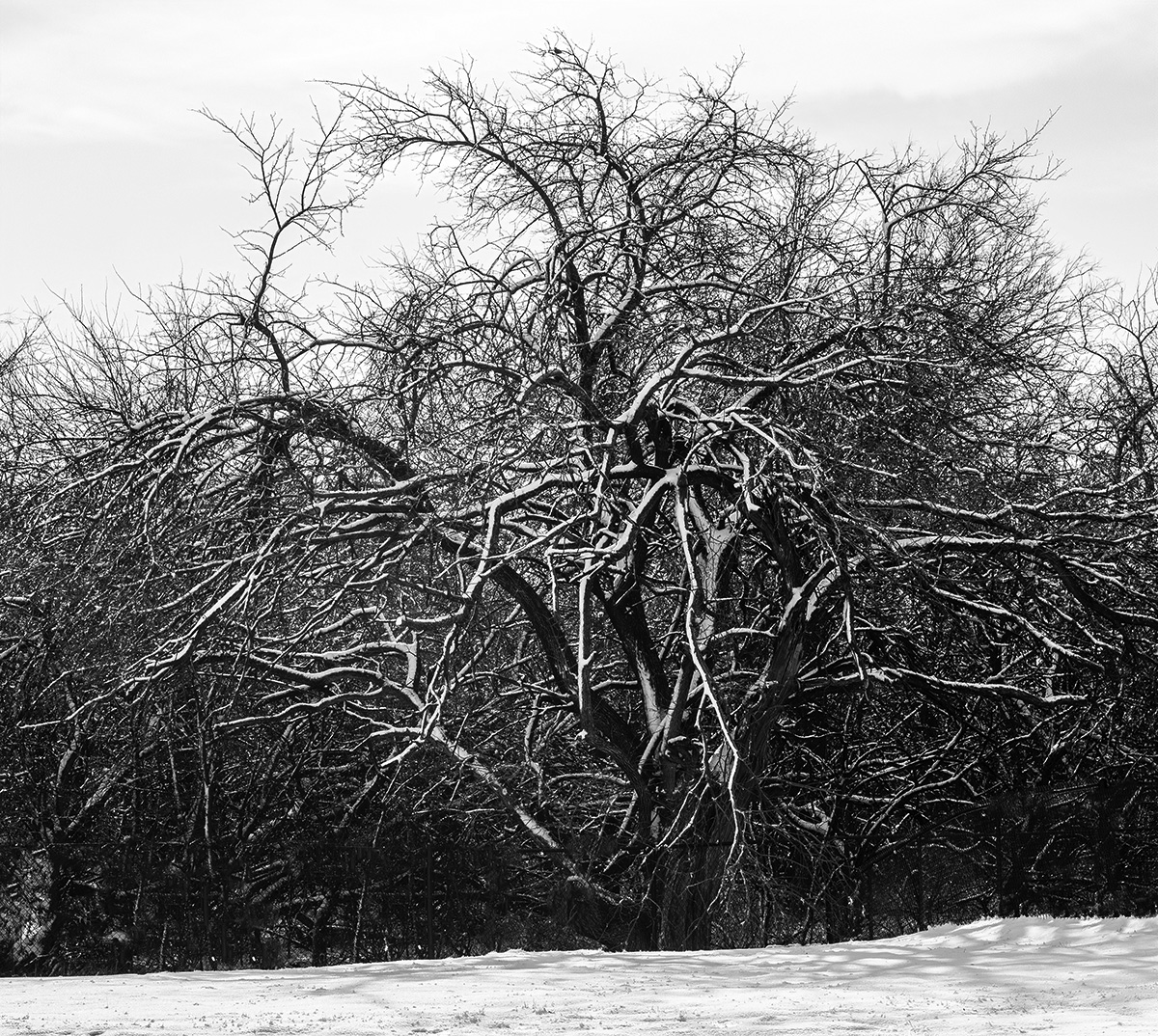
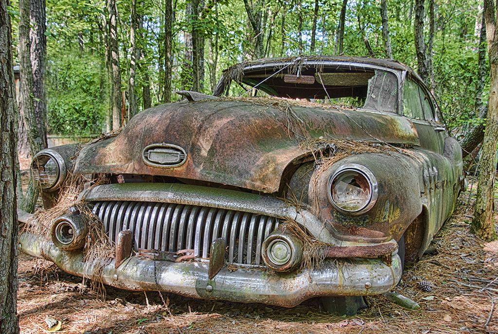
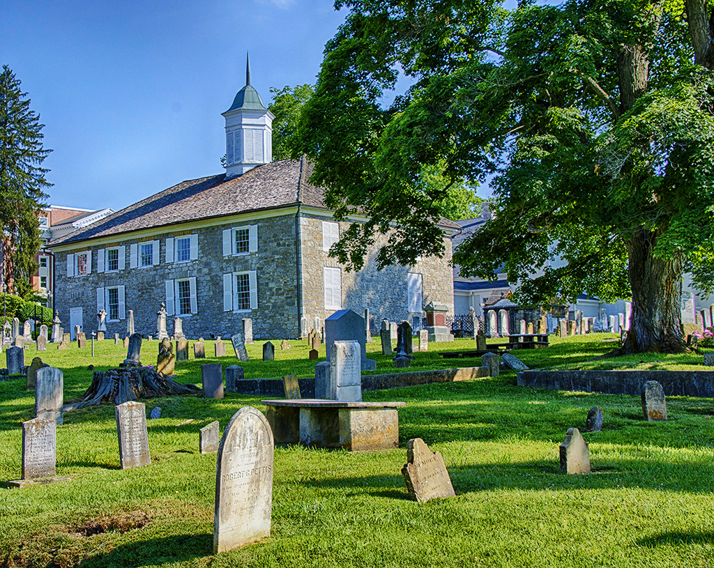
A very interesting image with the tree growing around an old Chimney. At first glance, it appears the the chimney is the tree trunk because of it being the color of the tree trunk. Of course, with closer look you can see the texture of the chimney. The image looks sharp with good depth of field. You also had a nice blue sky behind at least most of the tree. The path leading to the tree also adds depth to the composition. I do like the editing that Butch made. |
Jun 10th |
| 7 |
Jun 24 |
Comment |
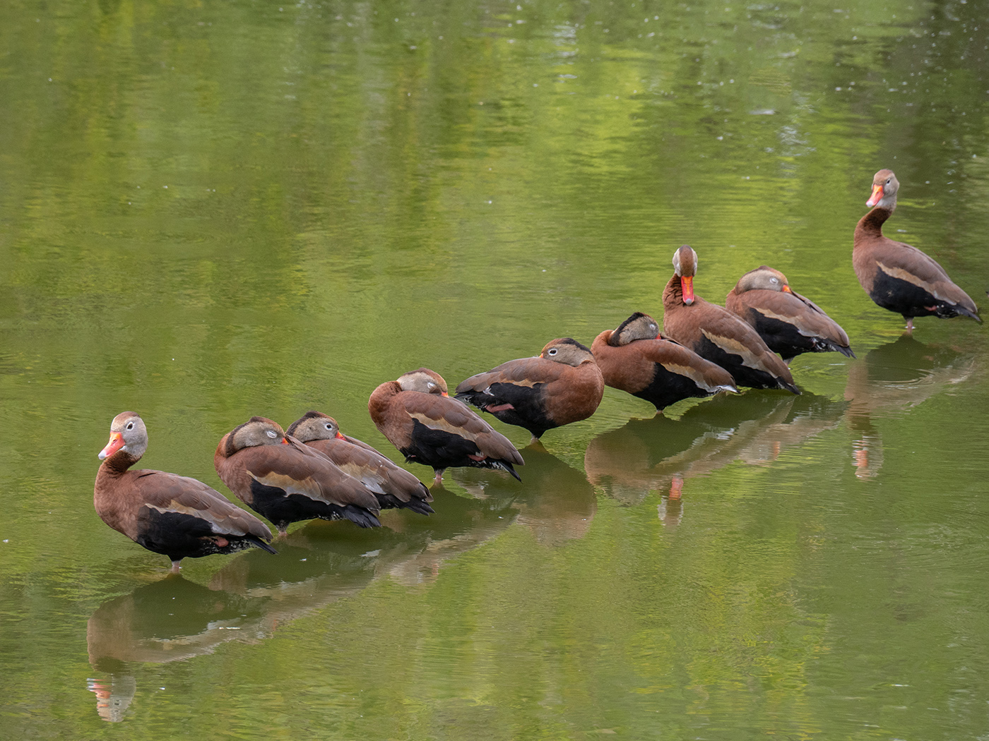
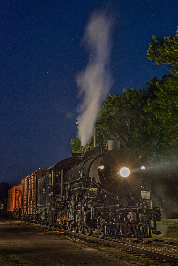
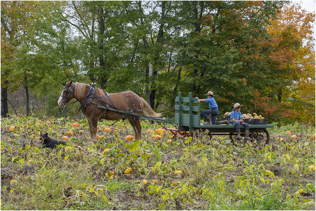
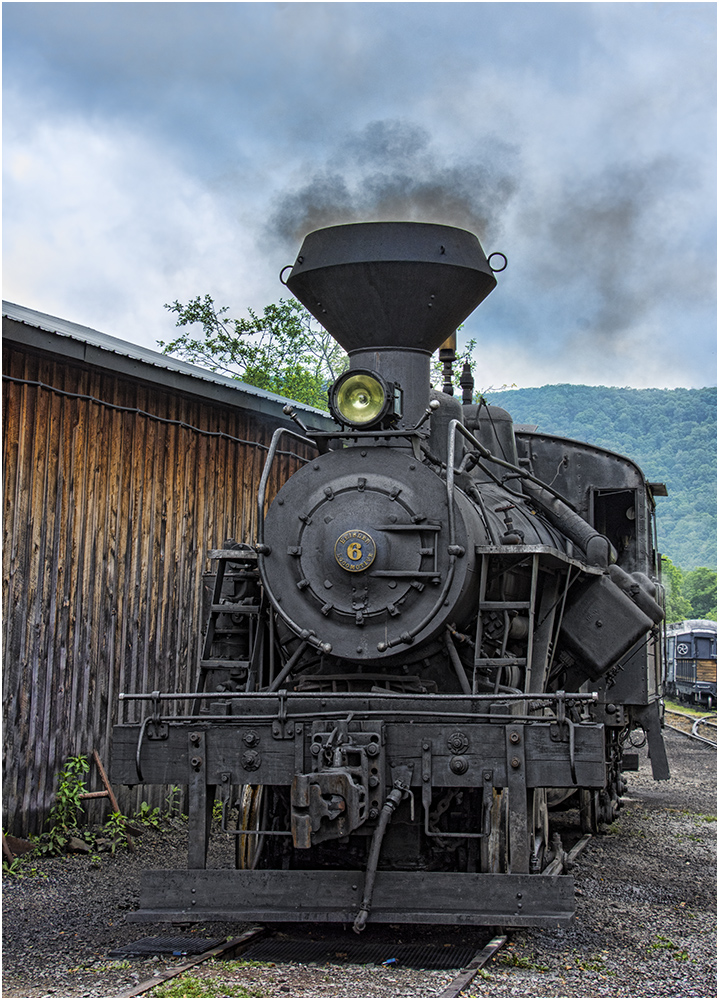
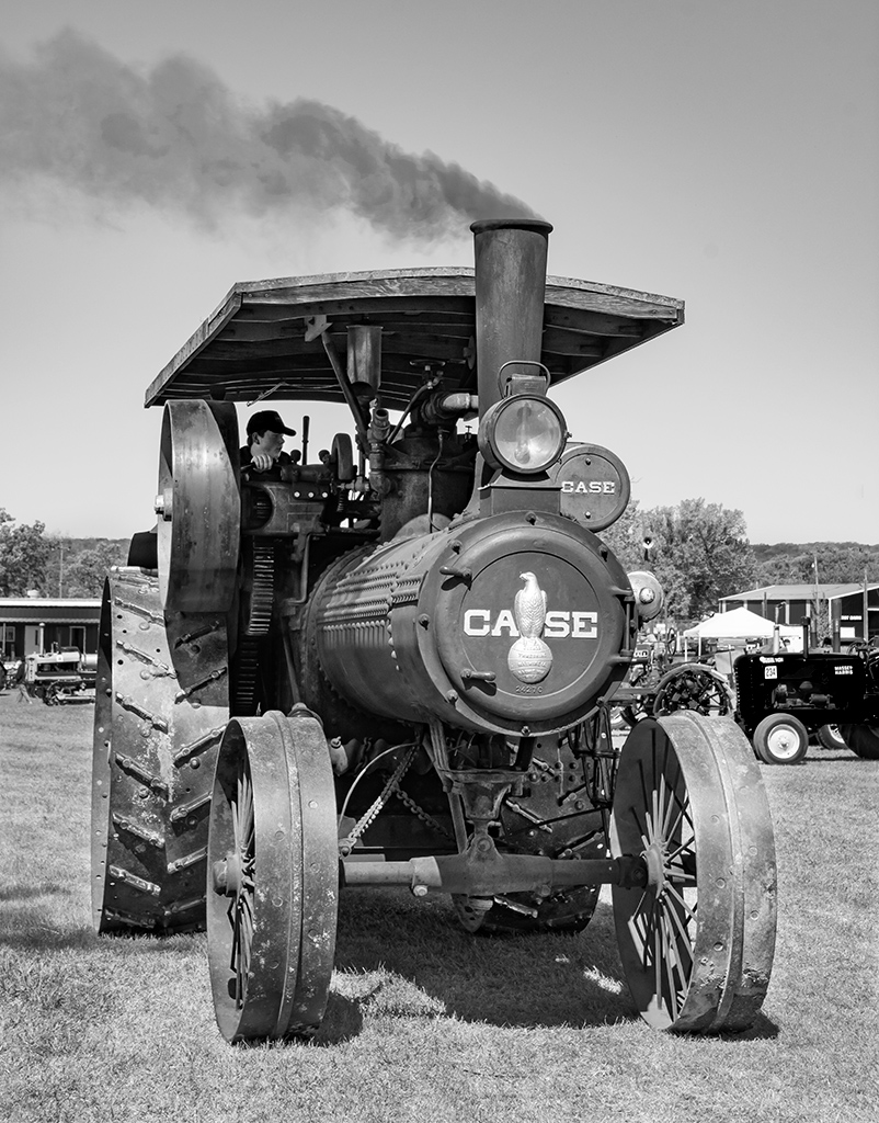
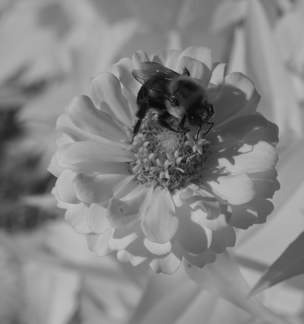
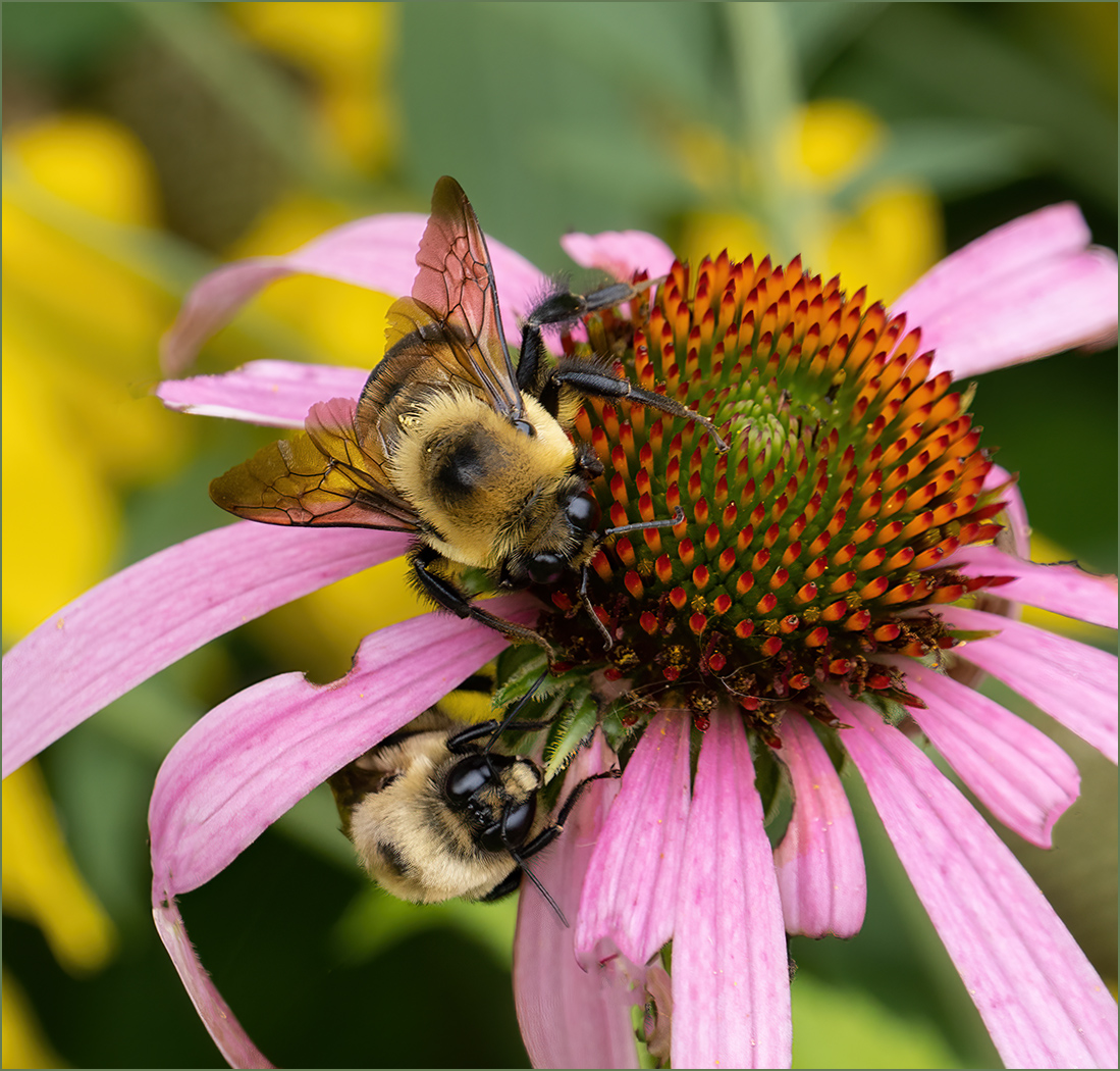
Great image with the wildebeests coming into the frame in the lower left corner and making curves as they fad into the distance and dust. The shutter speed was good to stop the motion. It looks to me like the image is very sharp, only suffering from the jpeg and website resolution limits. Of course the dust adds a great deal and going with sepia tone adds to the feeling of dust. I am glad that you had a print made to enjoy. |
Jun 10th |
| 7 |
Jun 24 |
Comment |
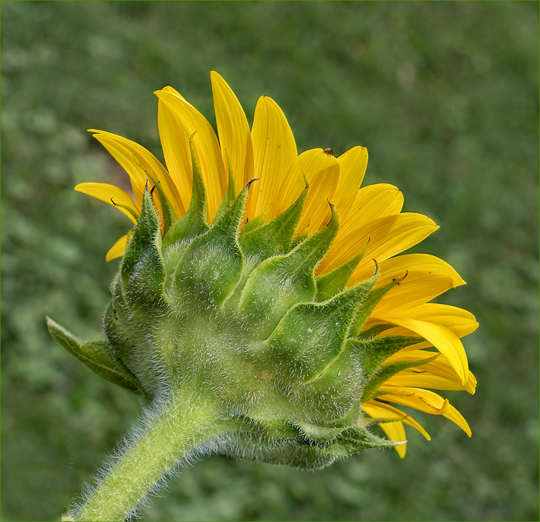
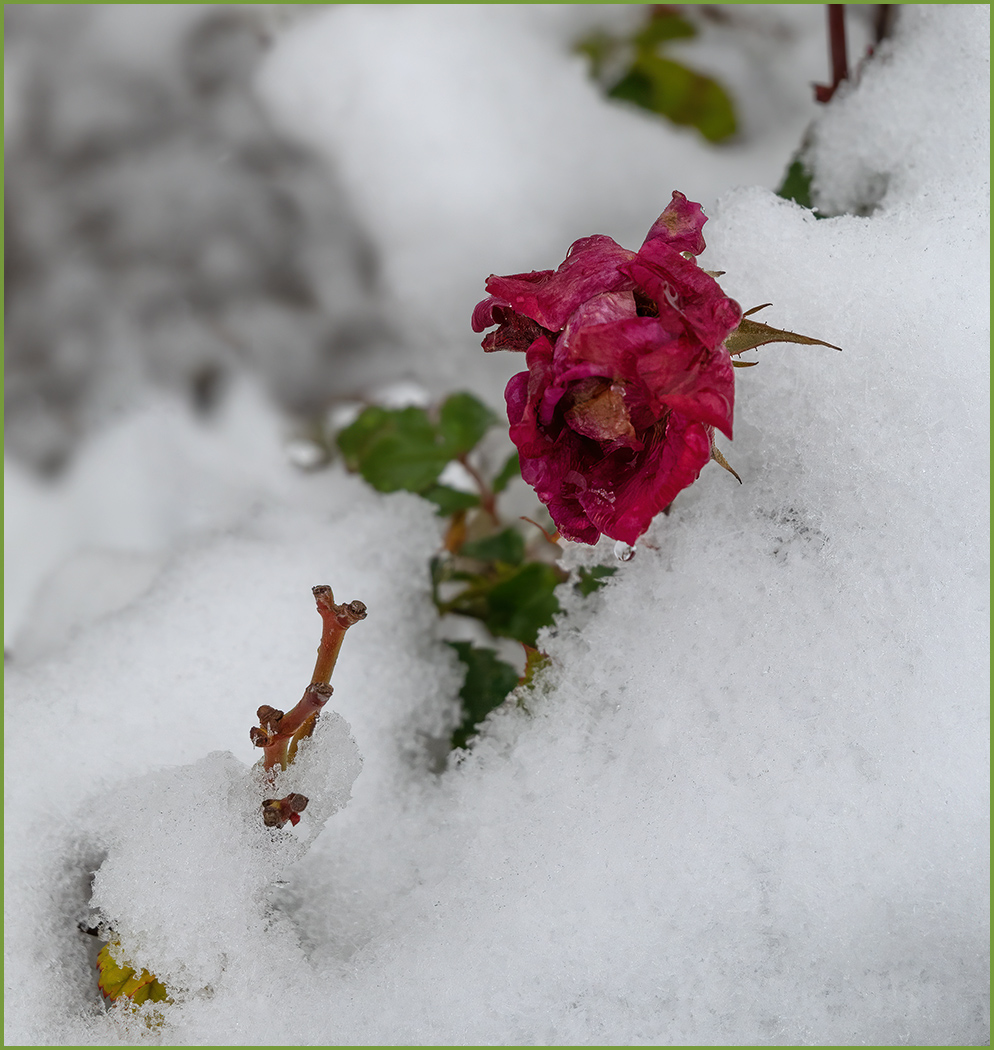
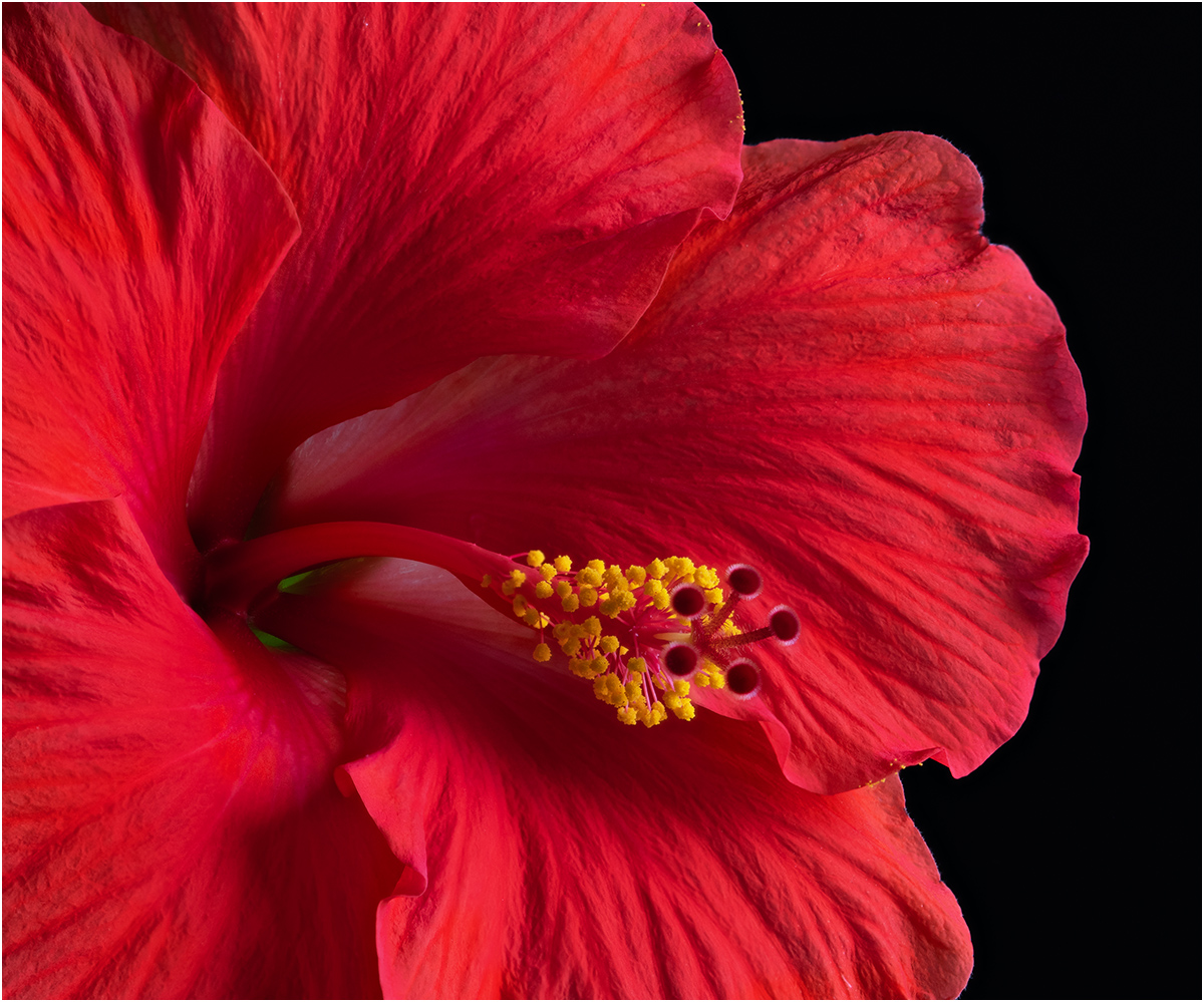
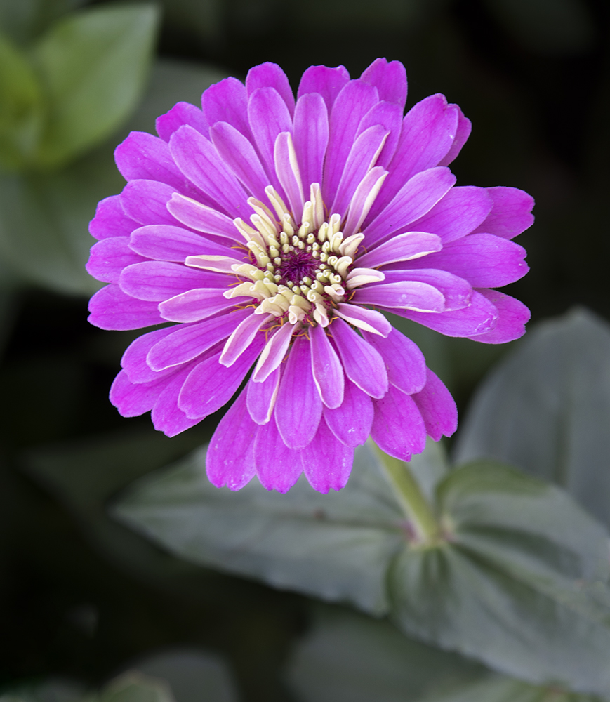
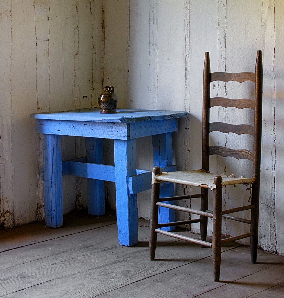
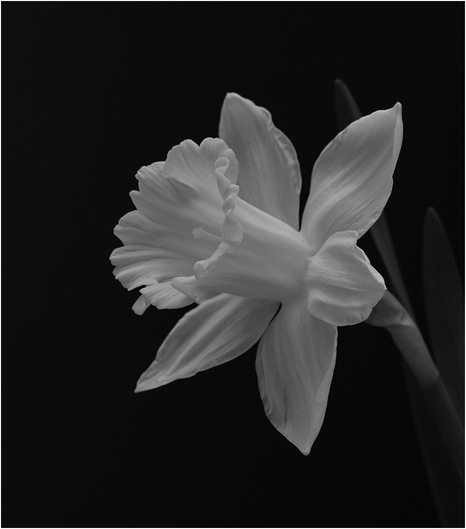
I really like the image. It is unusually to have a decaying flower, but it still has nice colors and we can see what it is. The image is very sharp with great depth of field and is very well lighted. The problem with the stem as originally presented is that it leads the eye out of the image -- hence Barbara's suggestion to flip it. I like Butch's idea about rotating the image, which you have now incorporated. I also like you moving the stem so that it is not going out the right side. Great improvements to good image to begin with. |
Jun 10th |
| 7 |
Jun 24 |
Comment |
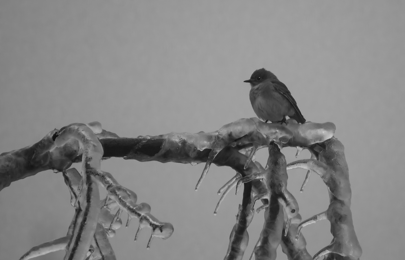
Nice capture of the bird in flight. You also caught it between the branches which is great. I agree with you that the wingtip blur is not a problem as it does show movement. The lack of sharpness is not bad, but what there is may be because of the tight crop as you say of only 1/8th of the frame. I like Butch's crop, but don't think that it would work for nature. Just cropping would have left some of the tree branches. So, he must have removed part of them. |
Jun 10th |
| 7 |
Jun 24 |
Reply |
Thank you for the comments and the edited image. I like what you did. |
Jun 10th |
| 7 |
Jun 24 |
Reply |
You are not the only one, the image changed. I have emailed Butch. |
Jun 10th |
6 comments - 2 replies for Group 7
|
| 32 |
Jun 24 |
Reply |
Thanks. Sorry to see you leave the group, but we all understand. Like Wes said, you can always view the group images and comments. |
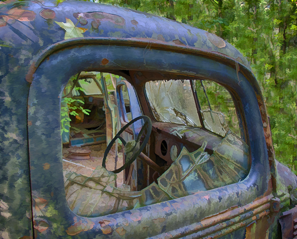
Jun 30th |
| 32 |
Jun 24 |
Reply |
I wasn't suggesting that you crop off the damaged area, only pointing out that you would have a very different image if you did. |
Jun 26th |
| 32 |
Jun 24 |
Comment |
Your editing to add more contrast to bring out more tones was good. I like the shapes and the shading, but wish that it was sharper. |
Jun 14th |
| 32 |
Jun 24 |
Comment |
I like both the monochrome and the cropped color image. In some ways, the bird is so colorful that I would hate to lose that. I like the catch light in the eye. I do agree with Stephen that the texture in the mono image is a distraction. As for making it all black or white, you would just have to try and see which you like better. It is so good that they rescue birds and then train them for photography so the they can still have a purpose for people to enjoy them. |
Jun 12th |
| 32 |
Jun 24 |
Comment |
Very sharp image in the mono, and I agree that the mono is sharper then the color. You captured the tongue in a perfect position. I like the smoother water in front of the snake that to me shows that it is moving. I agree with Diana that you should crop some off the top, but I would also crop off some on the right. You already have cut off most of the snake, why not cut off some more to made the head and tongue fill the frame more. |
Jun 12th |
| 32 |
Jun 24 |
Comment |
I like the toning and agree that the border is too much. The top of half dome is too close to the top of image. The tree really doesn't stand out enough to balance the image, but I think that the clouds on the right do. The image is so sharp that you can see the people. I like them, and to make them stand out more, I would get rid of the 2 downed trees close to them. Very nice image and you made it look like an old time photo. |
Jun 12th |
| 32 |
Jun 24 |
Comment |
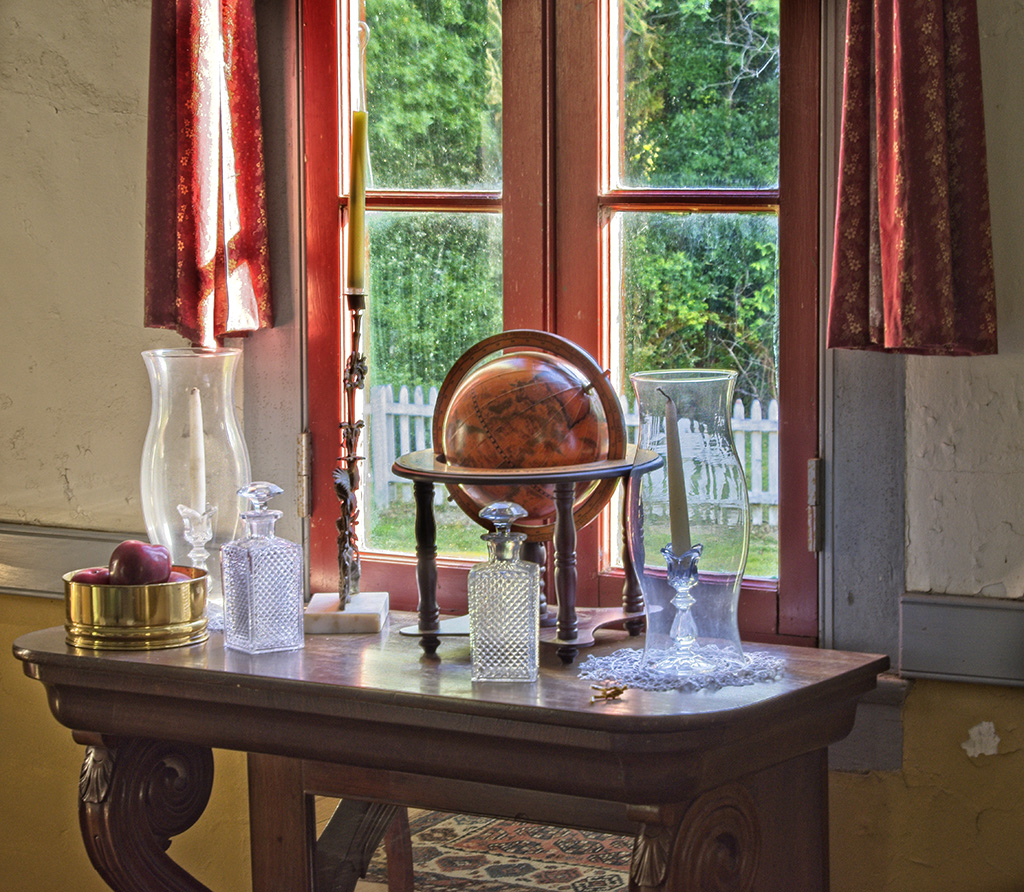
It appears to be a very nice and ornate old clock. I am not sure that it is a good subject for mono. The color has such nice gold tones. Also, in the color the black hands stand out better. I agree that you needed more depth of field but that can be difficult in closeups. |
Jun 12th |
| 32 |
Jun 24 |
Comment |
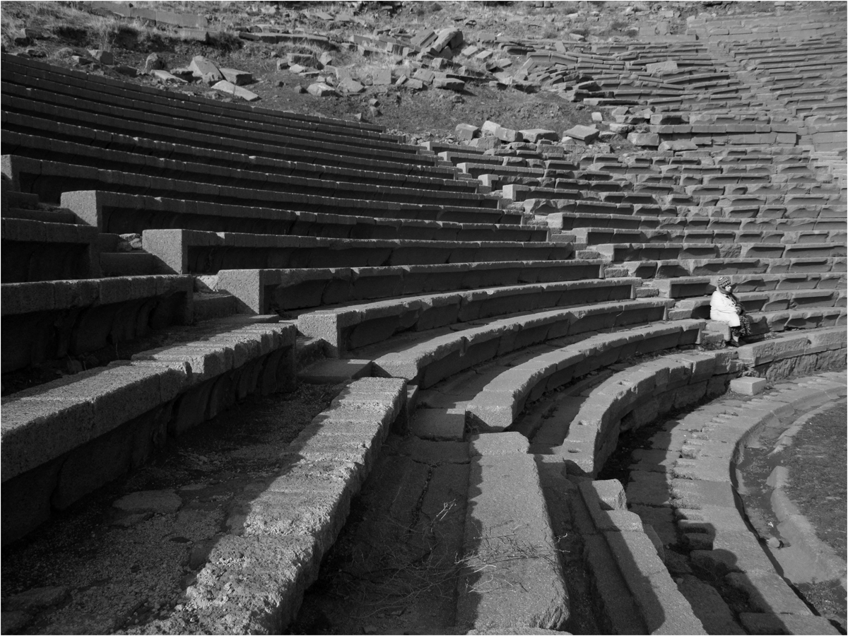
Nice image, and I like your crop. I think that you should make your wife the focal point, so I made her jacket lighter. I also used levels to add more contrast. You would have an different image showing a more modern stadium if you cropped off the damaged area at the top. Making that crop would have more of an image of a person sitting in an empty stadium. |
Jun 10th |
 |
6 comments - 2 replies for Group 32
|
| 57 |
Jun 24 |
Reply |
Thanks for the suggestion, it is a good one. The sideways wood boards are a distraction. |
Jun 28th |
| 57 |
Jun 24 |
Reply |
Thanks, that helps the image. |
Jun 18th |
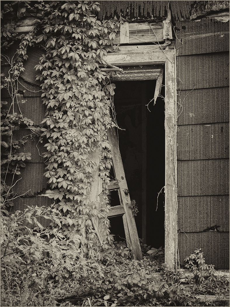
| 57 |
Jun 24 |
Comment |
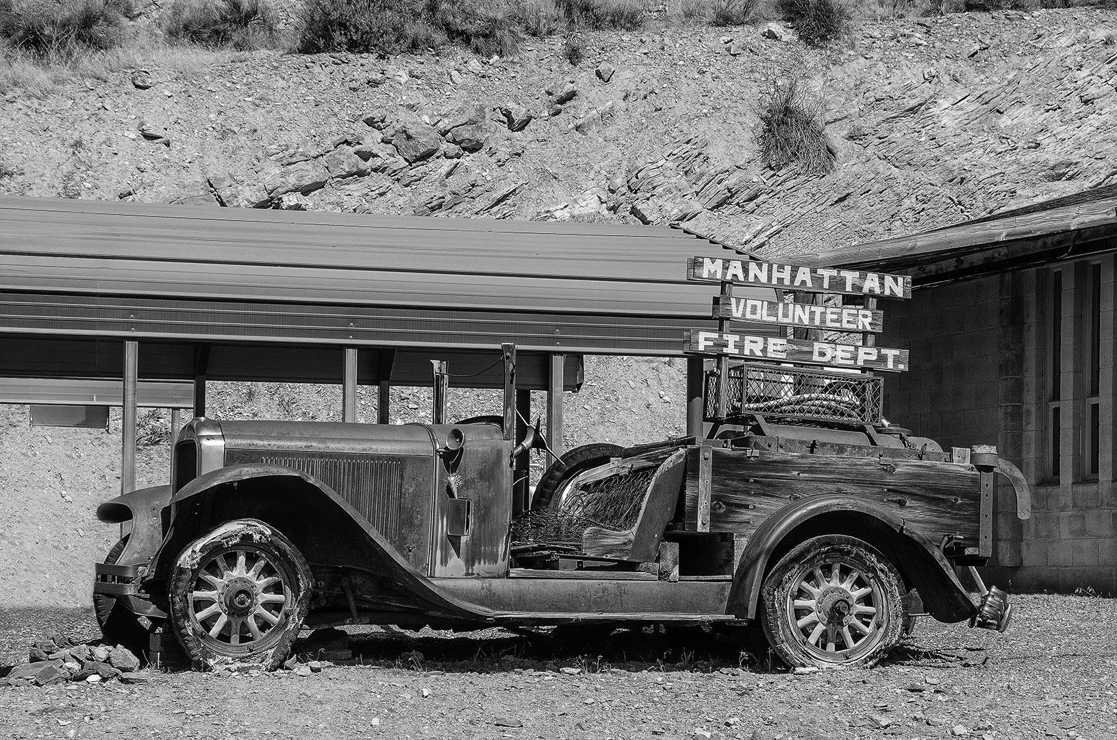
Thank you for telling us about this interesting site. I never would have thought that a small town in Colorado would be the first. The image could be sharper. |
Jun 17th |
| 57 |
Jun 24 |
Comment |
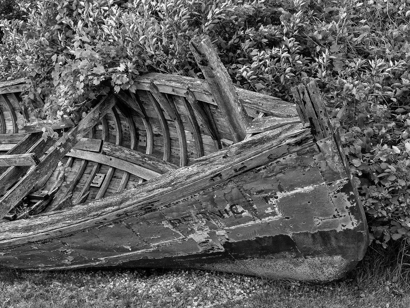
I like the sharpness and depth of field. You have presented an interesting comparison of decomposition and new life. I am sure that given enough time the entire animal will be just minerals adding nutrients to the soil. Your editing was very good. |
Jun 17th |
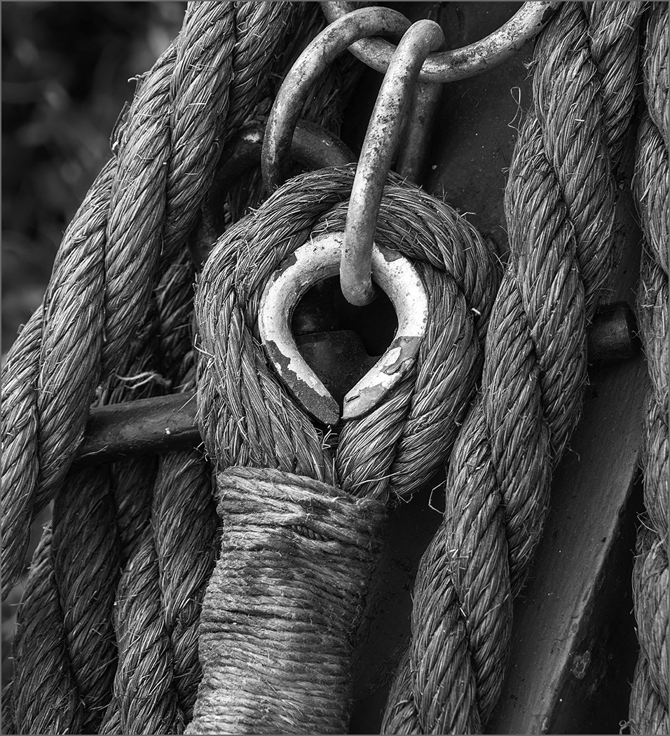
| 57 |
Jun 24 |
Comment |
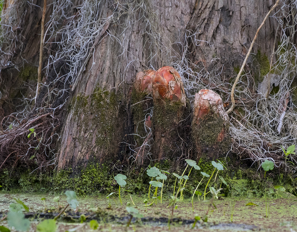
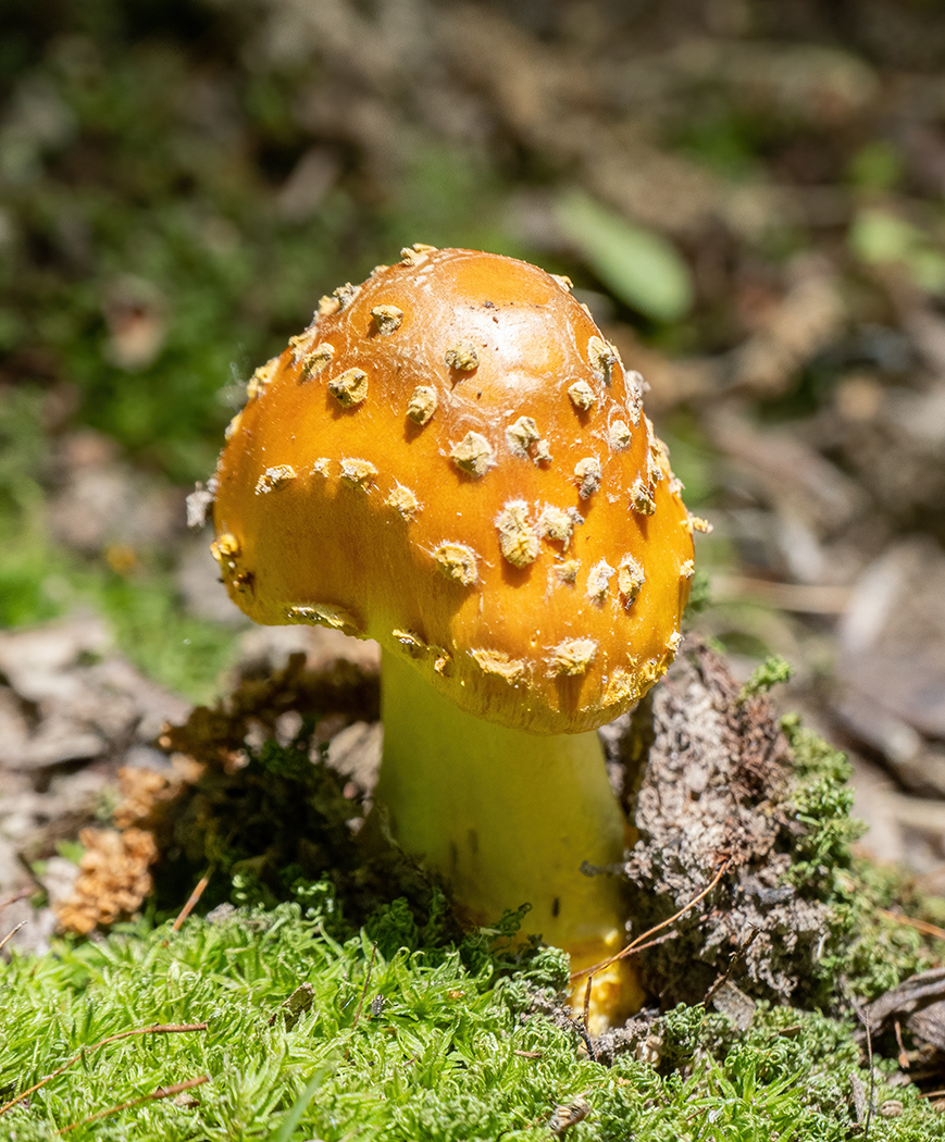
When I first looked at the image, I wondered what was on the tree. The part on the left almost looks like it is an animal's head. I like the depth of field, as we can see the tree bark, but it is not totally sharp that would distract from the mushroom. We often see mushrooms from the top, not looking sideways at them. I also like the composition. |
Jun 17th |
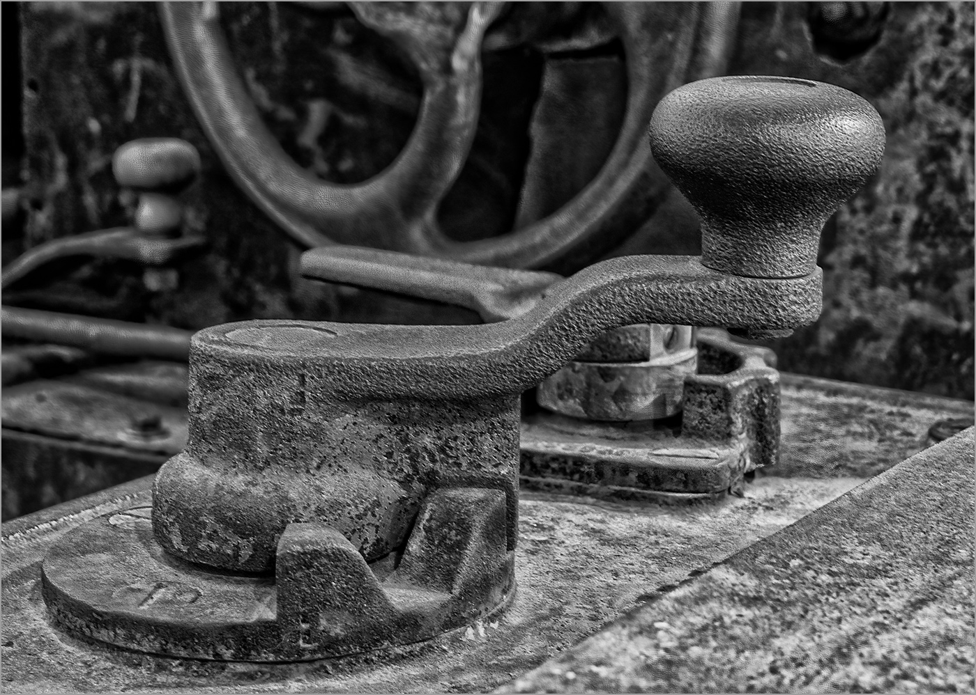
| 57 |
Jun 24 |
Comment |
You have a great photo eye to have seen this. The detail and sharpness is very good. I like that you captured it with the strings going from small at the top to large at the bottom. The angle is very good. It must be a very beautiful instrument. I would not change a thing. |
Jun 17th |
| 57 |
Jun 24 |
Comment |
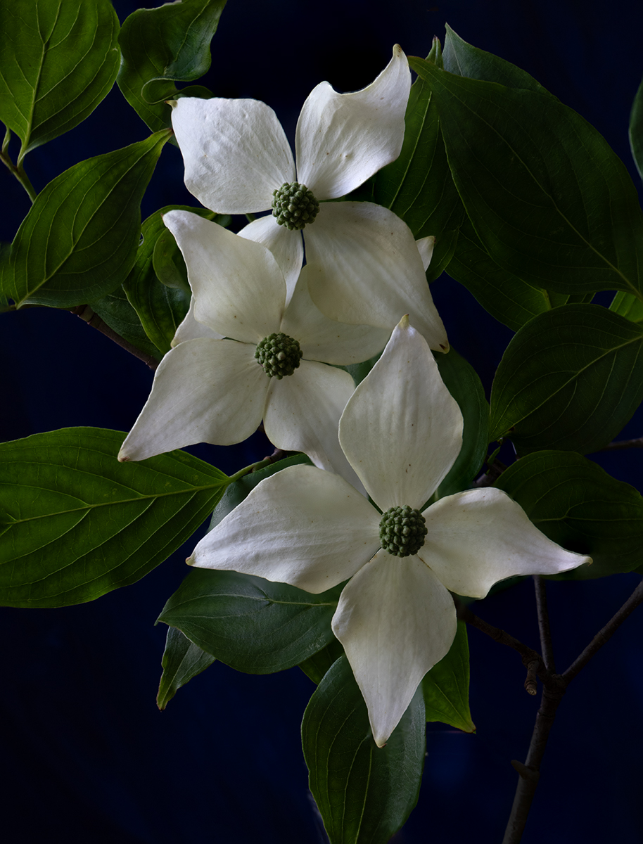
Great capture. I like the dark background that also has some detail. Very good exposure to have kept detail in the white petals. The depth of field is also very good. I like that you chose a blossom that is past prime as the brown tone on the edges and the fallen off stamens on the lower petals really add to the image. By selecting a past prime image you have captured something that is unique, as most magnolia blossoms that we see are new and white. |
Jun 17th |
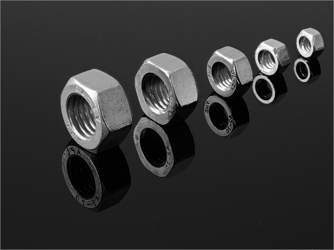
| 57 |
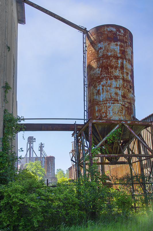
Jun 24 |
Comment |
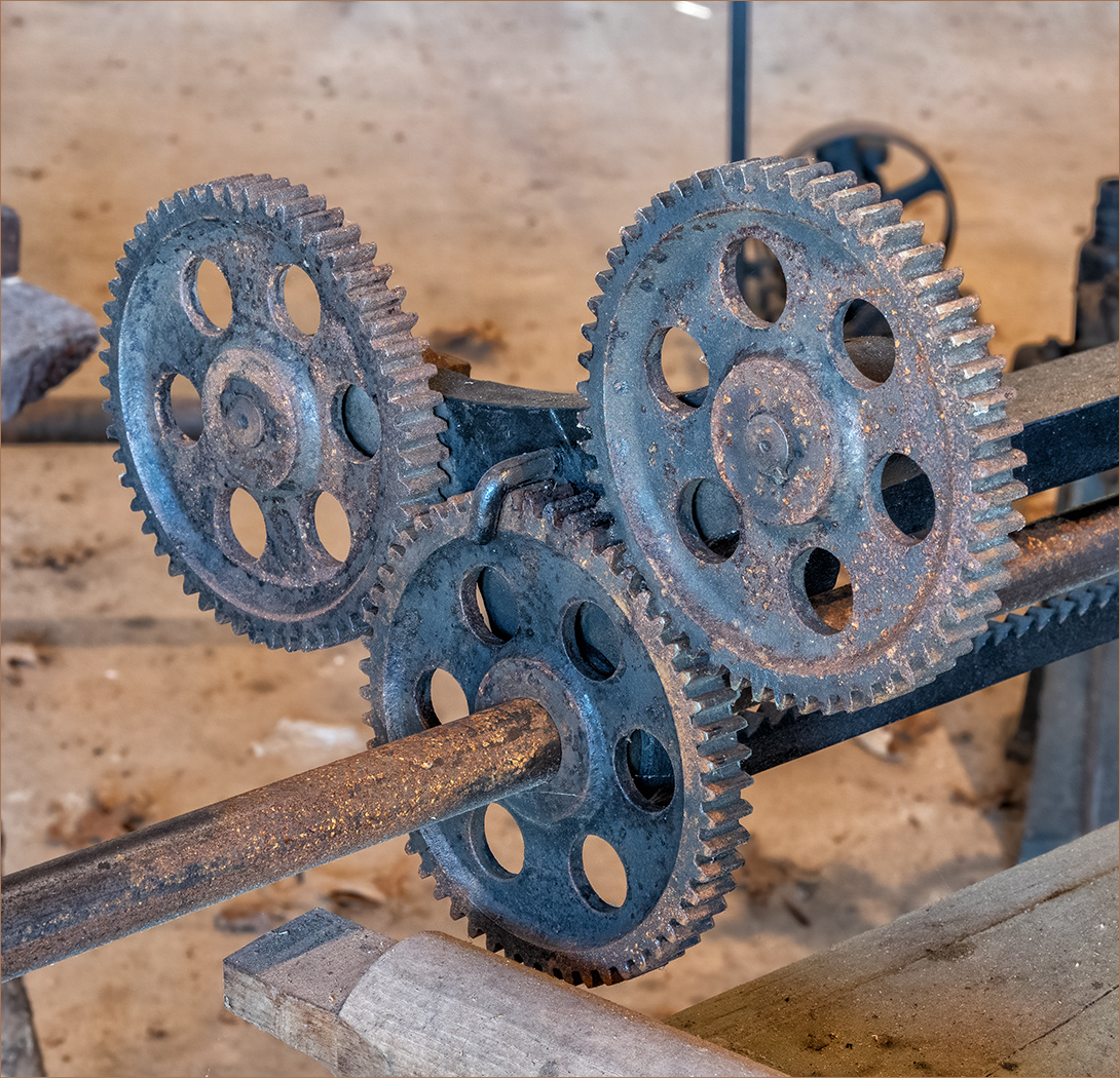
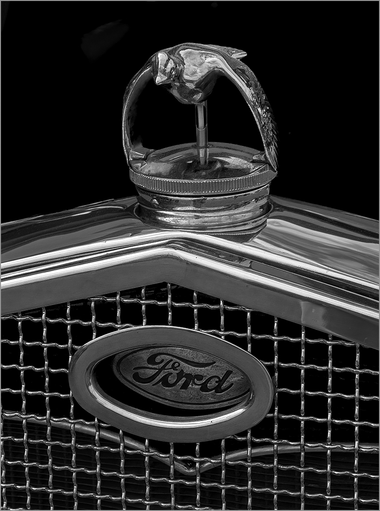
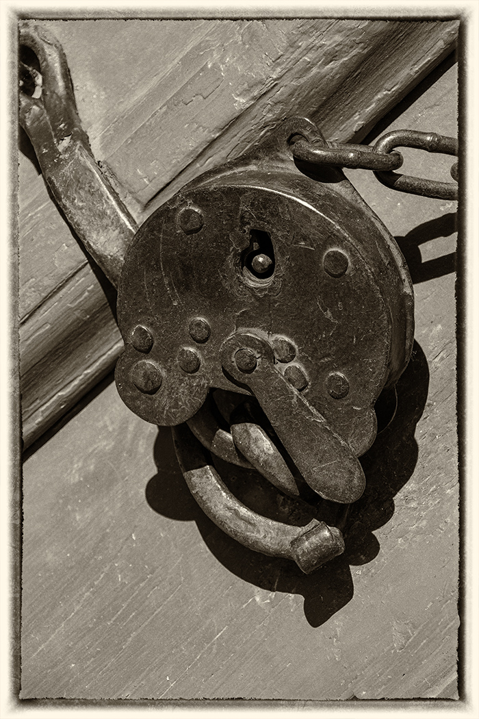
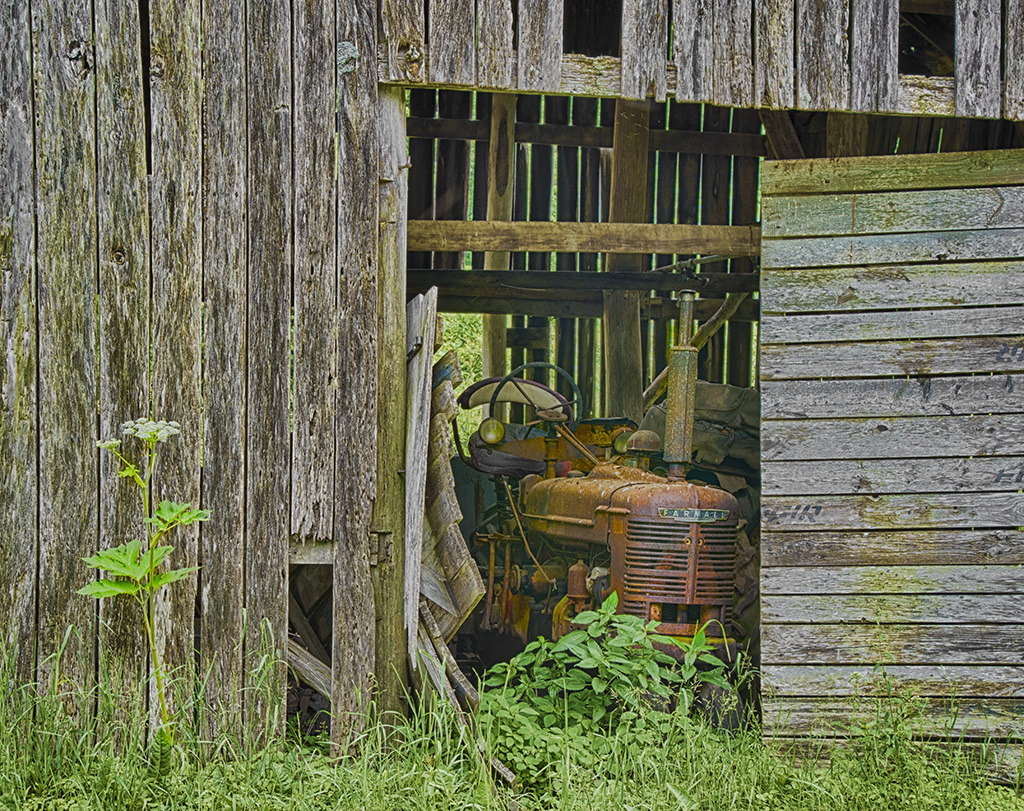
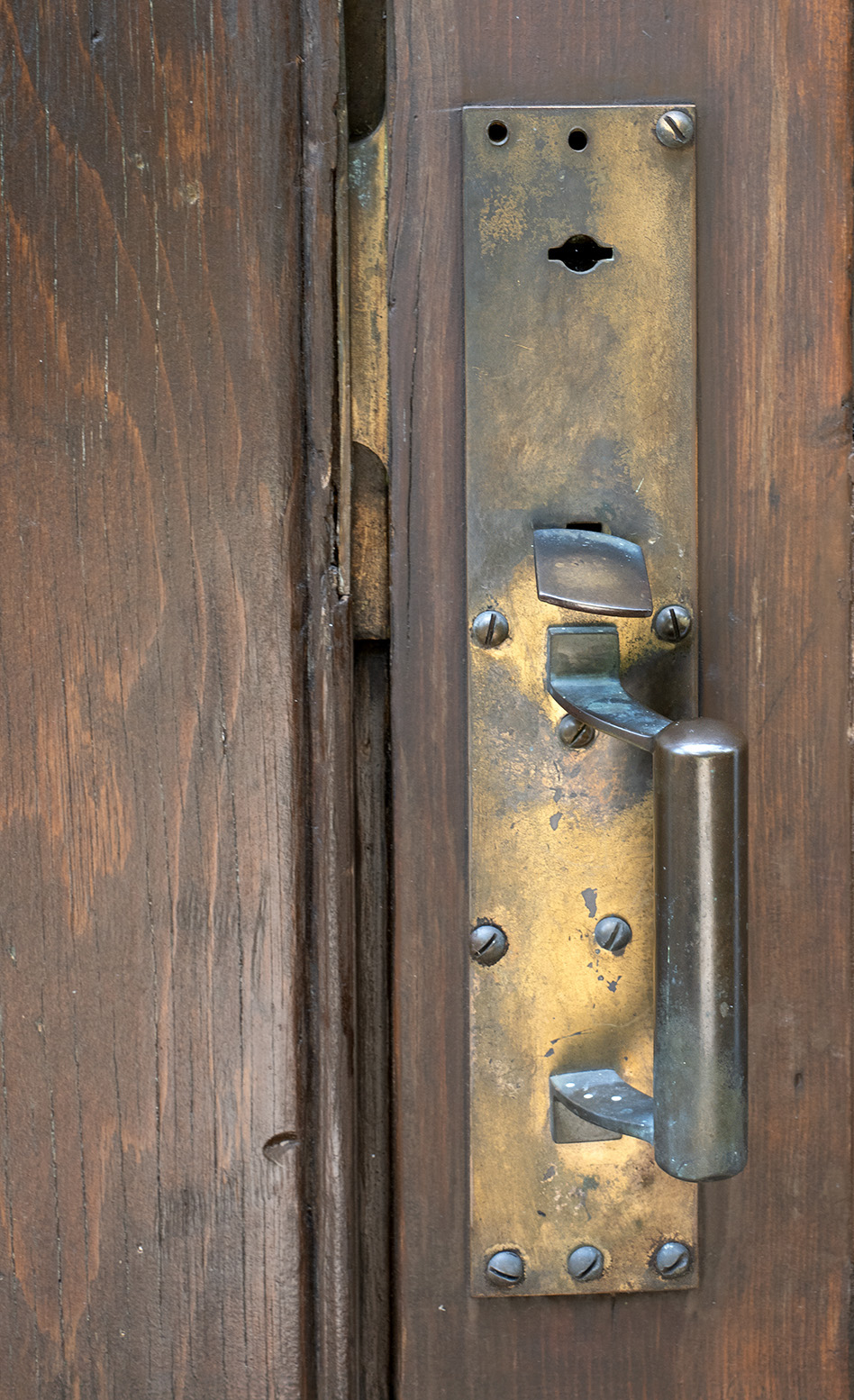
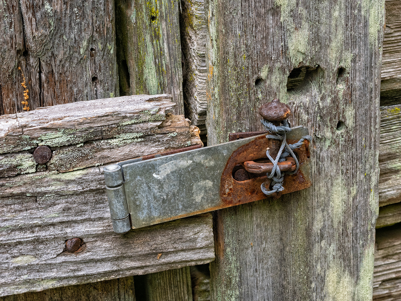
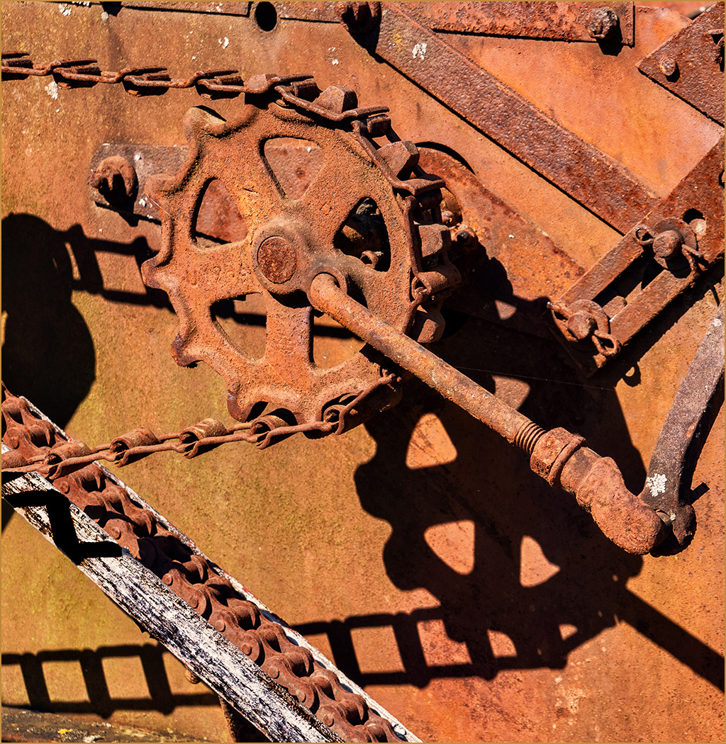
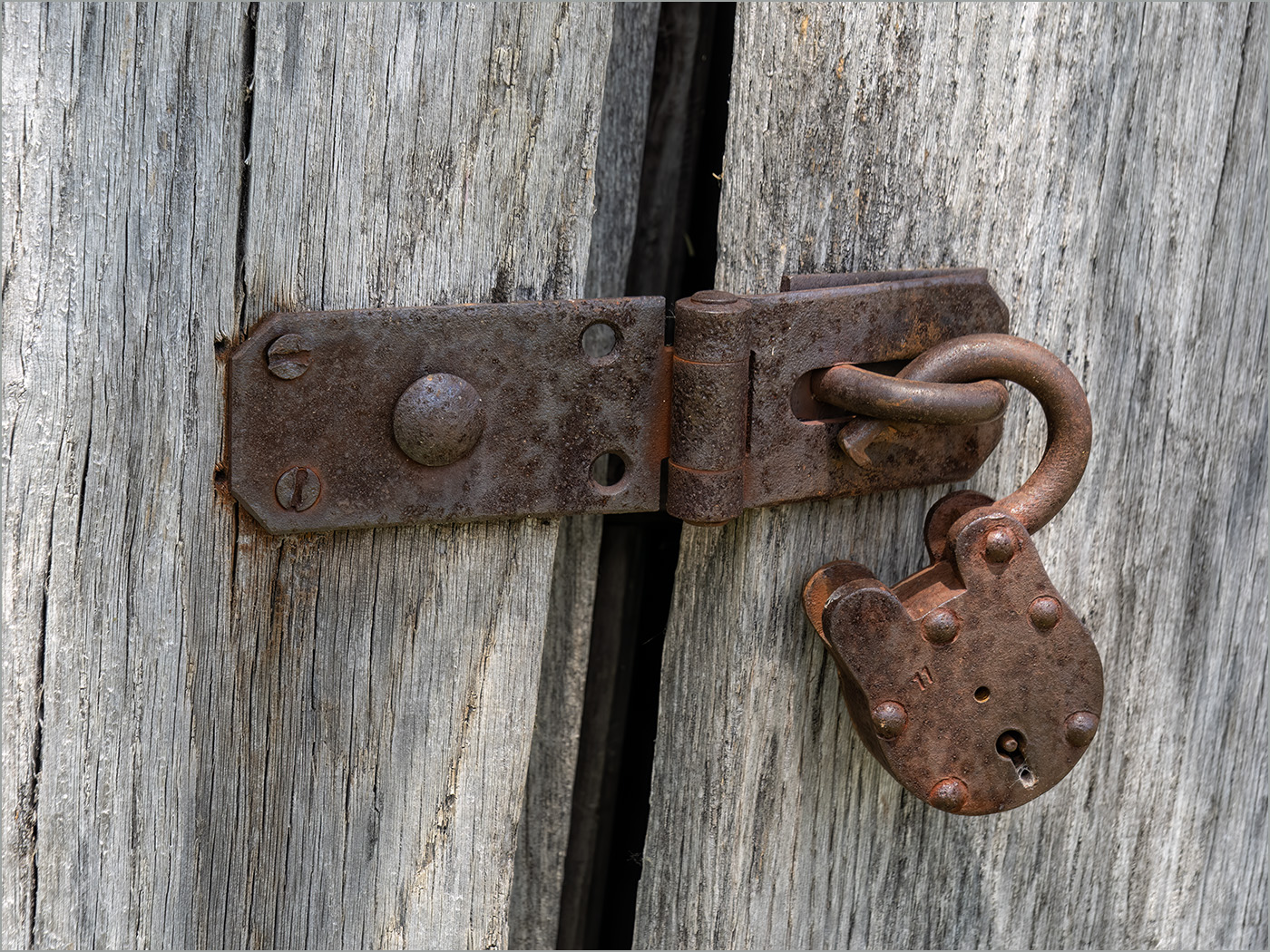
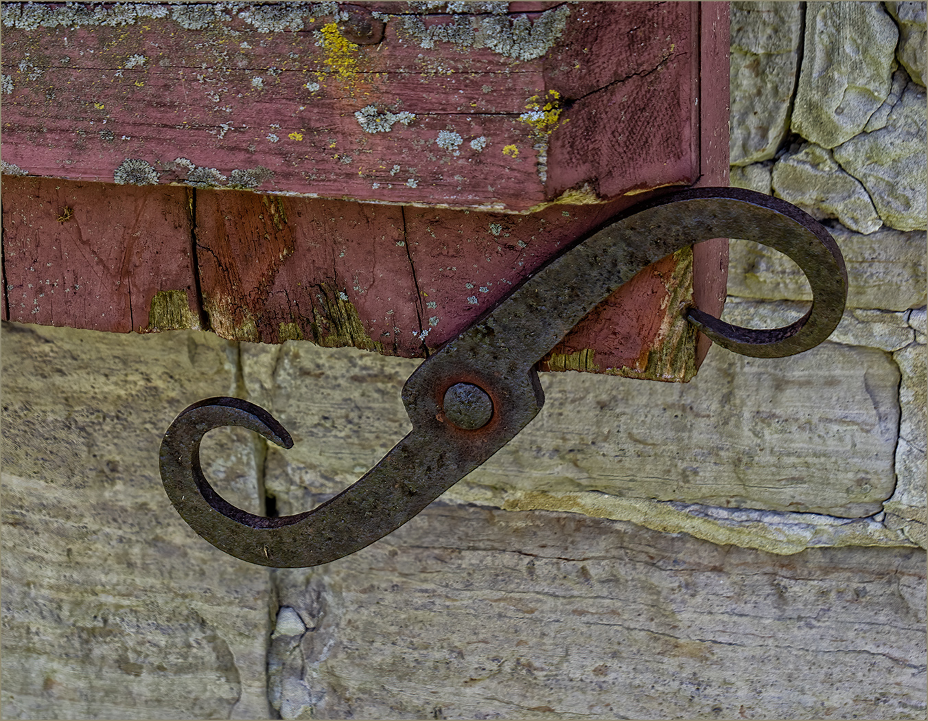
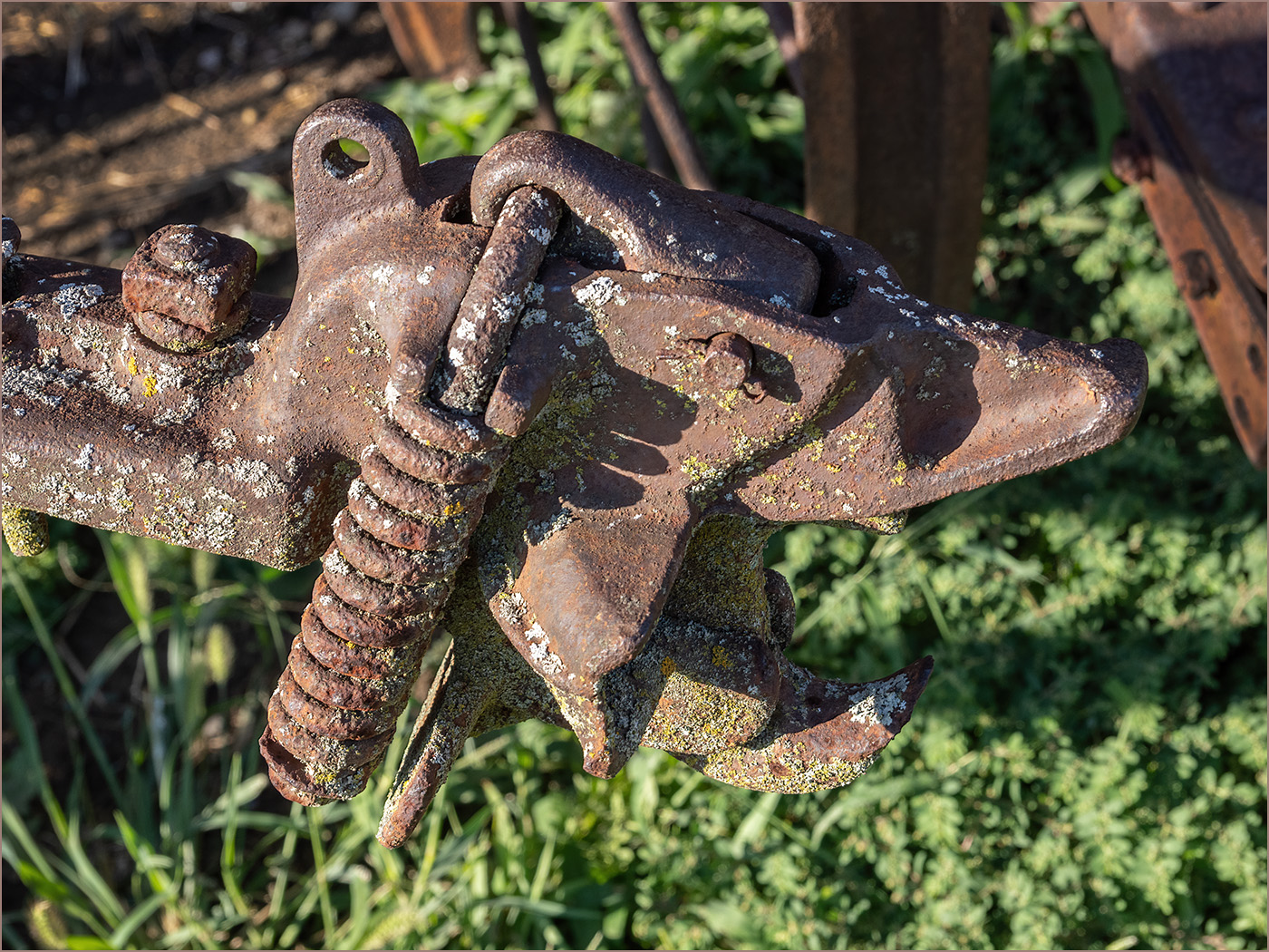
What a great find. The contrast between the yellow and the silver is very good. I like the lines in the silver, and it makes me wonder what caused them. The silver must have been paint or a coating, because where the silver is gone there is rust. The arrows coming from the left create a good lead-in. I would not change a thing. |
Jun 17th |
6 comments - 2 replies for Group 57
|
18 comments - 6 replies Total
|