|
| Group |
Round |
C/R |
Comment |
Date |
Image |
| 7 |
Mar 24 |
Reply |
Thanks for your comments. |
Mar 24th |
| 7 |
Mar 24 |
Reply |
Thanks. And things are getting greener here, and I am going to southern Louisiana next week, so it will be very much greener and warmer down there. |
Mar 24th |
| 7 |
Mar 24 |
Comment |
I am not familiar with PSA still life competitions, and so have no idea of what would win and what would not. I did look on the PSA website for prior still life competitions, and from what I saw, this is not what is normally shown. That can be good however, because the unusual can really catch the judges eye and so score high. It is a very simple and elegant image that is well exposed, with detail in the tulip, and very sharp. The lines from the ting ting around the flower really add to the image. The left ting ting maybe goes a bit too high and away from the tulip. You could enter it and see what happens. If so, please let us know how it does. |
Mar 16th |
| 7 |
Mar 24 |
Comment |
Very nice contrast between the snow and the bright flower. The exposure is good to keep detail in the snow. Your narrow depth of field was great and right on the flowers. To me, the texture in the stone??? area in the left corner is a distraction, so I prefer Gaetan's crop. |
Mar 16th |
| 7 |
Mar 24 |
Comment |
A nice peaceful image of the man enjoying the nice day and the ocean view. Your conversion to monochrome has brought out more detail in the man's back which helps the image. The shutter speed caught some good wave action. I don't understand Judith's comment about having the man move, you can crop some from either side if you wanted to move him out of the center. |
Mar 16th |
| 7 |
Mar 24 |
Comment |
My Kingdom -- My Way is a great image. The rhino is very sharp, in a good spot on the road, and the curve of the road also helps the image. High ISO doesn't seem show any noise. I like that the background is blurred. You have a winning image. That said, for pictorial you should get rid of the vehicle. For nature you should crop off on the left to get rid of the vehicle -- there would still be enough room behind the rhino and room for him to move into.
Beautiful Courtship is a good image showing both birds close together, sharp and with good composition. A distraction is that the beak of the closer bird covers the eye of the other bird, like you mentioned.
|
Mar 16th |
| 7 |
Mar 24 |
Comment |
I am glad that you did not throw the image away. The extreme editing did create a very good creative image. It obviously helps that the image is sharp. I also like the composition and the crop. |
Mar 16th |
| 7 |
Mar 24 |
Comment |
Great image, I love the stormy sky and the fact that you can see the light. I also like that the lighthouse looks weathered and dingy -- it add to the effect of the stormy weather. I have been to the lighthouse a couple of times, and none of my images look anywhere near this good, in fact, I have never seen an image of this lighthouse that I like better. |
Mar 16th |
| 7 |
Mar 24 |
Reply |
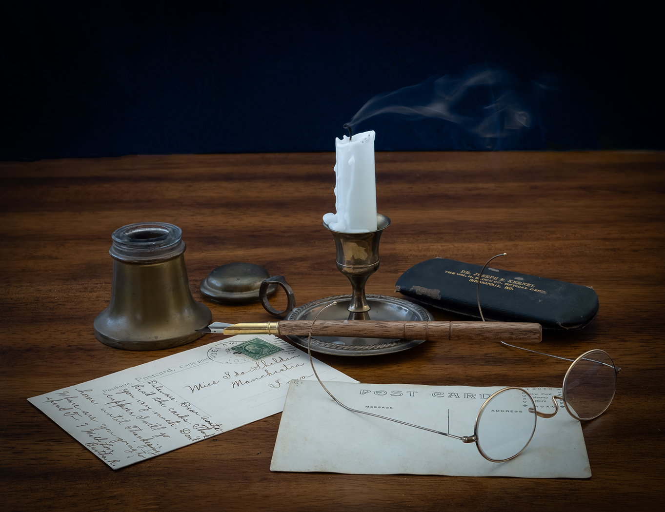
I was trying to create an image looking at it as if you were siting in a chair writing postcards which would have you look at it slightly down. Thanks for the PSA talk. Still life is not really my thing, but it is something to photograph when all the vegetation is dead and it is cold the get out. Thank goodness that the grass is getting green and the trees are starting to leaf out! |
Mar 13th |
| 7 |
Mar 24 |
Reply |
The whole smoke was probably another 1 foot high, which I think would have taken too much from the rest of the items. I have added an image with a lot less smoke, and it is all within the image. Do you like it better?
|
Mar 9th |
 |
6 comments - 4 replies for Group 7
|
| 32 |
Mar 24 |
Comment |
You captured them very well and your composition is good. Even though you had a nice sky in the color, I like the mono better. Thank you for volunteering, I am sure that it was appreciated. |
Mar 17th |
| 32 |
Mar 24 |
Comment |
I like the monochrome much better than the color. Your conversion to mono was very good. It looks like a lot of fun for all. |
Mar 17th |
| 32 |
Mar 24 |
Reply |
I didn't like it either, but I thought that I would just have to live with it. But after Stephen's comment I decided to try something, and didn't realize just how good Photoshop has gotten to remove items. I used Content-Aware Fill, and think that it did an excellent job including creating the edge of the gear. |
Mar 17th |
 |
| 32 |
Mar 24 |
Comment |
I am not a fan of ICM photography, so I am not the best person to be making comments about this image. I do think that the color image is much better than the mono, as the colors show more of what the image is and also add some interest. But it is fun to try different things, and if you like the image, then that is what really matters. |
Mar 16th |
3 comments - 1 reply for Group 32
|
| 57 |
Mar 24 |
Comment |
What a beautiful feather. I have never seen anything like it, as most are flat. You have great depth of field, and it is very sharp. I like the colors and the reflection that is black. It creates and interesting contrast. Your editing really improved the image. And thanks for sharing the story about the chicken. |
Mar 27th |
| 57 |
Mar 24 |
Comment |
It looks like both you and Bob were playing with water droplets. You have created a very striking image that is improved a lot by bringing out the orange color in you editing. I like the closer crop. All of the angles created by the fish line is contrasted by the round water drops. Very well done. |
Mar 13th |
| 57 |
Mar 24 |
Comment |
The nose and whiskers are very sharp and the rest of the face is sharp enough to show us that it is a goat. Having his nose and mouth through the fence is great, and the slight bend in the fence above his nose helps the image. I first thought that if the goat was straight on so that both the eyes were in the frame would be better, but after looking some more, the slight angle is better. |
Mar 13th |
| 57 |
Mar 24 |
Comment |
The image is very sharp from edge to edge. You have a nice selection of US and foreign stamps that adds to the interest. The placement, the size and the color help make the special delivery stamp the center of interest. The Army and Navy stamp does draw my eye because of its bright color. I toned it down in Photoshop. |
Mar 10th |
 |
| 57 |
Mar 24 |
Comment |
You created a fun experiment and and interesting photo. I like the different sizes and various lengths of the drops. The background colors are colors of the spring season. The longest drop looks a bit unsharp. Maybe because it was moving. A suggestion for your next try would be to have the spring at a slight angle to add even more interest. Overall, very well done. |
Mar 10th |
5 comments - 0 replies for Group 57
|
14 comments - 5 replies Total
|