|
| Group |
Round |
C/R |
Comment |
Date |
Image |
| 7 |
Feb 24 |
Reply |
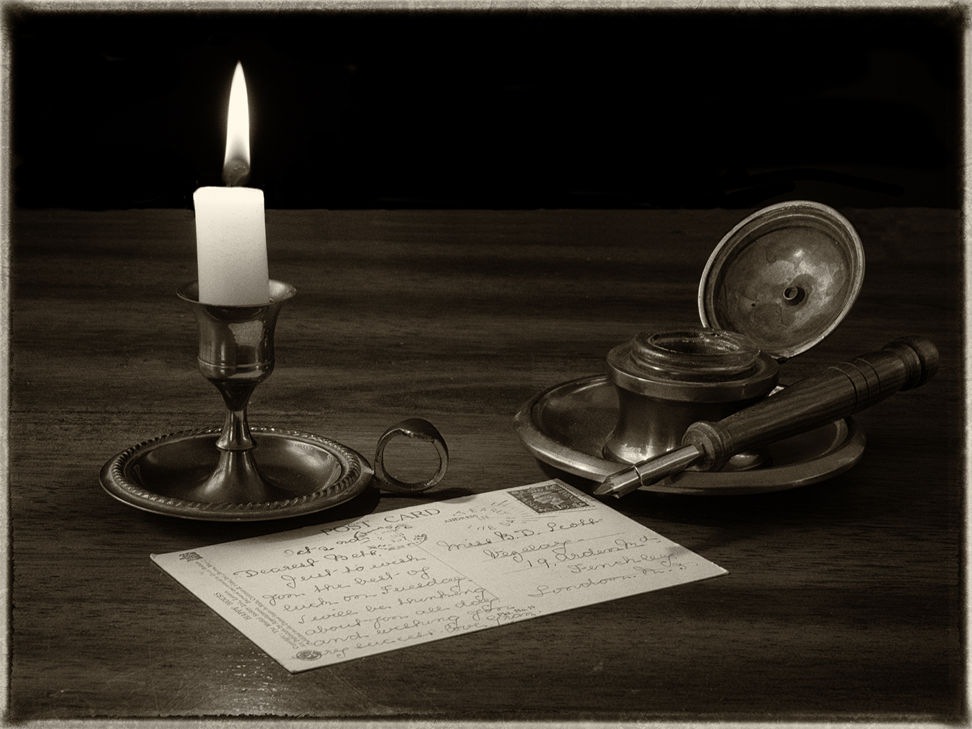
Good idea about the pen on the post card, but then the card would need to be partly written.
Thanks to everyone for your comments. I am trying to learn new types of photography and new methods. |
Feb 27th |
| 7 |
Feb 24 |
Reply |
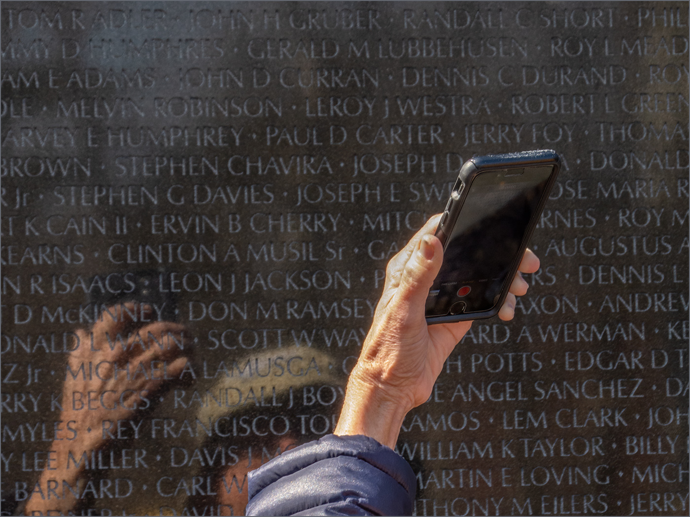
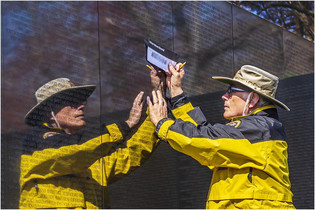
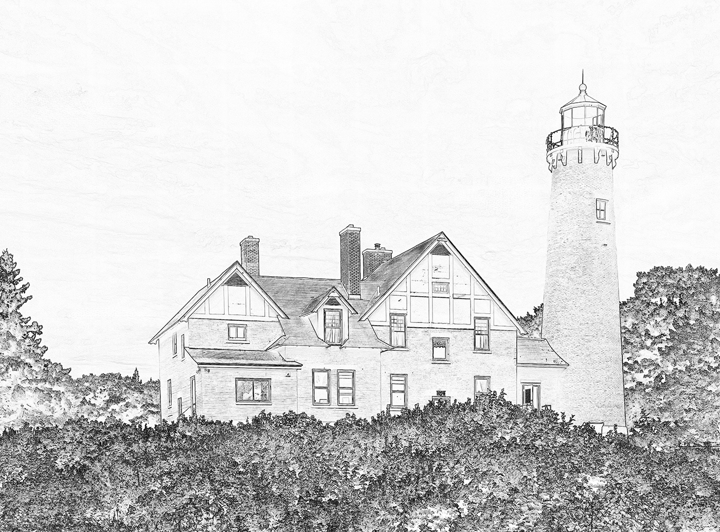
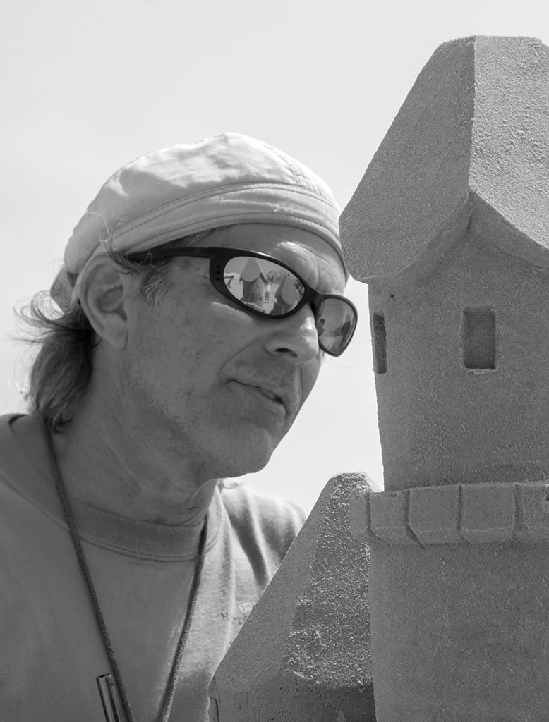
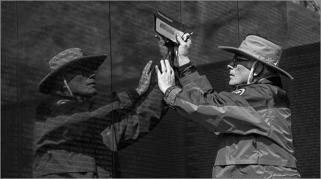
Barbara, the subject is a man standing in front of painting on a wall. |
Feb 24th |
| 7 |
Feb 24 |
Comment |
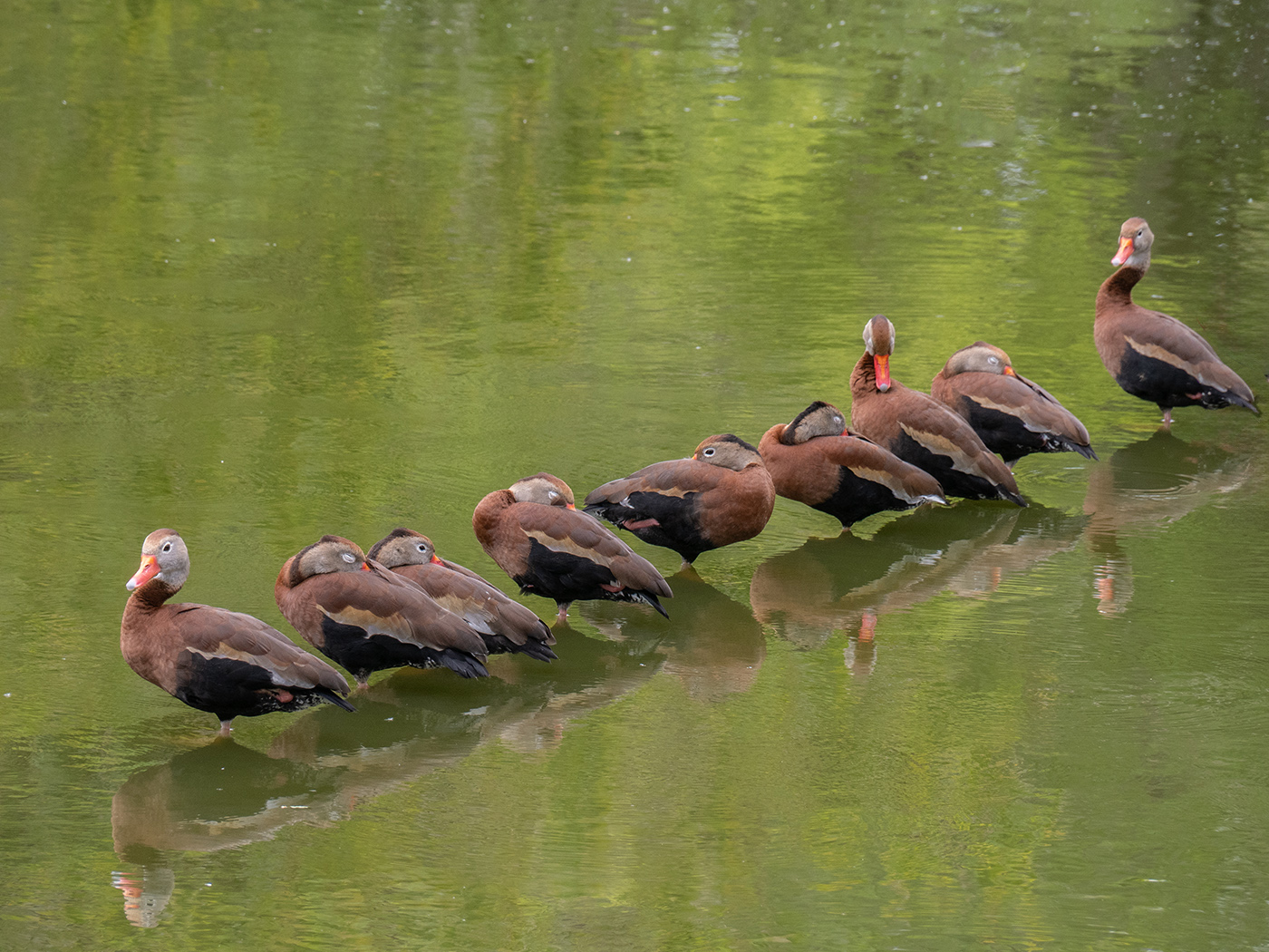
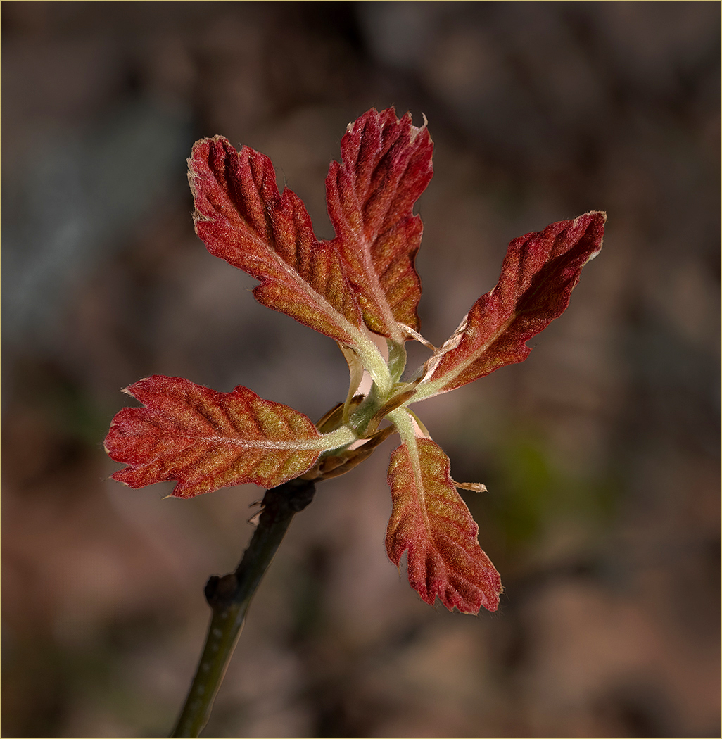
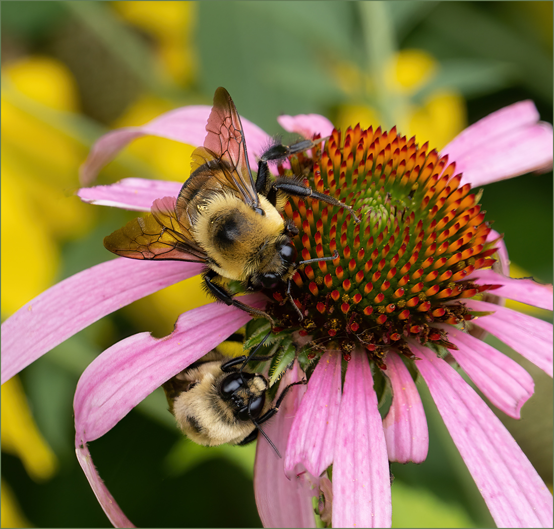
This must be a very small house plant to have the pods so large in the image. I like the very green plant against the rest of the image that is brown or grey. I think that the lower angle and looking up at the plant makes the viewer think that it is a larger plant. Then the small pods are a dichotomy or contraction to the plant size which has the viewer wondering about what is going on. To me, this tension adds to the image. I can see why Judith cropped, but I think that the extra space is needed, and also centers the plant. The out of focus area is not too distracting but could have been solved by putting the pod at more of an angle. |
Feb 11th |
| 7 |
Feb 24 |
Comment |
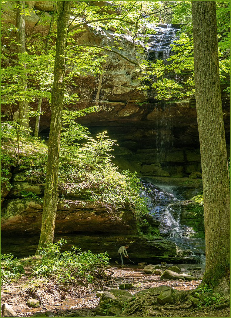
Very vivid greens against the brown water. Perfect shutter speed to smooth the water without overdoing it. I like the greens that you have around the water and that it is sharp even with a slower shutter speed. I like Judith's crop to get rid of distraction item. |
Feb 11th |
| 7 |
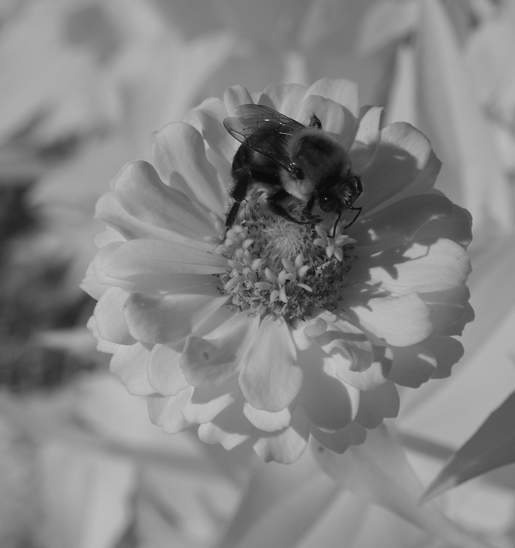
Feb 24 |
Comment |
I like the first image better, because I know how hard it can be to capture a flying bird flying straight toward you, and the background is very blurred. The bird is very sharp and I like that the head is pointed to the side. But looking at Judith's comments, I can see what she is saying about the edges. I am sure that it is the lighting, and the tail does seem a bit odd looking. I don't think that you need to see any blur in the bird, as it has movement from flying.
As to the second image, you did capture the water splashing up from the bird landing and the wings still up -- perfect timing on the shot. The second bird being there really add to the shot. I do like Judith's correction, and think that it would be permitted in nature as you are color correcting the entire image. That being said, I have not competed in salons for several years and have not kept up with the changing rules.
|
Feb 11th |
| 7 |
Feb 24 |
Comment |
You captured a nice image of the three sparrows. I like that they are all looking in different directions. The reflections are nice. I would crop off some on the top, just below the darker area. Like Hoshedar said, going to their level really helps the image. |
Feb 11th |
| 7 |
Feb 24 |
Comment |
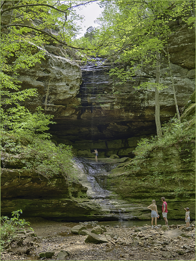
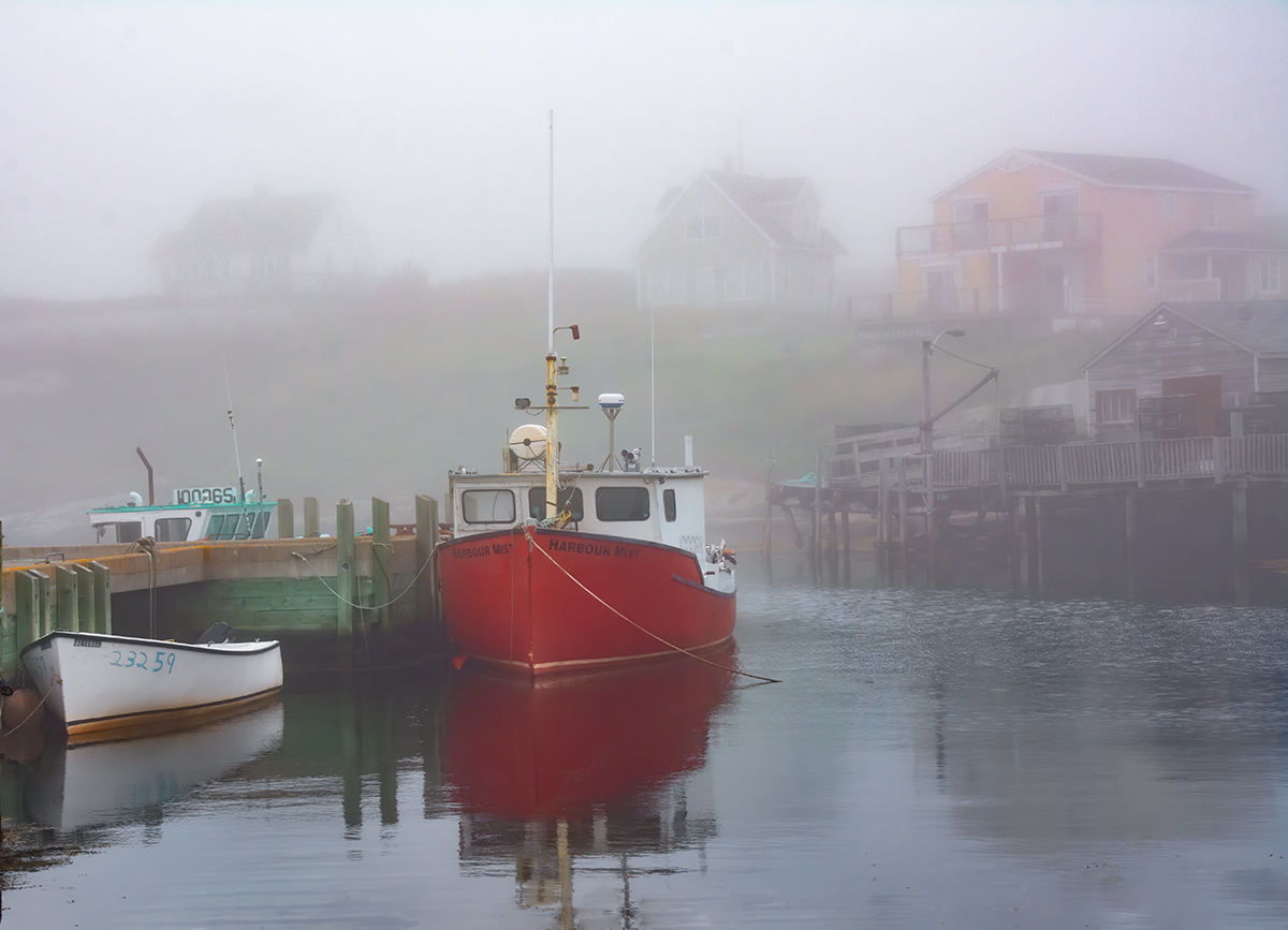
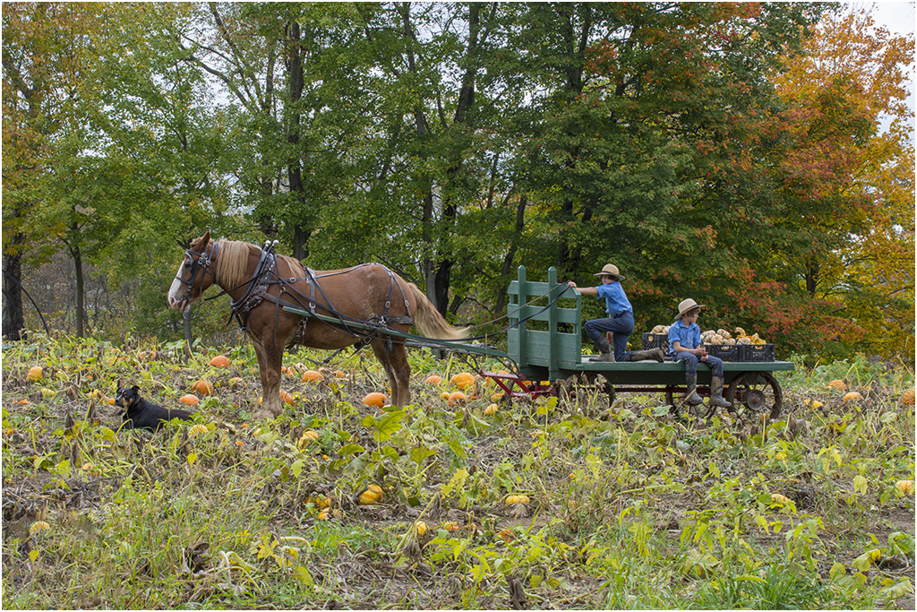
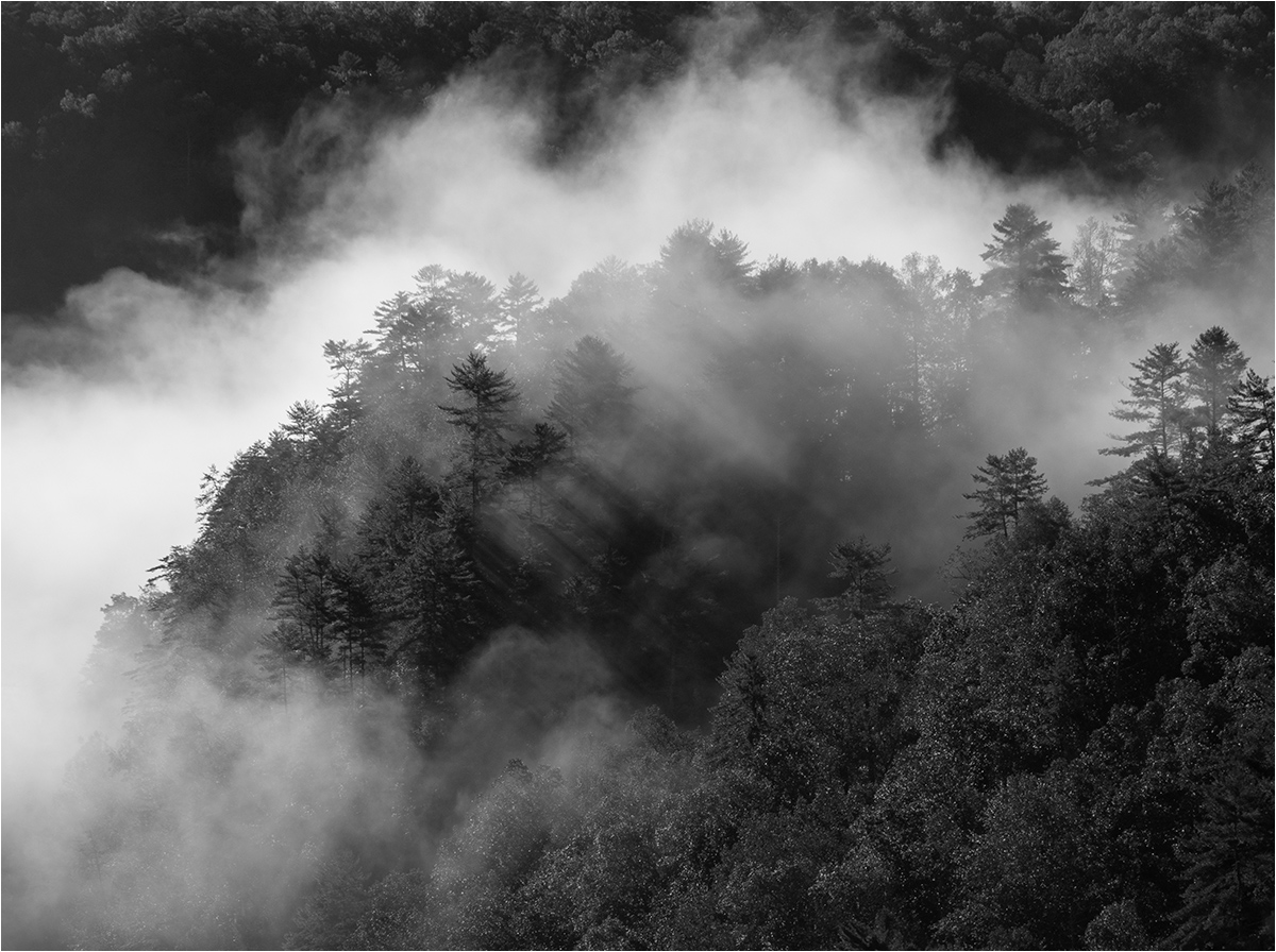
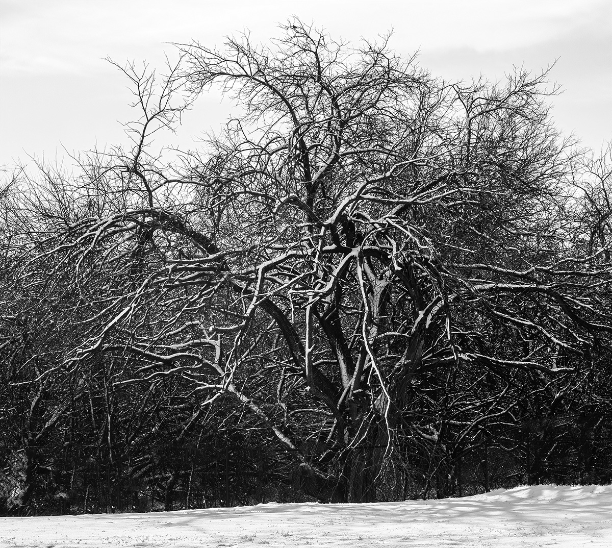
I like the image with the two photographers in the foreground and the low hanging fog below the mountains. There are enough clouds to help the sky and the clouds point in toward the center mountain which draws the eye to the center. I would crop off the tree on the right, I don't think that it adds to the image, and the trees on the right side are all leaning into the center which to me is a distraction. This must have been a great trip and you got several good images. |
Feb 11th |
| 7 |
Feb 24 |
Comment |
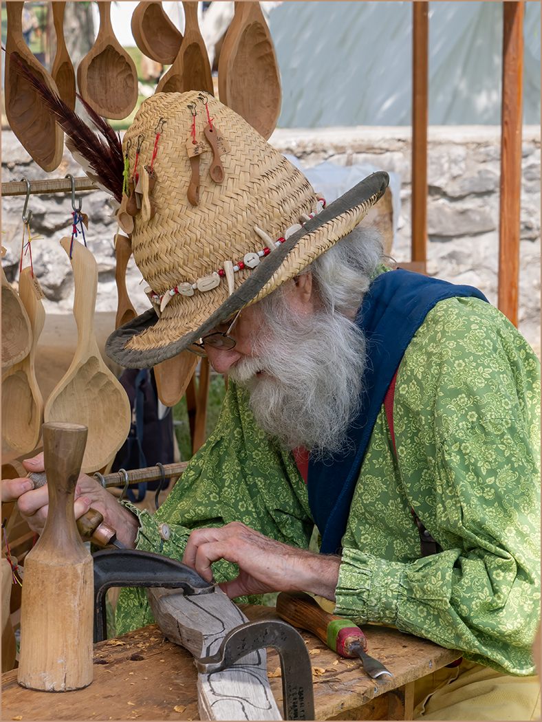
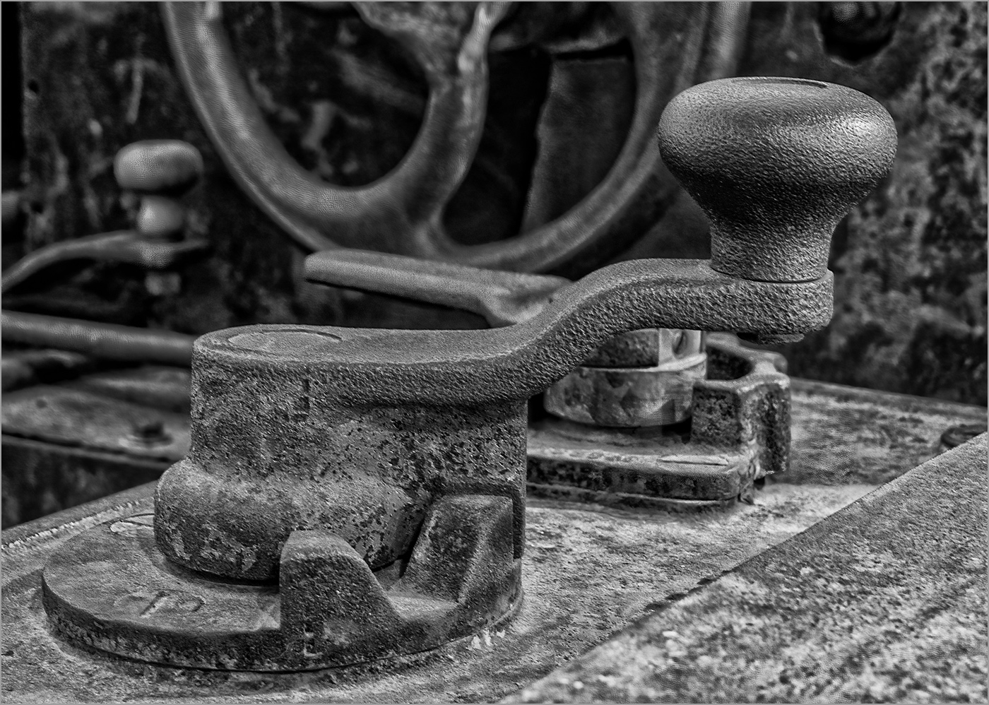
First, from a crop at a high ISO, I am not seeing any noise. Yes, he appears to be amused, and this adds to the mystery in the image. I am not bothered by the shadows on his head, and I thing that the mixed lighting and shadows add to the image. I like the crop. |
Feb 11th |
| 7 |
Feb 24 |
Reply |
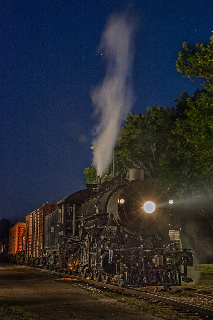
Thanks for the suggestions. I will try again. I used the Live Composite on my Olympus camera which I don't quite understand yet. So the exposure was longer than 10 seconds, but only the added light is recorded. |
Feb 5th |
| 7 |
Feb 24 |
Reply |
Thanks for your comments and suggestions. I am learning about light painting and need all of the help that I can get. |
Feb 1st |
6 comments - 4 replies for Group 7
|
| 32 |
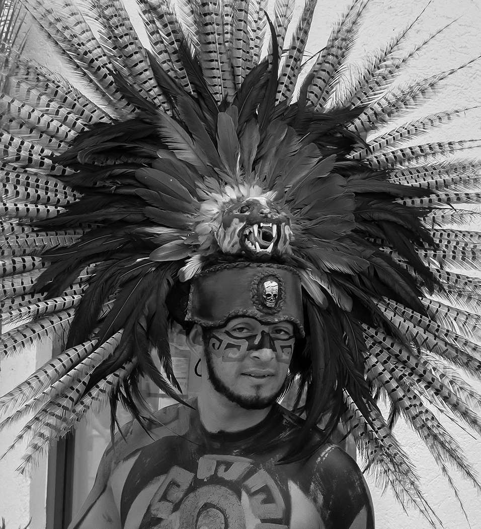
Feb 24 |
Reply |
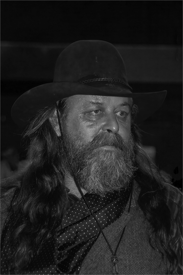
He had been looking at his cell phone. You can see it in his hand in the color image. I was not happy with his expression either, but thing that the headdress makes a good mono image. |
Feb 27th |
| 32 |
Feb 24 |
Reply |
I could get rid of the bottom part of the frame, but the part behind the feathers would be very difficult. |
Feb 17th |
| 32 |
Feb 24 |
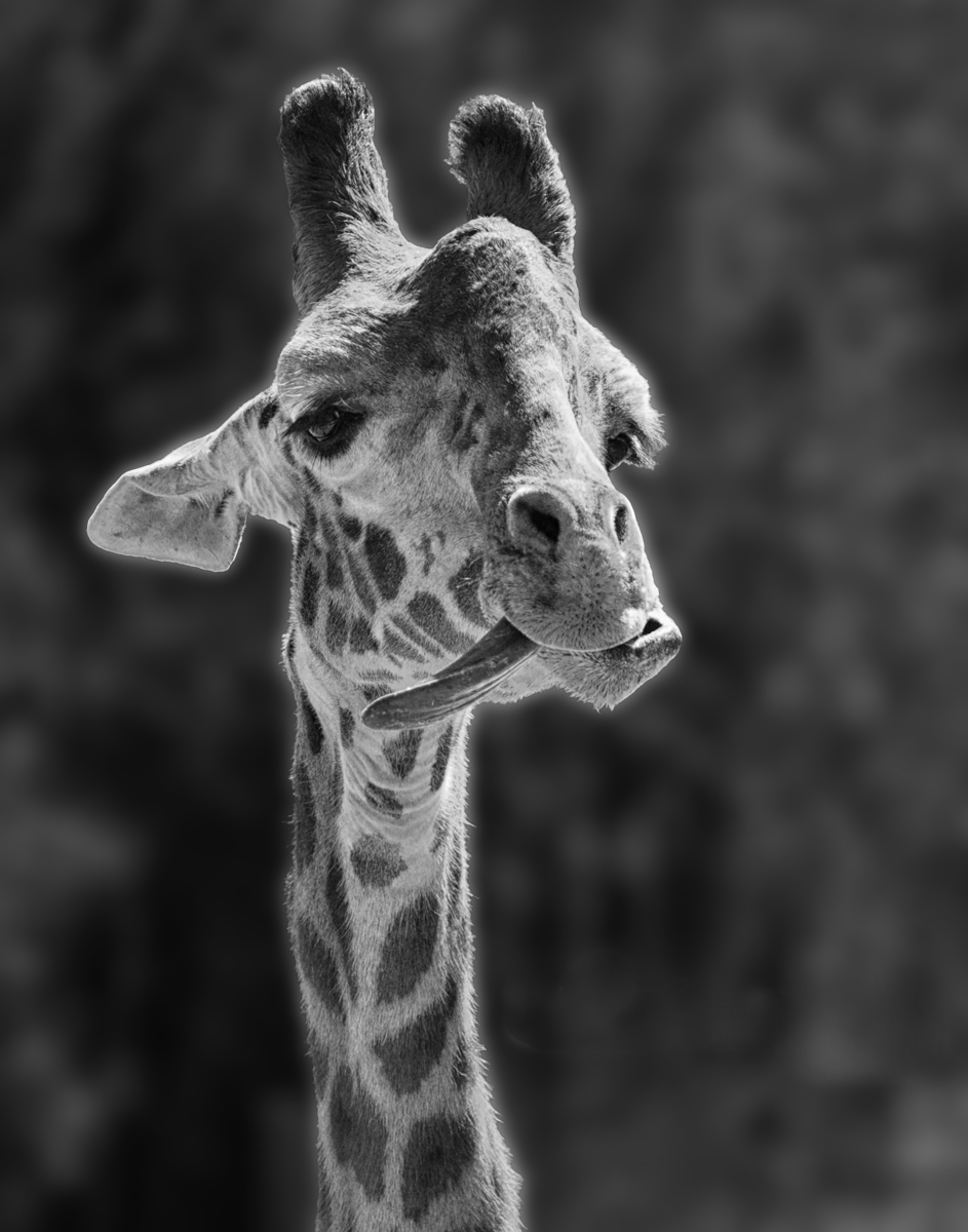
Comment |
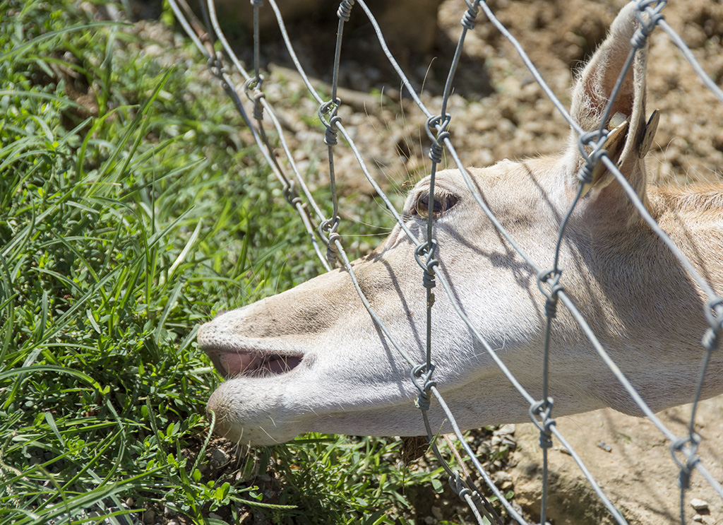
Nice capture with the long tongue. The background is a distraction. I would not go with total black. I did darken the background using sliders because of the color difference between the giraffe and the background. |
Feb 17th |
 |
| 32 |
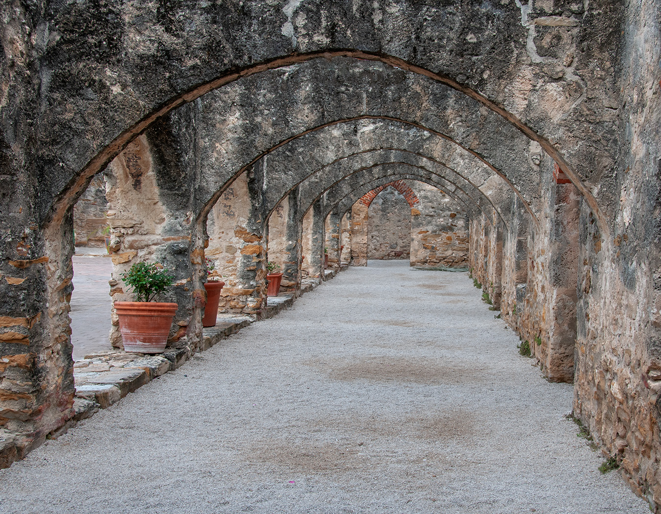
Feb 24 |
Comment |
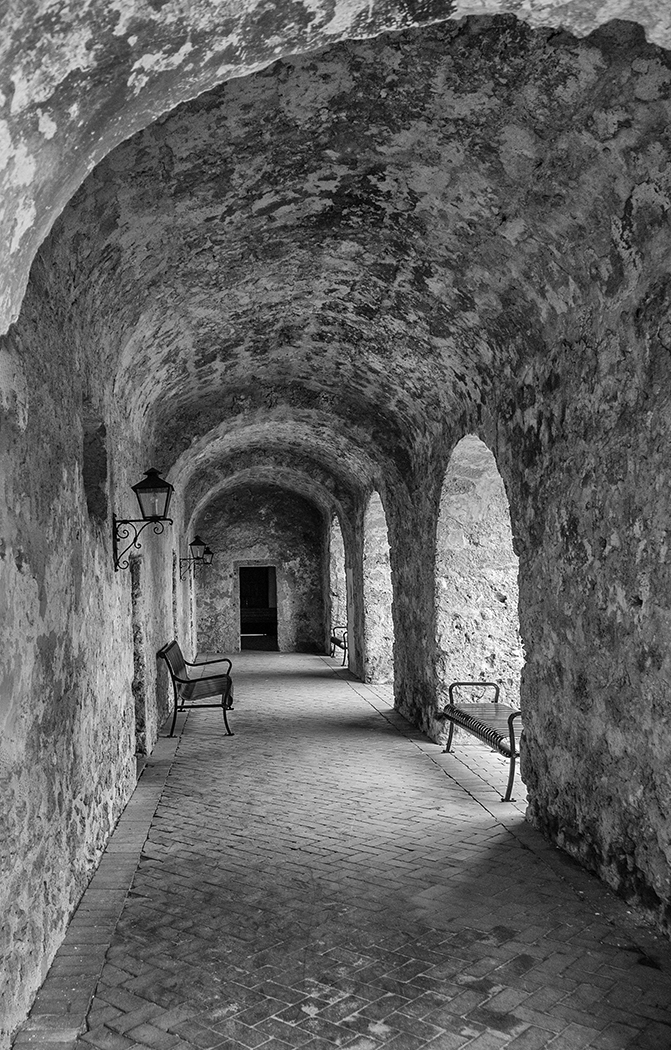
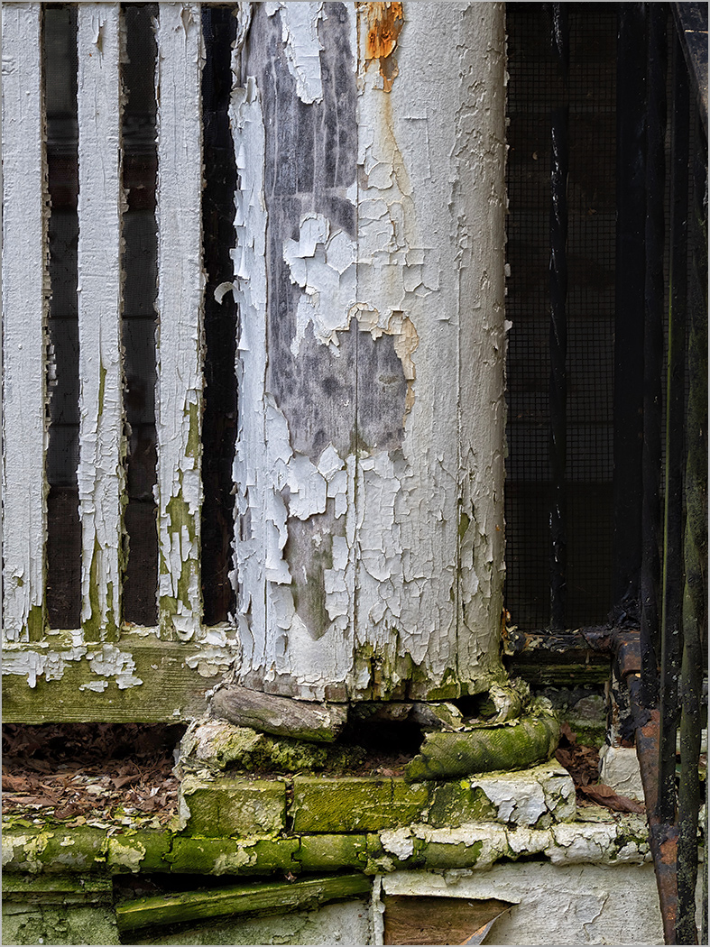
Great choice to go with monochrome. I like the grittiness of it and the reflections at the bottom. It is sharp from front to back. A small suggestion. I would crop off the small light areas in the far right to make the column a stopping point. |
Feb 17th |
| 32 |
Feb 24 |
Comment |
Great motion and lots of action from the splashing water. It looks like what you did in your editing accomplished what you wanted, the salmon does stand out more. It would make a great print. However, I like the color more, and the salmon does stand out because of it color. I would crop off the out of focus area at the bottom. Just for fun, I did a quick object selection in Photoshop and used the filter of "Wildlife Fur" in NIK color efex to add more texture to just the bear. |
Feb 17th |
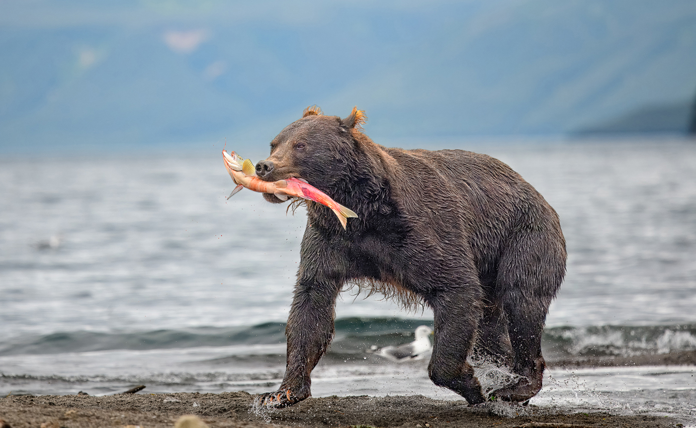 |
| 32 |
Feb 24 |
Comment |
I like the 5, and I like that there are 3 higher and 2 lower that kind of makes a pattern. They all look very sharp, and you stopped the motion so don't worry about the IS0. I think that the clouds below are good as they show that the birds are up high. And I would not crop in anymore as the space around the birds gives them space to move. |
Feb 17th |
| 32 |
Feb 24 |
Comment |
You captured the sign very well, and your crop and conversion is very good. Going to mono was a great choice. I like the angle of the sign. I would not change a thing. |
Feb 17th |
| 32 |
Feb 24 |
Comment |
It looks very good to me as you have cropped it. He is very sharp and the water on his whiskers shows that he just came out of the water. I have never been able to get a photo of otters because it seems that they have always been in the water when I have seen them is zoos. So for both you and Somdutt to have captured one so well is very good. |
Feb 17th |
6 comments - 2 replies for Group 32
|
| 57 |
Feb 24 |
Reply |
Thanks to all of you for your comments. |
Feb 29th |
| 57 |
Feb 24 |
Reply |
Thanks, good idea. |
Feb 27th |
| 57 |
Feb 24 |
Comment |
You have a lovely subject to photograph. I think that the orchid is a bit out of focus. Looking at the leaf in the lower left, it appears that the sharpest part is behind the orchid, and also that you have a very shallow depth of field. I can understand using f2.8 to throw the background out of focus, but that may not have enough depth to capture all of an orchid. It looks like you have other flowers to photograph, maybe one with a better background. I do like what Cindy did with the image, and also your tighter cropped image. |
Feb 24th |
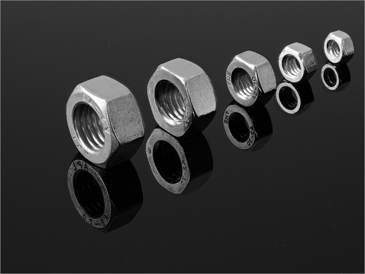
| 57 |
Feb 24 |
Comment |
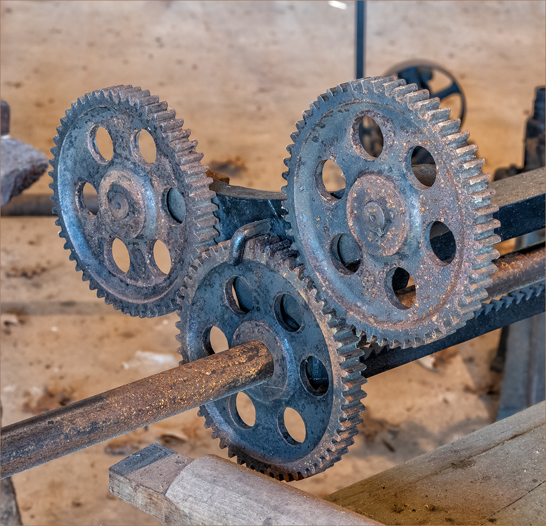
The image is very sharp, and I like all of the watch parts including the gears of one. It does not bother me that part of the other watches were cut off. I am thinking that the glass face on the main watch maybe makes the face not look as sharp as it other wise would. The angles of the watches are good. I differ with the above members, but I think the the background is a distraction and should at least be toned down. |
Feb 23rd |
| 57 |
Feb 24 |
Comment |
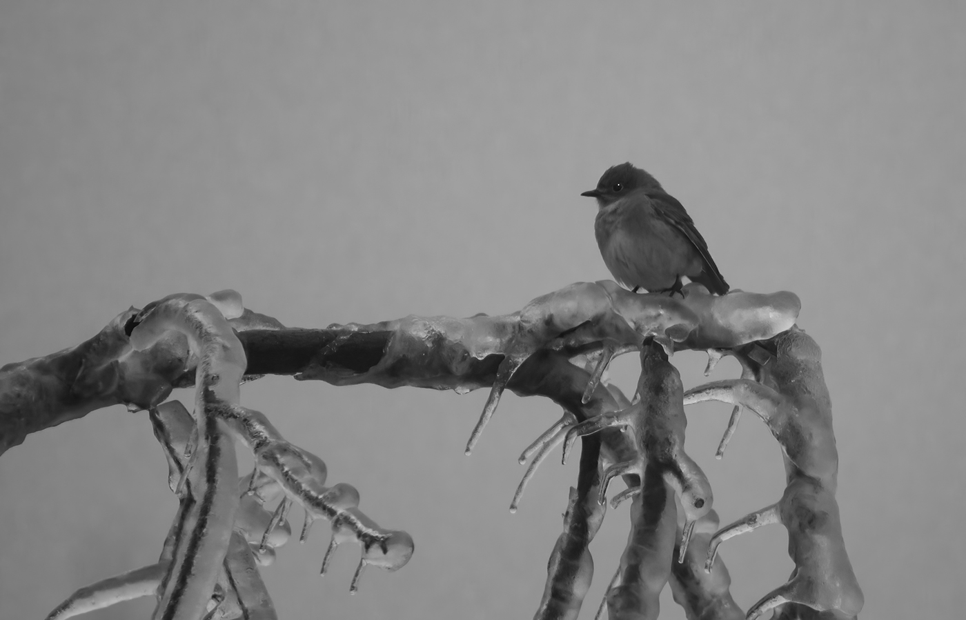
Your editing improved the image. I can not see any noise from the high ISO and you should not worry about not capturing the foot. The sharp feathers really help the image. I would crop some off the left and get rid of the large white spot above the tail. |
Feb 23rd |
| 57 |
Feb 24 |
Comment |
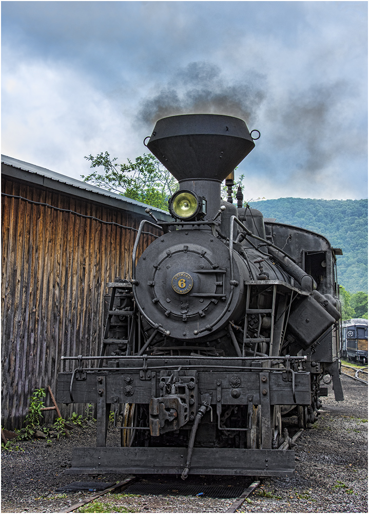
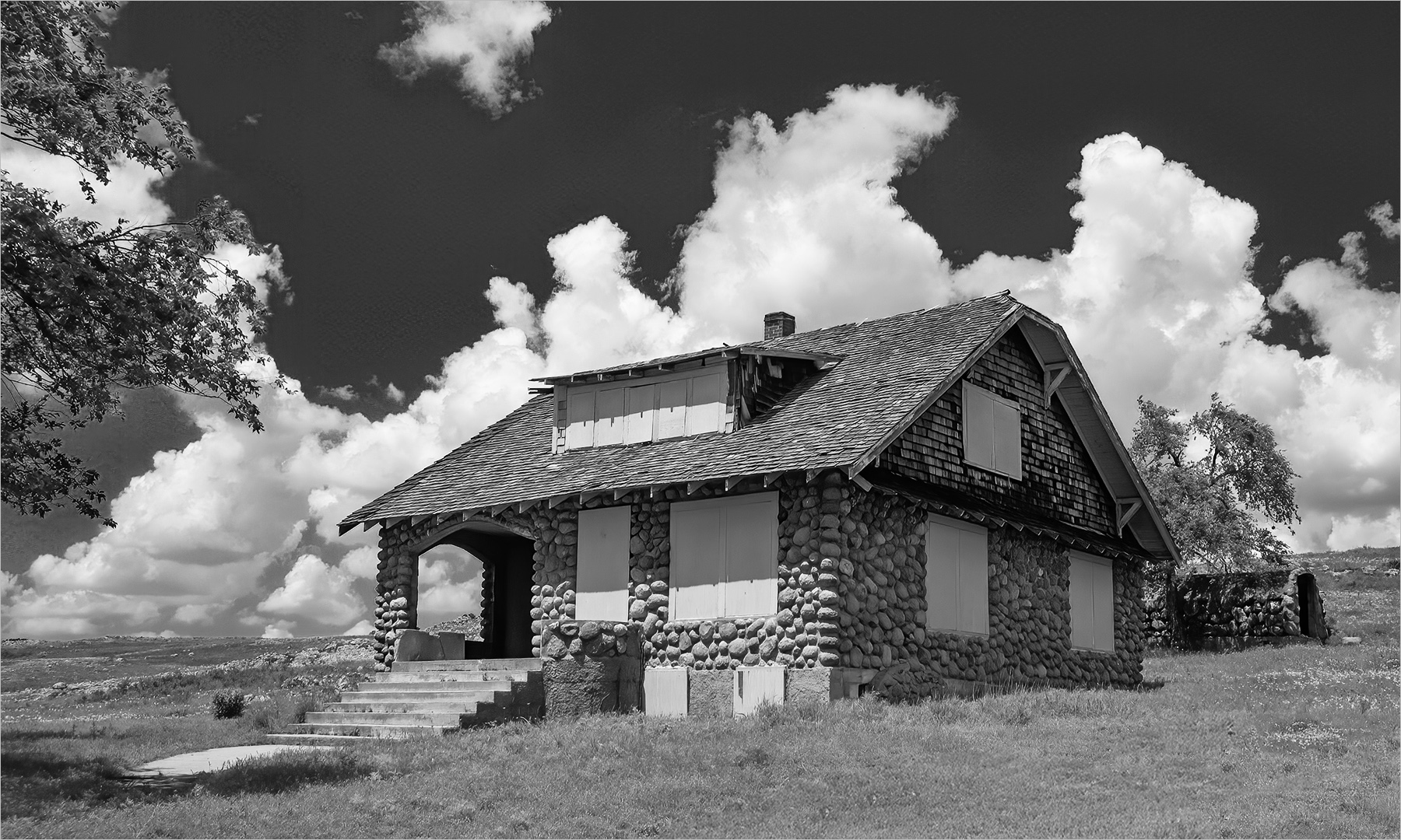
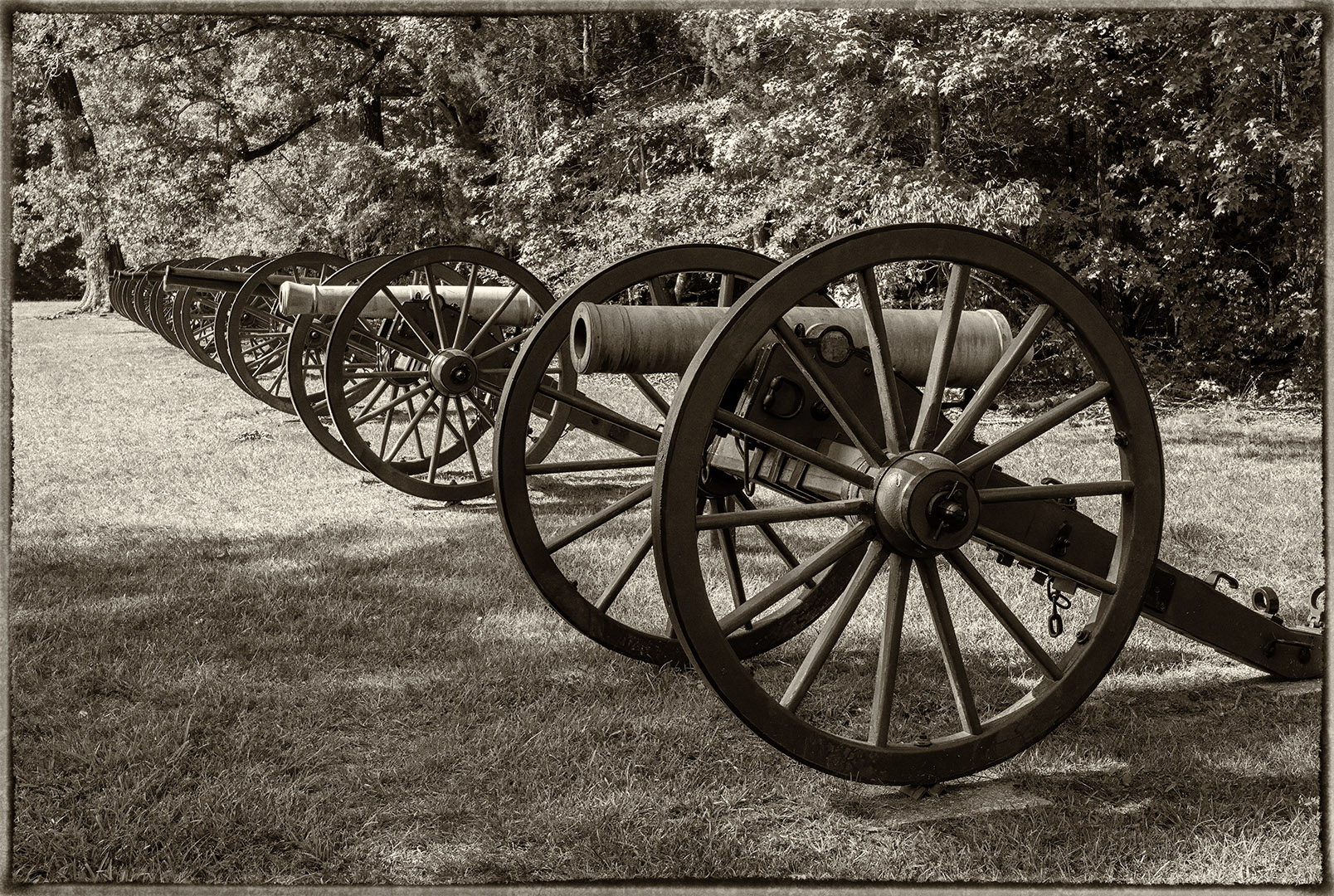
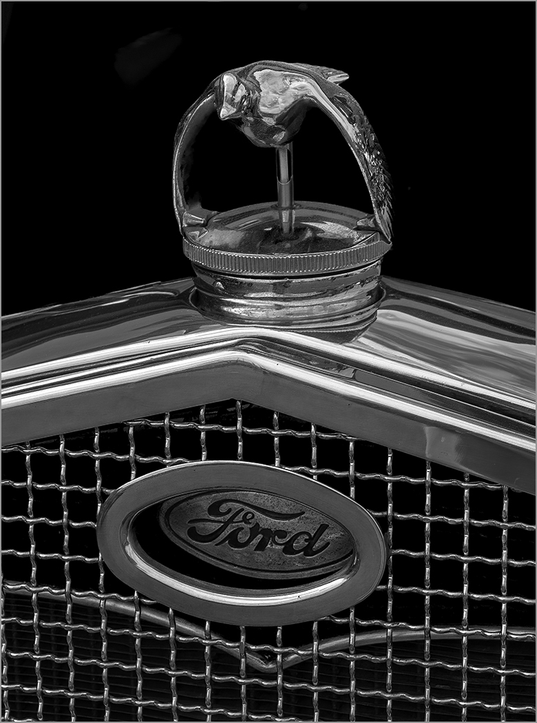
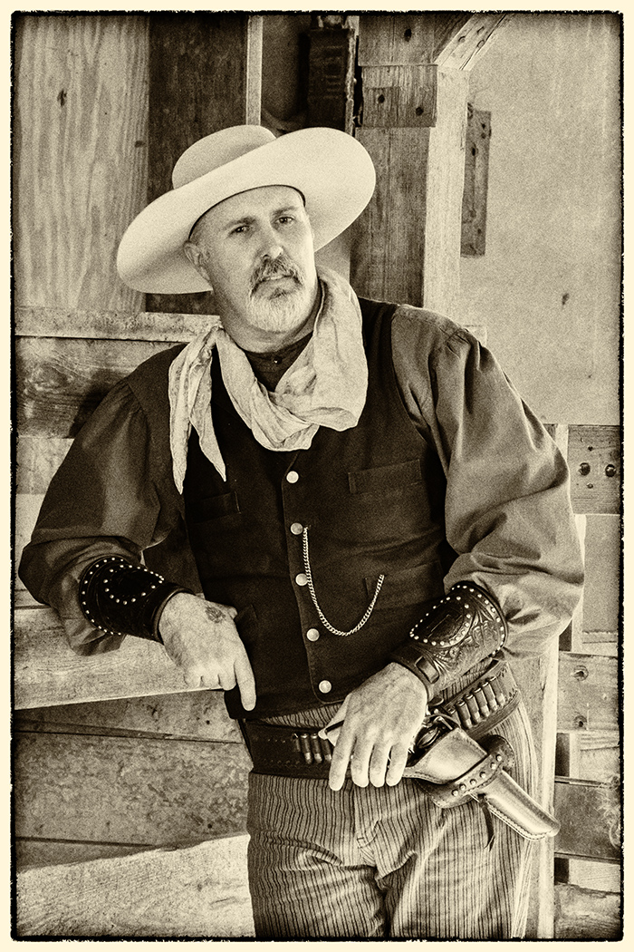
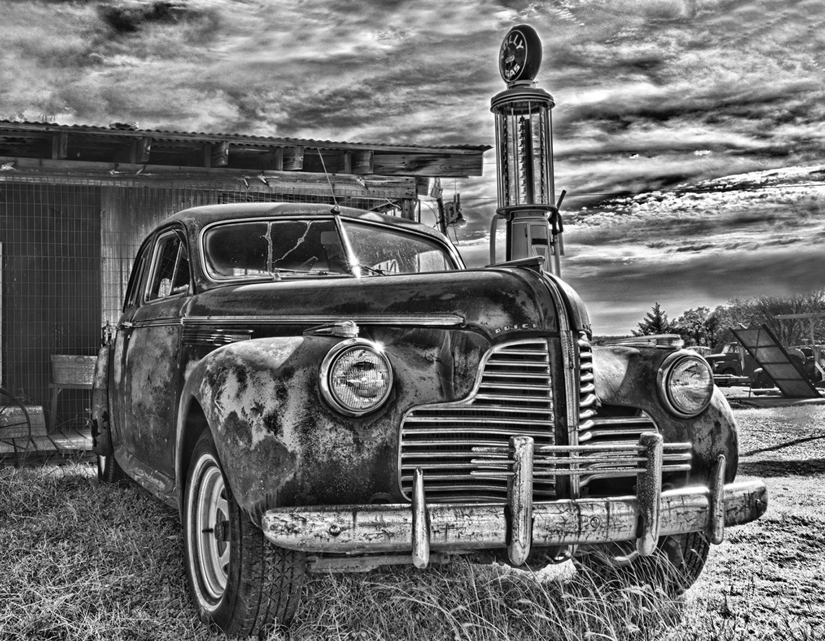
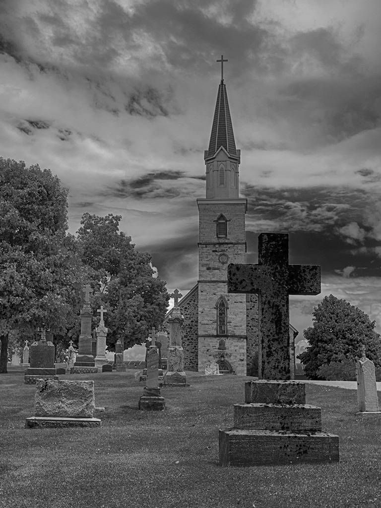
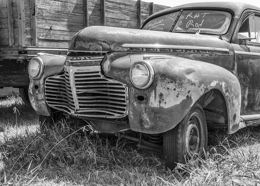
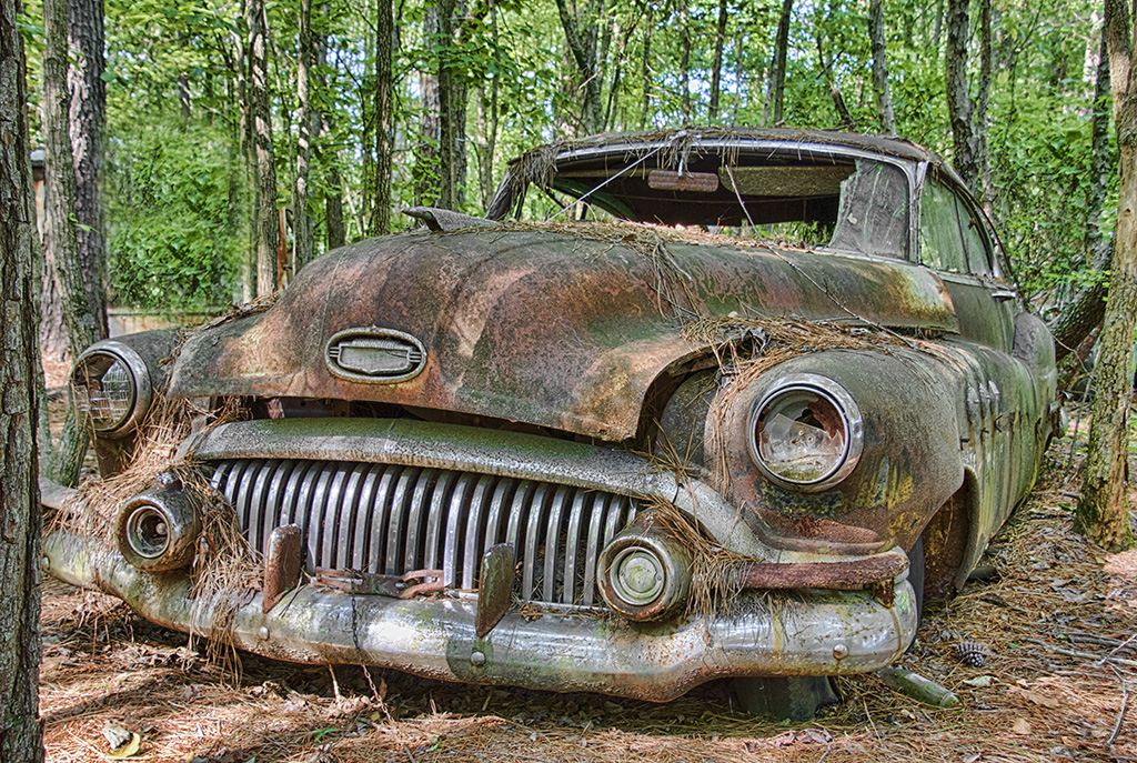
The crop, the angle, the sharpness and depth of field are all very good. I am glad that you noticed this and stopped to take a photo on what must have been a cold day. Without knowing what the color of the car was, it looks very good in mono. I would not change a thing. |
Feb 23rd |
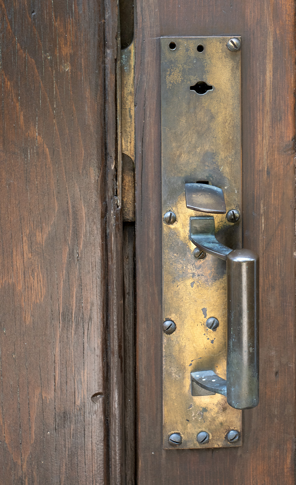
| 57 |
Feb 24 |
Comment |
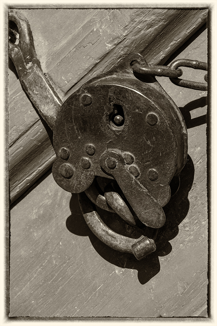
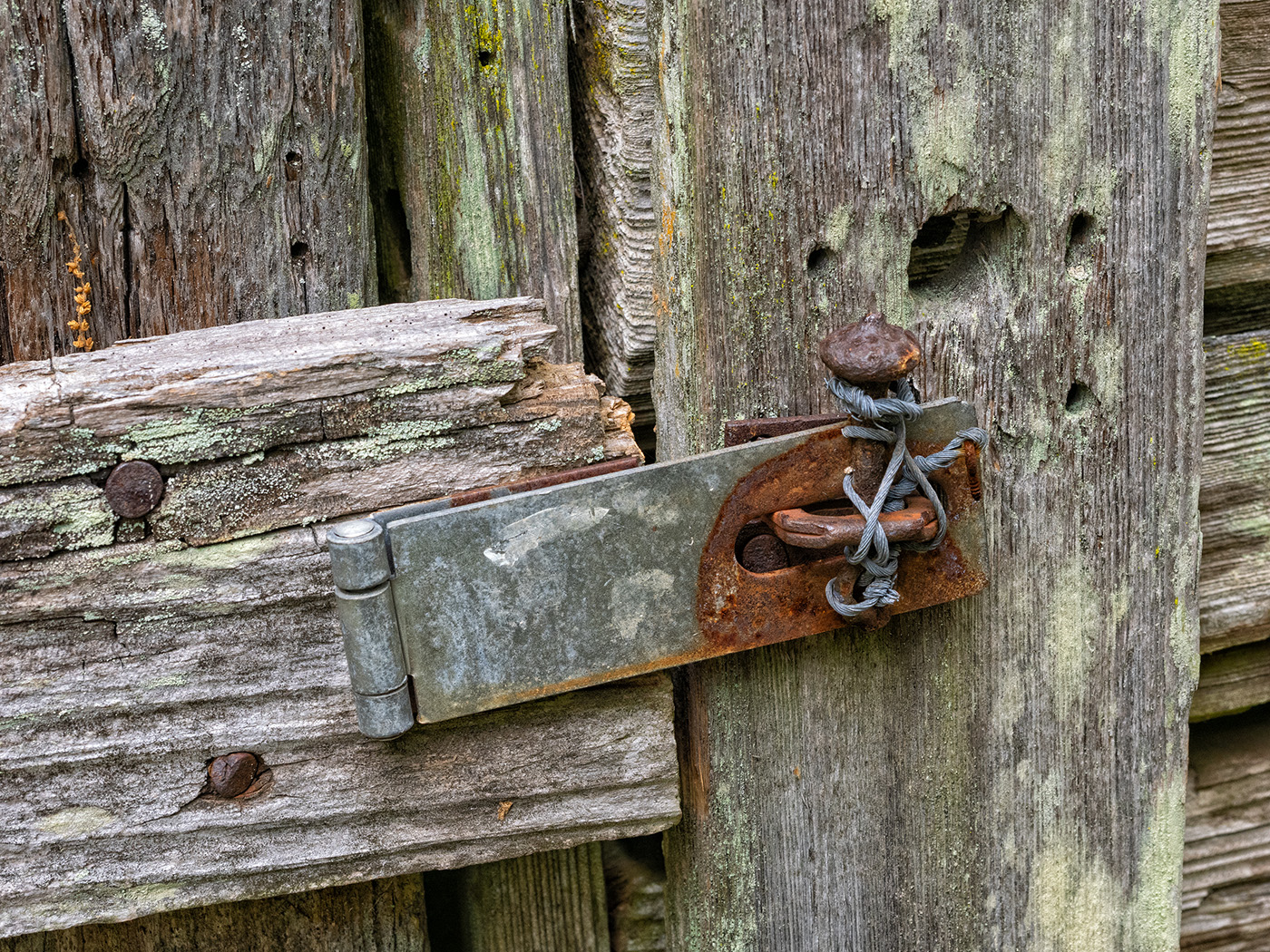
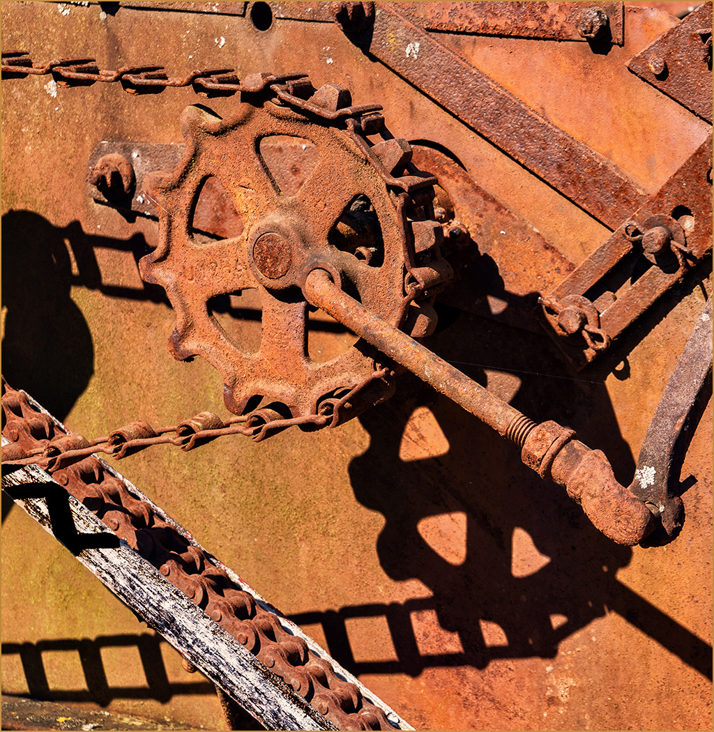
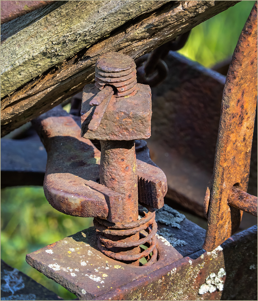
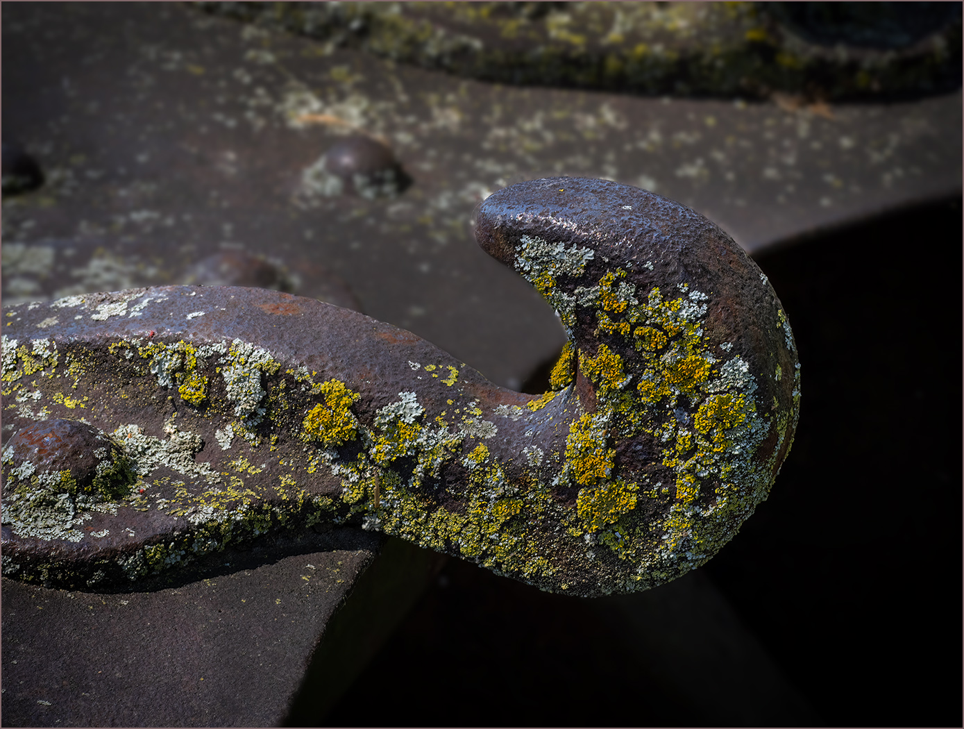
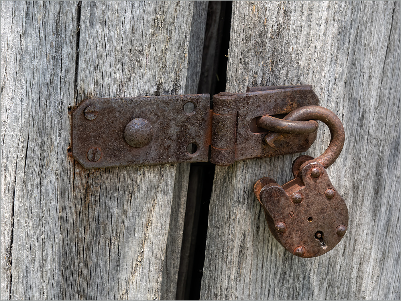
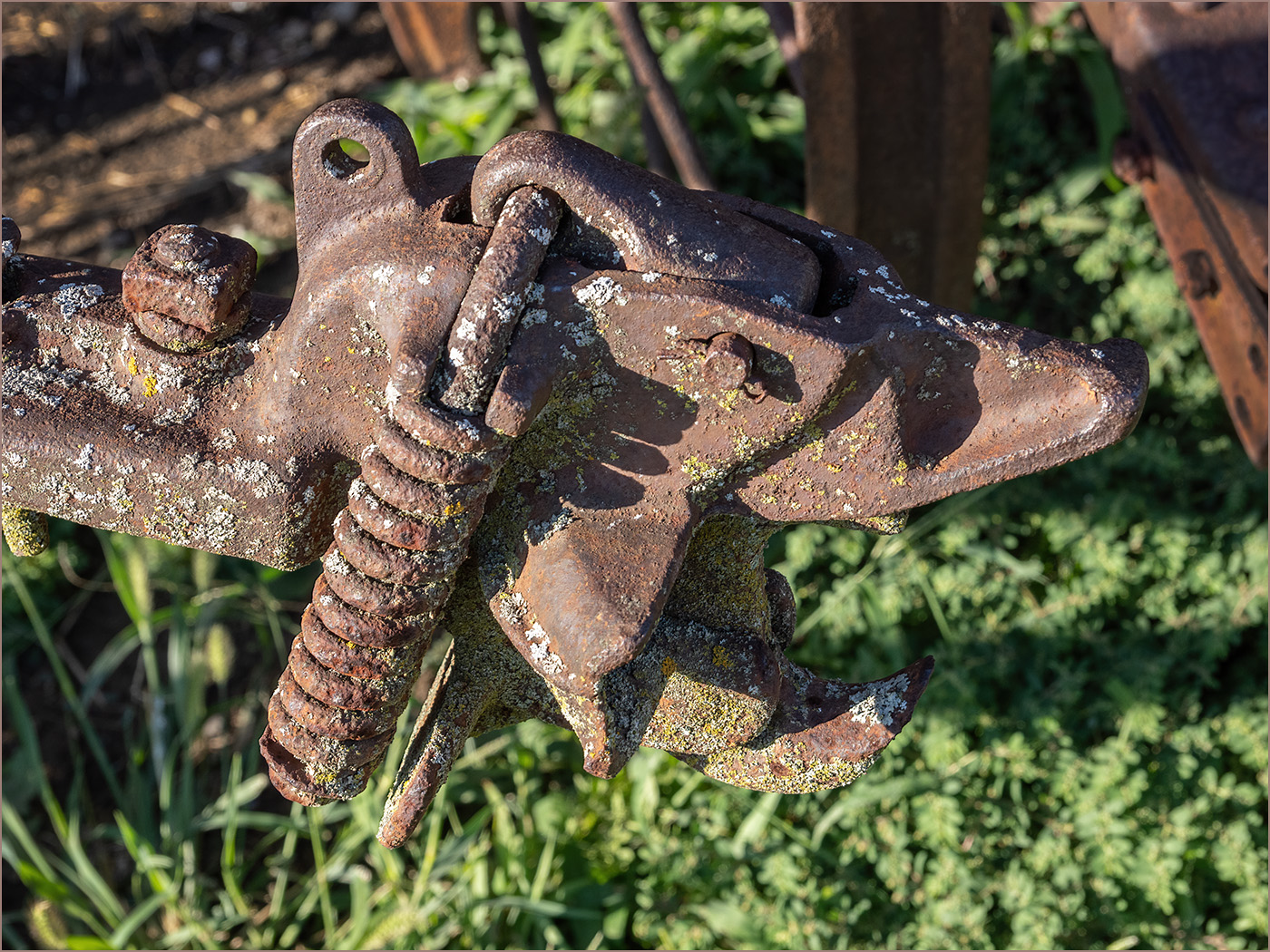
Yes, you do seem to like locks. It is interesting that there are two locks in this image. That creates a bit of a mystery, wondering why the lock and chain was needed -- maybe the lock in the box isn't working? I like the angle, the sharpness and the great depth of field. I think the the blue helps the image, it keeps the eye bouncing around the image seeing more things than just the lock on the box that first draws the eye. |
Feb 23rd |
| 57 |
Feb 24 |
Comment |
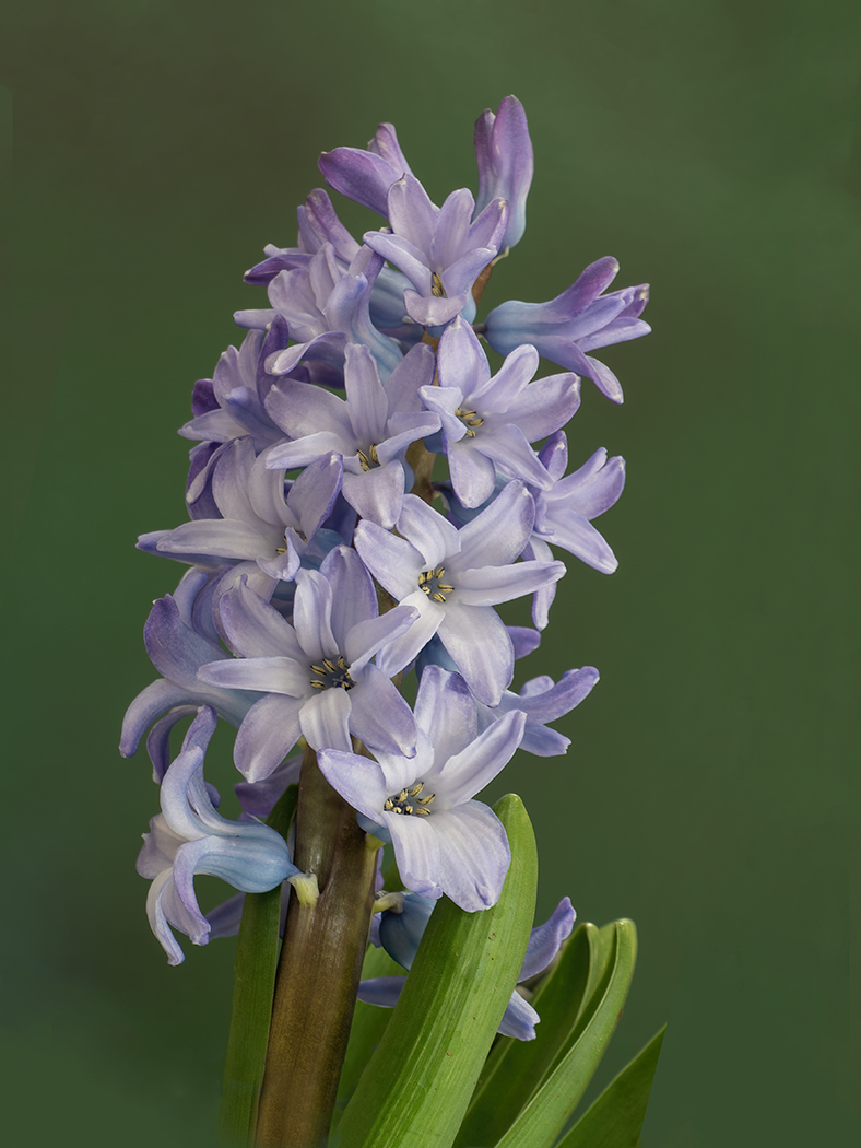
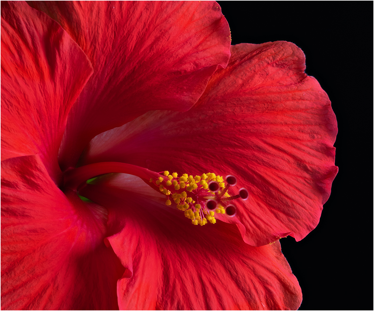
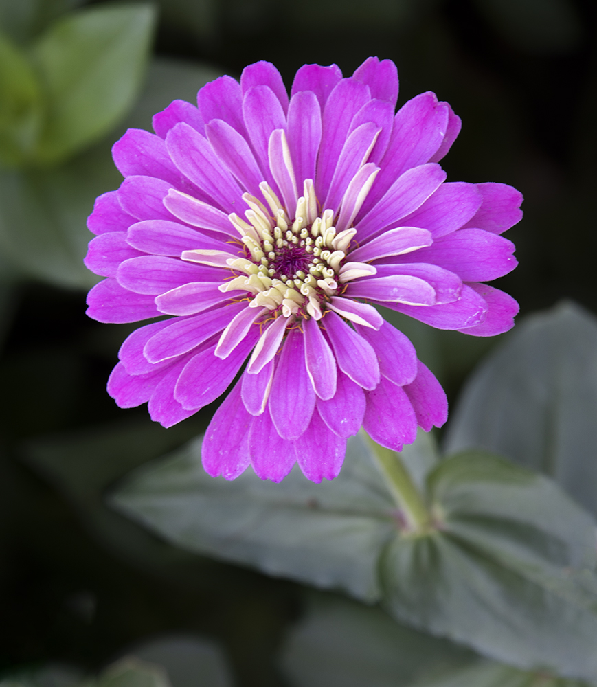
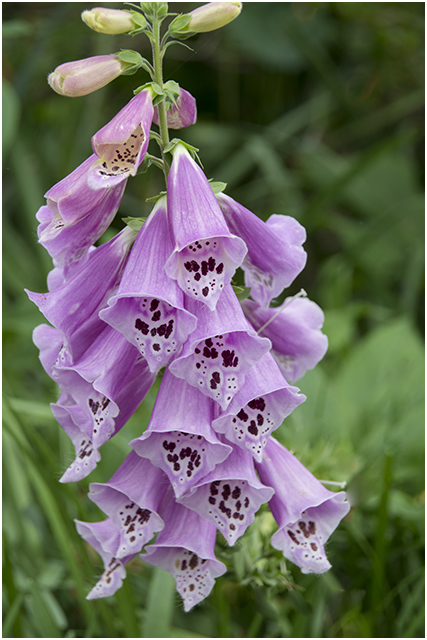
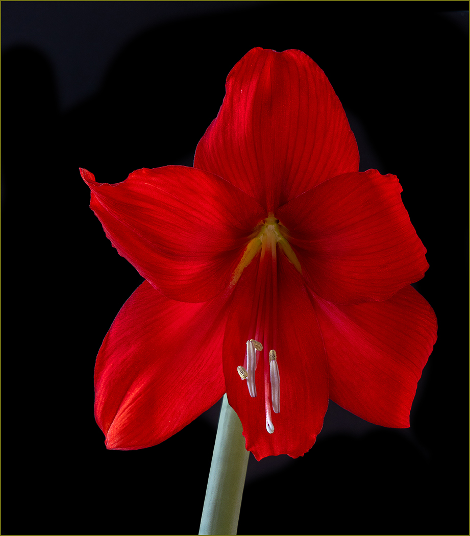
Good title for this very red flower. The extreme closeup of the flower is very sharp. I like the slight tilt to the flower. As Cindy suggested, you should darken the upper left green in the corner. |
Feb 23rd |
6 comments - 2 replies for Group 57
|
18 comments - 8 replies Total
|