|
| Group |
Round |
C/R |
Comment |
Date |
Image |
| 7 |
Jan 24 |
Reply |
Better late than never with your comments. Really sorry to here about all your problems. Losing a dog is hard. Thank you for your comments. |
Jan 26th |
| 7 |
Jan 24 |
Comment |
I have tried panning, and you will never get the subject to be perfectly sharp or without some movement. It looks like he was not pedaling or there would be more movement as seen by the spokes. Think about it, you are staying on the subject as he moves. You have to use a slow shutter speed to get the panning effect. To have a perfectly still subject you would have to take a panning shot of the background and then add a still subject, which would not look real. |
Jan 23rd |
| 7 |
Jan 24 |
Comment |
Thank you everyone for your comments and suggestions. I think that my favorite is the image from Rich. |
Jan 22nd |
| 7 |
Jan 24 |
Comment |
An interesting effect with the wide angle having the 2 boats leaning toward each other. It does have an element of mystery. The clouds in the center have a strange look to them, and to me, distracts from the image. I think that Judith went a bit too bright. |
Jan 11th |
| 7 |
Jan 24 |
Comment |
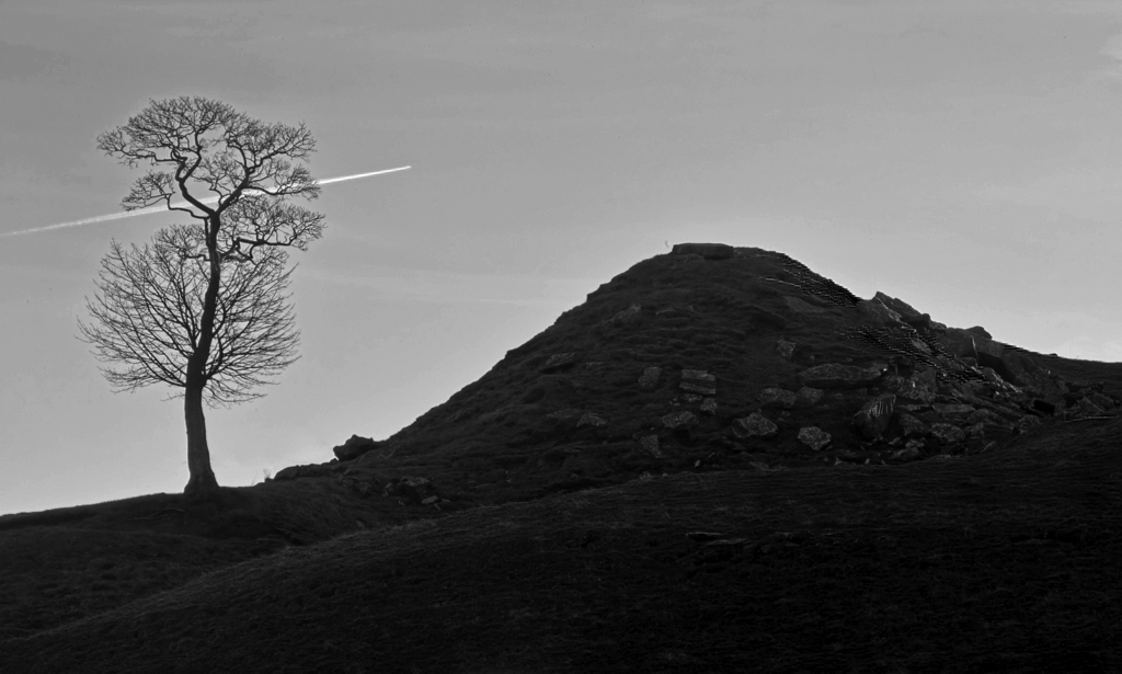
I like the idea and the composition with the trail, the tree and the hill. I agree that mono would be a better way to go. However, I think that Judith has too much contrast, and pretty much loses rise in the foreground. I tried something a bit different. |
Jan 11th |
 |
| 7 |
Jan 24 |
Comment |
I think that you did a very good job. The background is very simple but also horizontally blurred. The rider has his head up and is looking into the space that you left for him to ride into. His looking into that space adds interest as it makes us think about what is there. To me, it does not look like you did any photoshop work on the image -- the rider has a slight up and down movement. At 1/20th of a second (a slow speed was required to get the zoom), the rider as not perfectly still. |
Jan 11th |
| 7 |
Jan 24 |
Comment |
Very creative with great pastel colors. As Paul said, a perfect title. Your photoshop skills are very good to have created this image from three. I am surprised that they were taken on a lightbox, I never would have expected they would be so well lighted from the front. A little nitpicky, but the backdrop is showing through at the bottom of the right flower. |
Jan 11th |
| 7 |
Jan 24 |
Comment |
A very pleasant image and the sunburst really adds to it. Your image is a bit foggy and dreamy and Judith created an image with more punch. I like both of them. |
Jan 11th |
| 7 |
Jan 24 |
Comment |
You took the image perfectly centered and you have great depth of field to have the image sharp from front to back. You handled the lighting very well, and I agree that this is a great piece of architecture. I disagree with Hoshedar, there is plenty of color and it adds to the image. Small nitpick. I would get rid of the exit sign at the end of the hall. |
Jan 11th |
| 7 |
Jan 24 |
Reply |
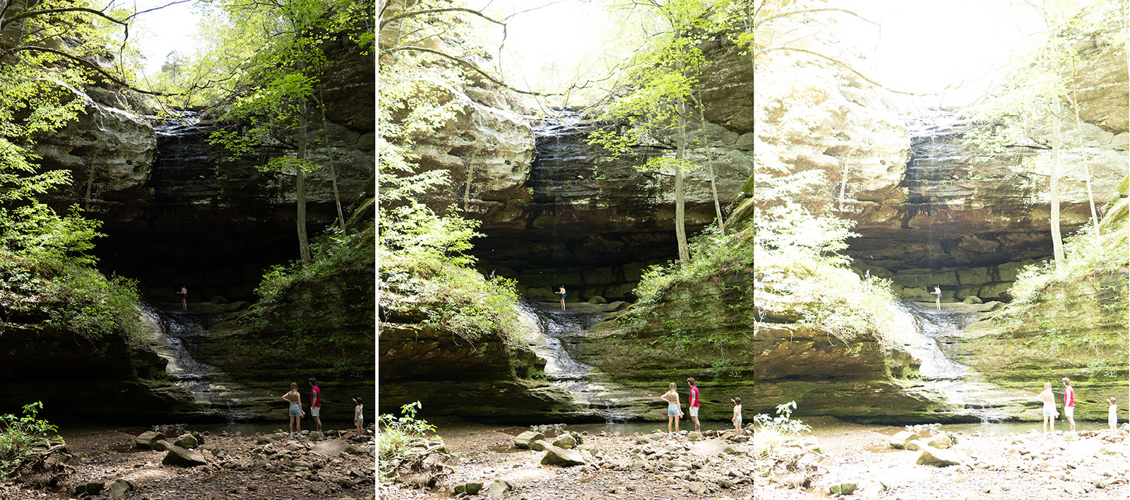
This was a very contrasty scene being in a canyon on a sunny day. Cameras are getting better with dynamic range, but none can see the full range that our eyes can see. So, to have more dynamic range there is HDR. The image below shows 2 stops under exposed, metered exposure, and 2 stops over exposed. This adds 4 stops of dynamic range. As you can see, none of the images have the full tonal shades that the HDR image has. |
Jan 11th |
 |
| 7 |
Jan 24 |
Reply |
Thanks. The leaves were a bit yellowgreen because it was springtime. But your image looks more like people would expect to see the leaves. |
Jan 11th |
8 comments - 3 replies for Group 7
|
| 32 |
Jan 24 |
Reply |
I like the image but you asked for suggestions, so I made one. |
Jan 17th |
| 32 |
Jan 24 |
Reply |
I just played with the sliders in Photoshop. |
Jan 16th |
| 32 |
Jan 24 |
Comment |
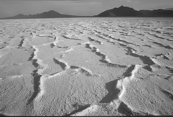
Interesting patterns and the mountains in the background. Good choice to convert to mono as the colors did not look good and it was mostly monochromatic anyway. Thank you for the information on the area and how the ripples were formed. I think that your image has too much contrast, and I converted your color image in Photoshop. |
Jan 16th |
 |
| 32 |
Jan 24 |
Comment |
Good choice to convert to mono as the colors distracted from the subject. The texture and shape of the large patch on the right is interesting. I like what Diana did in splitting the image and also increasing the contrast. I like them both but my favorite is the top one. |
Jan 16th |
| 32 |
Jan 24 |
Comment |
You captured the girl at the perfect moment, with hands up and speaking. Conversion to mono was a great choice as the colors did not look good, and you did a good job on the conversion. I would say your image as presented was more street photography with the busy background. I really like Diana's crop to improve the image. |
Jan 16th |
| 32 |
Jan 24 |
Comment |
I don't see anything wrong with cutting the bridge off. I like the composition with the water coming in on the left and the stream fading into the distance with some fog. The large rocks in the foreground really adds to the image and it is sharp from front to back. I don't think that you need more contrast, as it was a foggy day and should not have too much contrast. |
Jan 16th |
| 32 |
Jan 24 |
Comment |
A great pattern shot with good composition. Placing it at an angle was a great idea as the color image is rather static. I really like what Diana did with the image as yours was rather grey with no whites. |
Jan 16th |
| 32 |
Jan 24 |
Comment |
Nice well done portrait with dramatic lighting and the subject looking right at you. It is very sharp from front to back. You are very lucky to have such an excellent subject. I do not see anything wrong with using it in competitions. Maybe put a building behind him in the background, but watch the lighting. |
Jan 16th |
6 comments - 2 replies for Group 32
|
| 57 |
Jan 24 |
Comment |
This is a fascinating subject. You did a really good job of capturing it. The lighting is very good to have everything lighted but nothing over exposed. I like the contrast between the grain on the wood except for the orange sides. I would not change a thing. |
Jan 23rd |
| 57 |
Jan 24 |
Comment |
The bark shapes and textures are great. I think if you moved the knot area to the upper right that you would have better composition and it would become the subject. |
Jan 19th |
 |
| 57 |
Jan 24 |
Comment |
Great to hear that us older people can still accomplish a lot. It must be a lot of fun to take images at the speedway. Your editing is great and really improved the image. His expression with hand to mouth shows that he is planning what to do in the race. Well done. |
Jan 19th |
| 57 |
Jan 24 |
Comment |
Very colorful image and a great idea to see and capture this image. Very sharp and great depth of field. It looks like all of the reflections are from inside the box, except for the light on the upper right of the red bulb. I used the removal tool in Photoshop to get rid of it. I agree with Cindy that it would make a great Christmas card. |
Jan 19th |
 |
| 57 |
Jan 24 |
Comment |
Very sharp from front to back and the composition is very good to have the large cacti in the upper right. The lighting is good to have the tops all the lightest. The clean dark background it good and I am glad the you added a light stoke around the image to separate it from the black webpage. |
Jan 19th |
| 57 |
Jan 24 |
Comment |
Interesting image, but it is kind of busy. Converting to mono was a good choice as the shapes and textures are what is important and the colors were a bit distracting. |
Jan 19th |
6 comments - 0 replies for Group 57
|
20 comments - 5 replies Total
|