|
| Group |
Round |
C/R |
Comment |
Date |
Image |
| 7 |
Dec 23 |
Reply |
Beautiful images, I can see why you won. I am really impressed with having the candles in the image. I did one, and it was really hard to get the candle flame exposed correctly. |
Dec 17th |
| 7 |
Dec 23 |
Comment |
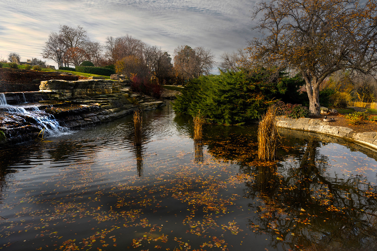
What a beautiful location, and the fall leafs in the water add a lot to the image. The sky and the lighting are good. I did some editing in Photoshop, to lighten the wall area on the left, to add some more saturation to bring out more of the fall colors, and some cleanup to remove the lamp post, remove the picnic tables in the center at the end of the pond, and the building on the right. The image is very good, but I think that it could be improved on. |
Dec 16th |
 |
| 7 |
Dec 23 |
Comment |
It is fascinating what the water glasses did with the fish. The background, the colors, the lighting, the focus and the placement of the glasses are all perfect. What a creative image out of the camera without using Photoshop to create. I would not change a thing and think that you have a winning image. |
Dec 16th |
| 7 |
Dec 23 |
Comment |
Great eye to see this very interesting tree pattern. I agree with Paul that this makes one wonder what caused the patterns. For pictorial, I like the crop that Judith made. But if you are more interested in the history of the tree trunk, then I would agree with Paul not to crop. |
Dec 16th |
3 comments - 1 reply for Group 7
|
| 32 |
Dec 23 |
Reply |
There is really nothing very close to the building. The land rising behind the building is the dike along the Mississippi river. The textures on the wooden posts look like the wood may have been cut from a tree trunk with an axe and not smoothed. |
Dec 10th |
| 32 |
Dec 23 |
Comment |
A very interesting image that is both simple, but also has a lot of details. The line of faucets if very interesting. I agree with Somdutt that the kids add a lot to the image. |
Dec 10th |
| 32 |
Dec 23 |
Comment |
The man with the boots is a great offset to the locomotive. The actor in the center looking toward the locomotive and the action in the background adds a lot of interest. Conversion to mono was a good idea, and you did it well. It must have been a fun outing. I do wish that the man with boots was a bit sharper. |
Dec 10th |
| 32 |
Dec 23 |
Comment |
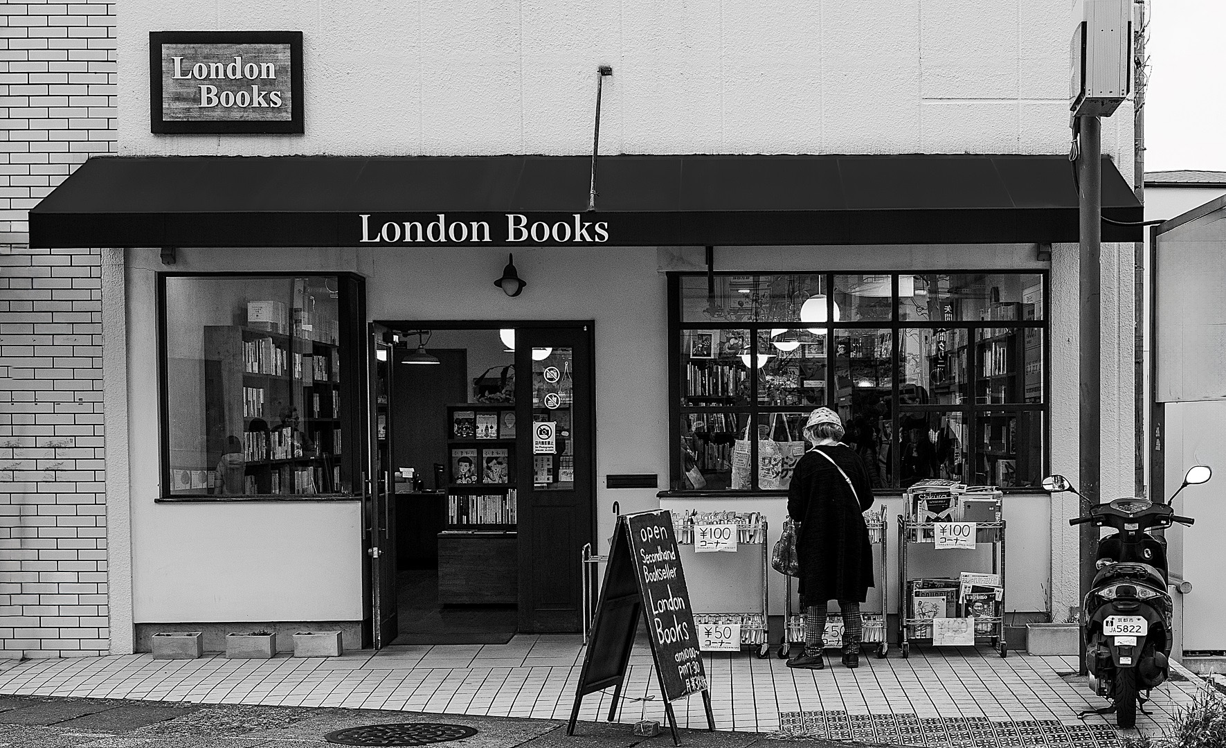
Your crop is very good, and really improves the image. Your conversion to mono is also very good. The woman adds to the image but it would be also be good without her. The prices in yen and the signs in English adds to the interest. I used the remove tool in Photoshop to get rid of the lettering on the far right and the partial black area on the far left. What do you think? |
Dec 10th |
 |
| 32 |
Dec 23 |
Comment |
Very nice fall image of the cascade with the leaf covered rocks. I think that your image has plenty of contrast as you presented it. Great sharpness from front to back. I agree with Stephen that cropping off the bottom as he suggested would be good. I don't care for the top crop that Somdutt made. There is not enough of the trees. If you are going to crop off the top, crop off all of the trees. |
Dec 10th |
| 32 |
Dec 23 |
Comment |
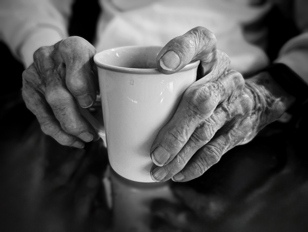
I think that you captured your Mother's hands very well. I like the spot of coffee on the cup, and the reflection of the cup. The simple white cup is very effective. You are correct, the hands do show great character. The hands may be a bit soft, but I think that is good as I would not want them too sharp. I did remove the white areas in the lower right and left. |
Dec 10th |
 |
| 32 |
Dec 23 |
Comment |
Very nice capture of this cute creature. The face is very sharp, and even the whiskers stand out. The mono is much better than the color and your conversion really separated it from the background. I do like Somdutt's crop. |
Dec 10th |
| 32 |
Dec 23 |
Comment |
I probably used Lightroom to adjust highlights and shadows. |
Dec 3rd |
7 comments - 1 reply for Group 32
|
| 57 |
Dec 23 |
Comment |
Very nice color, I am glad that you were able to capture it accurately. I have had trouble sometimes capturing true blue images. The dark leaves are nice. I think that you might have had more of a focus point and maybe depth of field issue rather than camera shake. The leaves on the right and left have very sharp hairs. |
Dec 17th |
| 57 |
Dec 23 |
Comment |
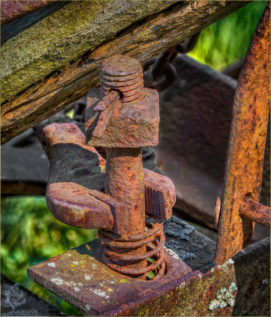
It is nice to have that kind of "junk" sitting around to photograph. I like the sharpness and the depth of field. If you want the red gear to be the center of attention, why not put it into the right side of the image? I flipped the image a cropped in just a bit. |
Dec 17th |
 |
| 57 |
Dec 23 |
Comment |
Interesting mysterious image, and a very nice job of editing to combine the two. I like the blue around the flame, but I do not like the blue hand. You need to leave the fading can below the flame, to give it something come from. I desaturated the hand, it would be better I think if it were more flesh colored. |
Dec 17th |
 |
| 57 |
Dec 23 |
Comment |
Good Christmas image. Your focus stacking allowed for excellent depth of field. I like that it is dark around it, and agree with Cindy to get rid of the white areas at the top and bottom. |
Dec 17th |
| 57 |
Dec 23 |
Comment |
Good sharpness and depth of field. I like the dark background. Good composition with the 3 apples and the red area on the right apple is in an excellent spot. I agree with Bob that the backside of the leaf at the bottom is a bit of a distraction, and I would get rid of the 3 small black spots on the apple on the right. |
Dec 17th |
| 57 |
Dec 23 |
Comment |
A nice head on shot with good sharpness and depth of field. It is a pretty flower with the colors going from almost green in the center to almost red at the edges. The shadow is okay, but if you crop like Cindy suggested, then the shadow will be mostly gone anyway. |
Dec 17th |
| 57 |
Dec 23 |
Reply |
It was an interesting article, but I did not bracket exposures. But I did use NIK HDR Effects and the Structuralize filter on the image. It did bring out more detail in the rust, and also made the color more like rust. |
Dec 17th |
 |
| 57 |
Dec 23 |
Reply |
Thanks for your suggestion. I like making the grass areas darker, but I think that you overdid the wood area at the top. And maybe a bit dark overall, at least on my monitor. |
Dec 15th |
6 comments - 2 replies for Group 57
|
16 comments - 4 replies Total
|