|
| Group |
Round |
C/R |
Comment |
Date |
Image |
| 7 |
Oct 23 |
Reply |
Thanks for the suggestion. |
Oct 29th |
| 7 |
Oct 23 |
Reply |
Judith's comment about 2 photos is something that I never think about when I am taking photos but it is a good one. Merge the 2 like a panoramic. |
Oct 14th |
| 7 |
Oct 23 |
Reply |
Thanks, that helps. This is the only cell phone image that I have edited, and all suggestions help. |
Oct 13th |
| 7 |
Oct 23 |
Reply |
Thanks for all of the comments. Yes, I should crop off more of the front and the left side. I left the leaves in the front, because they had the best color. Most of the leaves were not very colorful. |
Oct 13th |
| 7 |
Oct 23 |
Comment |
I prefer the color, but thanks for providing the monochrome as it shows how big the Cascade is. I really like the geometry of the V, the lighting is great, and the color of the flowers adds contrast. It is too bad the the people are cut off, but having them in the image shows the scale. Well done. |
Oct 13th |
| 7 |
Oct 23 |
Reply |
Curves panel. |
Oct 11th |
 |
| 7 |
Oct 23 |
Comment |
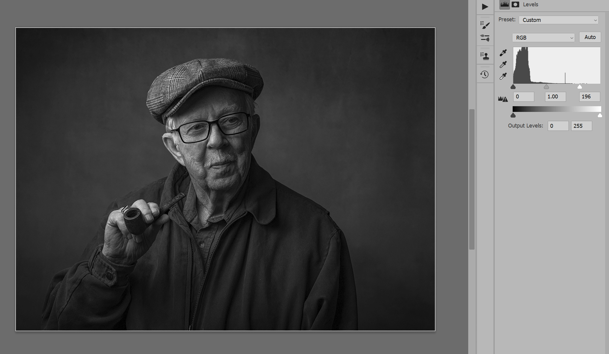
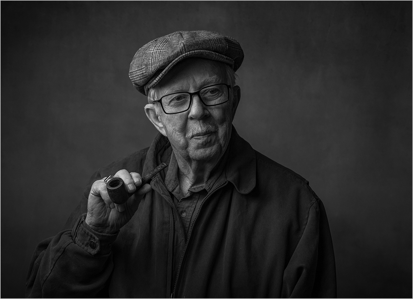
What a great subject! The pose and clothing and pipe are very good for this handsome man, and it looks like he is an oldtime newspaper person. I would say to add some smoke to the pipe, but that would distract from the face. Removing the ring was a good suggestion and was well done. To me, the image is too dark and does not have any whites in it. I opened the image and in levels moved the right slider over. That did make his sideburns too light and I did burn them some. Below is my adjusted image, and a screen print of the histogram and the levels panel. |
Oct 11th |
 |
| 7 |
Oct 23 |
Comment |
Great star burst with the setting sun. Like Barbara said, right place at right time. The composition is very good with the sun being on the right, and the bridges being at an angle. I would crop off a bit more of the white sky, showing less of it would help. I would also like to see more detail in the dark area on the left. |
Oct 11th |
| 7 |
Oct 23 |
Comment |
Very good lighting. I like the arrangement of going lower to higher from left to right. I am glad that there are some leafs as that adds some contrast to the apples. To me, the main point of focus is the large green apple with the leaf in the basket. The crab apples are interesting, but the ones at the bottom of the basket pull my eye down from the apples in the basket. As Barbara suggested, a light border or stroke around the dark image would help separate it from the black website. |
Oct 11th |
| 7 |
Oct 23 |
Comment |
That is a very interesting seed head and would be a good image by itself. The background is nicely blurry, but could be a bit darker. You did a very good job of blending in the dog's face, but a suggestion would be to make the face a bit clearer. The cropping is good. |
Oct 11th |
| 7 |
Oct 23 |
Comment |
The wolf looks hungry and looking for dinner! You were eye level with the wolf, and the wolf looking at you, which makes for a great shot. The background is good, with darker and out of focus. As mentioned above, it looks like there is some over sharpening. |
Oct 11th |
| 7 |
Oct 23 |
Reply |
Thanks |
Oct 9th |
6 comments - 6 replies for Group 7
|
| 32 |
Oct 23 |
Reply |
I do see a slight area, but not much. I could have gotten rid of it, if I had noticed. |
Oct 29th |
| 32 |
Oct 23 |
Reply |
The 4th Infantry is a good looking patch, and it has no numbers on it. I was with the 4th in Vietnam. |
Oct 26th |
| 32 |
Oct 23 |
Reply |
There is a East Quoddy Head Light in Canada, to the East. So, the name is correct. |
Oct 25th |
| 32 |
Oct 23 |
Reply |
It was taken at a slight angle, but looking at Ford, that word seems to be not straight with the frame around. I am not into old cars, but I like the details on them. |
Oct 15th |
| 32 |
Oct 23 |
Comment |
Very good job of taking a photo of this monument. The angle and lighting are great. I do find it strange that this is a WWII monument for the 36th infantry as the emblem is of the 4th Infantry "Ivy" Division. And it was not in Italy in WWII but in France. The rifle and maybe helmet look like more modern items than WWII. Nothing said meant to distract from your image. |
Oct 13th |
| 32 |
Oct 23 |
Comment |
Good story telling image, and good conversion from color. I like that you were looking up at the person on the right. You should have left the end of the drum stick in the image, but cropping off the person on the left was good. |
Oct 13th |
| 32 |
Oct 23 |
Comment |
I like the contrast of the stark blacks and whites. Partial windows and/or doors are never a good thing to have in an image. Showing more of the ramp would help the image. I would not replace the sky. I was there several years ago, but they were restoring it and so I could not get any really good photos. As I recall there was a sign that said this is the Eastern most point in the US. |
Oct 13th |
| 32 |
Oct 23 |
Comment |
Nice sharp flower with a blurred dark background. I hope that you have better luck next year and can show us some pretty flowers. |
Oct 13th |
| 32 |
Oct 23 |
Comment |
Very sharp image with good lighting and you kept the detail in the light dress. I like the pose of both people, with the woman's head pointing out. I like the revised image with them in front of a building. |
Oct 13th |
| 32 |
Oct 23 |
Reply |
I opened the color image, and can see that taking the red down to -200 is what made it go black. The other color slide adjustments had to do with the reflections in the metal chrome. |
Oct 6th |
| 32 |
Oct 23 |
Reply |
I don't remember anything about the car. There were lots of cars there. I do remember that there were several levels of interior work and wheels and so forth. I don't take many interior shots, so never thought to look at seat belts, but most of the cars were driven so I would hope that they had seat belts. I do have Photoshop save the steps taken on an image as part of the file. This is what the file showed about the color sliders in the conversion:
red: -200
yellow: 255
green: 51
cyan: 67
blue: -16
magenta: 148
|
Oct 6th |
5 comments - 6 replies for Group 32
|
| 57 |
Oct 23 |
Reply |
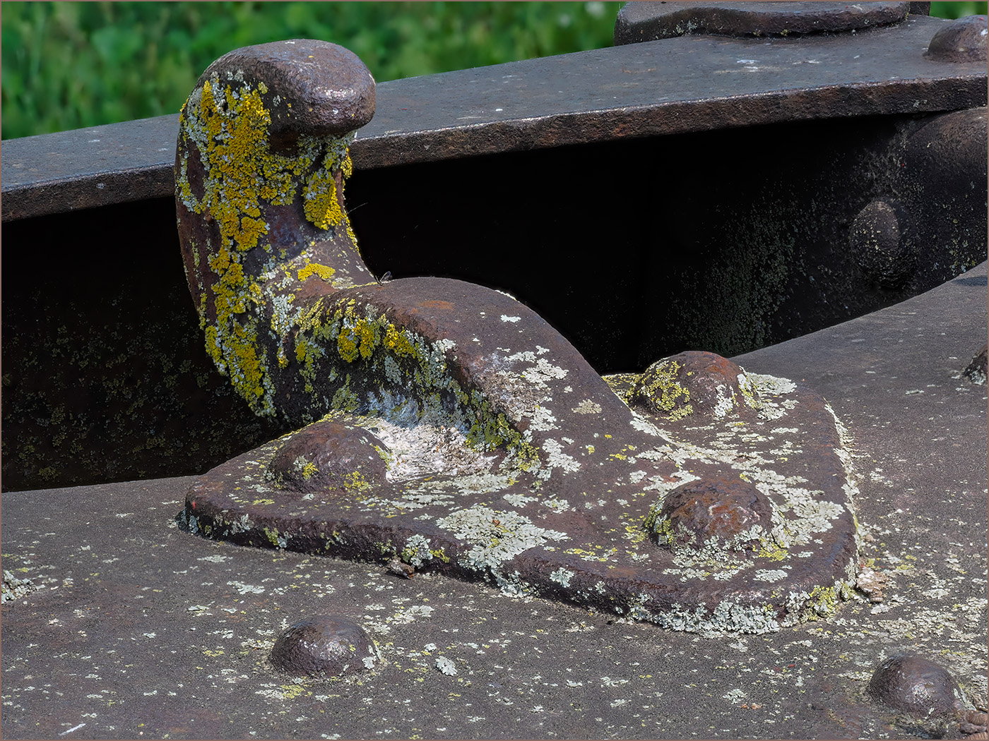
That is the west side, toward the Mississippi. I thought that the closeup was better. This is the whole hook. |
Oct 29th |
 |
| 57 |
Oct 23 |
Comment |
Nice image that is sharp where it should be and is very story telling. Thanks for telling us about why you took the image. |
Oct 14th |
| 57 |
Oct 23 |
Comment |
Perfect crop and background of the fall changing leaf. You picked the perfect leaf, with the red with green spots. I would not change a thing. |
Oct 14th |
| 57 |
Oct 23 |
Comment |
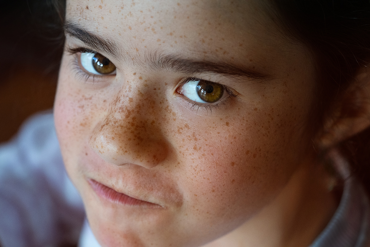
Skin tones look perfect and the sharp eye and the freckles are great. I like the angle looking down, and the expression is good -- not too happy and not to unhappy. Very well done, but the out of focus ear ring to me is a distraction. I used the remove tool in Photoshop to get rid of it. |
Oct 14th |
 |
| 57 |
Oct 23 |
Comment |
A very shape image of the flower with a good background. I like the crop. A suggestion would be to clone out the blue flowers in the lower left. |
Oct 14th |
| 57 |
Oct 23 |
Comment |
The image is nice and sharp and lacking in noise despite the high ISO. The textures and colors are very good. I agree with Bob that you should crop off the conduits on the left. |
Oct 14th |
| 57 |
Oct 23 |
Comment |
Nice capture of the flower being sharp and the background somewhat blurred. I agree with the above comments that you should crop off some of the bottom. |
Oct 14th |
| 57 |
Oct 23 |
Reply |
Interesting idea. Of course it is a towing hook, so it would never be upright like that. But if the viewer did not know that it was 90 degrees off, it is more interesting photographically. |
Oct 12th |
| 57 |
Oct 23 |
Reply |
Thanks, it does make the hook stand out better. |
Oct 12th |
6 comments - 3 replies for Group 57
|
17 comments - 15 replies Total
|