|
| Group |
Round |
C/R |
Comment |
Date |
Image |
| 7 |
Aug 23 |
Reply |
Thanks to everyone's suggestions. It was a very fun day with lots of reenactors and craft people, but also lots of visitors so the shots had to be kind of quickly made. |
Aug 26th |
| 7 |
Aug 23 |
Reply |
After looking at the image again, your suggestion is a very good one. I see that Paul agrees. |
Aug 26th |
| 7 |
Aug 23 |
Reply |
I like the revisions. |
Aug 26th |
| 7 |
Aug 23 |
Comment |
Great depth of field and texture in the hat and glove. Another very good still life! The two items go well together, and the empty space around the items is good.. I like your brightness better than Hoshedar's. |
Aug 20th |
| 7 |
Aug 23 |
Comment |
Very sharp and well lighted image for hand held at night. The cooks face and thumbs up grabs your interest. The smoke adds to the effect that he is cooking. I do like Judith's crop, and it gets rid of some distracting items. |
Aug 20th |
| 7 |
Aug 23 |
Comment |
I really like the image. The colors are great, and the fisherman in the foreground adds a lot of interest. I smoothed the water and added a bit more saturation to the water, and cropped off on the right back to the taller building. To me, the tall tower is what draws the eye, and the crop moves it out of the center. |
Aug 20th |
 |
| 7 |
Aug 23 |
Comment |
Welcome to the group. I love the drooping flowers and the petals that have fallen off. It sets a very melancholy tone. I wish that I were better at still life photography -- I took the PSA on-line class, but am still not good at it. I am also envious about your light painting skills, again something that I tried but not very well. The improvement from the original is very good. A small nitpicking thing is the dark leaf in the upper left, it is distracting to me. |
Aug 20th |
| 7 |
Aug 23 |
Comment |
Nice sharp flower with good blurred background. It is not what we normally see in an iris flower photo, because it looks a bit beaten down by the rain. This adds some interest, and the rain drops add to the image. |
Aug 20th |
| 7 |
Aug 23 |
Comment |
Well done to get both the inside of the bridge and the green in the windows. I like the symmetry with the beams. The lighting under the beams doesn't bother me, as there would be light from the windows, and it looks like the wall was open underneath. I like the image, but then I like old covered bridges. |
Aug 20th |
6 comments - 3 replies for Group 7
|
| 32 |
Aug 23 |
Reply |
Yes, as it is you do have good separation. It looks like you had back lighting on the fur on the arm, which helps. |
Aug 29th |
| 32 |
Aug 23 |
Reply |
That is interesting. Being on the Mississippi made this part of the country a popular area. I have only lived here 2 years. |
Aug 29th |
| 32 |
Aug 23 |
Reply |
Wes, thanks, it looks like a very helpful and interesting book. How much do I owe you? |
Aug 21st |
| 32 |
Aug 23 |
Reply |
Interesting, thanks. |
Aug 21st |
| 32 |
Aug 23 |
Comment |
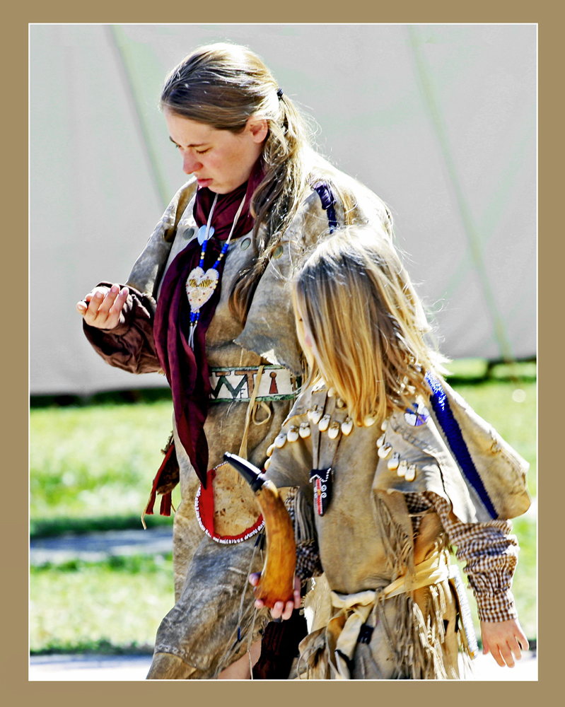
The woman liking at her hand makes us wonder what is in it. It doesn't bother me that we can not see the girl's face. i like what Stephen did with the monochrome. However, I like the color better. The only thing that bothers me about it is the color behind them. I reduced the saturation an increased the darkness some with Hues and Saturation. |
Aug 20th |
 |
| 32 |
Aug 23 |
Comment |
A fun photo. I like Diana's suggestion. And I agree with Wes that the color is better. |
Aug 20th |
| 32 |
Aug 23 |
Comment |
Your shutter speed really stopped the action, and I don't see noise from the high ISO. Lucky shot to have the bird. I like Stephen's crop. I think that Original 2 is a much better image, but you were trying to capture just one bull, which you did very well. |
Aug 20th |
| 32 |
Aug 23 |
Comment |
I really like the image, and think that the placement of the waterfall is fine. I think That the wind on the water is perfect, it shows the reflection but is not so calm that it looks like a mirror image. I would make the contrast higher, remove the item floating in the center, and crop just a bit off the bottom. The reflection is nice and really adds. |
Aug 20th |
 |
| 32 |
Aug 23 |
Reply |
Yes, it is interesting that we don't see something until it is pointed out, and then we can't stop seeing it. |
Aug 20th |
| 32 |
Aug 23 |
Comment |
I guess that I am the odd person out, because I think that you need more depth of field. The eggs are white and the brightest part of the image, so your attention is drawn to them anyway. I don't mind your crop, because you are showing abandonment. The shadows on the left egg adds interest. |
Aug 20th |
| 32 |
Aug 23 |
Comment |
Very good composition with 3 in a triangle. The priest looking at the cup adds interest to the white cup that also looks like the brightest thing in the image. I would remove the white "Please" sign in the background as it draws my eye and does not add anything. |
Aug 20th |
| 32 |
Aug 23 |
Reply |
Thanks, I will let you know when I receive it.
|
Aug 12th |
| 32 |
Aug 23 |
Reply |
2746 Chrysler St, Cape Girardeau, MO 63701.
|
Aug 12th |
6 comments - 7 replies for Group 32
|
| 57 |
Aug 23 |
Comment |
Interesting with the great reflections and blue background. I like the composition with psa in the middle. I agree with the comments above to crop off some of the blue at the top. The lighting is nice. |
Aug 21st |
| 57 |
Aug 23 |
Comment |
A very interesting work of art, and you captured it very well. It looks like you could have used a bit smaller lens opening to have the whole face in focus. As mentioned above, you need to get rid of the color dots. |
Aug 21st |
| 57 |
Aug 23 |
Comment |
A very different way to look at what we normal see. The depth of field is really good for a macro shot. I would crop in some to rid of a lot of the surrounding white. |
Aug 21st |
| 57 |
Aug 23 |
Comment |
Great image with the tight cluster of flowers and the nice green in the background. The white petals have detail, which can be hard to capture. I hope that it did well at your club meeting, it deserves it. |
Aug 20th |
| 57 |
Aug 23 |
Comment |
Very well seen, and captured. The rust and texture of the paint are great. And like Bob said, the chrome has a nice sheen. For better composition, I would crop a bit off the bottom, to the point that the rust has more texture. |
Aug 20th |
| 57 |
Aug 23 |
Comment |
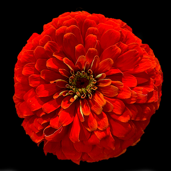
How nice of your daughter, the flower is in perfect shape. Straight on gives you great depth of field. The zinnia is very colorful and bright, but the white background is too much. I used the new Object selection tool in Photoshop and changed the background to black. |
Aug 20th |
 |
6 comments - 0 replies for Group 57
|
18 comments - 10 replies Total
|