|
| Group |
Round |
C/R |
Comment |
Date |
Image |
| 7 |
Jun 23 |
Reply |
Yes. I have tried it on other images, and it did not work as well, but it is a good thing to try. |
Jun 13th |
| 7 |
Jun 23 |
Reply |
Thanks. I have not had that problem with the remove tool. I am sure that Adobe will fix soon. |
Jun 13th |
| 7 |
Jun 23 |
Comment |
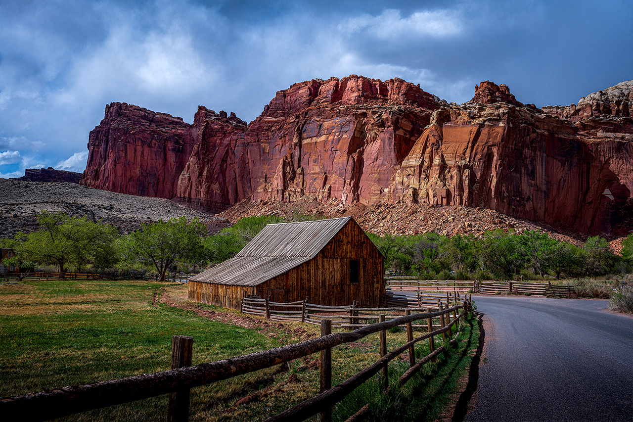
Nice capture of this iconic location. Everything is sharp, the composition is good, and the time of day has added texture to the cliffs. The clouds are not quite white since you do not have the full dynamic range from black to white. In levels I move the right (white) slider in. |
Jun 11th |
 |
| 7 |
Jun 23 |
Comment |
Nice action shot with a good sky. The wake of the surfer shows motion. The surfer and and kite are separated by quite a bit (but that is how they do it), but the white cloud in the center holds them together. |
Jun 11th |
| 7 |
Jun 23 |
Comment |
Great capture of this beautiful artwork. It is very sharp and it was obviously taken straight on as there is no distortion. Thanks for sharing it with us. My suggestion would be to not enter it in a salon as the judges might consider it someone else's art work and so score it low. |
Jun 11th |
| 7 |
Jun 23 |
Comment |
The colors and background are great. The lighting is very good. It appears that the flowers on the left (closest?) are not as sharp as the others. I think that you would have a stronger image if all of the flowers had been in focus. But, you are the artist (and a very good one). |
Jun 11th |
| 7 |
Jun 23 |
Comment |
Very nice capture of your husband, and I like the pose. I think that you accomplished what you wanted to do. Conversion to monochrome as Hoshedar did is a good suggestion. To me, the orange behind him is a distraction. I did a quick selection of him, inversed the selection and then used Hue and Saturation to reduce both the background saturation and brightness. |
Jun 11th |
 |
| 7 |
Jun 23 |
Comment |
Good focus on the lantern, and good exposure to capture the gas filaments glowing. The blue sky is much better than a hazy one. Looking up at the lamp is a different view and adds interest. I am wondering if you have too much depth of field with the background too sharp and distracting. |
Jun 11th |
| 7 |
Jun 23 |
Reply |
Maybe a bit of a tilt, but it was a wide angle lens so there is some distortion. |
Jun 9th |
6 comments - 3 replies for Group 7
|
| 32 |
Jun 23 |
Reply |
The right 2 nuts are a different material, more shiny. My camera does focus stacking automatically and then creates the final image in the camera. It does record all of the images on the card so that you could use software to stack them if you wanted, but I have found that the one created in camera is very good. |
Jun 19th |
| 32 |
Jun 23 |
Comment |
The Texas Hill County is a nice part of the country. Your conversion made a nice, but more of a "snap shot" image into one that looks like it was taken a long time ago. Good job. |
Jun 10th |
| 32 |
Jun 23 |
Comment |
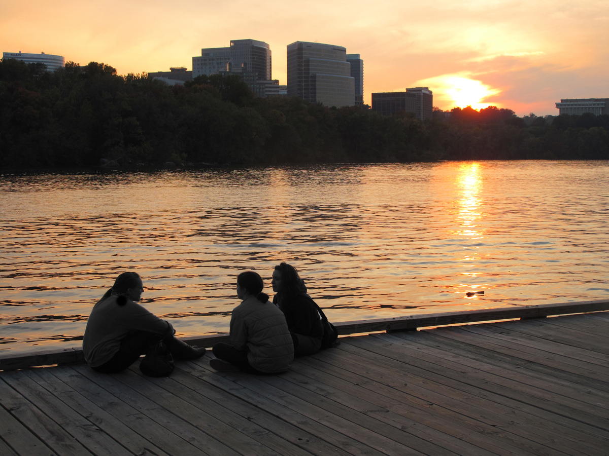
Capturing the 3 people really adds to the interest of the image. I do agree with Diana and Wes that the color is the best. Maybe if you only made it partial monochrome, with the people being mono so that their outfits do not distract from the lovely color of the sky and water. |
Jun 10th |
 |
| 32 |
Jun 23 |
Comment |
It is a moody image, and the tiger is well focused, which was a good job, not to be focused on the grass in front. I like the monochrome much better. What a great trip that must have been, thanks for sharing with us. |
Jun 10th |
| 32 |
Jun 23 |
Reply |
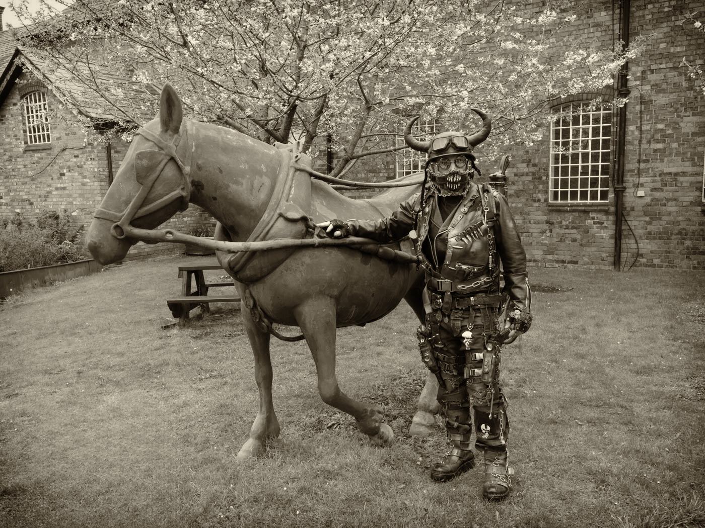
Then maybe you should tone it. I did use the new remove tool, but it left a pattern. Then I did a quick conversion to mono in NIK, and the sepia tone. |
Jun 10th |
 |
| 32 |
Jun 23 |
Comment |
You have a nice pattern image with good depth of field. I would crop off some of the top, to get rid of the upper roof area, crop to the top of the near figure. It is a point of interest that there are 4 lights but only 3 faces. It makes the viewer wonder where it is. |
Jun 10th |
| 32 |
Jun 23 |
Comment |
You captured a very interesting character. He certainly has a lot of punk items on him, and your image shows all the detail. I like the background, and no, I do not think that the horse is too gray. Unlike Wes, I like the mono better; it shows all of the detail without distracting colors. |
Jun 10th |
| 32 |
Jun 23 |
Reply |
Focus stacking on my camera is so easy, that I think that I will stick with it. And, I don't think that there is a tilting lens for Olympus cameras. |
Jun 3rd |
| 32 |
Jun 23 |
Reply |
I tried an different f stop, but could not get them all sharp. Also, images are not as sharp at f16 and f22. My camera was on a tripod, and my camera and the attached lens does focus stacking automatically, so focus stacking is very easy. |
Jun 1st |
5 comments - 4 replies for Group 32
|
| 57 |
Jun 23 |
Reply |
Thanks to all of you for your comments. |
Jun 25th |
| 57 |
Jun 23 |
Reply |
Thanks, and they were good to eat. |
Jun 18th |
| 57 |
Jun 23 |
Comment |
This reminds me of times past helping with the judging of PSA salons when we entered slides. It took 3 people on the projector. One to put the slide in, one to focus, and one to take the slide out the other side and place it in a tray based on the score. It was not as crowded as that may sound, the two people handling the slides were behind the projector and the person focusing was in front. The slide projector box and the slide projector in the background add to the story. The angle from the side was a good choice. The image does look a bit lacking in depth of field, but from you camera setting it was taken in a dark room. Thanks for showing us how far photography has progressed. |
Jun 11th |
| 57 |
Jun 23 |
Comment |
Great composition to have the eye at a power point -- the eye goes straight to it. The eye and the visible part of lizard are super sharp. I like that you left detail in the background as it shows his environment. Hard to believe that it was taken through glass as there are not the usual reflections. Your image quality and editing was really good to bring this back from 2 stops underexposed. |
Jun 11th |
| 57 |
Jun 23 |
Comment |
Interesting image of a truck tire. Your editing really brought out the detail in the tire. The tire being at an angle adds some interest, and your depth of field keeps all the tire sharp. The square crop back to the reflection was a good choice. The red arch of the fender and the truck reflected in the center of the tire also are good. Good eye to have seen this. I would not change a thing. |
Jun 11th |
| 57 |
Jun 23 |
Comment |
Nice sharp image with good depth of field. I like the contrasting pink and green, and the tight crop. The background is good, not completely black, but dark and out of focus enough not to be distracting. I thought about removing the out of focus leaf at the bottom, but since it allows the stem coming in to show, would leave it in. |
Jun 11th |
| 57 |
Jun 23 |
Comment |
I like this subject matter, and this image is well done. The rust and pealing and crackled paint are great. The lock makes a good main subject and you even have some old spider webs. The faint blue paint adds contrast to the image. I would not change a thing. |
Jun 11th |
| 57 |
Jun 23 |
Comment |
Nice and sharp, and the water drops add interest, as does the tilt of the stem coming in. I like the white background as it does not have anything to distract from the iris and it makes the image bright. No, I do not think that the iris is floating as you have the stem holding it up. |
Jun 11th |
6 comments - 2 replies for Group 57
|
17 comments - 9 replies Total
|