|
| Group |
Round |
C/R |
Comment |
Date |
Image |
| 7 |
Apr 23 |
Reply |
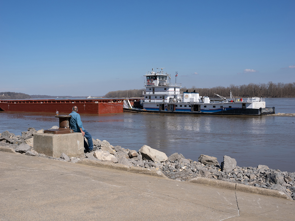
I like the smoke, not sure about the boat. Lets see what the other members say. |
Apr 18th |
| 7 |
Apr 23 |
Comment |
A nice moody image, I say moody because of the dark background and brown tones. The image is super sharp and great lighting. The center of the flower is the brightest point, and together with the red tones in the center draw the eye straight to the center. The highlights at the bottom of the glass are a distraction, but not enough to really distract from the image. |
Apr 14th |
| 7 |
Apr 23 |
Comment |
You really improved the image with your editing, especially the sunset. You have a steady hand and good image stabilization to have the image so sharp at 1/13th of a second. I like the textures in the items. I used content-aware fill in Photoshop to get rid of the white modern items. |
Apr 13th |
 |
| 7 |
Apr 23 |
Comment |
Wow, it looks like you captured it perfectly. The exposure is great, I would not want the dancer any lighter. Shutter speed is good, lots of embers flying, the dancer is mostly frozen, but there is some movement in the hand and item that they are holding. You have space for them to move into, and also show some of the spectators on the left. After looking closer, I can see that it is leafs in the fire, not coals. This would be a winner in PJ or Travel as well as pictorial. |
Apr 13th |
| 7 |
Apr 23 |
Comment |
Huge improvement from the original, and I like the crop. I like the skin tones, the pose, and the lighting. I like the dark background. A suggestion would be to darken the skin tone area below her face. I think that would make her face stand out more. |
Apr 13th |
| 7 |
Apr 23 |
Comment |
A nice landscape image. I don't see anything wrong with the shadows, and I am uncertain about the hawk. A small suggestion would be to get rid of the tire tracks in the lower left side. |
Apr 13th |
| 7 |
Apr 23 |
Comment |
The V in the mountains, with a taller mountain behind makes for a very good composition. Your added image is a great improvement, especially the clouds. I also liked Barbara's suggestion to crop off some of the water on the bottom and make it more of a panoramic image. It looks like a lovely location. |
Apr 13th |
| 7 |
Apr 23 |
Reply |
That is part of the cargo that he is pushing up river. There is more in front of what I am showing in the image below. It was really big, and I am sure that is why they were having so much trouble. |
Apr 10th |
 |
6 comments - 2 replies for Group 7
|
| 32 |
Apr 23 |
Comment |
Nice image telling the story, with the deserted street. Going to monochrome was a good choice, and I like the crop. |
Apr 16th |
| 32 |
Apr 23 |
Comment |
The judge is wrong, the sand at the top keeps the eye in the image. I like the greens and browns in the color, but you did keep the texture on the posts in the monochrome. I would crop off the sand area at the bottom and make it more of a panoramic image. |
Apr 9th |
 |
| 32 |
Apr 23 |
Comment |
What a lovely image of the snow caped mountain reflected in the water. I like the monochrome very much, but I also like the muted colors. The clouds look good to me. If I went with the color, I would crop off the bare trees on the left. How lucky you are to be close to the great location. |
Apr 9th |
| 32 |
Apr 23 |
Comment |
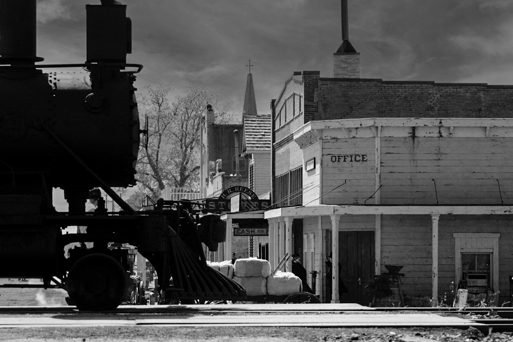
I think that the crop is good. Leaving in all of the buildings shows the location. Three things bother me; that the train is not sharp, that the train is too black, and the white shy. You should have used a different f stop for more depth of field. Did you try to adjust the shadows slider to open up the train area more? Sky replacement is so easy in Photoshop now, why not add a better sky. |
Apr 9th |
 |
| 32 |
Apr 23 |
Comment |
Very nice capture. I think that him looking down helps the image, as it shows that he is working and does not look posed (as it would if he looked up at you). I agree that going to monochrome was a good choice to simplify the image, and it does look sharper than the color. The highlight on the head does not bother me. I would crop some off the right, maybe back to the stool leg, which would move the man out of the center and place more importance on him. |
Apr 9th |
| 32 |
Apr 23 |
Comment |
Your image is very sharp where it needs to be, the eyes and beak. I like the v of the wings, and the crop that you made. |
Apr 9th |
| 32 |
Apr 23 |
Reply |
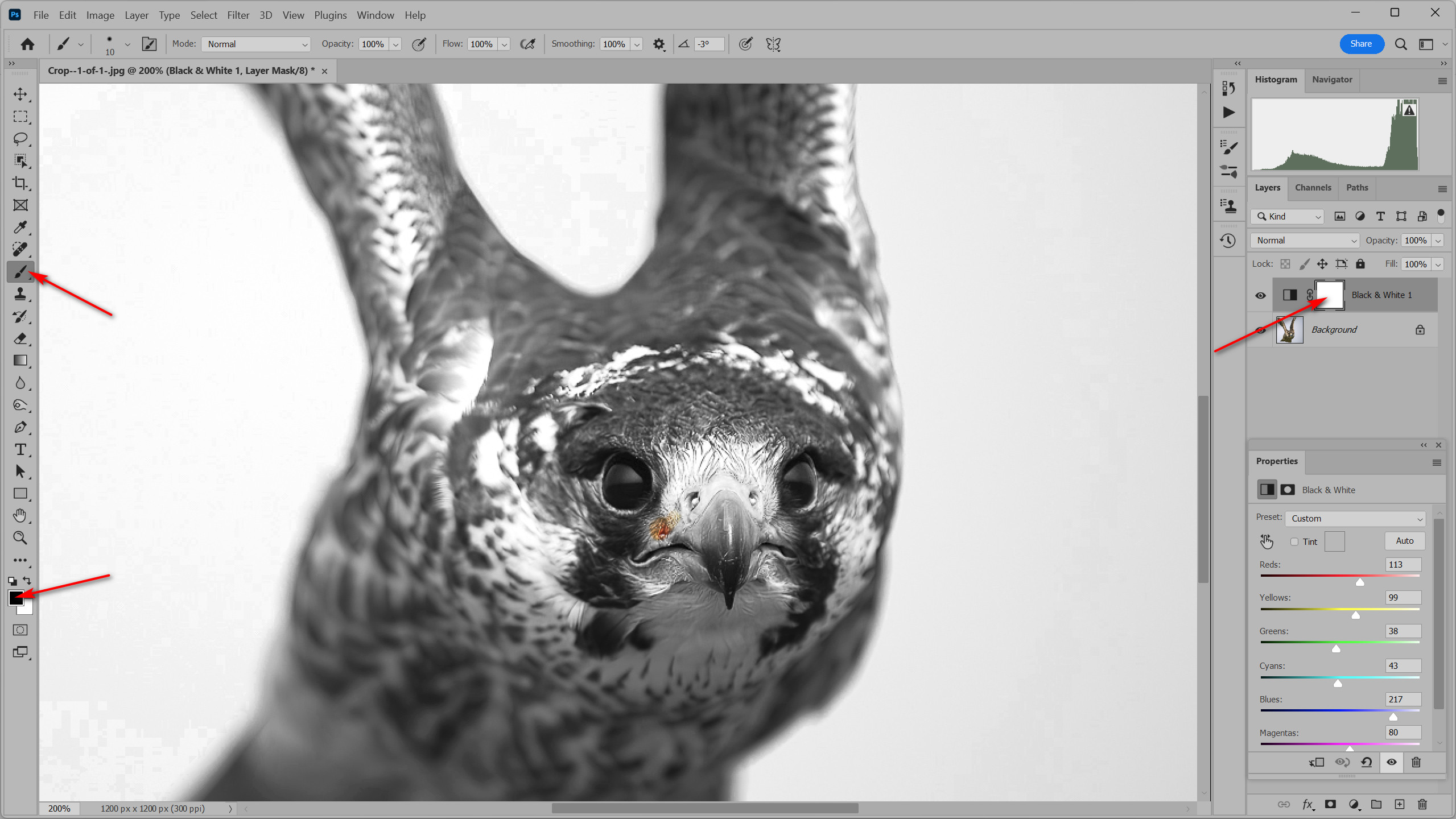
You need to paint with black on the layer mask. You see the corner brackets around the mask, showing that it is active and you are painting on the mask. The brackets should be around the mask as soon as you open the black and white adjustment layer. If they are not, the you can click on the layer mask to make it active. Sorry that I did not explain better earlier. |
Apr 9th |
 |
| 32 |
Apr 23 |
Reply |
Not sure how to do it in LR, but if you convert to mono in Photoshop, the mono layer will have a white mask (letting everything through). Take a small black brush and use it on the white mask to paint back in the red spot. The black on the mask will not let the mono layer show, showing the color background layer below. But you are correct, doing that will make the image a color image, not mono. |
Apr 3rd |
 |
| 32 |
Apr 23 |
Reply |
Thanks, the background is naturally blurred because of the distance from the handle. |
Apr 3rd |
| 32 |
Apr 23 |
Reply |
Yes, Topaz Photo AI is really great, I just got it, and had edited this image a couple of months ago. But thanks for the suggestion. |
Apr 3rd |
6 comments - 4 replies for Group 32
|
| 57 |
Apr 23 |
Reply |
Thank you everyone for you comments. I think that it is a handrail on the right, as this post was next to the front stairs. |
Apr 26th |
| 57 |
Apr 23 |
Comment |
You captured this tulip at the perfect point of decay. The back petals are all that are left exposing the center, and the yellow stamen drooping really adds to the interest. Even the brown tips on the leafs adds to the story. The colors are great, it is well lighted and it is very sharp. I am glad that you added a small stroke to separate the image from the black website page. I think that an improvement might be to have a slight tilt to the tulip as it seems kind of static. |
Apr 16th |
| 57 |
Apr 23 |
Comment |
The front pieces are very sharp and well lighted with good depth of field to blur the pieces behind. I like the texture of the board. The three front pieces seem a bit static, and the background is very distracting. It is a great looking set, and deserves another photo session. |
Apr 16th |
| 57 |
Apr 23 |
Comment |
Nice still life image that is very sharp and well lighted, of these interesting old items. Not sure that the figurine fits in with the other items, but it being white it does provide a good contrast. Increasing the saturation really brought out the color of the lantern and boxes. It was a great idea to turn a hot spot into a sun flare, and looks very natural. Your lighting experiment turned out good. |
Apr 16th |
| 57 |
Apr 23 |
Comment |
What a great capture of the adorable baby. Her lips, nose and eyes are all super sharp. I don't see any noise from the high ISO. You really improved the image with your editing. I don't think that she needs to be any lighter, but I do like the square crop that Cindy made (it gets rid of the distracting colors on the far right). It would make a great print for her parents and their friends to enjoy. |
Apr 16th |
| 57 |
Apr 23 |
Comment |
Good photographic eye to have noticed these interesting items. You really nailed the focal point and aperture, with one of them being super sharp and the rest out of focus. The line of items shows good depth as they become more out of focus as they become more distant. Going to monochrome was a great choice as the colors distract from story. I like the crop that you made. |
Apr 16th |
| 57 |
Apr 23 |
Comment |
Nice sharp image with plenty of sharpness and depth of field. I like the square crop and the slight tilt. You choose a good color of pansy to photograph, showing opposite colors on the color wheel. |
Apr 16th |
6 comments - 1 reply for Group 57
|
18 comments - 7 replies Total
|