|
| Group |
Round |
C/R |
Comment |
Date |
Image |
| 7 |
Dec 22 |
Reply |
Interesting points. It is right off the road. Maybe the owner uses it on the farm that is across the road. |
Dec 30th |
| 7 |
Dec 22 |
Reply |
Rich, I like this, and it puts the infinity point in the center. |
Dec 20th |
| 7 |
Dec 22 |
Reply |
Good comment, Rich. A slower shutter speed would have made the water softer. |
Dec 20th |
| 7 |
Dec 22 |
Comment |
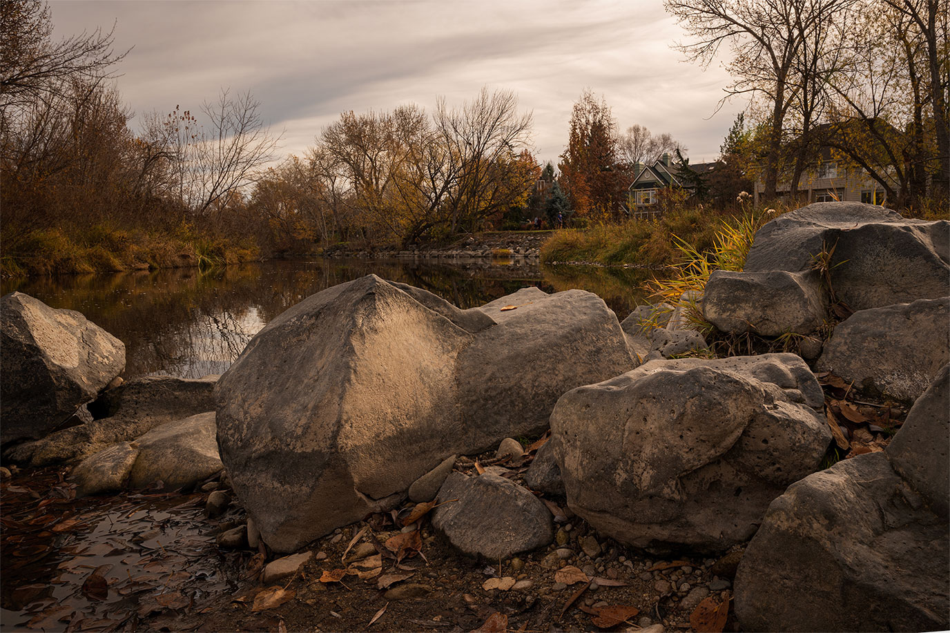
You have created a pleasant fall image with the rocks being the main subject. You have really good depth of field, probably because of your choice of f stop. I reversed the image, creating an open area on the left for the eye to enter the photo, and then the rocks are a stopping point to help keep the eye in the image. The yellow grass then becomes more important because of its placement. What are your thoughts? |
Dec 14th |
 |
| 7 |
Dec 22 |
Comment |
This is a great vanishing point image. I think that monochrome was a good choice, as especially the yellow line draws my eye too much. I like that you lightened the man walking toward us. You may think about cropping off the man on the far right. I don't know why (maybe his location?) but my eye is drawn to him too much, distracting from the vanishing point. |
Dec 14th |
| 7 |
Dec 22 |
Comment |
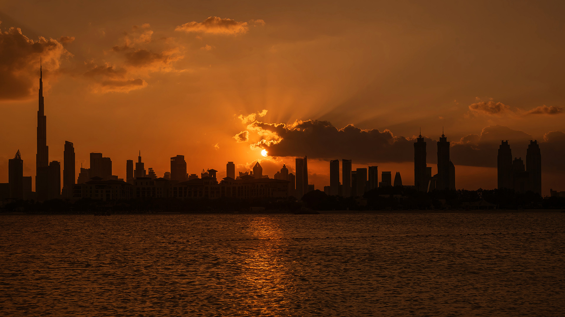
Nice sunrise image with the sun being in a very good place, and having light rays above the clouds. For a silhouette of the buildings leaving them dark is the way to go. The sun on the water is nice, but maybe cropping off some of it and making it more of a panorama image would be effective. I played with the brightness and color a bit. What do you think? |
Dec 14th |
 |
| 7 |
Dec 22 |
Comment |
Great job of creating a night time photo of this good looking location. The original image looked a bit blurred, but the night time image looks much better, and an image being a bit blurred at night is more acceptable to the eye. Very nice. |
Dec 14th |
| 7 |
Dec 22 |
Comment |
What a great image for as you said, a snap shot. The best camera that we have is the one that is with us. I really like the composition with the tall trees on the right and the trail coming in from the left. The people provide interest and scale, and there is even a bird at the top of the tree. The colors are also good. I would not change a thing. |
Dec 13th |
| 7 |
Dec 22 |
Comment |
For a high ISO I don't see any noise. This is the kind of image that I like. Interesting photo with the numbers, letters, cracked paint and rust. The letters and numbers provide the eye a place to rest on and the pealing paint and rust give lots of texture. I am wondering why you went with monochrome when it looks like there are lots of rust colors. |
Dec 13th |
6 comments - 3 replies for Group 7
|
| 10 |
Dec 22 |
Comment |
Really sharp image with excellent composition and the ed leave really adds to the image. |
Dec 18th |
1 comment - 0 replies for Group 10
|
| 32 |
Dec 22 |
Reply |
There is a really good PSA on-line class that I just completed and learned a lot. |
Dec 26th |
| 32 |
Dec 22 |
Reply |
Thanks for the comments. My teacher liked for the elements to touch. |
Dec 26th |
| 32 |
Dec 22 |
Comment |
The tilt angle adds to the image. A nice photo of the event. Like Diana I like the color better. |
Dec 12th |
| 32 |
Dec 22 |
Reply |
Thanks for the historical images and the history of the second. |
Dec 12th |
| 32 |
Dec 22 |
Comment |
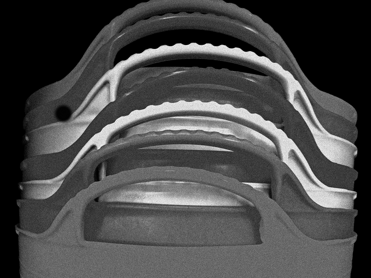
You did a good job with the sliders to separate the colors. I wish that you had left a bit of room at the top to show all of the upper handle. This is a nice pattern image. I agree with Diana to crop in some. They appear too shiny to me. How about adding some grain? |
Dec 12th |
 |
| 32 |
Dec 22 |
Comment |
I like the image and the "teeth" on the left are very sharp as are the ones on the bottom. Your rotating the image really helped, and the conversion to mono is good. Why not just paint out the inner set of teeth? |
Dec 12th |
 |
| 32 |
Dec 22 |
Comment |
The stamens being out of focus is a problem. It looks like you had the camera set for the shore birds and should have adjusted to a smaller aperture to have more depth of field, and/or focused closer. The image otherwise is very sharp. As for the tone, I like it and would crop off some on the left to get rid of some of the leaves. |
Dec 12th |
| 32 |
Dec 22 |
Comment |
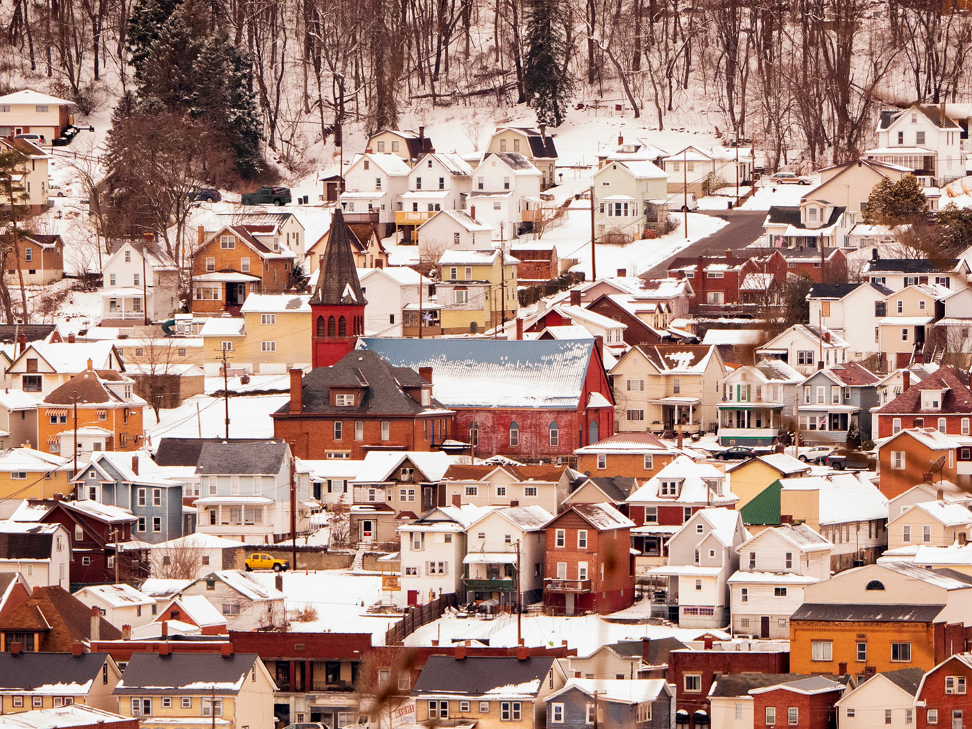
I can see why you wanted to go and take this image. It is very interesting with all of the houses so close to each other and the snow. The church really stands out as the center of interest. I did not notice the yellow car until Lynne mentioned it. The color image seems a bit faded and the red pickup in the upper left draws my eye. I adjusted the levels in the color and made the red pickup gray. |
Dec 12th |
 |
| 32 |
Dec 22 |
Comment |
Whatever the reason for the tilt, I really like it, it adds a great deal of impact to the image. The tower is very interesting with the circle wires around it. I would get rid of the white area in the upper right corner since it has the effect of drawing my eye out of the image. |
Dec 12th |
| 32 |
Dec 22 |
Reply |
Yes, it has helped me so far, and I am not finished. The commentator is really good. |
Dec 11th |
| 32 |
Dec 22 |
Reply |
That is all I get too, except maybe a Christmas card with a letter. |
Dec 4th |
| 32 |
Dec 22 |
Reply |
Thanks. |
Dec 4th |
6 comments - 6 replies for Group 32
|
13 comments - 9 replies Total
|