|
| Group |
Round |
C/R |
Comment |
Date |
Image |
| 7 |
Nov 22 |
Reply |
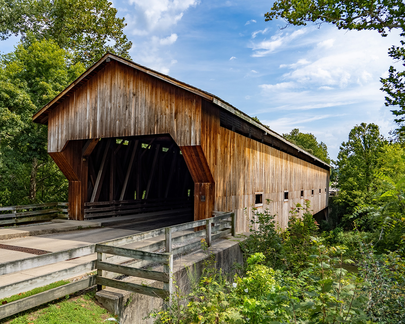
Paul, welcome to the group, and thanks for the comments. It is a really great old bridge in a nice location. |
Nov 22nd |
| 7 |
Nov 22 |
Reply |
Thanks, you brightened up the interior. As well as all that you said below. I added my image below for better side by side comparison. |
Nov 21st |
 |
| 7 |
Nov 22 |
Reply |
You really improved the image. |
Nov 18th |
| 7 |
Nov 22 |
Reply |
Thanks, Tony. |
Nov 15th |
| 7 |
Nov 22 |
Comment |
Interesting location with the palm trees in rows beside the road. As Barbara suggested, you should crop off more of the sky on the sides, but I would leave some blue showing. The man also needs to be lighter as shown in the original image. You over saturated the blue skies bringing too much attention to them. As Barbara suggested, a person walking into the distance (but close like this man) would be a good idea. |
Nov 13th |
| 7 |
Nov 22 |
Comment |
The giraffes are very sharp, and the background at least somewhat blurred. When I saw the thumbnail on the main group webpage, I could not tell what was going on. However, looking at the larger image I can see that the two are pushing against each other. I would crop some off the right side to bring more interest to the giraffes. As for salons, for nature you need to be careful with editing, and blurring would be against the rules. Please read the nature rules. If for pictorial, you could blur the background and darken it as suggested above. Good luck in salons. |
Nov 13th |
| 7 |
Nov 22 |
Comment |
Very clever to put a couple walking into the image where a couple was walking out, so the the shadows from the couple are already there. It looks like a lovely location. Good job of combining images. When Gaetan pointed out the break in the tree shadow behind the man, I now see it. |
Nov 13th |
| 7 |
Nov 22 |
Comment |
Great capture with the bird very sharp and looking back at you. The bird having something in its mouth adds interest. Well deserved congratulations on winning in camera club. The bird even has a catch light in the eye. |
Nov 13th |
| 7 |
Nov 22 |
Reply |
Would not work as a nature image with the blurring. |
Nov 13th |
| 7 |
Nov 22 |
Comment |
You have a very nice abstract. I never thought about reducing the clarity like you did. The composition with the branches on the left coming into the image and the larger branch on the right curving up to keep the eye in the image is great. The green leaves in the upper right are enough of a center of interest for me. |
Nov 13th |
| 7 |
Nov 22 |
Reply |
Thanks for the comments. Yes, it was a sunny day, but that is what you get when traveling. |
Nov 13th |
5 comments - 6 replies for Group 7
|
| 32 |
Nov 22 |
Reply |
I use a black foam poster board. |
Nov 19th |
| 32 |
Nov 22 |
Reply |
Wes's image has a full tonal range from black to white. |
Nov 18th |
| 32 |
Nov 22 |
Comment |
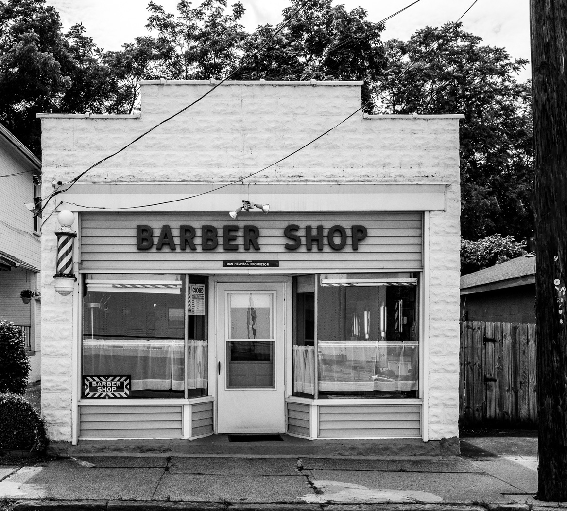
And then cropping back to the light pole to leave a stopping point to keep the eye in the image. |
Nov 18th |
 |
| 32 |
Nov 22 |
Comment |
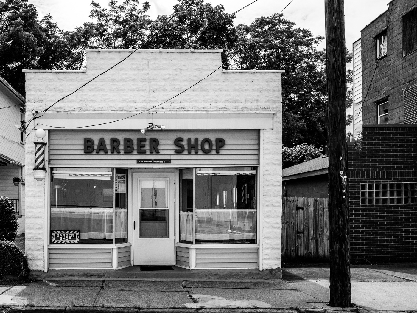
Welcome to the group. You captured an interesting building and your choice or monochrome and conversion to monochrome are good. Diana's suggestion of adding structure is a good one, but I think that her second image went too far. I used content aware fill in Photoshop (with some minor stamp tool) to get rid of the signs. First with your original crop. |
Nov 18th |
 |
| 32 |
Nov 22 |
Comment |
It is great to have a person in the image as it shows scale and also adds interest and a subject point. The walls are mostly monochromatic, so going to monochrome was a good choice as it shows the texture of the stone. I would crop off the out of focus left side. Both because the out of focus is distracting, and also because the mind would then imagine a larger canyon wall. I like your version better than Diana's as hers seems kind of dark. |
Nov 13th |
| 32 |
Nov 22 |
Comment |
It is an interesting subject that I did not know what it was until I read your description. I can see why the infrared setting worked because it made the green center white and darken the oranges. The edges being out of focus hold the interest in the center. |
Nov 13th |
| 32 |
Nov 22 |
Comment |
This is a great piece of architecture and you captured it very well. The bridge arches all centered and fading away into the distance is very good, and the time exposure of the smooth water was a good choice. |
Nov 13th |
| 32 |
Nov 22 |
Comment |
You can tell that the image is at night from the stars, and the texture of the rocks is great. After seeing the color, I can see the moonbow in the monochrome version. I like them both, and I am sure that it is rare to get this moonbow, and you did a good job. |
Nov 12th |
| 32 |
Nov 22 |
Comment |
This is an interesting work of art. Photographing something like this is not coping because of the photographer's selection of angle, lighting, and so forth. I agree with Stephen that the lower left item needs to stay in, for balance. I like the texture in the sculpture. I like the color version better. |
Nov 12th |
| 32 |
Nov 22 |
Reply |
I like it, and I am usually the one that suggests flipping images! |
Nov 8th |
| 32 |
Nov 22 |
Reply |
It looks not normal, maybe because I know that the part that you made darker is the lighter part. I did the reverse. |
Nov 1st |
 |
7 comments - 4 replies for Group 32
|
| 57 |
Nov 22 |
Comment |
The shutter speed is perfect to show motion and yet be able to see the center label. The composition and lighting are good. |
Nov 13th |
| 57 |
Nov 22 |
Comment |
Good eye to see this grouping of fruit. The image is very sharp and the blemishes on the upper fruit add interest. The lighting is very good. You should get rid of the yellow spot at the top and the black line on the right, as already suggested. I really like what Cindy did with the image. |
Nov 13th |
| 57 |
Nov 22 |
Comment |
Rotating the image was a unique idea, but works very well here. Adding all of the texture and making it more monochromatic was also a good idea. It is too bad that the near part of the fan is out of focus. The top and bottom are disconnected but there is detail in your original image so you should try and bring some of that back. Maybe clone out the small part of the fan blade in the upper right, it is drawing my eye out of the image. |
Nov 13th |
| 57 |
Nov 22 |
Comment |
Focus stacking made the flower very sharp overall, and yet the background is out of focus. Taking the rose from behind is different but works well here. Some of the petals curving back, but the center petal being strait up makes for a good composition. I agree with Cindy and Jessica about cleaning up the image. |
Nov 13th |
| 57 |
Nov 22 |
Comment |
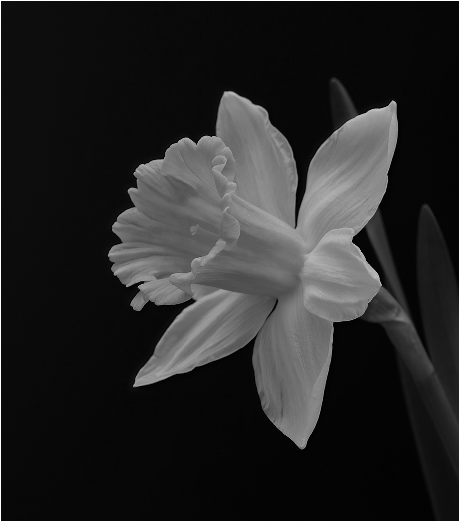
A really great very sharp image. The black background is good and leaving the stem keeps the flower from "floating". Great lighting and colors. |
Nov 13th |
| 57 |
Nov 22 |
Comment |
Very nice capture, and your editing to lighten and saturation made a pleasing image. It is very sharp. I agree with Cindy that you should have not cropped in so much to cut of the petal edges on the right and left. |
Nov 13th |
| 57 |
Nov 22 |
Reply |
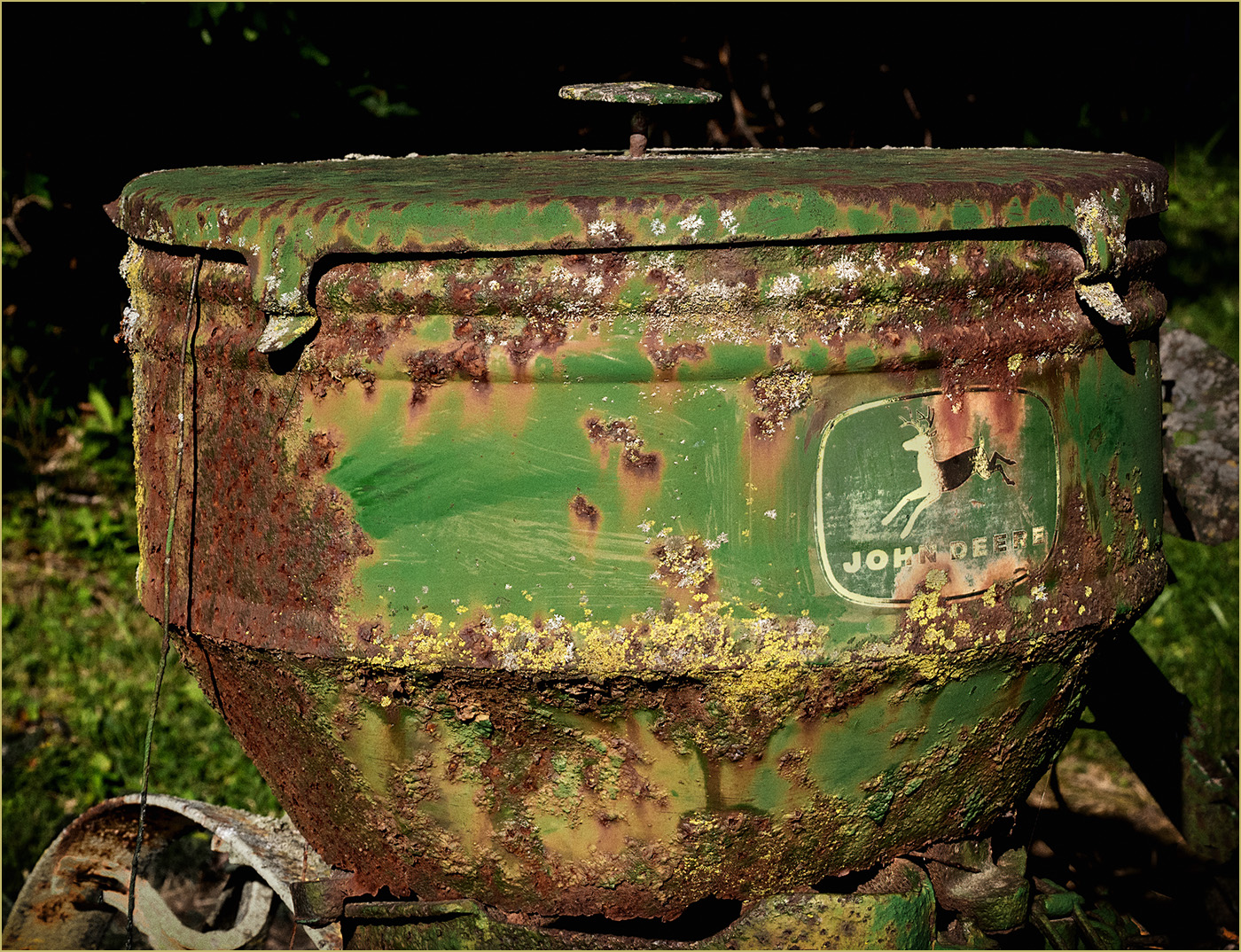
I cropped in on the whole item, and used NIK Color Effects and the Vintage Saturation preset. I cleaned up the stem coming in on the right, and desaturated and darken the yellow wheel in the lower left. |
Nov 13th |
 |
6 comments - 1 reply for Group 57
|
18 comments - 11 replies Total
|