|
| Group |
Round |
C/R |
Comment |
Date |
Image |
| 7 |
Sep 22 |
Reply |
Thanks, that looks good. |
Sep 28th |
| 7 |
Sep 22 |
Reply |
Thanks, it is a good suggestion, but I would leave all of the chairs in the image. The light on the floor would be easy to fix. |
Sep 27th |
| 7 |
Sep 22 |
Comment |
A nice peaceful scene. It is hard to tell that a breeze is blowing toward the hills. I like that you have a lower part of the hills in the center, that draws the eye to the center. I would suggest that you crop off some from the sky. |
Sep 15th |
| 7 |
Sep 22 |
Comment |
Interesting image, with the tree and house with the great stone work. You did a very good job of cleaning up the image and opening up the shadows. You were also fortunate to have a nice sky. You did a good job of only showing the important items in the image. I would not suggest any other changes. |
Sep 14th |
| 7 |
Sep 22 |
Comment |
You have a ghost image of the tower and clouds-- was that intentional? Interesting idea, but I think that the red is over powering. |
Sep 14th |
| 7 |
Sep 22 |
Comment |
Nice image of this beautiful location. The reflections in the water really add to the image. It is good that you only showed the minimum of the bald sky (cropping down to the top of the mountain). I think that you would have a stronger image if you cropped of the red canoes on the right side. It shows that the older cameras did a really good job. |
Sep 14th |
| 7 |
Sep 22 |
Comment |
You did a very good job of controlling the strong backlight. It is a great image to show the event, but I think that the out of focus head really distracts from the image. You should have gotten higher to not have the heads in the foreground. |
Sep 14th |
| 7 |
Sep 22 |
Reply |
Thanks for the comment and suggestions. When I took the image, I was not thinking about the image. If I go back, I will follow your suggestion. |
Sep 8th |
5 comments - 3 replies for Group 7
|
| 32 |
Sep 22 |
Reply |
Thanks, I like the dark background. And no, I do not have any more space in front of the trunk. |
Sep 26th |
| 32 |
Sep 22 |
Reply |
It is part of Photoshop, under Edit, and then Sky Replacement. There are some included skies, but those should not be used for PSA images. But over the years, I have taken interesting looking skies to use. The software works very well, and lets you move around the sky, flip it, and make tone adjustments. It creates masks that you could also adjust. That all said, I just usually go with what Photoshop selected, unless I need to reverse (flip) the sky to get the shadows going the right direction. |
Sep 26th |
| 32 |
Sep 22 |
Reply |
I did brighten it just a bit. |
Sep 20th |
| 32 |
Sep 22 |
Comment |
Very sharp, and the hair really stands out. The tongue and mouth action of course is what really makes this image. You did a good job of editing, and the monochrome looks much better than the white. You could have lighten the eye some. I am sure that the people in the restaurant will enjoy it. |
Sep 14th |
| 32 |
Sep 22 |
Comment |
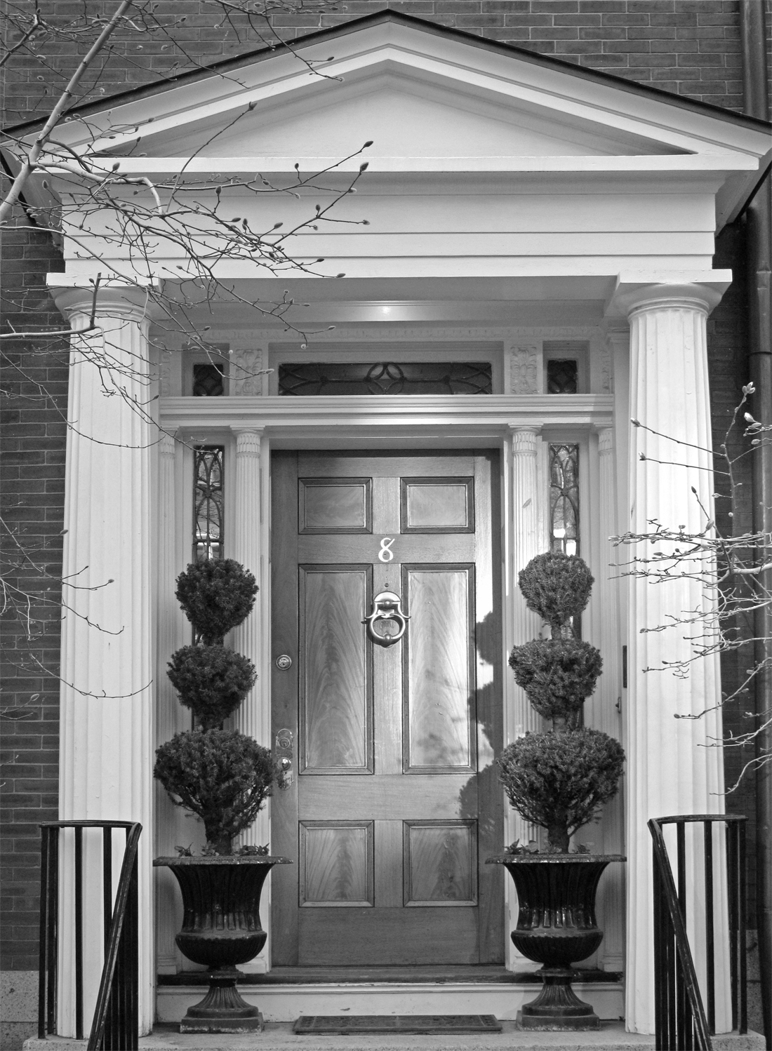
I like the perspective, I think you did it just fine. I like to framing with the bricks around the doorway. I don't know about the dead branches on both sides. I moved the right slider in some in levels, and on the mask painted the tones of the door back in with black. |
Sep 14th |
 |
| 32 |
Sep 22 |
Comment |
Thanks for the story about the bell. At first I thought that it was a bit dark, but then the lights being on show that it is an evening time photo. I don't know how you converted to mono, but if you use NIK, Silver effects pro has some presets that would bring out more detail. Or in Photoshop, if they have color play with the color sliders. I am wondering what Stephen will have to say about the perspective. The base is fading into the black with the webpage, a small border or stroke would help with that. |
Sep 14th |
| 32 |
Sep 22 |
Comment |
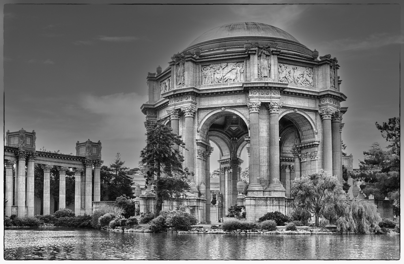
This is a beautiful piece of architecture in a great location. I can see why you keep coming back to take photos. The flat lighting did make the interior have detail. I used sky replacement for a sky that I had previously taken. To me, it does a super job and almost automatically. |
Sep 14th |
 |
| 32 |
Sep 22 |
Comment |
They are in a realistic and interesting pose. The lighting is not a problem, except for the soldier on the left, and you handled that well. The array of equipment adds. I would leave black and white, that is what the photos of the time were, not sepia. It looks like a photo that could have been taken in WWII. I like the patched tent and camouflage netting in the background. It looks like you had an excellent outing. |
Sep 14th |
5 comments - 3 replies for Group 32
|
| 57 |
Sep 22 |
Comment |
The angle adds a lot of interest to the image. Never saw a yellow record, I guess that is the new. |
Sep 25th |
| 57 |
Sep 22 |
Comment |
Interesting use of light. The strong yellow on the edge draws the eye out of the image. It could have been a bit sharper. |
Sep 15th |
| 57 |
Sep 22 |
Comment |
The lighting on the flower with the dark background is very effective. I am not sure about the flower bud, and maybe you should tone it down some so that it is not so bright. Of course with a closeup like this your depth of field is usually limited, and the normal rule would be to have the front petals sharp, and the back petals be more out of focus. However, what you did may not follow the "rule", but I think that it works here. |
Sep 15th |
| 57 |
Sep 22 |
Comment |
This must have been a great place to explore. This is a very sharp and simple image. I like that you are showing a part of the engine, but it appears to be a complete working assembly. Conversion to monochrome was a good choice and the frame is appropriate. Well done. |
Sep 15th |
| 57 |
Sep 22 |
Comment |
I really like the brightly lighted flowers and the fading to dark background, with the front flower very sharp and the flowers going out of focus as they go into the background. The composition is very good, with the dark slightly out of focus leave, and you captured all of the leaf. As I recall, hydrangea blooms are pretty small, so you must have been close. I am curious about the lighting. Putting a small green stroke around the image was good to separate it from the website background. I would not change a think. |
Sep 15th |
| 57 |
Sep 22 |
Reply |
Thanks, that does help the image. |
Sep 13th |
5 comments - 1 reply for Group 57
|
15 comments - 7 replies Total
|