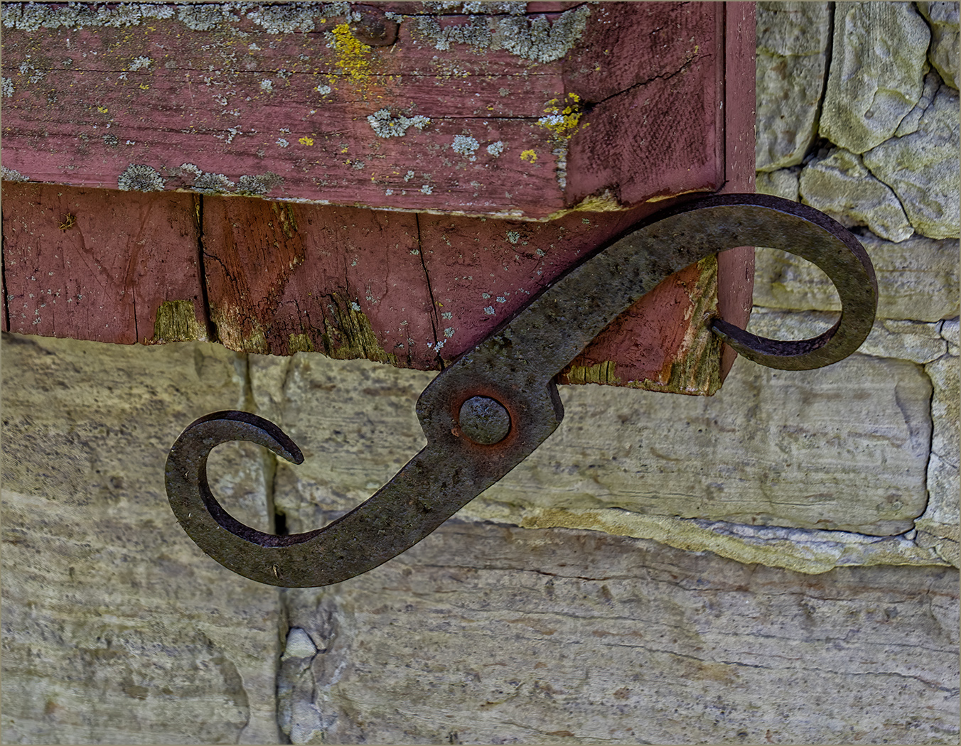
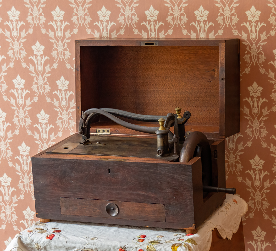
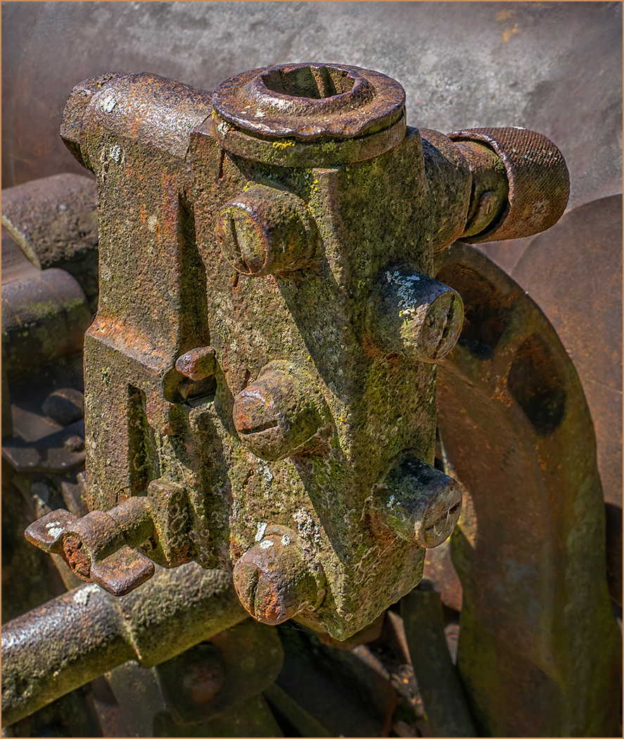
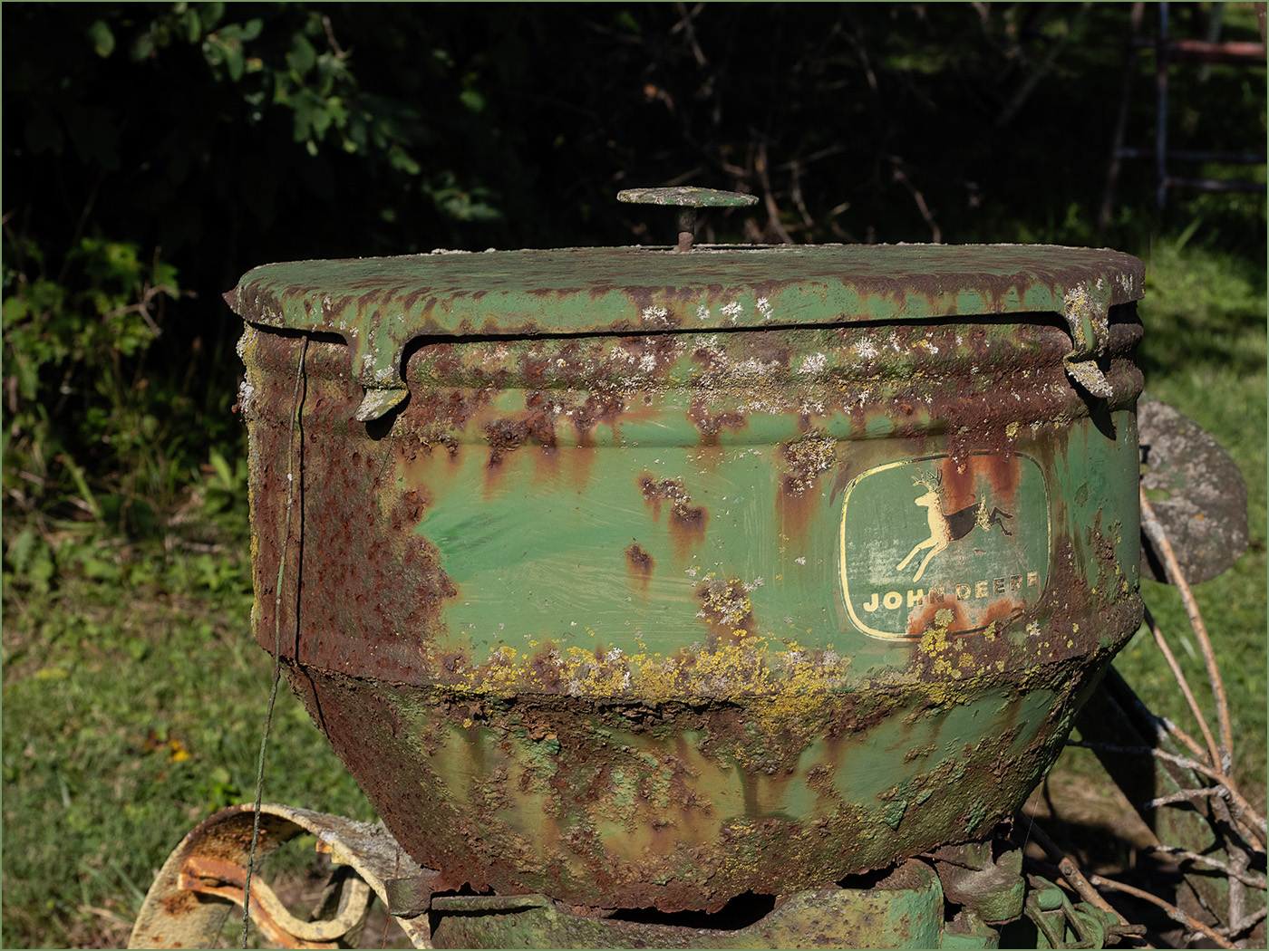
|
| Group |
Round |
C/R |
Comment |
Date |
Image |
| 2 |
Jul 22 |
Comment |
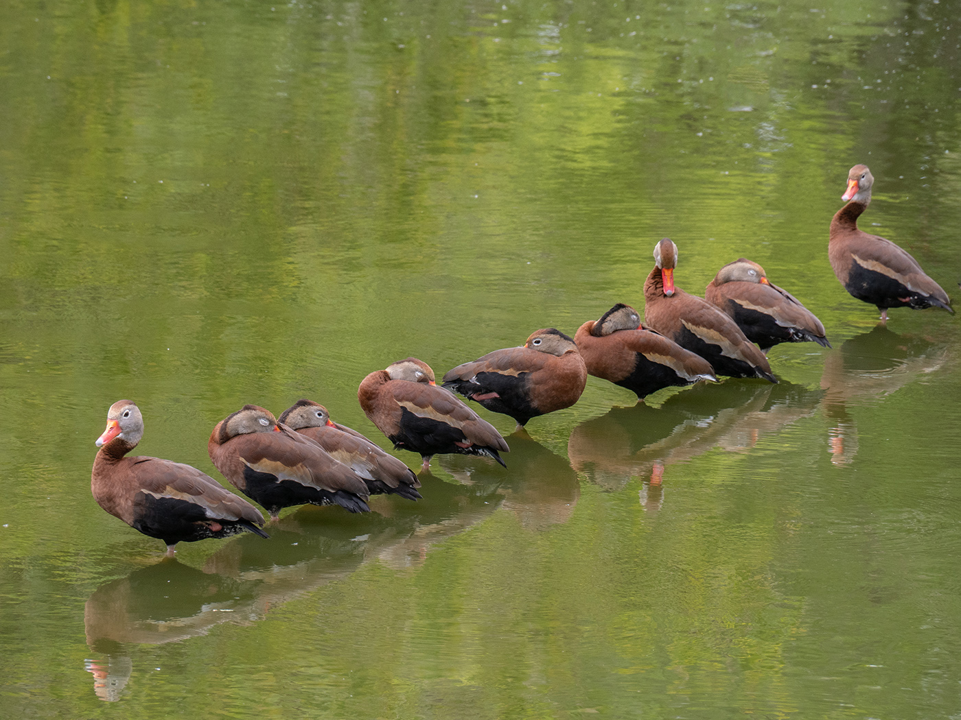
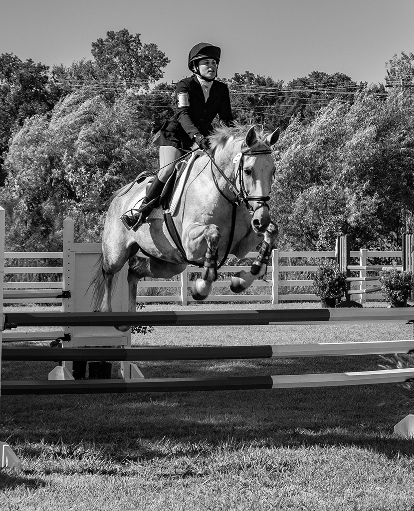
I think that the ball placement is perfect. It is what caught my eye when I was looking at the images. She is looking straight at the ball, and you can see her eyes, which is the most important thing in sports photography. The other players being slightly out of focus keeps the attention on the lead player. Great shot! |
Jul 25th |
1 comment - 0 replies for Group 2
|
| 7 |
Jul 22 |
Reply |
True, the color tones are nice. |
Jul 10th |
| 7 |
Jul 22 |
Comment |
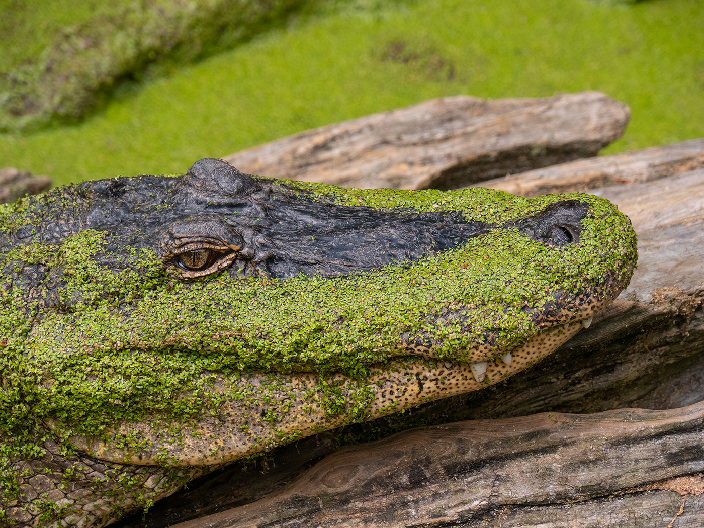
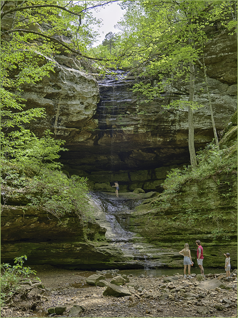
You have a good eye to have seen this image. Your image seems to have lost some detail in areas, and be over sharp in others. I do like the crop that Stuart made. I think that the green on the rocks is moss. There are a lot of good video's on Youtube. This is one that was interesting to me, because besides showing using Denoise and Sharpen, he shows the advantage of using the Raw image, which I had never tried. The link is: https://www.youtube.com/watch?v=80aasB7Oaw8 |
Jul 10th |
| 7 |
Jul 22 |
Comment |
You changed an ordinary looking color image into a more artistic image. I like the crop, but as suggested, maybe move the tree away from the center. And the image does seem a bit dark. Maybe add some brightness and less contrast. |
Jul 10th |
 |
| 7 |
Jul 22 |
Comment |
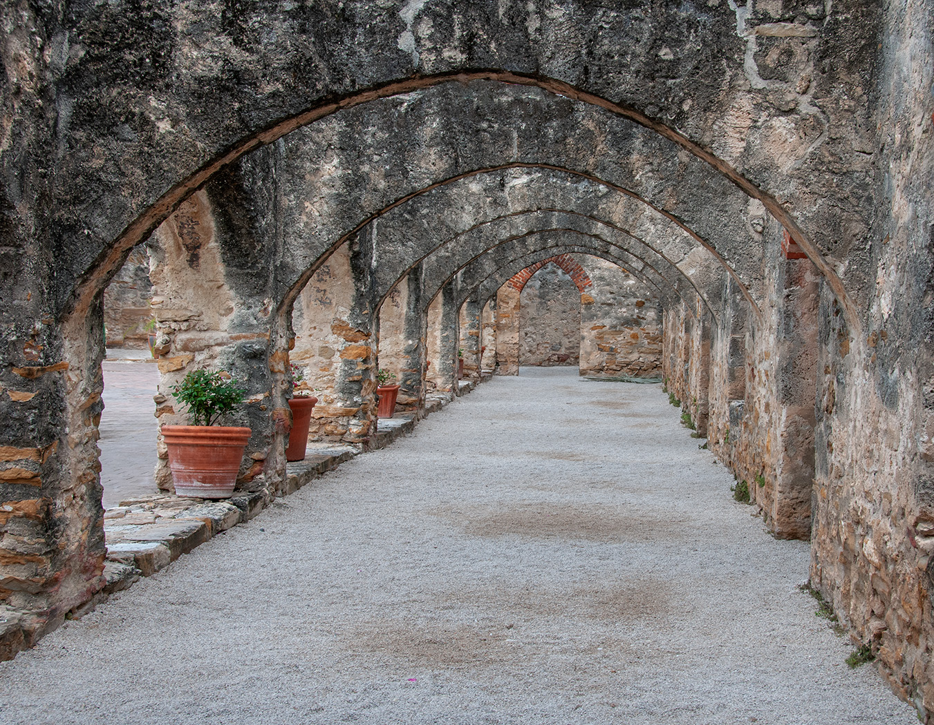
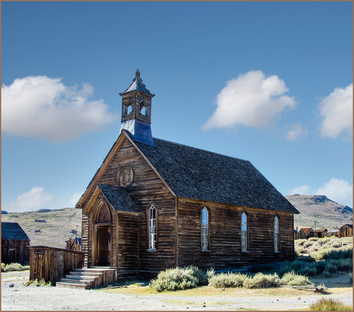
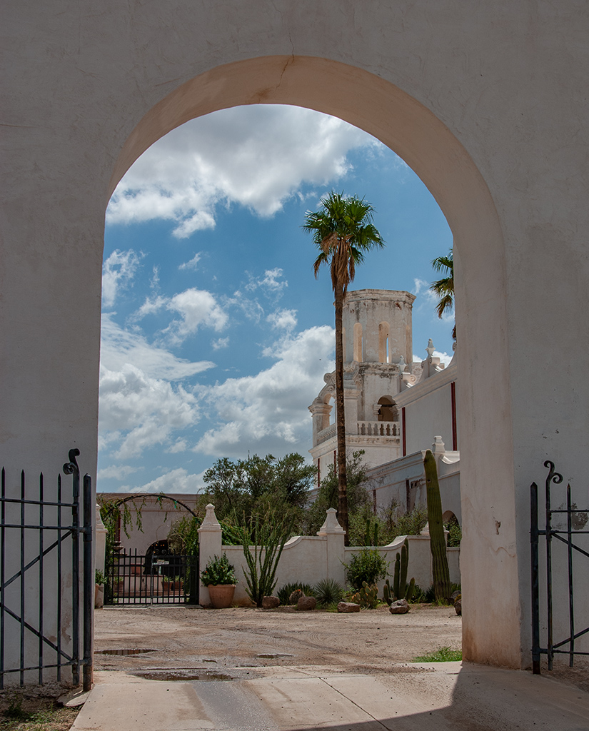
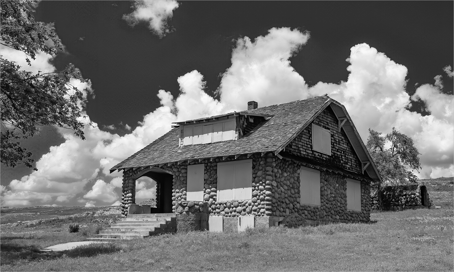
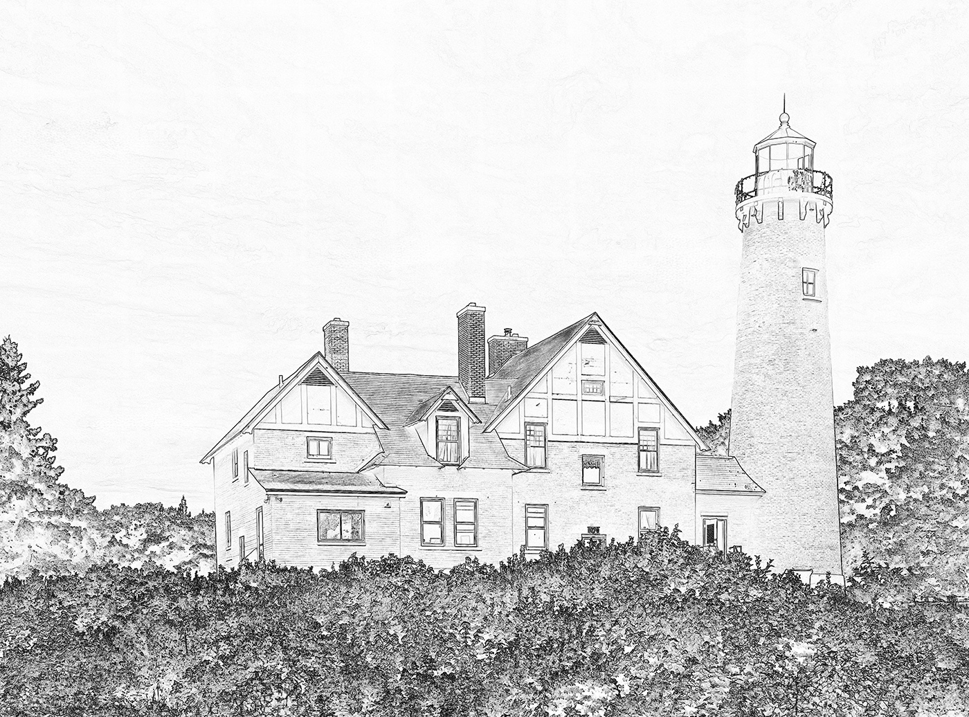
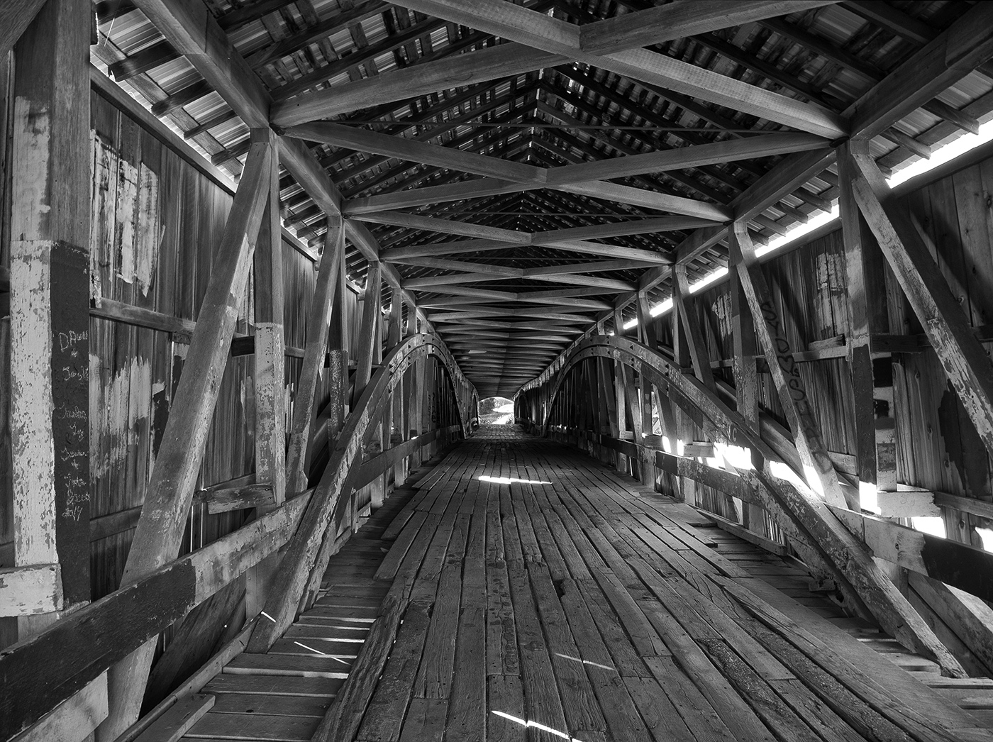
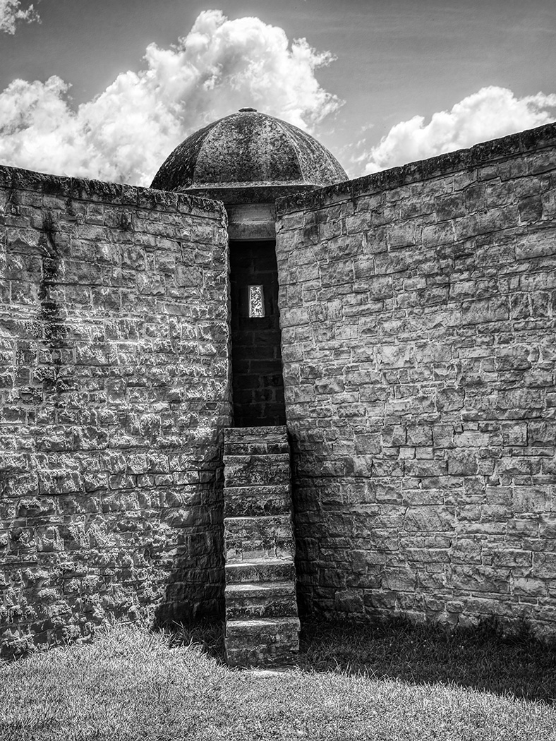
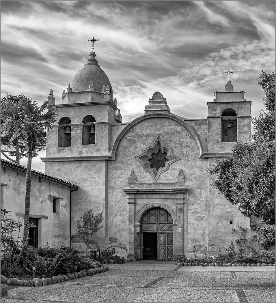
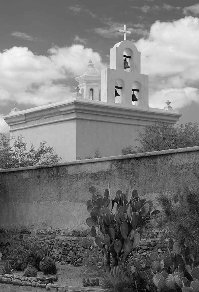
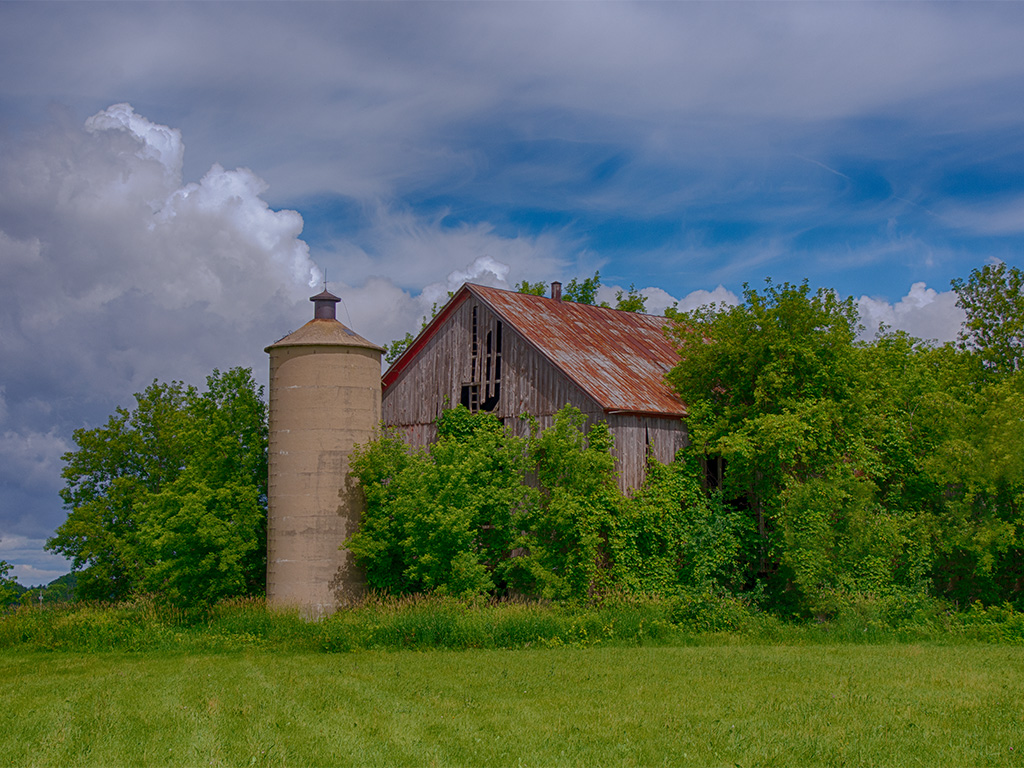
This is a very interesting structure, so I can see how you were drawn to it. The horizon does not appear to be quite level and the buildings in the background are a distraction. Gaetan's comment of getting lower to get rid of the buildings is an excellent one. Or, without going back, why not convert to monochrome. The structure is the main subject, so getting rid of the colors in the background would lessen them. |
Jul 10th |
 |
| 7 |
Jul 22 |
Comment |
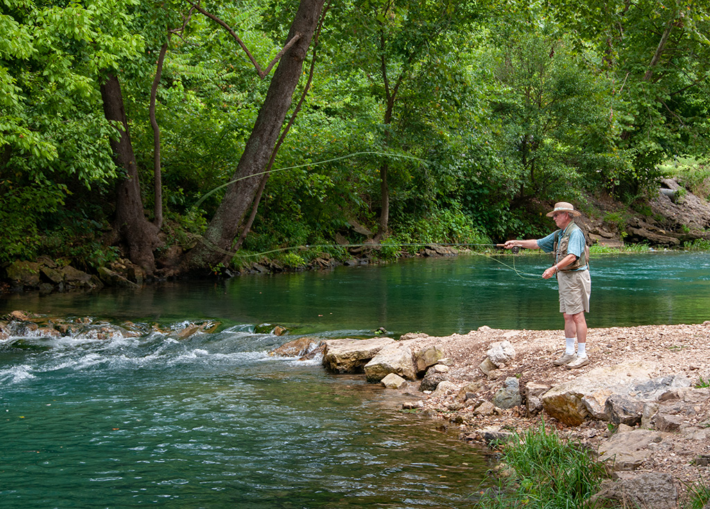
Great colors, and the people in the foreground add to the image. The image seems to have too much grain, or over sharping. Also, the horizon also seems to be bowed and not quite straight. I used Topaz denoise to clean up the noise, and Photoshop Lens Correction to clear up the bow. I also got rid of the palm branches on the far left. |
Jul 10th |
 |
| 7 |
Jul 22 |
Comment |
I like the first image better. The angle of the dog adds a lot of interest to the image. And like Gaetan said, the background on the second image is more of a distraction. Get rid of the brown spot as Paul suggested. |
Jul 10th |
| 7 |
Jul 22 |
Comment |
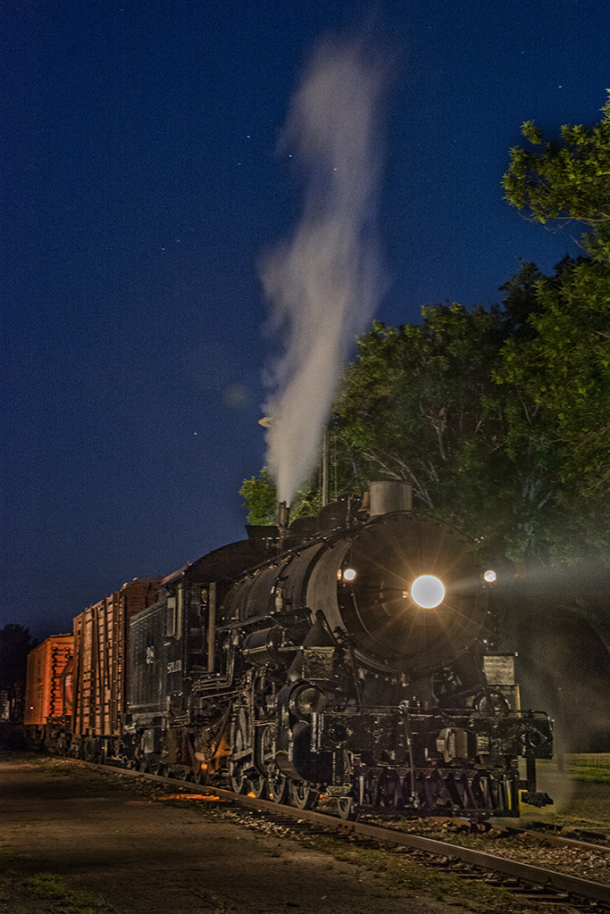
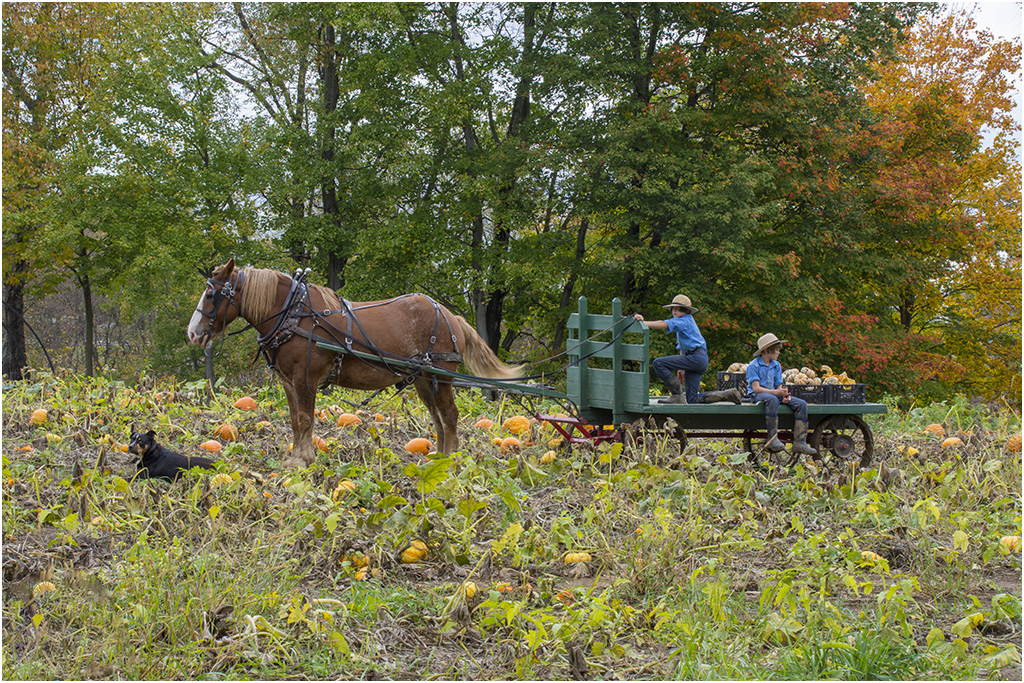
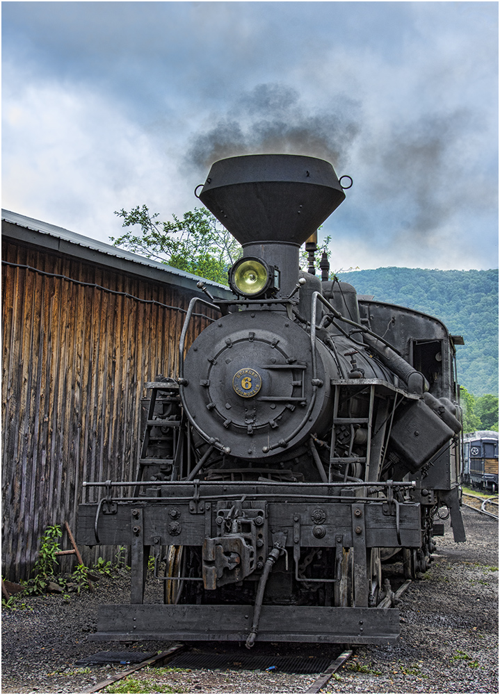
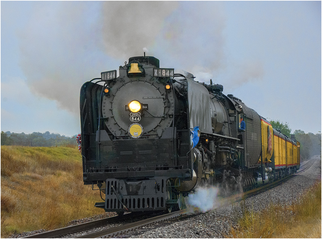
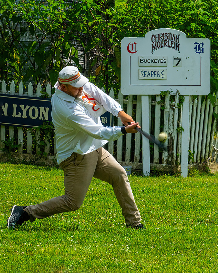
Great timing to capture the ball and the bat swinging, and a slugging posture in the hitter. And, thanks for the info on the image. That game must have been interesting to watch and photograph. The blur on the bat and ball show movement, which helps this image. The only thing that I would do is to straighten the sign. I may not have been straight looking at the fence (but fences are often not straight if the land has a slope), but the sign should be. |
Jul 10th |
 |
| 7 |
Jul 22 |
Reply |
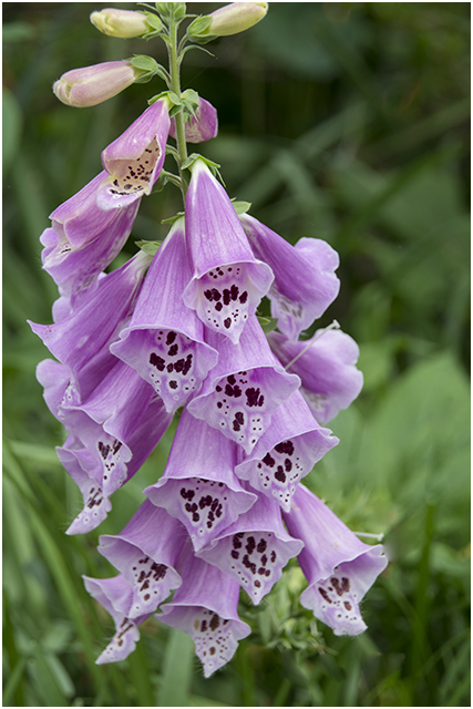
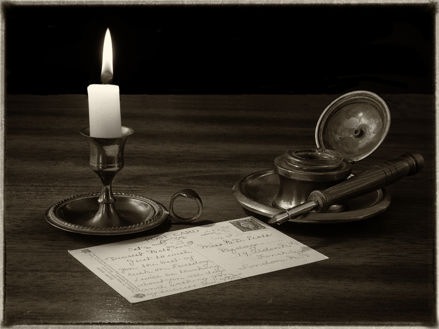
Thanks. It seems that lighting on puffy clouds always has a lighting direction, so really to get the lighting right on the flowers, I would need to use directional light for them. I had not planned on adding clouds when I took the image, but I guess that I need to plan better. |
Jul 9th |
| 7 |
Jul 22 |
Reply |
I took the sky a few years ago with a Canon point and shoot that I carried with me while on walks. I have collected clouds over the years to add to images. I added the background in Photoshop's Sky Replacement that works really well. I did not need to do anything to help the selection of the flower. Photoshop does let you adjust the color, brightness, and so forth on the sky. Photoshop actually supplies some skies but you can not use them in PSA competitions since all elements in an image should be taken by you. Some camera clubs may have similar rules. |
Jul 7th |
6 comments - 3 replies for Group 7
|
| 32 |
Jul 22 |
Reply |
You do not have to use the Photoshop supplied images. You can put your own photos into the Photoshop software (which is what I use - my own sky images). It is easy, I am sure that there are lots of tutorials on how to do it. I could write up some instructions and send to you if you want me to. |
Jul 12th |
| 32 |
Jul 22 |
Reply |
If you decide to, it is really easy in Photoshop with the sky replacement feature. |
Jul 12th |
| 32 |
Jul 22 |
Comment |
You have the fence, the mountains, and the sky. I agree with Stephen that the image may be over sharpened, and also his point about the blown out clouds. Looking at the original, there seems to be more detail in it than there is in the monochrome image. |
Jul 12th |
| 32 |
Jul 22 |
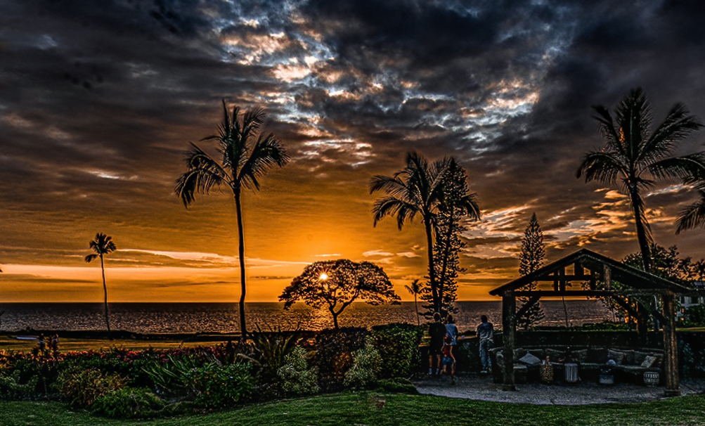
Comment |
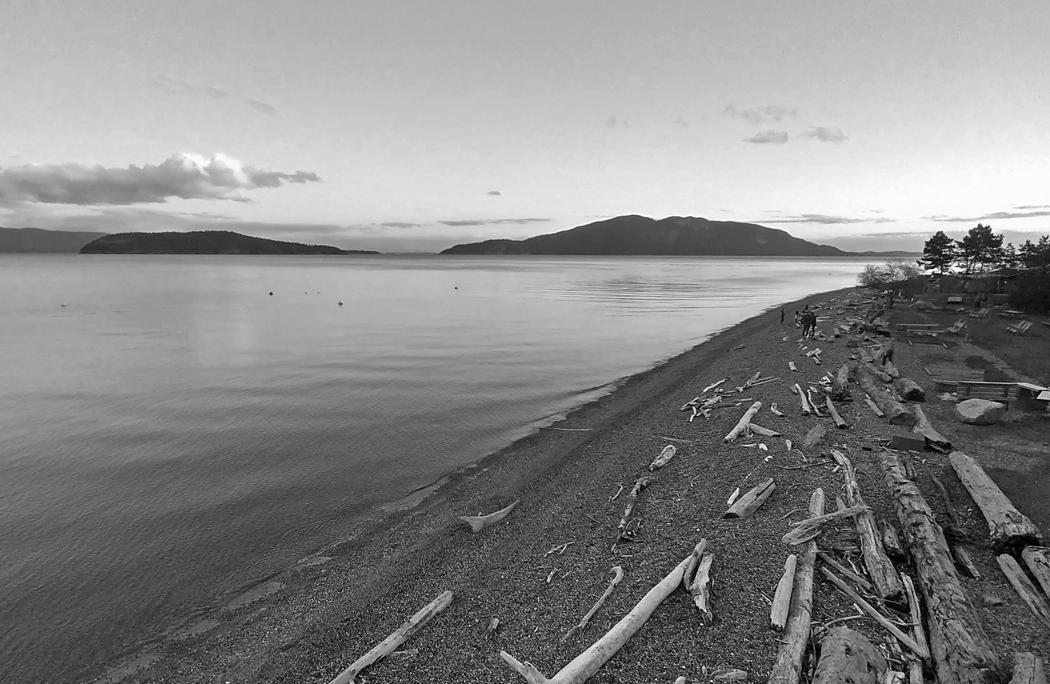
You have a nice, pleasing image and the driftwood on the shore adds interest. Cropping off some of the sky was a good idea. I know it is not what you saw from the balcony, but I would reverse the image. That makes the shoreline a good lead-in and makes the people on the beach a point for the eye to settle on. |
Jul 11th |
 |
| 32 |
Jul 22 |
Comment |
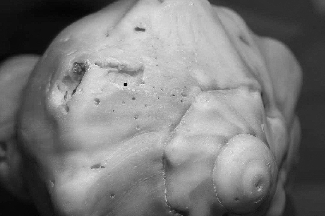
It was a good idea to convert to monochrome, as the color is over powering and takes away from the texture and detail of the shell. The mono image seems to have more noise than the color image. I used Topaz denoise on the color image, sharpen it some in Photoshop, and use Photoshop, adjusting the sliders to convert to monochrome. I would not flip the image, as to me the circle area at the bottom is the main subject, and it is better on the right. |
Jul 11th |
 |
| 32 |
Jul 22 |
Comment |
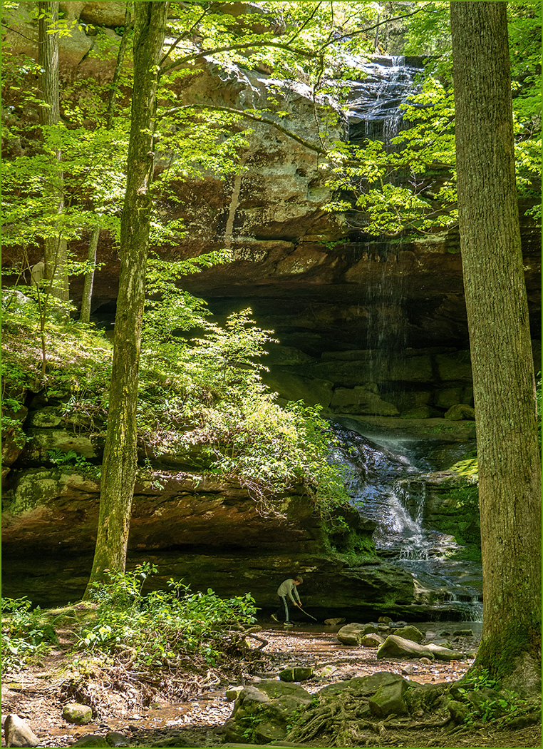
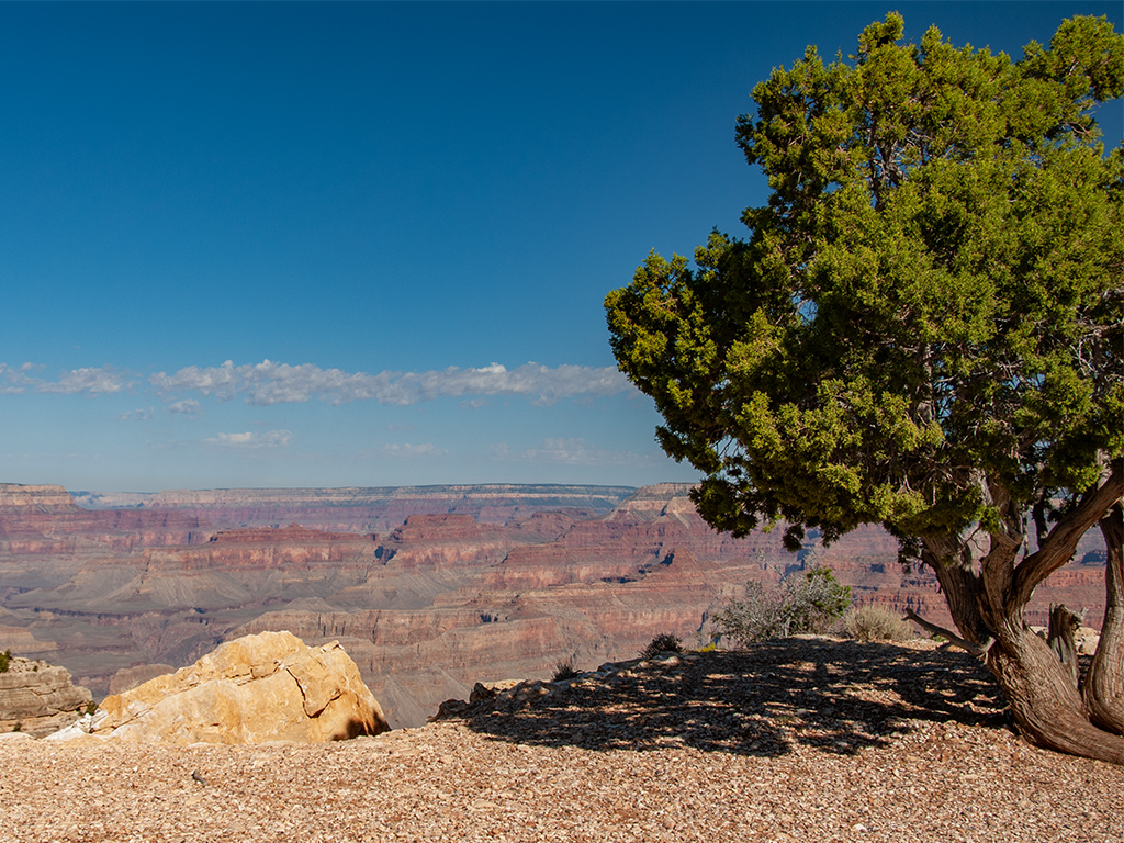
You have really great contrast and sharpness. The dark sky is nice against the lighter mountains, and it is good composition to not show much of the bald sky. I really have no comment about the perspective, since there is no architecture for me to see any distortion. I would crop off the snow at the bottom, as it draws my eye from the waterfall. |
Jul 11th |
| 32 |
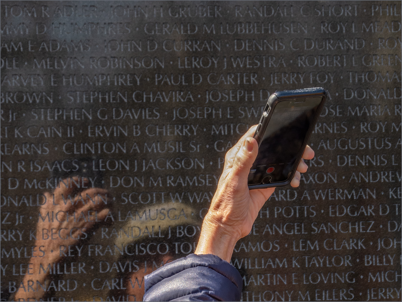
Jul 22 |
Comment |
Interesting image, and it is very sharp, especially the hand on the right. I wish that the hand on the right had an arm -- it appears to be floating as it is. I like the contrast, and I think that a small stroke around the image would help so that the image does not just blend into the black background of the website. |
Jul 11th |
| 32 |
Jul 22 |
Comment |
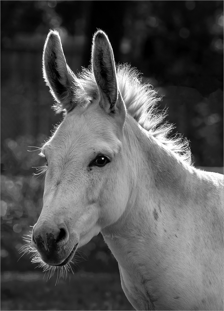
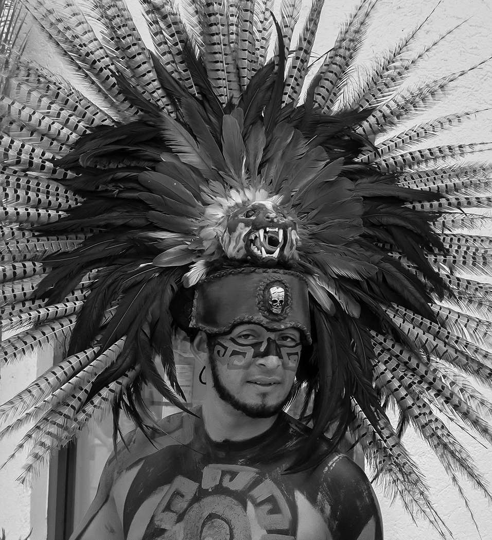
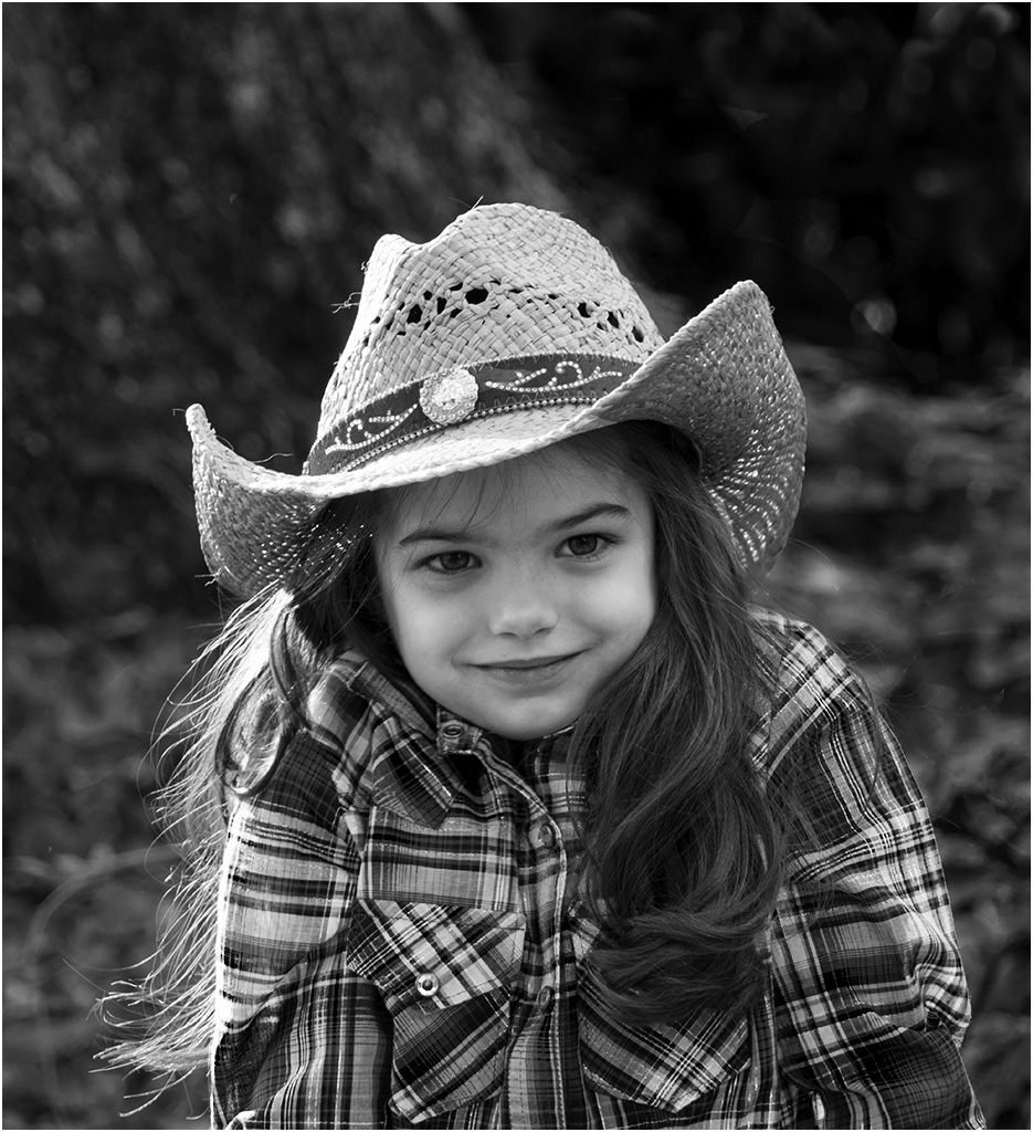
Nice sharp image, with a good background. I like the monochrome better than the color. Lighting is a bit flat, but she does show a lot of character. Adding a small catch light to her eyes would help. |
Jul 11th |
| 32 |
Jul 22 |
Reply |
Yes, that is really fast. Maybe without camouflage, they need to be fast to survive. Thanks for the comments. |
Jul 10th |
| 32 |
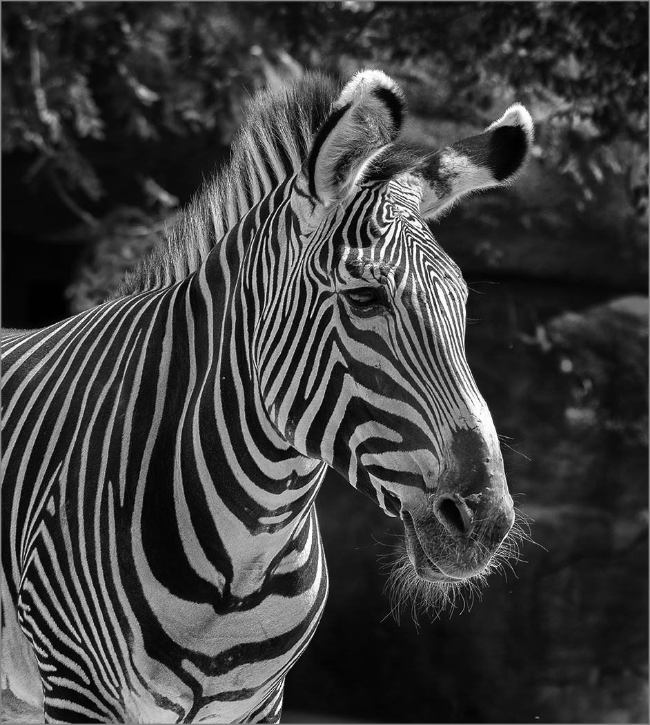
Jul 22 |
Reply |
He may have a PhD, but I think that they are white with black strips. The chin whiskers and the mane are white. Thanks for the comments. |
Jul 10th |
6 comments - 4 replies for Group 32
|
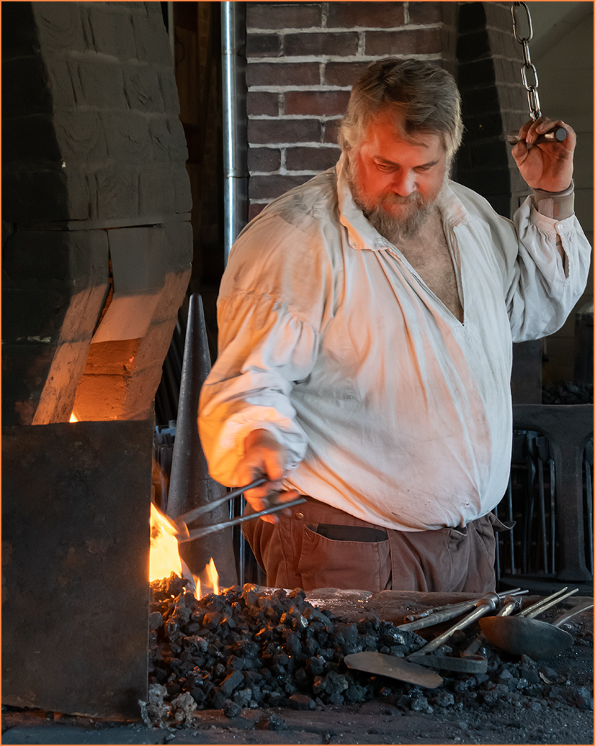
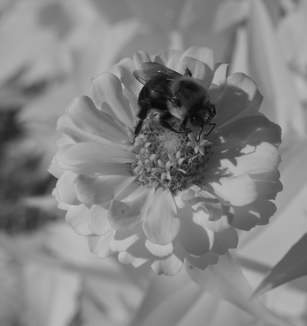
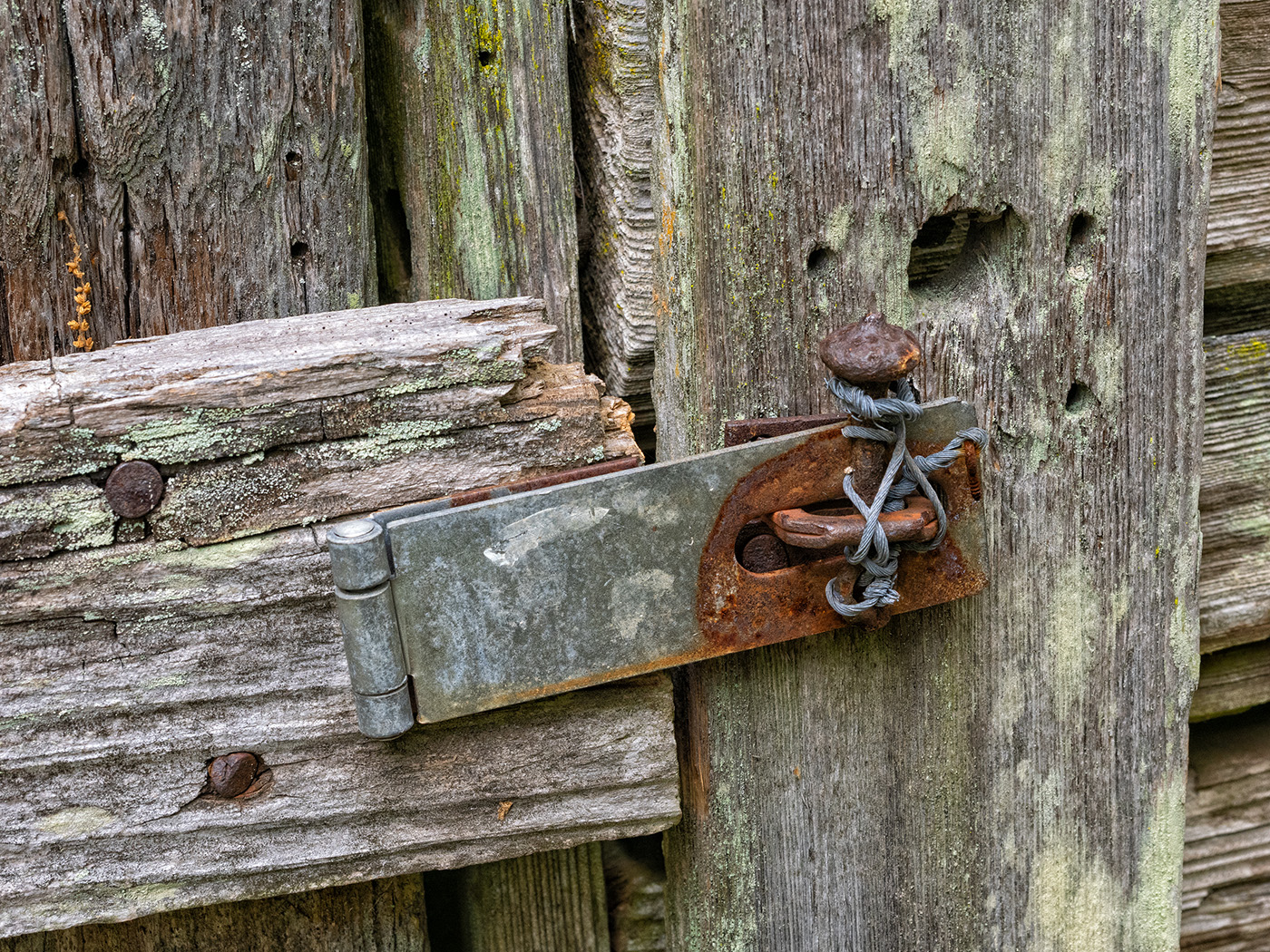
| 57 |
Jul 22 |
Comment |
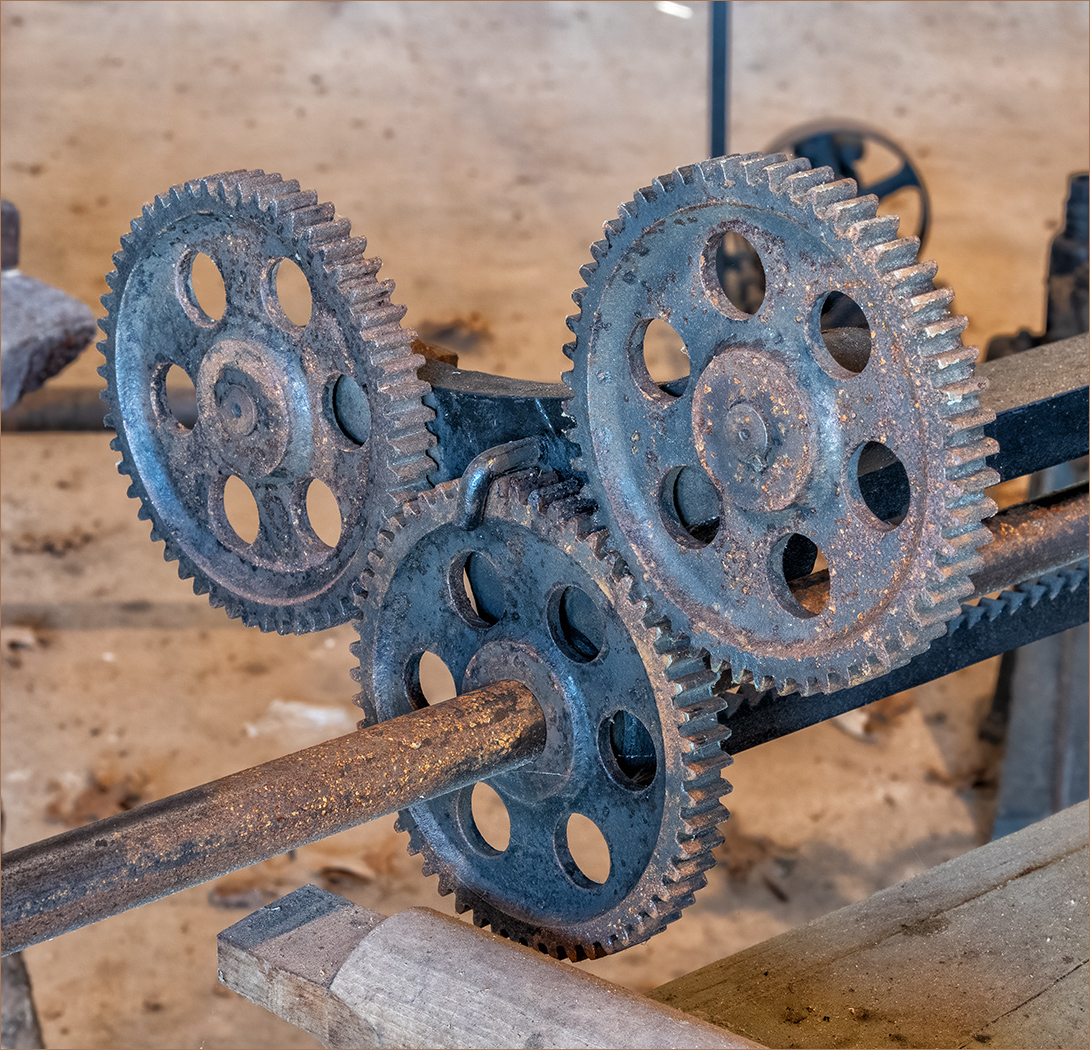
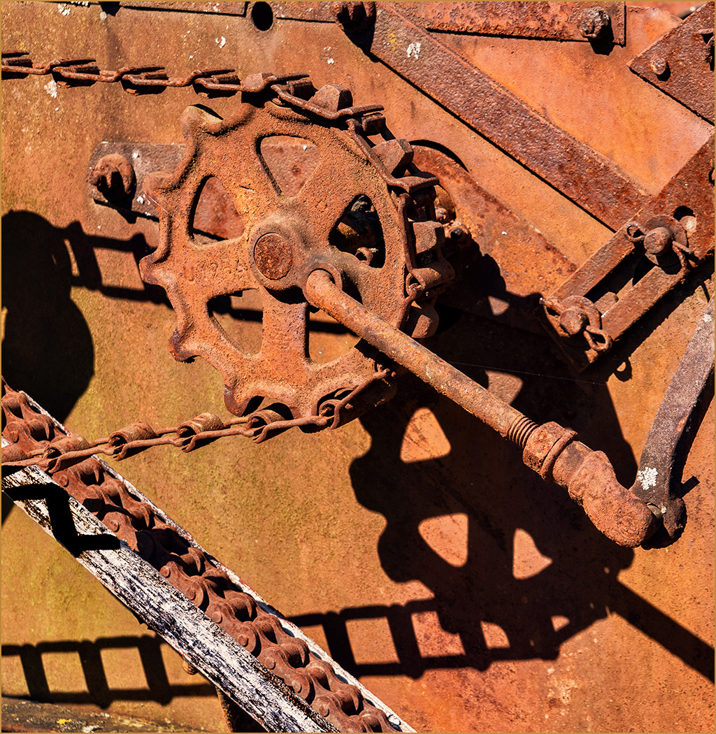
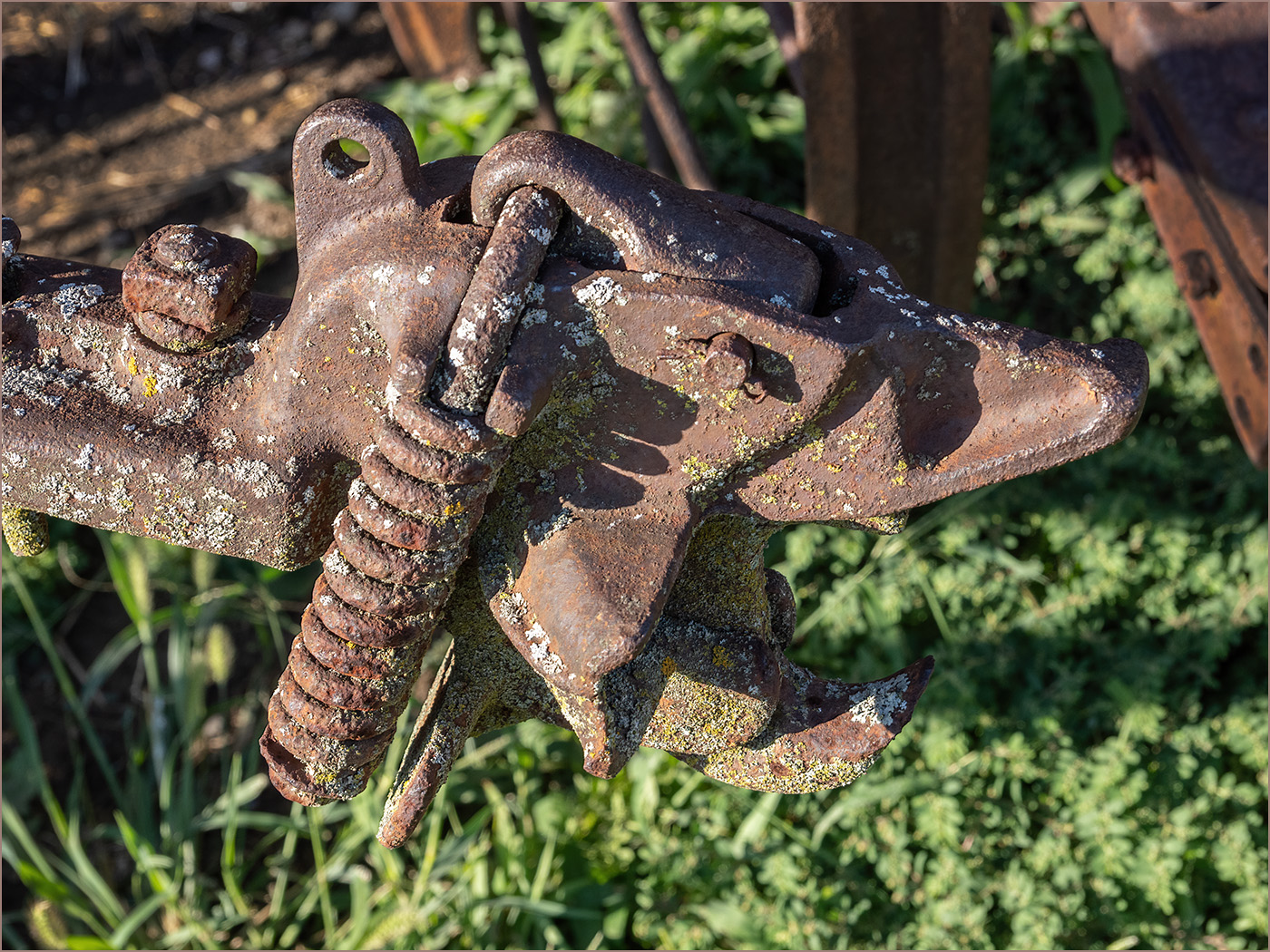
Putting the anvil at an angle adds interest. The image is very sharp from front to back, so your focus stacking was a good idea. I am surprised that you don't have more noise at that high ISO. Thank you for the story about the magnet. The colors really caught my attention, but I do like the monochrome that Cindy posted. It brings our the texture on the anvil better. |
Jul 12th |
| 57 |
Jul 22 |
Reply |
Cindy, thank you, that looks a lot better. |
Jul 12th |
| 57 |
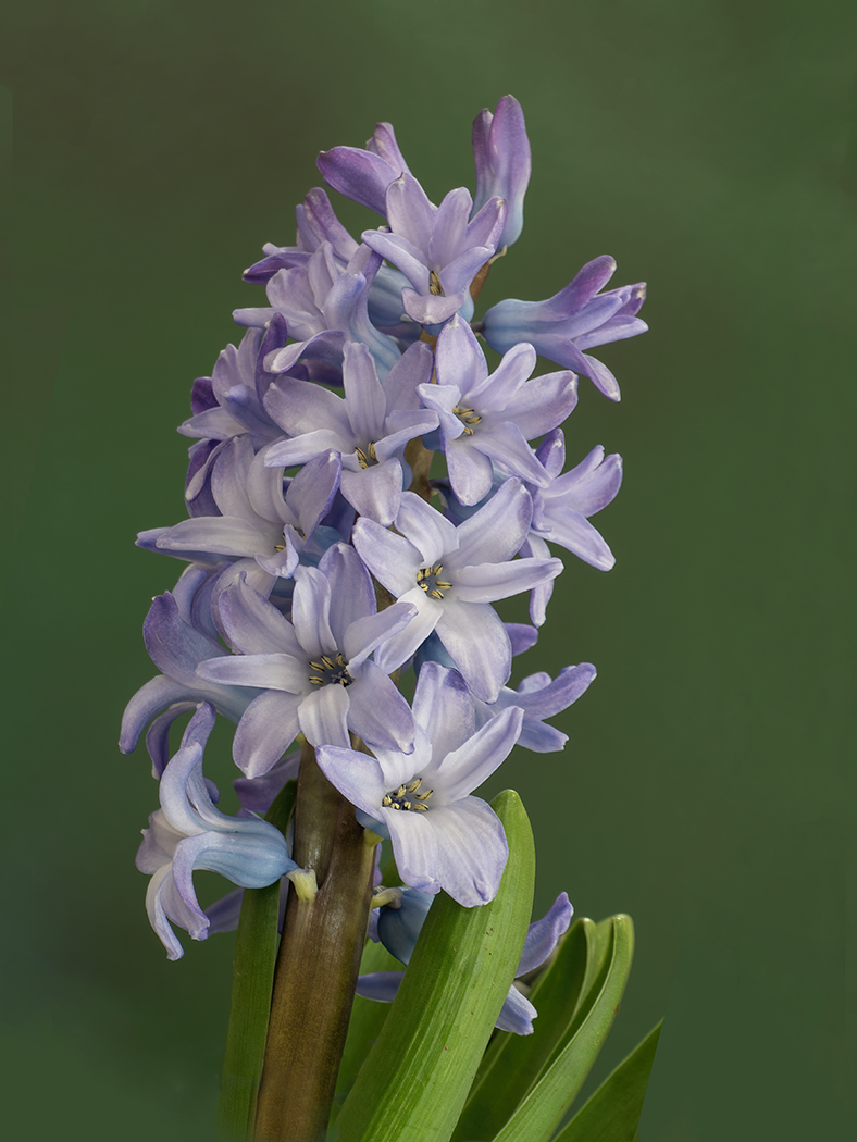
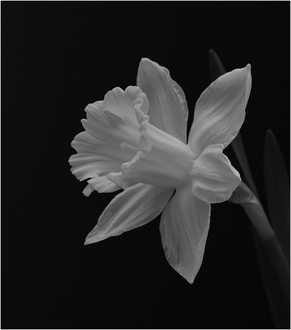
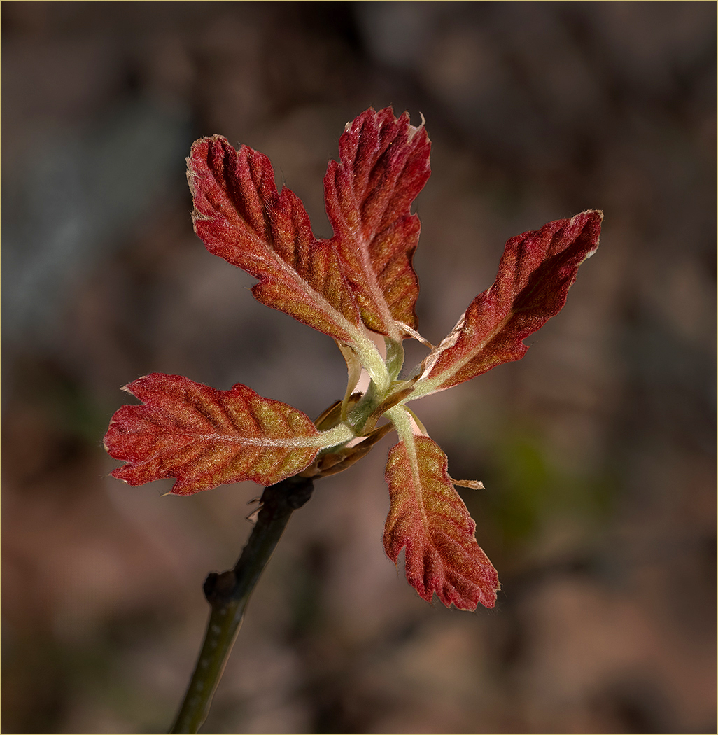
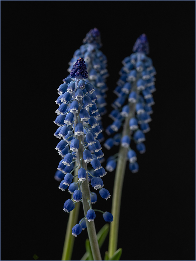
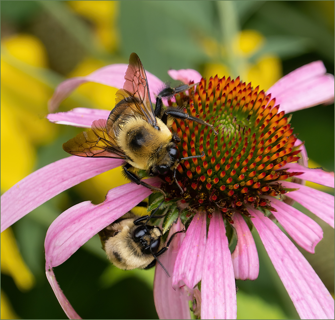
Jul 22 |
Comment |
Your depth of field on the main flower is very good, to have the flower sharp and the leaves and background blurred. Leaving in the out of focus flower and bud tells more of a nature story, as it shows the surroundings. What Stuart did makes it more of a formal image. The Stuart's small image looks good, but when I click on it to enlarge, it does not look very good, too much detail lost and noise added. |
Jul 12th |
| 57 |
Jul 22 |
Comment |
Interesting idea to take buds with an infrared camera. The flare adds a lot of interest to the image. I think that you have plenty of detail in the buds, and have even captured a small bug. I do which that you would have put a small white stroke around the image, to have some framing around the image. |
Jul 12th |
| 57 |
Jul 22 |
Comment |
You have a great exposure to keep all of the details in the white feathers. Good composition for the neck and head to be leaning back that keeps them really close to the white feathers, and they bring the eye straight into the image. I am glad that you added a white stroke so that the image is separated from the black background of the website. |
Jul 12th |
| 57 |
Jul 22 |
Comment |
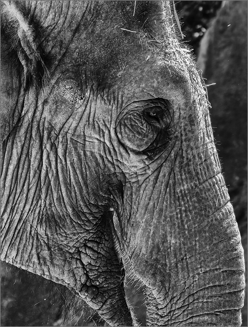
You have a lot of detail and depth of field. The angle does add a lot of interest to the image. The straw does not bother me, as it is part of the story. The dead area on the leaf does bother me, but it would be really hard to get rid of it in the image. I would remove the orange area at the left top of the straw, and the yellow spot on the right side of the glass. |
Jul 12th |
5 comments - 1 reply for Group 57
|
18 comments - 8 replies Total
|