|
| Group |
Round |
C/R |
Comment |
Date |
Image |
| 1 |
Jun 22 |
Comment |
Your patience was rewarded, by not only getting them to be still, but also to have several in the image. |
Jun 24th |
1 comment - 0 replies for Group 1
|
| 3 |
Jun 22 |
Comment |
Great image, thank you for sharing. |
Jun 24th |
1 comment - 0 replies for Group 3
|
| 7 |
Jun 22 |
Reply |
Rich, thanks for correcting the brightness. I did use HDR for a couple of images, but having a new camera, I used the camera's built in HDR, thinking that it would also keep the individual images that I could process later if I wanted to. It did not keep then, and I did not like the in-camera created image. I had used focus stacking, and it kept the individual images, and created a stacked image. I thought the HDR would do the same. Now I know. |
Jun 20th |
| 7 |
Jun 22 |
Reply |
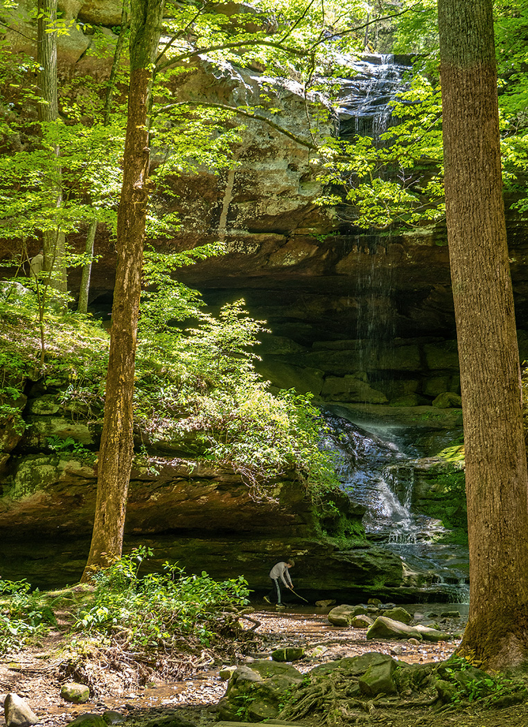
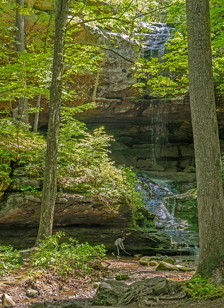
Tony, Thanks for telling me how you did it. That is very helpful and something for me to remember and use again. Below is my image. I did go one step further, I selected the boy and reduced his saturation and lightness to make him white, so maybe he will show up better in the image.
Whoops, I did not have the top part of image shown, so I did not select the top of the tree trunks. But that does show the change from the green to brown, so maybe it is good for an example. |
Jun 18th |
 |
| 7 |
Jun 22 |
Reply |
It looks good. Please tell me how you did it. |
Jun 16th |
| 7 |
Jun 22 |
Reply |
Tony, yes, it very green, from the sunshine filtering through the trees. I used Hue and Saturation to get rid of the green where it should not be, and Shadows and Highlights in Photoshop to adjust them. What do you think? |
Jun 15th |
 |
| 7 |
Jun 22 |
Comment |
A very interesting building, and thanks for sharing its history with us. The columns look nice and straight, and I like the tonal corrections that you made from the original. |
Jun 13th |
| 7 |
Jun 22 |
Comment |
Yes, you were in the right place at the right time. Very nice capture. The whites do seem blown out, and I like what Gaetan did with the image. |
Jun 13th |
| 7 |
Jun 22 |
Comment |
The slight tilt to the flower adds interest. I would crop some off the left to take the center of the flower out of the center. Getting rid of the noise helps the image. |
Jun 13th |
| 7 |
Jun 22 |
Comment |
Very nice image of the owlets, and even the tree branch is interesting. I really don't see any noise, so can not tell that it is a tight crop. You must be both very steady, and have good image stabilization. And of course the image is all about the eyes. Excellent nature image. |
Jun 13th |
| 7 |
Jun 22 |
Comment |
Good photographic eye to see this very nice abstract. Like modern art that people pay a lot of money for. I agree with Barbara and Gaetan that the log is a distraction, and like what Gaetan did. |
Jun 13th |
| 7 |
Jun 22 |
Reply |
It was very contrasty. Bright sun and dark below the falls.I can try and reduce the highlights, but they may be blown out. It is a lovely location, but since the falls are intermittent, finding them running on a cloudy day may be a challenge. Thanks for your input. |
Jun 13th |
5 comments - 5 replies for Group 7
|
| 32 |
Jun 22 |
Reply |
Very nice creative image. |
Jun 30th |
| 32 |
Jun 22 |
Reply |
They may have had to replace some of the roof shingles, and did not use a matching color. When I look at the original again, there seems to be an area at the very back that is the same color as the heart. |
Jun 27th |
| 32 |
Jun 22 |
Reply |
This is what I see as a figure. |
Jun 19th |
 |
| 32 |
Jun 22 |
Reply |
Just crop off part of the white area, so it is not so wide. |
Jun 13th |
| 32 |
Jun 22 |
Reply |
You could crop off part of it. |
Jun 13th |
| 32 |
Jun 22 |
Comment |
I think that the tones are okay. What bothers me about the image is that the arch and the view behind the arch blend together too much. I selected and darkened the arch area some. |
Jun 13th |
 |
| 32 |
Jun 22 |
Comment |
An interesting image with the man in a suit at the beach and the umbrellas. Good composition. I am not a fan of the grunge on the right side, and on my monitor the sepia is too strong. |
Jun 13th |
| 32 |
Jun 22 |
Comment |
An interesting image. The falling tree really adds to it. I don't know about a witch, but I see a scare crow at the lower back area. |
Jun 13th |
| 32 |
Jun 22 |
Reply |
Yes, and I find that sometimes I completely miss something until a member points it out, and then it is obvious. I can get so focused on part of the image. |
Jun 6th |
| 32 |
Jun 22 |
Comment |
As I recall the image the first time around, this is an improvement. |
Jun 6th |
| 32 |
Jun 22 |
Comment |
A very much needed area to put things away, shoes back on and maybe a belt also. A very good title for the area. I would crop off the partial area on the left. |
Jun 6th |
| 32 |
Jun 22 |
Comment |
A nice sharp image, and I like the texture with the leaves and tree trunks. The clouds add to the image. It looks to me that you have a full tonal range, from white clouds to black on some of the water. I would not change anything. Stephen has a point about the branches on the left, especially since they do not have a base, but they would be really hard to get rid of. Maybe thing about that if you are there again to take photos. And I do not think that you want to flip the image. The trees should be on the right side. |
Jun 6th |
| 32 |
Jun 22 |
Reply |
Thanks for the recommendation. I will keep that in mind. |
Jun 5th |
6 comments - 7 replies for Group 32
|
| 33 |
Jun 22 |
Comment |
I like your image. It is a pleasant image, with nice colors. I would crop off the light area on the right, I think that would help keep your eye in the image. |
Jun 6th |
1 comment - 0 replies for Group 33
|
| 57 |
Jun 22 |
Reply |
Okay, thanks. |
Jun 16th |
| 57 |
Jun 22 |
Comment |
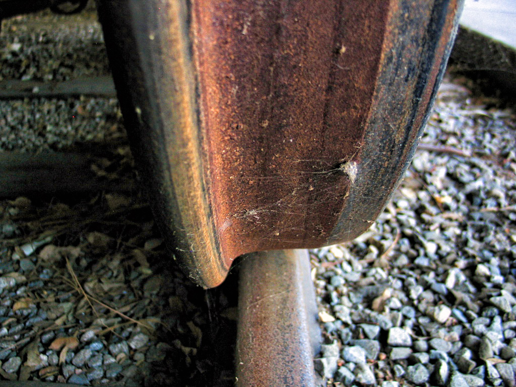
Thank you for informing us about train wheels -- I like old trains and that is something that I had not heard about. I like the rust on the wheel and the spider webs. It is good that you lighten up the left side. I do wish that the wheel was a bit sharper. I used NIK Color Effects and the Tonal Contrast preset to bring out the rust better and make it seem a bit sharper. |
Jun 14th |
 |
| 57 |
Jun 22 |
Comment |
Very interesting image, and you have a good photographic eye to have seen it. You need to keep the leaves to show size and perspective. Otherwise we would not know that it is a closeup. |
Jun 14th |
| 57 |
Jun 22 |
Comment |
I like the original image, and of course I think that any good creative image needs to start with a good image. I like the effect of the paint texture and how you applied it to the final image. Is the paint texture one that you downloaded, or one that you created? I really like the image, but one thing that you might try is reversing it. Of course that would not work with the original image because of the lettering. |
Jun 14th |
 |
| 57 |
Jun 22 |
Comment |
Very nice sharp image, and so I would say that you did not need a tripod. Parts of the butterfly are out of focus, but the head and eyes, that are the most important part are very sharp, and well lighted. The flowers add a lot to the image, and the out of focus and darker background is very nice. The butterfly and flowers fill the image, for good composition. |
Jun 14th |
| 57 |
Jun 22 |
Comment |
The bent stem adds a lot of interest to the image. You got a lot of depth of field with the iPhone, but it looks like the closest seeds are out of focus, with the focal point being more toward the center of the seed pod. The seeds in the plane are very sharp. I would tone down the blue area in the lower left. |
Jun 14th |
5 comments - 1 reply for Group 57
|
19 comments - 13 replies Total
|