|
| Group |
Round |
C/R |
Comment |
Date |
Image |
| 7 |
May 22 |
Reply |
Thanks |
May 20th |
| 7 |
May 22 |
Reply |
Thanks |
May 20th |
| 7 |
May 22 |
Reply |
Rich, I like what you did with the image. It brings out a lot of detail and texture. |
May 19th |
| 7 |
May 22 |
Comment |
The fog in the image really helps it, and brings out the light from the tower. The image is nice and sharp. Thank you for giving us a daytime image for comparison. I disagree with Stuart, and do not think that the image should have more detail brought out. The soft effect of the fog is lost. I also disagree with Barbara, about cropping out the 2 buildings on the right. While doing so brings more interest to the tower, it eliminates showing the low hanging fog on them. |
May 19th |
| 7 |
May 22 |
Reply |
I used my new, OM-1 that is a mirrorless, digital camera. It came out on the 50th anniversary of the film OM-1 camera. Sorry about the confusion. |
May 18th |
| 7 |
May 22 |
Reply |
Thanks. |
May 13th |
| 7 |
May 22 |
Comment |
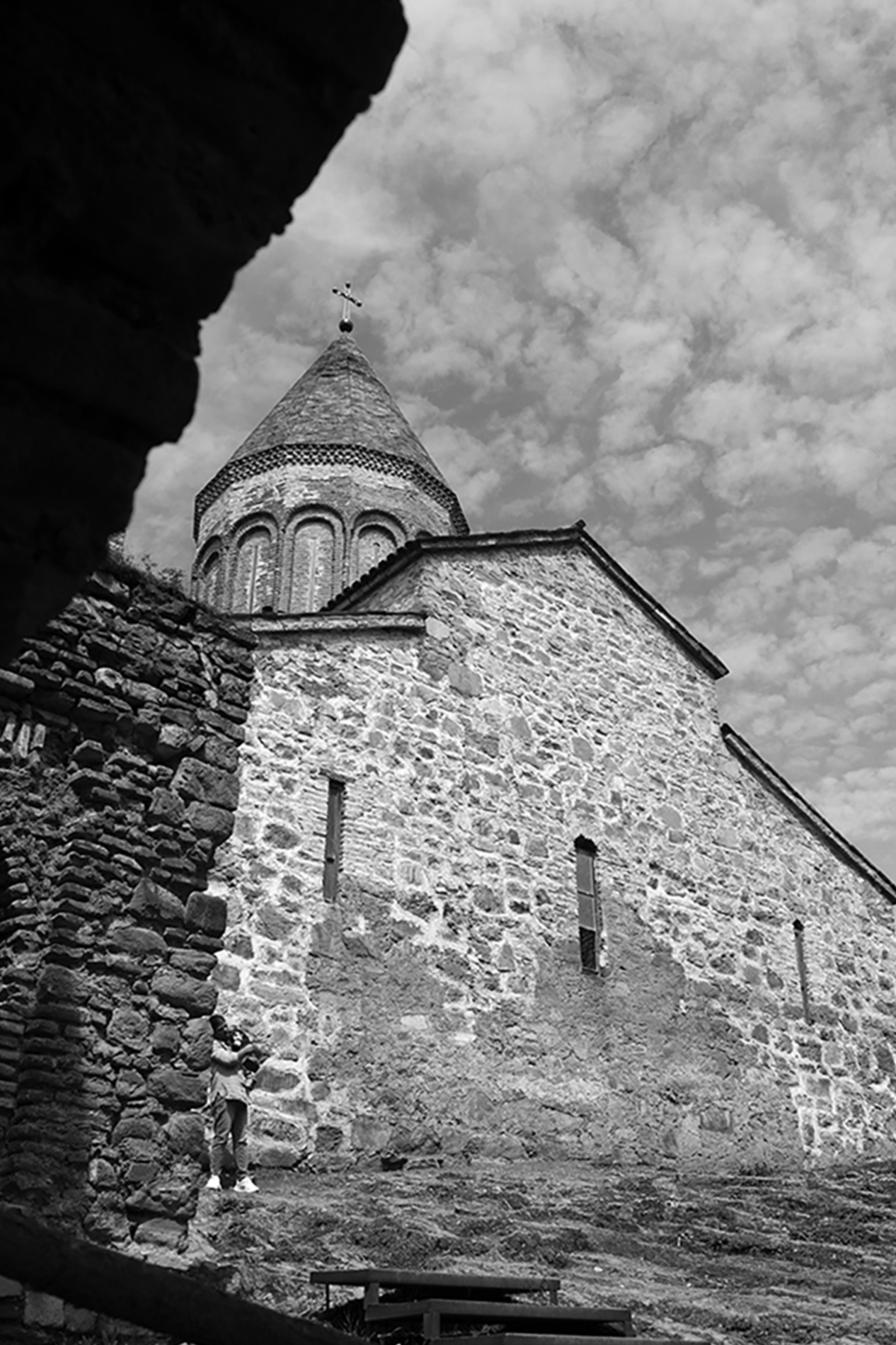
You have some distortion caused by the wide angle lens, but I am guessing that you had to use a wide angle to get the shot. You have a lot of texture in the building, and the sky is nice. It took me awhile to see the person in the image. It bothered me that the tower is leaning back. I played with it in Photoshop and lens correction. I adjusted the angle. |
May 12th |
 |
| 7 |
May 22 |
Comment |
The duckling is very sharp, and had a great reflection. The fact that he is swimming adds "life" to the image. The green around him adds interest. You have a lot of dead space around him, but that adds to your story about him being alone. You are fortunate to have so much nature around you. |
May 12th |
| 7 |
May 22 |
Comment |
Nice sharp image with plenty of depth of field for the tulip, but also a blurred background. I like that it is a tilted image (not head on, and not from the side). I is an interesting flower with the yellow inside. |
May 12th |
4 comments - 5 replies for Group 7
|
| 32 |
May 22 |
Reply |
That was before global warming and the severe drought in California. |
May 14th |
| 32 |
May 22 |
Reply |
Yes, and some have killed by wildfires. |
May 14th |
| 32 |
May 22 |
Reply |
Yes, that is better. |
May 11th |
| 32 |
May 22 |
Reply |
Maybe. |
May 11th |
| 32 |
May 22 |
Reply |
I played with them in Photoshop with Hues and Saturation. I could not get a true red. |
May 10th |
 |
| 32 |
May 22 |
Comment |
Going to monochrome really cleans up the image. A nice and unusual Christmas image. |
May 10th |
| 32 |
May 22 |
Comment |
Your shutter speed gave great movement to the water and the clouds. It looks like you captured the moon just coming out from the cloud bank, which helps with the clouds. I am not sure that I like the lights along the shore in the distance. They draw my eye from the moon, and you can tell where the shoreline is without them. |
May 10th |
| 32 |
May 22 |
Reply |
You made a good attempt, and at least you had the light from the moon on the water. Glad you were able to get a poster, and getting it from the family is a great plus. |
May 10th |
| 32 |
May 22 |
Reply |
Well, you did what you intended to do. You should not have shown the color image! |
May 10th |
| 32 |
May 22 |
Comment |
I can see it on mine to, but it is more distinctive on the color image. Looking at them again, that may be because the colors bring it out more. Your monochrome has a full tonal range, from black to white. I am thinking that the monochrome has more of a moody feeling that I don't think fits what I want to feel for the image, if that makes sense. The color image looks like a nice pathway on a sunny day. |
May 9th |
| 32 |
May 22 |
Comment |
It is an interesting image, and I like the detail in the plant. It does have a look like a spider. The grey on the right and left sides bother me, and I used the stamp tool to get rid of it. A quick job, but I think that you get the idea. |
May 9th |
 |
| 32 |
May 22 |
Comment |
Very nice, sharp image with plenty of detail in the white feathers. I do not think that the backlit feathers are to bright. I don't think that judges will worry about which way that the bird is looking, as you can't pose him like you would a person. I like the way that the bird fills the frame, but still shows a nice background area. The small tree branch in the upper right draws my eye, and I would clone it out, unless you plan on using this for nature. |
May 9th |
| 32 |
May 22 |
Comment |
You have a great, very attractive model. The lighting is very good, and you need to give Donny a treat for looking at the light. As has already been noted, it is very sharp and the whiskers stand out very well. I like the mono much better than the color. |
May 9th |
| 32 |
May 22 |
Comment |
Your mono image seems a bit dark to me, and you have lost the detail in the large tree trunk that is in the color image. If you did crop off on the right back to the tree, as suggested by Lynne, then you would have a stopping point in the image, and it would bring out the curve in the path more. It looks like a nice place to take a stroll. |
May 9th |
7 comments - 7 replies for Group 32
|
| 57 |
May 22 |
Comment |
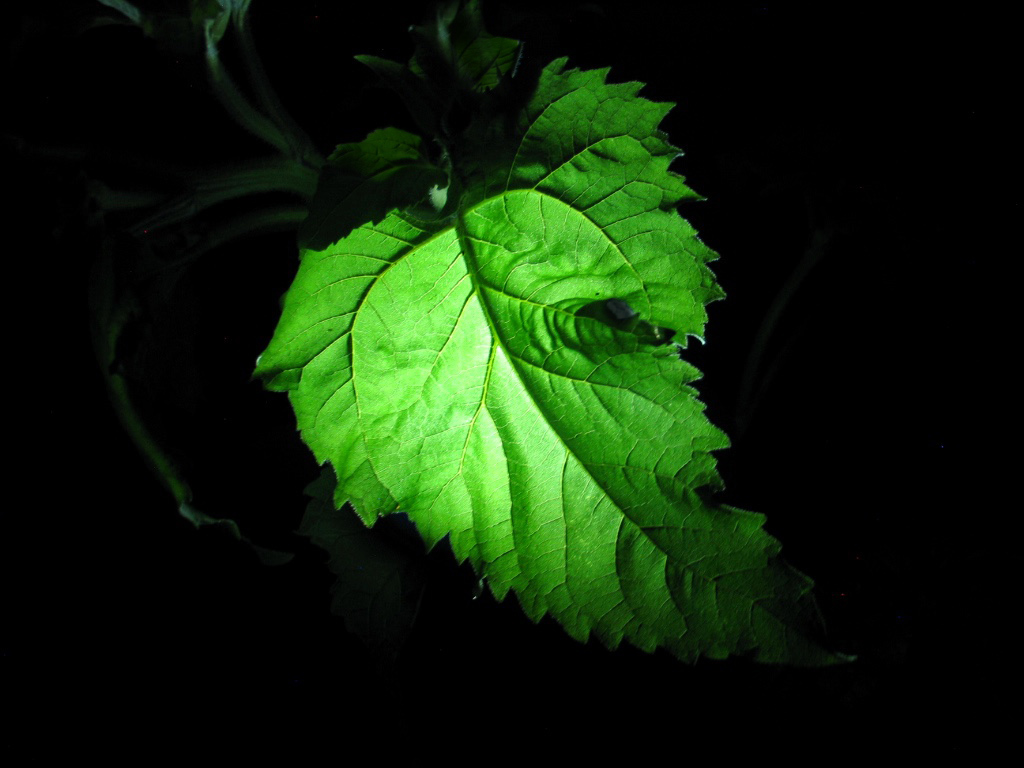
I like the bright green against the dark background. Taking the leaf at an angle adds interest, and the image is sharp. I cleaned up the image some by stamping out the small leaf areas at the top, and getting rid of the small white area behind the leaf. The white area really drew my eye, since it was the brightest thing in the image. |
May 14th |
 |
| 57 |
May 22 |
Comment |
The chains make a great pattern image. I like that they go up a bit from left to right -- that adds a lot of interest. I also like that they are sharp at the bottom but then are a bit out of focus at the top, that helps the eye to keep coming back to the lower part. I agree with Jessica that a bit more texture would help and Cindy's image is a real improvement. |
May 14th |
| 57 |
May 22 |
Reply |
Thanks for the comment. You are right, when I look at it, the yellow flowers are very bright. I was just looking at the bees and the flower -- it helps to get opinions from someone else. I played with the yellows a bit in Hues and Saturation, and a mask to only effect the yellow flowers. Is this better? |
May 14th |
 |
| 57 |
May 22 |
Comment |
Very nicely done image, with the high ISO and hand holding not being a problem. Glass can be hard to photograph, and you did a good job. Your double exposure effect gives some movement and life to the image. Making the background color match the base really makes the orange colors stand out. |
May 14th |
| 57 |
May 22 |
Comment |
Very sharp image of these striking tulips. The texture from the red on yellow really makes this image. The focus stacking made the tulips sharp from front to back, but the green stems and leafs are out of focus, very well done. The partial petal in the lower left is a bit of a distraction, but not enough to take away from the image. |
May 14th |
| 57 |
May 22 |
Comment |
The image is very sharp and has lots of depth of field. I like the composition and the tight cropping. The larger cactus is placed well in the image for good composition. I will agree with Jessica that it does seem a bit dark to me. |
May 14th |
| 57 |
May 22 |
Comment |
I can see why you like this variety of flowers. Your cellphone did a really great job of capturing this flower. It is very sharp from front to back and has lots of detail -- amazing what cellphones can do today! The whites have good detail. The colored tips make a striking image. I am looking forward to seeing your yellow flowers. |
May 14th |
| 57 |
May 22 |
Reply |
Thanks, glad to be a part of the group. The bees were busy feeding so they were still for a few seconds. |
May 13th |
6 comments - 2 replies for Group 57
|
17 comments - 14 replies Total
|