|
| Group |
Round |
C/R |
Comment |
Date |
Image |
| 7 |
Apr 22 |
Reply |
Thanks, glad that you enjoyed it. |
Apr 16th |
| 7 |
Apr 22 |
Reply |
Thanks, it is a beautiful house. |
Apr 16th |
| 7 |
Apr 22 |
Comment |
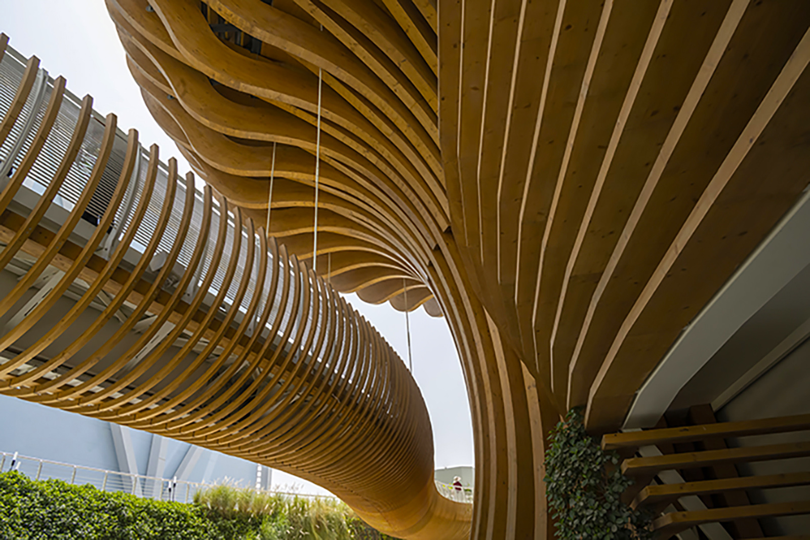
This is very interesting architecture. All of the curves add a lot of interest. When I first look at it, my eye goes straight to the person with the red shirt. You are fortunate to have them at that place, as they show scale. Although it may not be the actual tones, I added a bit of saturation to the wood. |
Apr 12th |
 |
| 7 |
Apr 22 |
Comment |
I like the colors and the reflection in the water. Having the shoreline at an angle is good composition, as is showing a good amount of the blue sky. Showing the city lights is also good. I would not change a thing. |
Apr 12th |
| 7 |
Apr 22 |
Comment |
The image has some mystery to it with the color through the opening. I am wondering why you reversed the image, as it is pretty much the same both ways. I like the tighter crop to show only the opening and the area around it. |
Apr 12th |
| 7 |
Apr 22 |
Comment |
Hard to believe that you had a problem with the exposure as it looks very good, and I do not see any noise. The shutter speed allowed for some of the water splashing around the fish to not be sharp, but that is probably good as it shows action. The fish and the bird are very sharp. Thanks for sharing the sequel with us, but the bird catching the fish tells a good story on its own. If you are not going to use the image for nature, I would get rid of the white dots in the water. |
Apr 12th |
| 7 |
Apr 22 |
Comment |
Your shutter speed captured what you were wanting. I like the colors and the abstract feel of it. It looks like you may have some blown out areas in water below the falls. This shows that we don't need the latest cameras to take great photos. |
Apr 12th |
| 7 |
Apr 22 |
Reply |
Thanks, that is a good suggestion. |
Apr 9th |
5 comments - 3 replies for Group 7
|
| 32 |
Apr 22 |
Reply |
Yes, I used both shadows and highlights in Lightroom. |
Apr 26th |
| 32 |
Apr 22 |
Reply |
Wes, I am glad that you liked the suggestion. |
Apr 11th |
| 32 |
Apr 22 |
Comment |
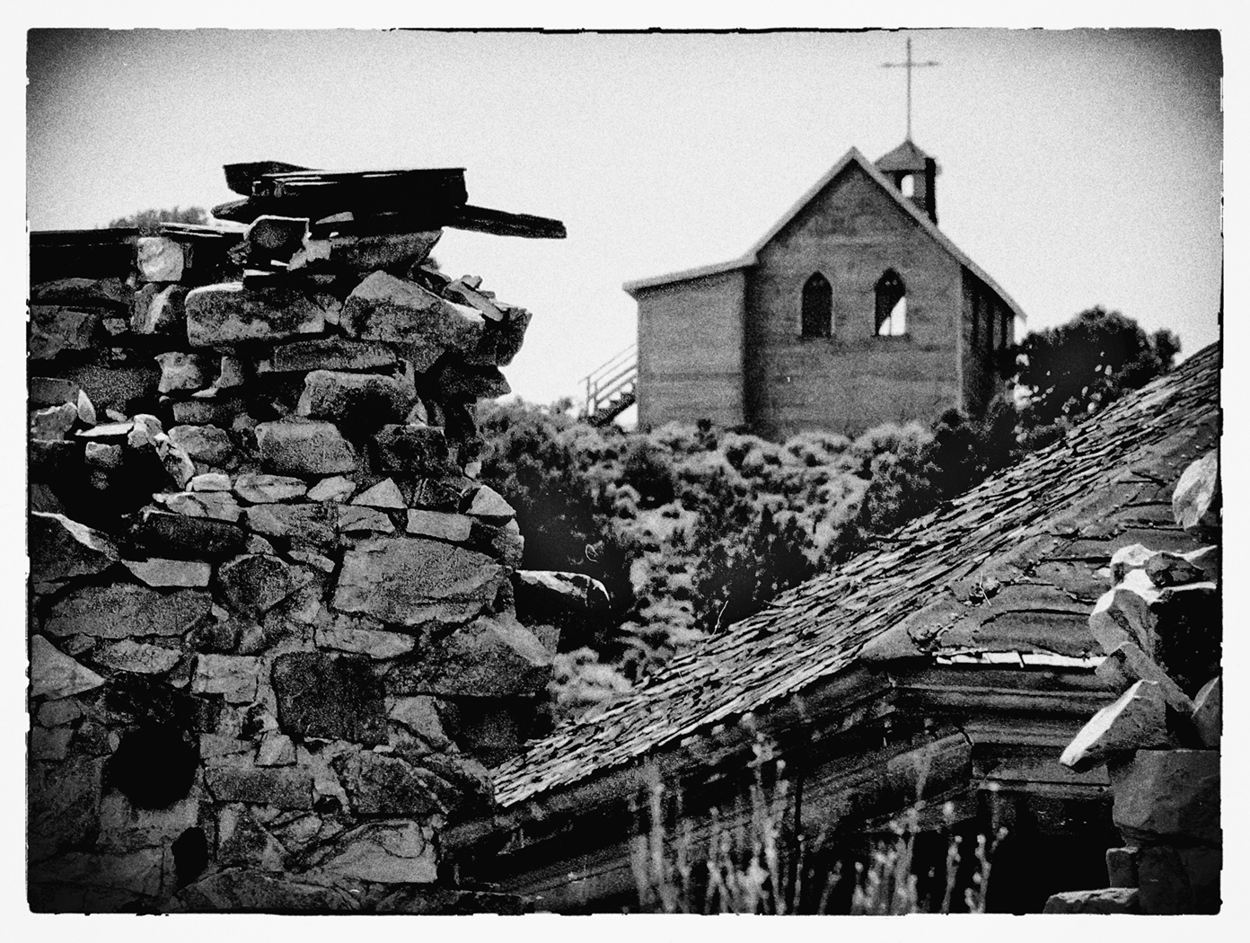
Lots of ruins, but of course the church is the main subject. You improved on the original image a lot with the grain, vignette and boarder. Since I think that the church is the main subject, why not reverse the image and put it into the upper right? That also allows the slanting roof to draw the eye to the church. |
Apr 11th |
 |
| 32 |
Apr 22 |
Comment |
An interesting way to show this historic building. It is too bad that you lost part of the top. The sun behind it makes the image. I do like what Lance did with the image. And I agree with Diana and Wes to leave the man with the black shirt but get rid of or reduce the rest of the tourists, especially the ones with the white shirts. |
Apr 11th |
| 32 |
Apr 22 |
Comment |
It is an interesting idea to show only a small part of the ferris wheel, and it is sharp enough. I think that you selected the correct area to use. The support goes the correct way, into the image from the lower left. And using the right side would loose part of the story of, "Lady Bugs". |
Apr 11th |
| 32 |
Apr 22 |
Reply |
Thanks. It is a nice image also, but I do like the monochrome the best. Cropping off part of the road would help the color image. |
Apr 11th |
| 32 |
Apr 22 |
Reply |
I would say white and a color, like sepia toning. It was just a comment that it was only green and black. |
Apr 10th |
| 32 |
Apr 22 |
Reply |
I also have an Olympus camera, and have seen that one of the features allows you to build up light, but have never tried using the feature. Most of the light painting images that I have seen are landscapes at night. |
Apr 10th |
| 32 |
Apr 22 |
Comment |
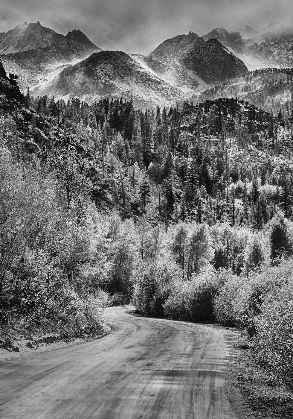
I like the image as presented, with the "S" road. It does not look like autumn. I am curious about the color image -- does it have autumn colors? The pattern in the road is a distraction to me. I used the blur tool to reduce it, and increased the contrast a little bit. |
Apr 10th |
 |
| 32 |
Apr 22 |
Comment |
The mono version does not seem to have a good white in it (except for maybe some highlights on the head), and the color does. I am glad that you cropped off the brown area in the bottom of the color version. I had never thought of using a round crop, but this is a good image for it, as the subject is round. I agree, that the mono version looks like an old photo. The bottom book is upside down, but it is hard to see. Good luck with using this image. |
Apr 10th |
| 32 |
Apr 22 |
Comment |
I have never tried light painting, and it looks interesting. I like the monochrome better. But really, the color (except for the Christmas lights) is monochromatic, being green and black. I could tell that it was one ball and a reflection, as you said, from the fuzzy edge. I think that the shelf edge helps the image, as it adds some interest, and keeps the eye circling back to the ball. |
Apr 10th |
| 32 |
Apr 22 |
Reply |
It was lighted by the windows. It is a doll house size, I could tell from the furniture that was in it. I should have asked more about the house. The man there was very helpful, but he was getting ready to leave. |
Apr 10th |
| 32 |
Apr 22 |
Reply |
Yes, using hind sight I thought that I should have moved the rocking chair, and probably could have had I asked. It would have made a clearer image of the model, but then it would not have looked so much like the model is in a room in use. |
Apr 4th |
6 comments - 7 replies for Group 32
|
| 70 |
Apr 22 |
Comment |
Nice Z pattern, and the bird really adds to the image. I like what Pierre did with the image. I reversed the image, so the the stream becomes a better lead in, from the lower left corner. |
Apr 27th |
1 comment - 0 replies for Group 70
|
12 comments - 10 replies Total
|