|
| Group |
Round |
C/R |
Comment |
Date |
Image |
| 7 |
Mar 22 |
Reply |
Thanks |
Mar 26th |
| 7 |
Mar 22 |
Reply |
Thanks for the comment. I agree that Paul's suggestion was better than mine, that was to crop off the left side. My main concern was the sign. |
Mar 26th |
| 7 |
Mar 22 |
Reply |
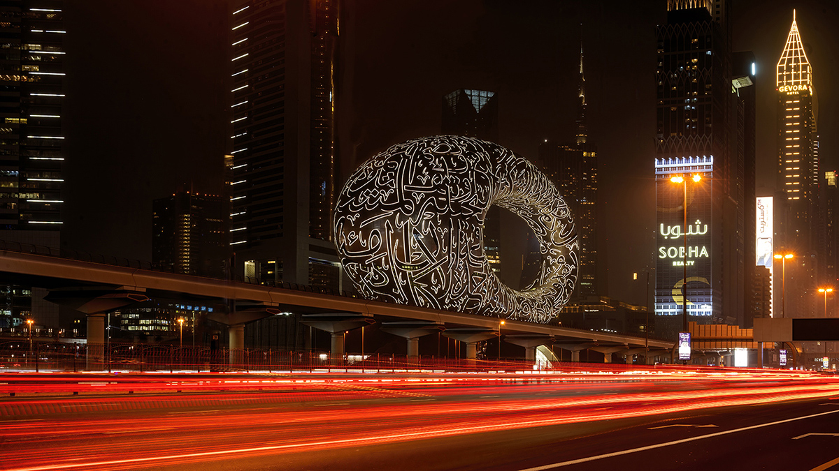
Paul, is this what you had in mind? I agree that it would be an alternative to cropping off a large amount on the left side. I used the clone tool, and the hardest part was the column under the elevated road. |
Mar 24th |
 |
| 7 |
Mar 22 |
Reply |
Reversing the image may be good for composition, but there are too many words that would then be reversed and look bad. |
Mar 19th |
| 7 |
Mar 22 |
Reply |
Cropping would also move the museum out of the center, for better composition. |
Mar 14th |
| 7 |
Mar 22 |
Reply |
I can see it both ways. There is plenty of room in front of the woman -- she is not near the edge. |
Mar 14th |
| 7 |
Mar 22 |
Reply |
For a catch light I used a very small white round brush in Photoshop. If your try is too large or too small you can just use edit to reverse and then try again. |
Mar 14th |
| 7 |
Mar 22 |
Comment |
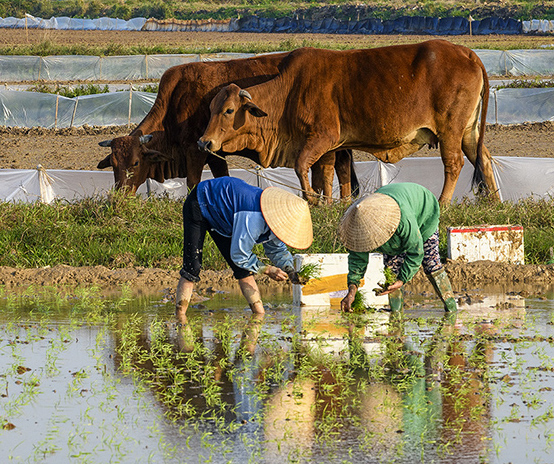
There are two ways to look at this image. The 2 people planting rice by hand with the cows in the background could be an image by itself. The whole image is a story of farming using old methods in a modern area. |
Mar 13th |
 |
| 7 |
Mar 22 |
Comment |
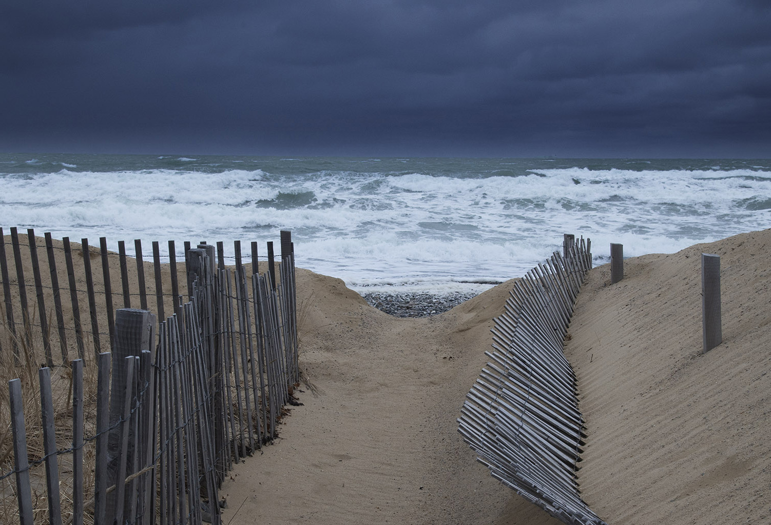
I am glad that you straighten the horizon. The crop is good, as you do not need all of the pathway and it adds more importance to the ocean. Making the clouds darker was a good idea as it adds to the stormy effect. What do you think about flipping the image, so the one line of fence make a lead in? |
Mar 13th |
 |
| 7 |
Mar 22 |
Comment |
Your shutter speed caught a lot of auto trails and they do create a good lead in. The exposure is very good. I would crop off the left side to get rid of the sign that is a distraction and does not add to the image. |
Mar 13th |
| 7 |
Mar 22 |
Comment |
Nice effect with the mist on a hill. I like the color, but the bright blue houses would pull the eye from the mist, so it was a good choice to go with mono. The white vignette does add to the mist subject. Glad that you were able to get out and take some photos. |
Mar 13th |
| 7 |
Mar 22 |
Comment |
Your image shows that the people are having lots of fun with all of the smiles. Shutter speed is great, as it froze most of the motion but still has the hands moving which adds some life to the image. Composition is good, with one woman with her head in a power point to be the main subject and the others less sharp but show the surroundings. I love the woman's hair. I would not change anything. |
Mar 13th |
5 comments - 7 replies for Group 7
|
| 32 |
Mar 22 |
Reply |
With a longhorn being the mascot of Texas University, the Texas fans point the 2 outside fingers up to show support of the team. The apposing fans turn the fingers down, or "horns down". |
Mar 27th |
| 32 |
Mar 22 |
Reply |
There must be some relaxed longhorns, as there is a real live Texas longhorn on the sidelines in the Texas football games, named Bevo. |
Mar 27th |
| 32 |
Mar 22 |
Reply |
Thanks for the suggestions. Yes it is sad with the beautiful old churches in a lot of rural areas that are losing population, that the declining congregations can no longer keep them up. |
Mar 17th |
| 32 |
Mar 22 |
Reply |
The long horns were wild in Texas and developed their characteristics from early cattle that were brought from Europe. |
Mar 8th |
| 32 |
Mar 22 |
Comment |
Of course I know the song, having lived in Oklahoma almost all my life and County music is everywhere. You did a good job of cleaning up the background. I agree with Diana that the image with the music has too wide of a border. Being a University of Oklahoma graduate and fan, I like the "horns down" look. |
Mar 8th |
| 32 |
Mar 22 |
Comment |
I would have had no idea what it was if you had not told us. The inside curves really add to the image, and you did a very good job of cutting out the subjects, duplicating and putting together. It would have been easier to cut out the rolls if you had used a background color that had more contrast from the rolls. |
Mar 8th |
| 32 |
Mar 22 |
Comment |
Slanting the image adds a lot of interest to the image and puts the face he is creating in a good spot for composition. I like both the mono and the color, but agree with Wes's suggestion to get rid of the yellow in the upper. |
Mar 8th |
| 32 |
Mar 22 |
Comment |
You were lucky to have snow on your visit, as it adds to the image. I like the composition. I like both the comments with examples of increased contrast. |
Mar 8th |
| 32 |
Mar 22 |
Comment |
A good pose and an attractive young woman. It was a good conversion from color to mono. I like the lighting, but a hair light would have help separate the hair from the background, but from reading the comments above you do not like a hair light and you are the artist. The real problem with the image is the lens that you used, a wide angle lens. You got closer to get the composition that you wanted, and in doing so make the arm and hand be out of proportion. Most portrait photographers use a short telephoto lens to prevent this. |
Mar 8th |
| 32 |
Mar 22 |
Comment |
Interesting image, and it does look like a space shot, except that the small planets with the items sticking out of them do not look like planets. Other than that I think that you did a good job. Good work for all of the judges. |
Mar 8th |
| 32 |
Mar 22 |
Reply |
I am sure that it is abandoned, and I would say very unsafe with the leaning steeple. |
Mar 7th |
6 comments - 5 replies for Group 32
|
11 comments - 12 replies Total
|