|
| Group |
Round |
C/R |
Comment |
Date |
Image |
| 7 |
Dec 21 |
Reply |
Thanks for your suggestions. I was just looking at the flower, and let the background go without improving it. That is why I like these DD groups, someone else makes good suggestions that I missed. |
Dec 30th |
| 7 |
Dec 21 |
Reply |
I like what you did with the duct better than mine. |
Dec 18th |
| 7 |
Dec 21 |
Reply |
Yes, I think that is an improvement. |
Dec 11th |
| 7 |
Dec 21 |
Comment |
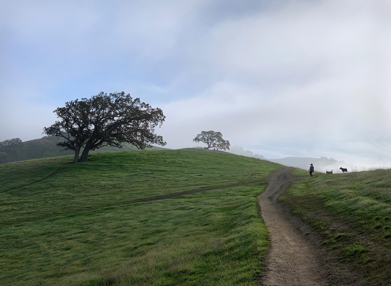
Very nice image and the fog really adds to it. As presented, you have two images, the person with the dogs and the trees. However, it would make a nice print to hang on the wall as it is. The paths give the eye someplace to wander around. I think that you would have a stronger image if you reverse it. The large tree now adds balance, but less importance and the person with the dogs is in a more important area. |
Dec 11th |
 |
| 7 |
Dec 21 |
Comment |
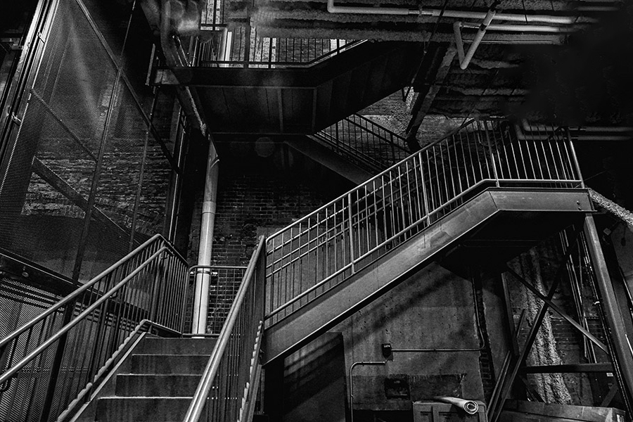
Welcome to the group. Very nice image with good composition and good lighting, and of course the yawning young man for a center of interest. I understand how an artist wants to present an image, but it does seem a bit dark to me. I used auto levels to lighten the image some. |
Dec 11th |
 |
| 7 |
Dec 21 |
Comment |
Then looking at the image some more, why not reverse it? Then you have the stairs leading you into the image. |
Dec 11th |
 |
| 7 |
Dec 21 |
Comment |
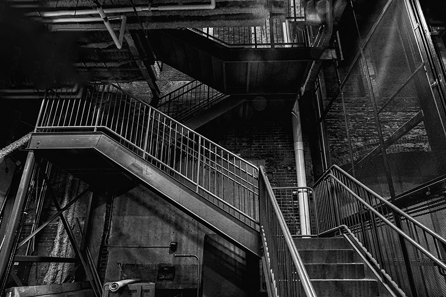
Good eye to see this interesting old staircase. It is sharp with a lot of detail including the shadows. The duct work in the upper left draws my eye, maybe because it does not seem to fit, but also because it is very light. I would crop it off, or get rid of it. I did that with content aware fill. |
Dec 11th |
 |
| 7 |
Dec 21 |
Comment |
Good capture to start with -- a pretty young woman, good lighting, a good pose and very sharp. That said, the original color is very good. I do like the tight crop and the conversion to high key monochrome. Well done. |
Dec 11th |
5 comments - 3 replies for Group 7
|
| 32 |
Dec 21 |
Reply |
If you did tone the entire image, then what looks like black is really very dark orange. I think that it would be okay, but in a salon you might have the judges question that. |
Dec 10th |
| 32 |
Dec 21 |
Comment |
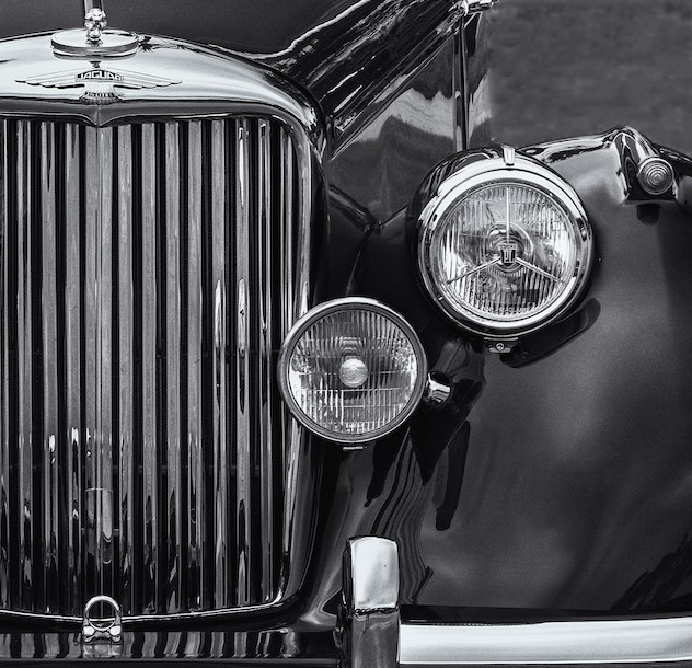
Going to monochrome was a good choice, because of the distracting background, and the fact that the car is mostly monochrome. The blur of the upper left corner was a good idea, and think that making it all one tone might look strange. I like the crop, but am wondering if using the other side of the front would be better? I did not do nearly as good of job of blurring the corner as you did, but this is really only for example. |
Dec 10th |
 |
| 32 |
Dec 21 |
Comment |
I like the color image the best, but understand that you are trying an etching. I like the bridge in the etching, but the fog seems kind of strange. |
Dec 6th |
| 32 |
Dec 21 |
Comment |
This is an interesting approach for a sunset image. The color image seems kind of flat, so going to mono is not a bad idea. But toning it orange like a sunset would look is an interesting idea. You did capture a nice sunset with the sun rays. The dark trees in the foreground give depth to the image. I like the image as presented the best, and not the less or more saturated images. |
Dec 6th |
| 32 |
Dec 21 |
Comment |
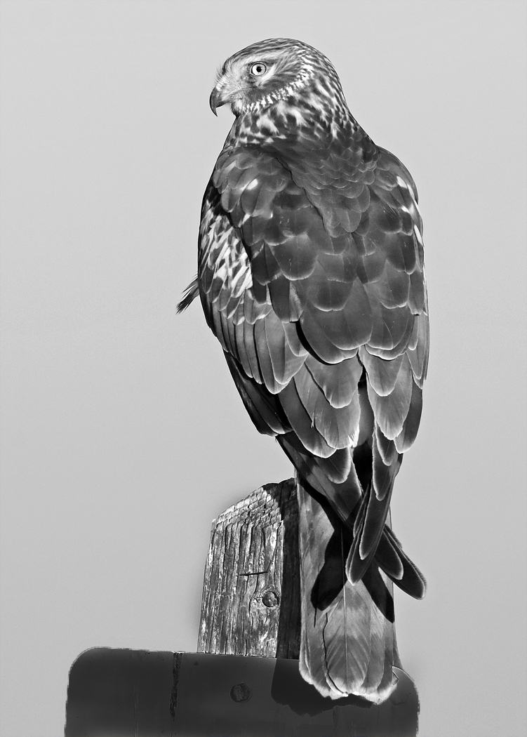
This is a very sharp image with good posing by the hawk. Good that you saw it and stopped. The feather adds to the image. I would not make the sky lighter. I made the sign a lot darker, and post a bit darker. The idea being to not have the sign lighter than the sky and so draw the eye toward the bottom and away from the great sharp eye. |
Dec 5th |
 |
| 32 |
Dec 21 |
Comment |
The images seems too dark. I like the composition and the lighting. The image seems to have a cold look, maybe from toning? When I first looked at it, I thought that it was metal made to look like flowers and not flowers. I think that Stephen went too far with his image, and somewhere in between would be the best.
|
Dec 5th |
| 32 |
Dec 21 |
Comment |
I have tried putting image together before, and they always turn out very bad! This is an interesting image that caught the judges eye. Monochrome is a good way to go, as the color image has tone issues, especially the shade under the truck. The white goat draws my eye, and then I wander around the image. I suggest that you think about making some creations as you take images instead of getting an idea and then trying to find images that could work. I am sure that this was a fun project. |
Dec 5th |
| 32 |
Dec 21 |
Reply |
I wanted to concentrate on the fog in the trees. |
Dec 4th |
6 comments - 2 replies for Group 32
|
11 comments - 5 replies Total
|