|
| Group |
Round |
C/R |
Comment |
Date |
Image |
| 7 |
Oct 21 |
Comment |
You are correct, I was just slightly off center.
|
Oct 20th |
| 7 |
Oct 21 |
Comment |
Thank you for the Halloween image. I would say that you accomplished what you were wanting to do. The old building is interesting, in itself. |
Oct 14th |
| 7 |
Oct 21 |
Comment |
Good job of photo editing. It looks like a beautiful location, and the man jumping adds a lot of interest. I do agree with Hoshedar and Paul that the lower area between the cliffs does not look natural and is a distraction. |
Oct 14th |
| 7 |
Oct 21 |
Comment |
You have a great story telling nature image. I do agree with Paul that you should crop some off the right. Let us know how it does in the salon. |
Oct 14th |
| 7 |
Oct 21 |
Comment |
Thank you for the information on the Great Wall of China. That must have been very exciting to see in person. Your reference images show how hilly it is, and what a great engineering feat it was to make. I like your image and can see in the distance the wall continuing. |
Oct 14th |
| 7 |
Oct 21 |
Comment |
The image is plenty sharp. The lighting and contrast are very good. I would crop off at least the bald head on the far right, and probably the woman on right. That would make the woman singing the main point of interest. I like her singing and using her hands. |
Oct 14th |
| 7 |
Oct 21 |
Comment |
An interesting image. It does not look like monochrome. It is an unusual image of a waterfall, but the eye is certainly drawn to the brightest, sharpest and most detailed part of the image. I like it. |
Oct 14th |
| 7 |
Oct 21 |
Reply |
Yes, there are distracting elements on both side. And when I look now, I see that the lamp posts are both leaning in some, the effect from 20mm (40mm in 35mm equivalent). |
Oct 6th |
7 comments - 1 reply for Group 7
|
| 32 |
Oct 21 |
Comment |
Maybe you just need the right panel of judges. When I was actively competing in salons, it seemed that the judge panels were not very consistent -- one panel would give the image a metal and then the next would not even score it high enough to be accepted. |
Oct 26th |
| 32 |
Oct 21 |
Reply |
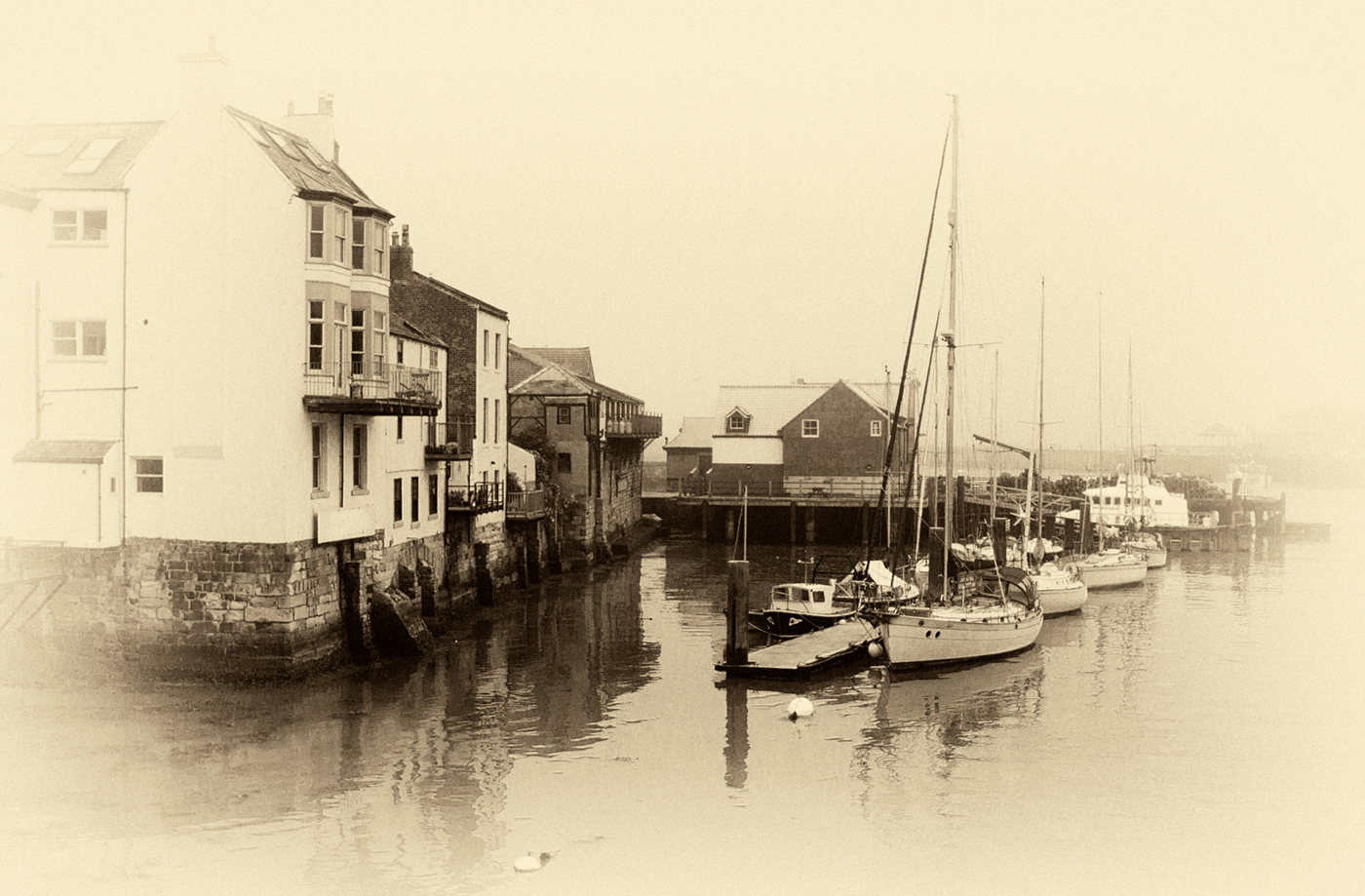
I like the mono version much better. And I think that the light vignette is effective here because of the fog, and fading out into the fog. |
Oct 26th |
| 32 |
Oct 21 |
Reply |
The only place that I am entering is a camera club. |
Oct 14th |
| 32 |
Oct 21 |
Comment |
It does look like an infrared image, but that is due to the darker blue sky and the light foliage. Thank you for the story about the image. It does look like an old time image, well done. |
Oct 11th |
| 32 |
Oct 21 |
Comment |
Your crop and contrast are both good. The area at the top shows us where it was taken. It is a charming image of your grandson. It is good that you have detail in his shirt. If you take some more image there, I would move more to your left, to have his right leg direct you more to his face. |
Oct 11th |
| 32 |
Oct 21 |
Comment |
You have lots of detail in the image and I like the curve of the stem. Both the mono and the original color are good, but I like the original color the best. I don't care as much for the second color. You should have a really good exhibit. |
Oct 11th |
| 32 |
Oct 21 |
Comment |
The curve in the road is nice leading into the hill side, but you did crop it off too soon. I think that you have plenty of contrast. The formations on the hills are interesting. |
Oct 11th |
| 32 |
Oct 21 |
Comment |
Really nice image with the old camera, and the man looking at the front of the camera. I also like the effect to make the image look old. I do agree with Stephen that more detail in the billows would help. |
Oct 11th |
| 32 |
Oct 21 |
Comment |
I like it, and do not feel that judges have the time to think about if you used a preset or did more work on the image (having been a judge). You seem to have 2 images, the boats and the buildings on the right -- I keep looking back and forth. What if you reversed the image? Then you would have the boats leading you off into the distance that is fading out, and the buildings would show you that it is in a small harbor. Of course you would need to get rid of the lettering on the sign. |
Oct 5th |
 |
| 32 |
Oct 21 |
Reply |
Thanks for the suggestion. I like it, as it gets rid of the bolt and the cotter pin and makes the gears more of a center of interest. Again, the group finds things that I missed. |
Oct 2nd |
7 comments - 3 replies for Group 32
|
14 comments - 4 replies Total
|