|
| Group |
Round |
C/R |
Comment |
Date |
Image |
| 2 |
Jun 21 |
Comment |
Piers, just having moved from Oklahoma City, I am well familiar with the location, and you did a really good job of photographing it. |
Jun 14th |
1 comment - 0 replies for Group 2
|
| 7 |
Jun 21 |
Reply |
Yes, that is what the website requires. |
Jun 26th |
| 7 |
Jun 21 |
Reply |
Yes, that is what the website requires. |
Jun 26th |
| 7 |
Jun 21 |
Reply |
Thanks for the comments. I kind of agree that removing the old truck on the right would bring more focus on the gas station itself. I don't remember gas being 15 cents, but remember it in the 20's, in a "gas war". |
Jun 22nd |
| 7 |
Jun 21 |
Comment |
I like Maiden 2 the best, and I really like what you did with the background. The young lady with the horns is better in monochrome in my opinion because the color image as almost no color. I am sure all of the young women will be delighted with the photos. |
Jun 9th |
| 7 |
Jun 21 |
Comment |
Yes, it does look cold and lonely. I like the crop that you made. I agree with Hoshedar that the left center looks blown out. It looks like a very interesting location, maybe you can go back. |
Jun 9th |
| 7 |
Jun 21 |
Reply |
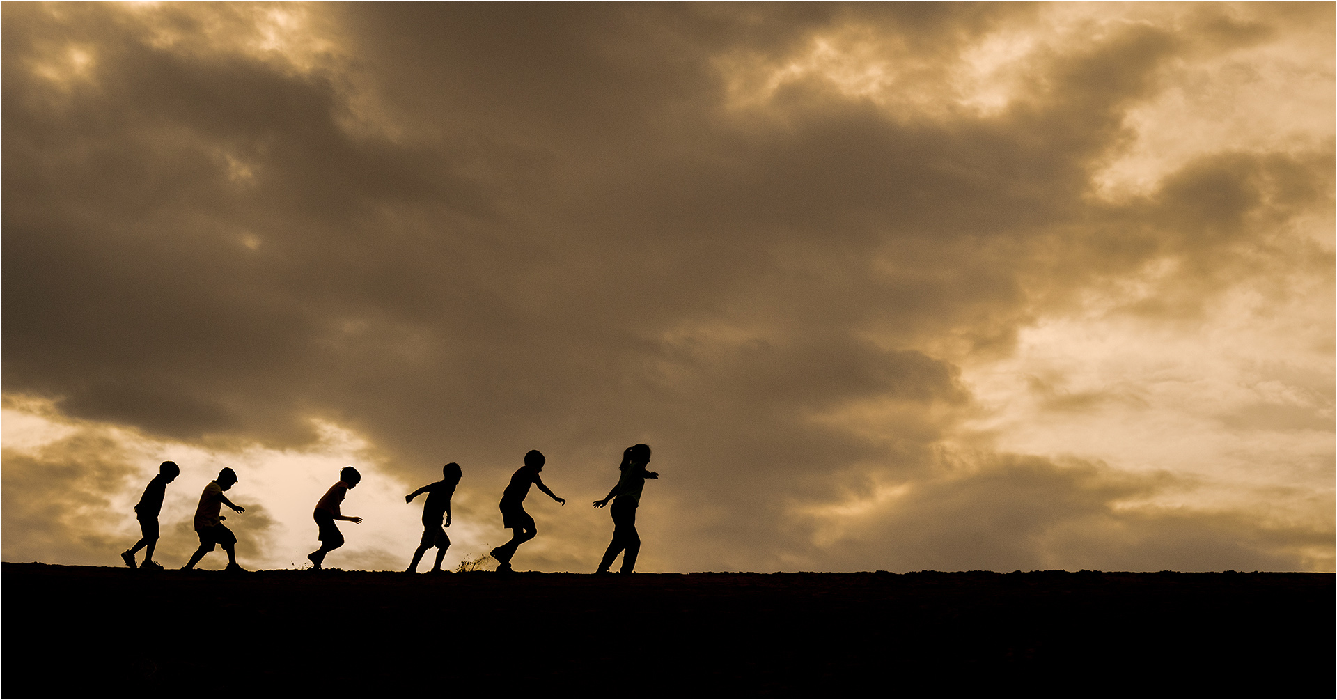
I added a photo filter of Warming (LPA) at 55%. Since the children are black, I did not select just the clouds but used the filter on the whole image. I also added a 2 pixel white stroke so that the children do not look like they are on the bottom of the image on the black website. What do you think? |
Jun 9th |
 |
| 7 |
Jun 21 |
Comment |
You were certainly in the right place at the right time. The exposure is perfect and the placement of the children in the frame is very good. I am wondering if you increased the saturation of the clouds some if it would add more impact to the image. |
Jun 9th |
| 7 |
Jun 21 |
Comment |
The image is very sharp, and I like the crop that you made. The lighting is very good. The background is nicely blurred, but a suggestion would be to darken the out of focus area behind the flower. |
Jun 9th |
| 7 |
Jun 21 |
Comment |
This must be owl month. The owl is very sharp, and I do not notice any noise in the image. The background is rather confusing, but looks natural. The only improvement that I would suggest is to crop off the out of focus branch in the far left. It is drawing my eye from the owl. |
Jun 9th |
| 7 |
Jun 21 |
Comment |
Owl is very sharp with a nicely blurred background. I like the tilt, and the framing of the owl. Great job of capturing the owl, and I really don't see anything that I would change. |
Jun 9th |
6 comments - 4 replies for Group 7
|
| 32 |
Jun 21 |
Reply |
I like the tracks of the animal. I used Content Aware Fill in Photoshop to get rid of the dune edge in the upper left. Not perfect, but maybe not too bad if you don't look at it too long. |
Jun 22nd |
 |
| 32 |
Jun 21 |
Comment |
I like the detail that you have in the snow. It shows that it was not taken in front of a white backdrop. I think that cropping some off the right would help. |
Jun 22nd |
| 32 |
Jun 21 |
Reply |
Russ, I would like to see it. I know it is hard, but watch the background when taking images. |
Jun 22nd |
| 32 |
Jun 21 |
Reply |
That makes it into a different image. I know that the fence leads out, and that a fence can be a stop to the eye entering an image. However, I like the fence and think it adds to the mood of the image because it keeps you away from the house and adds to the isolated feeling. |
Jun 12th |
| 32 |
Jun 21 |
Reply |
Thank you. The red was a distraction to me. I also think that the mono has more of a dark mood, like the abandoned house that it is. |
Jun 9th |
| 32 |
Jun 21 |
Reply |
Thank you for your comments. |
Jun 9th |
| 32 |
Jun 21 |
Comment |
I agree that the area of white really helps the image. Your conversion the monochrome is very good, and was a good choice. There is just enough of a line to see it. Well done. |
Jun 9th |
| 32 |
Jun 21 |
Comment |
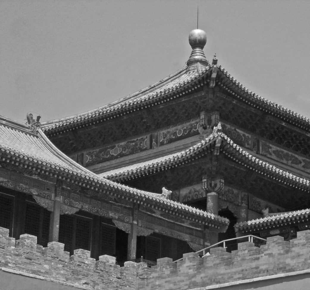
You captured a very interesting piece of architecture. I like the crop, but the part in the upper right is competing with the main part. I would crop off some from the right and then get rid of the part that is left. Of course altering an historical piece like this might not be what you want, but to me, that has never seen photos of it, it is more photogenic. |
Jun 9th |
 |
| 32 |
Jun 21 |
Comment |
Nice portrait of a self assured woman. To me, she is a hard working person, maybe in a factory. Maybe like "Rosy the Riveter" in WWII. |
Jun 9th |
| 32 |
Jun 21 |
Comment |
What a great horn! You have a nicely blurred background and the man and horn are very sharp. You did a really good job of converting to monochrome, but I like the color better. |
Jun 9th |
| 32 |
Jun 21 |
Comment |
When you start with such an attractive young woman, it helps with the final product. I like the effect very much -- your hard work was rewarded. I think that Stephen went too far, and between yours and his would be the best. |
Jun 9th |
6 comments - 5 replies for Group 32
|
13 comments - 9 replies Total
|