|
| Group |
Round |
C/R |
Comment |
Date |
Image |
| 7 |
May 21 |
Comment |
Thank you for telling us the story of this image. I like the perspective that shows the height and size of the tanks. It looks to me that the original image is different from the image presented. I like it better, and cropped in some. |
May 14th |
 |
| 7 |
May 21 |
Comment |
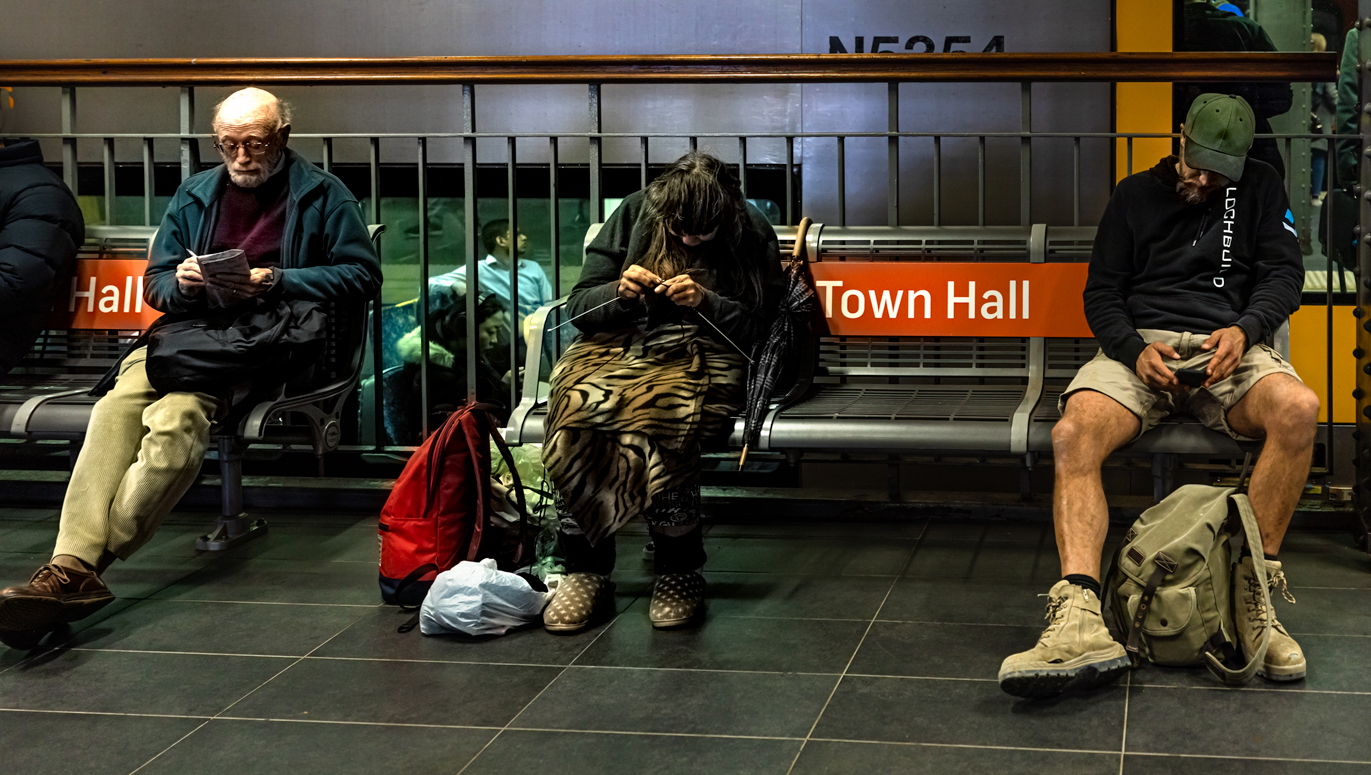
I like the color best, as it has 3 people doing 3 different things. The monochrome images with 3 people have too much contrast. I also like that it has people in the background. I would crop just slightly from the left to get rid of the face of the person on the left -- the black coat alone does not distract, and then the feet of the person reading are still in the image. You should try in lightroom or camera raw to recover some the the detail on the head of the person reading. |
May 14th |
 |
| 7 |
May 21 |
Comment |
Thank you for telling us about the time of year that the image was taken. It is a very nice image and story with the sailboat in front of the bridge. You did a great job of editing to brighten the image and to add a different sun. |
May 14th |
| 7 |
May 21 |
Comment |
What a great image, with the owls looking right at you. It looks very sharp and no noise; it does not look like only a small area of the original image. The framing is very good. I agree with Paul that the blurred leaf is a distraction, and can be cropped off so that the image can still be used in nature category. |
May 14th |
| 7 |
May 21 |
Comment |
The flower really stands out from the background. I like the angle that has the center of the flower shown, and the center area is very sharp. I wish that you had a bit more depth of field so that the pedals would be sharper. |
May 14th |
5 comments - 0 replies for Group 7
|
| 32 |
May 21 |
Comment |
I like the image as presented. The shadows do not bother me. I also like the color image with the pastel tones. |
May 14th |
| 32 |
May 21 |
Reply |
This sky is actually one that I took. I take images of skies that I like to use in my photos. |
May 14th |
| 32 |
May 21 |
Comment |
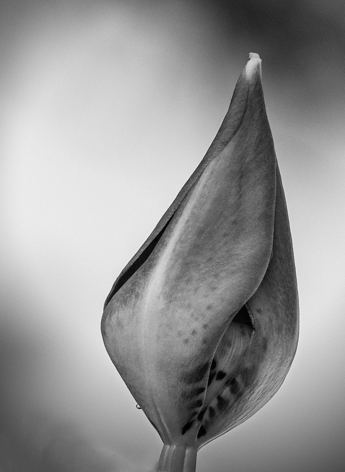
I like the detail in the bud, but being straight up is not very good composition. I expanded the canvas and rotated it slightly, and cropped in some. I did not do a very good job of smoothing out the lower left corner, but at least you get the idea. Do you like it? |
May 14th |
 |
| 32 |
May 21 |
Comment |
The image is very sharp and I like the detail in the eye, and the action. The starkness of the image catches my eye. The new Nature definition would probably allow this image to be entered in Nature, as the bird is in its new environment. However, I do not know if it would score well in Nature. I would not rotate the image. I think that it would score well in monochrome as presented. |
May 14th |
| 32 |
May 21 |
Comment |
The rhino is very sharp and you did a really good job of conversion to mono. His head on the ground is unusual and I am not sure that I like it. |
May 14th |
| 32 |
May 21 |
Reply |
I mostly like what you did, but maybe the clouds are a bit too dark. |
May 10th |
| 32 |
May 21 |
Comment |
It is a very good study in perspective, and an interesting piece of architecture. I do wish that you had a bit of room at the top. Photoshop sky replacement is great. They supply some skies to use, but of course you should use some that you have taken. I replaced the sky with just a couple of clicks. I did not convert to mono, but you can get the idea from the color image. |
May 4th |
 |
| 32 |
May 21 |
Comment |
The reflections in the sun glasses really add to the image. I do like the monochrome version much better than the color. I wish that you had put a stroke around the image to separate the black edges of the image from the black webpage. The image did seem a bit "muddy" to me, and I adjusted the levels in Photoshop. |
May 4th |
 |
| 32 |
May 21 |
Reply |
I did not take images inside. It must have been dark or not that interesting. |
May 4th |
6 comments - 3 replies for Group 32
|
11 comments - 3 replies Total
|