|
| Group |
Round |
C/R |
Comment |
Date |
Image |
| 7 |
Dec 20 |
Reply |
Yes, I like it much better. You have focused in on the main subject. |
Dec 17th |
| 7 |
Dec 20 |
Comment |
Interesting image of the smoke. I am not sure if I like the blown out area or not, but I do think that it adds to the story. |
Dec 14th |
| 7 |
Dec 20 |
Comment |
As part of a series this image might work, but as a single image it is lacking. |
Dec 14th |
| 7 |
Dec 20 |
Comment |
I don't think that the pants are that much out of focus. They may just be lacking some texture so there is nothing to show that they are sharp. Interesting image with all of the orange pants and cords and yellow hat. I would suggest that you remove the fire extinguisher as to me it draws my eye from the pants and does not add to the story. |
Dec 12th |
| 7 |
Dec 20 |
Comment |
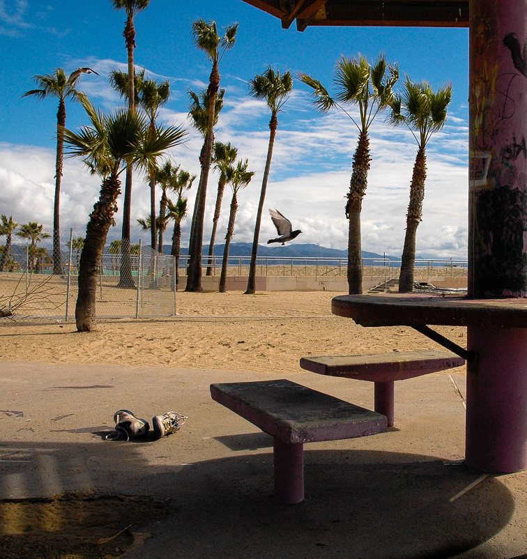
Nothing wrong with the older cameras, this is a nice sharp and well exposed image. I did not notice the pigeon until I read your info about the image. When I see it, I agree that it adds to the image. I would crop and flip the image. That makes the post a stopping point to keep the eye in the image. |
Dec 12th |
 |
| 7 |
Dec 20 |
Comment |
Nice capture and story with a lot of action and water splashing. The geese are sharp with a nicely blurred background. You have a good distance for the geese to move into. The reflections are also good. A slight comment would be to tone down the light area in the upper center. |
Dec 12th |
| 7 |
Dec 20 |
Comment |
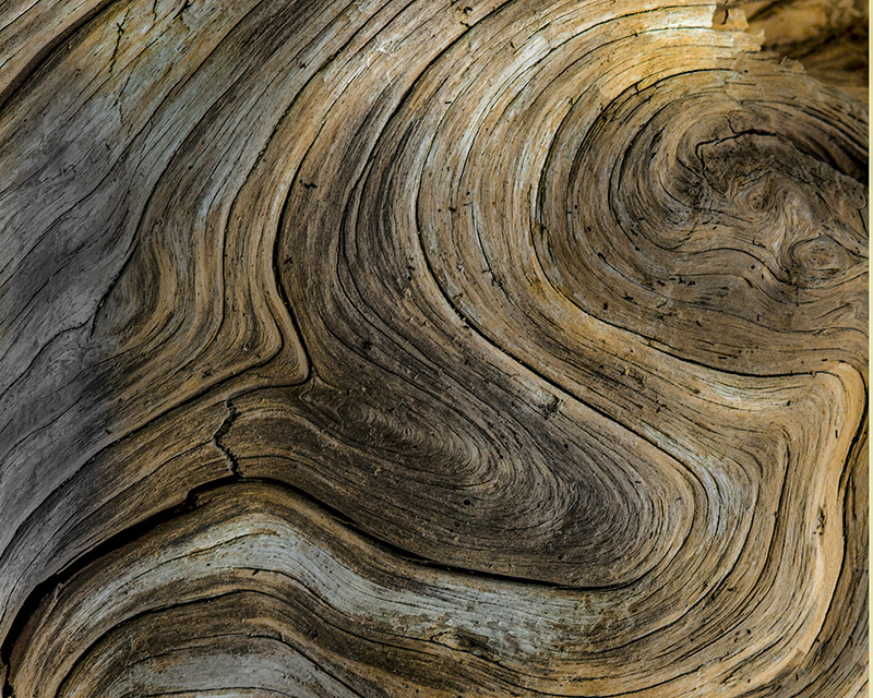
What a really great find! I like the texture and all of the curves (including an "S" curve) and of course the knot area. I think that your crop is also the correct one. It is nice and sharp and the lighting is very good to bring out the texture. It is also a great image to play with. I did make a rotation of the image, to put the knot in the upper right corner. I also adjusted the image to make it a bit brighter with a curves adjustment. |
Dec 12th |
 |
6 comments - 1 reply for Group 7
|
| 32 |
Dec 20 |
Reply |
I like the crop. |
Dec 29th |
| 32 |
Dec 20 |
Reply |
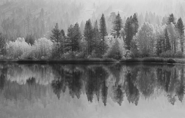
I agree that Jennifer's monochrome is much better. I was really trying to give her an idea about increasing the smoke. |
Dec 12th |
| 32 |
Dec 20 |
Comment |
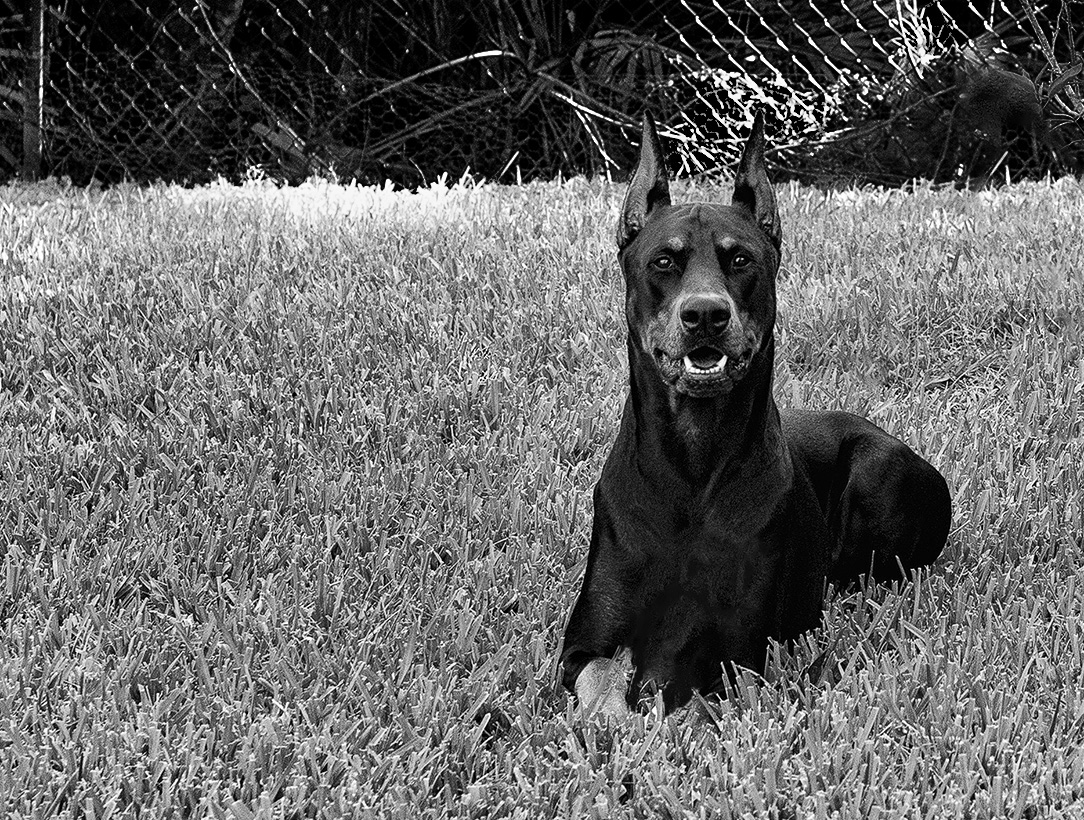
I had the same problem with taking photos of my Westies, when I tried to take their photo they ran toward me. First let me saw, what a good looking dog. I like the catch lights in the eyes. I agree that the fence is bad. You should have gotten just a bit higher to take the fence out of your shot. I did a quick selection on the frisbee,and then in Content Aware Fill, used only the body of the dog to fill in the frisbee. I cleaned up the area left by the selection and also removed the branches on the right side. |
Dec 11th |
 |
| 32 |
Dec 20 |
Comment |
Here is the conversion to monochrome, but also done quickly. |
Dec 8th |
 |
| 32 |
Dec 20 |
Comment |
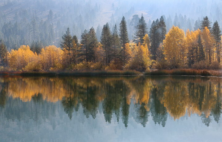
What a great landscape image with the reflections. I would not crop it any. I think that the monochrome is fine as it is, and the color is also very good. I think that the monochrome has really good contrast.If you want to show more smoke, us the de-haze filter in camera raw, just move the slider to add haze instead of taking it away. I did that with your image, but first duplicated the image so that I could use a mask to bring back the full color in the close trees and reflections. Then I also did a conversion to monochrome. |
Dec 8th |
 |
| 32 |
Dec 20 |
Comment |
Thanks for the story about the knot. I like the composition and the lighting. Your conversion to monochrome brings out the wrapping of the small line better. I like the background because it makes this image more of a texture image. |
Dec 5th |
| 32 |
Dec 20 |
Comment |
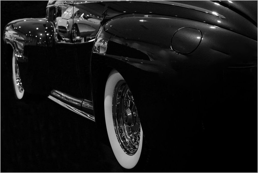
Nice eye to see this. Monochrome is much better. I did not like all of the reflections at the back of the car. I used Content Aware Fill to get rid of them. Maybe it is just me, but now I can see the lighter car reflected on both the door and the fender easier. The image seems sharp enough for me. |
Dec 5th |
 |
| 32 |
Dec 20 |
Comment |
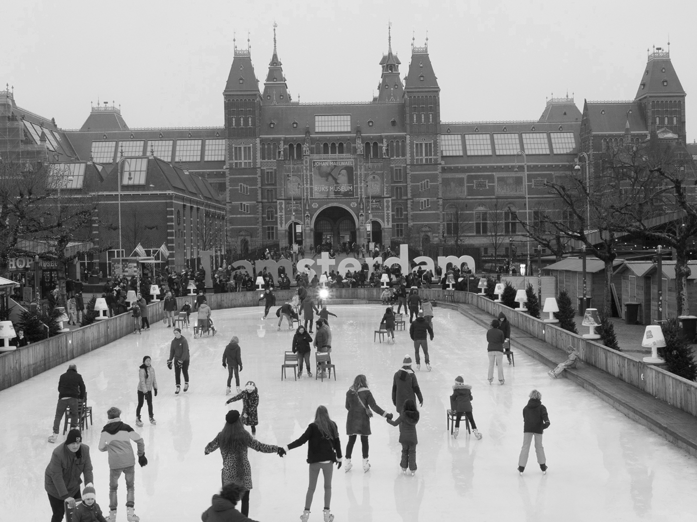
Thank you for sharing this with up. Very interesting. I do not like the black boarder area at the top of the image. It draws my eye from the subject. I converted in Photoshop and played with the colors to be able to read the "I am" better. I also removed the partial couple in the lower right, as it was also drawing my attention. I like the star effect of the spotlight in the center of the image. It draws my eye and then my eye looks around the rest of the image. |
Dec 5th |
 |
| 32 |
Dec 20 |
Comment |
Another nice image, but I think that you have lost the effect of being above the clouds. To me, it looks like I am looking up at the clouds instead of down. The cables vanishing into the clouds is a nice effect, and adds some mystery to the image. |
Dec 5th |
| 32 |
Dec 20 |
Reply |
We Westerners read from left to right (in the Orient they read from right to left). The same reason that most of our portraits are facing to the left. Flipping puts the bird into the upper right, in a power point. |
Dec 5th |
7 comments - 3 replies for Group 32
|
13 comments - 4 replies Total
|