|
| Group |
Round |
C/R |
Comment |
Date |
Image |
| 7 |
Sep 20 |
Comment |
Interesting idea of the old and the new. You did a good job of cleaning up the building, getting rid of the writing, and toning it down. Since the buildings were kind of monochrome anyway, I tried Rich's suggestion to make the building B&W. |
Sep 21st |
 |
| 7 |
Sep 20 |
Comment |
Really super image of the surfer and the wave. Caught at the perfect moment. And Tony, thanks for what you did with the image and your excellent explanation. |
Sep 21st |
| 7 |
Sep 20 |
Comment |
Great eye to have seen this. They say that the best camera that you have is the one that is with you, which is true, but with cell phones getting so good that is even more true. I would crop off the bottom area to get rid of the ruffles looking items. They are pulling my eye down. |
Sep 21st |
| 7 |
Sep 20 |
Comment |
Really great image. You caught it just right. And the story about the image is also good. Thanks for showing us some other images. |
Sep 21st |
| 7 |
Sep 20 |
Comment |
Really like the stop action of this very small bird in flight. I think that your crop is perfect and would not change a thing. The blurred background is very good. Great shot. |
Sep 21st |
| 7 |
Sep 20 |
Comment |
Nice pattern shot and good eye to have seen this. I like the starkness of it. |
Sep 21st |
6 comments - 0 replies for Group 7
|
| 32 |
Sep 20 |
Comment |
I really like the colors in your color image. The red house with green grass and the blue mountain. However, for your title of a lonesome house, the monochrome is a better choice. I will say "me to" about the auto if you want to use it for pictorial. |
Sep 9th |
| 32 |
Sep 20 |
Comment |
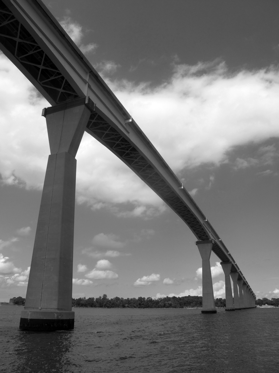
Excellent example of a "vanishing point" image. I really like the angle of the bridge and it that shows how high that it is. I would remove the thin poles above the bridge and the white area at the waterline on the far left. I like the tone of your original image better that your second image. |
Sep 9th |
 |
| 32 |
Sep 20 |
Comment |
Interesting old building and you have a good sky. Your image seems straight to me, and maybe Stephen's image is a bit straighter, but he has the roof on the left too close to the edge. I would crop off some on the right, maybe back to where the roof on the left is. That would move the cow more out of the center and toward a power point. |
Sep 9th |
| 32 |
Sep 20 |
Comment |
Russ, welcome to the group. I like that Diana had the right stem point toward the left stem. It keeps the eye coming back to the 2 peppers. I also like the contrast that Stephen added. You have nice texture on the base that they are sitting on. With the various colors in the original, I think that conversion to monochrome was a good choice, and it also helps with what you wanted to portray. |
Sep 9th |
| 32 |
Sep 20 |
Comment |
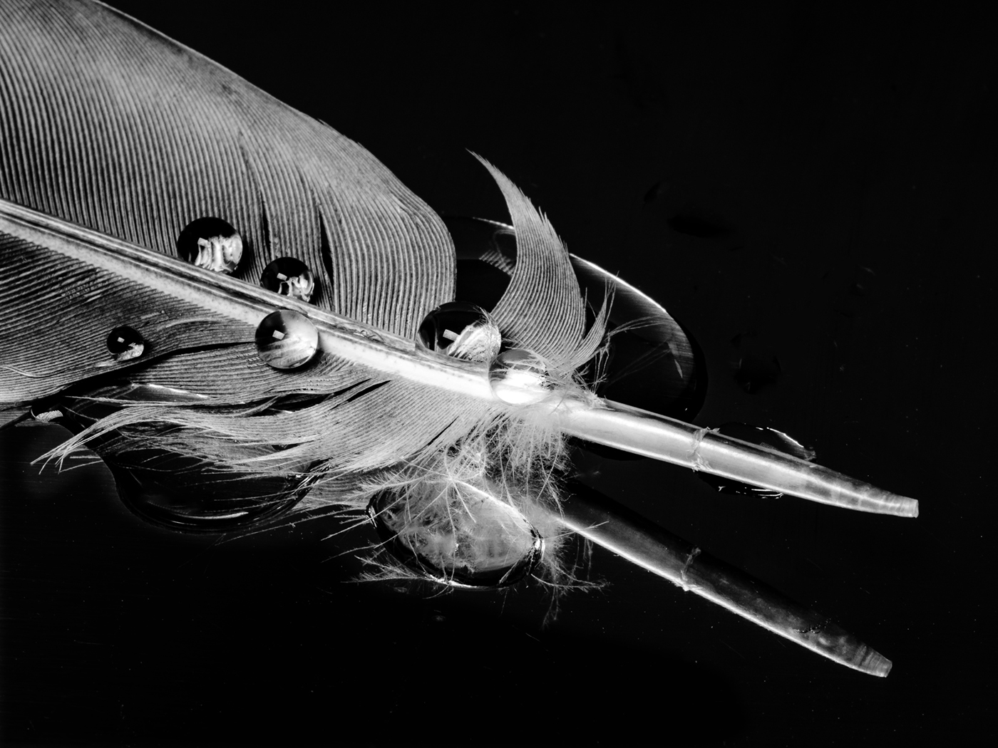
I like the lighter tone of the feather that Diana entered. I did use a duplicate layer and mask to darken only the feather shaft. Then to me the droplets above the feather are distracting, so I removed them and the reflection from the light and a few dust spots. I did notice the magnifying glass effect from some of the droplets on the feather. That effect has interested me, but I have never tried. Maybe this would be a good time for me to experiment. Also, maybe Diana could focus in more on the droplets that are magnifying parts of the feather. |
Sep 9th |
 |
| 32 |
Sep 20 |
Reply |
Even though they were firing blanks, I don't think that I would want to be in front of the canon firing to get to see their faces! |
Sep 6th |
5 comments - 1 reply for Group 32
|
11 comments - 1 reply Total
|