|
| Group |
Round |
C/R |
Comment |
Date |
Image |
| 1 |
Jul 20 |
Comment |
Really great idea and well executed. It looks like the wind is blowing some of the seeds off. |
Jul 16th |
1 comment - 0 replies for Group 1
|
| 7 |
Jul 20 |
Reply |
Don't adjust it, it is great as it is. |
Jul 17th |
| 7 |
Jul 20 |
Comment |
Interesting image but it seems overall the color of the flowers. It would be better is you had all of the left hand pillar, but don't crop it off, because the image needs it. |
Jul 16th |
| 7 |
Jul 20 |
Comment |
Your editing really improved the image. I like old covered bridges, but they are hard to photograph because of the dark interior. You did a really good job with this one. I think that the new wood adds to the interest in the image. But Barbara's suggestion to make them a bit lighter is a good one. That would make them noticeable but not distract, if you know what I mean. |
Jul 16th |
| 7 |
Jul 20 |
Comment |
At first I thought that it was too dark, but then the waterfall is the correct brightness. The lighting adds a lot of mystery and interest. |
Jul 16th |
| 7 |
Jul 20 |
Comment |
Great find. It is a really great looking old building. At first I thought that maybe the dead looking tree was a distraction, but then decided that it added to the story of the old building. The door color is really good, and I like the tight crop. The grass color is kind of a distraction. |
Jul 16th |
| 7 |
Jul 20 |
Comment |
The car must not have been moving, or it would be blurred at 1/60th of a second. I like the strong diagonal, and that you captured 3 workers. The cropping and conversion to monochrome are very good. Yes, the colors were distracting so conversion to monochrome was a good choice. |
Jul 15th |
| 7 |
Jul 20 |
Comment |
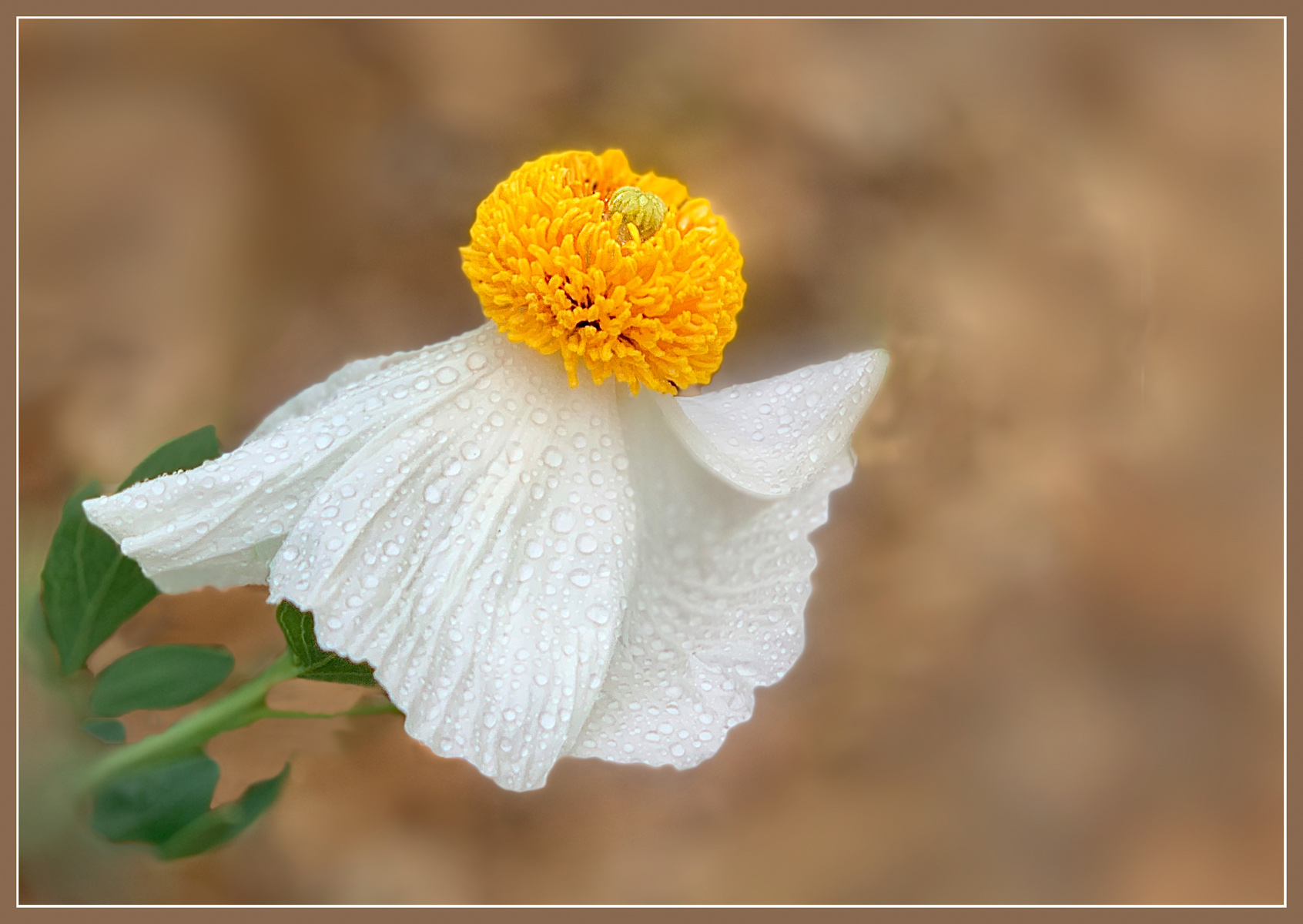
The poppy is very sharp and the water drops are great. The exposure is perfect to show the detail in the petals. I like the background blur effect. To me the green bud is competing with the flower. I used the clone tool to get rid of it. What do you think? |
Jul 15th |
 |
| 7 |
Jul 20 |
Comment |
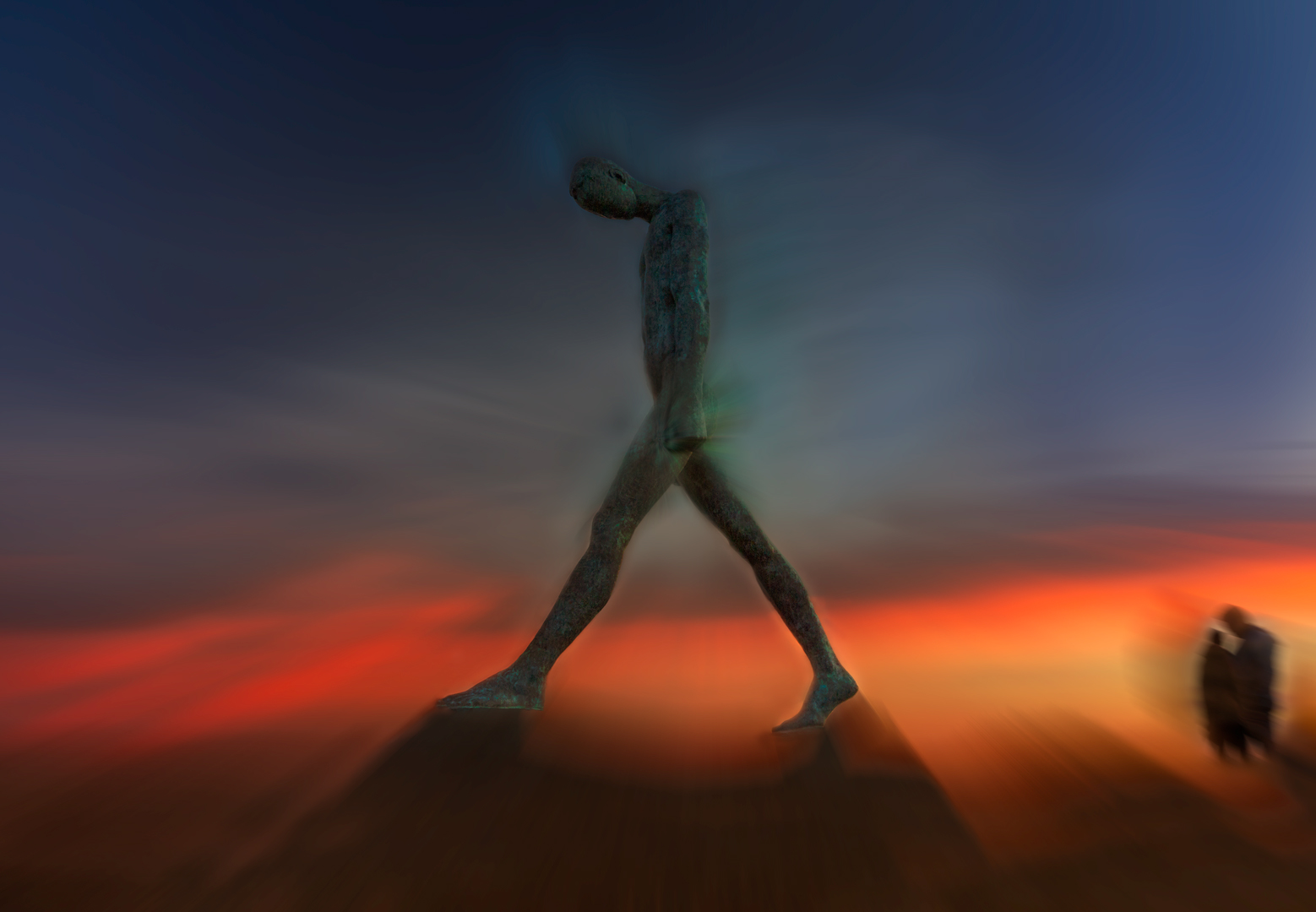
Grace made edits to her Lonely Man image from last month using our suggestions. It is shown here. |
Jul 5th |
 |
7 comments - 1 reply for Group 7
|
| 32 |
Jul 20 |
Reply |
Lance, Thanks for your comments. I have added the color image, without HDR effect. I did not crop it down as much. |
Jul 26th |
 |
| 32 |
Jul 20 |
Comment |
You captured a very good image. I like the sand thrown up by the running children's feet. My favorite is the image presented as the main image. The color of the original distracts from the children. Monochrome eliminates that distraction. The pure black and white lacks interest. I do remember using Kodalith in the darkroom in the 70's to create much the same effect. At the time they were somewhat popular in salons. I would crop some off the top of the image to make it more of a panoramic, as all of the sky area is not needed in the monochrome version and cropping would make the children stand out better. |
Jul 16th |
| 32 |
Jul 20 |
Comment |
Yes, you need the ceiling, agreeing with almost all the comments above. I had not noticed the skewed painting, but after it was mentioned, it was noticeable, and your corrected that well. It is an interesting image and your title fits it very well. |
Jul 16th |
| 32 |
Jul 20 |
Comment |
I do like the color image better, but then this is a monochrome DD group, and converting images to monochrome helps us all improve our photography. I do like Stephen's crop, and Rick's image is a real improvement. It adds a lot of impact to the image. His monochrome is almost as good as the original color. So, thank you for giving us the great learning opportunity. |
Jul 16th |
| 32 |
Jul 20 |
Comment |
I think that your crop is very good, and the image is very sharp. The mono is much better than the blue colored original. The spider web adds to the image. I do agree with Marie that you should clone out the vine leading us out of the image. A very nice study. |
Jul 16th |
| 32 |
Jul 20 |
Comment |
Good composition with the stems coming from the corner area. This is an interesting experiment. The depth of field is really not very noticeable, as the more out of focus areas go darker. I think that monochrome is the way to go. I do like the image. |
Jul 16th |
| 32 |
Jul 20 |
Comment |
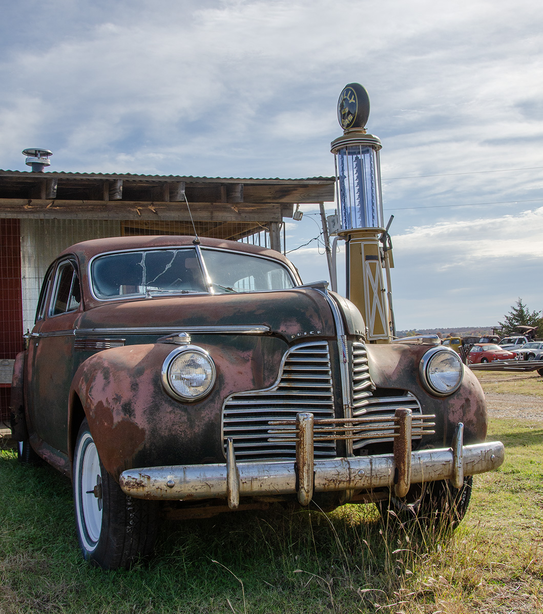
When I was a kid, the family went camping in a more rural area of eastern Oklahoma, and the filling station there at Scraper (named after the road grader that was kept there), had pumps like this. You used the hand pump to pump the amount of gasoline that you wanted into the glass top area, and that is why it had markings. Then you emptied the glass tank into your car with the hose. I am sure that they were common every where at one time. |
Jul 4th |
6 comments - 1 reply for Group 32
|
14 comments - 2 replies Total
|