|
| Group |
Round |
C/R |
Comment |
Date |
Image |
| 7 |
Jun 20 |
Comment |
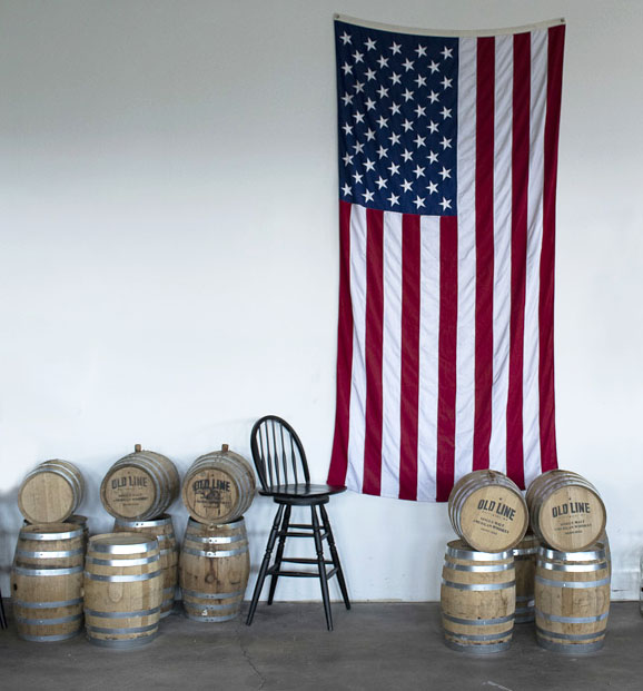
I like that you cropped off the still, as that would have made it have 2 main areas of interest. I think that your cropping should have been to leave 3 barrels on the left side. My quick edit does not have the good color and brightness that your image has, but it shows what I am suggesting for a crop. I used content aware fill to get rid of the electrical items at the top, and then a bit of cloning to get rid of the small area of the chair. |
Jun 13th |
 |
| 7 |
Jun 20 |
Comment |
Very striking image. Thanks for showing us the original and how you did the zoom effect. The poem is very good. A thought that I have, is to leave more base under the man so that he does not look so suspended. |
Jun 13th |
| 7 |
Jun 20 |
Comment |
These older cameras are really good, aren't they. You have an excellent photo eye to have spotted this. The lighting on the center flowers is really great. I do agree with Barbara to crop off the light sky area at the top. I also use Hue and Saturation to tone down the blues on the flowers in the shade. To me it looks more natural, because our eyes don't see the blues in the shade. |
Jun 13th |
 |
| 7 |
Jun 20 |
Comment |
What an interesting camera. Your image is very sharp and well exposed. I do like sharp images of flowers. A suggestion would be to clone out the kind of multi color spot on the petal in the middle of the right side. The colors draw my eye from the yellow center. |
Jun 13th |
| 7 |
Jun 20 |
Comment |
Very nice image of the owl looking at you. It sounds like you did a good job of editing to get rid of a blown out area. My only suggestion would be to make the blue sky darker. |
Jun 13th |
| 7 |
Jun 20 |
Comment |
Interesting old gazebo. I like the crop. It looks like the gazebo is all in the sunlight, is much better than partial shade on the building. Looking at the edited image and the original, it looks like you lost some of the whites on the gazebo. The flowers around it add to the image. |
Jun 13th |
6 comments - 0 replies for Group 7
|
| 32 |
Jun 20 |
Comment |
Welcome to the group. Great story about the image. To me, the image looks dark, even though you have a full range from white to black. The lighting to catch the reflections is very good. |
Jun 13th |
| 32 |
Jun 20 |
Comment |
Yes, monochrome is the way to go. I like what Diana did with the image, and agree with Larry's suggestion to crop off the hat. That would also crop out the bright flowers in the upper right corner that is a distraction. |
Jun 13th |
| 32 |
Jun 20 |
Comment |
I think that it is an interesting image for a composition study as discussed above. And that should be the main point of the DD groups, to create discussion, not show our "wall hangers". |
Jun 13th |
| 32 |
Jun 20 |
Comment |
I like what Diana did with the image. The top part is the best area. I would keep it for an architectural image, not a general subject. That said however, Diana's image is much stronger and might have a chance of acceptance. |
Jun 13th |
| 32 |
Jun 20 |
Reply |
That is really hard to do, especially with very small flowers. It was not seen by me when I first looked at the color, and in the monochrome image you don't see it at all. |
Jun 13th |
| 32 |
Jun 20 |
Comment |
Excellent exposure to leave all the detail in the pedals. The color has really delicate shades. The monochrome is also good. I do like what Lynne did with the image. I would have removed the leaf. My eye keeps looking at both the center of the flower and the leaf. |
Jun 13th |
| 32 |
Jun 20 |
Comment |
I like the delicate shades of the original. I would say that the yellow at the bottom of the flowers is pollen and the grey spot is a blemish. I do like that you flipped the image to make the stem a lead in. I really did not notice exactly where the stem came in until all of the fuss was made about it! Just make a nice crop and let the stem come in around the corner area. The flower is the subject,not the stem. I do like the high key effect that you did, and agree with Lynne that the dark area on the stem should be made lighter. I guess that this is another thought on where the stem should come in. |
Jun 13th |
| 32 |
Jun 20 |
Reply |
Thank you, welcome to our group. |
Jun 4th |
6 comments - 2 replies for Group 32
|
| 44 |
Jun 20 |
Comment |
Beautiful image that jumped out at me when I was looking at the months current images. The colors are great and the 2 people really add to the image. I will have to try the "Divide Blend Mode". |
Jun 23rd |
1 comment - 0 replies for Group 44
|
| 47 |
Jun 20 |
Comment |
Really great image with the sky and the sail boat. |
Jun 23rd |
1 comment - 0 replies for Group 47
|
14 comments - 2 replies Total
|