|
| Group |
Round |
C/R |
Comment |
Date |
Image |
| 7 |
May 19 |
Comment |
What an interesting old saw mill. You did a good job of capturing it, and I like the photo editing that you did. I would have left the foreground sharp, as you presented it. Adding fog to the foreground is a mistake to me. Seeing a foggy scene has the close elements clear, and then increasingly hazy in the distant. As an example of an image take in the fog in Nova Scotia several years ago with no extra fog added or taken away, you can see that the boat is very sharp but the building has a lot of haze and the distant shore is very hazy. |
May 20th |
 |
| 7 |
May 19 |
Comment |
What a great capture to have the two watching the fire area. A great story telling image. I like the toning in the final image, but do agree with Rich that the sparks in the upper right distract from the story, as well as the bottom distortion. |
May 20th |
| 7 |
May 19 |
Comment |
Nice abstract image, and I like that you have some detail in the white crosswalks. |
May 20th |
| 7 |
May 19 |
Comment |
This is a very beautiful building, and to add interest to it, you captured the people in front of it, and the lovely young lady really adds to the image. Your thinking to take an image of the full building while you were there shows your photographers mind and knowing what you wanted to do with the image. A lot of us would think about what we could have done better when we get home and look at the images, but then it is too late! Also, your Photoshop work is really great. A thought would be to crop off the right side including the photographer and make it a vertical image to bring more attention to the young lady and the building. That said, I really like the image as you have presented it. |
May 20th |
| 7 |
May 19 |
Comment |
A very pretty flower that is nicely sharp. I like that you blurred the background to get rid of the distraction of a sharp background. To improve the composition, I would crop some off the right side to move the flower out of the center, and that would get rid of some of some of the purple area also. |
May 20th |
5 comments - 0 replies for Group 7
|
| 32 |
May 19 |
Comment |
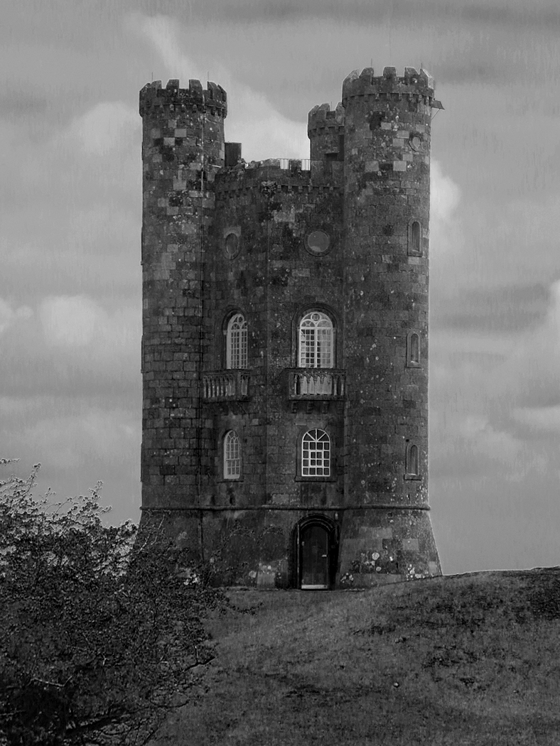
I like that Stephen straightened it. I did play with the sliders from the original, and brought out more clouds. The old tower is a very interesting subject. |
May 21st |
 |
| 32 |
May 19 |
Reply |
You could open up the shadows in Photoshop. |
May 21st |
| 32 |
May 19 |
Comment |
I think that the shadows are too harsh. In a salon this would score very low because it is an image of another persons art. |
May 20th |
| 32 |
May 19 |
Comment |
An interesting image of your plant, but for me there is way too much stem separating the pot and the flower. Maybe you could bring them closer together in Photoshop. |
May 20th |
| 32 |
May 19 |
Comment |
I like Stephens crop. To me the clouds are a distraction because they seem to lack detail in the white areas. |
May 20th |
| 32 |
May 19 |
Reply |
Thanks for your suggestions. |
May 20th |
4 comments - 2 replies for Group 32
|
9 comments - 2 replies Total
|