|
| Group |
Round |
C/R |
Comment |
Date |
Image |
| 7 |
Jul 18 |
Comment |
Really nice lighting. It is good that you have some of the bank edge in the image (and it is sharp), that adds depth to the image. The storm in the distance adds interest. |
Jul 17th |
| 7 |
Jul 18 |
Comment |
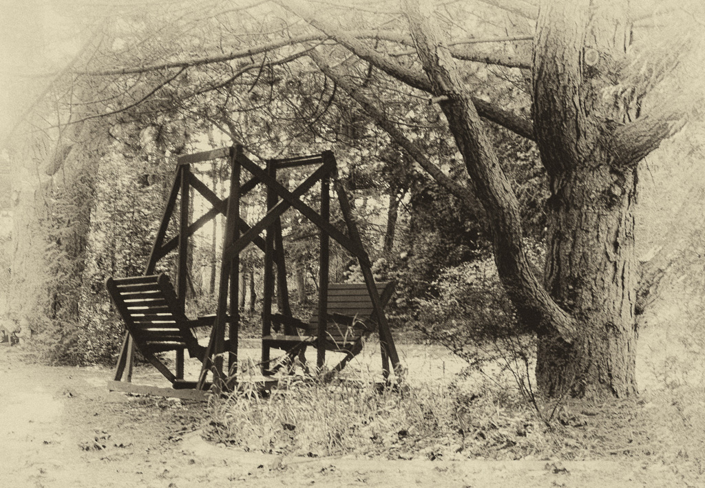
Lloyd, you made a good choice to convert to monochrome. I like the sepia and the vintage look. The swing is the area of greatest contrast and so the eye goes to it. The only suggestion would be to reverse it so the the tree becomes a stopping point for the eye to keep you in the image. |
Jul 11th |
 |
| 7 |
Jul 18 |
Comment |
Really great image and the princess is a good addition. That must have a really great sight in person. You did capture it very well. |
Jul 11th |
| 7 |
Jul 18 |
Comment |
Really great lighting. You really captured the sunrise very well. A suggestion would be to crop off about 1/3 of the left side to get rid of the dark area that is not needed in the image. |
Jul 11th |
| 7 |
Jul 18 |
Comment |
There is a lot of good interaction. You do not have harsh shadows like would be common in a shot like this. On my monitor, it does seem a bit over exposed. |
Jul 11th |
| 7 |
Jul 18 |
Comment |
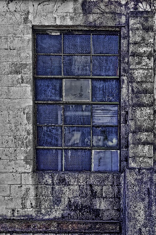
Rich, What was the purpose for this image? What you want to do with it will determine the suggestions. There does not seem to be a main center of interest. If you changed the color in one of the panes then you would have a center of interest. If you want to show more decay, I used Topaz Adjust 5 Spicify filter to add more. There was too much yellow so I used Hue and Saturation to get rid of it. |
Jul 11th |
 |
6 comments - 0 replies for Group 7
|
| 32 |
Jul 18 |
Comment |
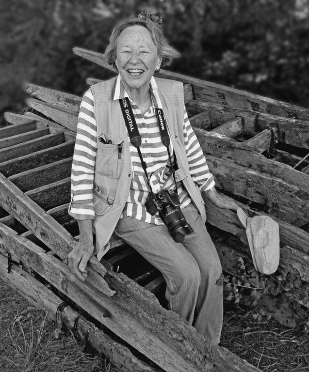
Conversion to B&W is a good choice so that there is not the browns and greens in the background to be a distraction. You have good blacks and white in the image. I did a quick selection on the background and a gaussian blur of 3 pixels and darkened it slightly. Is this what you were thinking about? |
Jul 11th |
 |
| 32 |
Jul 18 |
Comment |
Very sharp image and the eye is very sharp and well defined. Your B&W conversion is very good. You have really good whites and blacks in the image. The bird does stand out from the background, but it is a similar shade to the bird. I am not sure, but if you made it darker there would be more separation. |
Jul 11th |
| 32 |
Jul 18 |
Comment |
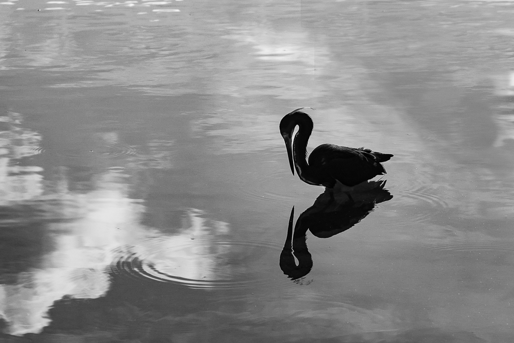
The curve of the neck and the reflection add interest to the image. It is good that there are some water rings. You have a peaceful image. The eye of the bird needs to be lighter so that we can see it. I tried to do that, and also get rid of the light area in the upper right. The light area in the upper right draws the eye out of the image and away from the area of greatest contrast, the dark bird. |
Jul 11th |
 |
| 32 |
Jul 18 |
Comment |
Interesting portrait with the mask and the eyes. The tilt of the head is good. The hands are okay, but if they were adjusting something it would be more natural for them to be in the image. I do like what Ian did. |
Jul 11th |
| 32 |
Jul 18 |
Reply |
Carol did portraits and usually used a 2 to 1 light ratio on the face so that there was some shadows and shaping but not harsh shadows. And of course always a light behind on the hair. Of course for men you might want more contrast. |
Jul 11th |
| 32 |
Jul 18 |
Comment |
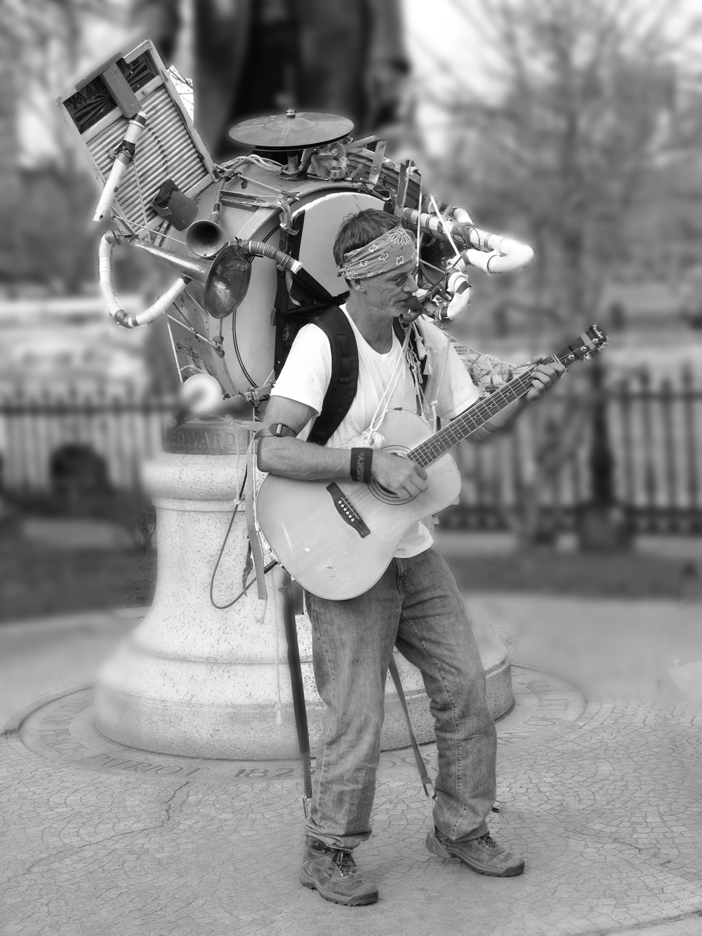
A very interesting person. I can see why you took the photo of him. B&W was probably a good choice to get rid of distractions that color can cause. The problem is the background is too sharp and it makes it hard to see just the bandsman. Taking a shot like this with a wider open aperture would have thrown more of the background out of focus. To try and help the image, I made a quick selection of just the bandsman, and blurred the background, about 6 pixels gaussian blur. My selection was pretty quick, so since I had added the blur on a separate layer, I was able to use a mask and clean it up some. I removed about 50% of the blur on the area in the foreground and around his feet. This is only an example to show what blurring the background will do to try and improve the image. I also removed the wire and the partial bike. |
Jul 7th |
 |
| 32 |
Jul 18 |
Reply |
Sorry, I should have added the camera info. Nikon D7200 with 18-300mm lens at 32mm, F14, 1/60th second, ISO 200. I do not remember exactly how far away I was, but only a few feet. I did not include the whole car as I thought that the front was the most interesting, and there were a lot of other cars and trucks around it which would be distracting. I also got done on my knee for a different perspective from a lower position. I like to do that for cars as to me it makes them seem more powerful and also gets rid of surrounding distractions with the sky being more of the background. |
Jul 3rd |
5 comments - 2 replies for Group 32
|
| 44 |
Jul 18 |
Reply |
Thanks, that looks good. |
Jul 17th |
| 44 |
Jul 18 |
Comment |
Very well done image, and HDR was really needed here because of the very contrasty light. Leaving a person is a good idea. You might think about cropping some off the top to bring more attention to the tea pot. Really great shot. |
Jul 11th |
| 44 |
Jul 18 |
Comment |
Really great location. Your early wake up was well rewarded. The s curve of the river is great composition. The fog really adds to the image. The water is also very good and was handled very well in your processing. After looking at Brad's comment, I saw the logs and agree that they should be removed. |
Jul 9th |
| 44 |
Jul 18 |
Comment |
Your processing is really good and you have a natural looking image. The shadows and highlights are all handled very well. I would make it more of a panorama and crop off about one half of the trees, to bring more attention to the head stones. |
Jul 9th |
| 44 |
Jul 18 |
Comment |
You created a very attractive painting like image. It could hang on the wall. |
Jul 9th |
| 44 |
Jul 18 |
Reply |
The sky is okay, but you removed too much of the saturation. |
Jul 9th |
| 44 |
Jul 18 |
Comment |
You located another great spot. The processing looks very good and natural, like we were there. I really like the composition with all of the yellow in the front and the very nice barn in a power point. It is nitpicking, but I would get rid of the light poles. Good image to hang on the wall. |
Jul 9th |
| 44 |
Jul 18 |
Comment |
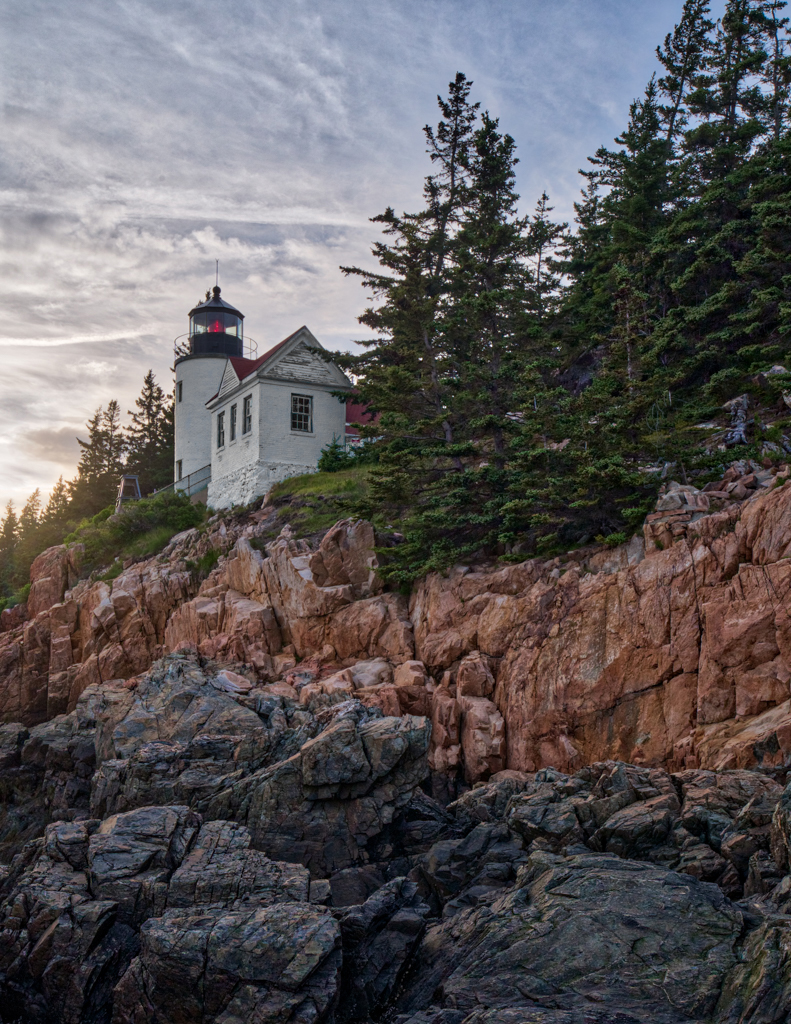
Very nice image of this well photographed lighthouse. Glad that you did not fall on the rocks. The processing is very good and natural. The sky is also interesting. The blue lighthouse bothers me, and I think the lighthouse would look better if it were white. I used hue and saturation and a mask to make it white. What do you think? |
Jul 9th |
 |
6 comments - 2 replies for Group 44
|
17 comments - 4 replies Total
|