|
| Group |
Round |
C/R |
Comment |
Date |
Image |
| 7 |
Jun 18 |
Reply |
Rich, Thanks for your suggestion. This DD group is to learn from each other and improve all of our images. |
Jun 10th |
| 7 |
Jun 18 |
Reply |
Rich, It is maybe a strange method to need to use, but there is not a way that I know of to be able to transform only 1 layer. |
Jun 10th |
| 7 |
Jun 18 |
Comment |
Good eye to see the board walkway curve into the unknown. That is what really makes the image, the imagination wonders what is around the last curve. The vignetting makes the walkway stand out, and the great depth of field keeps the end of the pathway sharp. |
Jun 10th |
| 7 |
Jun 18 |
Comment |
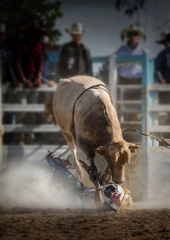
Good timing to capture the peak of the action, and your shutter speed was fast enough to stop the action. The cowboys in the background add to the story that it is a rodeo. Really, not a lot of editing needed to improve the image. I just cropped off the left side, darkened the red cowboy shirt and darkened the dirt in the front some. |
Jun 10th |
 |
| 7 |
Jun 18 |
Comment |
An interesting image with the colors that compliment each other. Good job of lighting the grass. Good composition to have so much of the sky in the image. The white spot (what ever it is) at the bottom of the sky adds a needed focal point. |
Jun 10th |
| 7 |
Jun 18 |
Comment |
What a great feature to have on a camera. It did a really great job of making a pano image. You also did a really great job of adding the top to the big rock. It looks totally natural. I would crop the 2 people on the far right -- they are pulling my eye away from the big rock that is the main subject, and they really do not add anything to the image. |
Jun 10th |
| 7 |
Jun 18 |
Comment |
Really nice image. Very sharp and the eyes are wide open. Good composition with the eyes in the upper right power point. Too bad about all of the white in the background, but even with that it is a very nice image. |
Jun 10th |
| 7 |
Jun 18 |
Reply |
That is a good suggestion, I will have to try it. That will get rid of the red roof and other distractions. |
Jun 10th |
| 7 |
Jun 18 |
Comment |
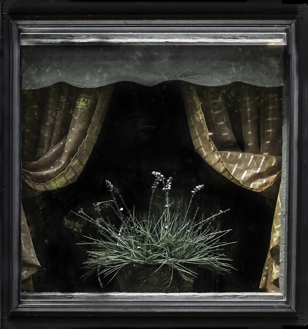
You have an interesting image. Your high ISO shows no sign of digital noise. I find the orange spots in the lower left a bit of a distraction. What I did to add the frame at the top was to expand the canvas by 150 pixels at the top to give room to add the lower frame. Then I duplicate the layer, and used Free Transform on the top layer and just pulled the bottom of the image up to the top, and then pulled the bottom down. That is how I flip and image. Then I used a mask to get rid of the part of the top image that I did not want (now with the bottom frame at the top on that layer). I had to use the stamp tool to blend the side frame. Included is a quick and dirty example. |
Jun 10th |
 |
6 comments - 3 replies for Group 7
|
| 32 |
Jun 18 |
Reply |
Thanks. Getting rid of the plain sky helps the image. |
Jun 10th |
| 32 |
Jun 18 |
Reply |
That is something about these digital groups, once someone points out something, then it becomes bothersome. And it does let the maker know how to improve an image. |
Jun 10th |
| 32 |
Jun 18 |
Reply |
The color is much better with the bright blue. |
Jun 10th |
| 32 |
Jun 18 |
Comment |
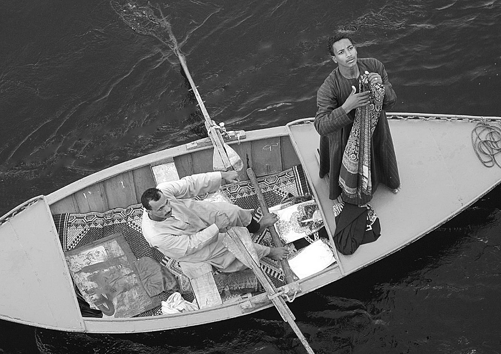
The angle of the boat and the men looking up adds a lot of impact to the image. I did not notice the rope until I red Diane's comments and then it really bothered me. The black item in the back of the boat also bothers me as it draws my eye from the front man that I see as the main subject. The image also seems a bit grey to me. I added contrast, used the healing brush to get rid of the rope and the black item. |
Jun 8th |
 |
| 32 |
Jun 18 |
Reply |
The color does leave the pale blue shy. |
Jun 8th |
| 32 |
Jun 18 |
Comment |
The toads sound bad -- glad that you were not hurt by them. I think that you have gotten rid of enough around the tractor, and it does stand out well against the background. The tone is effective for the old tractor. |
Jun 8th |
| 32 |
Jun 18 |
Comment |
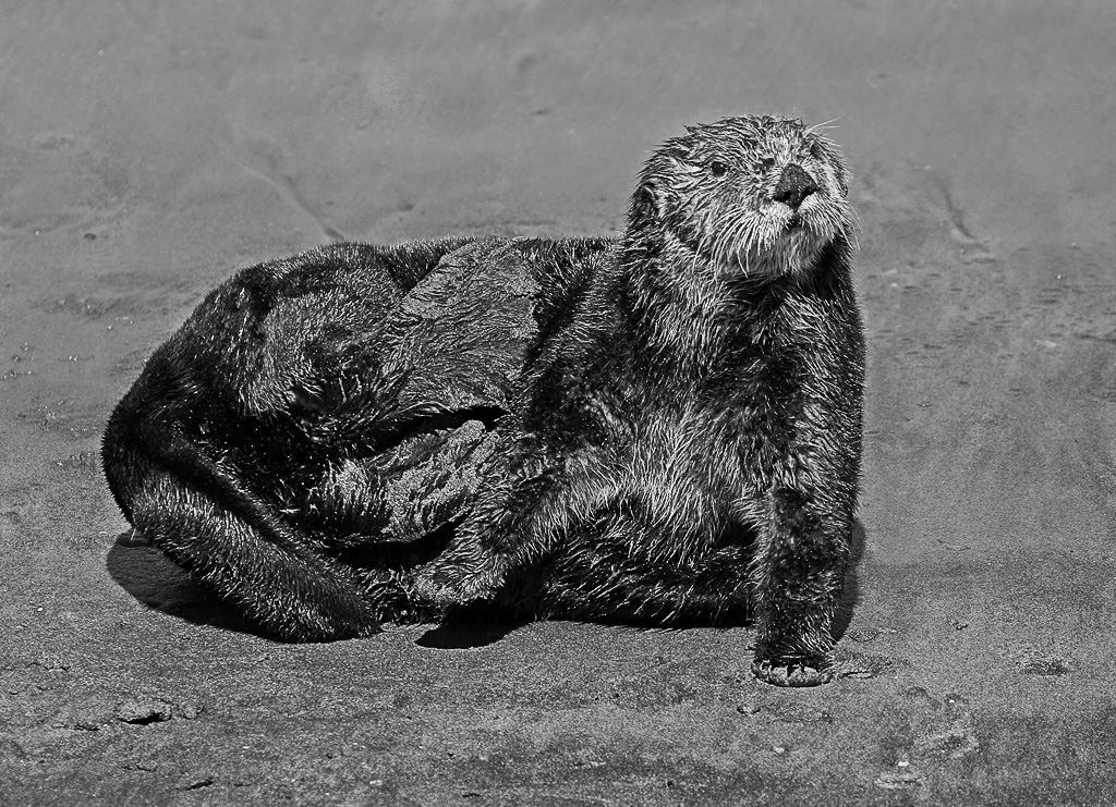
It is a bit confusing as to what he is doing. Maybe you need more action for the international nature. I do like the color better with the blues behind him. I used NIK silver effects and the high structure to bring out his fur more. I also used NIK silver effects with a normal preset to keep the area behind him from getting too much structure, by using a mask. I also lightened his his rear end some. I think it adds more "pop" to the iamge -- what do you think? |
Jun 8th |
 |
| 32 |
Jun 18 |
Comment |
Wow, that must have been quite and experience. I like the color better, but the monochrome is also good. Good exposure to keep some detail in the snow. It does seem a bit grey to me, and I added some contrast and darkened it some. Nit picking, but I also removed the small twigs in front of the bears, as they were drawing my eye. Overall, I think it will do well as a mono image. |
Jun 8th |
 |
4 comments - 4 replies for Group 32
|
| 44 |
Jun 18 |
Comment |
That is an interesting old fort. I did visit it several years ago. Your capture and processing make for a good presentation of the old fort. You have good detail in both the dark interior areas and also the outer walls. Leaving the sky as is a good idea. |
Jun 10th |
| 44 |
Jun 18 |
Comment |
Interesting image with all of the open spaces between the boards. The wires do not bother me. You did an excellent job of capture processing to have both the interior wood and the outside in good exposure. |
Jun 10th |
| 44 |
Jun 18 |
Comment |
Thanks for the tip on focusing, I had not thought to use that. I agree with Rick's suggestion on the cropping. The image does seem a bit over saturated on my monitor. |
Jun 10th |
| 44 |
Jun 18 |
Comment |
Great job of capturing and processing -- image looks like we were there as the eye saw it. I am glad that you left the person on the far right as it adds size and perspective to the image. Thanks for showing us this beautiful location. |
Jun 10th |
| 44 |
Jun 18 |
Comment |
Great capture of the complementary colors -- makes for a strong image. Your processing is very good and natural. The street grate is not a problem to me. Nitpicking, but I would crop off the green area on the far left, and get rid of the small light spots in the window on the far right. |
Jun 10th |
| 44 |
Jun 18 |
Comment |
Very well done, natural looking image. I would get rid of the TV antennas on top of the grey roof. The blue area of the sky seems kind of pale. |
Jun 10th |
6 comments - 0 replies for Group 44
|
16 comments - 7 replies Total
|