|
| Group |
Round |
C/R |
Comment |
Date |
Image |
| 17 |
Feb 17 |
Comment |
I would add to Glenn's observation that there is definitive black in some of the background growth and white on the rim of the bowl. But the point is always worth considering. Personally, I always found Ansel's images too dark overall, but who am I to critique the masters? And then there is the lightening that this site adds a bit to everything. |
Feb 12th |
| 17 |
Feb 17 |
Comment |
I liked the idea of seeing in monochrome. Here it is. It is different but maybe not better. |
Feb 12th |
| 17 |
Feb 17 |
Comment |
For those who don't like the pipe, I left it in because it says "indoors". Thanks for all the suggestions. I realize it takes a bit more right brain to perhaps buy what I was selling. |
Feb 12th |
| 17 |
Feb 17 |
Reply |
Thanks. I agree with your impression. It has lost just a little with the brightening on the site, but it had only so much to offer anyway. |
Feb 11th |
| 17 |
Feb 17 |
Comment |
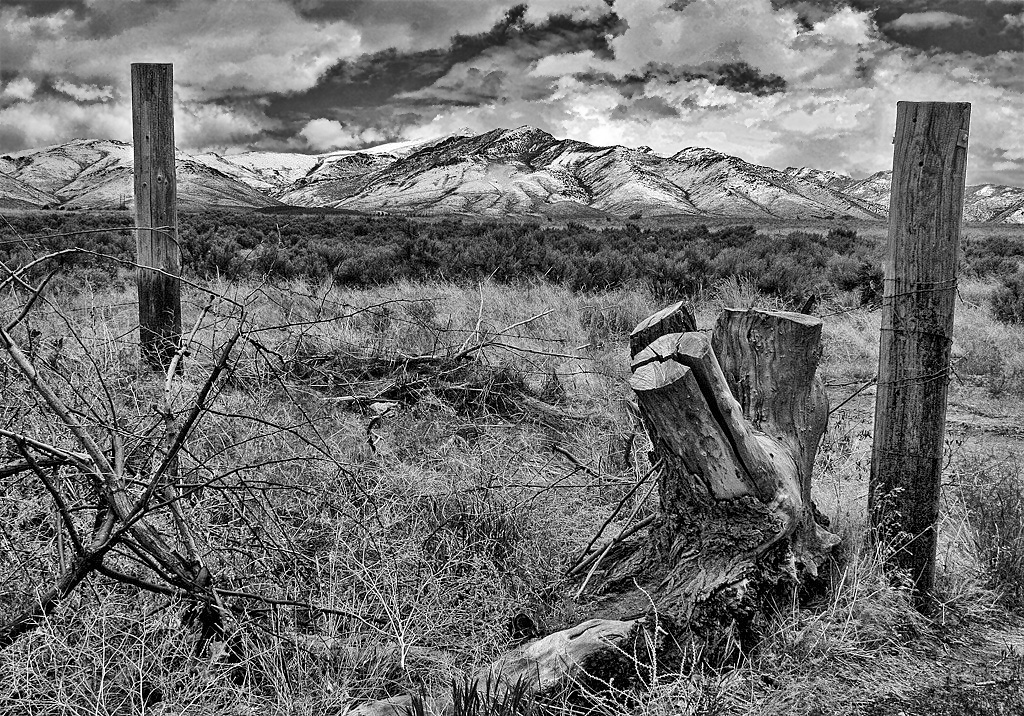
There is absolutely nothing to say about this image that would in any way make it better. In composition, exposure, choice of tonality, and sharpness, it is a big time 10. |
Feb 9th |
| 17 |
Feb 17 |
Comment |
Welcome to our little family, Ursula. Hope you will stay with us. Very pleasing scene well caught and presented. You may note that this site requires a little toning down of exposure, and images tend to blow out a little.Contrast would have popped more.
I really find this image very enjoyable. "Wat Rong?" Nothing! (Sorry). |
Feb 9th |
| 17 |
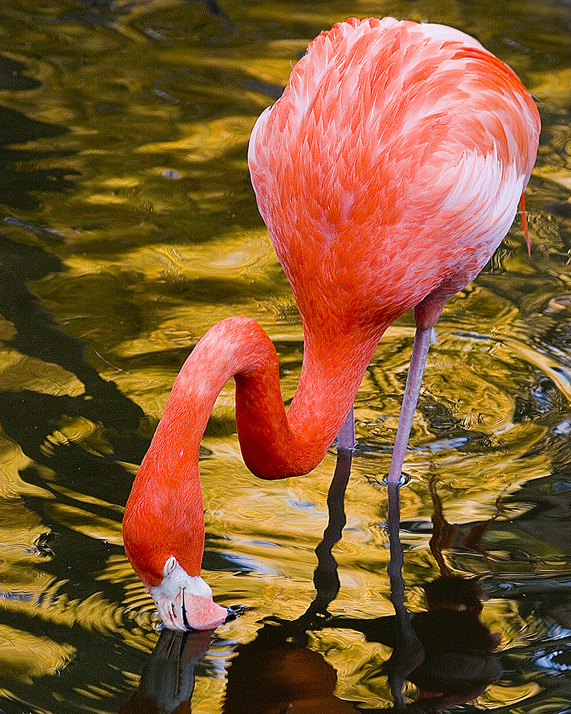
Feb 17 |
Comment |
Very good result in a very challenging action scene. All elements of the birds are good to excellent and the environment is well controlled. I feel like I was there. Thanks. |
Feb 9th |
| 17 |
Feb 17 |
Comment |
I liked this a lot in many ways, but I saw your concern about the bald sky. I also noted that there seemed to be some blue hiding in it, so I played with isolating it selectively and adjusted the elements in PS under "Exposure" with gamma and offset and managed to find some better sky. See what you think of it now. The radius is a bit hot causing some edge highlighting and enhancing noise, but maybe that gives some ideas for further work. It is otherwise a great presentation. |
Feb 9th |
 |
| 17 |
Feb 17 |
Comment |
She's lovely and well presented. I personally do not photo anything that would say "I don't like it" because it is definitely not a skill of mine. So I hesitate to critique it, but I am supposed to. I have a little trouble with the lighting, in that the eyes are disturbed by too many catch lights and the right cheekbone is a little blown out. The fold in the scarf in front is lit and distracts from the rest of the garment. All this may be in the reproduction on this site, but a more "Rembrandt" look with a slightly greater shadow to the left of the nose might be helpful. In camera club terms, it is still a 9/10 ad a really good job. |
Feb 9th |
| 17 |
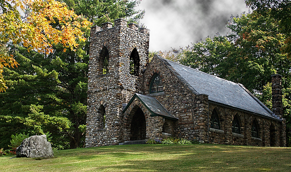
Feb 17 |
Comment |
Magnificent capture. The lighting, composition, clarity and selectivity are all superb. It should be bought and used by the church as institutional advertising or displayed on a wall. Great job with this! |
Feb 9th |
9 comments - 1 reply for Group 17
|
9 comments - 1 reply Total
|