|
| Group |
Round |
C/R |
Comment |
Date |
Image |
| 4 |
Oct 23 |
Reply |
I agree it's definitely a Cessna - probably a 182. I never did like flying those high wing types. The wing gets in the way in a turn when you try to see where you are going. |
Oct 25th |
| 4 |
Oct 23 |
Reply |
Well spotted, Vella! Cropping the top half creates a whole new picture. |
Oct 19th |
| 4 |
Oct 23 |
Comment |
Isaac, super image of yours on the inside back cover of the latest PSA Journal. Congratulations! |
Oct 15th |
| 4 |
Oct 23 |
Comment |
Hi Bill I just got the latest PSA Journal and see you have been awarded the Long Term Service Award. Congratulations - well deserved I'm sure. |
Oct 14th |
| 4 |
Oct 23 |
Reply |
Putting the shadows on to a different background might be a bit tricky. |
Oct 5th |
| 4 |
Oct 23 |
Reply |
Did you miss the bar too? |
Oct 5th |
| 4 |
Oct 23 |
Reply |
I thought of the Liverpool Central Library too! |
Oct 5th |
| 4 |
Oct 23 |
Reply |
Thanks Isaac. I think that's an improvement. |
Oct 5th |
| 4 |
Oct 23 |
Comment |
I agree with you Bill about the original background. Nice job processing and changing the background. The texture also works well. Should he be looking at the camera or not? I'm never sure about portraits like this.
Is a glass of bourbon part of the software requirements? |
Oct 4th |
| 4 |
Oct 23 |
Comment |
Nice shot Erik. I like the small aeroplane which, although very small, is the first thing to catch the attention and then takes us into the image. The colours seem unusual but I guess this was evening with the soft warm sunset glow providing the light. |
Oct 3rd |
| 4 |
Oct 23 |
Comment |
Vella, you have done well with the PP to bring out such a vibrant image from a fairly dull original. Good cropping to find a satisfying composition. The house stands out really well. However, its reflection is still quite dark. Could you just brighten it up a little? |
Oct 3rd |
| 4 |
Oct 23 |
Comment |
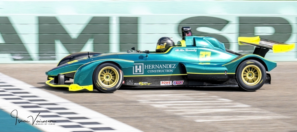
Good work with the panning and the low shutter speed. I think this has worked well. The car is sharp and the wheels show motion. The background also shows motion. A little more motion would be better, but not too much. I am not happy with that top section above the barrier so I cropped it out. I also lightened the lettering on the barrier and increased the vibrance on the rest to make the car stand out better. What do you think?
|
Oct 3rd |
 |
| 4 |
Oct 23 |
Comment |
This location would be a dream come true for me. I love the curves and the stairs. Your composition is excellent with the two diverging curves taking you into the image and then coming together in the distance. The effect is echoed at the top also. Although I really like strong b/w images, I think on balance I prefer the colour version which I think is more vibrant. |
Oct 3rd |
| 4 |
Oct 23 |
Comment |
Wow! That is quite something. The pose is great and the lighting is good in spite of the strong sunshine. The strong shadows add to the composition. Background shows it is in the street and the curved wall is more satisfying than a straight wall would have been. The two girls look like sisters of even twins.
For the benefit of our US friends, we have a snazzy TV programme called Strictly Come Dancing - hence the play on words. |
Oct 3rd |
8 comments - 6 replies for Group 4
|
| 59 |
Oct 23 |
Comment |
Just visiting from Group 04. Isaac this is great, especially with the darker background. |
Oct 6th |
1 comment - 0 replies for Group 59
|
9 comments - 6 replies Total
|