|
| Group |
Round |
C/R |
Comment |
Date |
Image |
| 4 |
Mar 23 |
Reply |
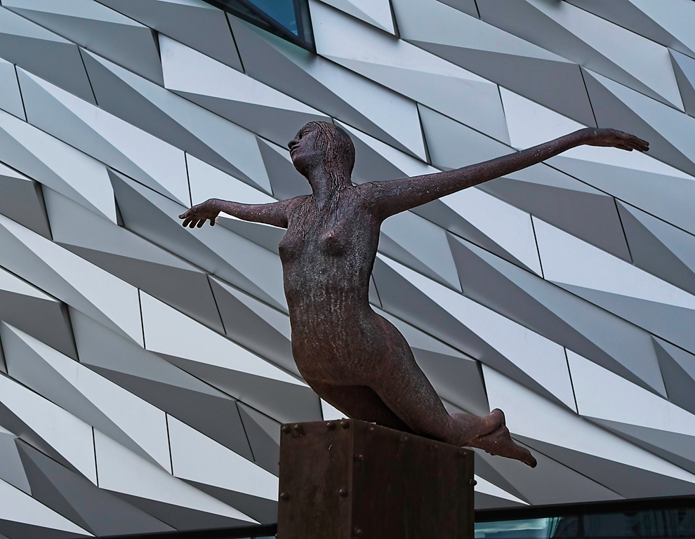
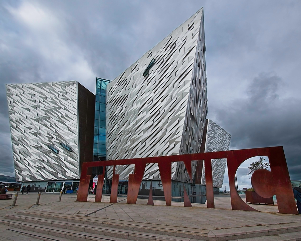
Bill, thanks for your comments. I thought about black & white but in the end I preferred the muted colours of the original. However, I have taken another look at opening the shadows on the statue and I feel there is more work that can be done in the colour version. I also have other views of the statue which might benefit. Thanks for the suggestion. |
Mar 25th |
| 4 |
Mar 23 |
Reply |
Nice work Erik. |
Mar 19th |
| 4 |
Mar 23 |
Reply |
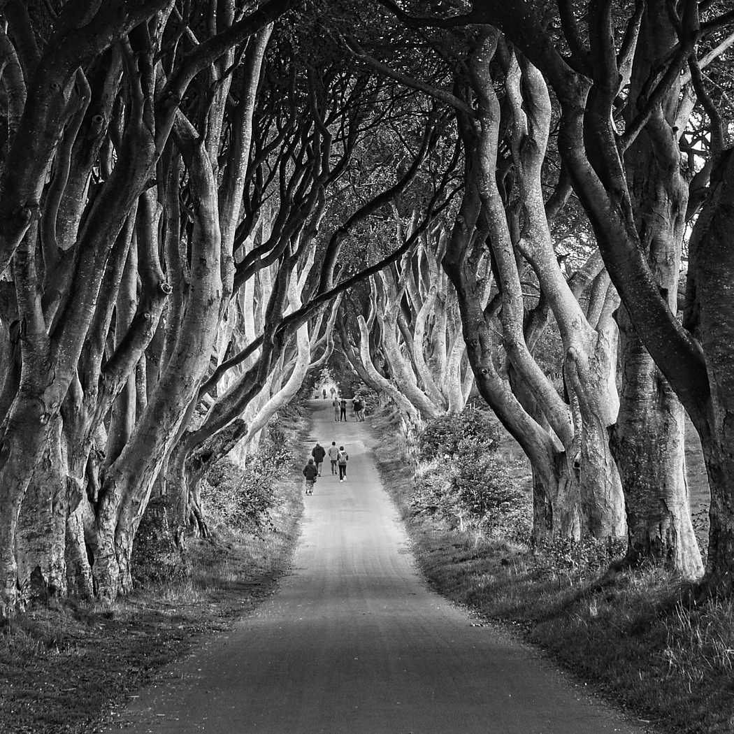
Easily done Erik. You wouldn't be the first person to do that! |
Mar 18th |
| 4 |
Mar 23 |
Reply |
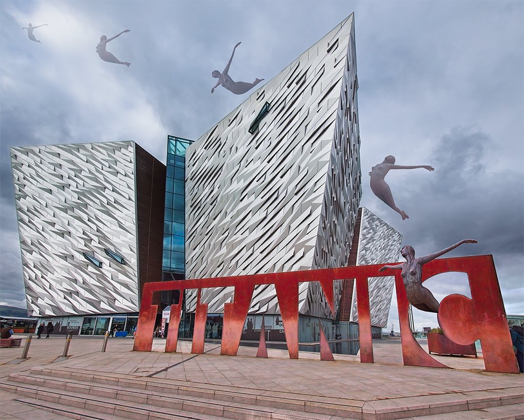
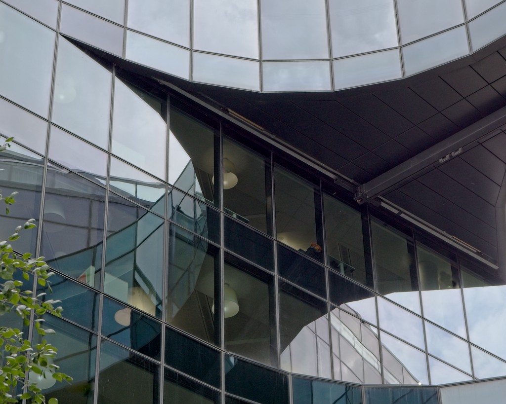
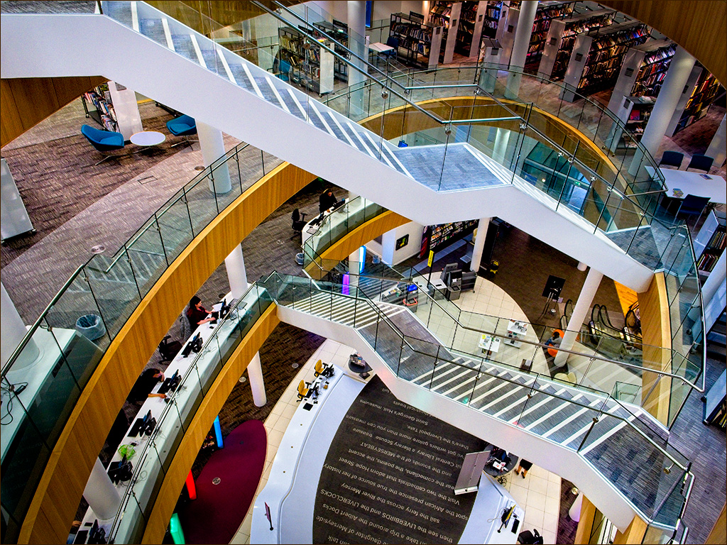
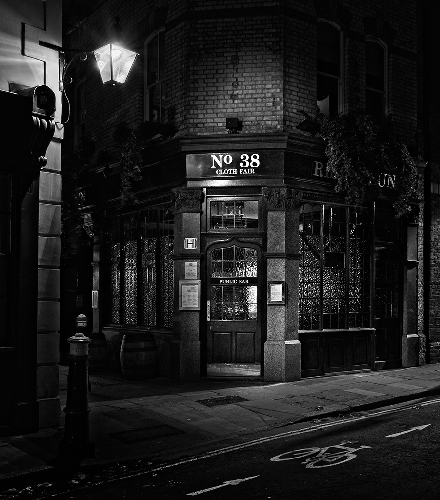
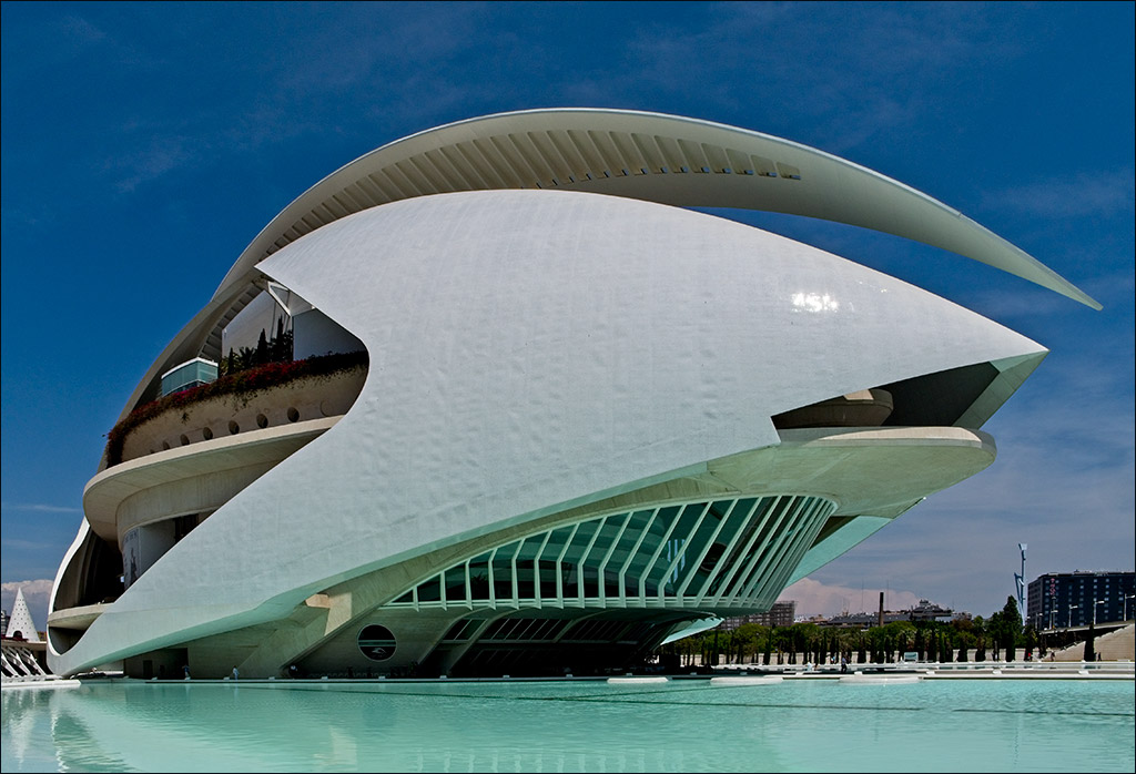
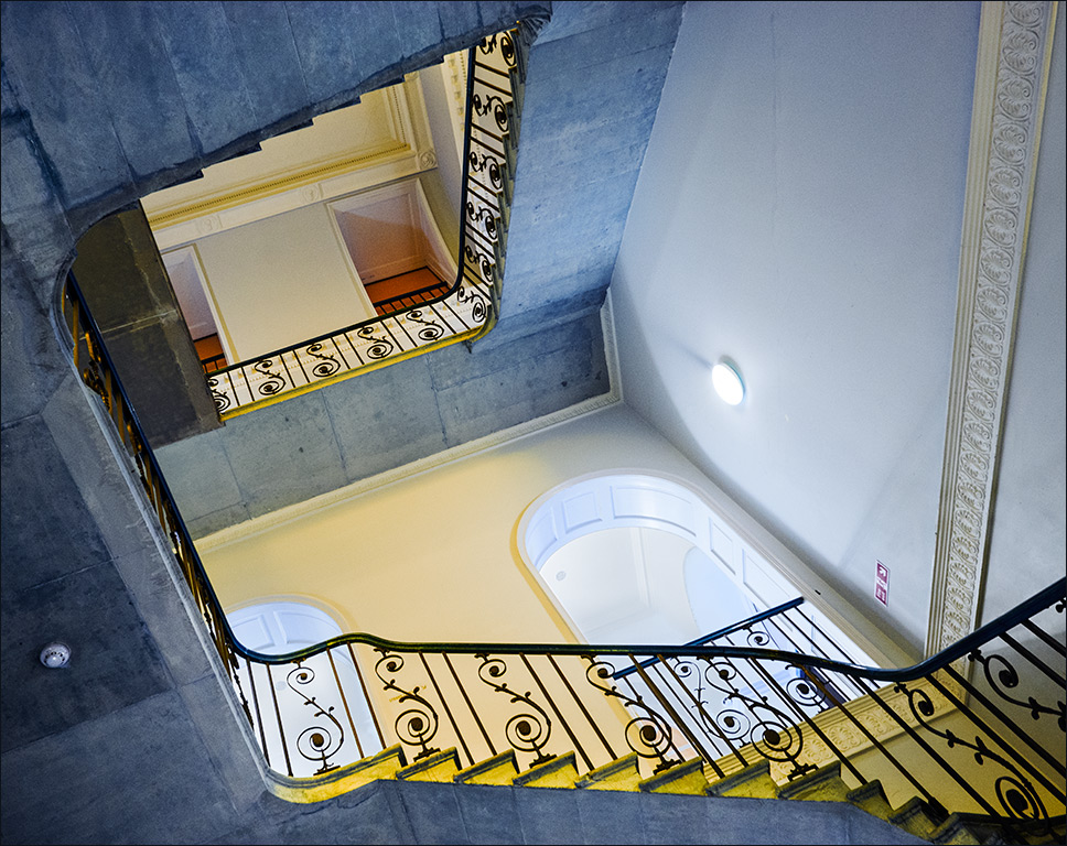
Gary, you are right about the glass section at the top. I guess I should have cloned it out provided the image was not used in any PJ or Travel sections. |
Mar 13th |
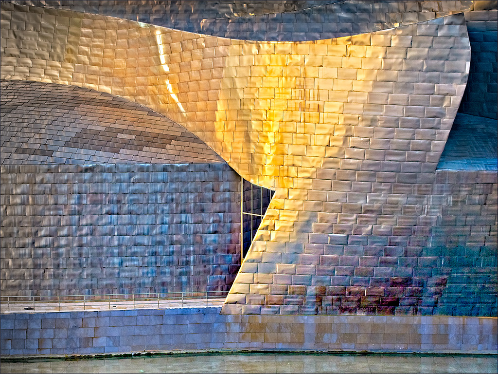
| 4 |
Mar 23 |
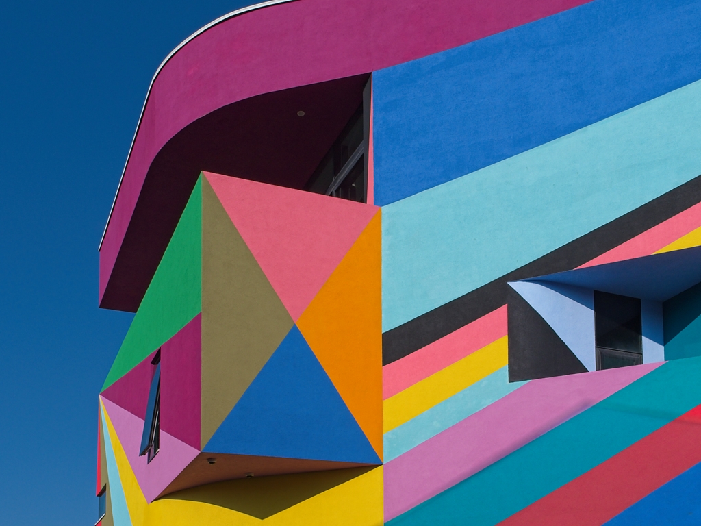
Reply |
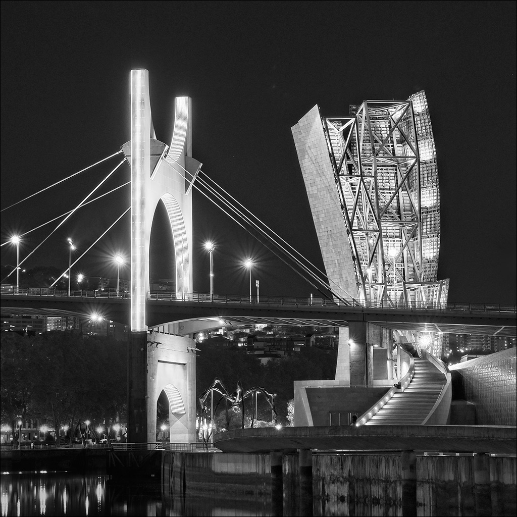
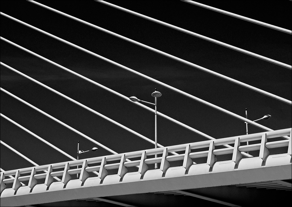
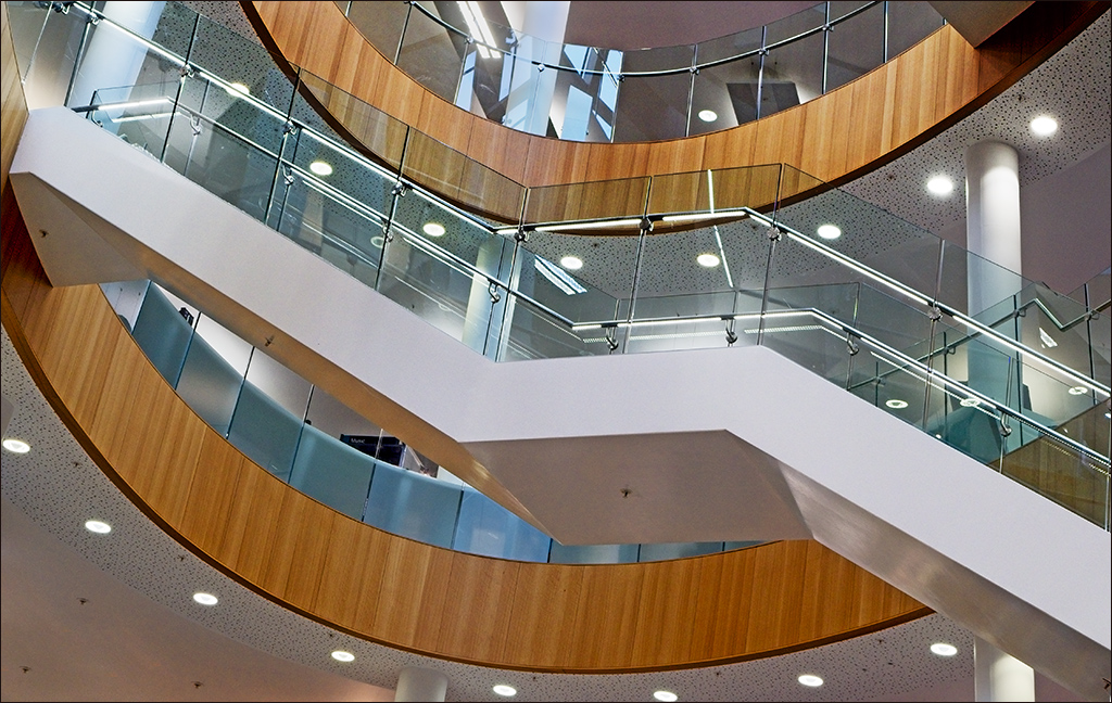
Thanks Ian. Glad you like it. It's a great place to go if you like modern architecture. |
Mar 12th |
| 4 |
Mar 23 |
Comment |
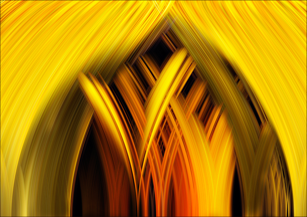
Here is another variation on the copy and flip trick. If the image is a Background layer, make two copy layers. If it is already an image above a Background then just make another copy layer. Then in PS on the first image layer go to Filter>Distort>Twirl and set the angle to 120 deg. On the second image layer do the same but set the rotation to -120 deg. Then set the upper layer to Lighten blend mode and flip horizontal. It doesn't have to 120 deg. You can play with other angles. WARNING - this technique is seriously addictive and I take no responsibility for any addiction you may develop!!! |
Mar 9th |
 |
| 4 |
Mar 23 |
Reply |
Hi Ian I forgot to add that I am pleased that you are feeling much better. |
Mar 9th |
| 4 |
Mar 23 |
Reply |
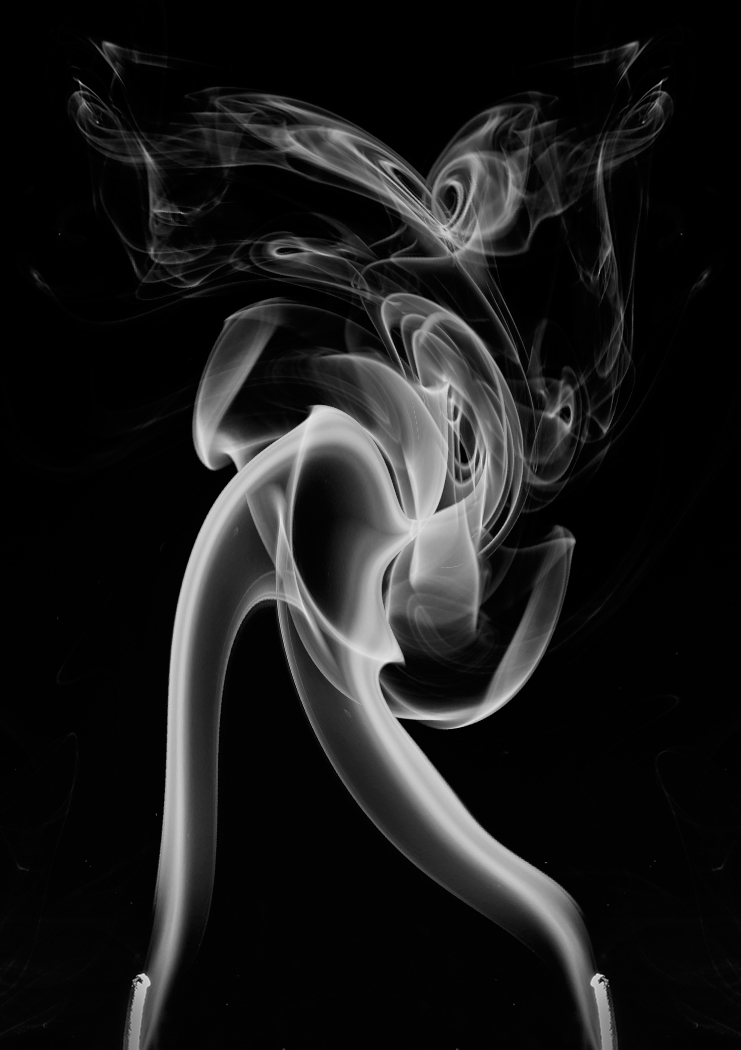
I didn't spot the butterfly. Nice interpretation. |
Mar 8th |
| 4 |
Mar 23 |
Comment |
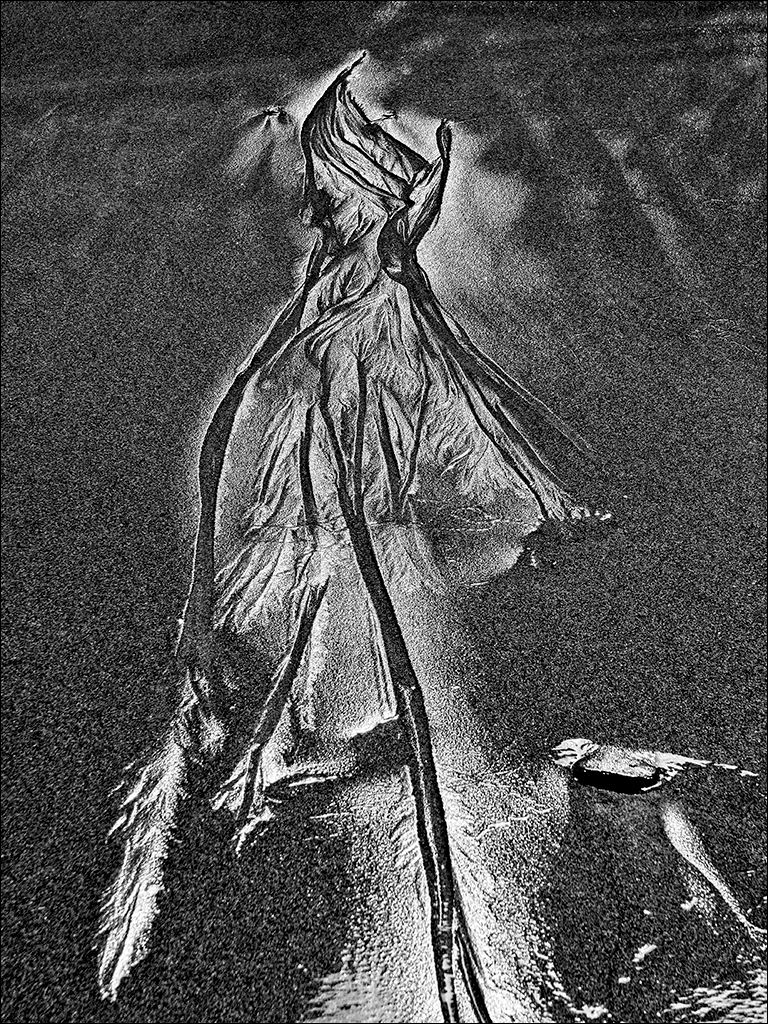
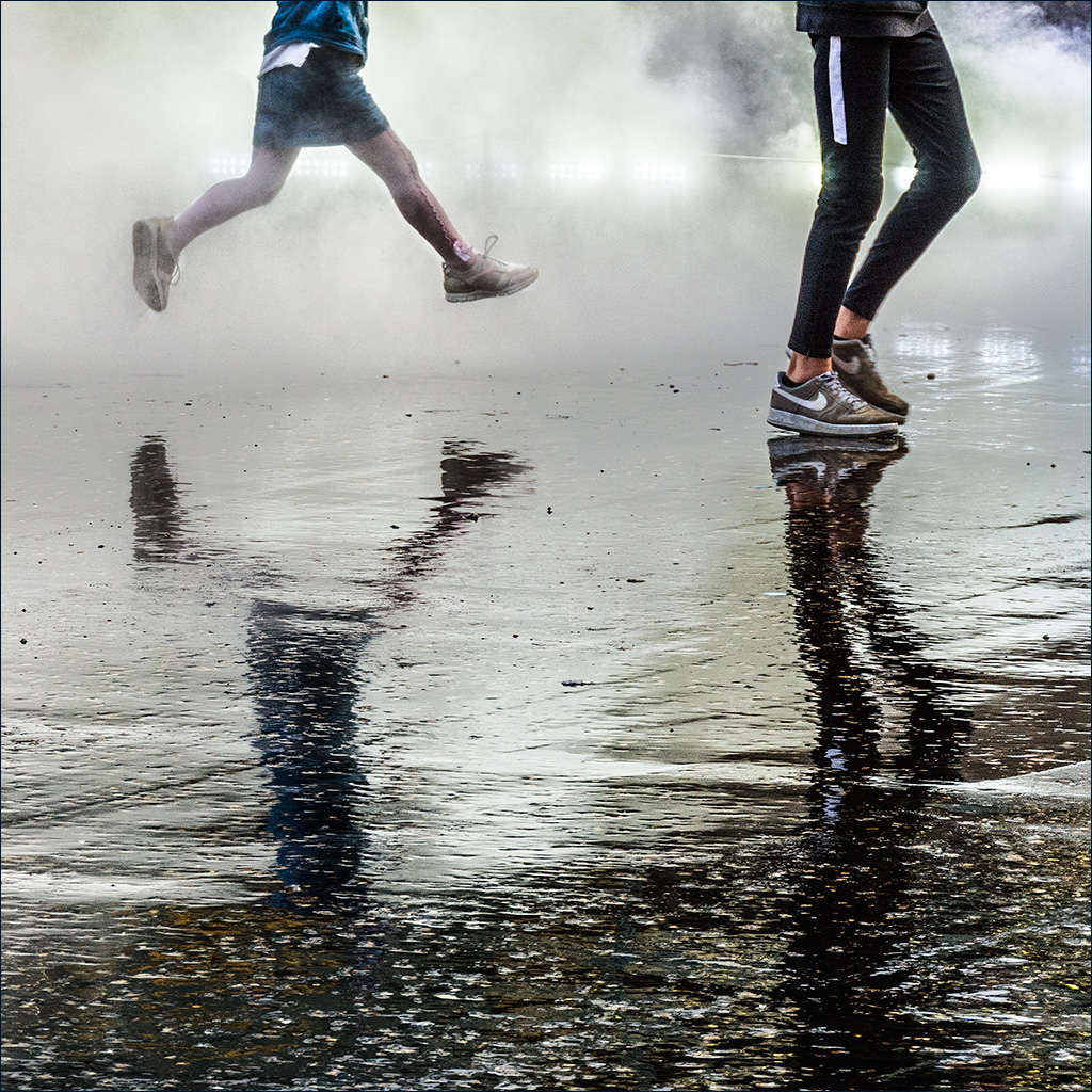
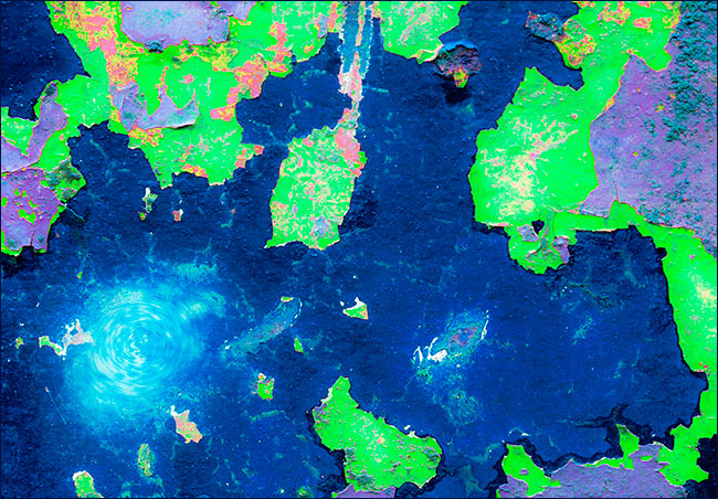
Are you sure about the medication Ian? I too love watching smoke patterns like this, but having spent most of my working life in aerodynamics I enjoy seeing the technical aspects before I see the aesthetic. Actually, I do see the lower half of the lady scuba diver, and then do I see the head of a fish at the top. With this type of image it can be fun to copy on to a new layer and flip, then play with blend modes. Here is my suggestion using Lighten blend mode on the flipped layer. I see a lady dancer with her hair flying all over her head! |
Mar 8th |
 |
| 4 |
Mar 23 |
Comment |
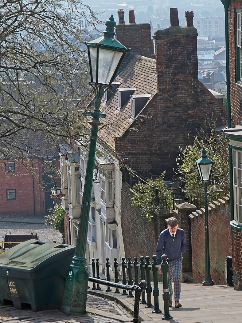
Excellent action shot Erik! I hope the rider did not suffer any serious harm. Images such as this show what is happening at the time and you cannot choose your background or even your framing as the action is so fast. I agree with Gary that Stuart's crop is too tight on the left, although I would be happy with taking a little off the left but still including the girl leaning against the gatepost. I must congratule Stuart on his removal of the man standing up - nicely done. |
Mar 8th |
 |
| 4 |
Mar 23 |
Comment |
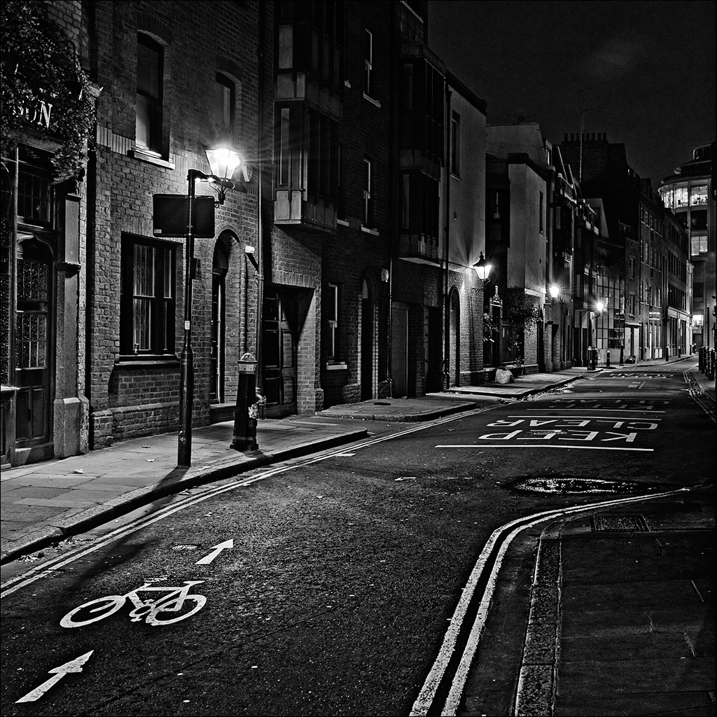
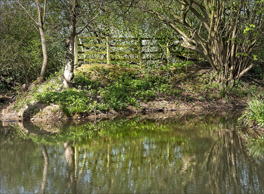
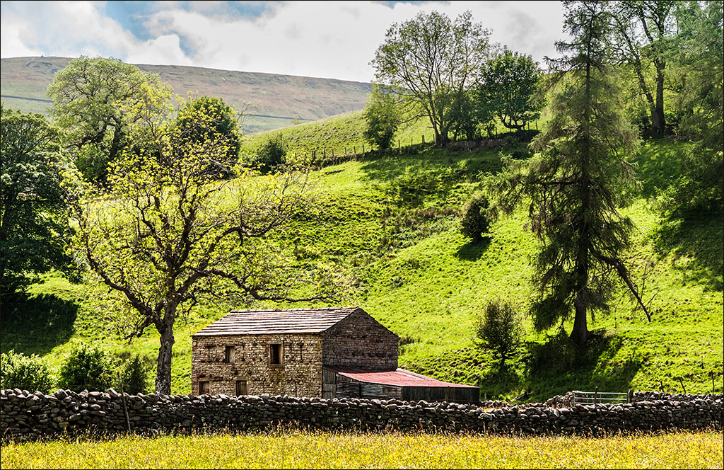
Like Gary, this image takes me back to my childhood when I had a friend whose father had a farm. Cows are very curious and will gather together like this when something out of the ordinary happens. Processing has been done well and I prefer your original crop leaving the sides as they are, because this is part of the story showing that the cows have come together at a gate rather than just at a continuous fence. |
Mar 8th |
| 4 |
Mar 23 |
Comment |
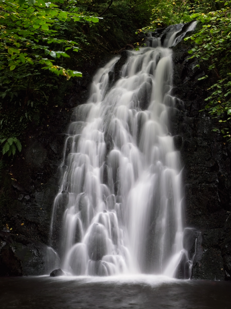
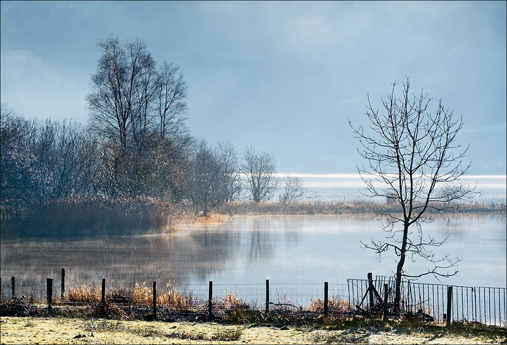
I can see why you chose this image for the watercolour treatment. It is almost a watercolour as it stands, with the gentle colours and relaxing composition. Some years ago I played with trying to achieve a watercolour effect but can't remember how I did it. This is very effective but I agree with Gary that maybe the 'brushstroke' lines could be made less dominant. I think this would look good printed on a textured art paper, just like a true watercolour on cartridge paper. |
Mar 8th |
| 4 |
Mar 23 |
Comment |
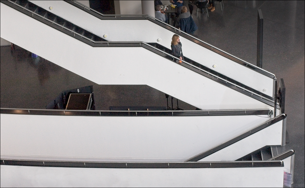
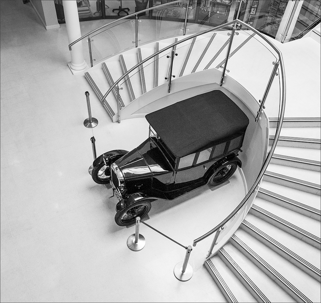
Isaac, this is a very clean looking mono image with great contrast and sharpness. I am amazed that you were able to acieve the sharpness with exposures going up to 1.6 sec just leaning against the side window. The composition is interesting. Conventional thinking might want the other roof window to be in the frame, but I think this would unbalance the image. The one roof window plus two bright patches on the floor work well together, with the near bright patch providing the foreground interest. |
Mar 8th |
| 4 |
Mar 23 |
Comment |
Gary, this is an interesting image that asks questions. Why is the adult offering such a large fish to the chick? Does the adult think that the chick is able to swallow this fish or is it just showing the chick how to feed? I'm glad you completed the narrative to say that the adult swallowed the fish - quite a remarkable acievement in itself I would think, looking at the size of the fish. Photographically, it shows just how well the chick blends in with the nest and how difficult it must be to get a clear shot of the action. |
Mar 8th |
7 comments - 7 replies for Group 4
|
7 comments - 7 replies Total
|