|
| Group |
Round |
C/R |
Comment |
Date |
Image |
| 4 |
Oct 21 |
Reply |
Gary, whichever way you do it, it depends on the personal opinions of the judges. I have judged in several international exhibitions and you only get a few seconds per picture, so it is very much a case of making snap decisions. Best of luck with that image anyway. |
Oct 24th |
| 4 |
Oct 21 |
Reply |
Hi Gary. I'm with Bill on this one. I'm not into PJ either and have never entered any PJ section in any exhibition, but Bill's crop does, to me, enhance the artistic content while still leaving a story in the image. The story is quite clearly that of filling the balloon and the physical work of controlling it as it inflates. The group of people on the right that Bill has cropped out have no obvious connection to the story, even though you know they are going to fly in the balloon. The viewers (including PJ Exhibition judges) do not know what you know and can see no connection so could easily see them as a distraction. |
Oct 24th |
| 4 |
Oct 21 |
Comment |
Great shot, Erik. I confess I did not at first notice the utilities pole as it was not dominant, but I agree that it is better taken out. Rain often puts people off taking pictures, so well done for jumping out of the car and getting this shot. It is well framed and sharp. Your post processing was nicely done, and I think Gary's changes do improve the image. I can't imagine how you managed to hide a Canon 7D with 100-400 lens.....! |
Oct 20th |
| 4 |
Oct 21 |
Reply |
Thanks Ian. I didn't realise the support on the right was so important until you mentioned it. Npw I see that if you take it away, the composition is unbalanced. |
Oct 14th |
| 4 |
Oct 21 |
Reply |
Thanks Gary. I'll take a look at using the template. |
Oct 11th |
| 4 |
Oct 21 |
Comment |
Vella, good pose and your work has really brought detail back to the shadows. I agree with Isaac, though, that the background is still a bit too bright and his work has improved the tonal balance. However, I think it still needs one final adjustment. I took it into Photoshop and noticed that there was space at the right hand end of the histogram. I applied a Levels adjustment layer and moved the white slider to the left almost up to the end of the histogram to brighten the image. |
Oct 8th |
 |
| 4 |
Oct 21 |
Comment |
This is an interesting one. Vella's suggestion of going for a painting look is interesting. It could be printed on a textured art paper, maybe Permajet Museum heritage, to enhance that. As a projected image, though, my thinking is to make it a bit stronger. There is a nice trick in Photoshop (mine is CS6, but I guess it is still there in CC) and that is to use Image>Adjustments>Shadows/Highlights at the default setting (Shads 35, Hlts 0) and then to use Curves to bring back contrast. |
Oct 8th |
 |
| 4 |
Oct 21 |
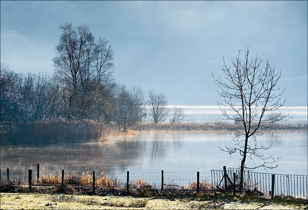
Comment |
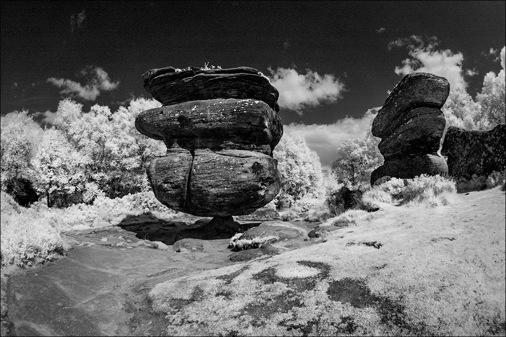
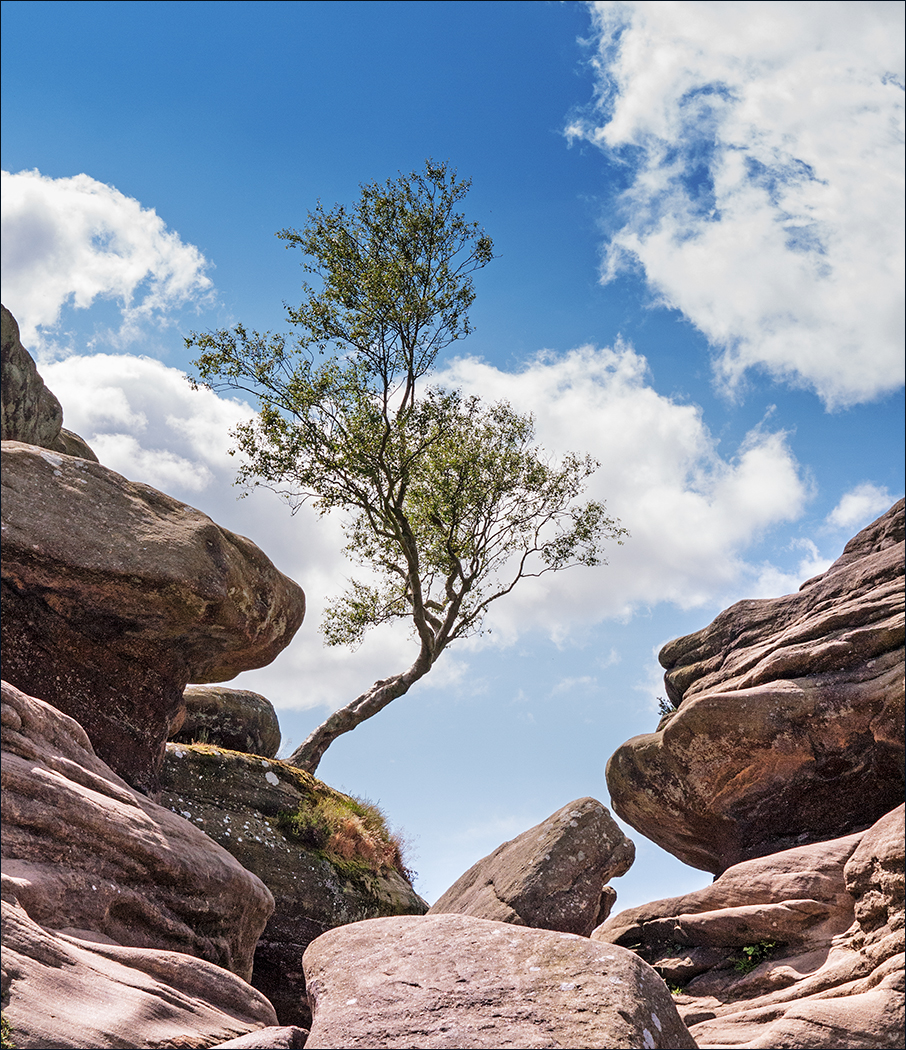
I wish I could have been there. It would have been good to meet up. I have a friend who used to run photo workshops and he once commented that nature is never tidy so we should look for the beauty in natural complexity. This is a superb example of that, with the mass of backlit grasses and aspens showing golden yellow against the blue sky. Well composed using the sun as the visual focus, yet safely shielded by the dead tree. This also shows the high quality of modern phone cameras. |
Oct 8th |
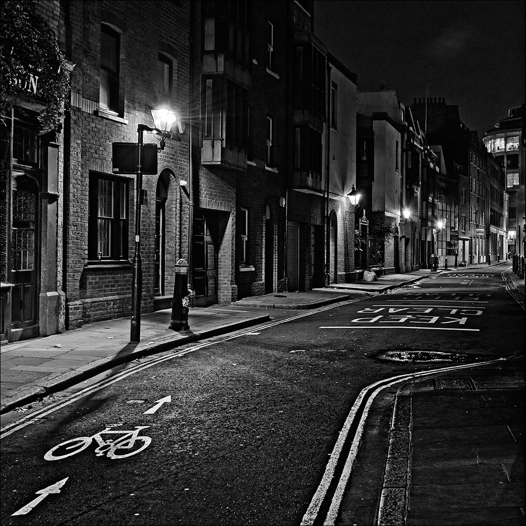
| 4 |
Oct 21 |
Comment |
Isaac, this is a very omposing building with great symmetry, so your square on approach seems to be the right way to photograph it. It is good that you had a plain blue sky as white clouds would have spoiled the hard angular geometry of the composition. The two cyclists do break the symmetry but in a good way, providing a focal point to come back to when looking at the image. I am happy with the coloured version, but I share Gary's line of thinking in changing to strong mono, which looks equally good. |
Oct 8th |
| 4 |
Oct 21 |
Comment |
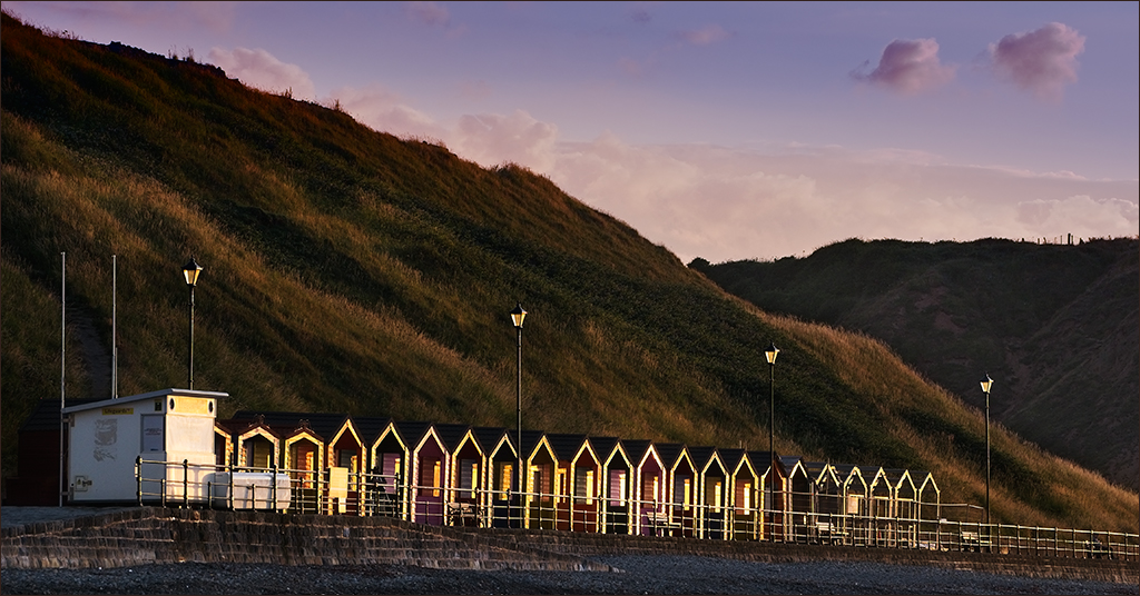
I am always amazed that they don't set fire to these balloons when they start inflating them. A good image depicting the work that goes in to getting a balloon inflated and ready for flight. Everything is sharp but I found my eye going to the brightly coloured balloon in the background. I took it into Photoshop and made a b/w adjustment layer which I put into Luminosity blend mode. This left the base image in colour but enabled me to darken down the bright colours simply by using the colour sliders in the b/w adjustment layer. Then I used Curves layers with well feathered freehand selections to brighten up the black balloon plus the relevant people and to bring back some of the brightness in the grass. |
Oct 7th |
 |
| 4 |
Oct 21 |
Reply |
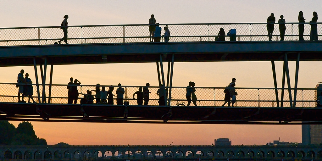
Thanks Isaac. I left the London Bridge sign in because I felt it added tension to go with putting the sky at the side. As it is a shot taken vertically upwards, there is no right or wrong orientation so it comes down to opinion which is where I could not make up my mind. Your version is much more restful. |
Oct 7th |
6 comments - 5 replies for Group 4
|
6 comments - 5 replies Total
|