|
| Group |
Round |
C/R |
Comment |
Date |
Image |
| 4 |
Sep 21 |
Reply |
Thanks Erik. Useful and constructive comment. |
Sep 22nd |
| 4 |
Sep 21 |
Reply |
Thanks Ian. Yes, I am intending to print it. |
Sep 21st |
| 4 |
Sep 21 |
Reply |
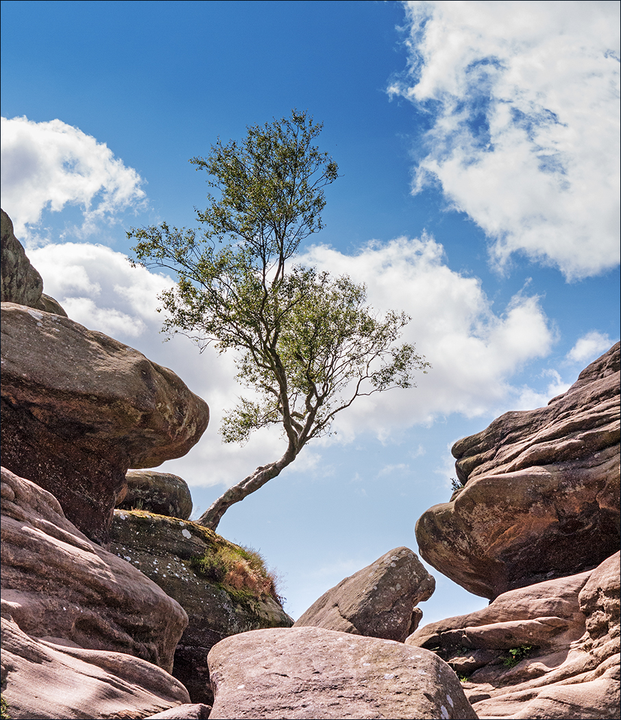
Nice one Isaac! It just shows how effective its camouflage is. |
Sep 15th |
| 4 |
Sep 21 |
Reply |
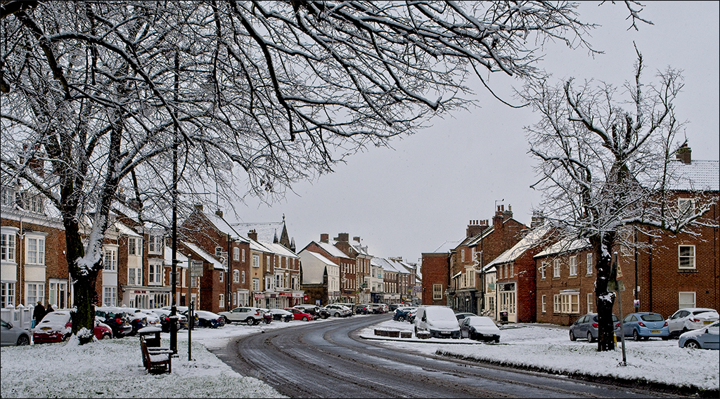
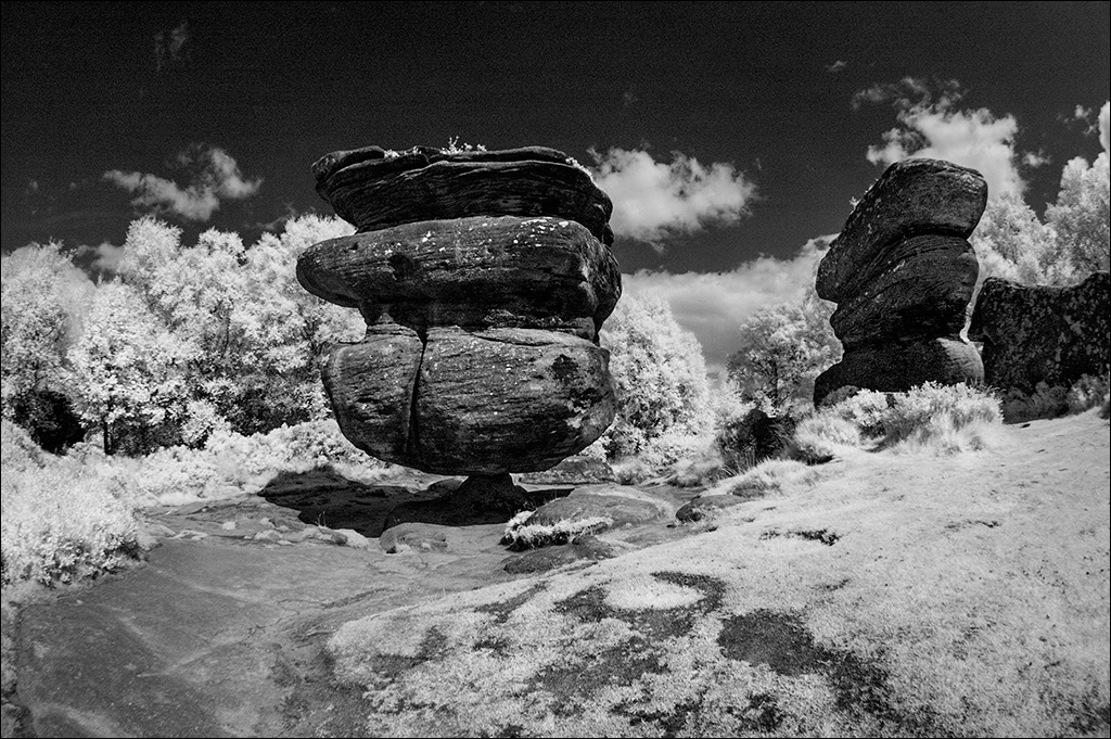
Isaac, I am normally very particular about horizon lines. Look kike I goofed here! Thanks for pointing it out. Your crop at the tight has also improved the composition. Thanks for your feedback. |
Sep 15th |
| 4 |
Sep 21 |
Comment |
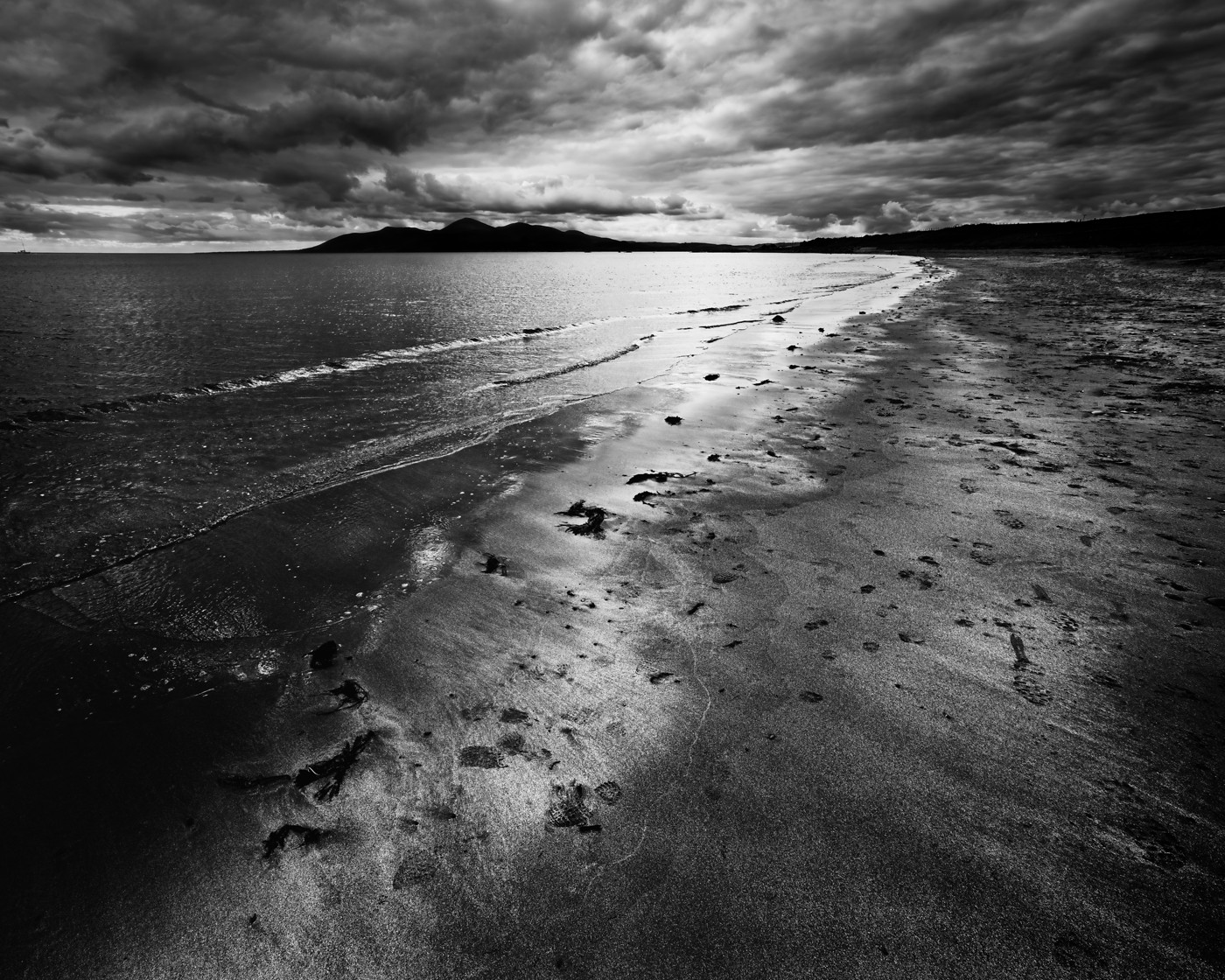
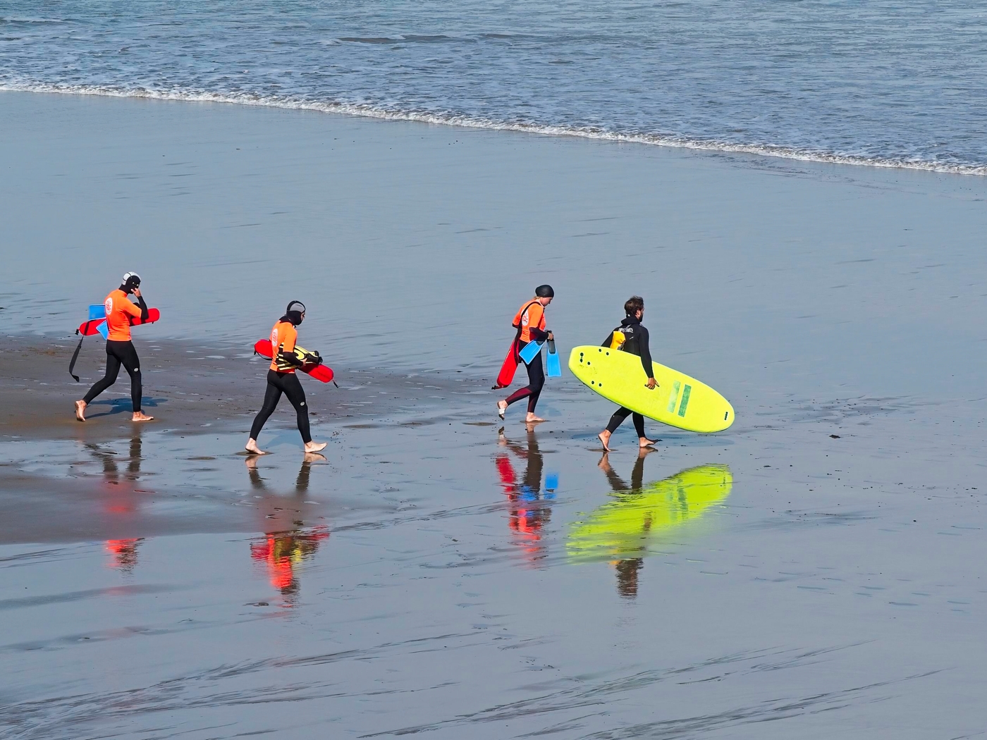
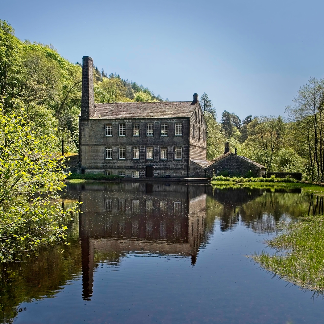
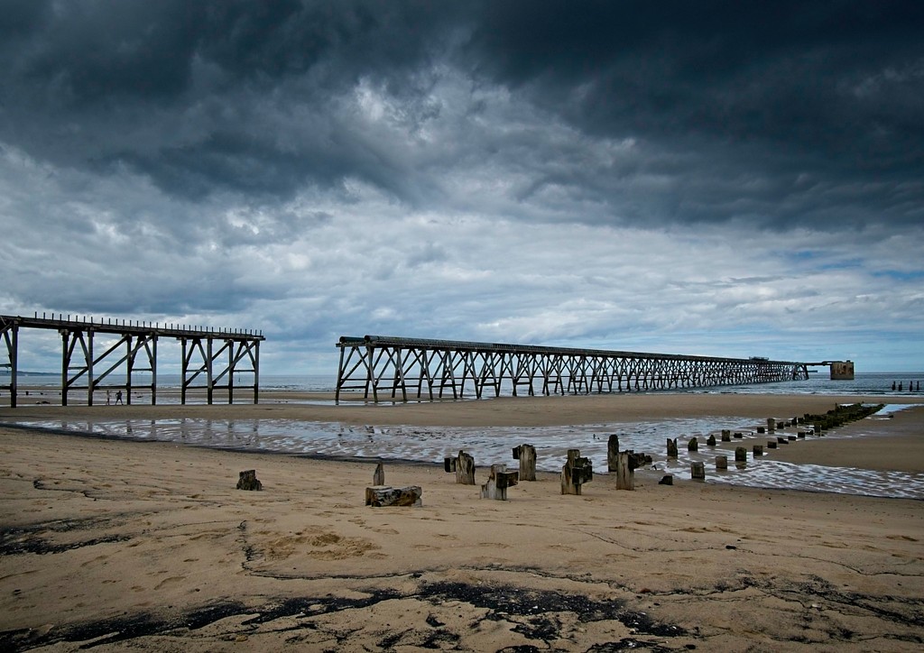
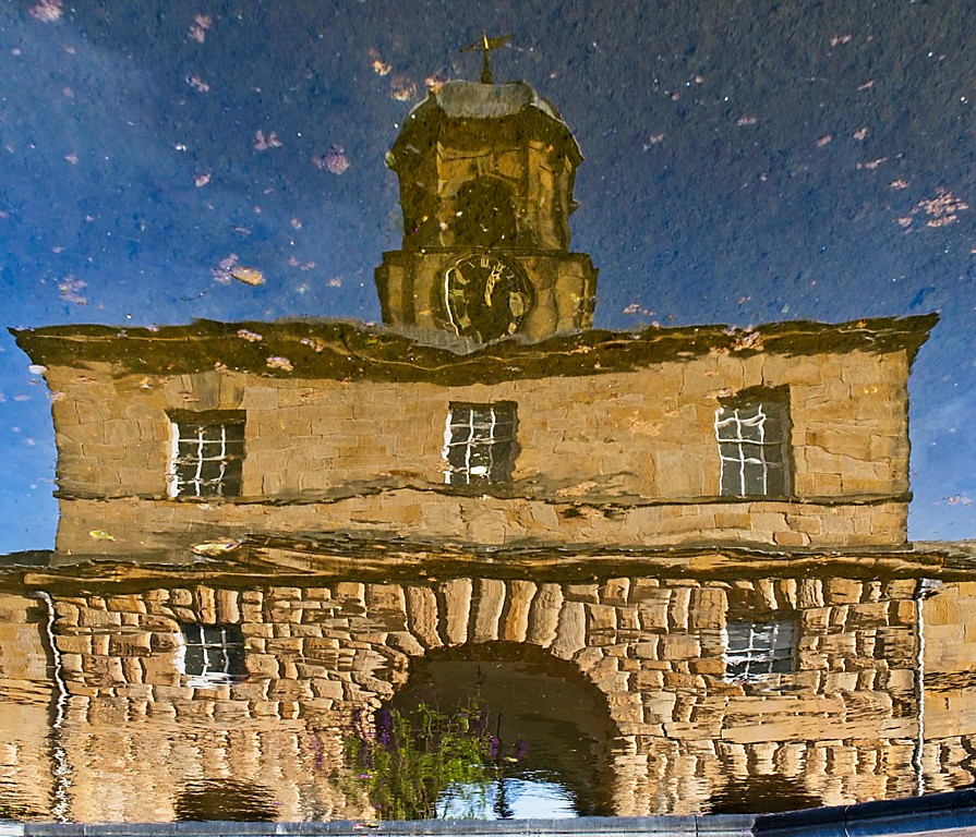
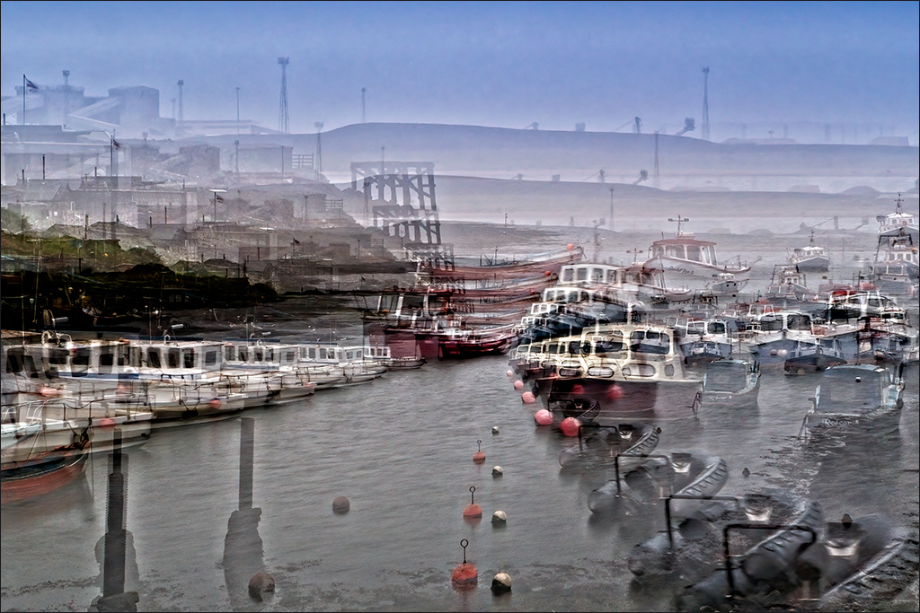
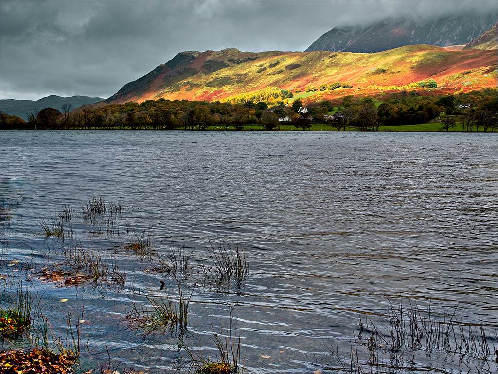
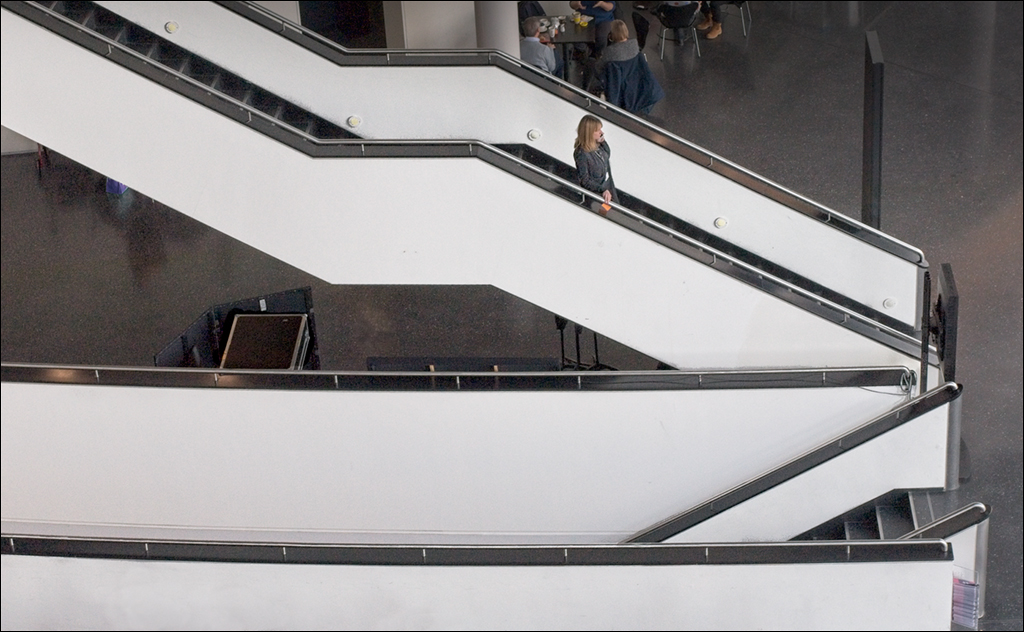
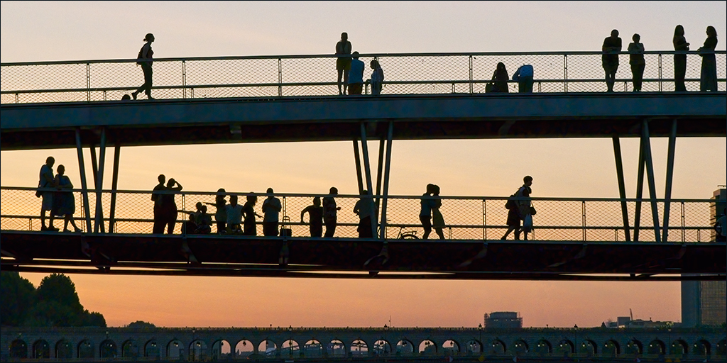
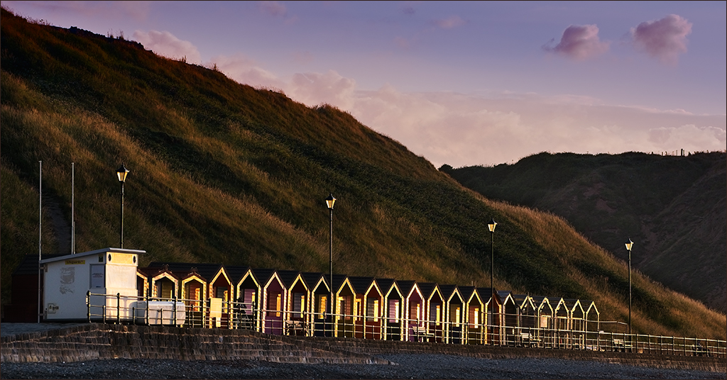
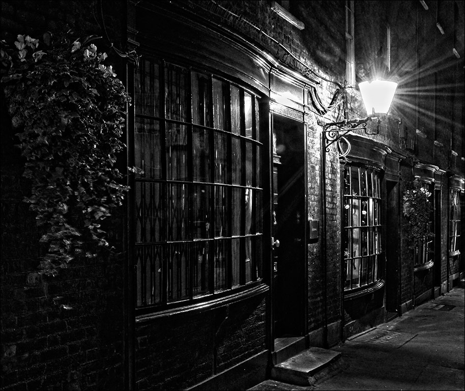
Ian, thanks for showing another image from your early morning excursion to this location. The light is indeed magical. I am very happy with the framing as I enjoy the reflection as much as the lighthouse so my preference is not to crop the bottom of the image. I had not noticed the bird, so well done Stuart for spotting that, and I agree with him that you might clone it out. I think I would also clone out, or darken, that light coloured rock about a quarter of the way up at the left hand edge. I think the ship on the horizon is fine though. I think the ship complements the lighthouse. After all, if you didn't have ships, you wouldn't need lighthouses! |
Sep 14th |
| 4 |
Sep 21 |
Comment |
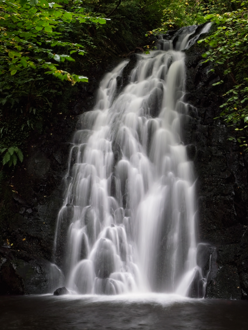
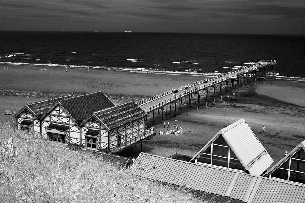
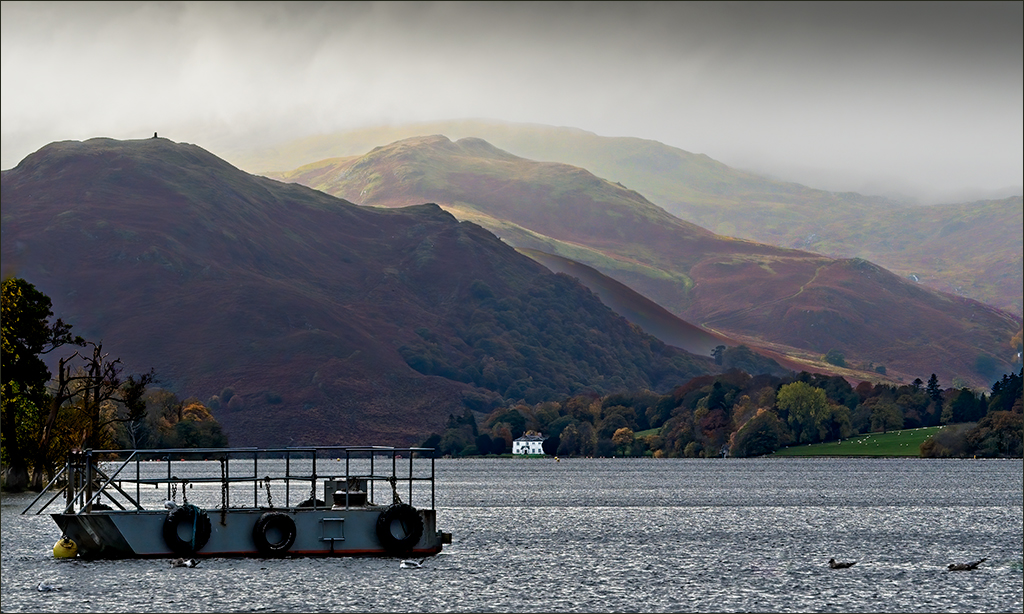
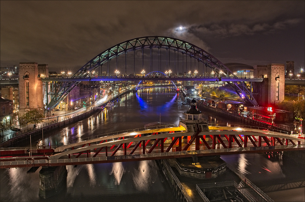
Erik, you chose just the right time of day to get the illuminations, the detail in the background and light in the sky. It all looks sharp and the 2.5 second exposure combined with the lighting has produced a wonderful smooth glow in the water and spray. What strength was the ND grad that yiu used? |
Sep 14th |
| 4 |
Sep 21 |
Comment |
Vella, your ability to shoot from a boat and get a good sharp image is admirable, particularly after a massive crop like that. Your original shows the way the jaguar blends in with the grasses on the river bank, but I agree with Gary that as a picture it needs to stand out more. I took it into Photoshop (CS6) and made a rough freehand selection of the cat and feathered it generously. Then I used a Curves adjustment layer to increase the contrast and brightness a little. Using the inverse of the same selection, I used a second Curves layer to darken the surroundings. |
Sep 14th |
 |
| 4 |
Sep 21 |
Comment |
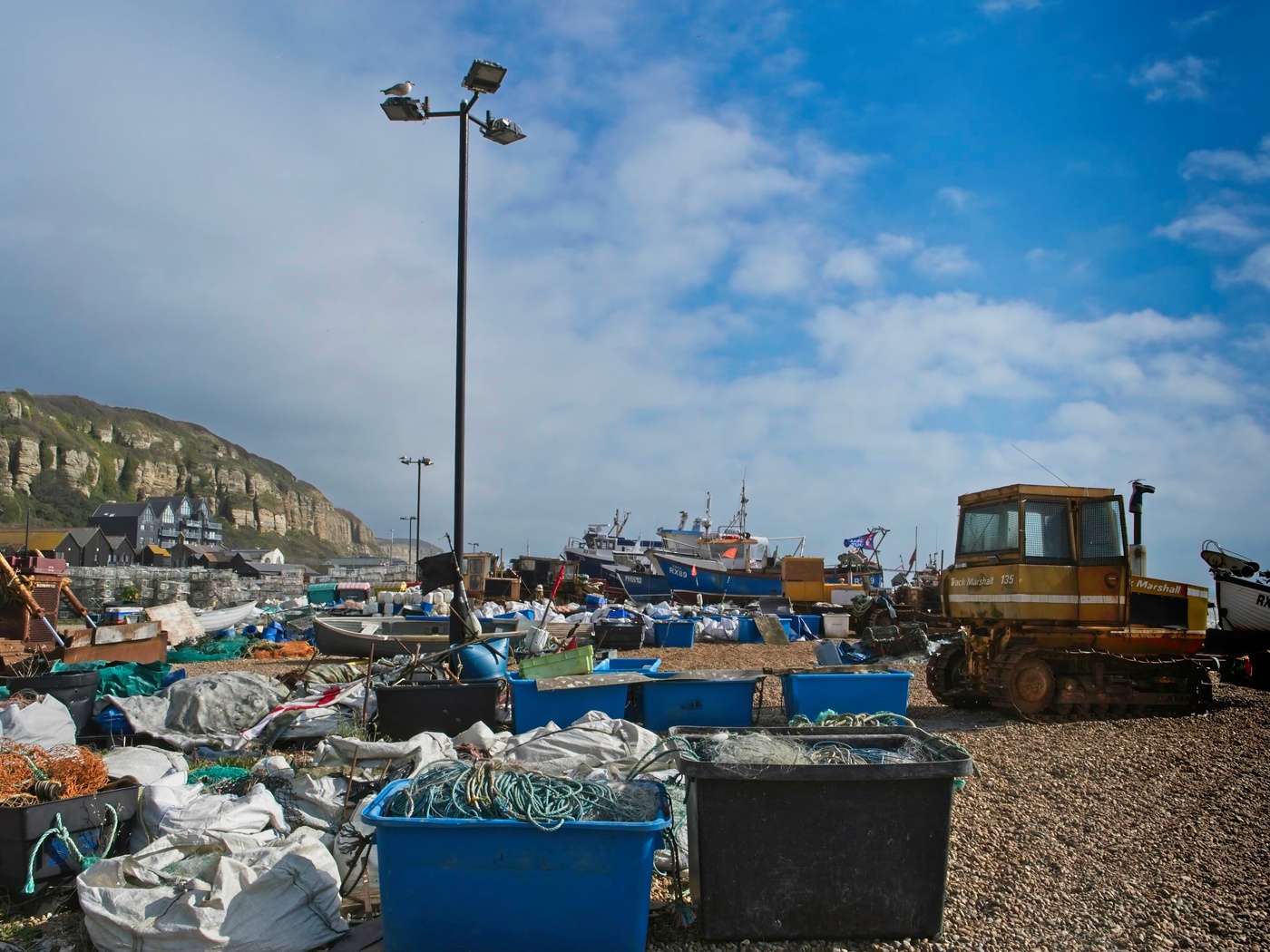
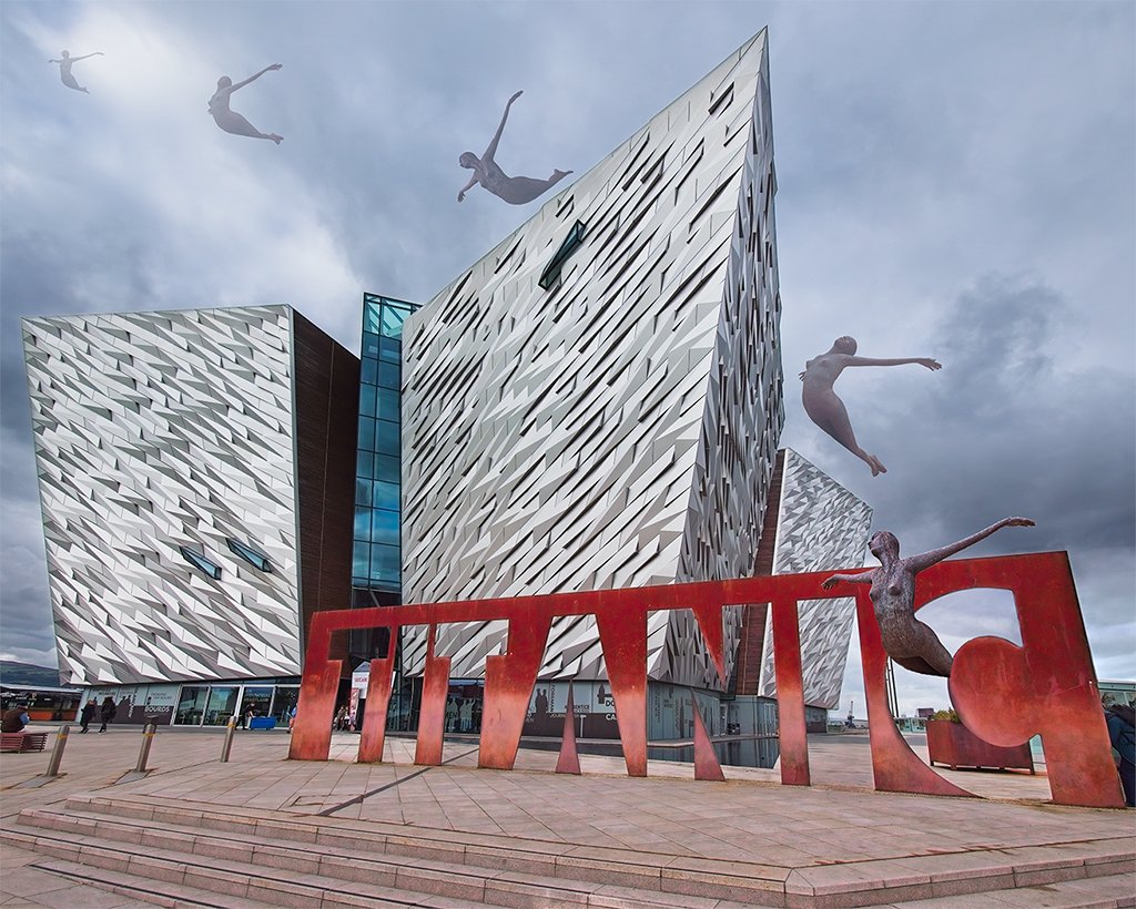
Bill, it's a remarkable shot, and one that could only be taken using a drone or light aircraft. I agree with the comments made so far, that the white wall needs some space from the left edge and that some extra sky would be good. Maybe Content Aware Fill can come to the rescue! I wasn't distracted by the part building on the right, but it could easily be cloned out, or even just cropped out. The picture certainly stands out with the bold colours and strong composition.
Drones do have a bad reputation in the UK, mainly because of a few irresponsible people who have put commercial aircraft at risk. From my point of view, as a judge, I am happy to treat drone pictures in the same way as any other. |
Sep 13th |
| 4 |
Sep 21 |
Comment |
I think Joe must have been looking down on you when you took this! It is a splendid piece of observation combined with a fertile imagination to see Alfred Hitchcock's outline in an otherwise insignificant detail. Great work.
(I've heard of pareidolia but couldn't spell it until now!) |
Sep 12th |
| 4 |
Sep 21 |
Comment |
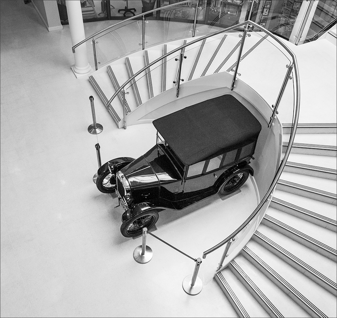
Gary, my thoughts were exactly the same as Ian's so I had a little play with your original image. I took it into Photoshop (CS6) and used the Black/White adjustment layer to make it b/w. I used the color sliders to control the way the various colours display (yellow & red control the rust, yellow & green control the grass, blue controls the sky). Then I made a rough selection of the car and heavily feathered it. Using this selection on two Curves adjustment layers to set brightness and contrast of the car, and the inverse selection on another Curves layer to set contrast and brightness on the grass & sky, gave me a lot of control over the image. Finally, an overall Curves layer was used to finish it off. |
Sep 12th |
 |
| 4 |
Sep 21 |
Reply |
Gary, that was pretty much the full image. I take your point about the very light roofs on the bottom right. Maybe I should try toning them down a little. |
Sep 12th |
6 comments - 5 replies for Group 4
|
| 64 |
Sep 21 |
Comment |
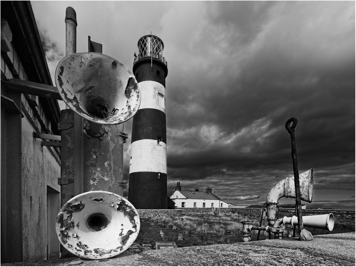
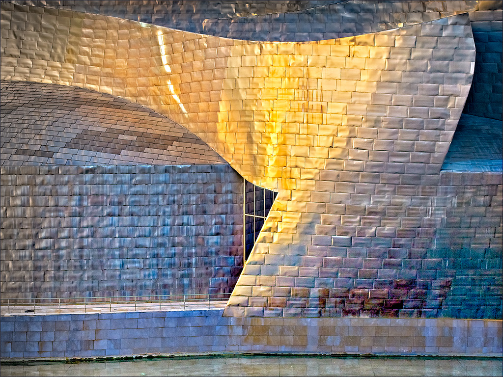
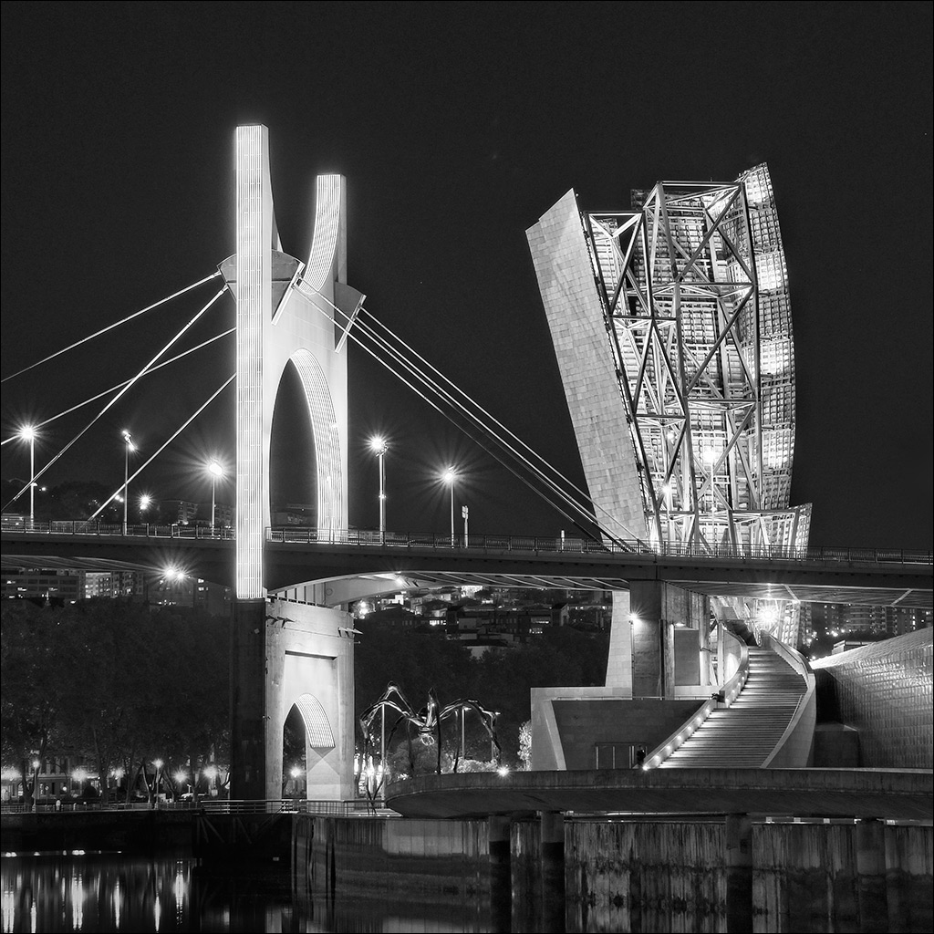
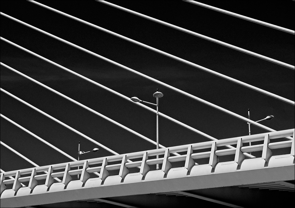
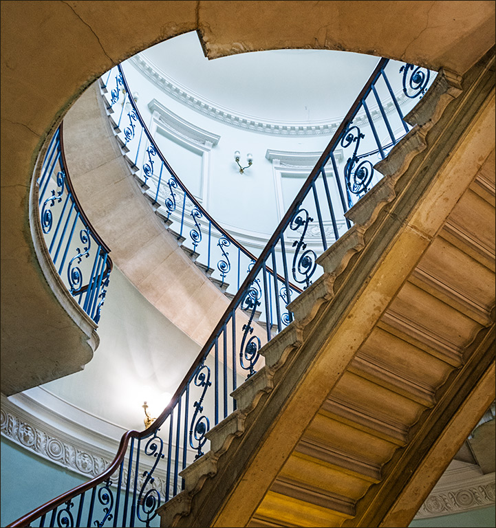
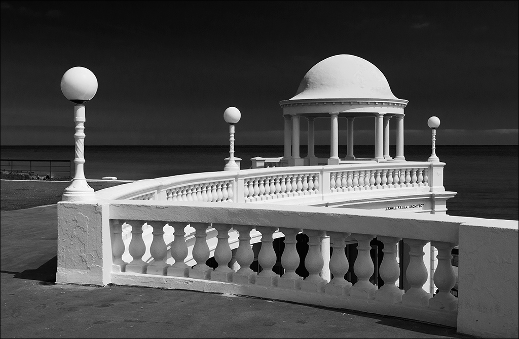
I love a good monochrome, and you have got one here. I have photographed other structures (but not this one) and find that usually colour is a distraction. The mono presentation allows you to emphasise the shapes and the details. You have also chosen an interesting viewpoint which does bring out the shape of the structure very nicely. I wonder if a little more contrast would be good.
Incidentally, the two 'gondolas' are perfectly balanced even if there is only a boat in one of them. Putting a boat into one, pushes out the same weight of water according to Archimedes, so the weight stays the same! |
Sep 14th |
1 comment - 0 replies for Group 64
|
7 comments - 5 replies Total
|