|
| Group |
Round |
C/R |
Comment |
Date |
Image |
| 4 |
Jun 21 |
Reply |
Always interesting to see other people's interpretations. |
Jun 24th |
| 4 |
Jun 21 |
Reply |
I think the marketing might prove too stressful! |
Jun 17th |
| 4 |
Jun 21 |
Reply |
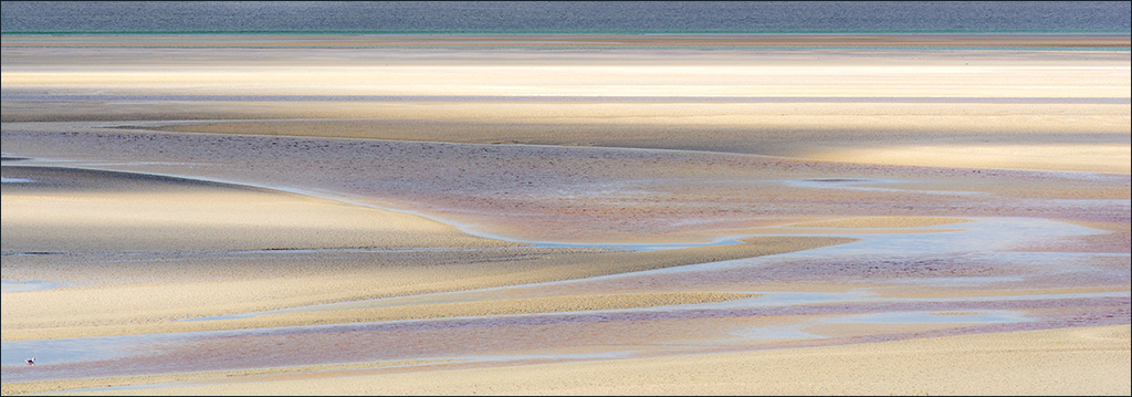
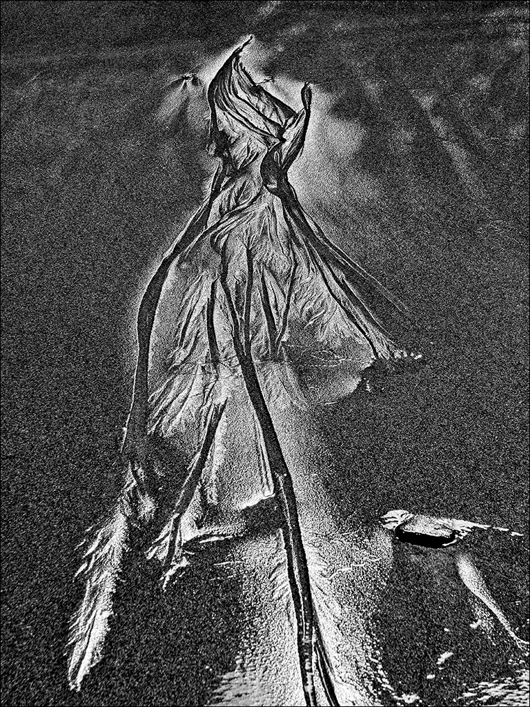
Ian, you have a very good memory! I did post an image of a different part of these sands some time ago. It was not given the dreamy effect as it included a couple of buildings and some people, so I left it to be more realistic. Glad you like this one. |
Jun 17th |
| 4 |
Jun 21 |
Reply |
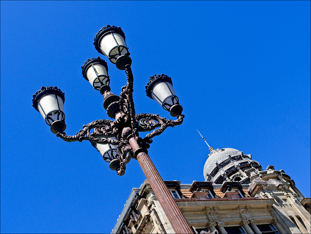
Me too! I would have spent quite a while on this building. |
Jun 17th |
| 4 |
Jun 21 |
Reply |
Hi Ian. Condolencies on yourfamily loss. It is always sad when someone close dies. |
Jun 11th |
| 4 |
Jun 21 |
Reply |
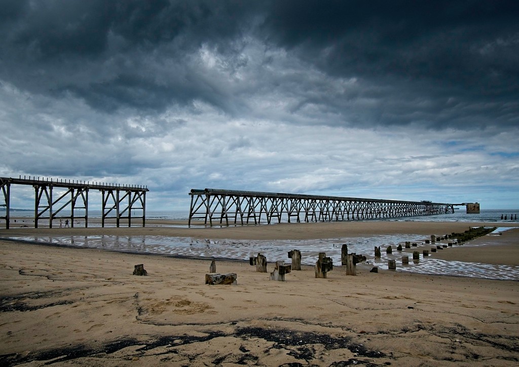
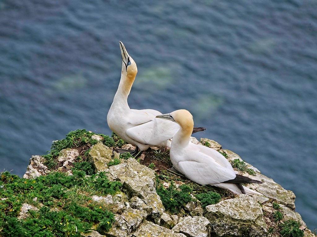
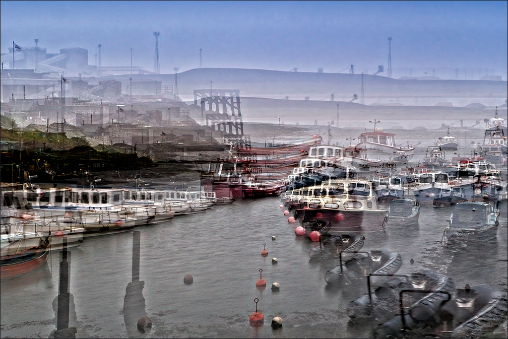
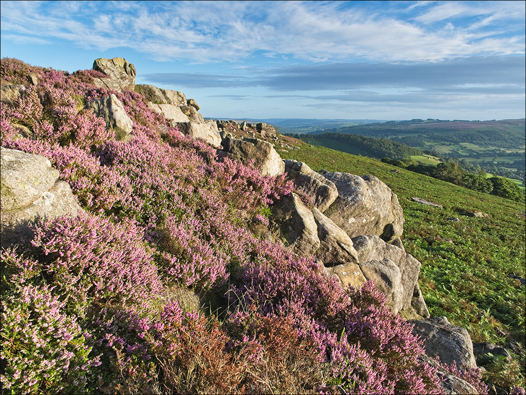
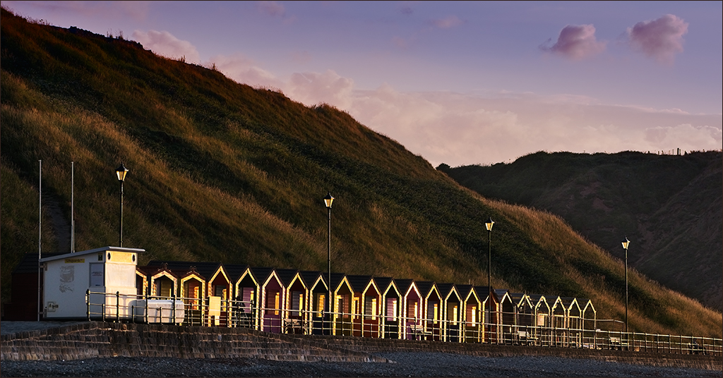
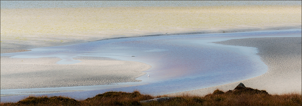
Hi Vella. The blue strip at the top is actually the clear water in the estuary. Seeing it as the sky creates a very different aspect to the image. I might try dropping a real sky in to see how that feels. |
Jun 9th |
| 4 |
Jun 21 |
Reply |
It's amazing what you learn in this group! |
Jun 9th |
| 4 |
Jun 21 |
Comment |
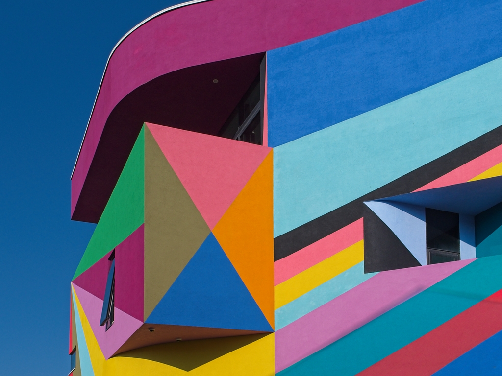
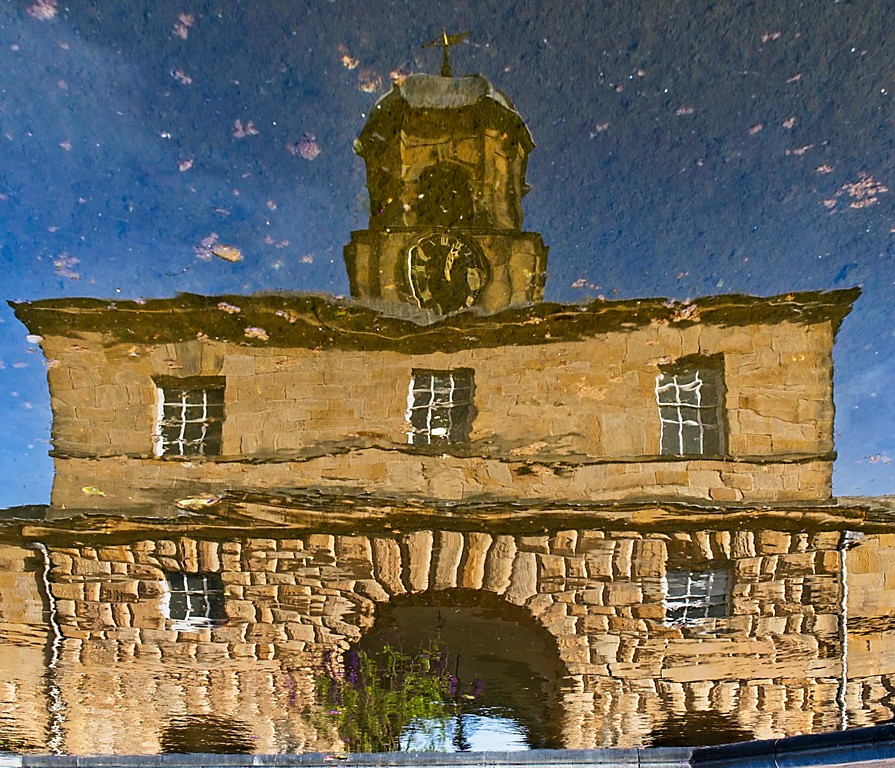
Hi Ian. Missed you last month. This is a very sharp and colourful record of this wall art. Congratulations on being asked to record the making of it. Even if it is not a competition image, I think it is still worth straightening up the verticals. I did this quite quickly in Photoshop and cropped in to eliminate the resulting blank patches. For a record shot, I would stop there. However for pictorial satisfaction I cloned out a white rectangle at the extreme right. I also darkened down the white gatepost at the extreme left (Select>Color Range then Curves and pull down the top RH point on the curve, then pull down the mid point a little too). |
Jun 9th |
 |
| 4 |
Jun 21 |
Comment |
Good, sharp image of this bear. It is nicely lit and there is plenty of detail visible. Depth of field is shallow so that only the bear and its immediate surroundings are in focus, and the background is well out of focus. As Isaac has pointed out, it is a pity you were not able to zoom out further to avoid clipping its foot. In such circumstances it is a good idea to crop in closer to make it look deliberate, as Isaac has suggested. In a pictorial image I would clone out that bit of grass above one ear, but that would not be allowed in a nature image, |
Jun 9th |
| 4 |
Jun 21 |
Comment |
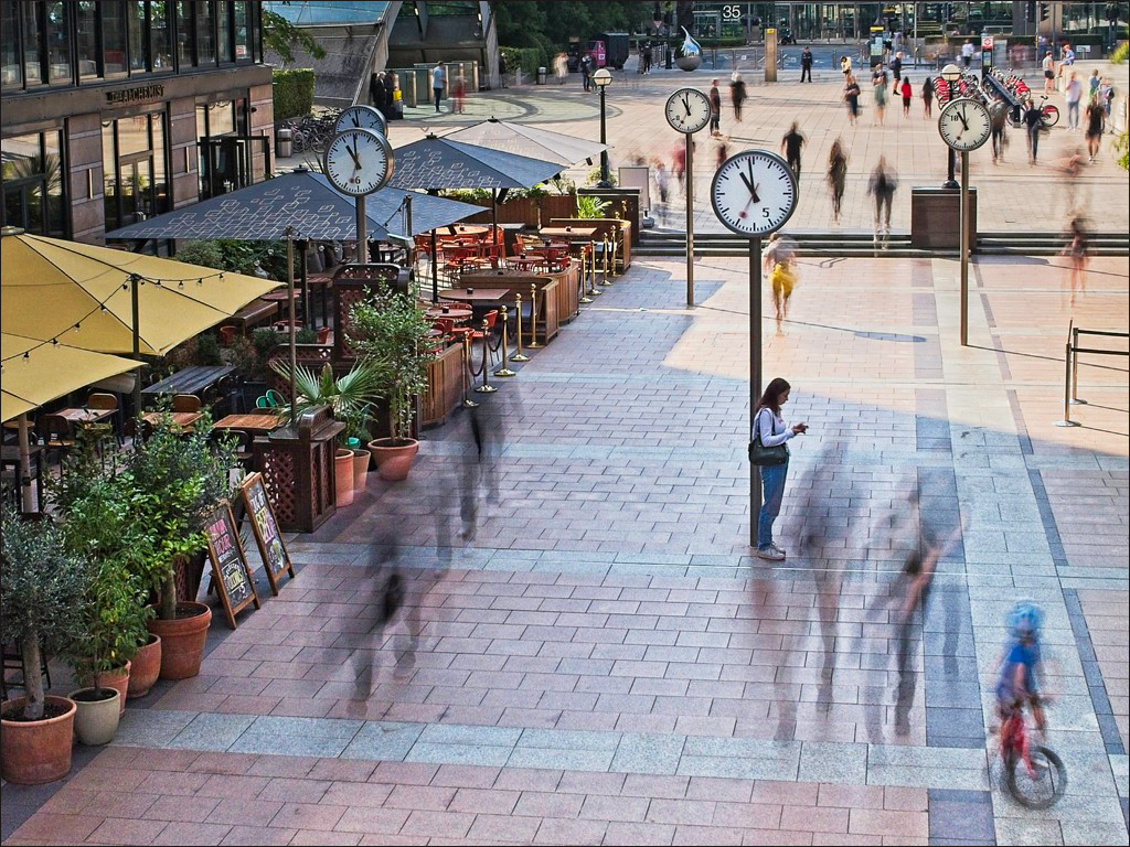
I love this kind of street photography. You have corrected the perspective distortion very well. It is sharp with good detail and your post processing has brought out the colours very well. However, my eye goes straight up to the top right to try to read the words on the wall, and I want to see the rest of what they are saying. I appreciate that you may not have been able to include everything, but would it have been possible to recompose the shot with the double doors and down pipe at the left edge, leaving more of the wording at the top right in the image? You say it is an old image but I wonder if you have any other shots taken at the same time that you could maybe stitch on at the right. |
Jun 8th |
| 4 |
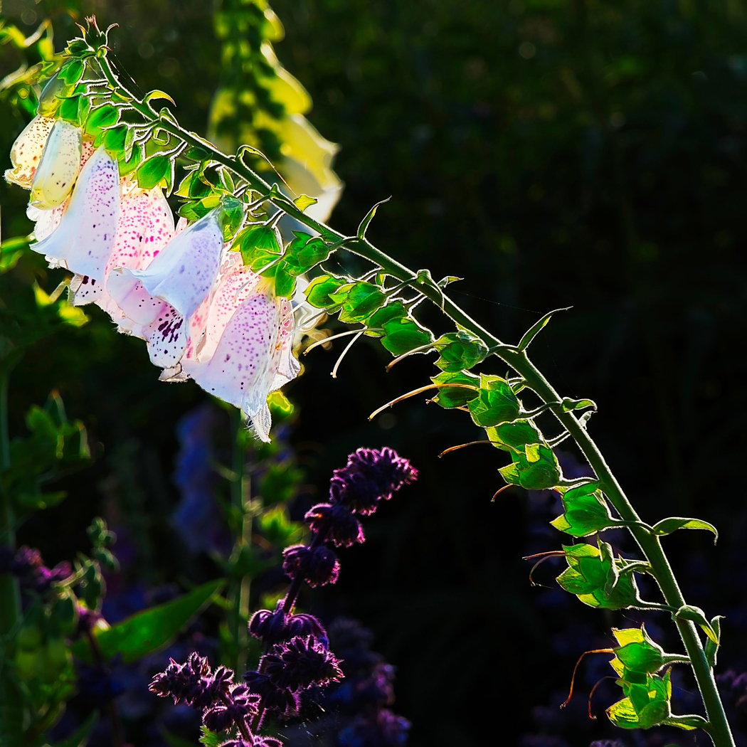
Jun 21 |
Comment |
Bill I showed this image to Paula and she really likes it as she does similar things. I think you have caught the dying beauty of the tulip very well. THe lighting is well controlled with the backlight bringing out the details in the petals, and the frontal lighting cutting out dark shadows and illuminating the stem and seed head. This would make a very nice print on an art paper, maybe a lightly textured art paper. |
Jun 8th |
| 4 |
Jun 21 |
Reply |
Isaac, I'll remember that - never underestimate the complexiy of simplicity. That's brilliant! |
Jun 8th |
| 4 |
Jun 21 |
Comment |
One of the interesting things about this group is the non-photographic knowledge that we gain. I had never heard of camel polo so this image is an education for me. It has been well captured, it is very sharp and is well lit in spite of the strong sun. The background crowd is nicely out of focus so as not to be distracting - good use of f/2.8. The action is well portrayed and I would not have thought of any way to improve the image. However Gary has seen a small improvement that makes a big difference (though not acceptable for Travel). |
Jun 8th |
| 4 |
Jun 21 |
Comment |
Great shot of a very difficult subject! Church interiors with stained glass windows are very tricky with a wide brightness range (especially on a bright day) so you have handled this very well indeed. Choosing the very low viewpoint was a master-stroke. I guess you had some serious correction of the verticals in post processing. I agree with Isaac's suggestion of reduced exposure. |
Jun 7th |
6 comments - 8 replies for Group 4
|
6 comments - 8 replies Total
|