|
| Group |
Round |
C/R |
Comment |
Date |
Image |
| 4 |
Nov 20 |
Reply |
Thanks Ian. It was one of those typical Lake District days! |
Nov 15th |
| 4 |
Nov 20 |
Reply |
Joe, we generally don't get the vivid fall colours that you get across the Atlantic. Ours are less spectacular but can be enjoyed just as much. |
Nov 13th |
| 4 |
Nov 20 |
Comment |
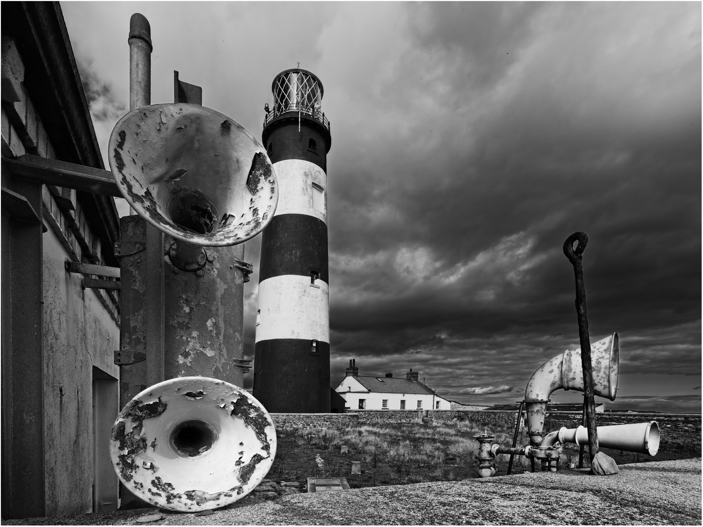
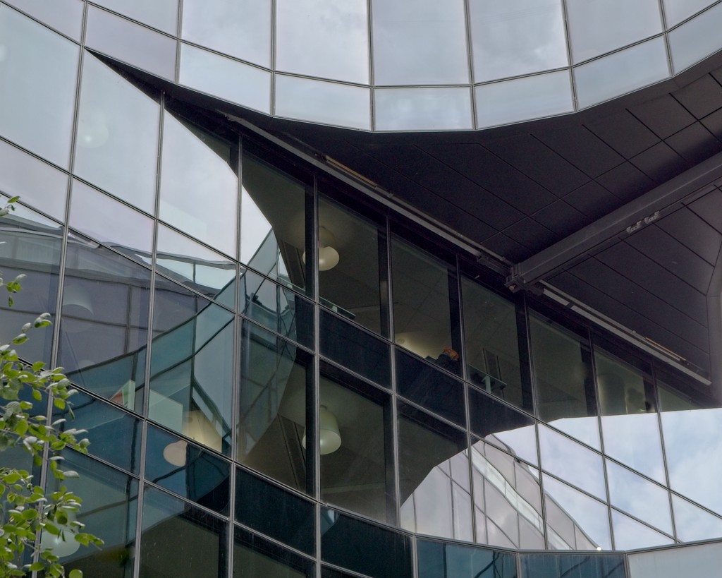
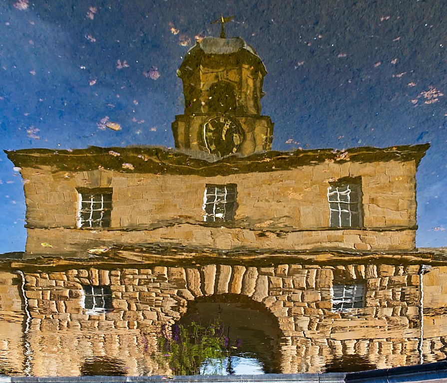
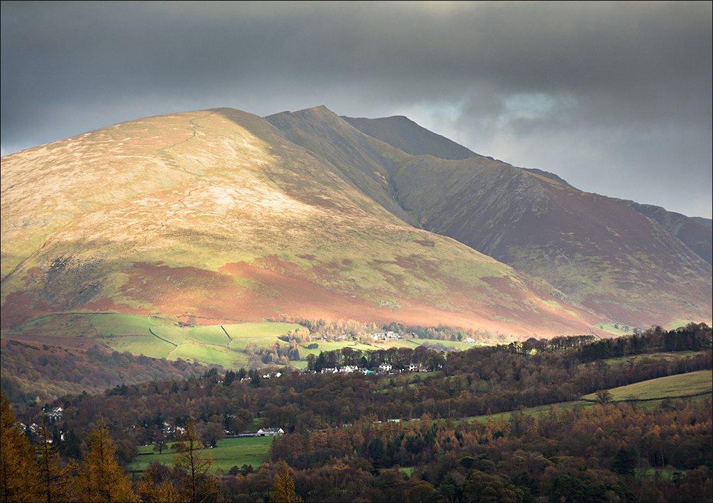
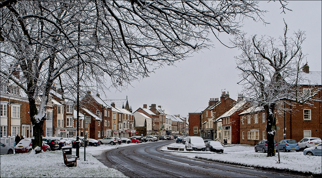
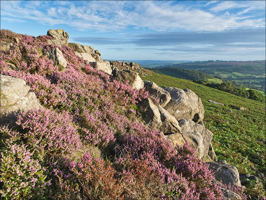
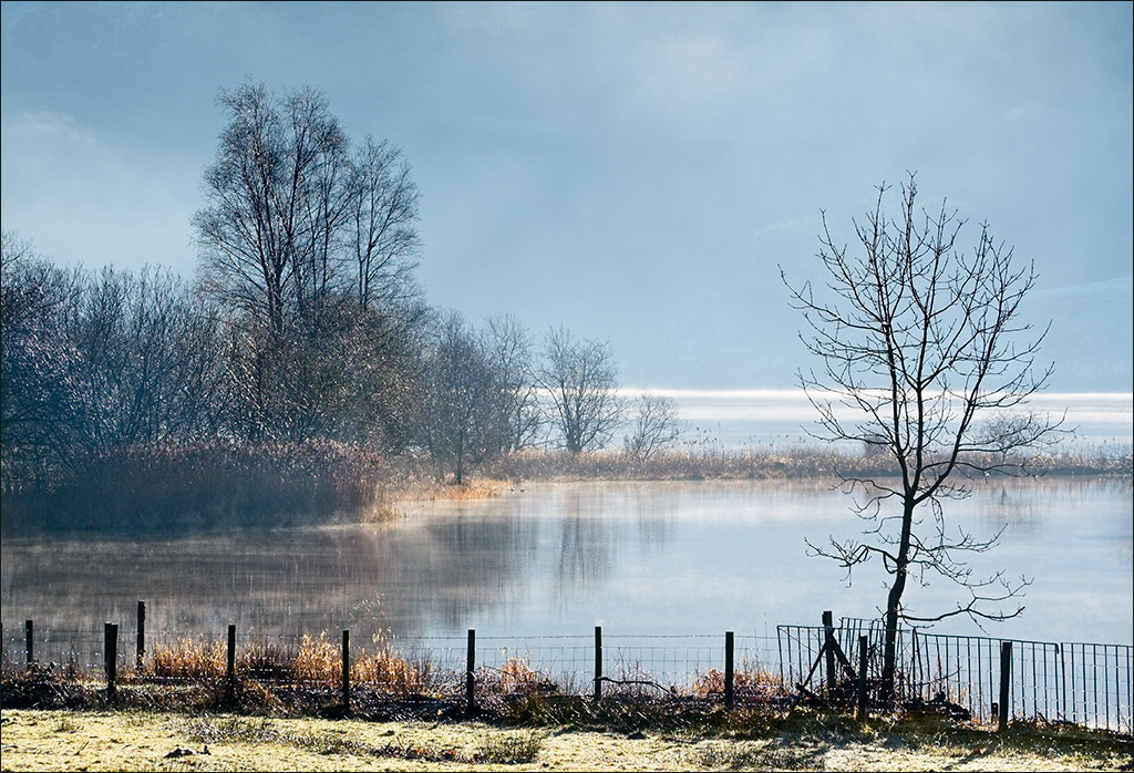
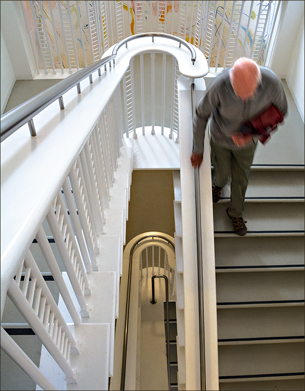
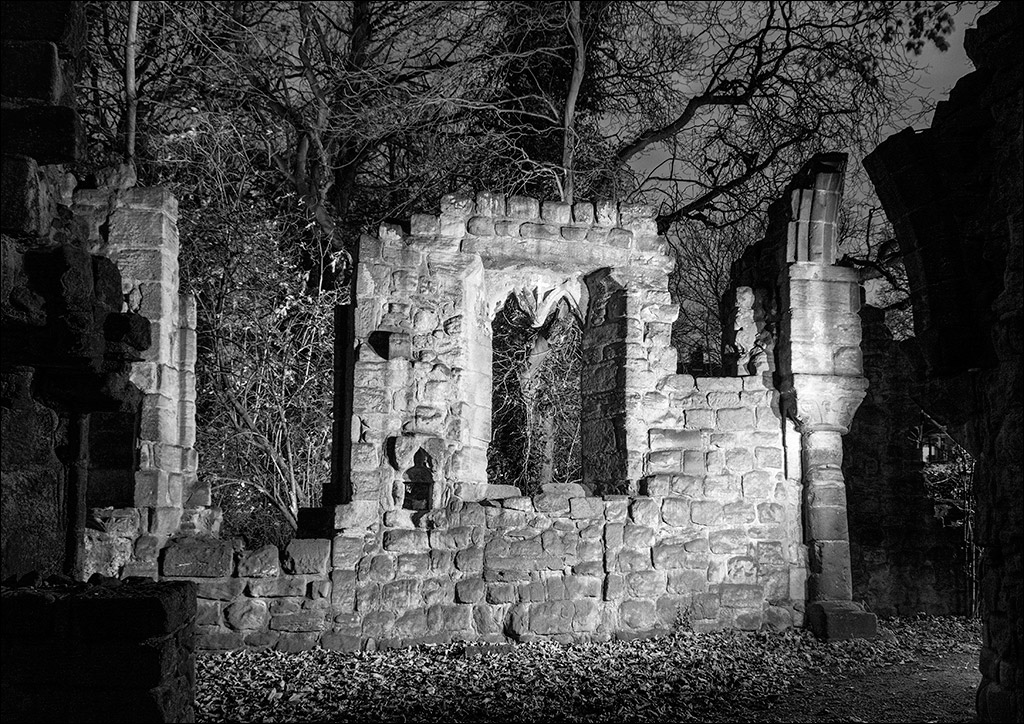
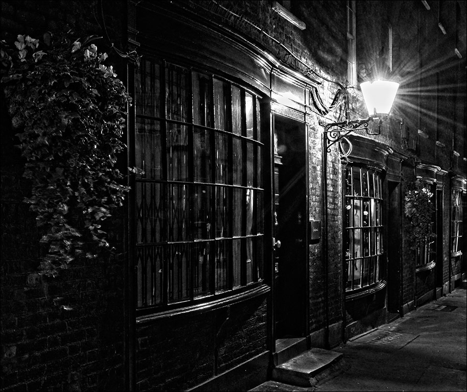
Ian, this image sums up a lot of what we are experiencing at the moment. The autumnal colours are tyipcal of old English deciduous trees at this time of the year - gentle blends of yellows, greens and some reds. The framing of the shot by the window opening is a metaphor for our being confined (mainly) indoors and having to enjoy the outside scene by gazing wistfully out of the window. The deccorative balustrade is typical of Victorian architecture. The image is very calming and restful. |
Nov 13th |
| 4 |
Nov 20 |
Comment |
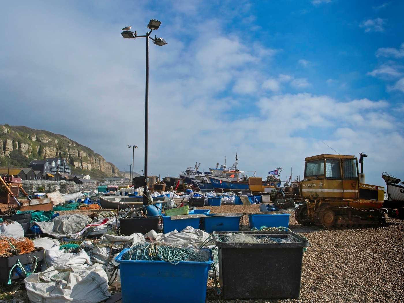
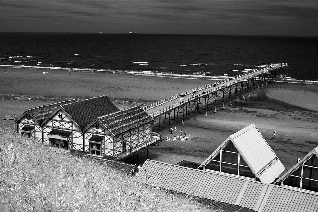
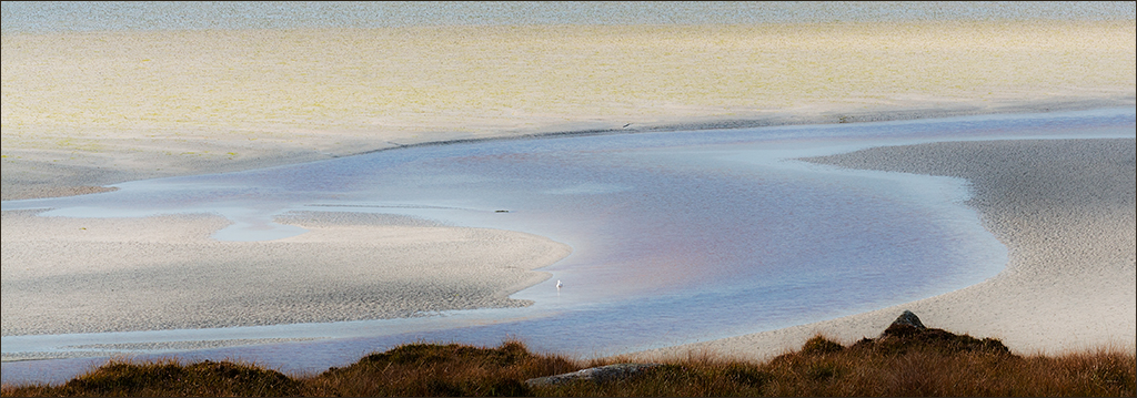
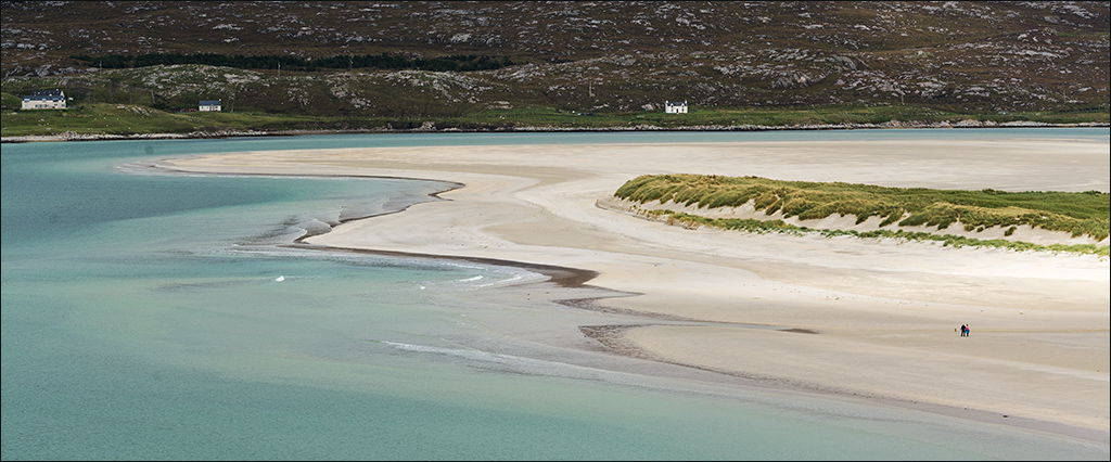
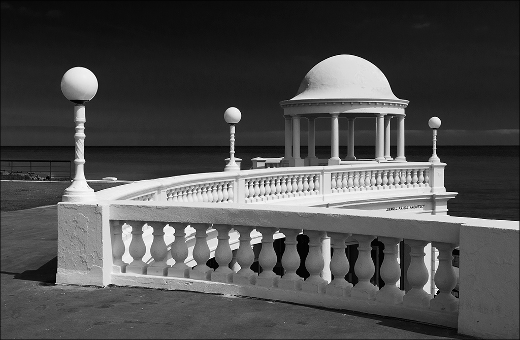
I like the lead in from the bottom right, into the bay and back to the lighthouse and the red building. There is some softness in the foreground so I tried the latest Topaz Sharpen AI which I have just downloaded. It has tree modes: Sharpen to counteract the natural softness of digital files, Stabilize to counteract camera shake, and Focus to counteract slight out of focus (depth of field etc). I tried all three and found that Stabilize had the greatest effect on the foreground foliage, suggesting movement in the wind, but it overdid the sharpening on the buildings so it would need to be masked off for those parts of the image. It is a bit difficult working with a low resolution image so it might be worth a try on the full size image. |
Nov 13th |
| 4 |
Nov 20 |
Comment |
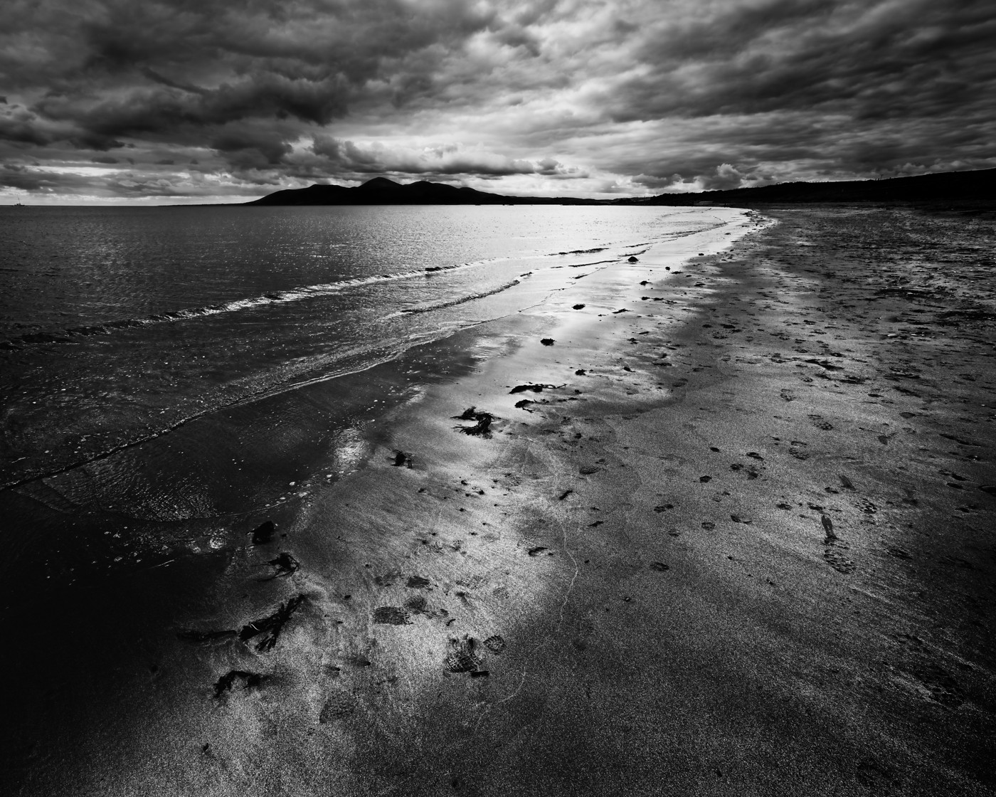
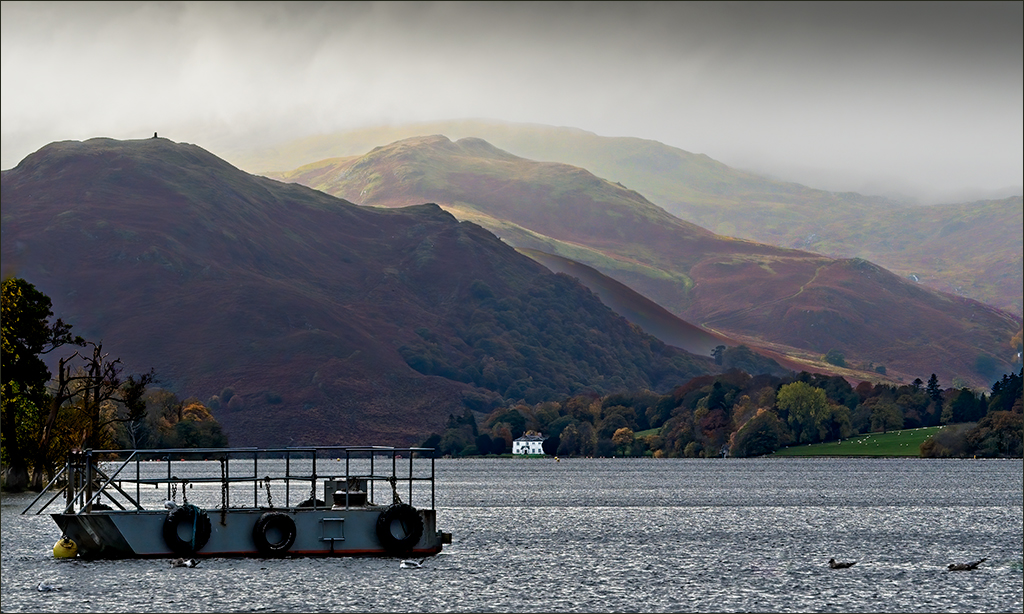
You did a great job with bringing out the colour and making the weather look a lot brighter than it appears in the original shot. Like Joe, I have never been to the Norwegian fjords, but I don't have the excuse of long distance as they are just across the North Sea from where I live. The image is very sharp and clear - not easy when you are on a moving ship. I agree with Isaac about the use of a polariser to cut down the bright reflections, but my experience of photographing from a moving boat or ship suggests that although you are moving quite slowly, the scene changes all the time and if you stop to fiddle with the lens or fit a polariser you miss the shot. It is normally a case of see it, snap it! |
Nov 13th |
| 4 |
Nov 20 |
Comment |
Bill, it is a super picture of the dahlia with everything sharp from front to back. Well composed and cropped, with the flower head placed just the right amount off centre. This would make a very nice print on a smooth art paper.
Focus stacking has introduced a new dimension into close-up photography - I really must give it a try. |
Nov 13th |
| 4 |
Nov 20 |
Reply |
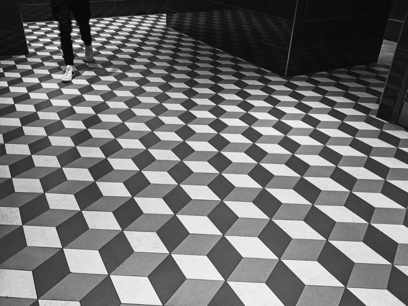
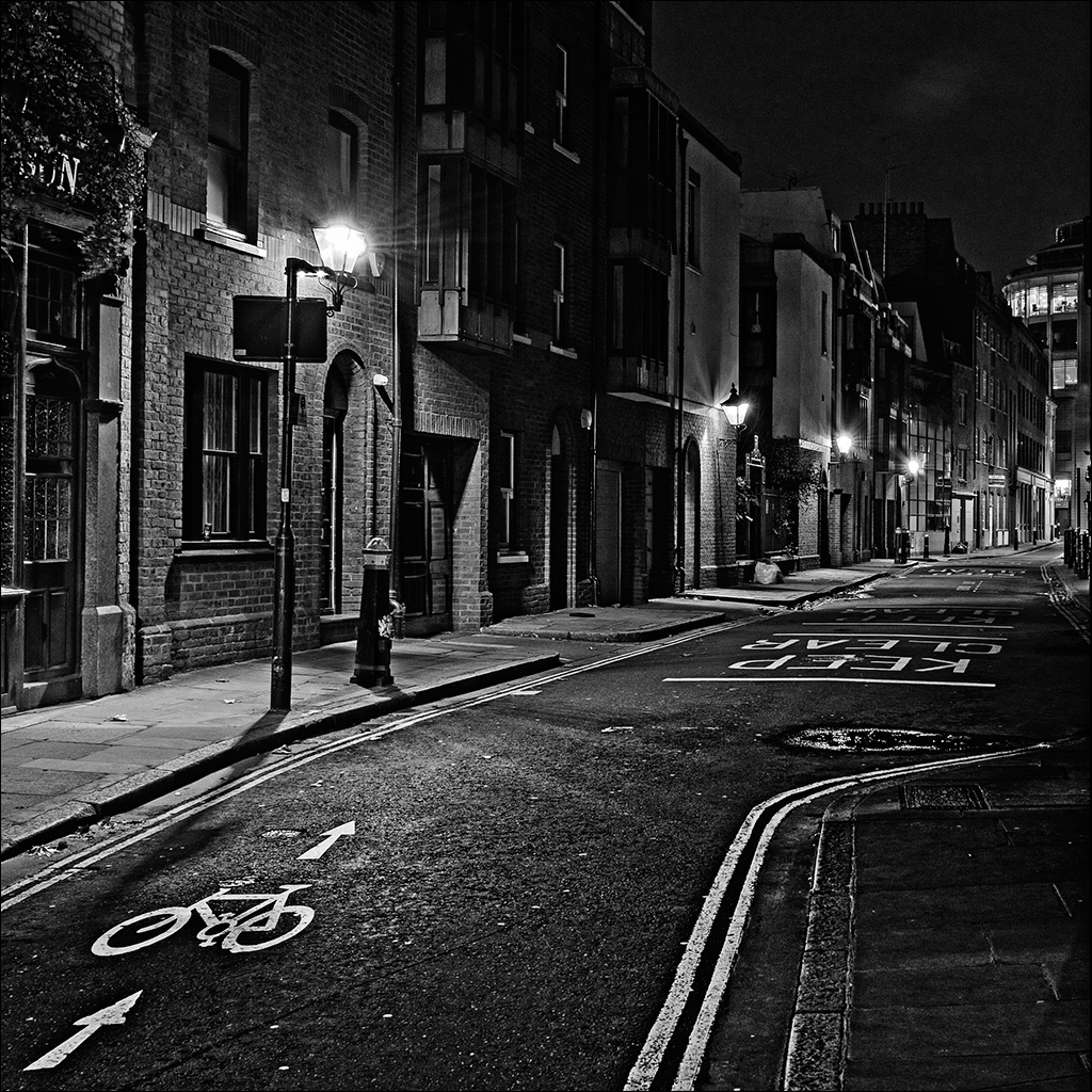
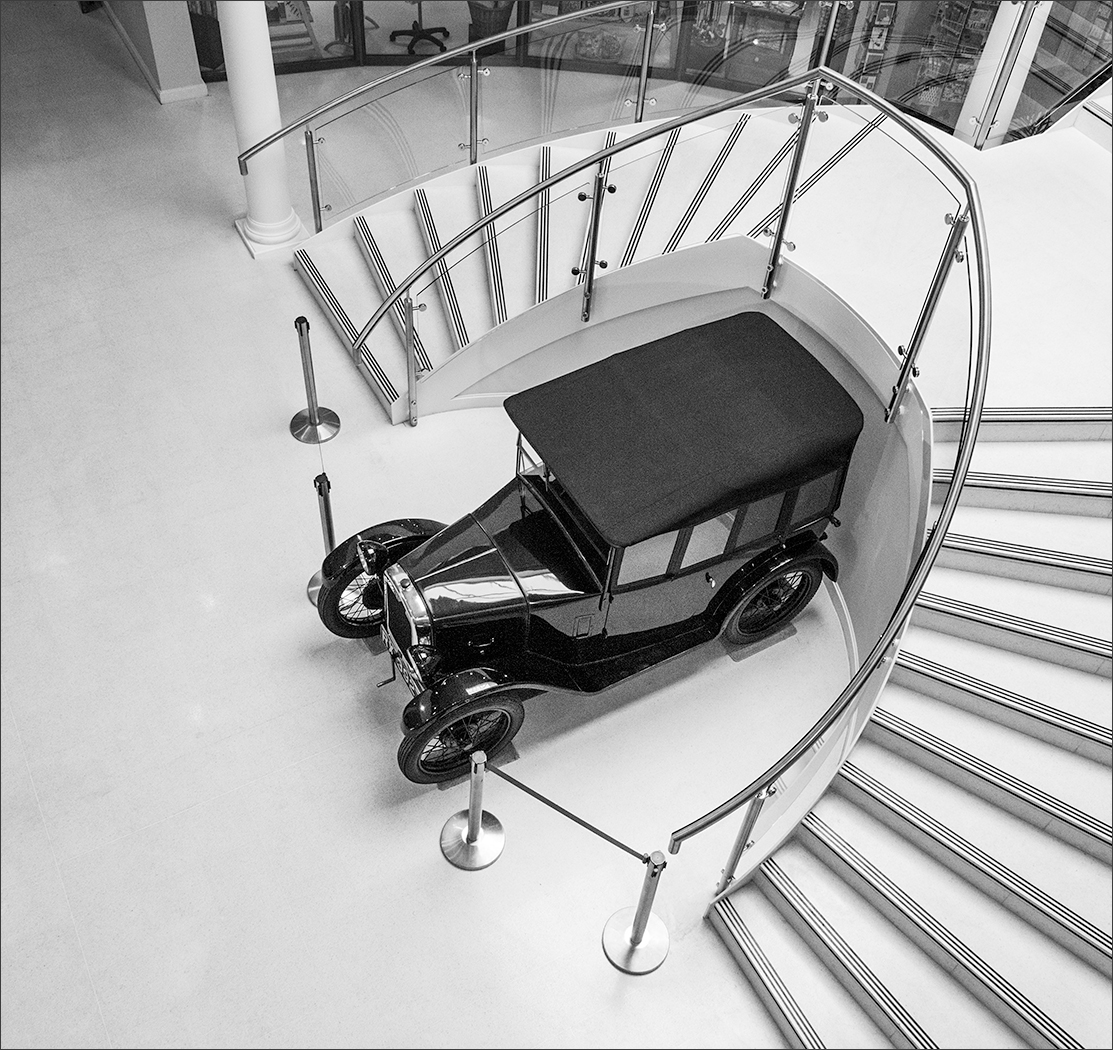
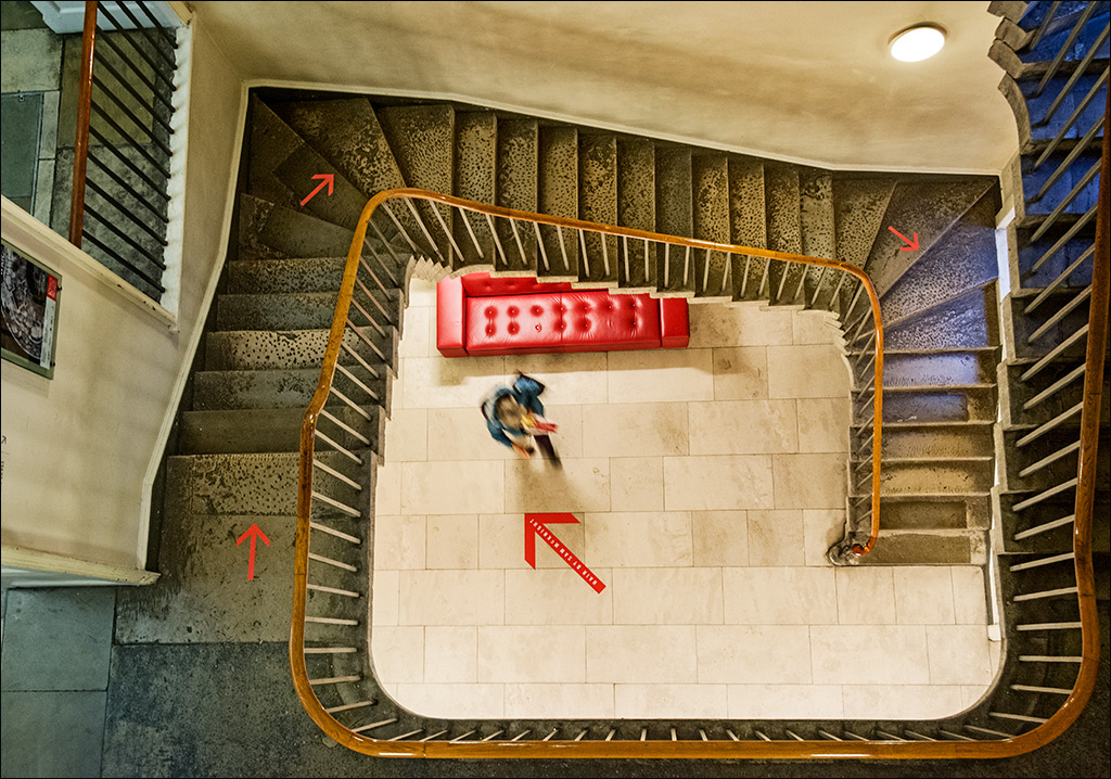
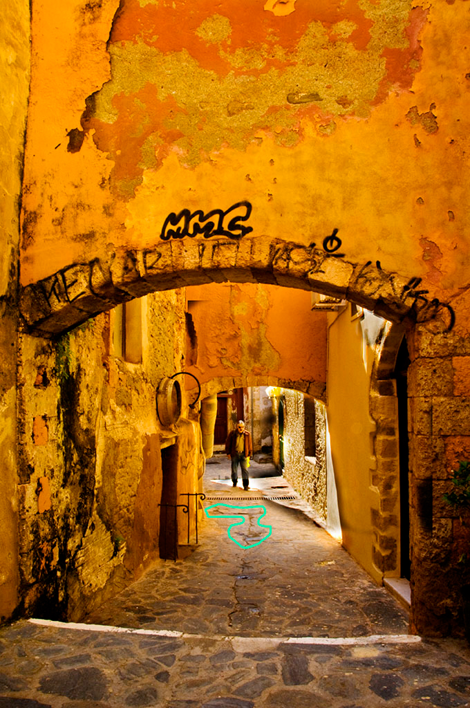
Isaac, now that I look a bit longer, I think the 'arrows' on the ground may be just part of the stone paving. If you look about three paces in front of the man, there seems to be a right angled arrow coming in from our left and turning towards us with the arrow head opposite the light coming in from the right. Once you have seen it, it is difficult to 'unsee' it! |
Nov 13th |
 |
| 4 |
Nov 20 |
Reply |
I went micro four thirds mirrorless - half the weight! |
Nov 12th |
| 4 |
Nov 20 |
Comment |
Lovely light on this bird, and the image is very sharp. Crop is tight and the bird is placed nicely to the right of centre, with the body angled into the frame. This is a great nature shot. My only other comment is that I wonder if I could even pick up an 800 mm f/5.6 lens these days, never mind point it at a bird in a tree! |
Nov 9th |
| 4 |
Nov 20 |
Comment |
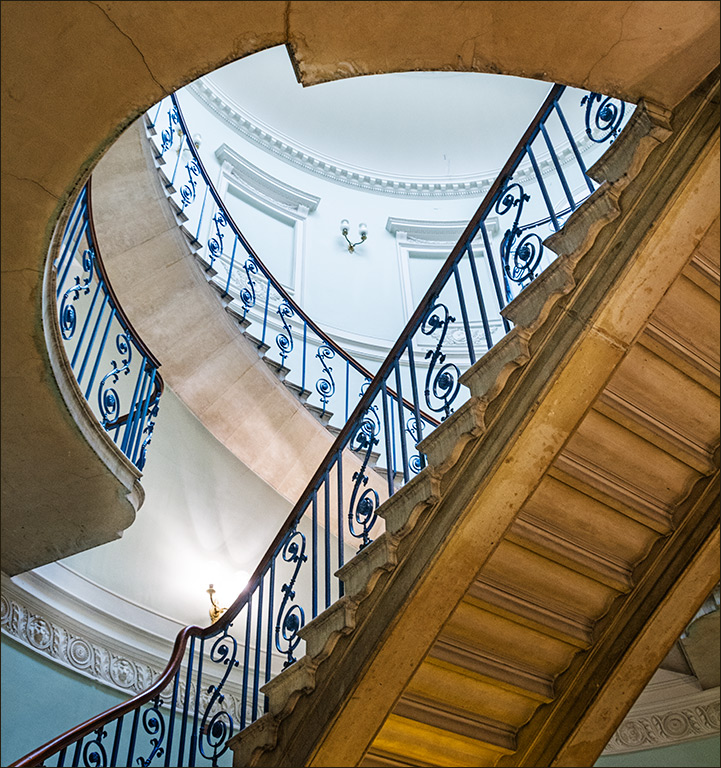
We had a holiday in Crete some years ago and it is a great place to find interesting and colourful images. I like the archway and the passage to the man at the end, but I would prefer to see less of the wall above the arch. The top part is sufficiently interesting that it divides the viewer's attention. I can't decide about the arrows on the ground though. |
Nov 9th |
| 4 |
Nov 20 |
Comment |
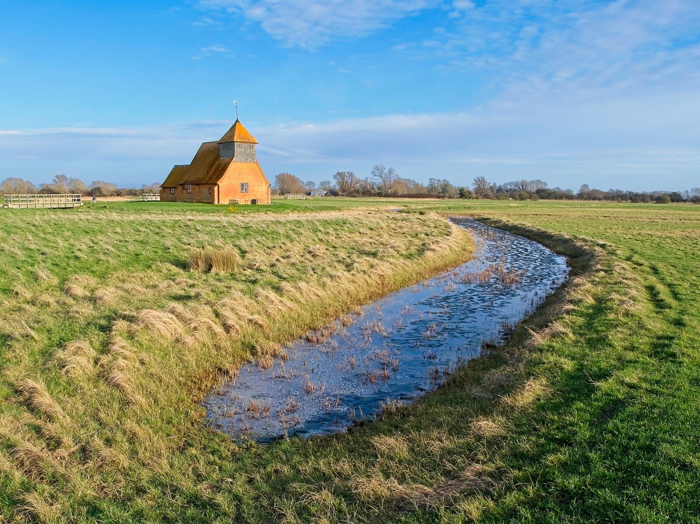
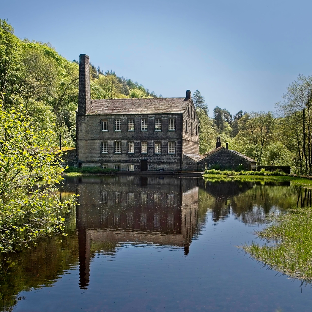
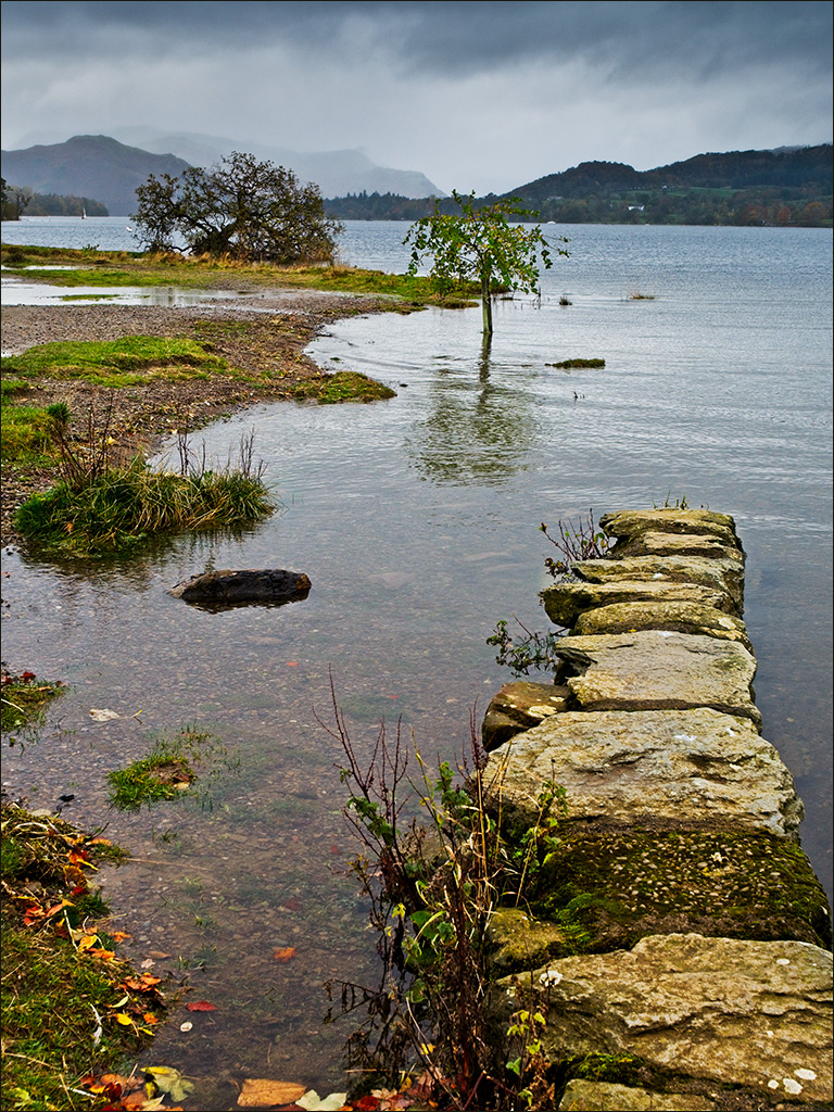
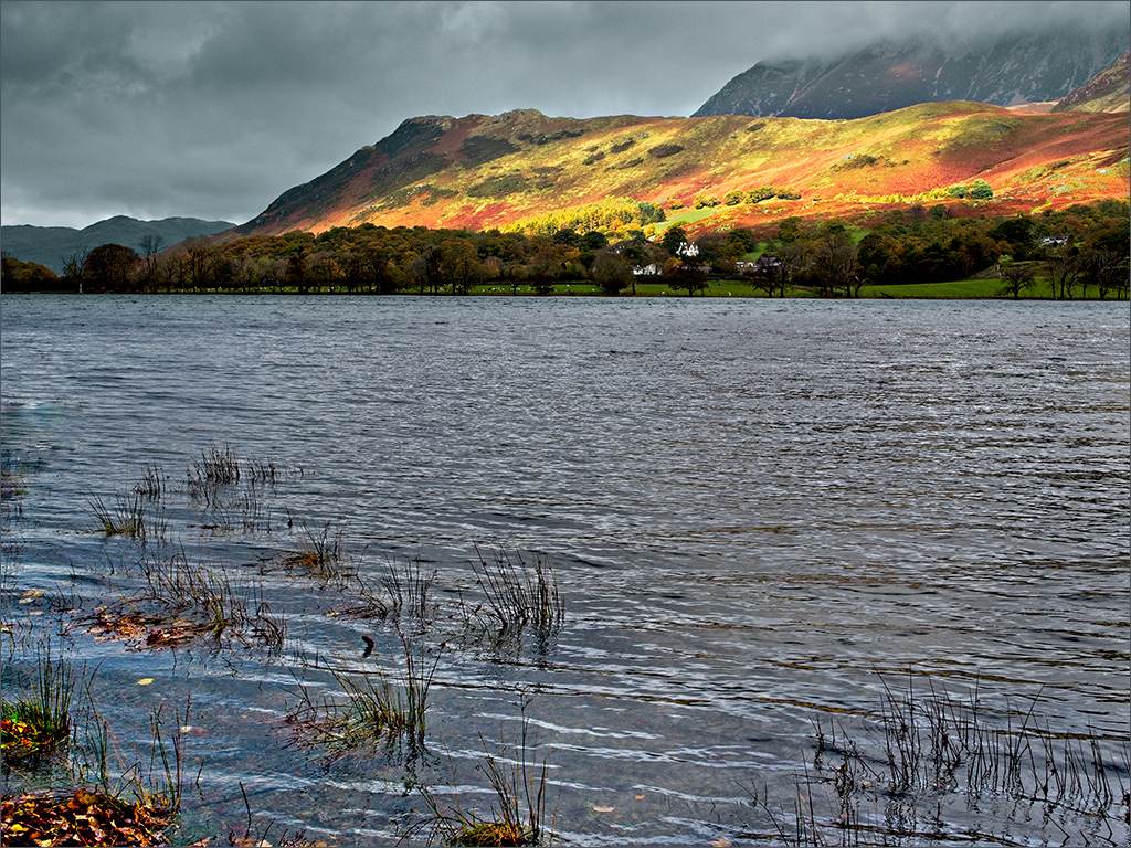
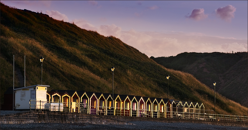
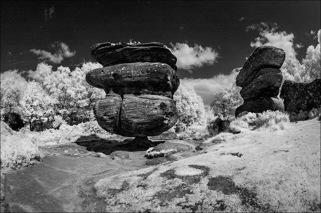
Hi Witta, thanks for the comments. It's always interesting to get other people's views. I spent some time on this image trying to decide on the crop, whether to include the dark clouds higher up, and on how much light on the hills. The nearest hill was very dark so I lightened it to show some detail. The house was rather dull (neither something nor nothing) so I brightened it up to make it stand out. If you can't fight it, feature it! I like your interpretation though so I may well take a second look at the image. |
Nov 9th |
7 comments - 4 replies for Group 4
|
| 77 |
Nov 20 |
Comment |
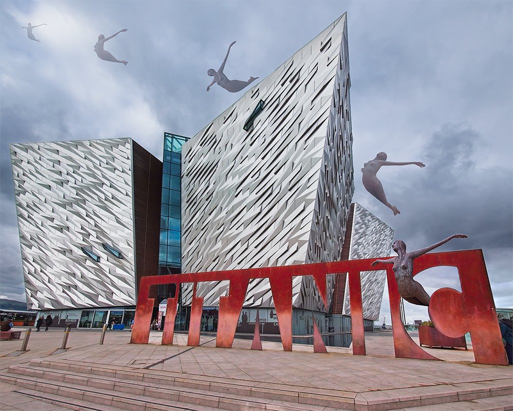
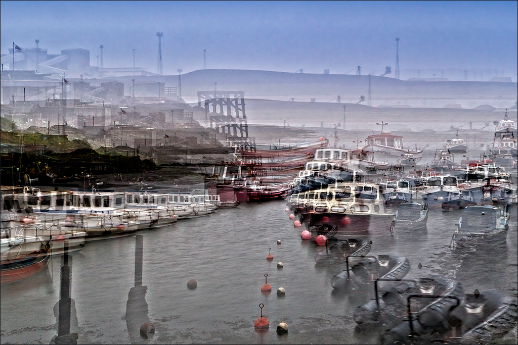
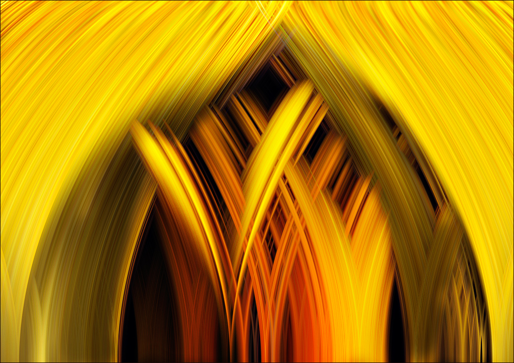
Hi Witta. Great piece of composite work. I guess the colour you choose depends on the mood you want to portray. I like it as it is, whereas a blue cast would make me shiver and want to put my overcoat! If you were to try a blue cast then you might try adding some mist as well. |
Nov 13th |
| 77 |
Nov 20 |
Comment |
Georgianne, this is really beautiful. I love everything about it. |
Nov 13th |
2 comments - 0 replies for Group 77
|
9 comments - 4 replies Total
|